OPPO ColorOS 13 review: A unified OS that gets the best of OxygenOS
By integrating OxygenOS features into ColorOS, OPPO built the unified OS it wanted — without changing the name.
Get the latest news from Android Central, your trusted companion in the world of Android
You are now subscribed
Your newsletter sign-up was successful
OnePlus and OPPO said at the end of 2021 that they would work toward a unified OS that combines the best features of ColorOS and OxygenOS into a single interface. The aim was to merge the exclusive features that were present in OxygenOS with the stability of ColorOS.
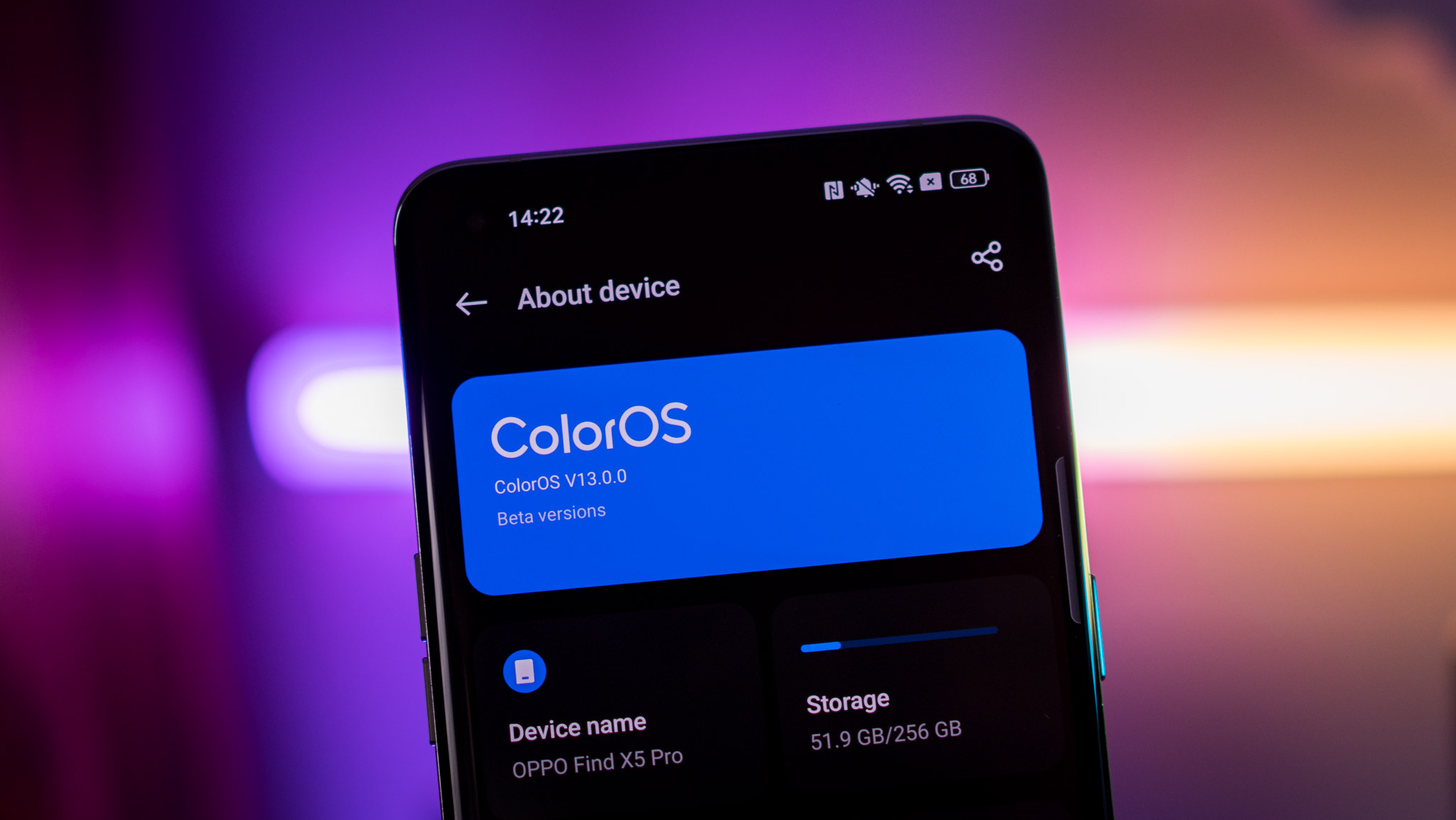
That plan was abandoned after user backlash, with OnePlus noting that it will continue to use OxygenOS. OPPO must have failed to get that memo, because it went ahead and built the unified OS it wanted anyway — the only difference is that it is still called ColorOS. Make no mistake here, ColorOS 13 is the realization of over two years's worth of effort.
While OxygenOS and ColorOS have been largely identical for the better part of 18 months, there were a few features that were limited to OxygenOS. That line is nonexistent in ColorOS 13; OPPO has ported the erstwhile OxygenOS-exclusive features to ColorOS, bringing feature parity to the two interfaces.
So why is OxygenOS still a thing? That's what I asked Gary Chen, who heads OPPO's software efforts, and was told that while the two interfaces share the same features now, that may not be the case in the future.
Be that as it may, what you need to know is that OxygenOS and ColorOS are one and the same, and ColorOS 13 comes with a whole host of meaningful features and design changes that make it one of the best Android interfaces around.
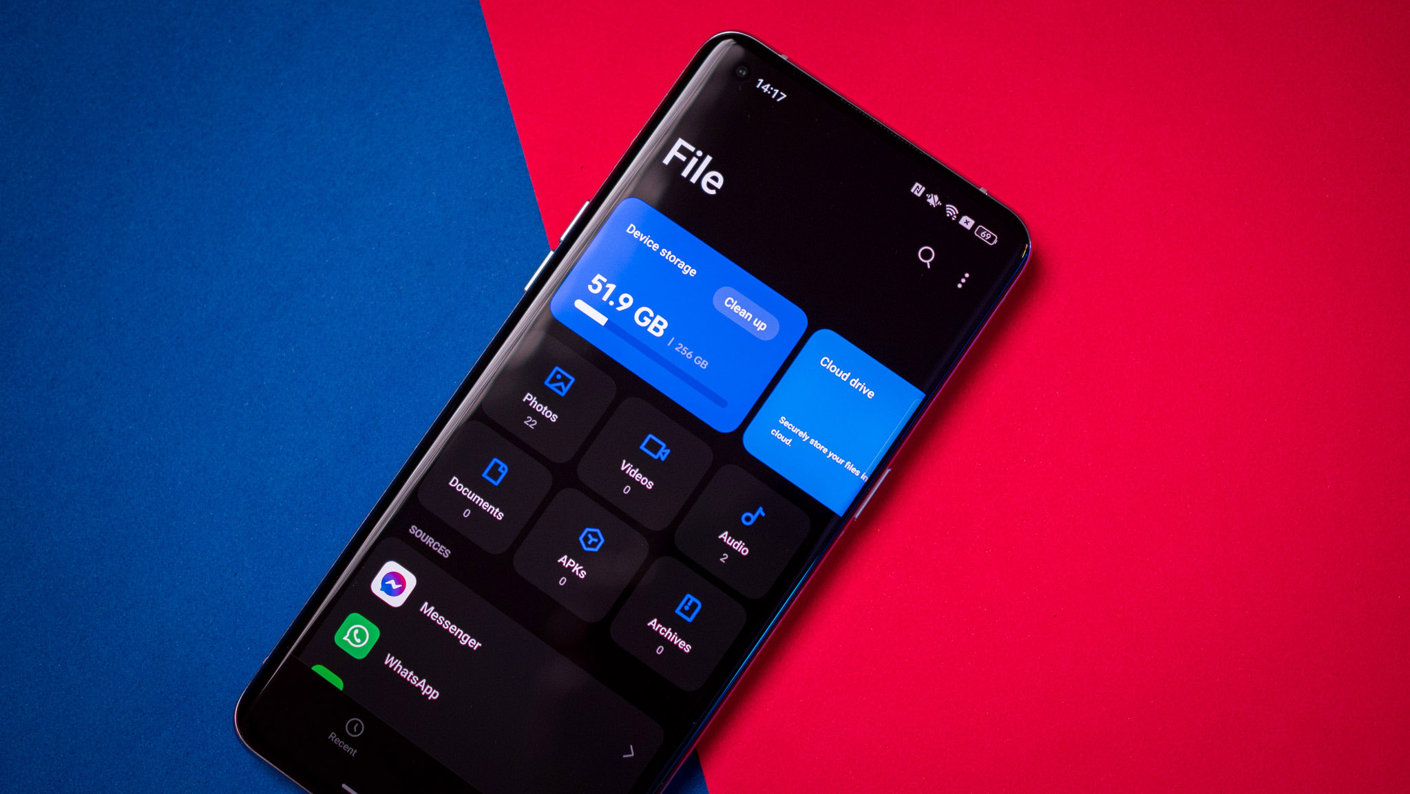
Let's start with the design. OPPO used the same Infinite Design language for three years now, so it is switching things up and going with an Aquamorphic Design aesthetic with ColorOS 13. The new design is inspired by water, and features vibrant hues, new color palettes, and rounded icons with high contrast and a new system font with better readability.
All the subtle tweaks combine to make ColorOS 13 that much more modern than its predecessor, and the new card-style layout — evident in the settings and all the stock apps — does a great job decluttering the interface.
Get the latest news from Android Central, your trusted companion in the world of Android

A change that I particularly like is the home screen; you can now set up large folders on the home screen that take up a 2x2 width, and doing so lets you open an app within the folder without opening the folder itself.
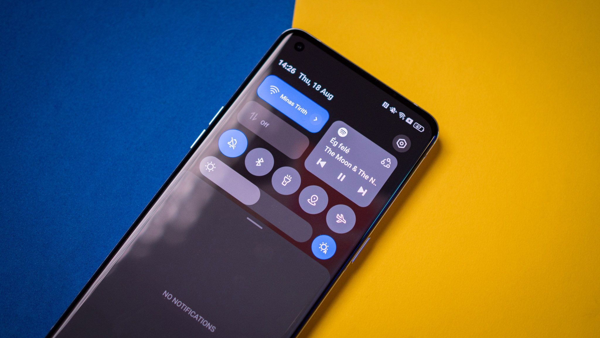
The notification pane has also picked up a lot of attention, with larger tiles located at the top combined with a second row of tiles at the bottom. There's also a new music player tile that sits to the right, and the tweaks here makes accessing tiles controlling music playback just a little bit easier. The transitions throughout the interface have been overhauled as well, and they're dynamic and smoother.
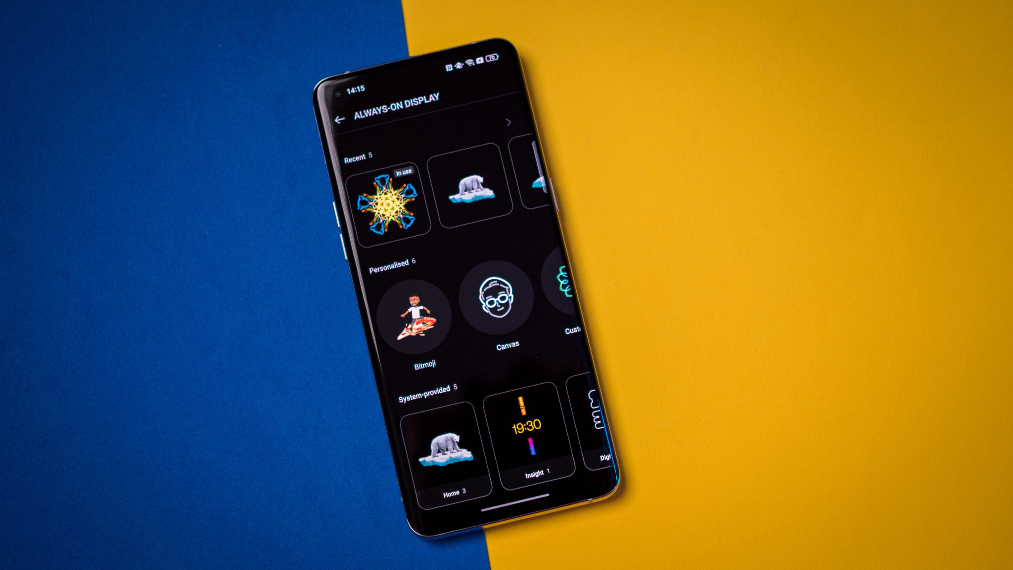
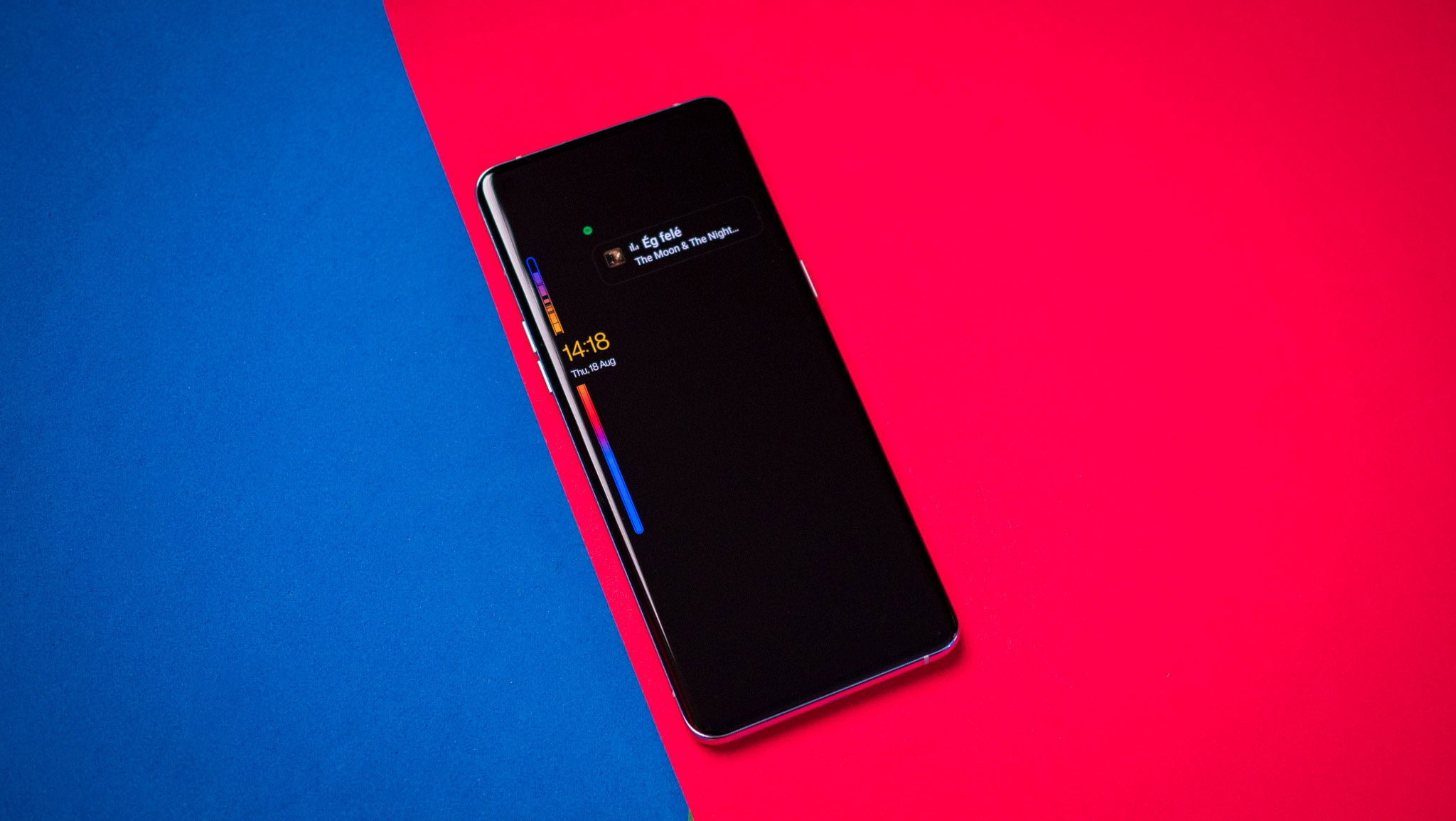
One of the biggest additions is straight out of OxygenOS: AOD styles. ColorOS 13 now lets you use Insight, Bitmoji, and Canvas styles, and the integration means a lot more users can get started with these styles — after all, ColorOS has over 500 million global active monthly users.
There's a new Spotify integration that surfaces a widget if you have AOD enabled, and it's a nifty way to see what song's playing and control music playback without having to wake the screen. ColorOS is also integrating food delivery services into AOD, with the feature aimed at Indian users initially.
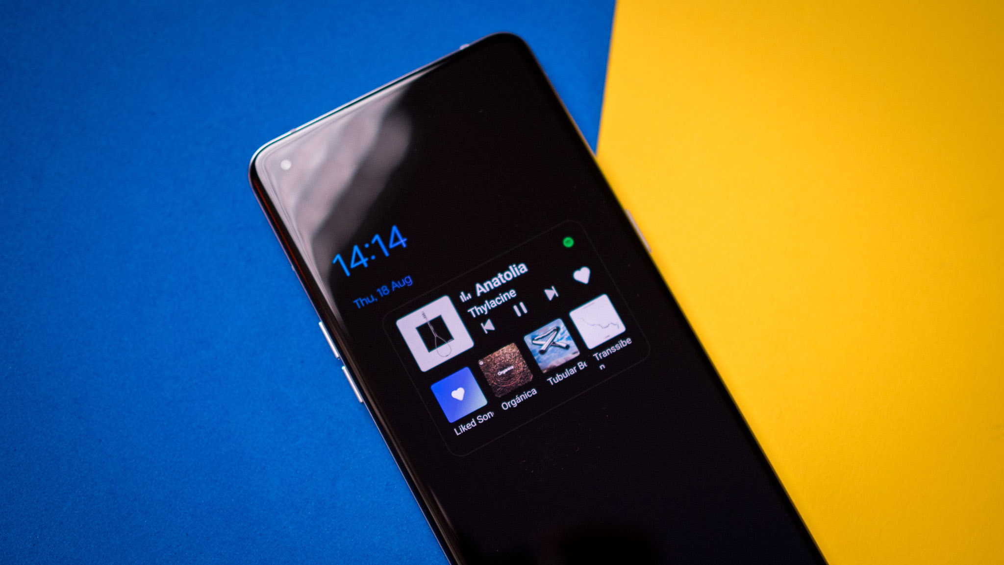
The feature isn't live in ColorOS 13 just yet, but users in the country will be able to see the status of their Zomato and Swiggy orders in real-time on the lock screen — I'll share further details once it goes live. Work-Life Balance is also coming to ColorOS 13, but it won't be available until the 13.1 release rolls around sometime in 2023.
As ColorOS 13 is built on a stable build of Android 13, you get all the features that Google introduced with the latest version of Android, including a secure photo picker alongside all the privacy and security changes. While you don't get resizable widgets here, ColorOS has its own version of the Material You dynamic color picker, and it works incredibly well — you get the ability to choose custom colors.

There are a few changes to the Multi Connect feature as well, but as with Samsung phones, I haven't really used the feature to any meaningful degree. What I do care about is bloatware, and ColorOS 13 still has too much of it on my Find X5 Pro to my liking. Chen said that the manufacturer is considering cutting down on bloatware with upcoming launches, but wouldn't make any guarantees in this area. That said, I didn't run into any services that I wasn't able to uninstall.
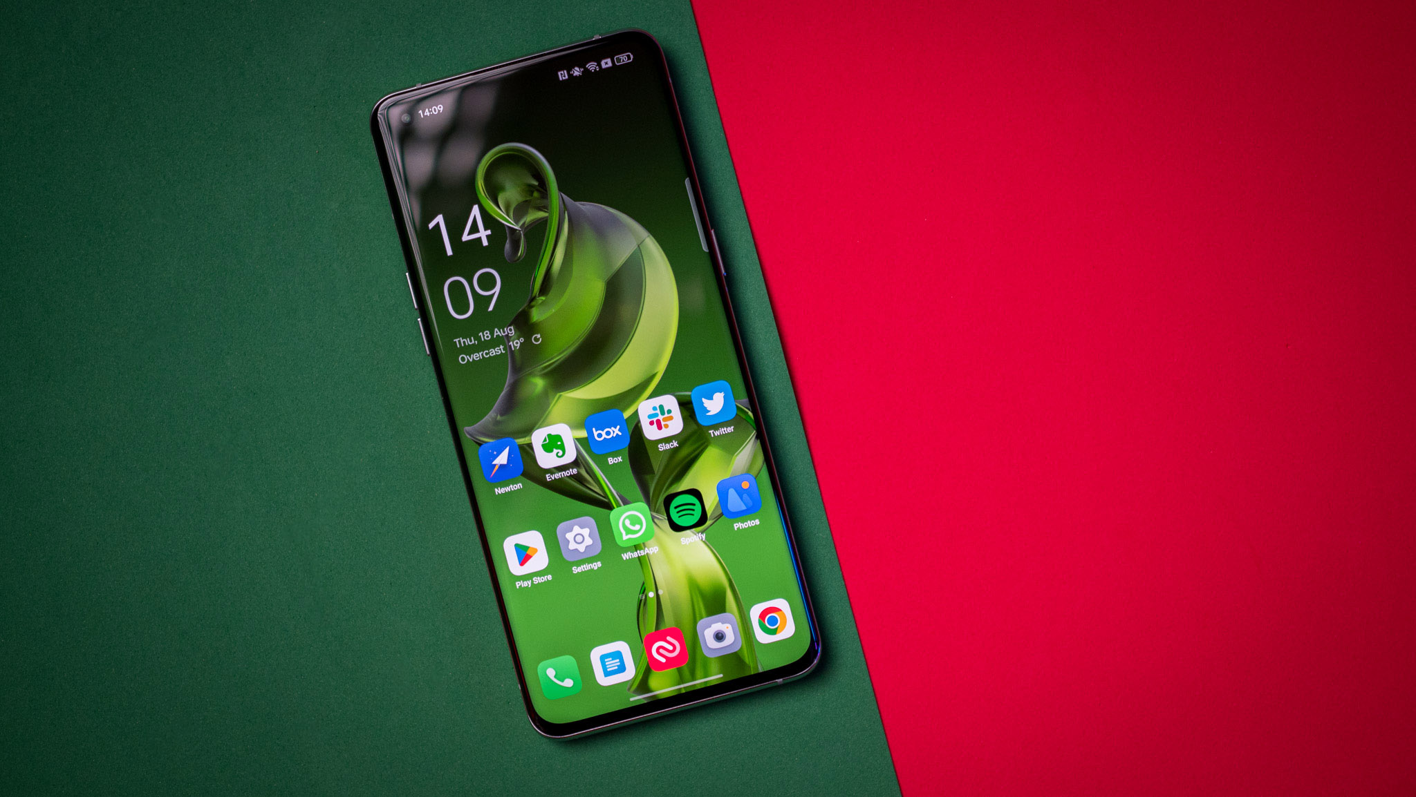
Having used ColorOS 13 for a while now on the Find X5 Pro, Find N2, and other devices, I can easily say that this is the most refined interface yet from the manufacturer. The new design language feels modern and clean, the changes to the notification pane make it just that little bit easier to use, there are a lot of great security and privacy-focused features. And thanks to all the OxygenOS additions, ColorOS 13 is one of the best interfaces around if you care about customizability.
The stable ColorOS 13 build is now available for the Find X5 series, and it will make its way to other devices in the coming weeks and months. For more details regarding eligible devices and rollout schedules, head to my detailed ColorOS 13 guide.

Harish Jonnalagadda is Android Central's Senior Editor overseeing mobile coverage. In his current role, he leads the site's coverage of Chinese phone brands, networking products, and AV gear. He has been testing phones for over a decade, and has extensive experience in mobile hardware and the global semiconductor industry. Contact him on Twitter at @chunkynerd.
