YouTube changes its app interface yet again, moving to bottom tab navigation
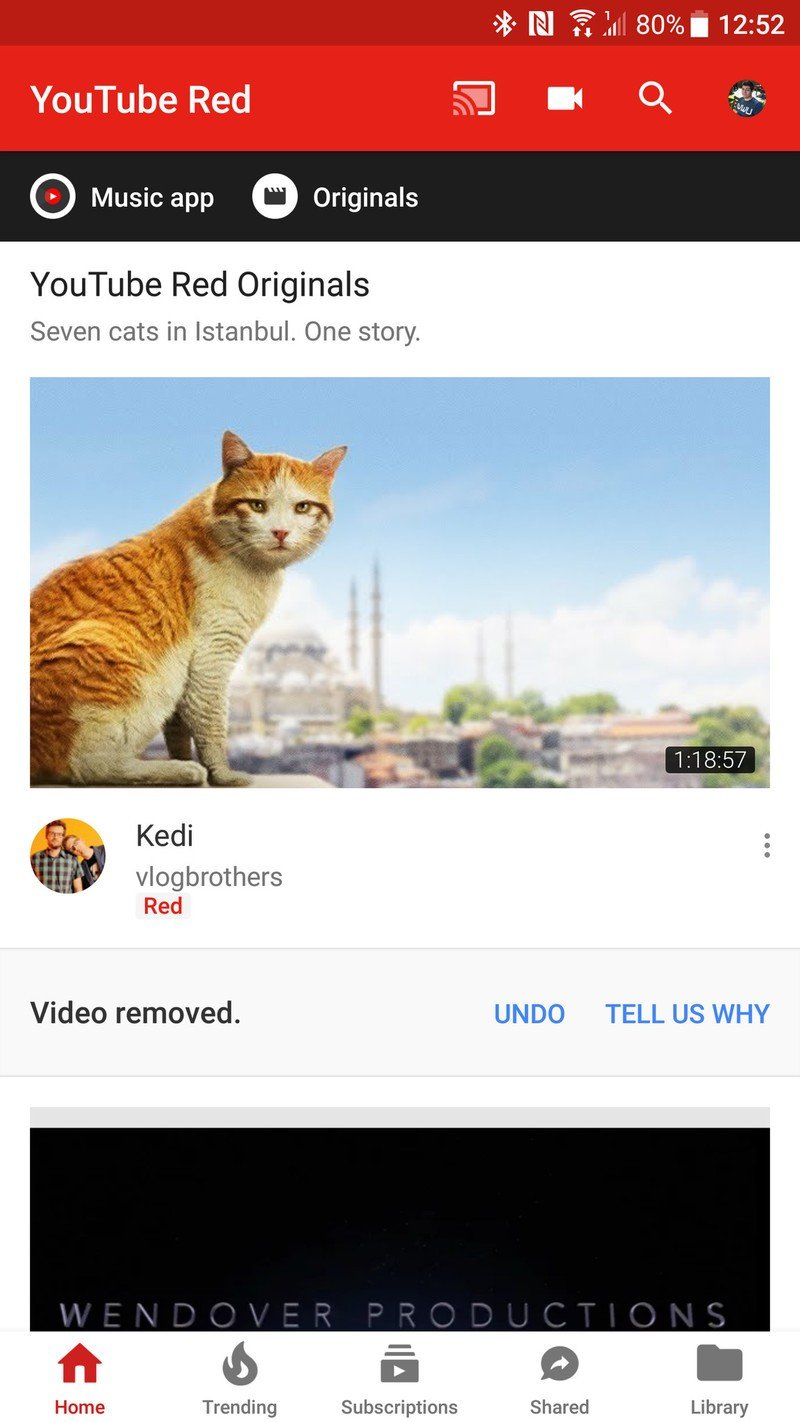
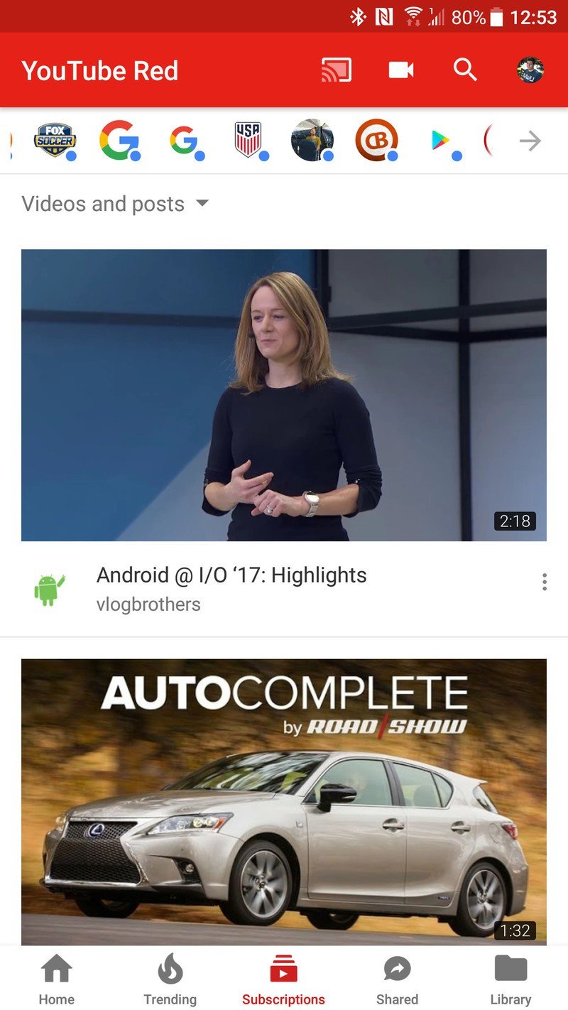
YouTube is once again tweaking its Android app interface, aiming to hopefully clean things up and make the most-used YouTube functions easier to quickly reach. The crux of the new interface is the move to a bottom navigation bar that lets you quickly tap one of five tabs: home, trending, subscriptions, shared and library. The trending and subscription tabs use a familiar bubble interface at the top of the page to let you refine your view.
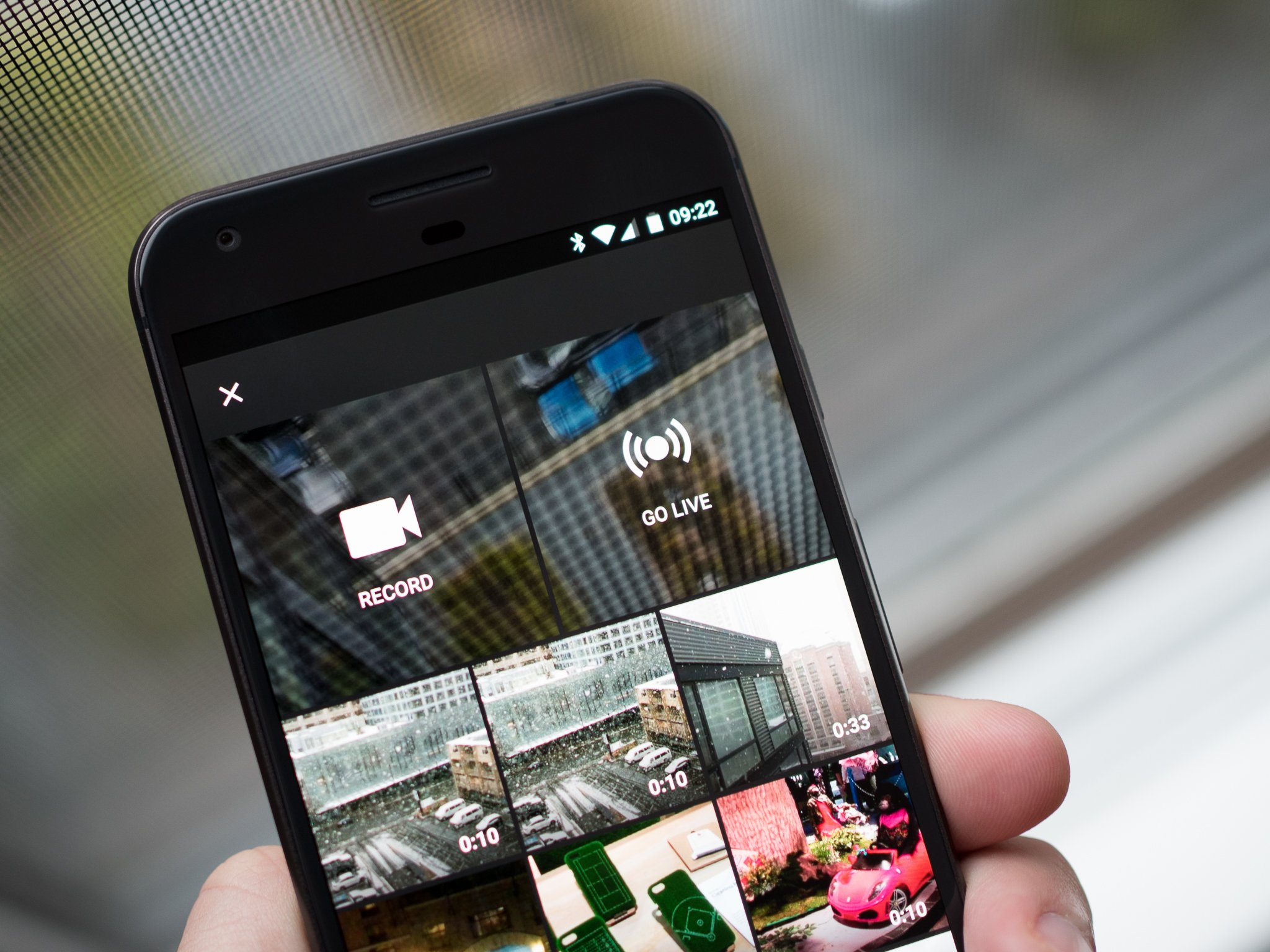
Outside of the tabs moving from the top of the interface to the bottom, not much else has changed to our eyes. The live video button is no longer a floating action button and now has a permanent place in the top bar, and your account icon is also stuck up on the top bar rather than in a submenu.
The YouTube app listing in Google Play hasn't actually been updated for a few days, but we're actually seeing this new interface arrive without a distinct update to the app itself. To force the update we just force-closed the app and reopened it. This is likely rolling out in waves, though, so be patient if it doesn't arrive right away.
Get the latest news from Android Central, your trusted companion in the world of Android

Andrew was an Executive Editor, U.S. at Android Central between 2012 and 2020.
