YotaPhone 2 review
Niche Android phones have a history of doing that one really cool thing, but more often than not fail at being a great regular phone. It's cool if you're one of the 100 people in the world who could honestly benefit from having a projector baked into your phone, or have a mighty need for the ability to charge someone else's phone with the massive battery built into your device. But when these features end up being the sole thing that makes your phone special, it's clear that the phone isn't ever going to escape that niche market.
When I was first able to spend time with the original YotaPhone, I immediately felt that the phone was forever doomed to niche markets. It was huge, the software wasn't great, and while the ePaper screen was neat it didn't really do much. There's a really good chance that very few people have ever touched the original YotaPhone — mostly a Russian endeavor anyway — as a result.
This is not that phone. This is the YotaPhone 2, and it is clear that the creators of this device have done everything they could to take this phone out of that extreme niche category to make something that could legitimately appeal to everyone. Like its predecessor, the most interesting part of the YotaPhone 2 is the second screen on the back of the phone. Unlike its predecessor, the rest of the YotaPhone 2 is a decent phone. A combination of thoughtful software development, careful hardware optimization, and the potential for a limited U.S. release for those who don't want to import have created a unique option that would work well for users of all types.
Here's our full review.
About this review
We're writing this review after a week and a half using the international YotaPhone 2 in the Baltimore area with great HSPA+ coverage from T-Mobile, as well as several days prior on just WiFi. This phone, which was provided by YotaPhone, was running Android 4.4.3 with software build KTU84L.
For the majority of the time with the YotaPhone 2 a Moto 360 was connected over Bluetooth.
YotaPhone 2 hardware
The best-feeling double-sided glass phone you've ever seen
Be an expert in 5 minutes
Get the latest news from Android Central, your trusted companion in the world of Android
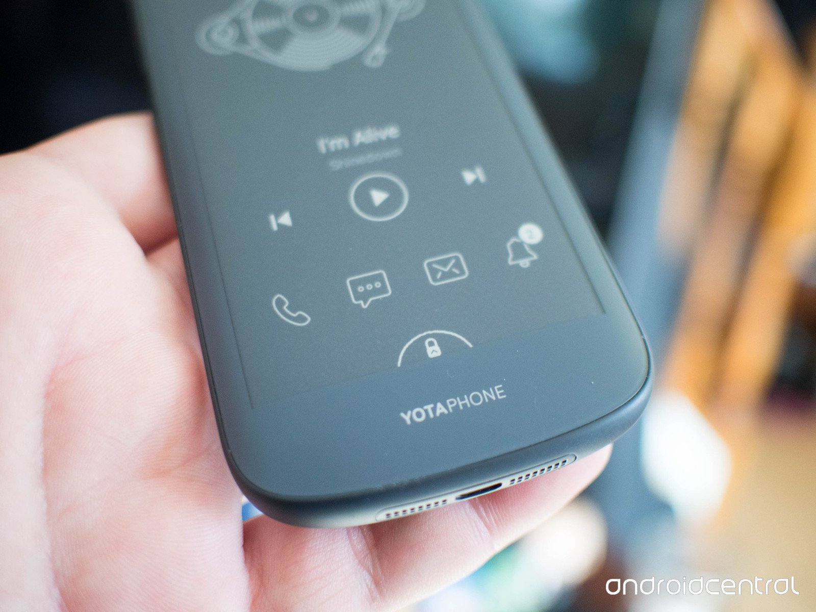
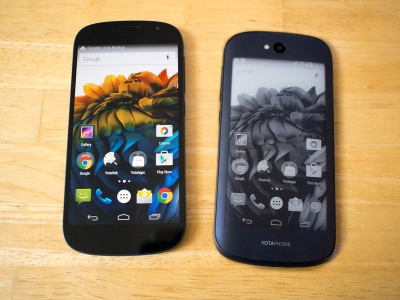
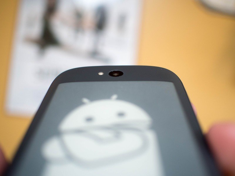
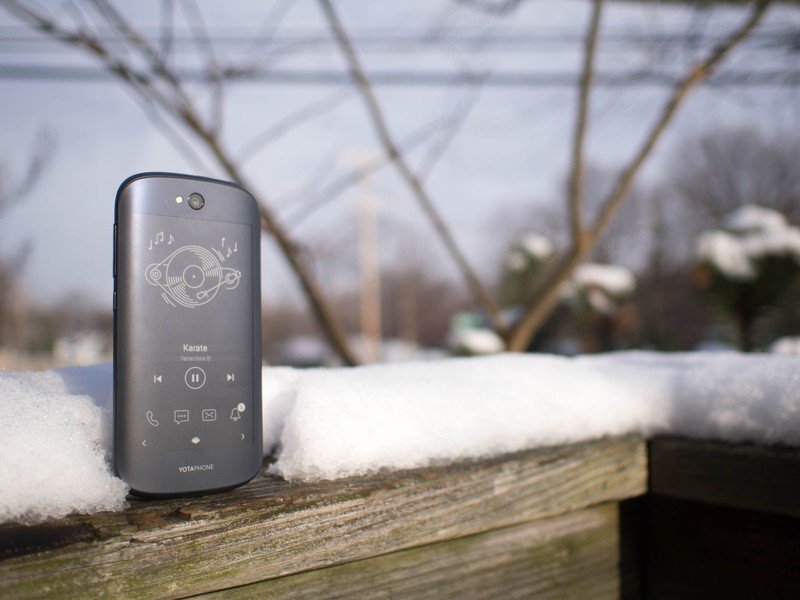
Pulling the YotaPhone 2 out of the box is a unique experience. At first, the phone almost looks like a flattened Galaxy Nexus. The oval curvature to the outside of the phone offers a pleasing symmetry, and as you pull the phone out of the box you're greeted with a soft-touch coating on the back of the device. The coating doesn't offer the same level of grip as the soft touch plastic on, say, the 2013 Nexus 7, but it's a noticeably grippy and smooth surface. Flipping the phone over reveals the ePaper display, which uses zero power unless it is refreshing to bring you new information or receive your input. If you've ever touched a Kindle Paperwhite, you have a rough idea of what this surface feels like. The only real difference is the glass underneath instead of plastic, which can be either cool or warm to the touch depending on your environment. The rear camera sits flush with the back of the phone, so the soft touch coating and the slight curve to the back of the phone cause immediate distinction between the two sides when reaching for the phone in your pocket.
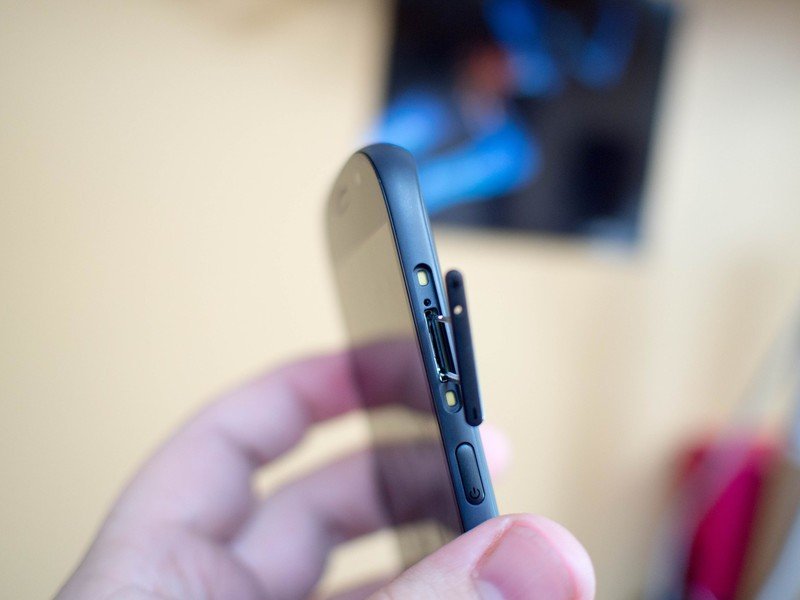
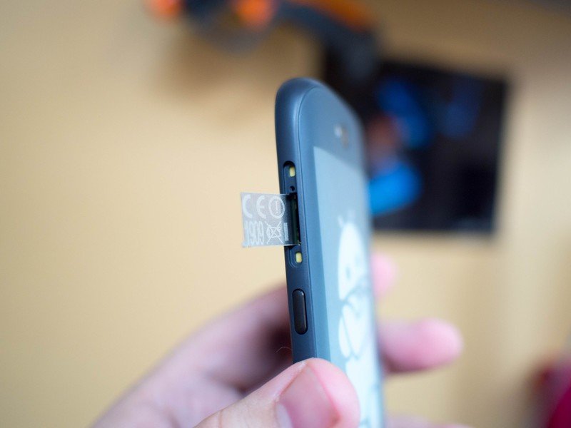
YotaPhone 2 isn't "edgeless" like the back of the HTC One M8, but it's about as close as you can get. There's a slight gap where the glass on the back meets the plastic that wraps around the sides of the phone, but otherwise it's a consistent curve from front to back and is a genuine pleasure to hold. The volume and power buttons are well-pronounced, and because the volume rocker pulls double duty as a SIM tray there's a tiny hole in the volume-up section. The speakers for this phone sit on either side of the microUSB port at the bottom of the phone, and as a result they are highly directional but still loud enough to be enjoyable even when facing away from you. The headphone jack at the top of the phone serves as the only other disruption in the casing, since the FCC information is cleverly concealed in an aluminum tag that can be pulled out with the SIM tray.
The YotaPhone 2 displays
A pair of mostly average experiences come together to make something more
There is nothing particularly impressive about the color display on the YotaPhone 2. It's a 5-inch, 1080p AMOLED display that is basically unusable in direct sunlight and does a perfectly average job displaying colors and text. It's a decent screen, but in a world with frankly absurd 2K displays that crank up to compete with the sun there's nothing special about this display. It's nice, and it'll get you through the day, but that's about it.
The same could be said of the ePaper display, if we lived in a world where Android on an ePaper display was something that happened every day. As ePaper panels go, this 960x540 display is just all right. The refresh rate isn't amazing by today's ePaper standards, and while that's not a huge deal when reading a book it is pretty irritating when scrolling through a Twitter feed. It's a decent mid-range panel, but nothing to write home about.
It's the way these two screens work that make the phone worthwhile
What makes the YotaPhone 2 exciting is the ability to use these two screens together. You can flip to the ePaper panel in direct sunlight and laugh at the mere mortals who cower in the shade to check their phones, and you can use the color display when someone sends you a funny video. It's the way these two screens work that make the phone worthwhile, and in order to make two decent screens play nice and not have a $1,000 phone it's understandable that neither display is the best thing ever on their own.

YotaPhone2 software
Kind of like a Nexus, with extras
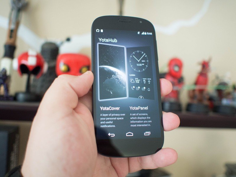
Using the color side of the YotaPhone 2 is a surprisingly spartan experience. You've got your stock set of Google Apps, the apps needed to manage the ePaper side easier, and that's about it. It's the closest thing to pure Android 4.4.3 I've seen in a production phone that wasn't a Nexus in a long time, and with that Snapdragon 800 processor under the hood it felt plenty snappy doing everything I threw at it. Even the camera app is straight up Google Camera, with no extras.
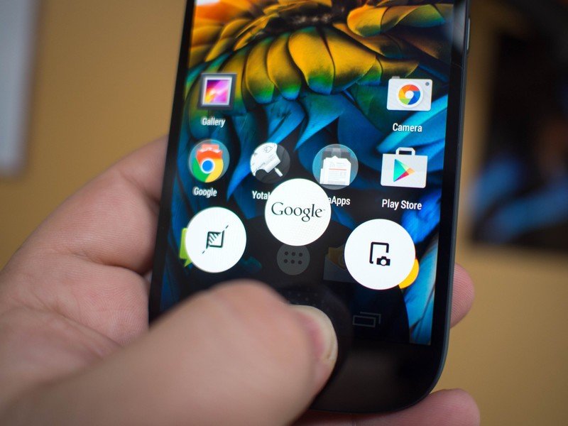
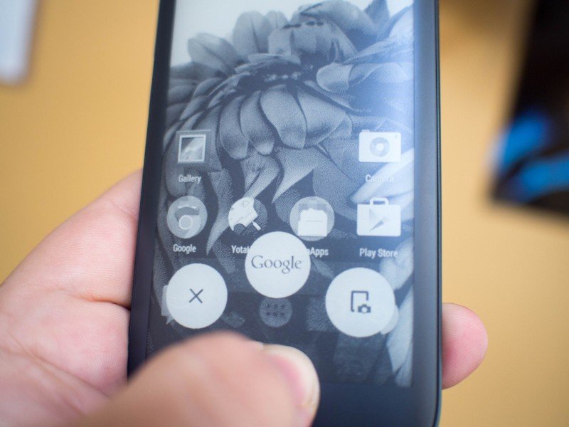
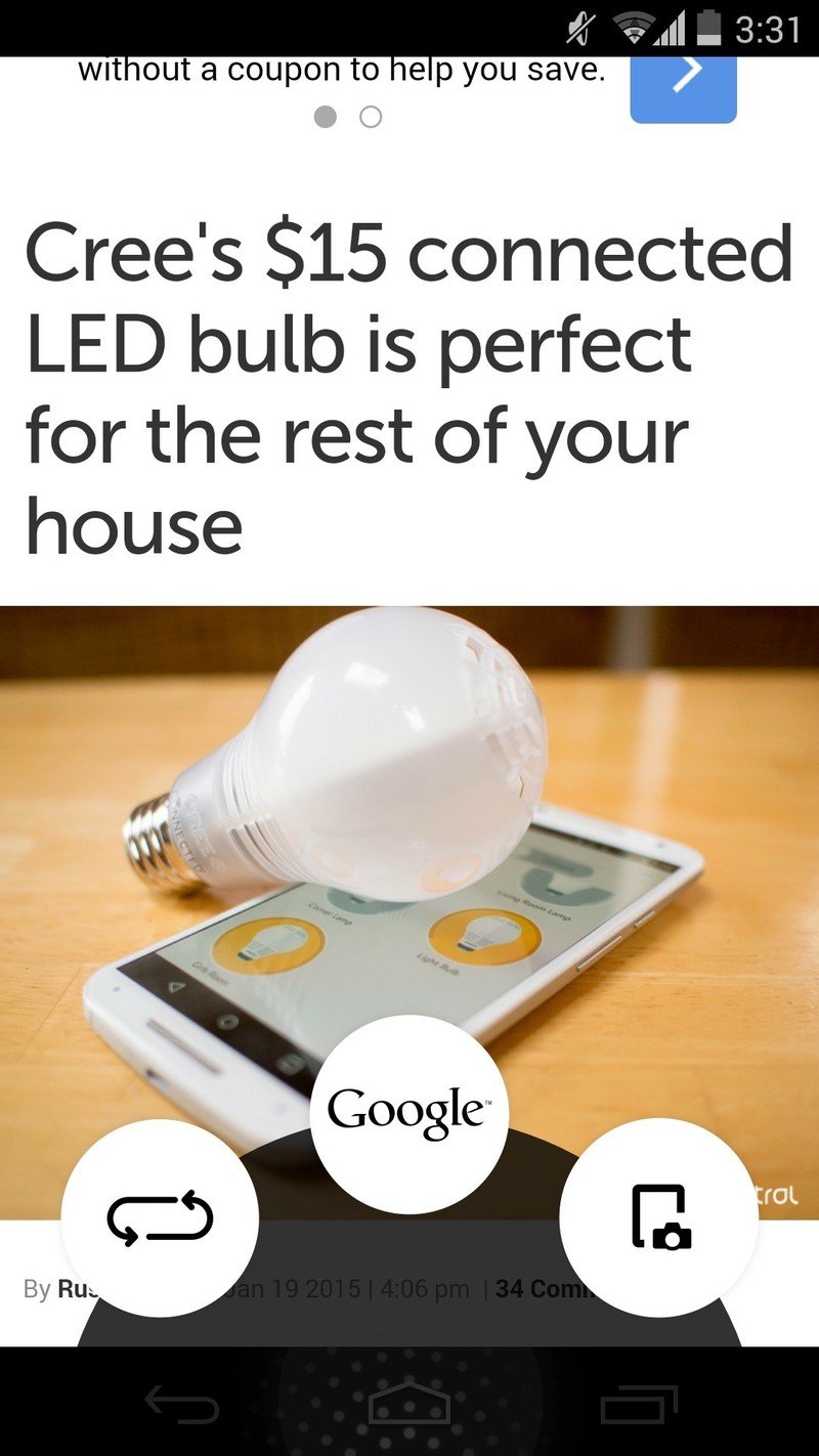
It's great if you're a fan of that Nexus experience, especially since there's plenty of bonus material on the B side of this particular device. The only place you immediately notice non-Google software is when you swipe up to summon Google Now — you'll see three orbs instead of one. The orb to the left activates YotaMirror, which takes whatever you are doing on that AMOLED display and flips it to the rear ePaper display. The orb to the right takes a screenshot and pastes it to the ePaper display. I've long felt that manufacturers should be doing more with this bottom action ring, and the folks at YotaPhone have done a fantastic job with their extra features.
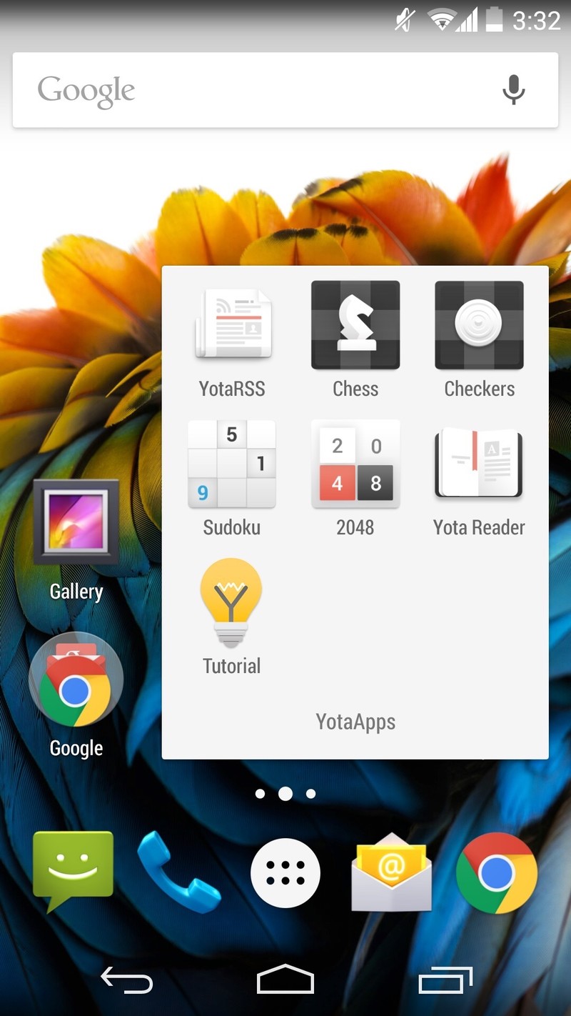
The party side to this smartphone mullet is packed full of unique features, nearly all of which focus on giving the user a glanceable experience that draws next to no power. We've talked a bit about this display and all of its features already, but this experience truly is one of a kind and way more useful than ePaper selfies and reading a book. When I thought about the activities that regularly have me waking my phone to check or tweak, this display started to make way more sense. The only real frustrations with the ePaper display happens when using apps that aren't compatible with the YotaPanel, which is entirely out of anyone's control at this point. No reasonable person would expect every app to work with this panel, and that's why the ability to access the entire OS from the ePaper panel is such a big deal. Unlike a lot of other niche app setups where it's all or nothing, there are options here that make it easy for you to get exactly what you want out of this experience.
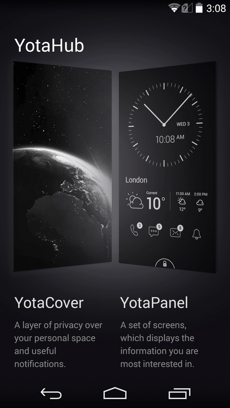
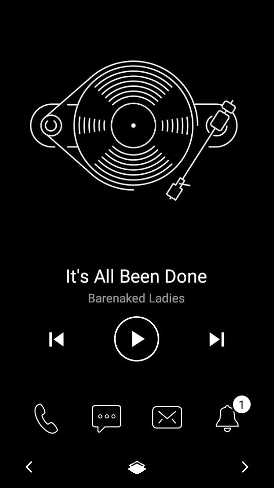
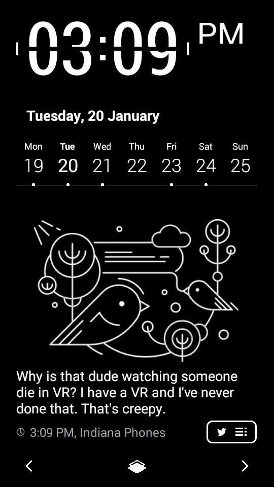
Even with the ability to change tracks and look at Google Navigation on my Moto 360, I found myself preferring the full screen experience on the YotaPhone 2. More information was available to me without needing to wake my phone, and the way this display locked as soon as I flipped the phone over quickly felt more comfortable than the notification panel on my wrist. After a week had gone by I took the watch off entirely, and found that I didn't miss having it like I did with my personal device. If only because I spend a lot of time at my desk or outside, I'd say I use the ePaper display roughly 60% of the time right now, and only flip to the color side when I need to reply to a message or if I'm checking in on a game. It's a significant departure from the way I normally use a smartphone, but I was eased into the changes rather than being forced, which is fantastic.
YotaPhone 2 cameras
Pure Google, for better or worse
There's no nice way to put this, so I'll just come out and say it — the rear camera on this phone is its biggest weakness. It takes decent photos when lighting is great, and the color representation in those photos is reasonably accurate, but in every other situation the camera struggles to take the shot. Low lighting will cause the focus to miss even when you have tapped in the area you want, and the flash only helps if the object you're grabbing a shot of is between two and five feet away. Because this camera is run by the Google Camera software, you run into a lot of the same HDR issues seen with this app on many other phones. The combined photo often looks decent on the phone but on a larger screen you see a lot of clarity and focus issues.



Since it's an 8-megapixel sensor, you won't be recording any 4K video or anything with the rear camera. The 1080p video is decent in good lighting, and that really is the nicest thing I can say about this sensor/software combination. At this point being able to take a decent photo or record a decent video outdoors is the bare minimum to expect from a smartphone camera, and that's exactly what you get with the YotaPhone 2. The front-facing camera does a great job for a 2.1 megapixels, especially with video, but with the rear screen you're unlikely to use it often for photos unless you just love seeing yourself in ePaper.

YotaPhone 2 battery life
Ignore the estimates
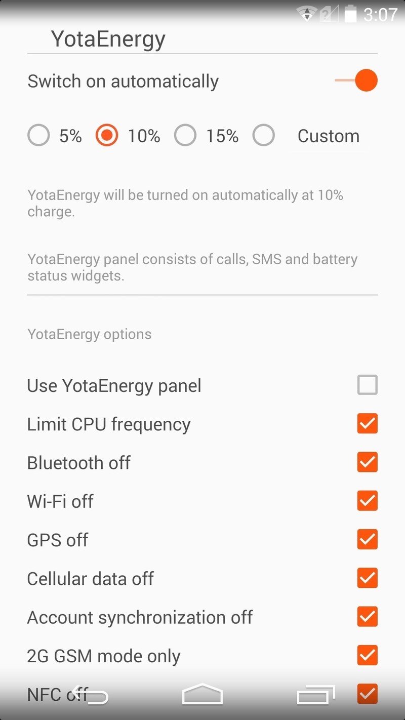
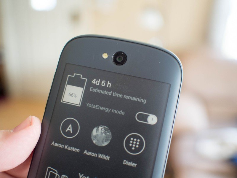
The first thing I noticed when curious about the battery life on this phone was the YotaEnergy meter on the ePaper side, which told me I had two days remaining after having already used 15% of the battery. Right next to this estimate is a switch that sets the phone into YotaEnergy mode, which I assumed was similar to the Ultra Power Save Mode on Samsung's Galaxy S5 or the HTC One M8. Tapping that switch throws the phone into a custom power save mode that you can control yourself, and in its default setting that battery estimation jumped from two days to an incredible five days of battery life.
Unfortunately, neither of these numbers came even close.
I'm still not entirely sure what YotaPhone bases these calculations on, but my usage in normal mode routinely put the phone at 20 percent battery remaining by 10 p.m. Since I'm usually up at 6 a.m. and use my phone constantly, that's not bad at all. By comparison, my 2014 Moto X under very similar usage on Verizon is typically either dead or in power save mode and clinging to life by this point. In YotaEnergy Mode, using the default settings, the phone easily doubled this. The tradeoff, however, is that you're sacrificing cellular data, WiFi, Bluetooth, GPS, account sync, CPU performance, and screen brightness among other things. The phone basically becomes just for making calls and stops being a smartphone under these conditions, but you can go through and uncheck the things you actually need and meet somewhere in the middle on battery savings. It's nice to see how much control you actually get here, even if that time remaining estimate is completely worthless.
Regardless, keep in mind that we were testing an international phone on T-Mobile HSPA+. (This model is compatible with AT&T LTE bands, however.) So our use isn't exactly apples to apples in terms of what we typically use here in the states.
YotaPhone 2
The bottom line…
Like all niche phones, the YotaPhone 2 will not be holding a candle to any of the flagships anytime soon when it comes to the best all around experience. That having been said, this is the first niche phone that is actually worth recommending to people, and that's not nothing. YotaPhone 2 is just plain fun to use, and it's the first phone in a long time that I've used in public and had people stop and ask what on earth I was doing with the back screen. Aside from the less than spectacular camera, the YotaPhone 2 is a well executed complete thought. This phone isn't going to fly off the shelves, especially since it's not clear if or when you'd be able to buy one in the U.S., but if you're looking for something new or you're tired of going everywhere with a smartphone and a Kindle this could easily be worth the £555.00 to own.

