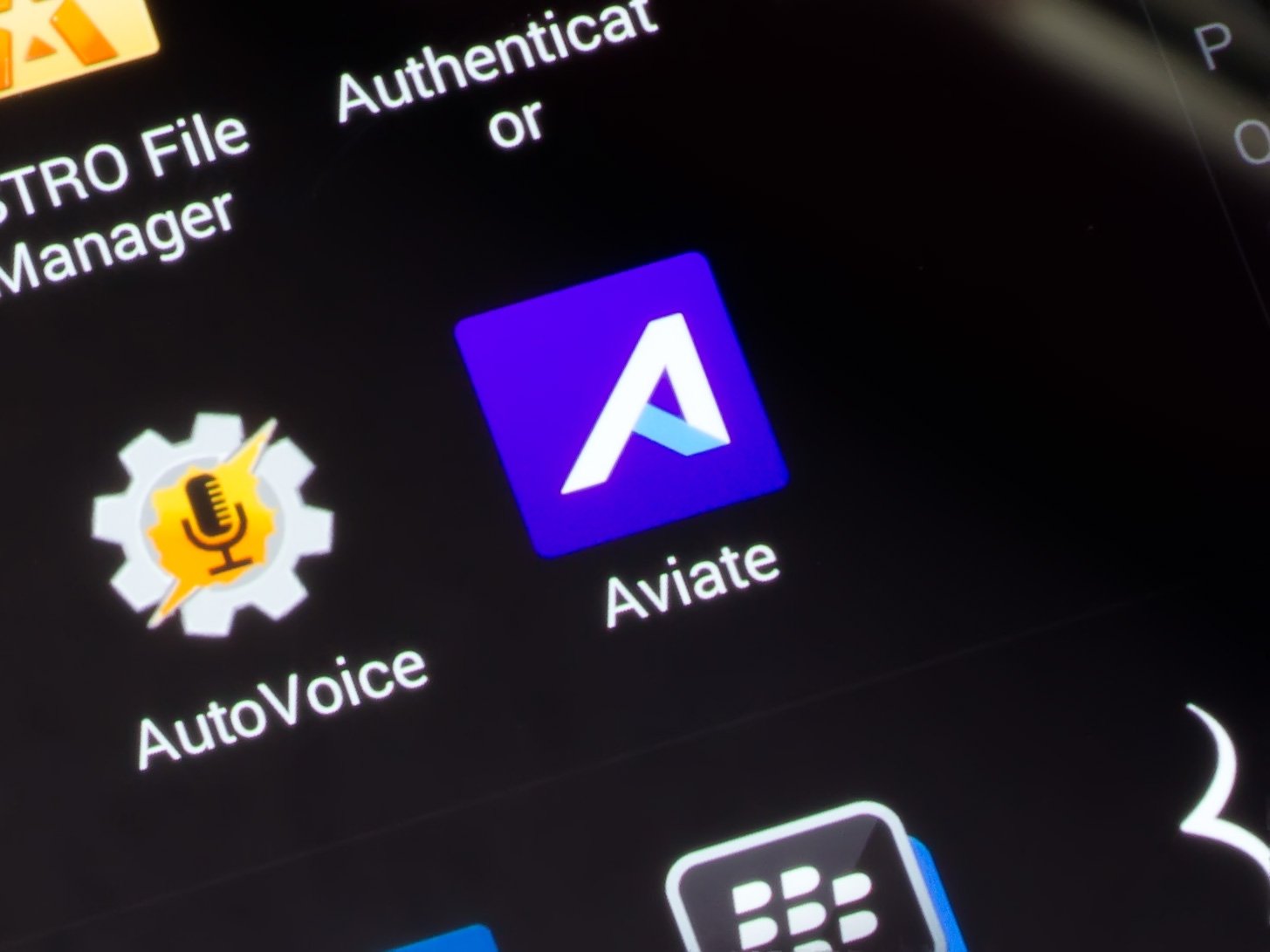
Aviate is a popular launcher acquired by Yahoo earlier in its development, and through a short closed beta, it's become a very mature option for those looking for a polished overall Android experience.
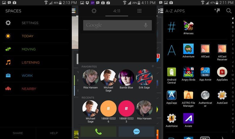
The main gist of it is that Aviate builds collections of your apps based on different types of activities. You can, of course, tweak those collections manually as well, and Aviate can offer suggestions to fill in collections (though this is really just a form of advertising rather than intelligent suggestions). Aviate figures out where you are and what time of day it is, and serves up relevant collections in custom-built interfaces called Spaces so you can better handle those activities. For example, if you plug in your headphones, it offers you quick access to media controls and your favorite music apps. Hit the road, and you'll be offered shortcuts to navigation home and to the office. It's a great idea on paper, but let's see how it pans out.
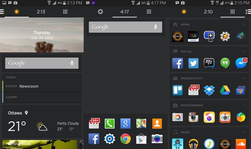
The primary home screen starts off with your top ten apps. They can be swapped in and out as normal. Above them is your widget area, which can host everything you're used to. Swiping up from the bottom tray will show your most frequent contacts and those that you've marked as favorites. The screen to the left are your Spaces. These will automatically swap out throughout your day. Widgets and app collections are dropped in here.
Tap the hamburger menu in the top-left from here and you can manually switch between different spaces. Go one over from the right of the primary home screen, and you'll see all of your collections. The first five will show in a single row, but you can tap the header to see the rest. One more screen to the right and you have your full app list in alphabetical order with a handy search bar on top. You can drag apps over to your collections on the previous screen, or create standard icon-style shortcuts, like Google Maps directions to a set location or favorite contacts.
Aesthetically speaking there's little to complain about. Like Yahoo's other Android apps, Aviate is sharp and stylish. It supports custom icon packs, light and dark themes, and you can drop all of the standard widgets onto the primary home screen and second Spaces screen. Just keep in mind that those are the only two screens you can drop widgets into; if you're a heavy user, Aviate probably won't be able to support you.

My biggest complaint so far is the clock in the top center of the main screen. There's already a clock in the notification tray, so having a second one is redundant and a waste of space. This sensibility has been baked in since Jelly Bean, and there's little reason Aviate shouldn't follow suit. Either leave it blank or put the date in there.
There's a little integration with Yahoo here, but not as much as you'd expect, for better or worse. News Digest offers a filmstrip of 8 daily news items that you can check out in the Home pane by default, though you can take it out or put it on the primary home page like any other widget. You can just as easily lean on Google search and Weather and not have to deal with Yahoo trying to shove their counterparts down your throat, which is the classy way to go about it.
The most useful cases for Aviate automation for me have been Foursquare check-ins. Get settled into a restaurant, and Aviate will suggest you check in. On the down-side, this isn't a one-tap affair; clicking the Check In button launches you into Foursquare where you have to pick out your location and confirm the check-in again anyway. At that point, it's not much more convenient than just launching the Foursquare app yourself in the first place. On the upside, custom Spaces can be created for specific spots, plus you can designate home and work locations for those those Spaces to kick in.

Other use cases, like Music, are more straightforward and are handled very well. Once you have some tunes rolling, it pulls in various artist information, tweets from the artist, upcoming concerts, and launching directly into Spotify tracks. This kicks in for playing music on Google Play Music, but not some other services however, like Songza. There are other smart app partnerships, such as Uber integration in your calendar to order a ride to your next meeting. These tailor-made experiences pop up throughout daily use as pleasant surprises.
It would be nice to have a bit more manual control over when and how changes in Spaces are triggered. Often enough a change won't happen when I want it to, or it will switch to something not especially useful. I'm sure the formula will be refined over time, but it would be great to have the power to manually set your own location, time, speed, and parameters for each space.
Good
- Slick UI
- Strong concept
Bad
- Activity prediction is still hit and miss
- Only two screens for widgets
Bottom Line
The concept behind Aviate is great, and they've made a solid start. For the launcher to be a big success though, it needs continued refinement. It may not be the fully customizable powerhouse like Nova Launcher or Go Launcher, but the amount of polish, consistency, and ease of use in Aviate is hard to beat. By hooking into more popular apps, improving the algorithm for switching between Spaces, and making slight UI adjustments, Aviate could easily become my daily launcher. Even as it stands, I'm likely to keep it around for awhile.


