Yahoo! v1.0 update improves interface, adds news summaries

A newly refined design highlights the company's best products
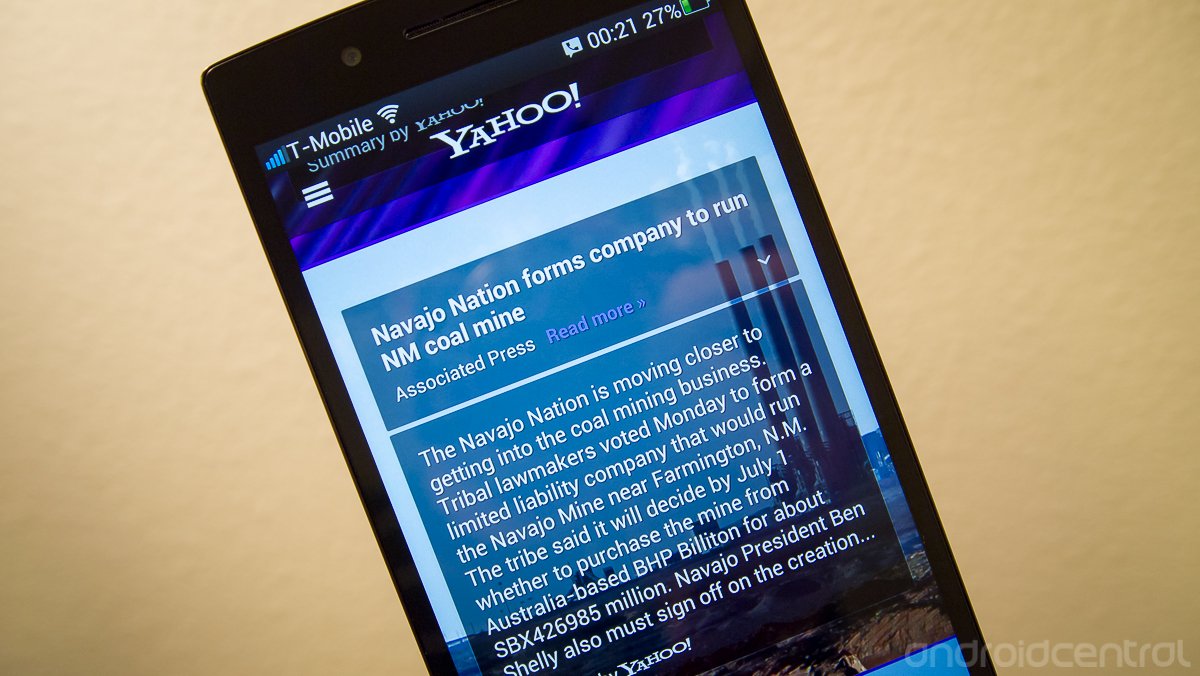
In an attempt to make some leaps forward in terms of design and user experience, Yahoo! has revamped its Android app today with a new interface and set of features. Version 1.0 of the app changes the look of things, with an endlessly scrolling set of news stories as the main page, which nicely displays the article title and a summary with an opaque background over a headline image. Those summaries condense the article's main premise into a short paragraph, which is very similar to the technology that Yahoo! acquired just recently when buying a company called "Summly".
Other highlights of the app include a revamped search interface that includes images and video in-line, which can be found behind a nice slide-in panel on the left side of the app. Here you can also find settings for customizing your news topics and sources, as well as quick tabs to launch other popular Yahoo! apps on your device such as Mail, Finance and Messenger. The entire design is a big step forward for Yahoo!, and certainly makes a better case for staying installed on your device.
Be an expert in 5 minutes
Get the latest news from Android Central, your trusted companion in the world of Android
Andrew was an Executive Editor, U.S. at Android Central between 2012 and 2020.

