Xperia X10 review
The Xperia X10 is a continuation of every smartphone aficionado's love-hate affair with Sony Ericsson. It's a combo of exceptional hardware and build quality, with poorly implemented software that is taking far too long to get updated. By the latest standards, it's no powerhouse, but the specs are still good and were top of the line when we first saw it at CES in January 2010. But the software. Oh the software -- especially the fact that it's still running Android 1.6 is so hard to swallow. Hit the break, and have a look at the impressions, both good and bad, that AT&T's version of the X10 left on me.
The first thing you notice when you pick up the X10 is the build quality. It's truly a beautiful phone, very well made and has a touch of class that you don't get from most black slabs on the market today. You can tell the designers put a lot of thought into it, and it's very enjoyable to use as a phone. The call quality was adequate -- nothing good or bad stood out, but it feels very nice and comfortable in the hand, more than other phones like the Evo or the Droid X. The 4-inch screen seems to be the perfect mix of usability, both as a media and messaging device and as a phone. Of course your mileage may vary, but to me, it's a perfect blend. It's also very difficult to put a finger on exactly why. The materials are nothing special, plastic all around (including the trim and buttons) with a unique coating on the larger parts to give a tiny amount of texture. Again, credit to the design team goes here as well.
There is one thing about the hardware that drove me nuts. There seems to be a coating on the glass that makes it very smooth under your finger for gesturing and swiping, which also smears horribly during use and give off a very annoying glare -- to the point where you have trouble in bright light. Keep a cloth handy with this one.
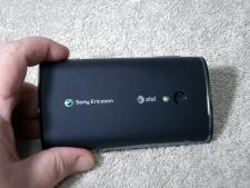
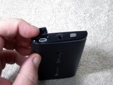
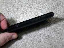
For a look at the exterior hardware a little more, check out the initial hands on with the X10 we posted a while back. There's not much more to say about the build. The specs, as mentioned aren't dismal:
- 1 GHz Snapdragon CPU
- 1 GB ROM
512384 MB RAM- 4-inch capacitive touchscreen
- 8.1 MP camera with LED flash
- the usual array of WiFi (b/g), GPS and Bluetooth
- 1500 mAh battery
Battery life was fair. In the phone's defense, it was roaming most of the time because of my area. The 1500 mAh battery still lasted through a day's use under average conditions. The camera was spectacular. Even hampered by less than optimal software on Android 1.6, taking pictures and video was easy and they turn out well, even in the hands of a relatively unskilled photographer like myself. The video is clear and crisp, and even during a windy day in the mountains there was no "whistle" from the wind during filming. Here's a sample of raw video capture, at 640x480 resolution and in .mp4 format (default high quality settings), followed by some still shots taken in an abandoned apple orchard.
Youtube link for mobile viewing


The Software
This is where things start to go downhill. When you take fast hardware and match it with a fast OS, things are nice and zippy. That's what we are all used to with 1 GHz processors. When you match it with older and slower versions of the software, it's barely passable. And when you toss in an incredibly complex and graphic rich user interface, it's a trainwreck. I'm talking about TimeScape, of course. What could be the shining spot of the X10 is it's Achilles' Heel.
Be an expert in 5 minutes
Get the latest news from Android Central, your trusted companion in the world of Android
Youtube link for mobile viewing
I can't help but wonder how well TimeScape could run if it were on Froyo and a bit more optimized. I do know it's almost unbearable on Android 1.6. Everything works, and the OS is surprisingly bug-free, it's just too much at once for the phone to handle, I think. Having said that, I couldn't fault anyone willing to give up some speed and fluidity for the eye candy -- it does look beautiful. And as shown above, the phone itself isn't too terrible using a third party launcher, so go ahead and try one if you've picked one of these up. The X10 isn't too saddled with bloatware, but does have AT&T Family Locator, AT&T Maps, Where, AT&T Navigator and AT&T Radio pre-installed. No Yahoo or Bing, and those apps are likely useful for many. Here's a slew of eye-candy stills, and the ubiquitous benchmark results.
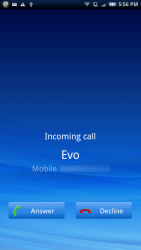
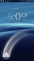


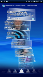
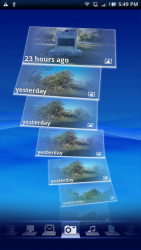
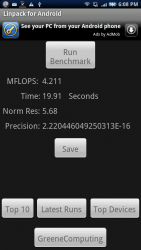
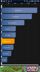
It's all very glassy and modern looking. It's really a shame it runs so laggy, as it's both beautiful and elegant -- much like the X10 itself. And the benchmarks show that there's potential there, this is Android 1.6 remember.
In the end, would I recommend anyone buy the X10? That would be a yes. If you value style over function (and many of us do, there's no denying) this is the phone for you. Sony Ericsson has promised an update to Eclair, and I even held off on this review for two weeks on a tip that it may be available soon that turned out not to apply to AT&T branded phones. An OS update and the more optimized TimeScape that's sure to be in the works to go with would do wonders for this phone. Also, those of you on AT&T looking for sleek and sexy hardware and have plans to follow the dark path and root the darn thing have one hell of a canvas to work with here. But if you're like most, and want an Android phone that offers a great Android experience out of the box, I would recommend you look long and hard at all the models AT&T is currently offering and weigh your decision carefully.

Jerry is an amateur woodworker and struggling shade tree mechanic. There's nothing he can't take apart, but many things he can't reassemble. You'll find him writing and speaking his loud opinion on Android Central and occasionally on Threads.
