Why Action Launcher is the only launcher I use ...
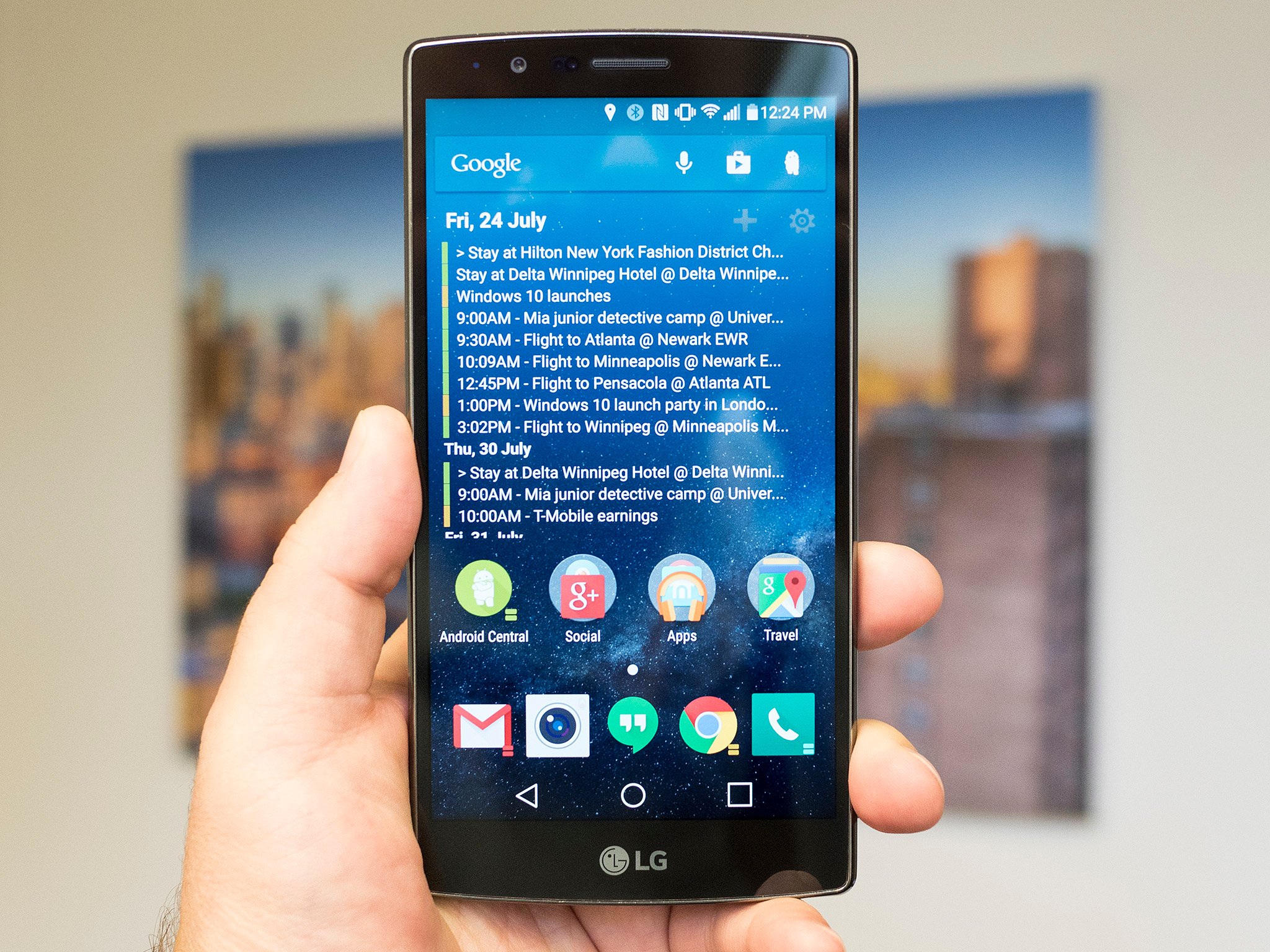
I don't recall exactly when I got fed up with every launcher that wasn't Action Launcher. But I do remember why. I'm not all that adventurous when it comes to my home screens. I know what apps I want out front, and I know where I want them. And what I don't want is for the spacing to be all jacked up between the only widget I use and any apps or folders. And maybe between the Google Search Bar, which might or might not have its own spacing issues of its own, depending on whether it's permanently embedded in the home screen, or overlaid as a widget.
And to be fair, this was some time ago. Nexus phones handled things just fine. And I'm pretty sure Motorola did (and still does), too. But way back when I took the plunge on Action Launcher, which did away with the typical app drawer full of icons and moved things to a side-sliding list. Those of you who came from the early days of Windows Phone will note that this sounds familiar. And I wasn't exactly a stranger to that sort of thing either, having been a longtime user of the precursor to Windows Phone, the Microsoft Zune HD. Long live the list.
But really, I was here for the adjustable spacing.
Fast forward to mid-2015. Action Launcher 3.5 is fresh on my phones (for whatever reason I still don't use a different launcher on my tablets). And it's still the only launcher I'll use.
First, a disclaimer: Against my protests, Action Launcher's developer bought me a salad in San Francisco earlier this year. I believe it had chicken on it. I, however, have purchased more than one version of Action Launcher on more than one occasion with my own allowance. So I think we're even. And that includes the chicken.
Also, a confession. I don't even use some of the best, most unique parts of Action Launcher. There's a wealth of settings inside this thing. Let's break it down.
The Quickdrawer
Be an expert in 5 minutes
Get the latest news from Android Central, your trusted companion in the world of Android
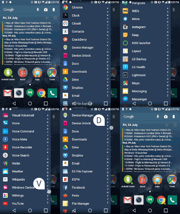
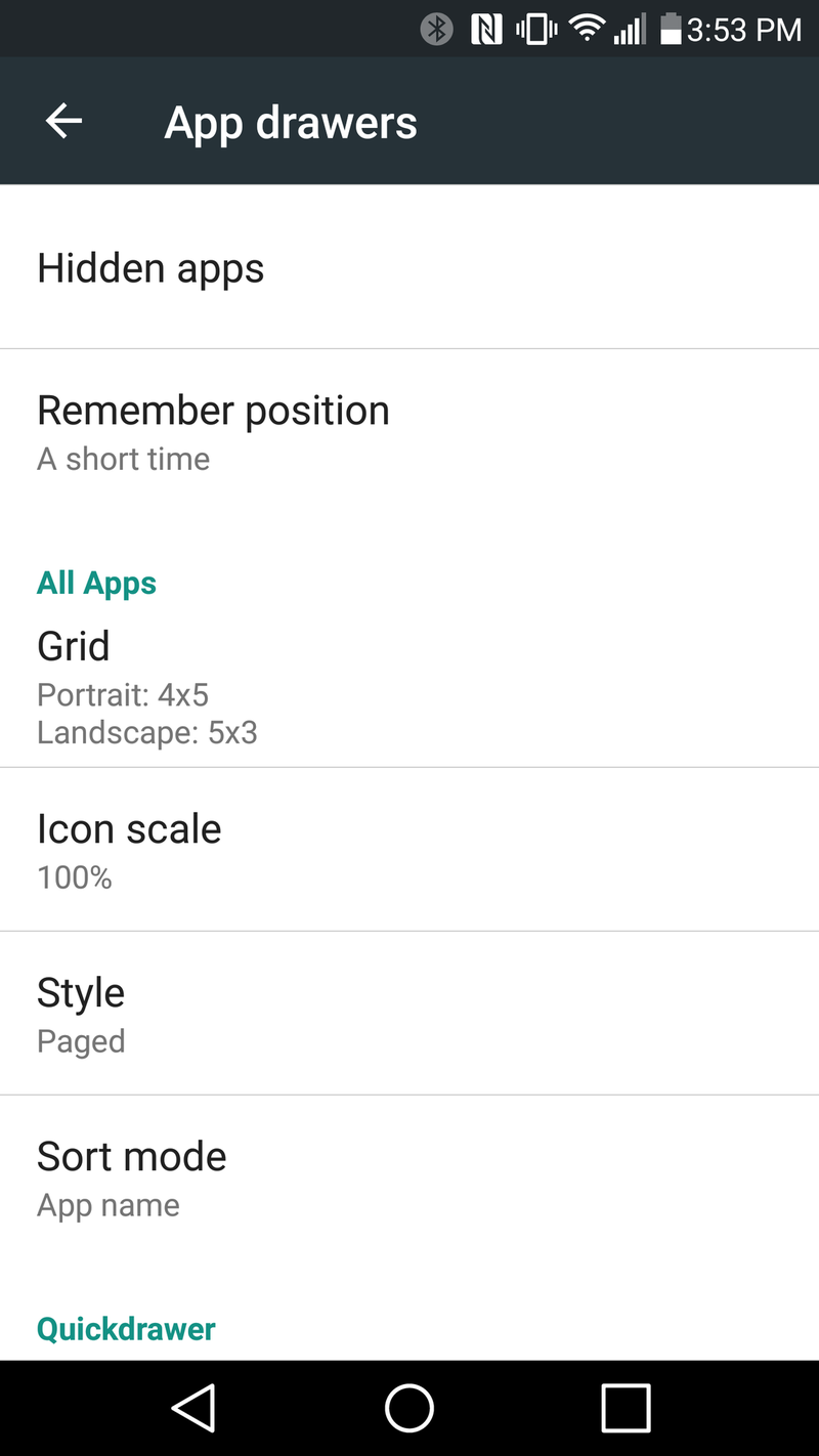
This is the aforementioned replacement for the standard app drawer. Actually there is still the standard option for an app drawer in AL3.5. You won't want it.
This scrollable list is 100 times faster to flip through than a grid of icons. And you can do it with just one thumb, without having to move the phone around in your hand to make things more comfortable. And run down the right-hand side of the Quickdrawer to quickly move from letter to letter, so you can go from 1Password to YouTube in no time. You still can drag apps out onto the home screen just like you would a normal app drawer, or up to the top to uninstall (that might currently be a beta thing, iirc), or to get to the application info.
You've got sorting options here as well — name, most used or installation date. But for me the more powerful option is to hide apps that you never use. And that's a godsend if you're using pretty much any phone that's not a Nexus. I don't worry about apps I can't uninstall — I just hide them.
The Quickbar

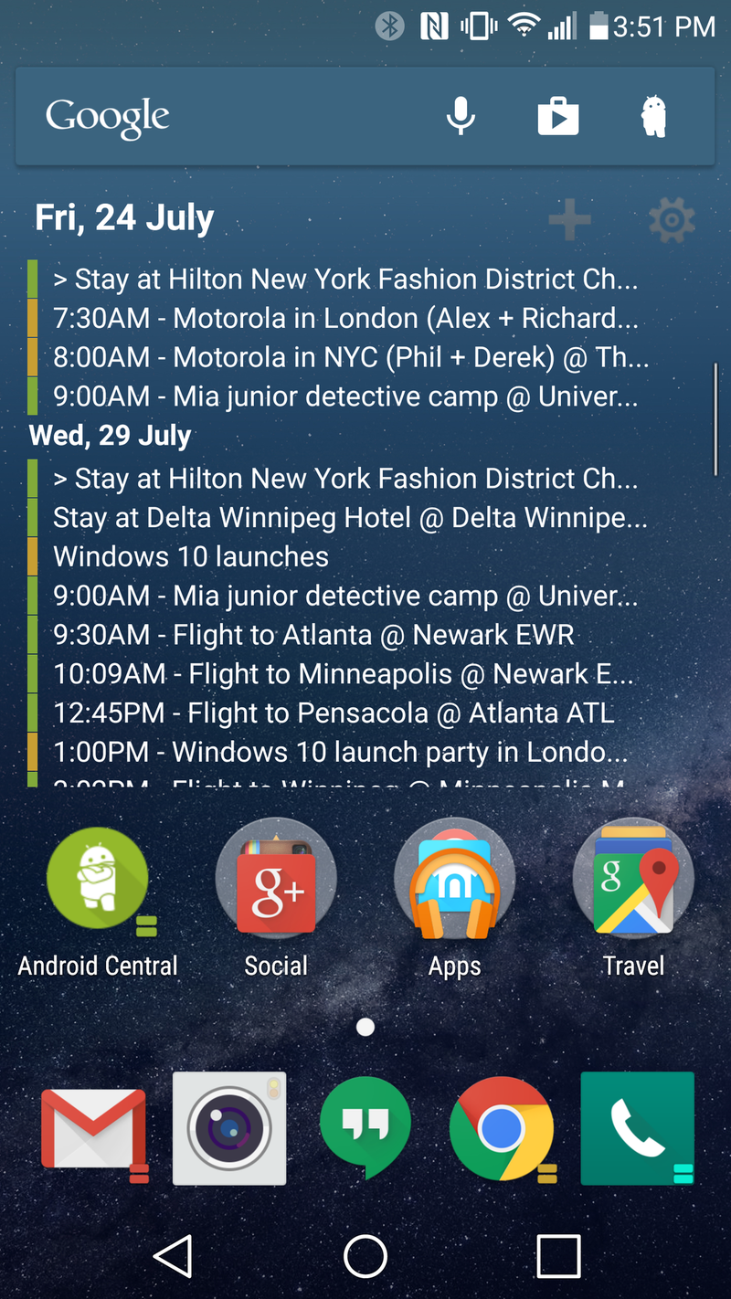
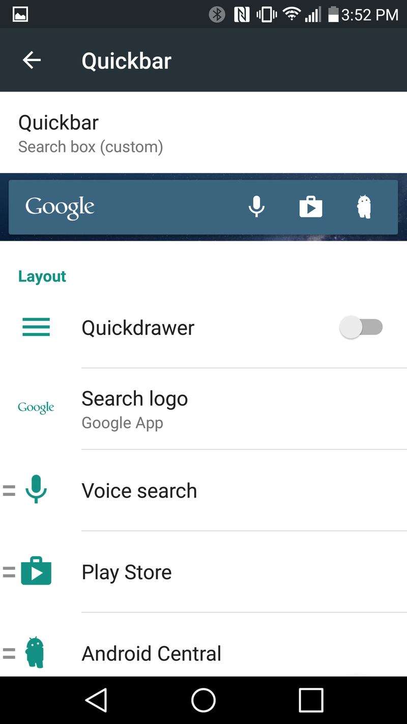
This is one of the new options in AL3.5, and it's a good one. You can now stick app shortcuts inside the Google Search Bar. I stick to just a few — Google Play Store, the voice search microphone and the Android Central app, because having Lloyd in there is awesome. I've seen folks fill it to the gills with app icons, but I prefer to have just a couple. Regardless, it's a great way to save yourself a little more room.
Covers
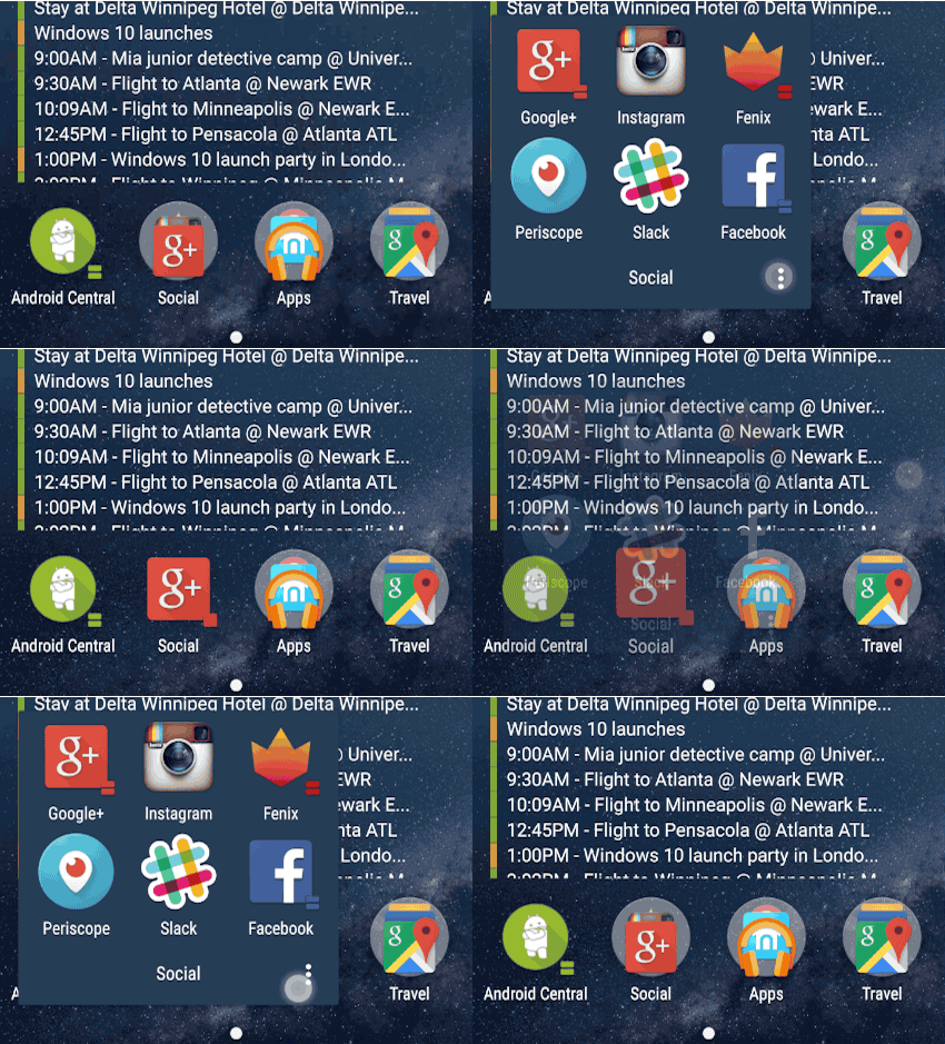
This is an old standard for Action Launcher. Folders are great, but they're just containers for apps. I keep a folder for all my social networking stuff. But if I had one app I used way more than the others — say, Google+, I'd be better off turning that folder into a cover, with Google+ as the lead app. (Whatever is on "top" — or at the top left of the folder — will serve that purpose. Once a folder is converted into a cover, you tap it to simple launch that lead app, but swipe it to actually open the folder to get to those other apps.
It's a really cool shortcut. It's not one I actually use — if an app is in a folder it's because I tend to use it pretty frequently — but it's still a really cool option.
Shutters
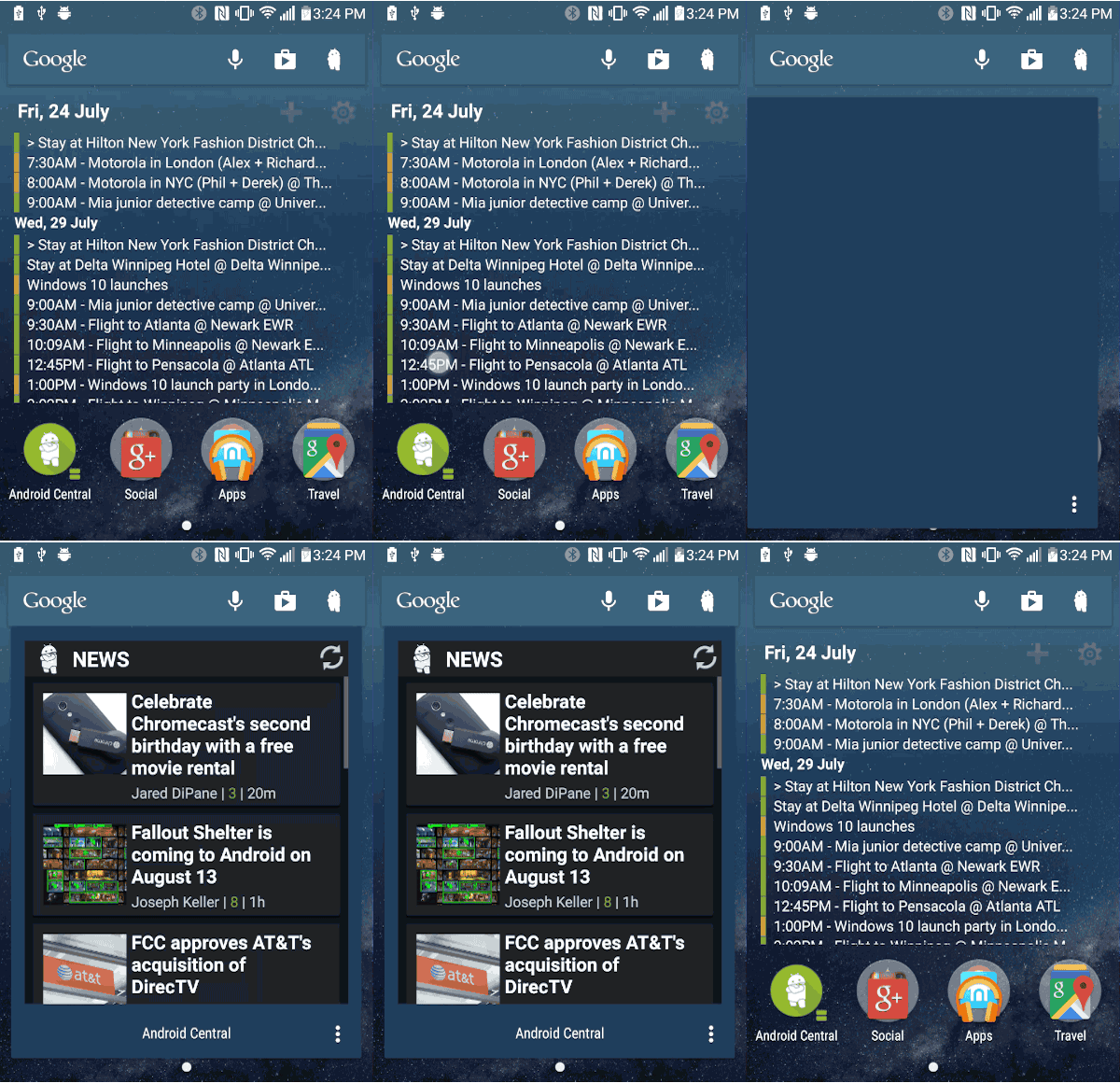
This one might even be better. I love widgets for their functionality. But because there's no standard style for widgets, having more than one on a screen can ruin the overall look and feel of things pretty quickly. (That's a big reason why I only have one widget on my home screen — and a transparent one at that.)
Shutters take an app that has a corresponding widget — say the Android Central App — and sticks a couple lines on the bottom right of the icon. You tap to open the app per normal. But swipe up and the widget will launch, on top of the home screen. Then just dismiss it when it's done. It's a great way to get the temporary functionality of a widget without the permanent disfigurement of having a bunch on a screen all the time.
That one will change your life.
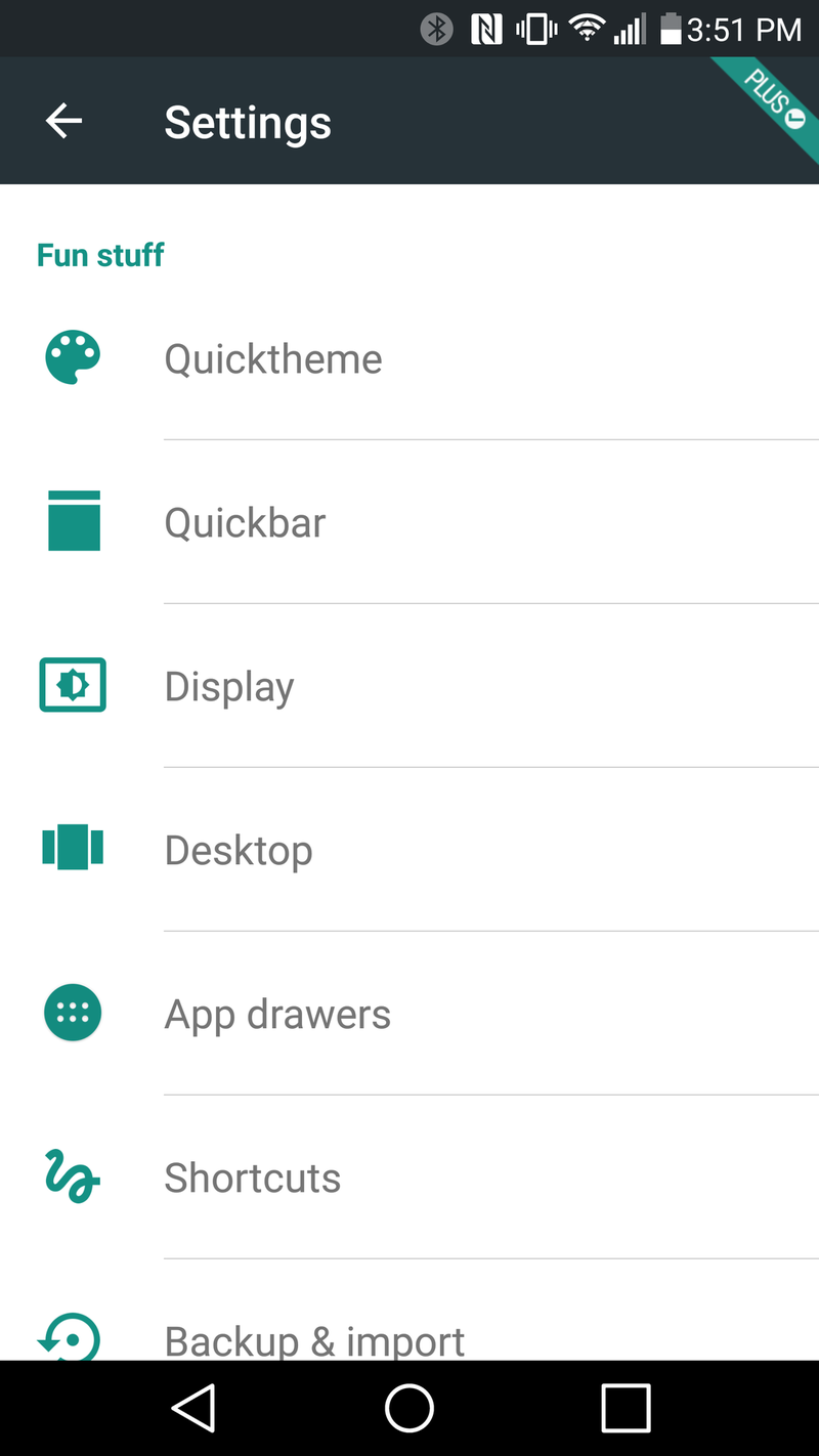
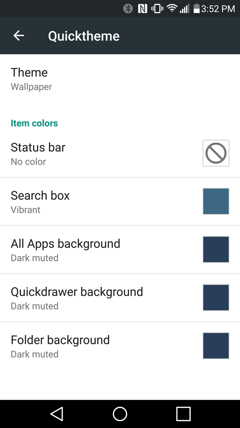
Quicktheme
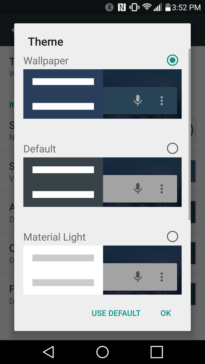
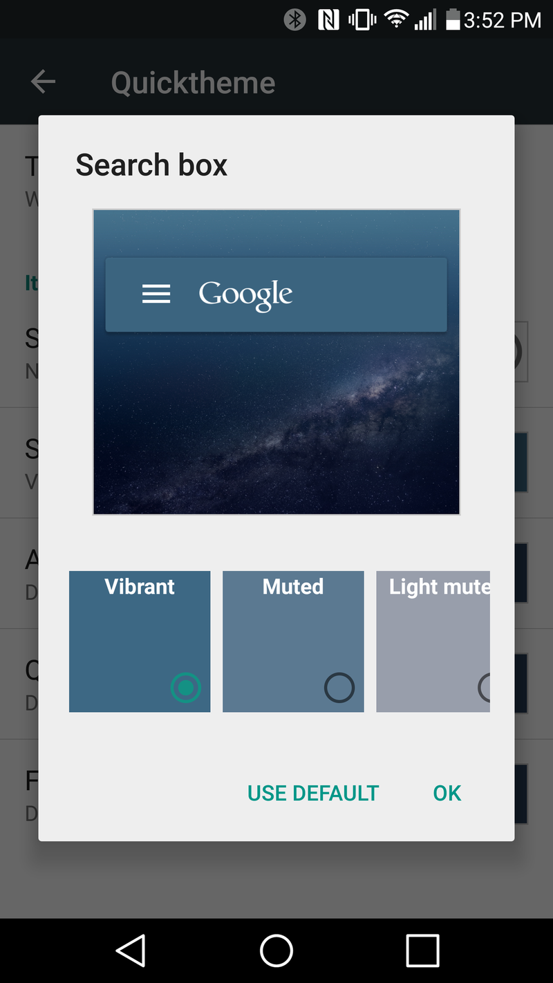
As the name implies, Quicktheme is a quick and easy way to theme your home screens. You've got a number of options here, but I generally just let it theme things based on whatever wallpaper I'm using. And that gets to be pretty fun if you use a wallpaper app like Muzei. As the wallpaper changes, so does the theme of the UI. Pretty cool.
And that's not all
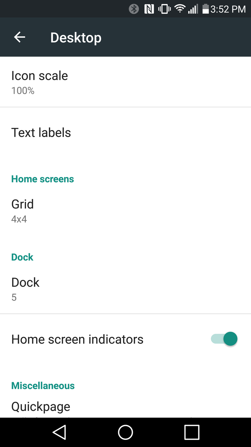
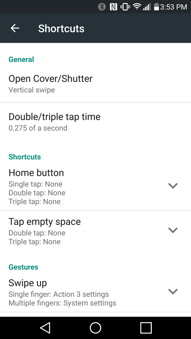
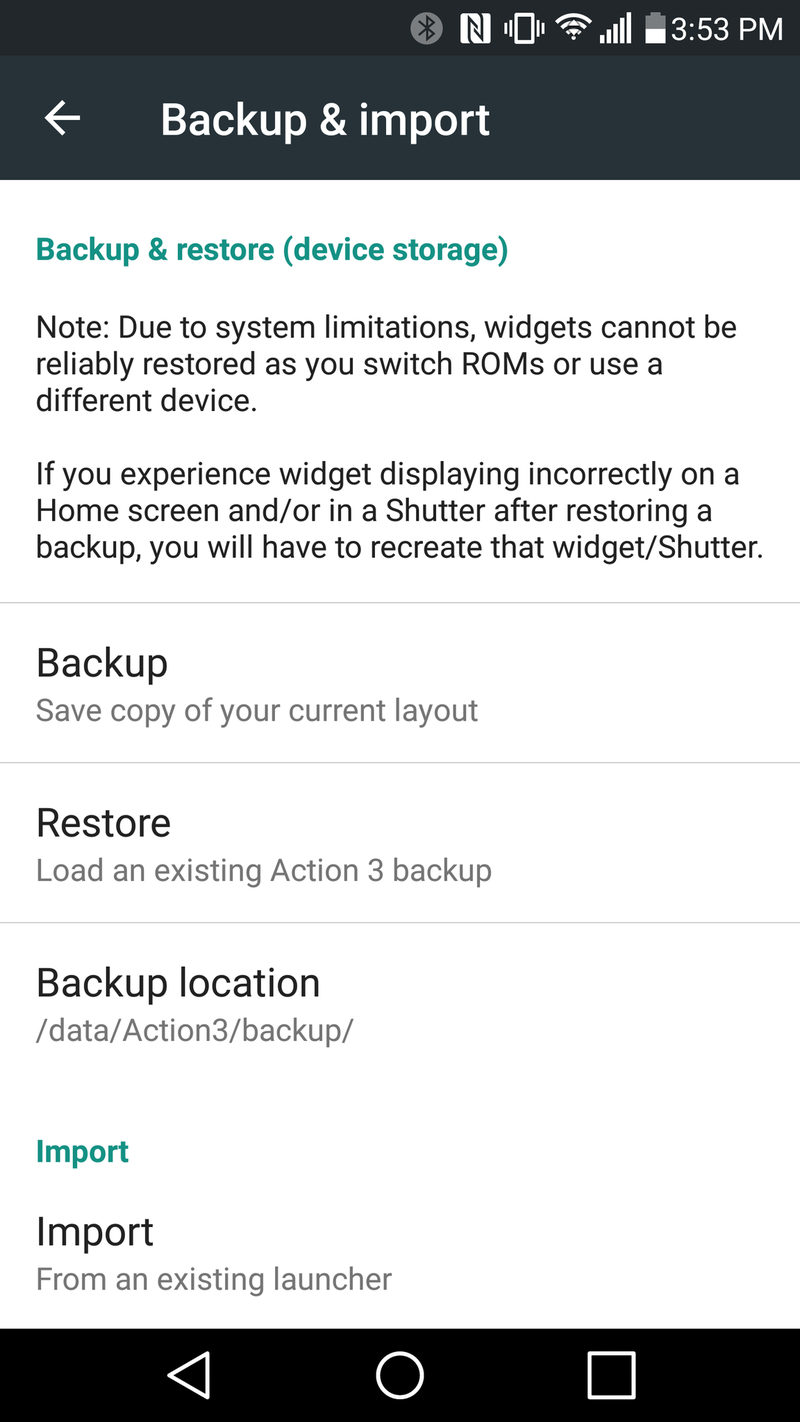
Covers, Shutters, Quickdrawer and Quickbar make up the meat of Action Launcher. (I don't even have to adjust the spacing of the grid manually anymore, which is great.) There are still more customizations available for the swipes and gestures you'll use with AL. You also can back up your layout, and import layouts from other launchers to make setup even easier. (I generally just start from scratch, but then again I'm way too used to setting up new phones.) There's also the Quickpage, which gives you a little 4x4 app drawer accessible at all times, from the right of the screen. Have apps you use a lot? Stick 'em in there.
Plus, a lot of work has gone into Action Launcher to make this full featured home screen replacement easy to use. This is pretty nerdy stuff, but it's also not something that feels like a chore to use.
Action Launcher pricing
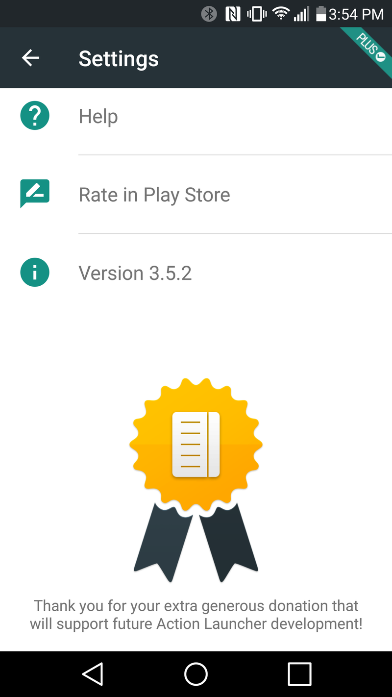
There was a bit of a to-do about Action Launcher 3 moving to a freemium model, given that we'd already paid once for an earlier version. You can download it without paying a cent, but features like the Quickbar and Quicktheme and Shutters and Quickpage are behind a $4.99 in-app purchase. To me this was a new app, so I gladly paid for the upgrade. (In fact, I went so far as to do the $9.99 "Plus & Donate" option because this is an app I use more than any other, on every single phone I own. And because I think developers should be paid for their work.
And also because of the chicken.
