What's the best power and volume button placement on a phone?
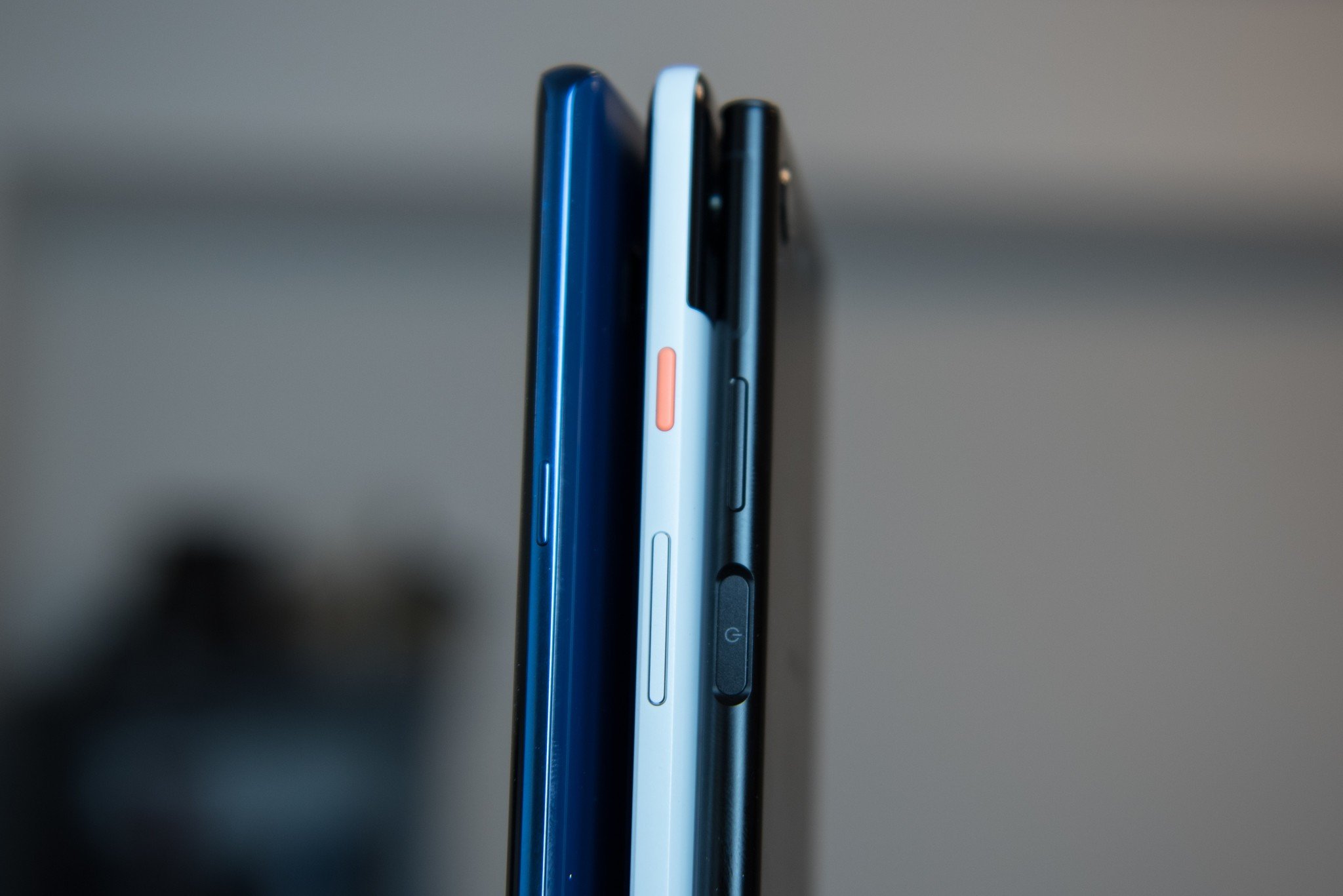
Has this ever happened to you: you upgrade phones only to spend the next few days pitifully jabbing your finger at a spot the old power button used to be? The proposition sounds like the beginning of a terrible late-night infomercial, but it's something I've been thinking about over the past few days: where do I prefer my phone's power and volume buttons?
The last four phones I've tested, the Samsung Galaxy Note 8, LG V30, Sony Xperia XZ1, and Google Pixel 2 XL, all have different placements for their power and volume buttons, and I can't decide which one I prefer the most (or least, I guess).
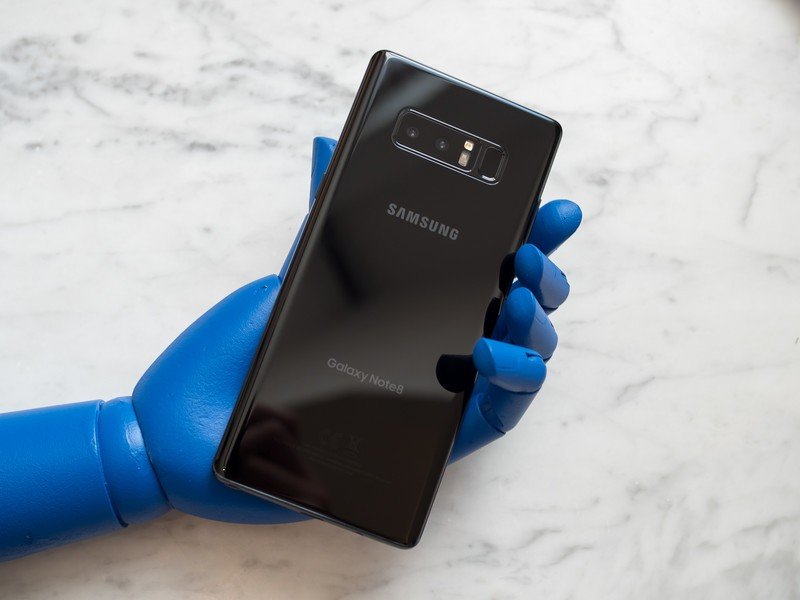
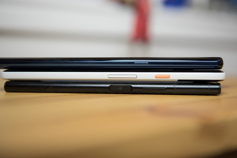
The Galaxy Note 8 separates the power and volume buttons, putting the former on the right and the latter on the left. To me, this is the obvious solution, as the delineation is unambiguous — regardless of orientation, or whether the phone is in my pocket, I can change the volume without looking at the phone.
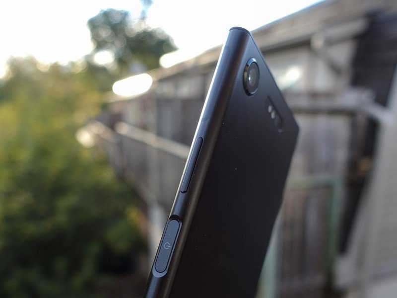
The Xperia XZ1 puts the volume rocker above the power key, which is centered on the right side of the phone. This is my second favorite placement, as I tend to hold the phone near the bottom, so it's easy to turn on and off the phone (and in Sony's case, hit the fingerprint sensor at the same time) without drastically shifting my hand.
It also helps when the handset itself isn't gigantic.

The LG V30 puts the power button on the back, embedded in the fingerprint sensor. This makes sense when combined with the company's on-screen gestures — when flat on a table, you can just double tap anywhere on the screen to turn it on, and double-tap the notification area to turn it off at any time.
The volume buttons lie on the left side of the chassis, which can be a bit disorienting, but it's not really a big deal.
Be an expert in 5 minutes
Get the latest news from Android Central, your trusted companion in the world of Android
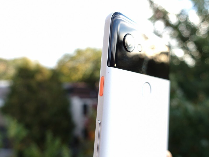
The Pixel 2 XL's combination — power button on top of the volume on the right side — is my least favorite of all of them. (Actually, that's not true — power button on the left side of the phone, as per the Alcatel Idol 3 and 4 series, is an abomination and should not even be considered here.)
As phones get bigger, it makes sense to keep the power key as close to where the thumb naturally rests while holding the device, but the Pixel 2 XL forces you to shift upwards to hit it. I don't care how good that orange button looks (and my goodness does it look great!), it's still a poor choice, in my opinion.
I'm probably leaving out a couple combinations that have appeared in the Android world over the years, and I'm also not taking into account devices like the Moto Z2 Force where the front-facing fingerprint sensor doubles as a power button.
What's your take on all this? Let me know in the comments and see if we can come to some sort of consensus (hah!).
Daniel Bader was a former Android Central Editor-in-Chief and Executive Editor for iMore and Windows Central.

