This is what the Google Pixel 2 could have looked like

If you're a fan of the design for any of Google's latest products that were announced last October, the woman you'd want to thank is Ivy Ross. Ross is in charge of Google's design team for its hardware division, and Google's official blog 'The Keyword' recently interviewed her as part of its The She Word series.
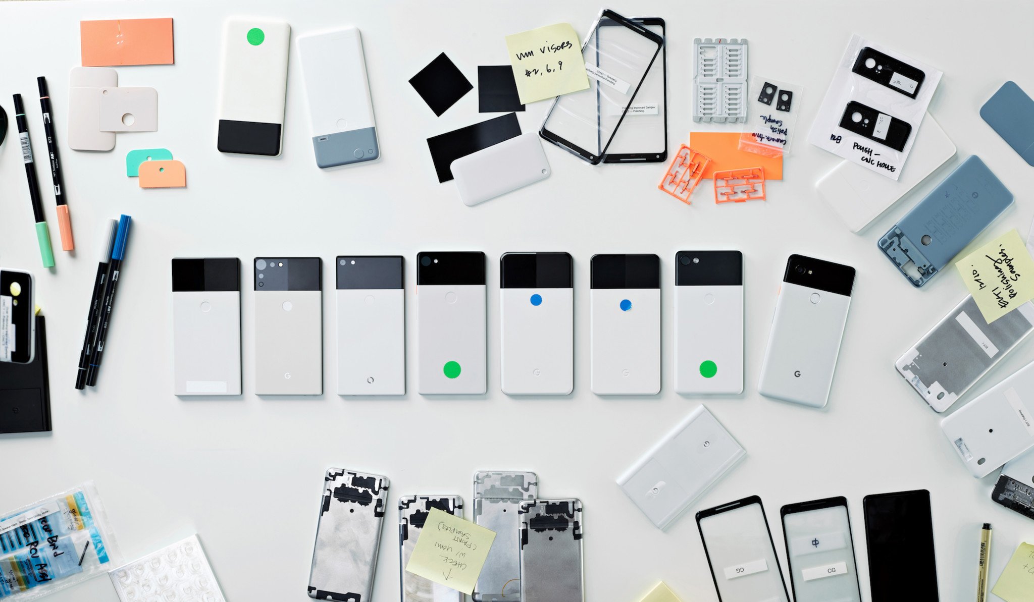
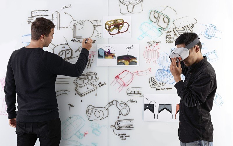
I highly recommend checking out the entire interview as it's an excellent read, but one of the most interesting tidbits to come out of it are early design concepts for the Pixel 2, Pixelbook, and Daydream View headset.
As you can see above, Ross and her team tested a ton of different designs for the Pixel 2 before settling on the final version. All of the concepts have a two-tone design with the glass and metal back, but some of them had bodies that were wider, blockier, and had different-sized camera sensors.

We also have a look at a couple different designs for the Pixelbook, both of which feature glass that took up about half of the front as opposed to the smaller glass window Google ended up choosing. It also looks like Ross toyed with the idea of having the window in a black paint job, meaning we could have gotten a panda Pixelbook alongside the Panda Pixel 2 XL.
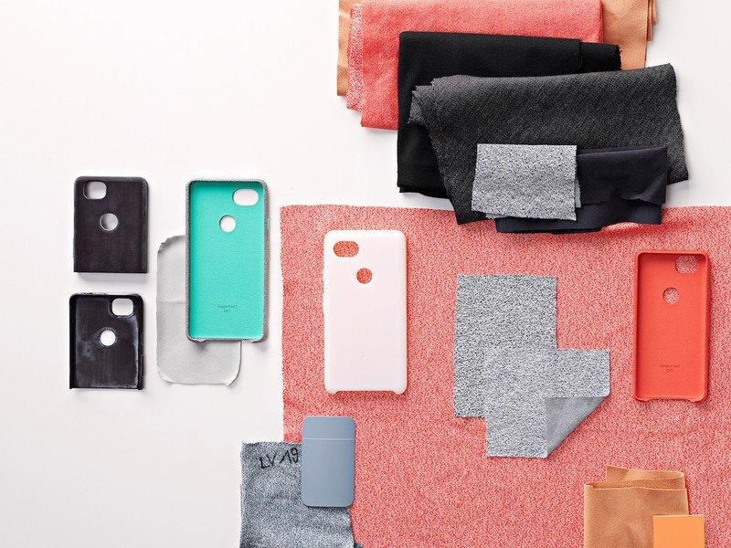
In the photos below, you can also see early designs for the Daydream View (one of which had holes on the front...yuck), color swatches that were tested for the Home Mini, and different fabrics that were considered for the Pixel 2's fabric cases.


I'm more than happy with the final products Ross and Google chose, but it's still interesting to get a look at what could have been. What are your thoughts on these early design concepts?
Be an expert in 5 minutes
Get the latest news from Android Central, your trusted companion in the world of Android
Joe Maring was a Senior Editor for Android Central between 2017 and 2021. You can reach him on Twitter at @JoeMaring1.

