This is what Fuchsia OS looks like on the Pixelbook
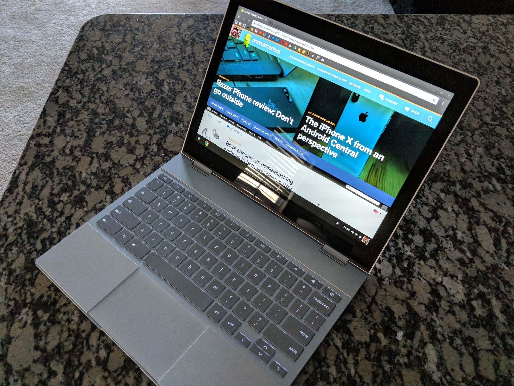
At the very beginning of the year, it was discovered that Google had added the Pixelbook as an official test device for its mysterious Fuchsia OS. Just about a couple weeks later, the team at Ars Technica managed to get Fuchsia running on the machine with some (expectedly) mixed results.
Unlike an early version of Fuchsia that came out in May of 2017, this is running directly on the Pixelbook rather than just showing a UI on top of Android. You can read Ars Technica's article to learn about all the nitty-gritty details, but what I find most interesting is how the UI works.
Starting first with the lock screen, you'll see the time in the middle with a plus icon near the bottom right. Tapping this brings up shortcuts for Wi-Fi, Login, and Guest, but for the time being, all of these are quite broken.
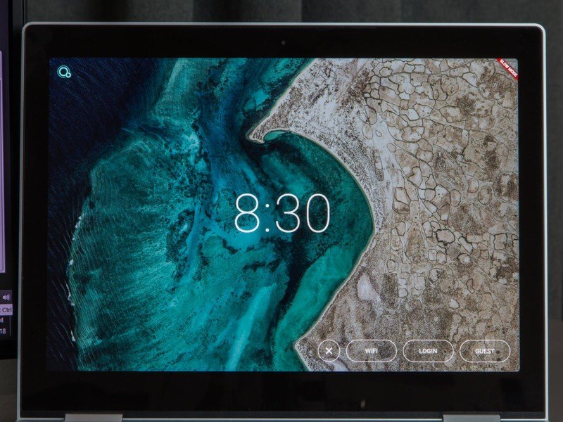
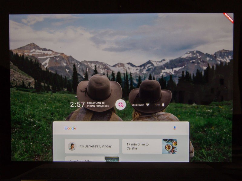
Fuchsia's lock screen (left) and home screen (right)
Once you move past this and get to the home screen, the time/date, Wi-Fi indicator, and battery information is present in the middle of the screen. Below this is a Google Search bar and notification cards to show contacts' birthdays, how long it takes to get to a restaurant, etc. When you tap on the Fuchsia logo at the top, you'll get volume and brightness sliders, airplane mode toggle, do not disturb mode, and auto-rotate lock.
Any apps or web pages that are open appear at the very top, and you can move these around and open them up in split-screen mode as you like.
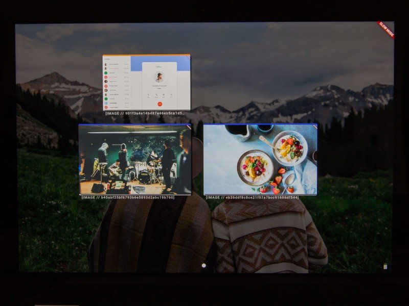
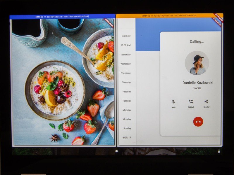
Recent apps and split-screen mode in Fuchsia
Be an expert in 5 minutes
Get the latest news from Android Central, your trusted companion in the world of Android
Fuchsia OS is still in very early stages, and there's a good chance a lot of what we're seeing here could change by the time it's ready for the limelight. Even so, it is interesting to get a glimpse of what Google's working on.
Joe Maring was a Senior Editor for Android Central between 2017 and 2021. You can reach him on Twitter at @JoeMaring1.

