webOS Review -- Smartphone Round Robin
If you think about webOS and Android, the Pre and the Droid, and Palm and Google--there aren't too many apparent similarities. Think about it: round vs square, small vs big--it's as if they exist in two separate worlds. But you dig deeper and realize there are some similar underlying aspects. The Pre and the Droid have been easily the two most recognizable phones released this year (non-iPhone, of course) and webOS and Android are the two newest platforms that are actually changing the way we use our phones by bringing in better concepts.
Though they're both trending differently (financially, at least), there's a common will to see them both succeed. Sure it might be for different reasons--Palm, for the underdog, soft-spot-in-our-hearts aspect and Google, for the changing-the-world-we-live-in aspect, but the faith in the common smartphone user exists (okay maybe, we're reaching there).
Nonetheless, there's much to learn about the webOS platform but we'll give this away first: the Palm Pre and Palm Pixi were both splendid devices to use and webOS is such amazing execution of an amazing concept that I was thoroughly impressed with Palm's new direction and wouldn't even mind owning a Pre myself.
Now let's take a closer look at webOS from an Android perspective after the jump!
Hardware
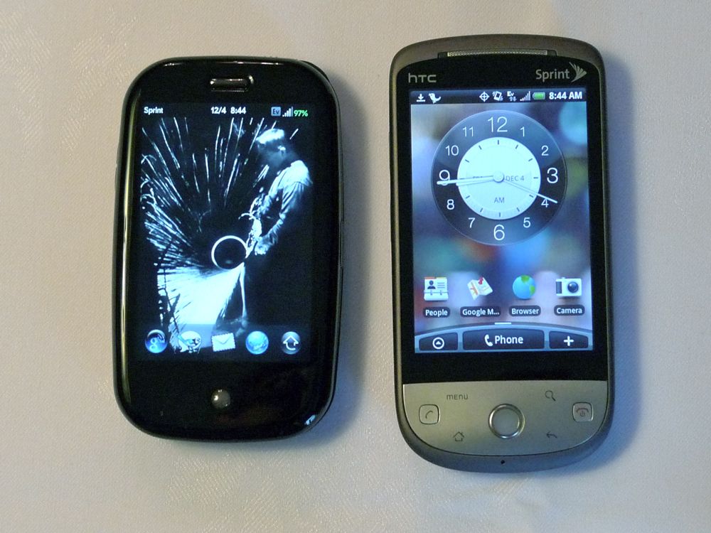
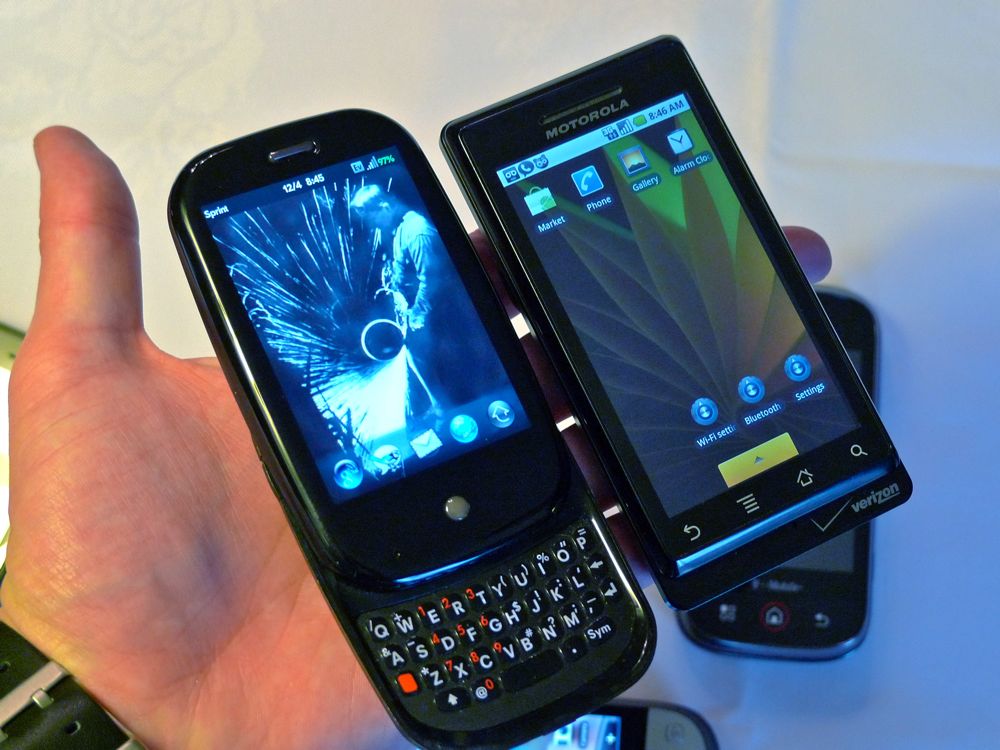
The Pre is an extremely well designed phone. It's a vertical slider, a form factor we lack in Android, that's not too thick and very fun to use. If you haven't had the chance to see it or hold it yet, know that the shape feels incredibly good in your hand and it's easily pocketable because the Pre's footprint is so small. There's definitely a plasticky feel to the device which will definitely turn some users off but it's not too bad. There's also a 'rickety' feel to it, the sliding mechanism definitely isn't as solid as the Droid, which obviously brings concern of usage over time. In fact, compared to the Droid, the Pre is the antithesis. Instead of hard right angles and metal, the Pre uses soft curves and plastic. Instead of a big expansive brick-like device, we get a small pebble-like figure. Both work, and the Pre is excellent but we still prefer the Droid.
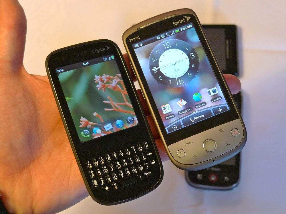
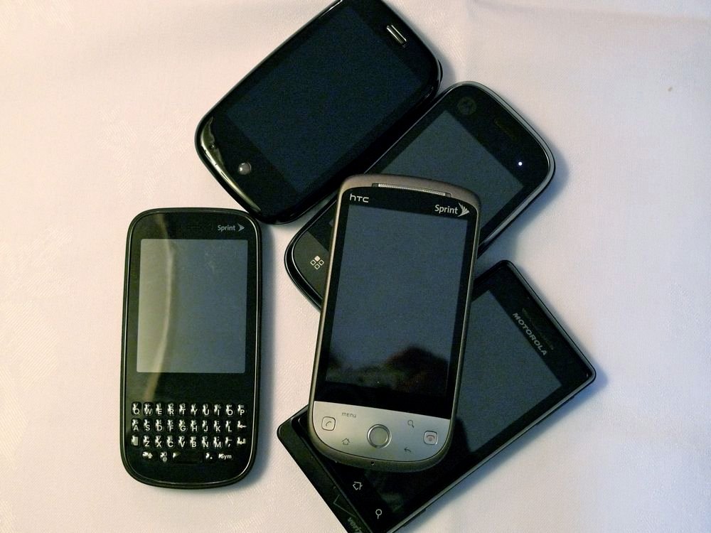
The Pixi is another well designed phone, the candybar QWERTY-model with touchscreen is really something we're waiting to see in an Android device because it offers a completely different experience. The Pixi is impossibly thin and small, and has the rounded curves to make the device feel even smaller. The back of the Pixi is covered in a matte finish that can be likened to the T-Mobile G1 or HTC Hero but significantly more 'matte'. Our only gripe with the Pixi's design is that the area where a typical trackball would be is completely empty, which leaves a glaring blank spot on the front face of the phone--like something is missing.
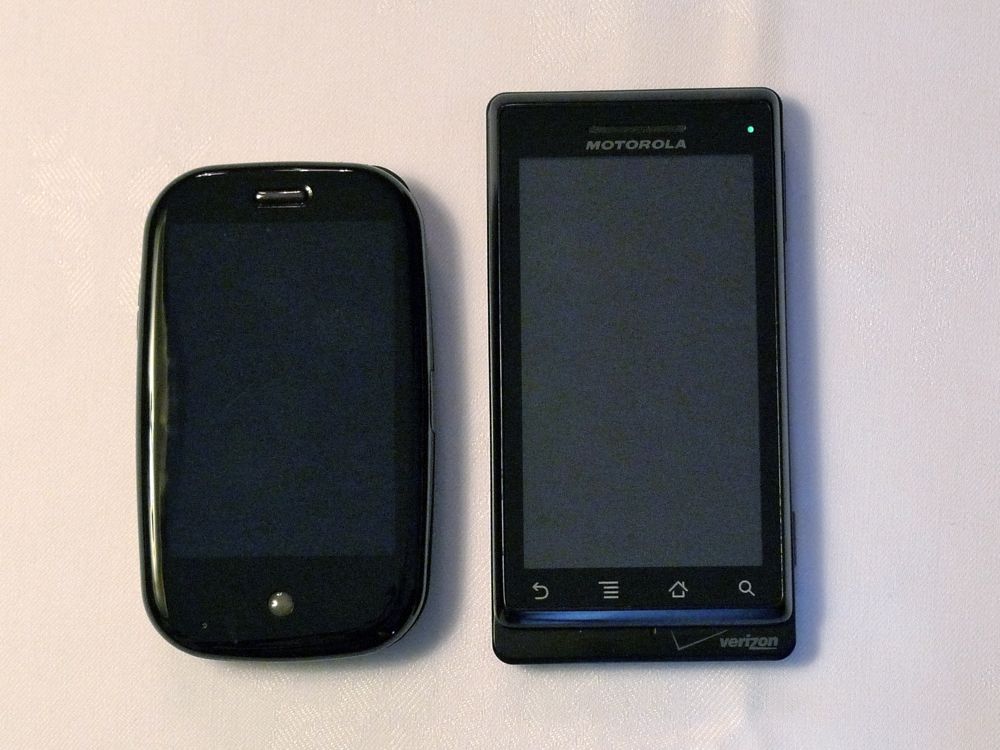
However, what these two webOS devices gain in their small footprint and overall size, they lose in screen size and functionality of the keyboard. As there's a movement toward bigger and larger screens (see: Droid, HD2), the 3.1 inch screen of the Pre barely cuts it and the 2.63 inch screen of the Pixi doesn't clear the bar at all. The screens themselves are sharp enough but the overall size leaves a lot more to be desired, especially when browsing the web on the Pixi.
Be an expert in 5 minutes
Get the latest news from Android Central, your trusted companion in the world of Android
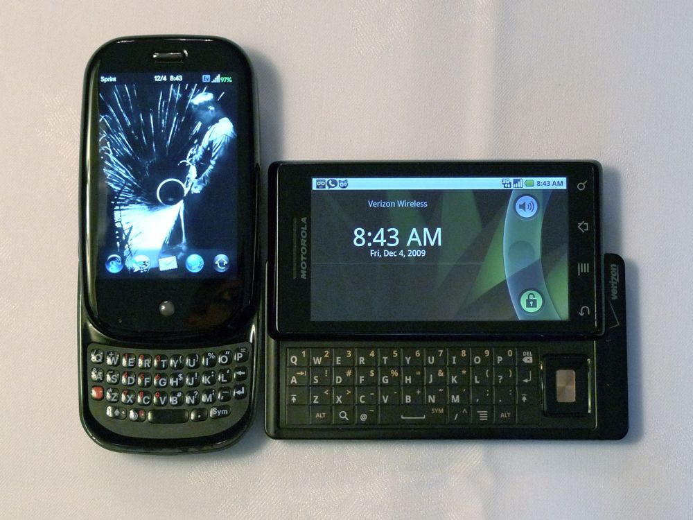
We know we don't have the greatest of keyboards on the Android platform but the Pre keyboard is our least favorite keyboard on a smartphone. The buttons feel odd, the top row of keys is very close to the bottom edge of the screen, and nail-typing just isn't an adequate solution for us. We think our problems stem from the fact that the Pre keyboard kind of 'dips' into the device, its slight concave shape makes it harder to type on. We hope a vertical slider in the future can fix that keyboard issue.
On the other hand and as odd as it sounds, the Pixi's keyboard, though smaller than the Pre's, was much easier to use. It's easy to pick up, gives a satisfying click, and we can thumb type with no problem. Maybe the fact that the keyboard is on a flat slab helps the performance? Either way, typing on the Pixi gave us no problems but those with extra large thumbs may find it difficult.
Overall, Palm did an incredible job with design in these two devices. They have a relatively uniform, unmistakably Palm look to them and are both very well designed devices. The little touches are Palm's long standing mantra and it's good to know that it's still consistent today (speaker grilles, ringer switch, mirror). And though the Pre's keyboard is a little rough and both the screens are small, we're still walking away with positive feelings about the hardware. We love that the Pre's screen blends in with the black of the front fact, we love the simplicity of the design, and we love, love, love, love the gesture area. Why no one copied/stole/re-invented it yet is beyond us. It makes typically useless area so incredibly useful.
webOS
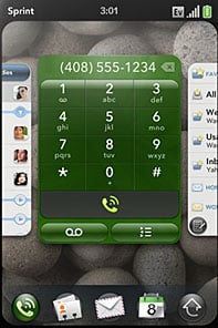
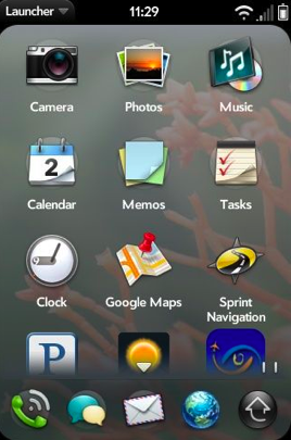
Before we start with the OS, we think its safe to say that webOS just very well may be the prettiest, best looking OS around. The fonts are gorgeous, the cards are elegant, and the icons are sharp--it all fits under one cohesive umbrella of beautiful. Android is certainly 'prettying' up in Android 2.x with better, sharper icons and more elegant screens but it's no where near as consistent as webOS.
Taking a deeper look beyond the surface, our first thought of webOS is that it's stunning that Google didn't go in this direction with Android. The very basis of webOS is the web: HTML, CSS, Javascript are used to develop applications, anyone who knows the web will know webOS, etc. Doesn't Google own the web? Wouldn't you think they would be the ones who would have built a web-based smartphone platform? Doesn't it make too much sense? That new Chrome OS certainly seems like a reset button for Google to design the OS they seem destined to build.
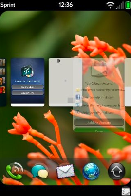
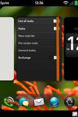
The main draw of webOS is easily the multitasking aspect of it. And though Android does multitasking just fine, the implementation of multitasking on webOS is much more elegant. There are 'cards' that show which applications are open and running, to move to the next app just slide to the next card, if you want to close the application, swipe the card away. Simple, effortless and borderline genius. It's an understatement how easy it is to pick up.
But the question is, is this type of in-your-face multitasking necessary, and do I prefer it? I'm going to go with a kind of yes. The ease of multitasking in webOS is really to die for, from not having the option to close apps on Android (unless when using a third party app killer) to simply swiping up makes incredible sense. Considering we're constrained by screen size on a smartphone, 'Cards' is easily the most elegant and fluid solution for multitasking--it extends your small screen into multiple desktops.
I would love for this to become a feature in Android. But that's the keyword: feature. Multitasking on webOS is so in-your-face that it replaces a true homescreen experience, I'm not sure if multitasking alone is worth that. The lack of widgets and a true homescreen experience is something I'd definitely miss if I used a webOS device full time. If I could bring up a 'Cards'-like interface in Android while keeping my homescreen experience with widgets, well hey, let's make it happen Google.
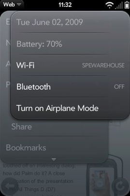
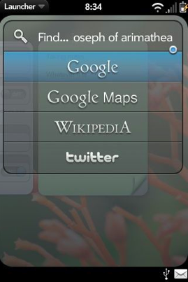
Beyond just multitasking, webOS is a smartly designed smartphone OS. Palm definitely put their time into it and there are nice touches sprinkled around to make it such an enjoyable experience. The fact that you can tap the top right corner from anywhere on your phone to bring up your Wi-Fi and bluetooth settings is smart. We have a widget on Android that does this on the homescreen but webOS' implementation takes up no additional screen real estate unless called for. The Browser is sweet. It supports multitouch which makes us even more jealous. We'd rate it slightly better than the Android experience because of multitouch. We also like the Universal Search that comes with the Pre, the option to search other avenues like Twitter, Wikipedia is much appreciated.
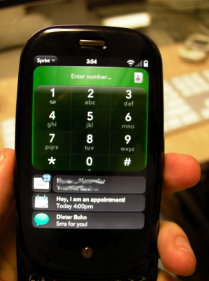
The notifications in webOS are also nice, when you get an e-mail, a notification will pop up on the 'bottom line' and give a one-line scroll to let you know what's up. If you get more notifications it'll continue to stack. What's great about this system is that you're notified of exactly what you're getting without being disruptive in any way. Think about it like watching ESPN and having the 'bottom line' scroll and notify you of game scores and stats. You get to continue watching the game but also know what happens outside as well. With webOS, it's interactive, so if you see something of interest, simply tap it and it'll open, if you don't care for it, ignore it or swipe it away--it's like notification with options. It doesn't remove you from your current task to deal with notifications and it doesn't just notify you that you have 2 e-mails, you actually know what those e-mails are. With that said, there should still be a notification light--why not use the already light-able gesture area?
But the biggest downfall of the Pre and the Pixi is its speed. It's just too slow right now. Too much lag, too many hang ups in usage, and just not as pleasant experience as it deserves. Considering it uses the same processor as the Droid and the iPhone 3GS, it brings webOS into question, is webOS the problem? Is it the mulitasking? Is it the pretty fonts? webOS needs to get a speed boost in order to hang with the big boys. Android is no speed demon but it's significantly faster than webOS. Another big minus point for the battery life, it's barely good enough to eek out a day of usage and if you're going heavy, bring an extra battery cause you'll absolutely need it.
Palm Present & Future
We have to commend the Palm team for simply re-inventing themselves while still staying true to their roots. webOS, the Pre, and the Pixi are paving way for a brand new Palm that brings Palm to the new age while acknowledging its past. It's everything new but still familiar. You can tell by the current makeup of Pre/Pixi users. I asked the users of PreCentral.net if they were long-time Palm users or first-time Palm users, and a large portion have used Palm devices since before we even knew what a smartphone was. As different as webOS is from before, it's still Palm and there are still the magnificent little Palm touches.
We'd be remiss to not mention that it's simply amazing how much the platform has changed and transformed since the last Smartphone Round Robin. Remember, we were using the Palm Treo Pro last year that ran Windows Mobile. That felt tired and old and I even made a comparison that Palm was going down the route of game maker Sega. This year? So. Much. Better. The ideas that Palm is bringing to the smartphone scape are fresh and definitely worthy of mimicking.
We don't hand out awards or anoint winners in the Smartphone Round Robin but there's no doubt in my mind that Palm is the runaway winner of Most Improved Platform. Come on, last year's Smartphone Round Robin had a Palm representative in name only (it ran Windows Mobile), this year's webOS devices are absolutely wonderful.
Though the smartphone landscape is getting increasingly crowded and competitive with the biggest companies in the world all wanting a slice of the pie, Palm is in a good place. They have a great, young platform with cool and fresh ideas. They have wonderful devices that have managed to re-capture the old Palm magic. And they have that excitement back again. In one year, Palm has turned themselves into a brand new company, from an aging, floundering company who made boring products to a new age, underdog company who pushes the innovation bar higher. What a year for Palm.
Final Thoughts
It's always odd ending these Round Robin reviews because most of the time, you won't see these devices for another year. So when you use a device that you truly did enjoy, it's a little bittersweet saying goodbye. Last year, I felt sad saying goodbye to the Blackberry Bold, this year it's tough for me to say goodbye to the Palm Pre (heck, I'll even miss the Pixi). I just enjoyed the neat little touches that the OS had and I loved staring at the UI.
Could I use a Pre full-time? Well, not really. The keyboard is too tough for me to type on, the screen is too small to browse on, the lag is too much to deal with it, and the battery life would leave me with an expensive paperweight by the end of the day. But from using the Pre, it definitely makes me excited for what the future Pre 2 (Post?) would be.
To make comparisons, the Pre is in a similar position to the T-Mobile G1 last year. Obviously, the Pre is a much more polished device compared to a T-Mobile G1, but it still is only available on only one US carrier, still limited by some hardware oddities, and still needs improvement in battery life and speed--just like the G1. The T-Mobile G1 and Palm Pre both have some great ideas in their respective platforms and cool touches in their respective hardware but you knew/know better devices were/are coming. So what will come next for Palm? I'm actually excited to find out.

