Garmin vívomove Trend vs. vívomove 3
The Garmin vivomove Trend and vivomove 3 are both stylish analog-style wristwatches that hide a touchscreen underneath, but there are some notable differences between them.
Classic look, feature rich
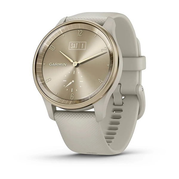
The Garmin vivomove Trend is a solid option worth considering if you want a feature-rich smartwatch that doesn’t necessarily look like a smartwatch. It employs a classic analog watch design with a hidden touchscreen that only activates when you want it to, along with plenty other smart features to enhance your workouts and day-to-day life.
For
- Neat hidden touchscreen
- Decent battery life
- Compete with friends in app
- Wireless charging enabled
Against
- No built-in GPS
- Expensive
Affordable alternative
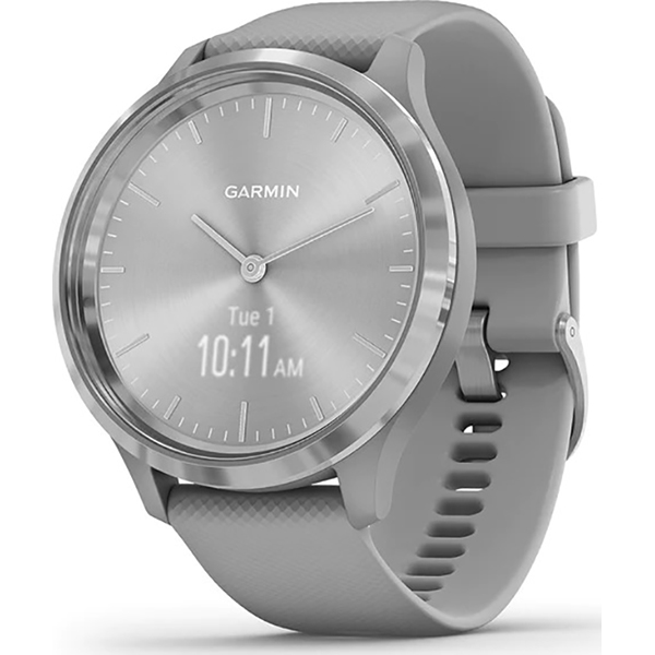
As a more affordable alternative, the Garmin vivomove 3 has many of the same features as the vivomove Trend, including the analog style design and hidden touchscreen. It’s missing a few things, like wireless charging. But by and large, you’ll get a similar experience with health, wellness, and activity tracking plus smart notifications, and all for less money.
For
- Neat hidden touchscreen
- Decent battery life
- Compete with friends in app
- More affordable
Against
- No built-in GPS
- Only one color option for standard version
- No wireless charging
Some of the best Garmin smartwatches are offered in a variety of sub-brands, such as the vivomove line. This line includes several models that focus on both function and style. Among the latest are the Garmin vivomove Trend vs. Garmin vivomove 3, both of which employ a similar design with many of the same features. But there are subtle differences that might sway you towards one or the other.
Garmin vivomove Trend vs. vivomove 3: The design
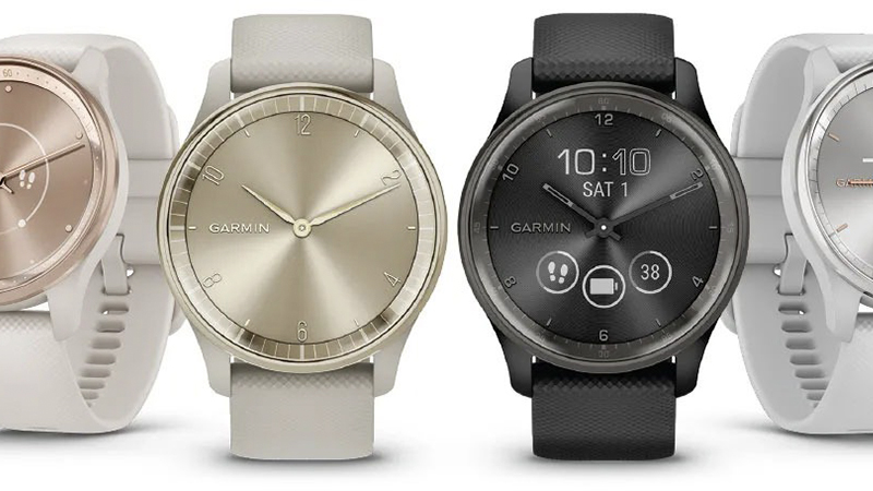
Both these smartwatches are stunning wristwatches that look more like wristwatches than they do smartwatches. That’s because they employ a classic analog design with a round face, lines, and hands in the middle to tell time. But they both harbor a secret: there’s a hidden full-dial display that pops up only when you want to interact with the touchscreen. Once you tap, the hands dynamically move away to reveal the digital data.
The Garmin vivomove Trend comes in a variety of colors, including Peach gold stainless with a French gray case, Slate with a black case, Peach gold with an Ivory case, and Silver with a mist gray case. Made of domed glass, each comes with a comfortable silicone 20mm quick-release band so you can swap it out for other colors and styles as desired.
The vivomove Trend has a 1.01 x 0.74-inch 254 x 346 liquid crystal display and it’s swim rated so you can confidently take a dip in the pool with it on, shower, wash dishes, run in the rain, and more.
Offering up to five days of battery life, you can get an extra day in analog-only mode. Plus, charge it for 15 minutes to get an additional day in smartwatch mode if you need it to track a quick run or daily workout. What’s most notable about charging this watch is that it is the first wireless charging-enabled smartwatch from Garmin. While it uses a proprietary charger, it can also be charged using any compatible Qi wireless charging pad.
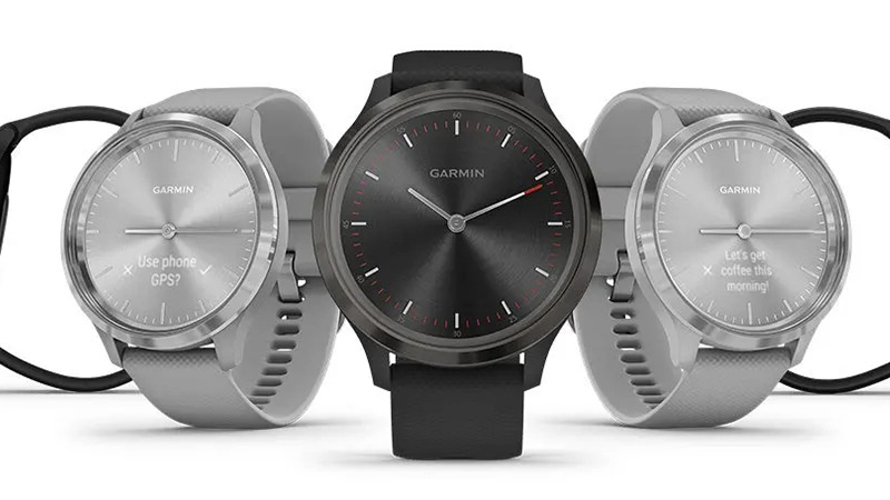
The Garmin vivomove 3 comes in silver stainless with a Powder gray case and the same 20mm quick-release band. The screen is much smaller at 0.35 x .072 inches as well as a lower resolution at 64 x 132, but it’s also an OLED, which makes it sharp and clear.
It’s also overall larger and slightly heavier than the Garmin vivomove Trend. But the Garmin vivomove 3 also comes in an alternative version called the vivomove 3S that has a slightly smaller case size and narrower design, plus it’s a bit lighter than both the vivomove 3 and vivomove Trend. That one, which sells for the same price, comes in Light Gold stainless with a Dust Rose case, Rose Gold stainless with a Light Sand case, and silver stainless with a Granite blue case. Its touchscreen is the same size and resolution as the vivomove 3 but the physical size of the watch is smaller and uses 18mm industry standard bands versus 20mm.
The Garmin vivomove 3 does not include wireless charging like the vivomove Trend but it does boast the same five-day battery life and can be used in simple watch mode for an extra week before charging. This can be useful if you’re on vacation or a business trip, for example, and forgot to bring along the proprietary charger.
Wireless charging is the stand-out feature here with the Garmin vivomove Trend. It’s a feature you don’t often see with smartwatches and could be the deciding factor for some. The much larger size of the touchscreen on the vivomove Trend as well will appeal more to those who might have trouble reading tiny text and want something that’s larger and more easily viewed at a glance.
Garmin vivomove Trend vs. vivomove 3: Breaking down the specs
We’ll get deeper into what these two trackers have to offer, but first, let’s compare the specs.
| Header Cell - Column 0 | Garmin vivomove Trend | Garmin vivomove 3 |
|---|---|---|
| Compatibility | Android, iOS | Android, iOS |
| Colors | Cream Gold/French Gray, Slate/Black, Peach Gold/Ivory, Silver/Mist Gray | Silver/Powder Gray (other color variations with the vivomove 3S alternative) |
| Swappable Band | Yes (20mm) | Yes (20mm or 18mm with 3S) |
| Battery Life | Up to 5 Days + 1 Day Analog Only, 15 min Quick Charge | Up To 5 Days + 7 Days Watch Mode |
| App | Garmin Connect | Garmin Connect |
| Heart Rate Monitoring | Yes | Yes |
| Stress Tracking | Yes | Yes |
| GPS | Connected | Connected |
| Sleep Monitoring | Yes | Yes |
| Swimproof | 5ATM | 5ATM |
| Phone Notifications | Yes | Yes |
| Blood Oxygen | Yes | Yes |
| Mobile Pay | Garmin Pay | None |
| Screen Size | 1.01 x 0.74 inches | 0.35 x 072 inches |
| Screen Type | Liquid Crystal | OLED |
| Screen Resolution | 254 x 346 | 64 x 132 |
| Size | 40.4 x 40.4 x 11.9mm | 44 x 44 x 11.3mm |
| Weight with Strap | 43.4 grams | 46.1 grams |
There are a few notable differences here, but by and large, a lot that is also the same. Let’s look further into how these two smartwatches compare.
Garmin vivomove Trend vs. vivomove 3: Tracking sports, activities, and wellness
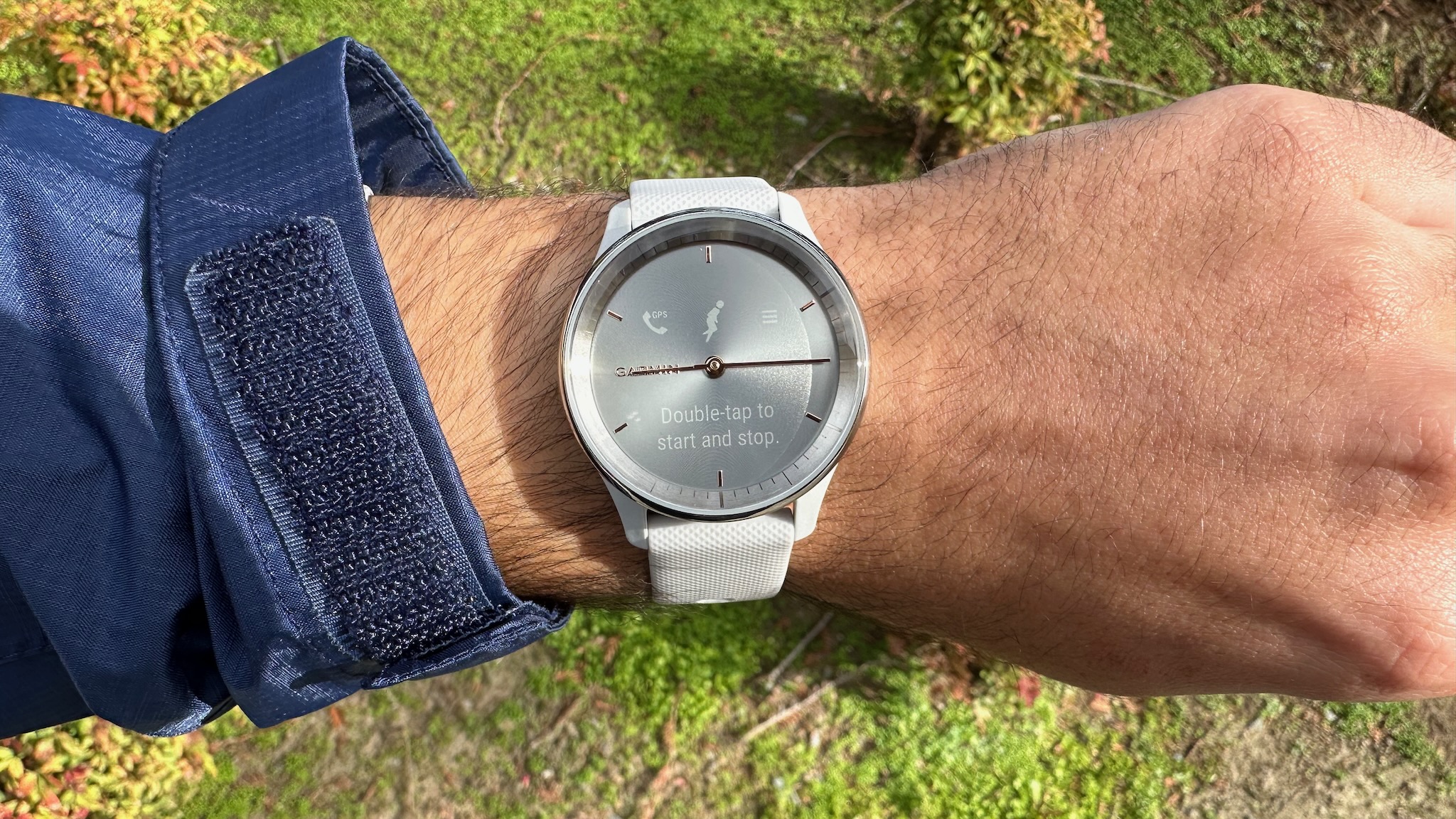
The great thing about both these smartwatches is that while they look like regular wristwatches, they can also track tons of health and wellness stats as well as sports and activities. None of this data is in-your-face, so to speak. It only lights up on the watch when you want it to thanks to the hidden touchscreen that appears with a tap to dynamically move the watch hands out of the way and reveal it.
Both smartwatches come with pre-loaded sports apps like yoga, strength, cardio, and swimming, including 10 timed activities and automatic rep counting for some workouts. They track steps, floors climbed, calories burned, and intensity minutes, as you would expect.
There’s also 24/7 heart rate tracking with alerts if the watch detects unusually high or low rates, as well as sleep monitoring and scores, Pulse OX and respiration, blood oxygen saturation, stress tracking, hydration tracking, mindful breathing, and women’s health all important aspects of your health, wellness, and activity.
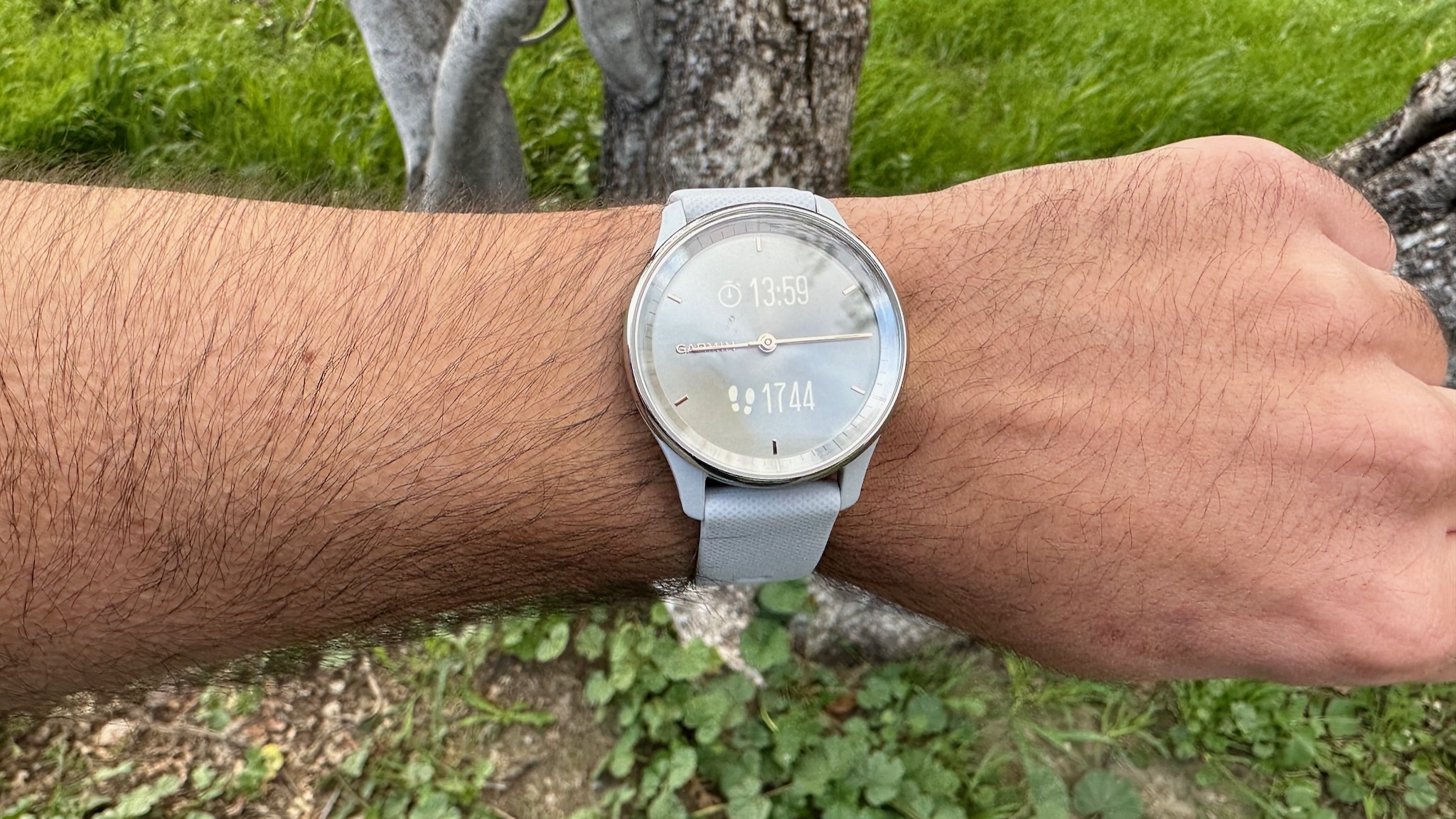
Garmin’s Body Battery is included with both, which analyzes your body’s energy levels throughout the day and tells you when it’s the best time to engage in an intense workout, do some moderate exercise, or take a rest day to recharge. While exercising, you’ll also get data on intensity minutes so you can keep track of if you’re meeting personal daily goals and then work on improving.
If you’re a runner, cycler, or other outdoor sports enthusiast, note that both these smartwatches come with connected GPS, which means you can track your routes but it requires your smartwatch’s antenna to do so. So, you can’t go for a ride and leave your phone at home if you want to plot your route. This is unfortunate given the higher price of both these trackers, but most people happily bring along their phones for music playlists and emergencies, anyway.
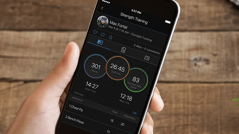
One worthwhile feature to note is that both work with the Garmin Connect app where you can connect, compete with, and challenge friends, family, colleagues, and others who own a Garmin watch or tracker. You can earn badges as you meet certain goals and milestones as well, all of which are big motivating factors.
Bottom line: these smartwatches are pretty much in line with one another when it comes to sports and activity tracking and health and wellness stats.
Garmin vivomove Trend vs. vivomove 3: Staying connected
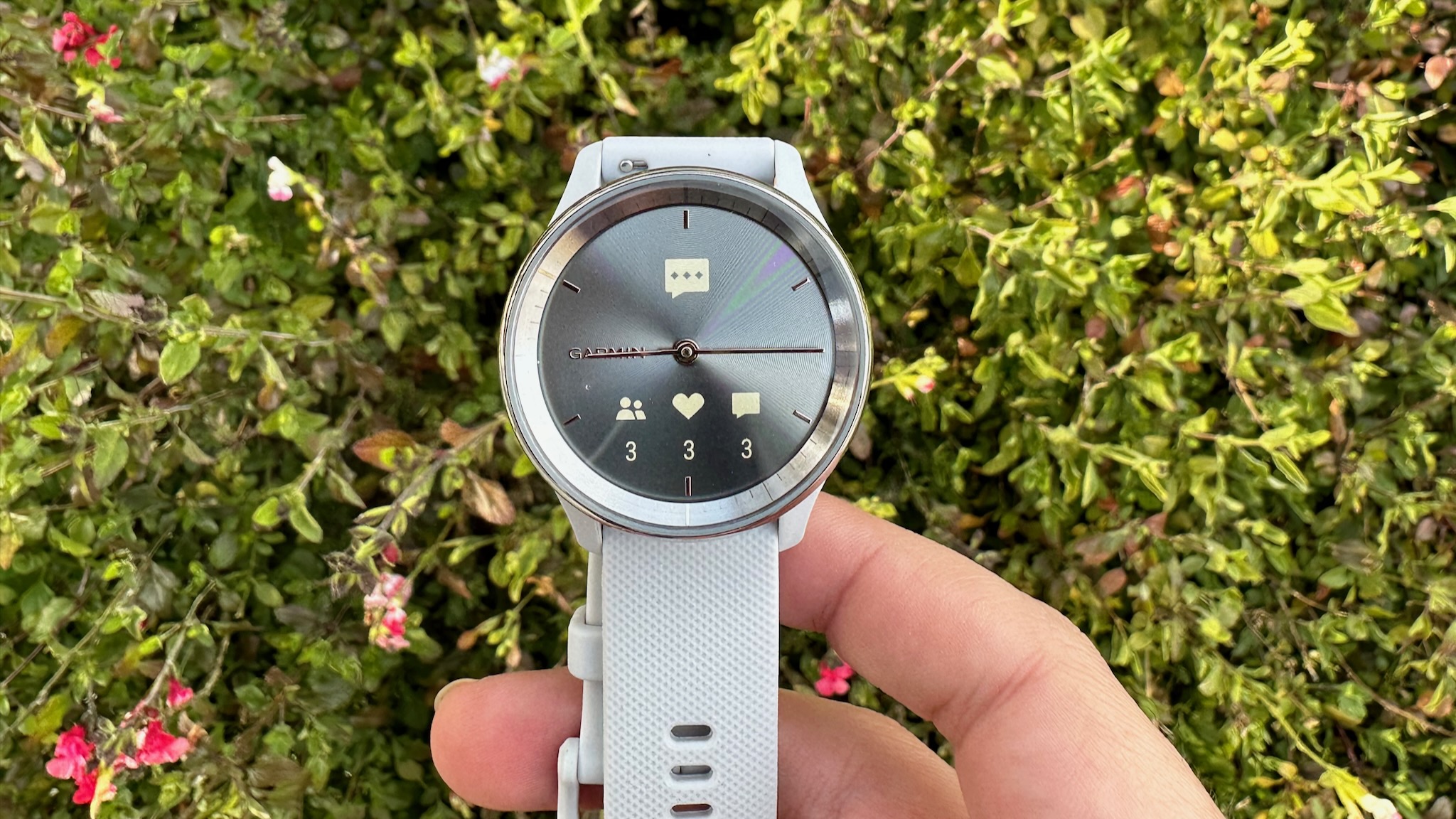
Along with notifications about your workouts, health, and wellness, smartwatches also provide details about things like incoming calls, messages, calendar appointments, and more from a connected smartphone. And the Garmin vivomove Trend and vivomove 3 are no exception.
Both provide notifications for texts, calls, calendar reminders, social media updates, and more. They both work with Android and Apple, but with the Garmin vivomove Trend, you can also respond to texts via compatible Android phones right from your wrist, a handy feature for those who are constantly on the go.
Both can also function as a chronograph, timer, and stopwatch, which is useful for other tasks and timed activities, like timing something cooking on the stove in the kitchen, your performance running laps on the track or your kids’ races in the backyard.
Another feature worth mentioning, which is included in both these smartwatches, is the inclusion of live location, which can be sent to contacts manually or automatically via incident detection. If the watch senses there has been an issue, like a hard fall, it can make sure you get the help you need. With the manual option, if you are feeling unsafe, you can tap a button to reach out to contacts and tell them where you are.
Finally, the Garmin vivomove Trend has Garmin Pay whereas the Garmin vivomove 3 does not, which is something to factor into the decision as well.
Garmin vivomove Trend vs. vivomove 3: Which should you buy?
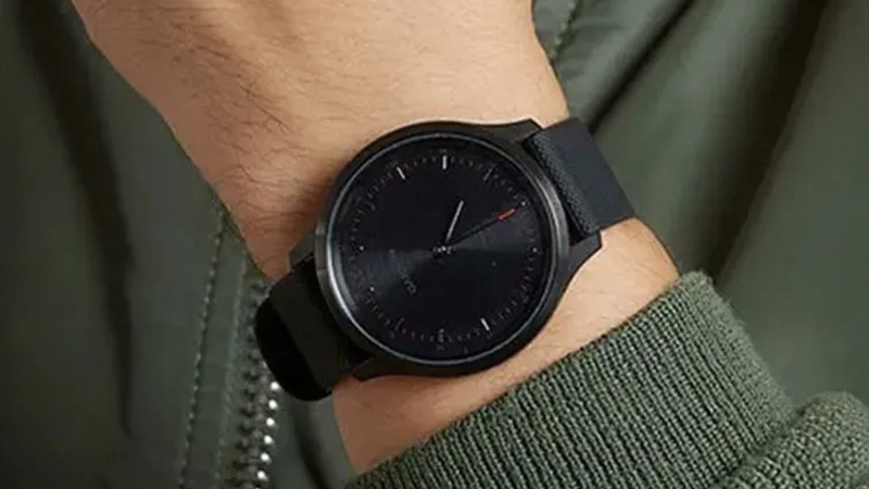
Choosing between the Garmin vivomove Trend vs. vivomove 3 really comes down to a few points. The first is size. The Garmin vivomove Trend is smaller, lighter, and thinner, so if you have a small wrist, you might prefer it. Though if you are leaning towards the Garmin vivomove 3, you can consider the 3S alternative, which is the smaller and narrower option.
Despite the smaller size, however, the Garmin vivomove Trend has a much larger hidden touchscreen display, which is the most notable differentiator between these two devices. If you plan to look at your wrist for notifications, to set activities, or see daily stats, you want something that’s as readable as possible.
The Garmin vivomove 3 has a nicer OLED screen, but it’s also smaller. For far-sighted individuals who need reading glasses, this could be a deciding factor. With that said, it’s worth taking a look at both devices because though the numbers on paper sound drastically different, the Garmin vivomove 3’s screen will still be quite readable and comfortable to view for most.
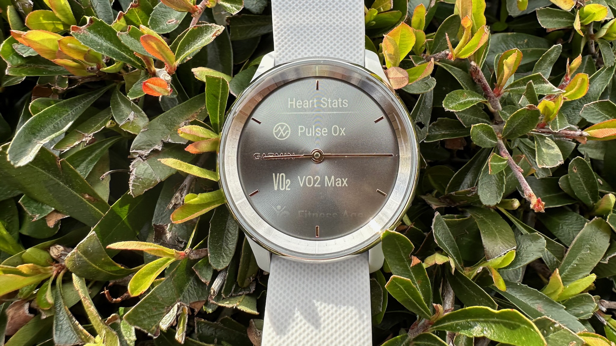
The other factor to consider is the wireless charging capabilities in the Garmin vivomove Trend, which, for some, is more than just a nice-to-have. If you already have a Qi wireless charging pad on your desk at the office or at home that you use to charge items like your smartphone and wireless earbuds, being able to plop your smartwatch down on the same pad is super convenient. If you don’t think you’d often use wireless charging, however, this won’t matter. But if you would, it might justify the extra bucks.
There are more color options with the Garmin vivomove Trend, and if you opt for the smaller Garmin vivomove 3S, the color options skew more towards the light, feminine side, so this is a watch that’s better suited for smaller, daintier wrists.
You get the same main battery life, but the ability to use the watch as a regular wristwatch for an extra week with the Garmin vivomove 3 after the battery depletes is a really nice one to have.
When it comes to most other features, these two smartwatches fall in line with one another, making the decision even more difficult. It comes down to size, screen, color (though both have swappable 20mm quick-release bands that are easily replaced with one of the best Garmin vivomove bands), charging and battery, and style.
The Garmin vivomove Trend is the more expensive of the two, but the larger screen and wireless charging along with 15-minute quick charging justify the price hike. But if you’re on a tighter budget, you won’t be disappointed with the Garmin vivomove 3 and might not even miss the features like wireless charging and a slightly larger screen since this one is a stunning OLED.
If you can afford it, go with the Garmin vivomove Trend, but if you don’t want to spend that much, the Garmin vivomove 3 is a solid alternative that has many of the same features and employs a similar design. Alternatively, you might also want to consider the Garmin vivomove Sport, which is an older model but employs the same hidden touchscreen design.

Wireless charging capable
As Garmin’s first wireless charging capable smartwatch, the Garmin vivomove Trend has a few other features that make it stand out, including a larger screen, Garmin Pay, and, of course, the clever hidden touchscreen behind an analog design. It’s a solid smartwatch that comes in a myriad of stylish color options.

Same design, more affordable
The Garmin vivomove 3 doesn’t have wireless charging and has a much smaller though nicer OLED touchscreen. But it employs the same hidden touchscreen design and analog look with feminine styles and colors. There’s even a smaller 3S version for those with dainty wrists who really want to hide the smarts inside.
Be an expert in 5 minutes
Get the latest news from Android Central, your trusted companion in the world of Android

Christine Persaud has been writing about tech since long before the smartphone was even a "thing." When she isn't writing, she's working on her latest fitness program, binging a new TV series, tinkering with tech gadgets she's reviewing, or spending time with family and friends. A self-professed TV nerd, lover of red wine, and passionate home cook, she's immersed in tech in every facet of her life. Follow her at @christineTechCA.
