Android Central Verdict
Garmin's hybrid watches are designed for those who want access to Garmin's data without the prohibitive price or sporty designs of its other watches. The vívomove Trend hasn't changed too much from its Style and Sport predecessors in features, but its vastly improved hidden LCD display makes it much more usable and the addition of tap-to-pay and wireless charging make it a better all-around device.
Pros
- +
More attractive than most Garmin watches
- +
Qi wireless charging support
- +
Pixel-rich hidden touchscreen display
- +
HRM, SpO2, altimeter, and tap-to-pay
Cons
- -
No built-in GPS
- -
Touchscreen-only nav can be tricky
- -
Short battery life
Why you can trust Android Central
I'll be the first to say that most Garmin watches won't win any design beauty pageants. They prioritize function over form in the Forerunner series, and strike a delicate balance with the attractive Venu series. Now, Garmin has brought back the vívomove hybrid series, which reverses Garmin's priorities and chooses form over function.
The Garmin vívomove Trend is an elegant, lightweight watch that evokes a classic analog feel at first glance, but has a useful hidden LCD display to give you a stripped-down version of the Garmin OS and workout metrics that so many users appreciate. It's a much more passive device than most Garmin watches, but for a certain type of athlete, that may actually be for the best.
Garmin vívomove Trend: Price and colors
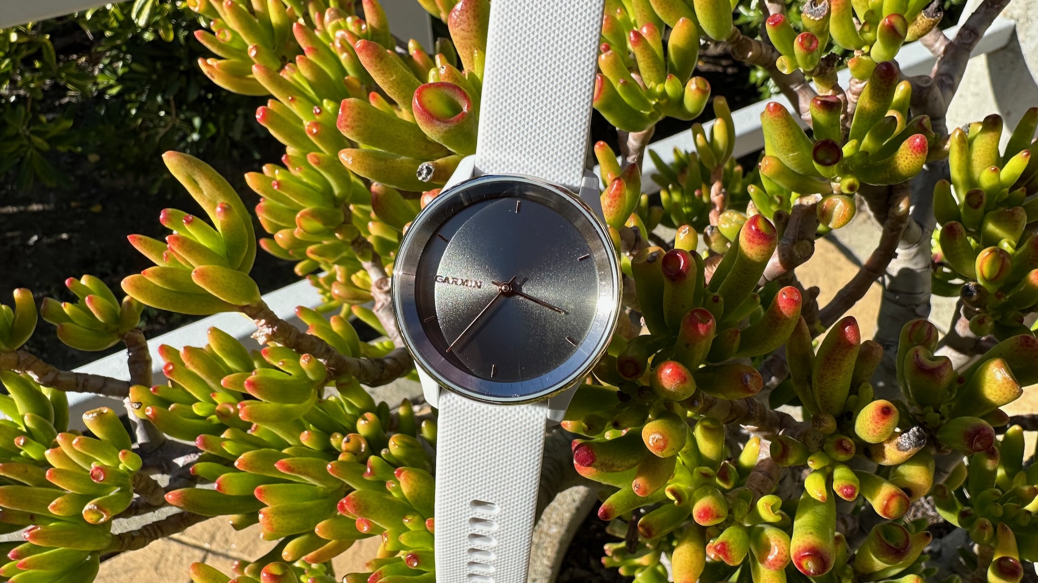
With a watch as fashion-focused as the Garmin vívomove Trend, you're buying it for the finish as much as anything else. You have four Stainless Steel color options: Silver Bezel with Mist Gray Case, Slate Bezel with Black Case, Cream Gold with French Gray, or Peach Gold with Ivory.
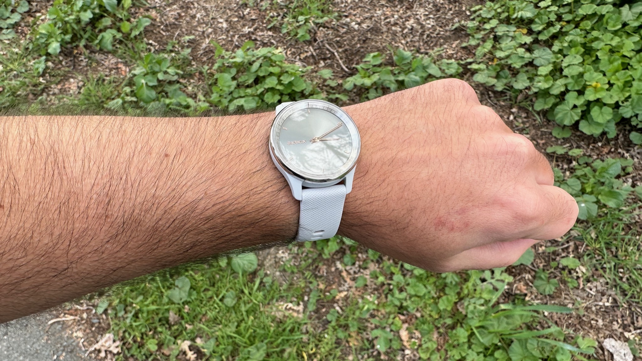
The two Gold models cost $300, while the Silver and Slate watches dip down to $270. Aside from the more stylish finish, the Gold watches have no feature upgrades; you're just paying for the look, which does admittedly look quite chic. Garmin sent me the cheaper Silver vívomove, which still looks quite attractive in my subjective opinion.
You can find the Garmin vívomove Trend on various retailer sites like Best Buy, Target, and Walmart — though some only have the non-Gold watches available — as well as Garmin.com.
Garmin vívomove Trend: Design, UI, and touchscreen
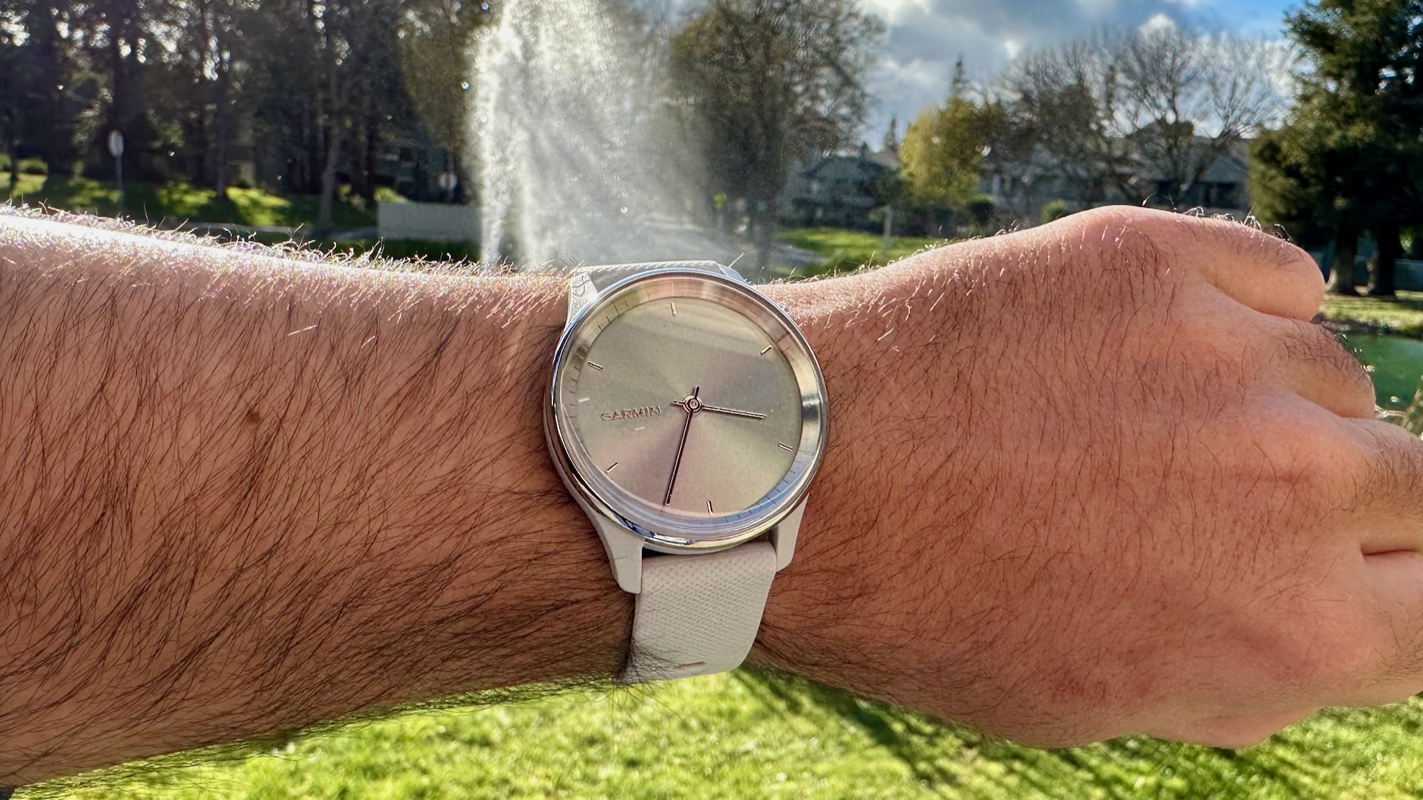
I've gotten used to the thick, athletic look of most Garmin watches, so switching to the vívomove Trend makes me suddenly feel much more fashionable. While the case is the same plastic material as most Garmin watches, the thick stainless steel bezel is all you'll see from the top down. That metallic look paired with the golden watch hands means that at first glance, this won't look like a sporty watch at all.
At 11.9mm thick, it's significantly thinner than many of my favorite Garmin devices. That makes it more petite, and no doubt this will be marketed as a "women's watch," but I see no reason why men would dislike its analog aesthetics. Its thinness makes it much better suited for sleep tracking than a thick Forerunner watch, too.
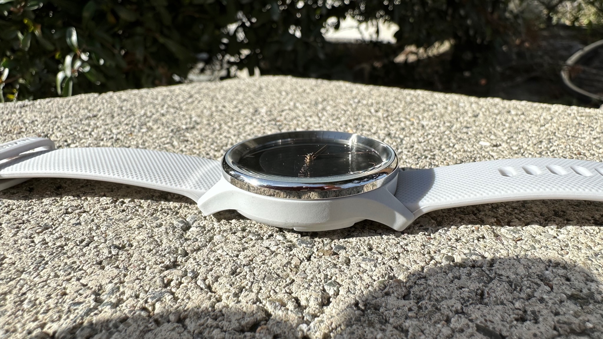
Unlike the vívomove Sport, which lets you choose a nylon or silicone band, the Trend sticks to silicone. Compared to my Forerunner watch bands, the Trend's silicone material has a more uniform outer texture and a softer inner feel, while also losing the extra lug holes on the rear for a more casual look.
Unlike most hybrid watches, which give their smarts away with side buttons and crowns, the Garmin vívomove Trend relies solely on the touchscreen, which adds to its design simplicity. I have my complaints about touch-only watches I'll address in a minute, but the simplified Garmin OS does lend itself to this type of navigation.
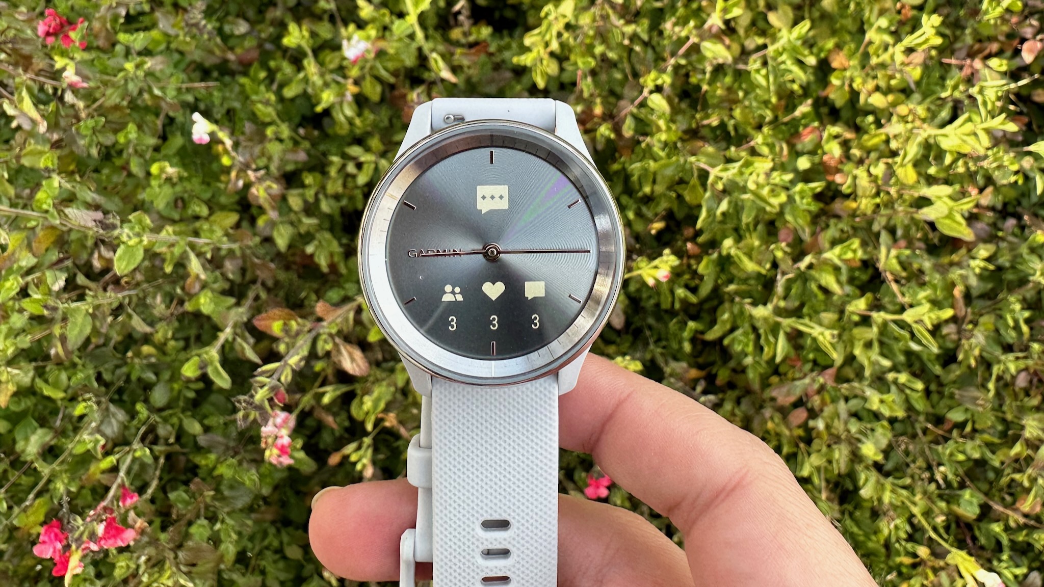
If a notification logo appears, you simply tap the display to read the full message. To see your workout or health-measurement options, you tap and hold the screen and then select an icon. To check your daily fitness data like steps tracked, you swipe up or down from the main watch face.
The software is much more limited than on a typical Garmin watch. But because of that, almost every function you might need is only one or two swipes plus one tap away. So even if you have the occasional mistaken tap or swipe, it won't take you too long to navigate back to the right screen.
Still, I definitely recommend using Garmin Connect to move your favorite widgets as close to the watch face as possible for the fewest up/down swipes. In my case, I keep notifications one downward swipe away, so I can send quick replies to messages (only on Android phones). I keep music controls and my calendar one and two upward swipes away, respectively.
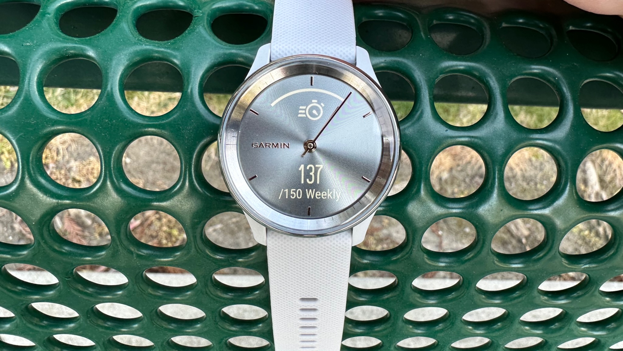
As for the LCD display, I'm pleasantly surprised at how visible the white text is even in sunny conditions. I've read that other vívomoves had serious issues with this, especially the full-color vívomove Style, but that's no longer the case here. I have no data on max brightness (nits), but the 254 x 346 resolution in a compact area seems to be especially pixel-dense compared to most Garmin MIP or AMOLED displays.
The main downside here is the "chemically strengthened glass" lens. Other Garmin watches use Gorilla Glass, and the lack of official protection means you're either going to want to buy a screen protector stat or just be especially careful to avoid scratches.
One other cool element of this hybrid UI is how the watch hands glide out of the way when you look at a widget. The default is the horizontal look in the photo below, but for some widgets like step-counting, they point to how far you've progressed in your goals in an arc from left to right. As you swipe through widgets, it's fun to watch the hands drifting from one unique position to the next.
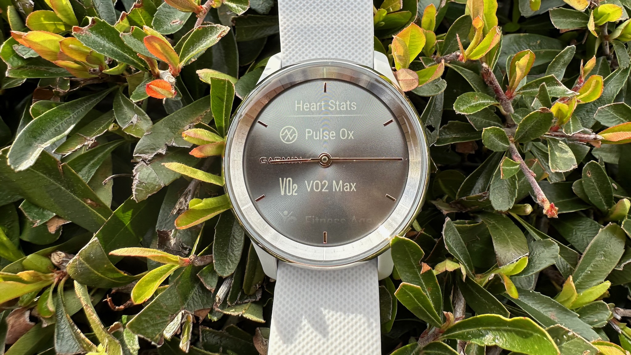
So in essence, this hybrid smartwatch has a simple interface that works well enough on a touchscreen. But hoo boy, this touchscreen can be hit-or-miss.
Sitting at my desk, I have little trouble swiping through menus, and there is enough screen space to fit three or four circular buttons and have it recognize which button I'm tapping. It's quite responsive, and there hasn't been much noticeable lag even when swiping quickly through menus.
So what's the problem? This vívomove Trend sometimes can't differentiate between my swipes and taps, so I'll select a widget instead of swiping through it. Then I'll futilely swipe up and down, not realizing I need to swipe left to right to go back to the last screen first.
Other times, I'll look at a data screen for too long and it'll time out right as I'm swiping, and then nothing happens because the screen only turns back on if you turn your wrist sharply or double-tap the display. Otherwise, you can tap, swipe, or press and hold the display all you want; nothing will happen.
To be clear, this isn't a unique concern. Practically every touch-only fitness tracker can be finicky, from the premium Fitbit Charge 5 to the budget Amazfit Band 7. You're compromising for a lightweight design because even one button adds to the weight and ruins the look.
At least with the vívomove Trend, you're less likely to run into issues because the software is designed for you to mostly ignore it. I've also gained a better knowledge of what the watch considers a swipe or tap, so I've had fewer issues over time. That being said, I definitely miss my Garmin buttons. And you'll want to make the screen timeout medium or long, even if it means the battery dies more quickly.
Garmin vívomove Trend: Software and sensors
| Specification | Garmin vívomove Trend |
|---|---|
| Lens | Chemically strengthened glass |
| Bezel | Stainless Steel |
| Case | fiber-reinforced polymer |
| Water resistance | 5ATM |
| Display | 1.01" x 0.74" LCD touchscreen (254 x 346) |
| Weight | Case only: 28.3g; With silicone strap: 43.3g |
| Battery life | Up to 5 days |
| Charging | Garmin clip charger or Qi-certified wireless charging |
| Software | Fitness Age, Body Battery, Stress, Relaxation reminders, Sleep score, Hydration, Menstrual cycle |
| Sensors | HRM, SpO2, altimeter, accelerometer, ambient light sensor |
| Tracking | Connected GPS only |
| NFC | Garmin Pay |
| Activities | Walk, Run, Cardio, Bike, Strength, Breathwork, Yoga, Pool Swim, Treadmill, Other |
Garmin gave the vívomove Trend what I'd call the "Garmin Starter Pack" of features. You have a Sleep score, Body Battery, respiration and hydration tracking, menstrual cycles, intensity minutes, Pulse Ox, and fitness age.
You also get a few basic sports modes, but nothing too niche and the available workout data is stripped down. For example, with the Run activity, you can technically view your timer, distance, heart rate, average or current pace, heart rate zones, calories burned, and other data; but you can only customize two data fields, so you'll probably have to stick to the first three metrics.
The same applies to swimming, cycling, and any other activity. You'll hardly see any actionable data on your wrist during a workout, nor will you get much information after it's over. Garmin is expecting you to check all that data in the Connect app.
For anyone who uses Garmin watches passively, you should be totally fine. Runners can still analyze their run cadence, current VO2 Max, and other useful metrics in the app, for instance. But if you actively use features like Garmin Coach to guide your pace, or created or preloaded workouts to improve your gym routine, then the vívomove Trend definitely isn't the right choice for you. It's meant to blend into the background.
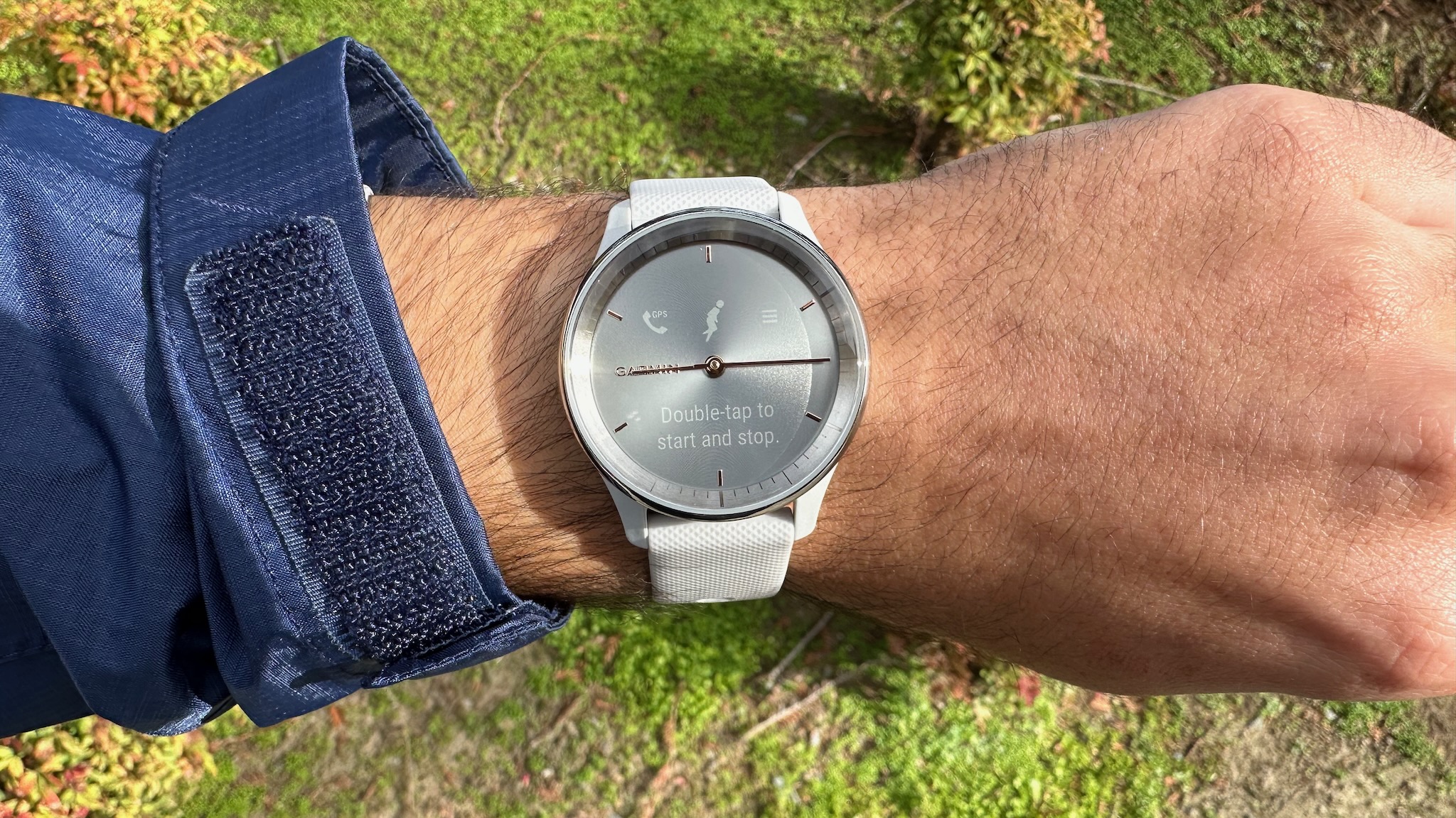
That reliance on your phone also applies to tracking. Unlike 95% of Garmin devices, this watch has no built-in GPS or GLONASS; when you start an activity, you'll need your Garmin Connect app open with access to your location data at all times. Thankfully, the GPS typically connects within a couple of seconds, and any modern Android phone or iPhone should be quite accurate — though the signal might be occluded a bit if your phone is stuffed in your pocket.
Most workout data relies upon the optical HRM to determine your intensity level. The Garmin vívomove Trend uses an older-generation sensor rather than the newer Elevate v4 found in 2022+ Garmin watches like the Forerunner 255. That doesn't necessarily mean it's inaccurate, but the newest HRM does tend to adapt more quickly to changes in heart rate.
Otherwise, the vívomove Trend has an accelerometer to react to your wrist movements and determine when you're walking or checking your display; an ambient light sensor to match your screen brightness to your surroundings; a blood oxygen sensor you can have turn on during sleep tracking; and a barometric altimeter to determine floors climbed. The latter is a pleasant surprise, since many Garmin watches on the cheaper side skip the altimeter despite its usefulness.
Garmin vívomove Trend: Battery life and charging
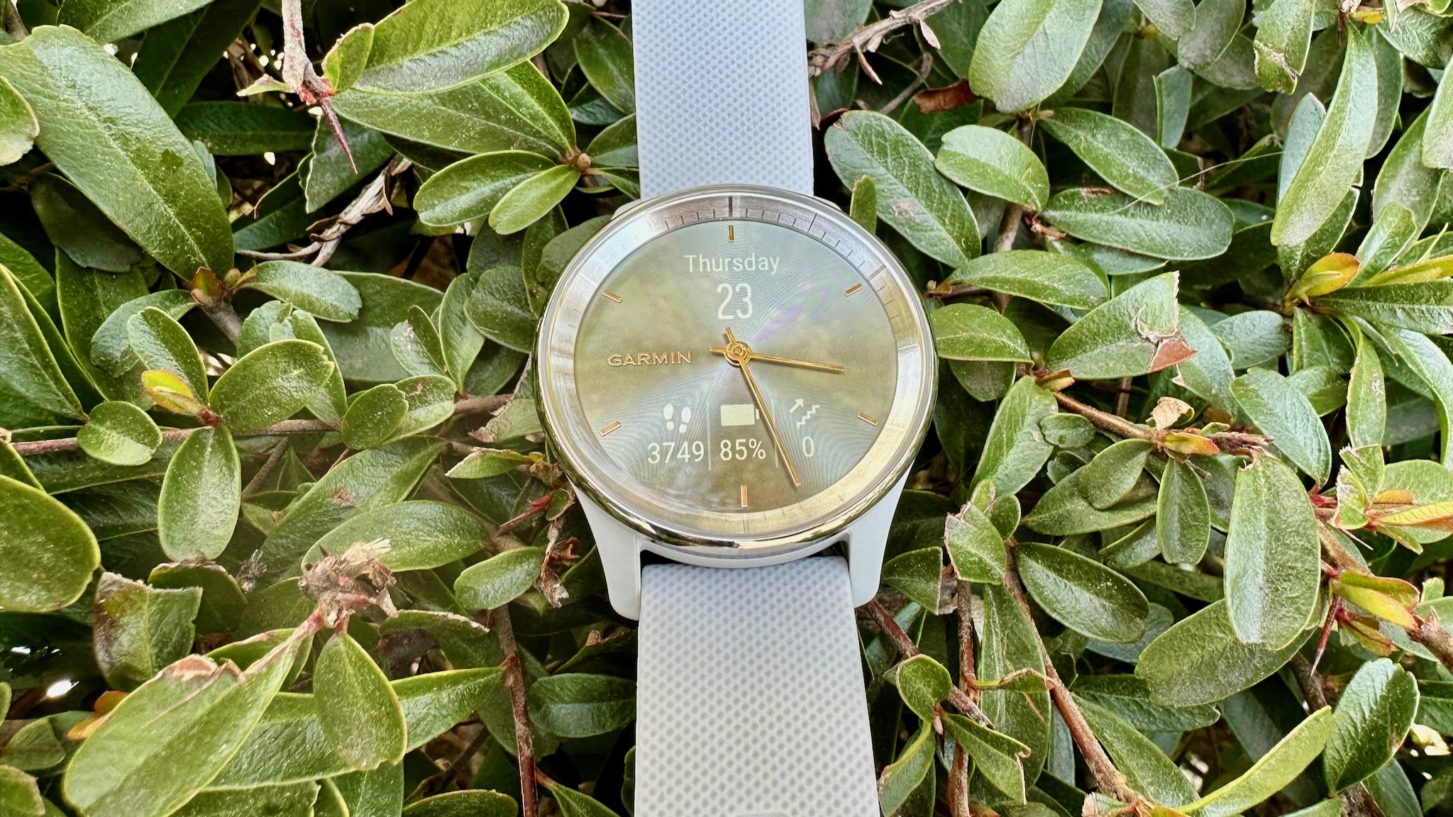
Smartwatch brands' official battery life estimates should always be taken with a grain of salt, but in all my Garmin reviews, its watches have typically stuck closely to the certified length in my own tests. With the Garmin vívomove Trend, it only has a five-day estimate, and I've found that to be somewhat generous.
Although it doesn't have built-in GPS to burn battery, connected GPS for workout tracking has a similar effect, so the more active you typically are, the more often you'll need to recharge it. Continuous heart rate detection does take its toll, as does using Pulse Ox tracking at night.
Depending on how often you actually check the watch for notifications, it may only last you three or four days per charge. That's certainly not terrible compared to a typical lifestyle watch, but it's quite short for a fitness watch.
Once your vívomoves Trend battery runs low, you have two charging options. Your first is an old-school clip-on charger that Garmin has largely deprecated for its current watches, but likely takes up less internal room for the skinny Trend than its usual pogo-pin chargers. It's a little tricky to line up the clip correctly, so just be careful to check for the charging symbol before you walk away.
More excitingly, Garmin added Qi charging for the first time. Garmin says the Trend is compatible with "most Qi-certified wireless charging pads," so while I can point you to our site's favorite Qi portable chargers and power banks, there's no guarantee it'll work with every Qi pad; you'll have to just carefully place the Trend on its center and test for yourself on a case-by-case basis.
Whether you choose the clip or a Qi charging pad, the Trend should recharge in a couple of hours. That's the usual timeframe for a Garmin watch, but given its shorter lifespan, you may resent the lack of fast charging.
The Competition: Other vívomoves, Garmins, and hybrids
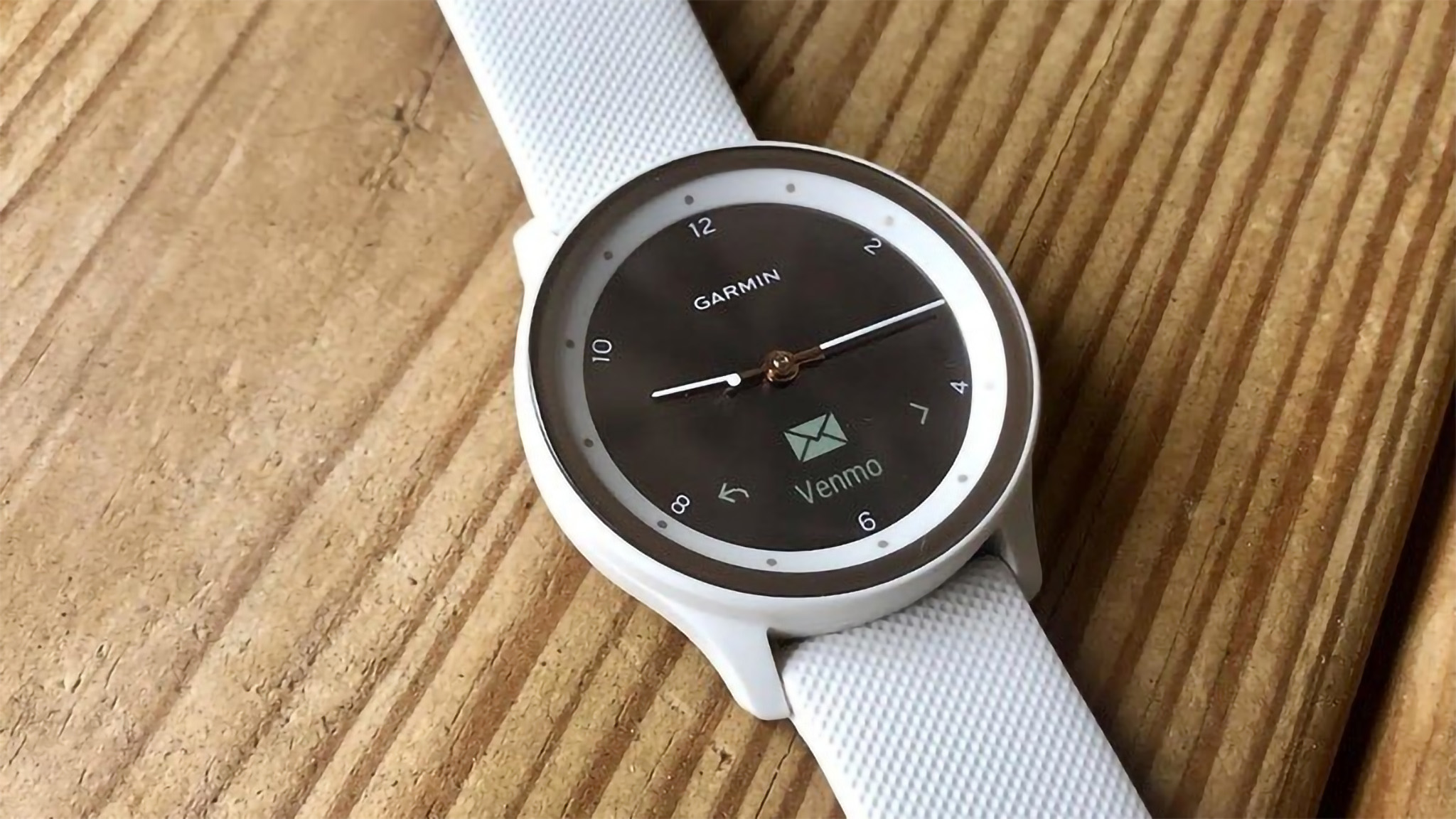
Garmin sells several other vívomove models, including the vívomove Sport and vívomove Style. While I haven't tested either watch, both watches essentially offer the same software, battery life, and overall hybrid look as the vívomove Trend.
The Style, which costs the same as the Gold Trends, uses a hidden color AMOLED display, a domed Gorilla Glass 3 lens, and an aluminum case and bezel. While it's sleeker and more durable, it lacks the new Qi charging option, and various reviews from experts and customers tend to agree that the color OLED display is too dull and hard to read, a problem I didn't have with the monochrome Trend.
As for the Sport, my colleague scored it higher than I rated the Trend, but don't assume that means it's better. It looks more sporty than stylish, its OLED section is confined to a small bottom space, and it misses out on some of the Trend's tools like Garmin Pay and an altimeter. It's cheaper, but this hybrid watch trends too far toward the analog side in my opinion.
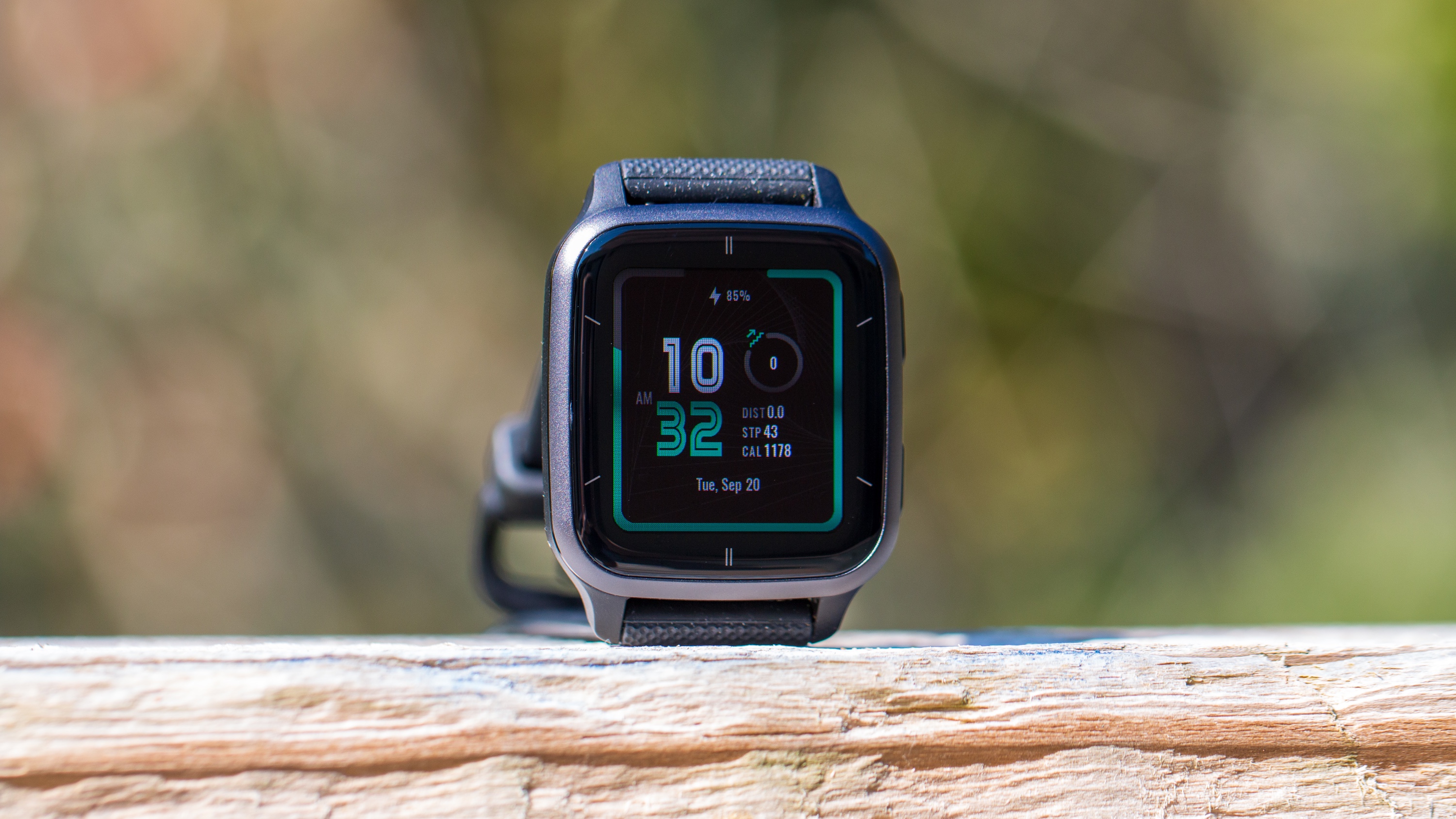
The vívomove Trend's actual best competition is with the Garmin Venu 2 Sq, which costs slightly less or more depending on whether you buy the Music storage version. Its squircle AMOLED design is much more modern and basic than the chic Trend, and both watches share most of the same core Garmin suite of tools. What makes the Venu 2 Sq more compelling is the 11-day battery life, built-in GPS, more sports modes and custom workouts, Garmin Coach, and Connect IQ access for more customizable watch faces.
If you like the analog look but want more of a runner's style, and prefer a much better battery life and durability, check out the Garmin Instinct Crossover hybrid instead!
Otherwise, you can check out other hybrid smartwatches across other brands that'll each offer a classic watch look, but pack much different software. Fossil is the biggest hybrid name, with the Gen 6 Hybrid Wellness Edition as its latest offering. That gives you various health and workout tracking tools, plus access to greater smarts like an Alexa assistant and a 2-week battery thanks to the e-ink display.
Garmin vívomove Trend: Should you buy it?
You should buy this if...
- You want a stylish hybrid watch that makes an impression.
- You're easily distracted or discouraged by mid-workout data and want something simpler to keep you in the zone.
- You want a relatively affordable (for Garmin) device.
You shouldn't buy this if...
- Long battery life is a priority.
- You rely on guided workouts and coaching to succeed.
- You like to work out without your phone on hand.
When I joined a running club in New York, our coaches told us to tape over our watch displays and focus on running at a pace that felt right for our fitness level. Having too many metrics on hand was more distracting than helpful, they claimed. These days, I often rely on metrics to push me to hit running goals I might not reach naturally; but it's also possible that I would enjoy myself more if I didn't have so much data about my current abilities so readily at hand.
That difference in perspective is what'll determine whether the Garmin vívomove Trend or a more sporty option like the Venu 2 Sq is best for you. I personally prefer my Forerunner 955 because I want as much data as possible, but for some, time and heart rate data are really all you need during a workout, and you'd rather have a watch that looks stylish and feels comfortable to wear than some bulky lump on your wrist.
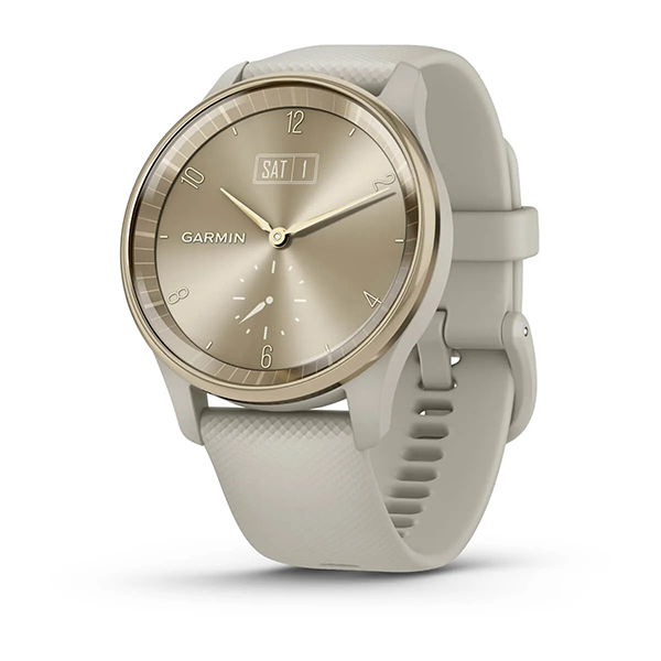
With an attractive and comfortable design, bright hidden display, and all the core Garmin software you need, the vívomove Trend gives athletes the basic health and workout data they need in a much more visually pleasing package.

Michael is Android Central's resident expert on wearables and fitness. Before joining Android Central, he freelanced for years at Techradar, Wareable, Windows Central, and Digital Trends. Channeling his love of running, he established himself as an expert on fitness watches, testing and reviewing models from Garmin, Fitbit, Samsung, Apple, COROS, Polar, Amazfit, Suunto, and more.

