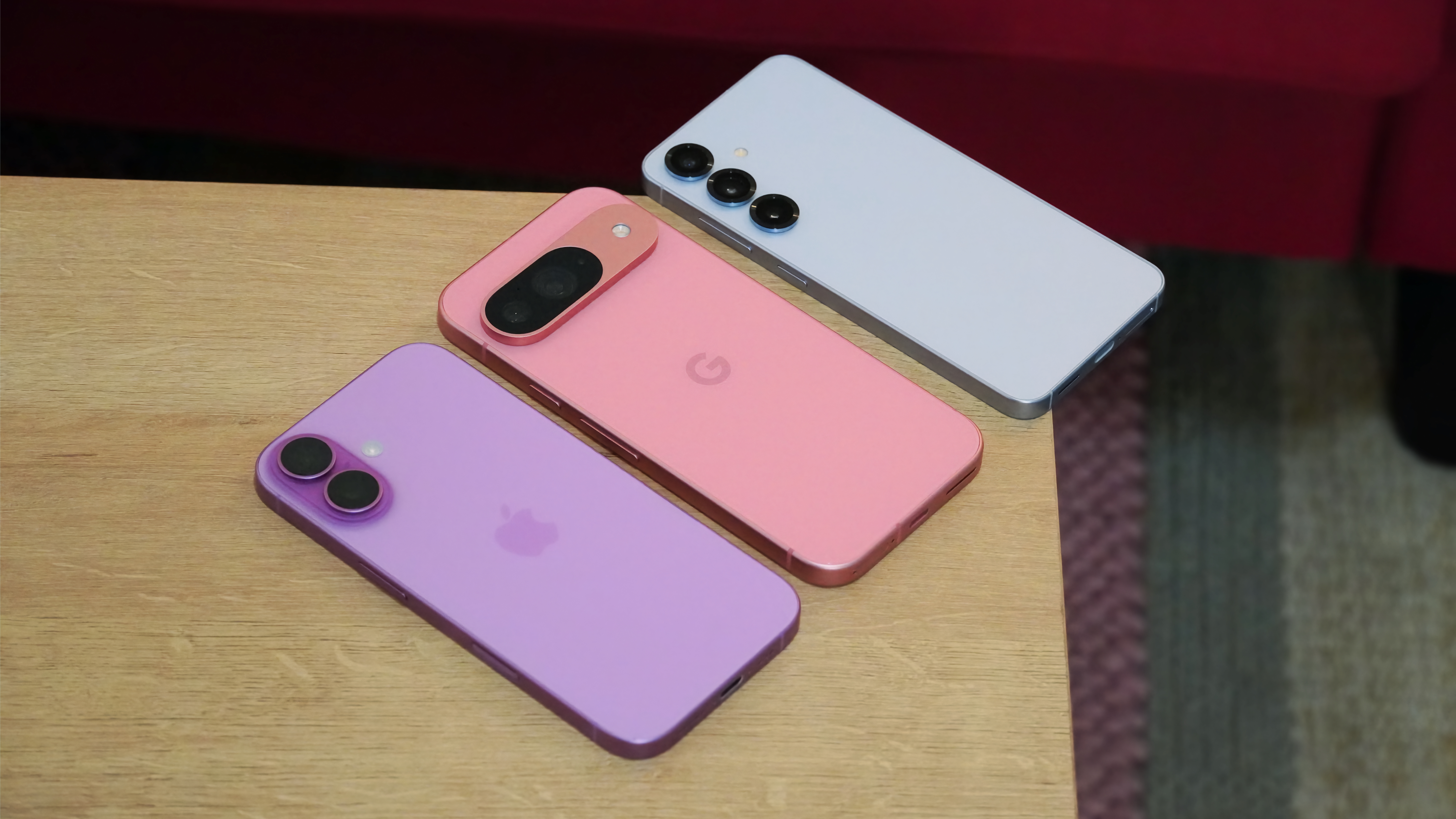
It took Apple to make accessibility features look cool
And I'm not mad about it.
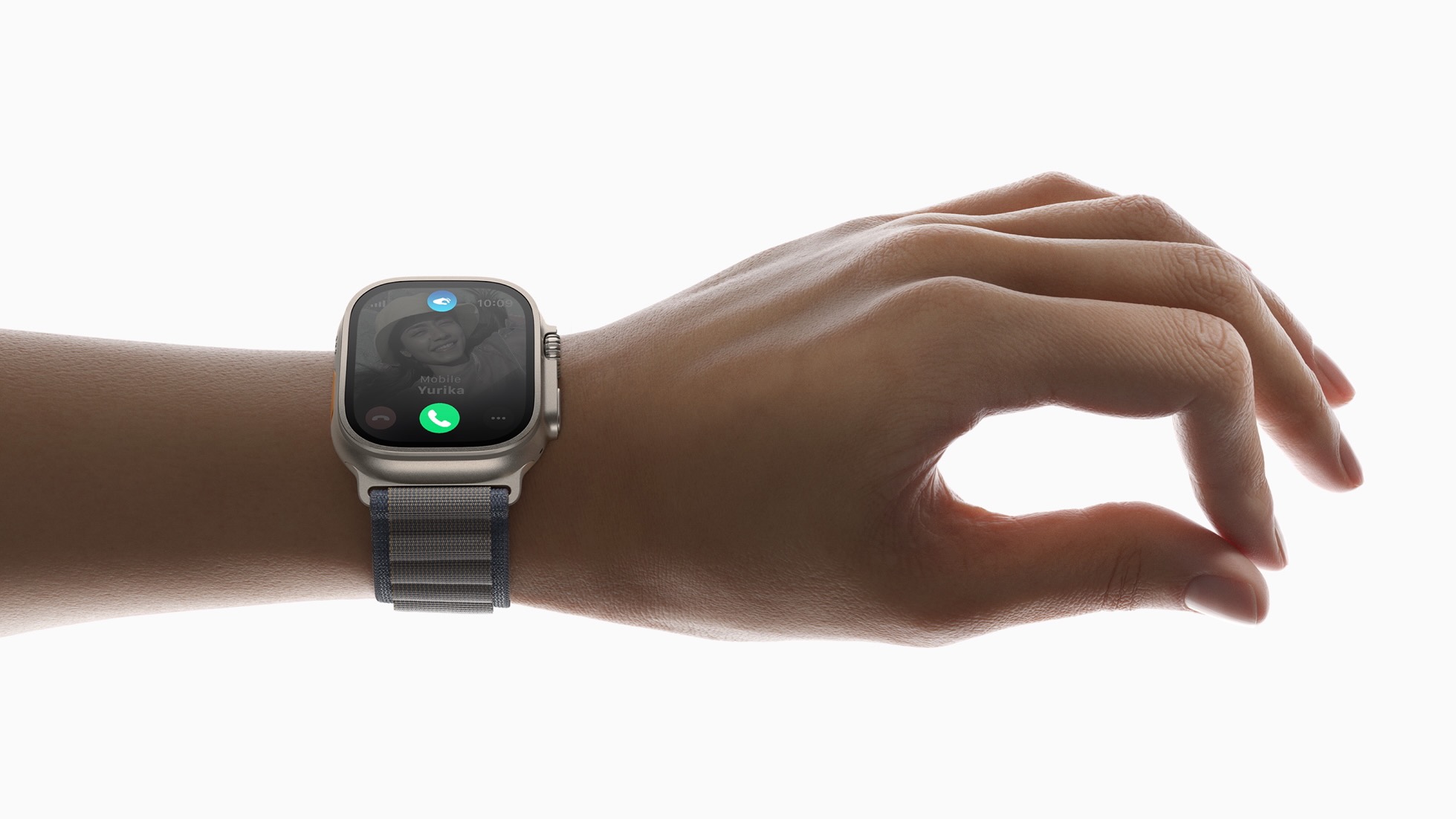
One thing caught my eye during the Apple event — the double tap feature on the Apple Watch. It also caught a lot of other people's eye and made an accessibility feature pretty darn glamorous.
This is not a bad thing. It's also not a new thing, even for the Apple Watch. It's a way to repackage something everyone does so it looks good on a stage and a product page that's enticing you to buy something.
What I like about it is how this draws attention to a relatively simple feature that a lot of people need to have on any smart device, but especially one that you wear. It literally brings it front and center, where it becomes something important for everyone.
Not all disabilities are the same
As I've mentioned several times already, gestures like Double Tap are important accessibility features. A company that wants to make products for (almost) everyone needs to incorporate them, especially on a wearable.
A lot of people have a special need of some sort. Some you can see, and some you can't. I can tell you from experience that people with visual disabilities don't really want any sort of fuss or special treatment, but when it comes to something like a phone or a watch, we want to just be able to use them like everyone else.
Obviously, someone who happens to be missing an arm absolutely needs features like gestures if they are going to wear a smartwatch. The alternative is trying to poke and tap things with your nose or something just as bad. It's simply a must-have feature.
People with a disability you can't see might need the same features. My motor skill issues don't really affect my hands and arms too much, so I usually have no issue using a watch. Other folks do. It's tough to use a tiny touch screen, even for someone with full control sometimes, but imagine trying it when your fingers don't always want to cooperate when it comes to making precise movements and tapping tiny buttons.
Be an expert in 5 minutes
Get the latest news from Android Central, your trusted companion in the world of Android
It doesn't work. I know it doesn't work because I have days where my hands and fingers twitch in ways that make it impossible. Not very often, but often enough to see why gestures on wearables are so important. For someone who has to rely on them every day, they are even more important.
Enabled by default
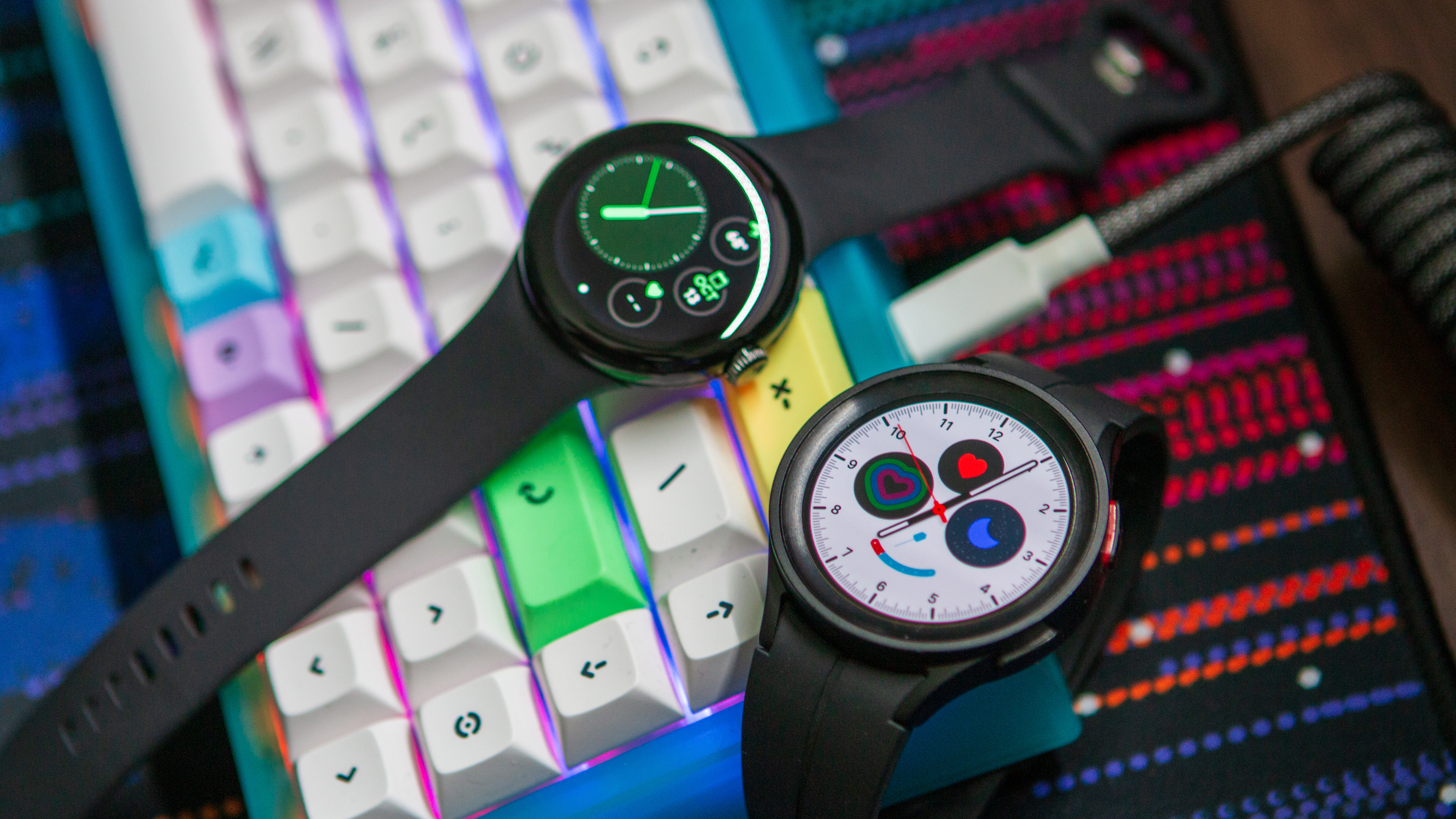
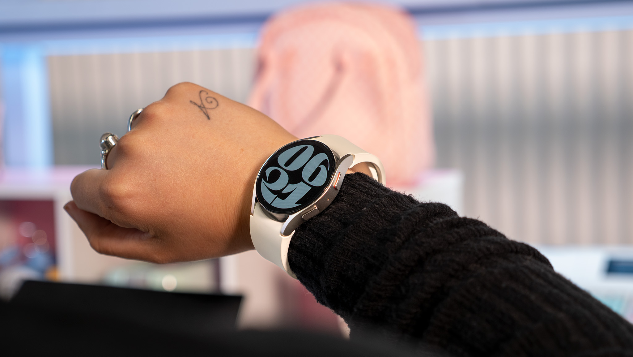
Getting accessibility features out of hidden menus is awesome because it lets everyone know they are there. Did you know a Galaxy Watch has the same Double Tap feature, along with gestures like making a fist or shaking your wrist? Probably not. You probably also didn't know Apple Watches have had the same sort of features for a while, either.
That's because they tend to get buried layers deep behind settings like Interaction and dexterity or Assistive touch, which are buried somewhere deep in the device's Accessibility menu. This is why I really love that Apple showed one off during its iPhone and Apple Watch event.
I'll probably never buy an iPhone or an Apple Watch. Not that there is anything wrong with either, but because I've sunk all my data and my money into Google's clutches and don't feel the need to give the same to another company. I do own a Galaxy Watch, though.
I didn't buy it because it had any accessibility feature I wanted or needed. To be frank, I didn't know it even had gesture controls built in when I first bought one. That's not good news for Samsung.
If I happened to be someone who needed to use gestures to control my smartwatch, I would have never bought one. I'm not about to spend $400 on a thing I might not be able to use. Nobody does that.
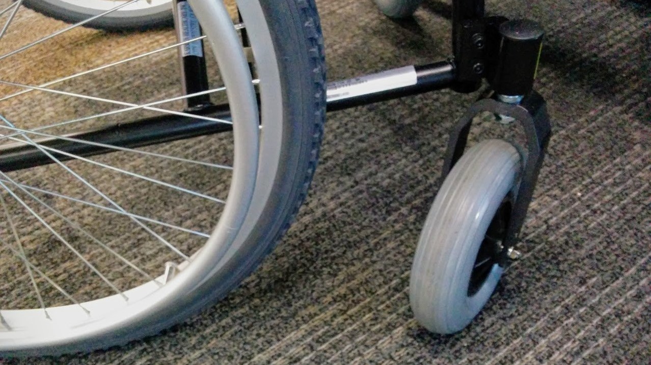
That means I would have missed out on the other features a wearable has to offer, like seeing notifications or health tracking. These are important for many of us, and I'm learning how valuable they are now that Garmin has made a watch that's actually designed for folks in a wheelchair.
While this means a person might miss out on some convenient feature they enjoy and save $400, for a company that makes wearables, it means lost sales and fewer people being thrust into their product ecosystem.
As a regular person (I swear I'm not a pod-person), I don't care about greedy tech companies. It's my job to try and decipher the things they do and how they think, though. I know that lost sales are a small but real issue for tech giants like Apple or Samsung. I also know that lost future revenue is a huge issue, and not getting people to buy into subscriptions or purchase accessories equals lost sales.
For Apple, pushing out a necessary — but very cool looking — gesture as something new and something everyone will love was a simple way to bring more attention to the Apple Watch. Samsung will do the same thing because it worked well for Apple — remember some smart tech guy once said "Great artists steal" and he was right.
More importantly, for you and me, we now know that there are some gestures built right into our watch. It would be kind of fun to see how they work, even if we end up turning them off. For others, it means they know they can actually use a smartwatch, and that's a whole lot cooler.
Smooth operator
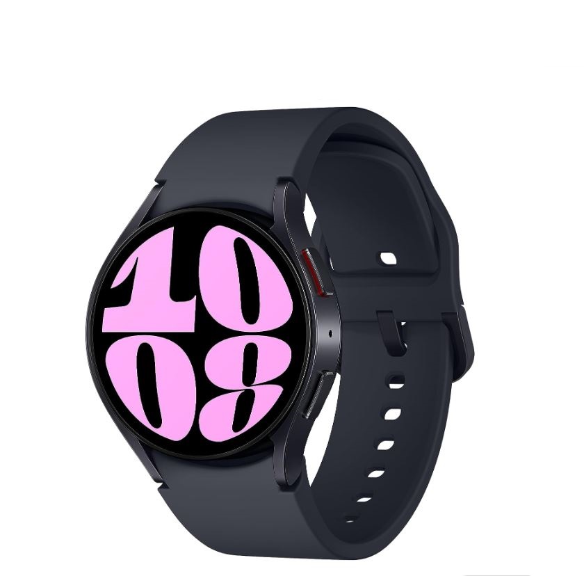
The Galaxy Watch 6 is the first smartwatch to launch with WearOS 4, while offering many of the features that we've come to know and enjoy in recent years.

Jerry is an amateur woodworker and struggling shade tree mechanic. There's nothing he can't take apart, but many things he can't reassemble. You'll find him writing and speaking his loud opinion on Android Central and occasionally on Threads.
