AC
Score
4.5
Wear OS, Google's smartwatch platform has not had an easy life. It's been blasted and bemoaned for a clunky UI, and its watches — powered by long-outdated chipsets — have fallen further and further and further behind the Apple Watch, in performance, in style, and most starkly in fitness and health. WearOS got a name change last year, but what it needed was an overhaul of how it actually worked.
In August, Google announced that overhaul was indeed coming to most current Wear OS watches, and last week, it began to trickle out in a slow public release. This new UI promised a simpler, streamlined experience: the recently redesigned Google Fit would be a single swipe away, as would a quicker, better Google Assistant.
Well, Google has delivered on its promise, and the future for Android wearables is looking brighter than ever.
About this review
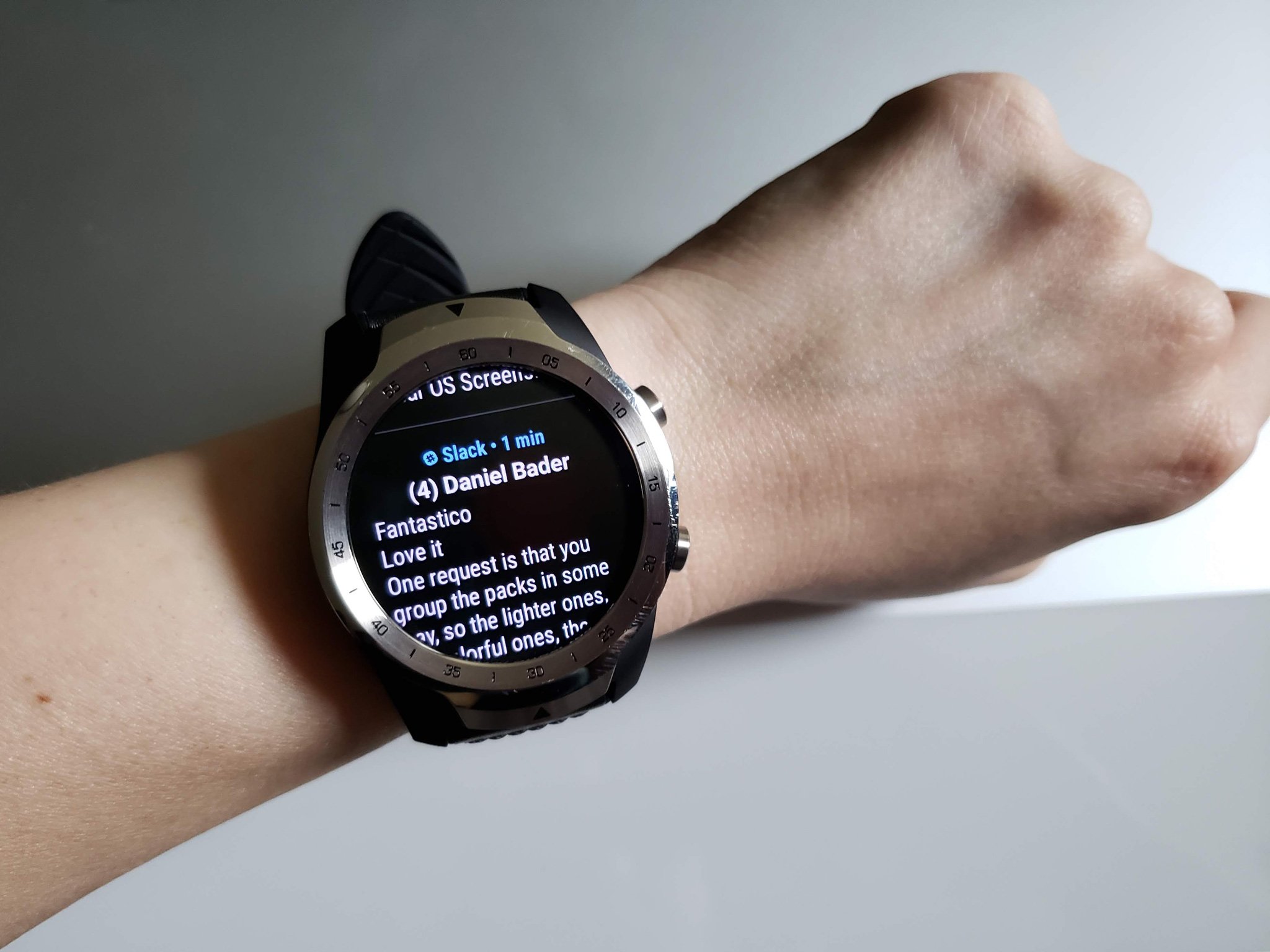
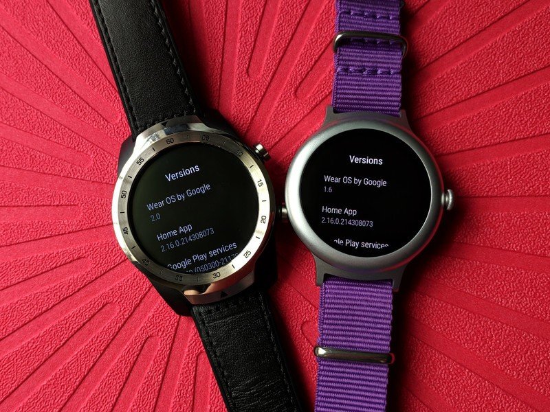
I have tested and tinkered with the new Wear OS 2.0 update for about 36 hours after receiving it Monday morning on my TicWatch Pro, which I have been wearing for over three months. I have been a consistent Wear OS user since the original Moto 360, using an original Huawei Watch, LG Watch Style, TicWatch E, and TicWatch Pro over the last 4 years, using it primarily for notifications, quick replies, media controls, Google Keep grocery lists, and TicHealth's hourly reminders to take a break and some steps.
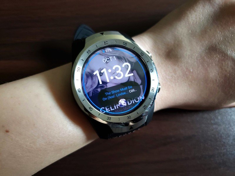
Swipe for sanity
Wear OS 2.0's condensed UI brings efficiency and simplicity
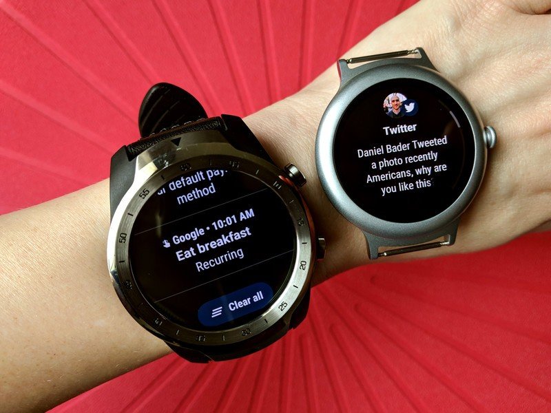
Wear OS's previous incarnations were a bit of a hot mess. If you swiped left or right on the watch face, you'd swap to another watch face. Each notification was its own card and its own slide on a Rolodex of a feed. The app drawer was a dense carousel, and Google Assistant could only be summoned by pressing and holding the power button. Now, the main Wear OS UI has been simplified into a cross of sorts:
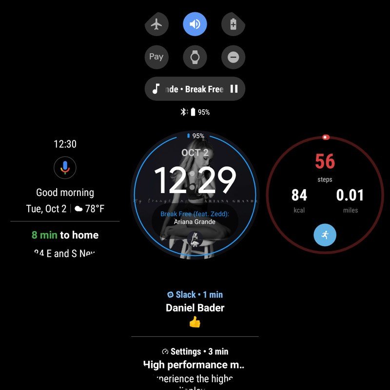
- Center: watch face — To swap or customize the watch face, long-press the face.
- Top: Quick Settings — Toggles: Airplane mode, Battery saver, Theater mode, Do Not Disturb, Play/Pause music. Shortcuts: Settings menu, Google Pay tap-and-pay, Music controls
- Right: Fitness app — For most watches, this will be the redesigned Google Fit, showing your progress on Move Minutes and Heart Points and a shortcut for starting a new Workout.
- Bottom: Condensed notification feed — No more wasted space! Tap a notification to expand them in-line and reveal any actions and quick reply suggestions.
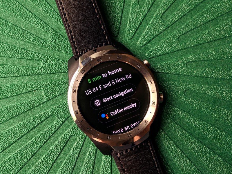
- Left: Google Assistant — Voice prompt icon at the top of a Google Now-like feed, showing search and command suggestions based on location, weather, time, and upcoming trips or deliveries.
It's hard for me to say which one of these improvements is the most useful, because they're all much better than they were — well, except for TicHealth's paltry replacement of Google Fit, but that's an anomaly most users won't have to deal with. It's also one I hope Mobvoi changes quickly. The condensed notification feed is much easier to sift through, and the new Assistant feed makes it much quicker to initiate searches or check on upcoming items like flights and reservations.
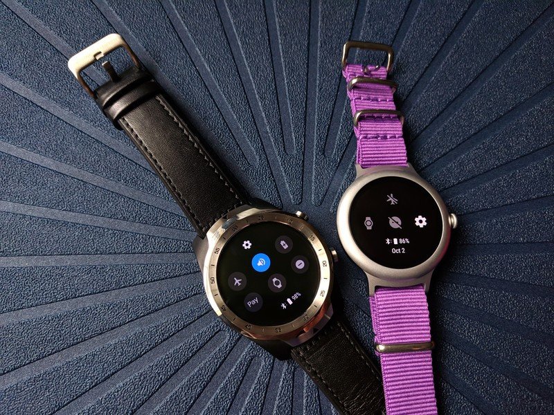
Everything is quicker to get to and easier to use.
Quick Settings has more than doubled in usefulness, and the addition of Google Pay and music is especially gratifying. Now, playback controls won't get buried under a mountain of new messages — or accidentally cleared away with them — and tap-and-pay can be easily summoned without leaving your current app or activity. The sound toggle is a welcome addition, as well, sitting somewhere between Do Not Disturb and Theater mode on the scale of interruption control.
This update also fixed several recent bugs that had been creeping into Wear OS, such as music not appearing in the Now Playing complications on watch faces. Overall, responsiveness and speed seem to have picked up a little, too, even if the biggest benefits of Wear OS 2.0 are going to be reaped by upcoming watches with the new Snapdragon Wear 3100 chip.
Usability, at last
Still shaking off the shackles of Wear OS's sluggish past
While the main UI has seen a definite upgrade here, it doesn't reach to every corner of the system yet. Most apps seem to load a tiny bit faster, but the Google Play Store, in particular, is still a hot mess: slow to load, slow to download apps and updates, and a complete pain to try and look for apps or watch faces on. Google Keep and Nest have been quicker to load, and even data-intensive RadarScope has been zippier when switching radar sites and adjusting the positioning, but Google Play is clunky and just as hard to navigate as ever.
Another area that has seen little improvement on current devices — but should see a boon on new models — is voice prompts. There has been a small bump in the speed of voice recognition, but Wear OS is still slow to start listening, missing the first half-sentence of spoken replies on my TicWatch when trying to reply to Hangouts and Slack messages. The Wear 3100 has specific hardware improvements that Wear OS will be able to easily capitalize on, but for those of us who already have a smartwatch, things are at least a tiny bit better. Thank Google for small mercies, I suppose.
It's still way better than actually trying to type on a smartwatch.
Assistant ascending: Google's AI is finally usable on your wrist
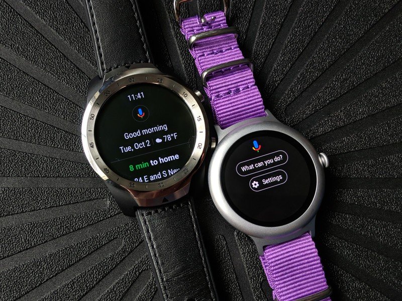
Google Assistant in the previous incarnations of Wear OS was entirely reliant on voice, and even worse, reliant on a long-press reaction to summon up the voice prompt screen. The Google Assistant feed might not be something you use all the time, but being able to swipe over and tap that microphone icon in half a second is worlds better than pressing a hardware button for two seconds and waiting another 2-5 seconds for Assistant to load and start listening.
With the feed and its suggestions, as well as the slightly speedier voice prompts, Google Assistant is finally, feasibly functional on your wrist.
Software's fixed, time for hardware
A new day for Wear OS watches, old and especially new
Wear OS 2.0 might still have some small, slight imperfections to work out, but by and large, this is the Wear OS that we've been waiting years for. No more swiping through card after card of individual notifications, no more accidentally switching watch faces, no more waiting eons for Google Assistant. This update will breathe new life into almost all of the Wear OS watches on the market today.
4.5 out of 5
For those who have long-since given up hope on the platform, they might actually change their tune once we see how a Wear OS watch performs with this snappier new UI and Qualcomm's new Snapdragon Wear 3100 chip sipping battery and sliding through a busy week on a single charge.
Ara Wagoner was a staff writer at Android Central. She themes phones and pokes YouTube Music with a stick. When she's not writing about cases, Chromebooks, or customization, she's wandering around Walt Disney World. If you see her without headphones, RUN. You can follow her on Twitter at @arawagco.
