Vizio tablet review
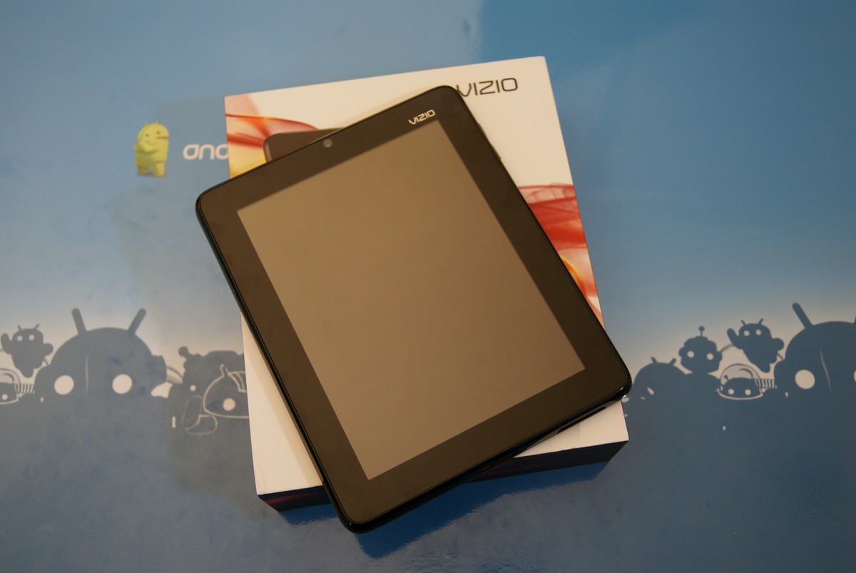
It seems like every week we see a new Android device from a company we either haven't heard of, or one that's not known for portable computers. More often than not, these devices end up at a discount store or on a television shopping channel at 3 a.m. on a Tuesday. The Vizio tablet has a couple advantages that most of those devices don't -- a little bit of experience with bright, colorful LCD screens and a distribution channel that's pretty darn good. They've also hit a very interesting price point, if you shop around you can pick up a Vizio tablet for under $275. That only leaves one big question -- has Vizio succeeded where others have tried and failed, and delivered something that's actually worth the $300? Hit the break and see what I think, and hopefully it can help you decide.
A hands-on look
Youtube link for mobile viewing
So, yeah, this one is a bit different from what we're used to, especially in the software department. Before you call it DOA, you'll want to keep reading. Some of what's different is done well, and some not so much. It's real saving grace is the construction and design -- the Vizio tablet is one well-built piece of gear.
Hardware
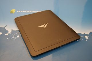
The Vizio tablet is eight inches of well-built electronics. It's a case where the total exceeds the sum of the parts, as the specs don't have anything that stands out above the crowd. What does stand out is the very nice look and feel of the Vizio tablet. It's made from a mix of matte finish and glossy plastic, and you won't think you have something "cheap" in your hands. The power button and the volume rocker are solid, none of that wiggle you see from other inexpensive gear, and overall I think you'll be impressed by the construction.
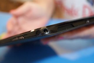
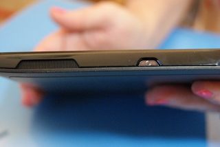
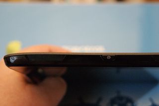
On the top of the Vizio tablet (they really have to find a more friendly name for this one) you'll find two stereo speakers, a power button between them, and a 3.5mm headset jack perched precariously on the corner. The speakers sound very nice, with decent volume. The power button does just what you want a power button to do -- it just sits there without protruding and getting bumped. You won't be accidentally hitting it. The headset jack is in an odd place, but it works. I was certain that I would find something I didn't like about having it right on the curve of the corner, but other than being different, it was just fine. I'm still not sure why that design choice was made, but I'll stop questioning it now.
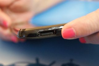
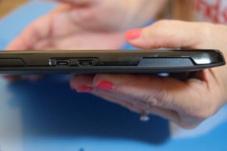
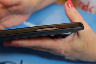
The volume rocker switch sits all alone on the side of the tablet, and like the power switch isn't sticking out waiting to bump everything you don;t want it to bump. On an 8-inch device, placement isn't as big an issue as it is on a device designed for one-handed use, so it works just fine. On the bottom, you have a USB connection and an HDMI connection, both of which work just fine with no wiggly plugs to be found. There's a surprise down there, too -- a third stereo speaker. This is pure genius, because in both portrait and landscape you have sound coming from both sides of the tablet instead of coming from the top and bottom. I want to see other manufacturers pick up on this idea, little things like this make a big difference that you don't appreciate until you try it. Also included, tucked under a protective plastic flap is a microSD card slot if you need some extra storage, and with only 2.4GB of storage available internally after all is said and done, you will.
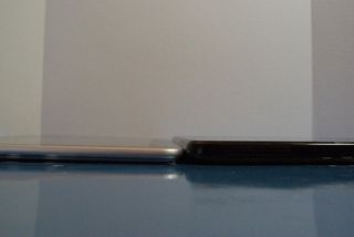
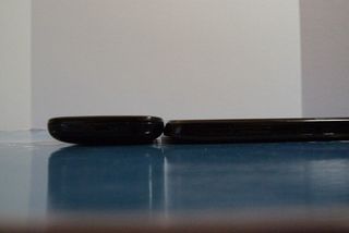
The tablet isn't the thinnest out there, but it's not unwieldy either. It's about a half-inch thick, putting it somewhere between the Samsung Galaxy Tab 10.1 and the average smartphone (in this case the Nexus S). Even if it were a full 10-inch tablet, it would probably be a little heavy, but at 8 inches, it's just fine and you'll have no problem using it to web surf, watch and listen to your media, or even read a book.
Be an expert in 5 minutes
Get the latest news from Android Central, your trusted companion in the world of Android
Specifications
- 8-inch 1024×768 pixel resolution display
- 1GHz Marvell Armada 600 processor
- Android 2.3
- 512MB of RAM
- 4GB of storage
- front facing VGA camera
- 802.11 b/g/n WiFi, Bluetooth, GPS
- microSD slot, micro-USB port
- HDCP compliant micro-HDMI port
- three stereo speakers
- accelerometer and proximity sensor
- 6.6×8.1×0.48 inches
- weighs 1.2lbs
- up to 11 hours battery life
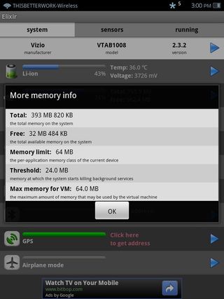
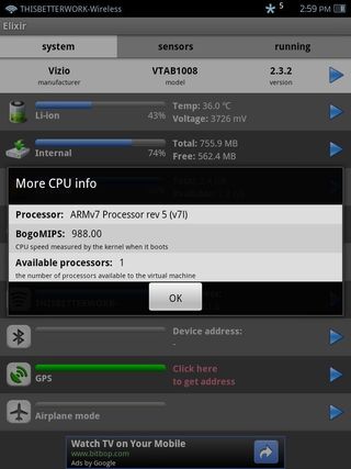
The Vizio (that's what I'm calling it -- if the OEM won't name it, I will) is not the snappiest Android device you'll ever use. It's not horrible, and it doesn't "stutter", it just plods along at it's own pace. It's almost as if the animations were designed to keep things at an easy, relaxing clip . We'll take more about that when we get into the software a bit later.
The screen is better than expected from a tablet in this price point. It's not an IPS display, or any other fancy series of letters, but it's a bright, clear display with just barely acceptable viewing angles. If you and your significant other want to sit together and watch a video, you'll have to sit close. Speaking of video, Netflix is not in the Market for the Vizio. HBO Go is in the Market, but doesn't work. The new Market doesn't give you the video player, but does have the Movies section. In short, you'll have to copy your own media to the device, or rely on web streaming via things like Youtube or Amazon video. For television content, Hulu plus has been updated and works well.
Battery life isn't bad -- you'll have to charge every day or so, depending on how much you use it. I'm not buying the 11 hours of use time, but it's plenty to watch a movie or listen to a bunch of music.
Software
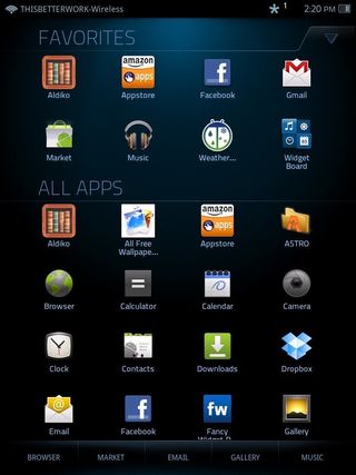
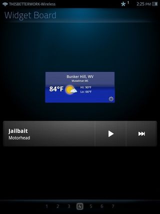
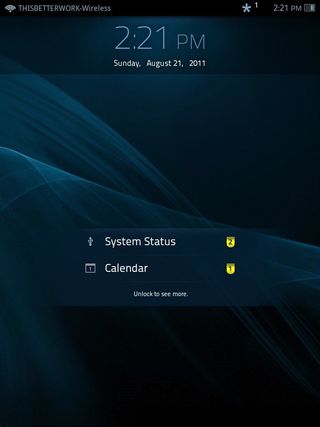
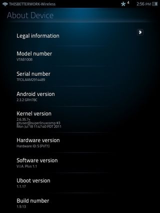
The Vizio tablet runs Android 2.3.2, with it's own custom skin. Underneath, things are mostly the same, as you'll see when you go through the settings, but on the surface it's very different from what we're used to seeing in Android. The "Home" screen, what you'll see if you press the home button, is the grid of installed applications. Vizio has included an app called "widget board" that has seven different blank screens for you to fill with widgets. It works well enough, but it feels clunky compared to what we're used to with Android. If Vizio's goal was to set themselves apart from the crowd, they succeeded, but I just don't think changing the entire experience of Android was the way to go. There's a bit of customization allowed in the icon homescreen, and things we're used to like the notifications panel is still there. It's just an odd, less intuitive way to get to it all.
The Vizio skin feels a bit off as well. It feels artificially slowed down, and the whole UI is full of animations and transitions. This is great the first couple of days you use it, but you'll soon wish you could shut them off and just let the launcher do what it does best -- launch other stuff. You'll see lag every now and then, depending on just how much you're trying to do, but there's the slowness on top of it all. Think how slow the Honeycomb home acts compared to Gingerbread, then multiply it a little. It's something you get used to, but I really wish we didn't have to.
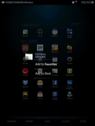
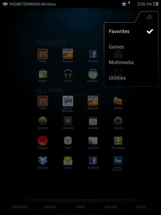
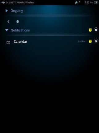
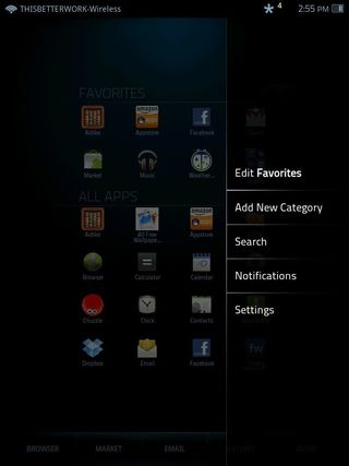
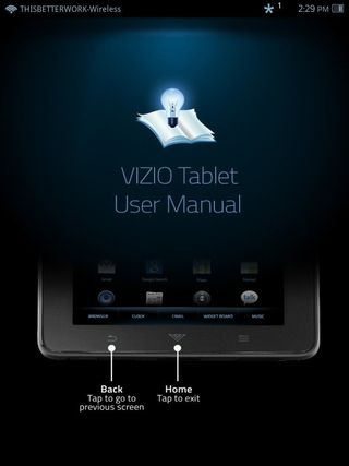
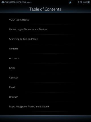
Vizio has included a couple of really nice additions to the OS, namely the IR remote app and an very nicely done user manual. The remote app isn't just for Vizio products (although one would imagine it works best with them) it also worked great on a couple newer Samsung televisions, and an old generic 17-inch LCD television ordered several years ago off eBay. All the basic functions were there, and on the newer televisions after entering my model number I even got most of the special function buttons. This opens a whole 'nother usage case for the Vizio tablet -- a smart remote. My wife remarked that you could use the same device to switch channels as you could to view your cable providers online channel guide, and with things like the IMDB app you even have a reference source if you aren't sure what a movie is about. She's a smart cookie -- I'm glad she lets me hang around.
The user guide shines as well. It's fairly detailed, nicely laid out, and will answer most every question you could have about using the tablet. The best thing is you'll never have to hunt for it, it's right there on your device. More manufacturers should follow suit.
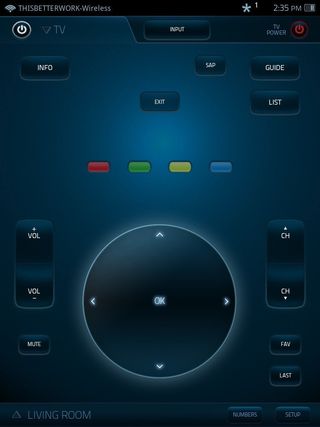
Also included, as should be on any Android tablet you're considering, is the Android Market. In fact, all the Google apps, shy of the ones that need a cellular connection like Google Voice, work really well on the Vizio. Because you're not using Honeycomb, you'll be using the phone versions, but most apps scale well to the odd (for Android anyway) 1024x768 resolution.
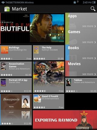
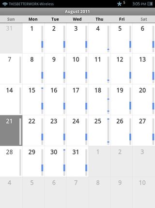


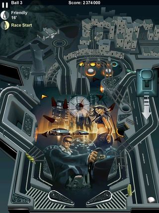
Of course, some of the more finiky apps (ahem, Popcap) don't quite scale as they should, but you'll find plenty of games and utilities that work fine in the Market. The nice screen and smaller size made for an exceptional eReader, provided you stay inside and away from any glare. The web browser also works well (it's the standard Gingerbread browser) and the Vizio has Flash support out of the box.


The wrap-up
I'll cut right to the chase -- this thing is less than $300. If you are expecting something on the level of the Xoom or the Tab 10.1, you'll be disappointed. On the other hand, tablets in this price range aren't exactly spectacular, and the Vizio stands head and shoulders above most. Go into the purchase with the right expectations, and I think you'll be pleased. It's very well made, and while the software is a bit odd feeling, on the whole it preforms well. For the kids, or the less technically inclined parents in your life, this would be a great choice, and at the right price.

Jerry is an amateur woodworker and struggling shade tree mechanic. There's nothing he can't take apart, but many things he can't reassemble. You'll find him writing and speaking his loud opinion on Android Central and occasionally on Threads.

