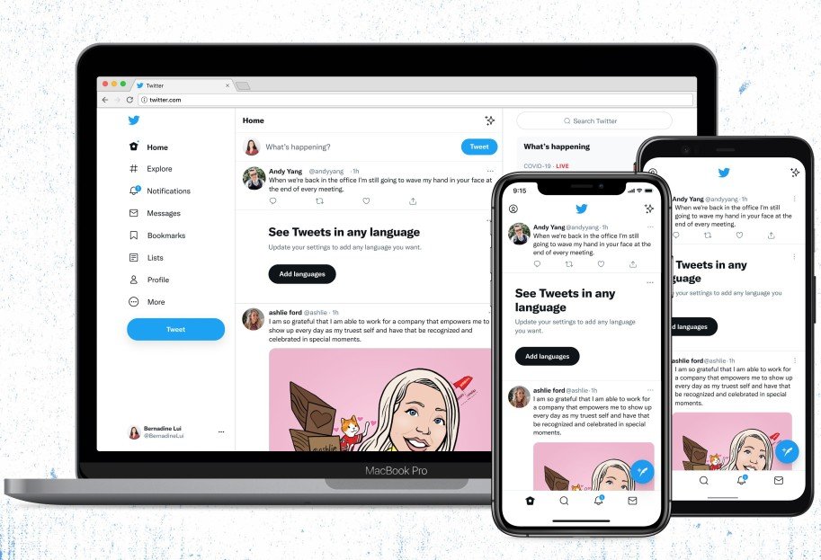
Twitter gets a fresh new look on Android, iOS, and the web

What you need to know
- Twitter has rolled out new design changes to make its website and mobile apps more accessible.
- The most significant change is the switch to Twitter's new "Chirp" font.
- Twitter has also updated its colors to be high contrast and less blue.
Back in January, Twitter revealed "Chirp," its first-ever proprietary font. Eight months later, the company has finally rolled out the new font. Aside from the new font, Twitter is also rolling out a few other design changes that it says will make its website and mobile apps "more accessible" and less cluttered than before.
Notice anything different?
Today, we released a few changes to the way Twitter looks on the web and on your phone. While it might feel weird at first, these updates make us more accessible, unique, and focused on you and what you’re talking about.
Let’s take a deeper look. 🧵 pic.twitter.com/vCUomsgCNANotice anything different?
Today, we released a few changes to the way Twitter looks on the web and on your phone. While it might feel weird at first, these updates make us more accessible, unique, and focused on you and what you’re talking about.
Let’s take a deeper look. 🧵 pic.twitter.com/vCUomsgCNA— Twitter Design (@TwitterDesign) August 11, 2021August 11, 2021
"Chirp strikes the balance between messy and sharp to amplify the fun and irreverence of a Tweet, but can also carry the weight of seriousness when needed," Twitter said when it first revealed the font. With the switch to Chirp, all Western-language text now aligns left on Twitter.
I want to give a bit more depth to Chirp, our new typeface.
Type, in 280 character doses, is the foundation of Twitter. In the history of the company we’ve either relied on someone else’s typeface, from SF Pro and Roboto, to Helvetica Neue in our brand. pic.twitter.com/OrvlYsxF9gI want to give a bit more depth to Chirp, our new typeface.
Type, in 280 character doses, is the foundation of Twitter. In the history of the company we’ve either relied on someone else’s typeface, from SF Pro and Roboto, to Helvetica Neue in our brand. pic.twitter.com/OrvlYsxF9g— Derrit DeRouen (@DerritDeRouen) January 27, 2021January 27, 2021
Twitter has updated its color palette to be high contrast and a lot less blue. This change, according to the company, will help "draw attention to the photos and videos you create and share." It also plans to roll out new colors soon to give users a fresh palette. If you have a Twitter Blue subscription, you can already change the colors of the mobile app and its icon on both iOS devices and the best Android phones.
Twitter's new buttons are high contrast as well to make the "most important actions you can take stand out." The follow buttons can now help you see what actions you've taken at a glance. To reduce visual clutter, Twitter has reduced the number of gray backgrounds and unnecessary divider lines. Text is also now easier to read, thanks to increased space. Twitter says this is only the start of more visual updates as it becomes "more centered on you and what you have to say."
The changes appear to have widely rolled out already, but some of you may have to wait a little longer to see the new font and updated color palette.
Be an expert in 5 minutes
Get the latest news from Android Central, your trusted companion in the world of Android

