Twitter Android app is being updated with a bottom navigation bar

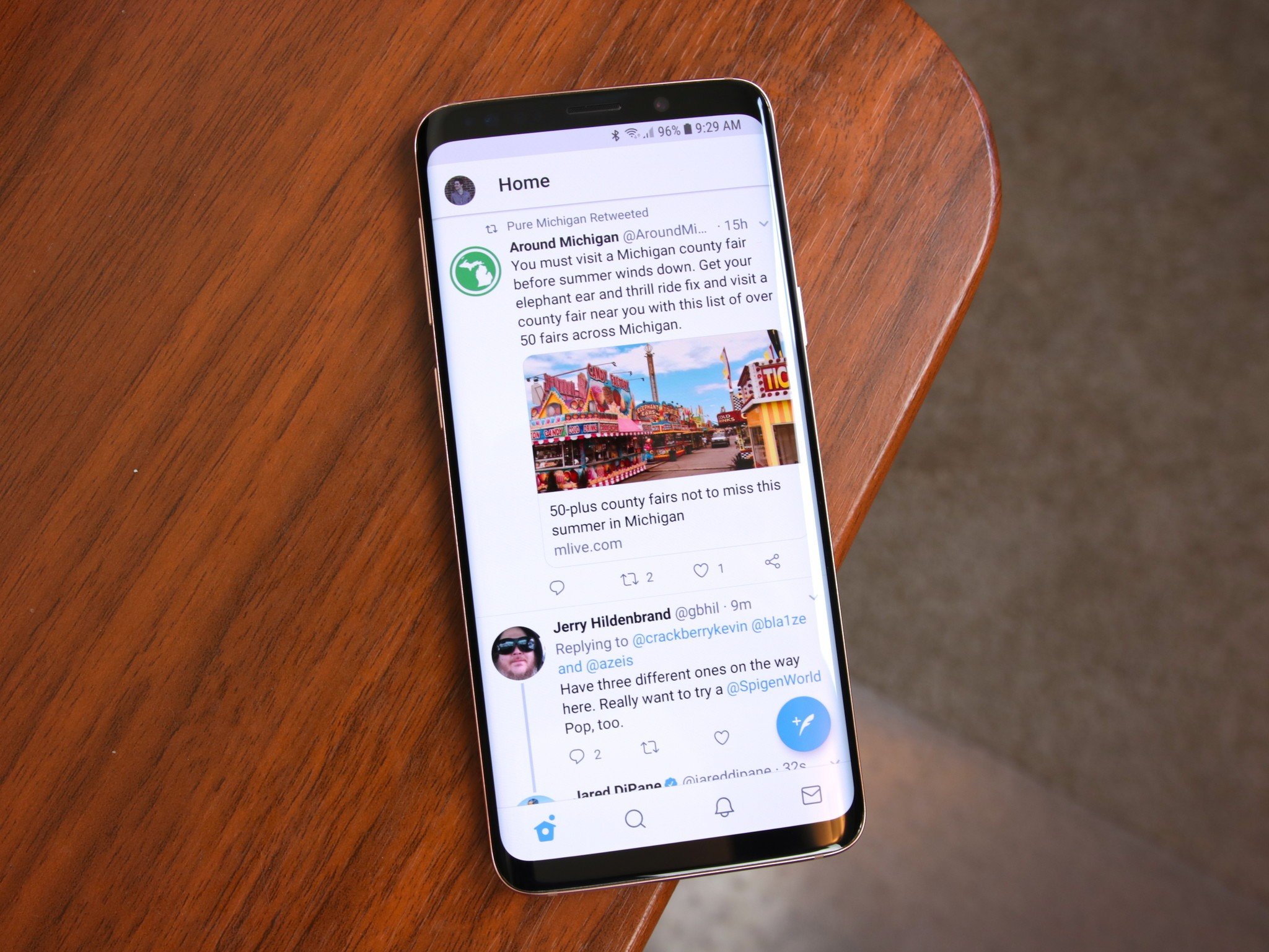
On Thursday evening this week, the Twitter Support account announced a new update for its Android app. There are a few things to take note of, but the biggest change reworks the app's navigation we've had since June 2016.
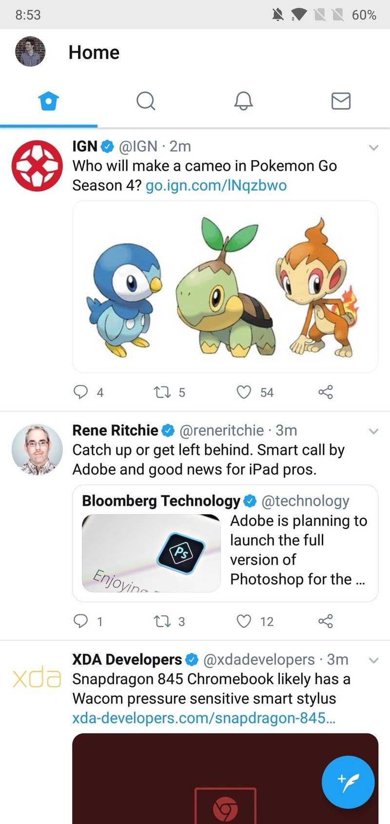
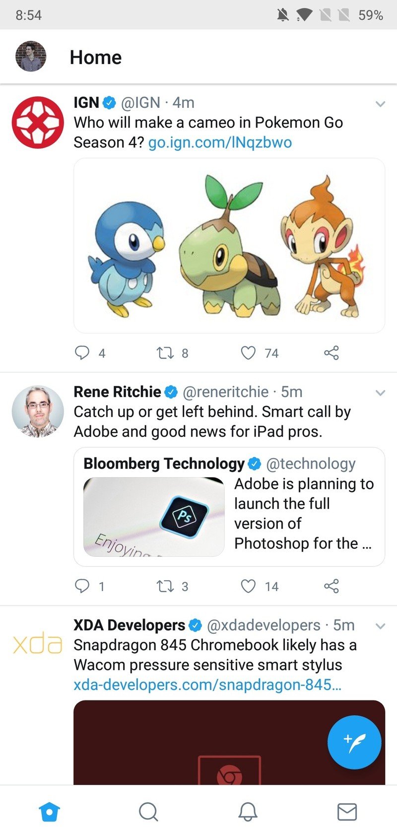
Rather than showing icons at the top for Home, Moments, Notifications, and Direct Messages, these are now moved to the very bottom of your screen. This repositioning does make it much easier to tap on the icons for moving between these four pages, but unfortunately, Twitter's also removed the gesture that allows you to swipe back and forth through them.


Old (left) vs. new (right).
Part of the reason for this likely lies with the new Notifications page. The update makes it easier to switch between all of your notifications and just your mentions, and one of the ways to go back and forth is with a swipe.
The removal of swiping between Twitter's main pages is a bit annoying, but I greatly prefer both the look and functionality of the bottom nav bar compared to their previous positioning.


Old (left) vs. new (right).
The new look is rolling out to all users now and comes as part of a server-side switch (meaning you don't have to update the app from the Play Store as it'll just happen automatically).
Be an expert in 5 minutes
Get the latest news from Android Central, your trusted companion in the world of Android
Joe Maring was a Senior Editor for Android Central between 2017 and 2021. You can reach him on Twitter at @JoeMaring1.

