Tweet Lanes review - a new twist on twitter, but still a work in progress

Tweet Lanes launched on Android earlier this month and somehow managed to muscle its way into a plenty-crowded category of Twitter clients. There are a few things that Tweet Lanes does differently that immediately sets it apart from the norm.
The main thing is that all outgoing tweets are pumped through the same context-sensitive text box. no matter if you're starting a new tweet from scratch, replying, or retweeting. This is done by selecting which tweet (or tweets) you want want to interact with, and the top bar changes and bottom tweet box adjust accordingly. Secondly, Tweet Lanes can use a device's volume up and volume down keys to navigate through feeds.
Functionality

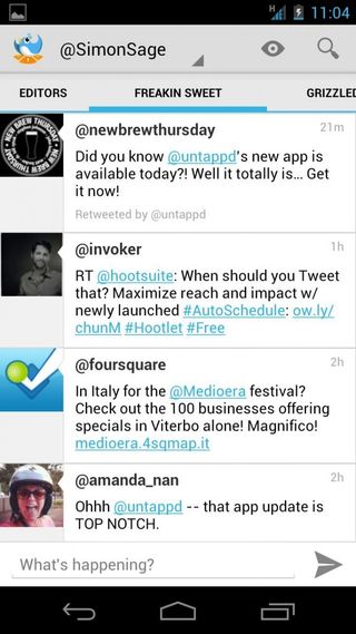
Tweets are organized in tabs, starting with the standard ones (my tweets, @ replies, timeline, favorites) then moving into lists. Tapping a user link goes to their profile page, from where you can start following and flip through their tweets, mentions, and favorites. Advanced functions like filtering retweets and replies from lanes, monitoring multiple accounts, reporting spam, blocking users, and attaching location and images to tweets are included and working. Tweets that link to videos or images will also show in-line thumbnails, which is always welcome.

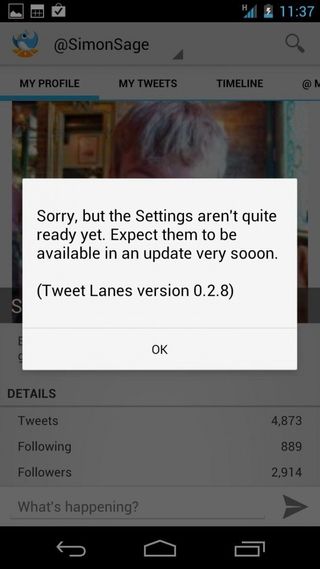
Unfortunately, many features aren't yet implemented, and apology pop-ups result when users try to activate placeholders. Some of these disabled features include the creation of new lanes, managing friendships, and even the settings menu. There doesn't seem to be any section for direct messages, nor are there system notifications for mentions, which may be a dealbreaker for many.
In terms of performance, I wasn't entirely thrilled with how long it took to load threaded replies to selected tweets, but otherwise, Tweet Lanes ran very smoothly on my Galaxy Nexus with stock 4.0.1
Style

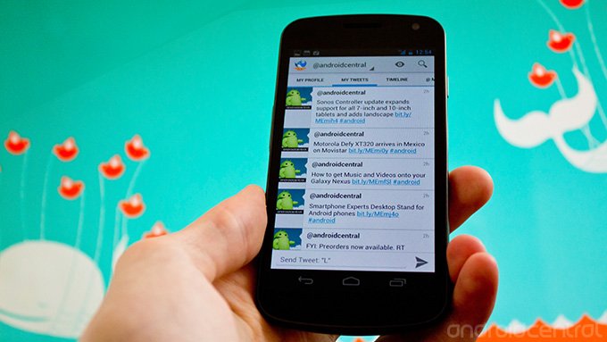
The overall user interface of Tweet Lanes falls very nicely in line with the ICS style: underlines indicate active lanes, while the top bar hosts familiar icons such as search, back button in the top-left, and the app menu in the top-right. The dev claims to "adhere strictly to the Android Design guidelines" and I believe it. No doubt Tweet Lanes will grow into Jelly Bean in due time. The neutral grey color scheme with blue highlights is very readable and not overly flashy.
One particularly cool feature is VolScroll, which allows users to scroll up and down through feeds with volume keys. In a lot of ways, this feels more natural than swipe-scrolling, even if the animation isn't as fluid. If there were some accelerometer controls for switching lanes, then you'd be able to full navigate Twitter one-handed. While the smart context bar is neat and all, it feels like Tweet Lanes is relying on it a little too heavily - for some tasks, long presses, double-taps, and swipes work perfectly well.
Get the top Black Friday deals right in your inbox: Sign up now!
Receive the hottest deals and product recommendations alongside the biggest tech news from the Android Central team straight to your inbox!
The good
- Polished UI fits into ICS perfectly
- Context-sensitive tweet box is a unique twist
- VolScroll is neat
The bad
- Many key features still a missing
- Over-reliance on contextual tweet box
Conclusion
While Tweet Lanes is promising, it still needs some time in the oven before it's fully-baked. That said, it's commendable on the developer's part to release what is basically a beta app, but the app isn't clearly labeled as such in Google Play, which may feel like a bait-and-switch for those hoping for something full-bodied. A devblog would go a long way to roping potential users into the beta culture and providing feedback to upcoming features. Hopefully this early look will work out as a mechanism for drumming up excitement prior to a full launch. Carbon is coming to Android soon, and assuming it's as awesome as it was on webOS (if not moreso), Tweet Lanes will have some catching up to do.
The plan for Tweet Lanes in the long haul is to add premium features which will be unlocked through in-app purchases, but early adopters that get in on Tweet Lanes now will get all of those features for free later on. For that reason alone, it's worth checking out the app, especially since the app's currently free. I would have to see the list of premium features later on to know if they're worth it, but if nothing else, Tweet Lanes will make a name for itself as a Twitter app that melts seamlessly into the native Android UI.
Download: Tweet Lanes


