Tweedle for Twitter: Flying under the radar
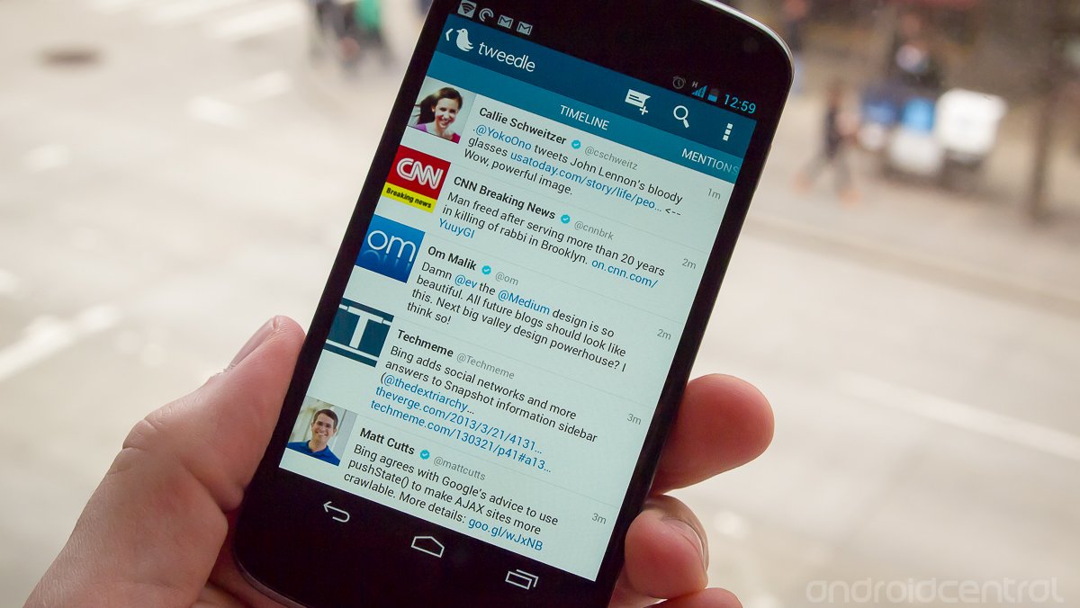
There's no shortage of great Twitter clients out there -- we've highlighted dozens on the site -- but that doesn't mean we're going to stop showing off the best ones we find, such as Tweedle for Twitter. This client has been around for some time now, but may not be at the top of user's minds when asked to name the Top 5 clients available on Android. That doesn't mean it's a bad app though -- far from it, it recently pushed over the 500,000 user install mark on Google Play.
Tweedle for Twitter offers a smooth and modern interface with the opportunity to granularly control notifications, syncing and the entire color scheme of the app. Hang around after the break to learn a little more about Tweedle.

Tweedle has a very simple interface that checks all of the boxes for most users. The main timeline view scrolls smoothly, has pull to refresh and displays tweets very similarly to the Twitter webpage. Pictures and videos don't show in-line by default, but can be turned on in the settings. Swiping left reveals mentions and direct messages in a normal Android "holo" fashion. Swiping in from the left edge revels an account switcher for users with multiple accounts. The top bar holds compose, search and settings keys.
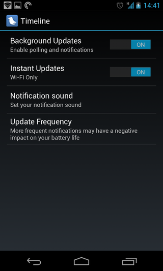
There isn't a countless number of settings, but the places where they have chosen to implement granular settings control are the important ones. The first is notification preferences. You can set separate update and notification rules for each of the timeline, mentions and direct message settings for each account. For example you can set your timeline to not update in the background, but have your direct messages and mentions update every minute so you're notified quickly. You can manually set the refresh setting once you have turned on notifications, anywhere from 1 minute to 4 hours. If there's one complaint to be had about this choice is that we'd like to separate notifications and background updates -- that is, update the timeline in the background but don't notify me -- but because you can choose to manually pull-to-refresh, it's a tough argument to make.
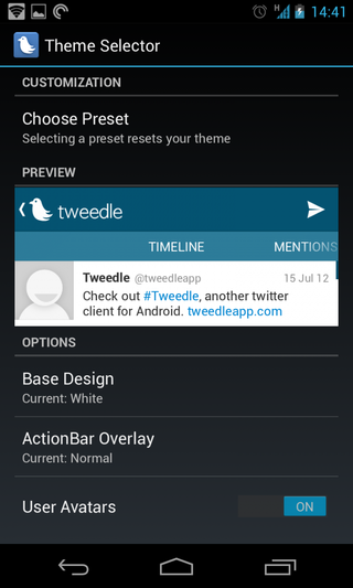
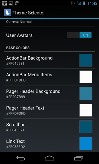
The "theme selector" menu is the second portion of the settings that has huge potential for customization. While there are five great included themes -- default, market, light dark, eco -- there's also a complete set of options to make your own theme. You can start with a "Base Design" of the five presets, then choose between three action bar textures, and then select the entire color palette of the app from that point. Changing the background, menus, headers, scroll bars and link text to whatever color you want. More advanced users can get the exact color they want by entering color codes, or you can guesstimate using a color selector.
Tweedle is what I would call a properly designed logical evolution of Twitter's own first-party client. It is low on frills, with a simple white and blue color scheme (if left as default) and a basic set of functions. Put another way, this is more or less what Twitter should make its own client look like as a prime example of Twitter on Android. If you haven't yet given Tweedle a look, you may come away surprised when you try it out.
Be an expert in 5 minutes
Get the latest news from Android Central, your trusted companion in the world of Android
Andrew was an Executive Editor, U.S. at Android Central between 2012 and 2020.

