TuneIn Radio Pro updated with holo design
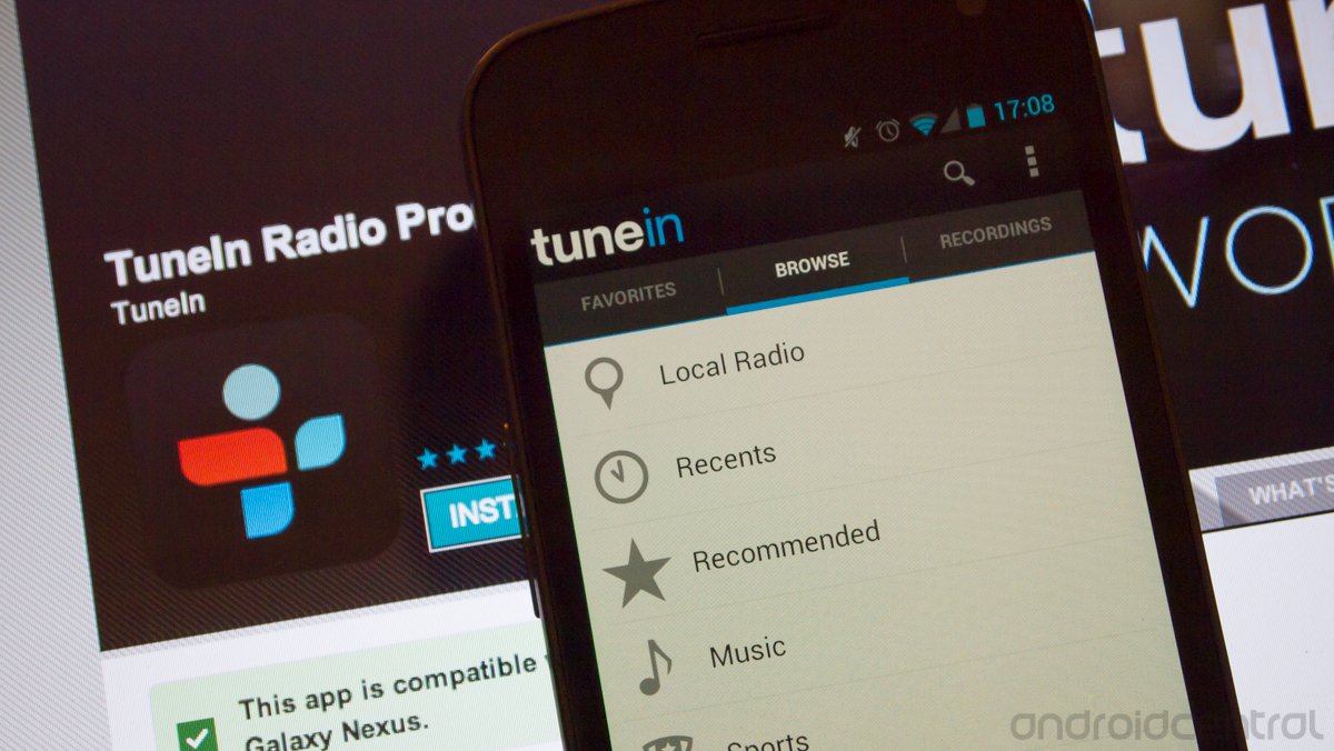
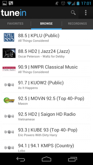
One of the most popular radio apps on Android, TuneIn Radio Pro, has been updated with a proper holo design. Since the release of Ice Cream Sandwich, Google has been engaged in getting developers on board with a design language that helps unify the user experience across apps. This "holo" design has been implemented in many of Google's own apps, and now many headline developers have implemented it as well.
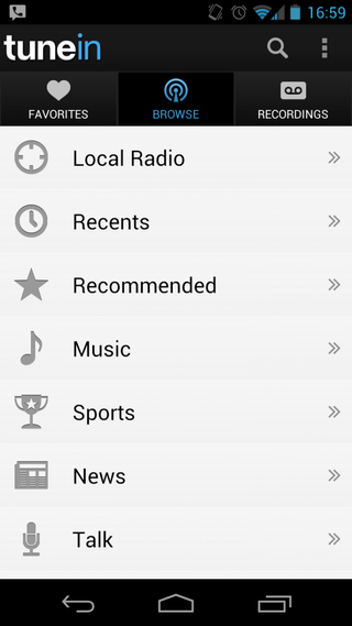
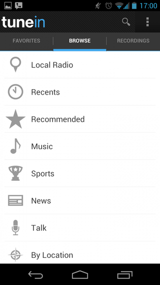
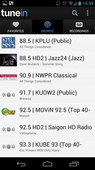
Bits of polish show in a swipe across stations to choose available streaming qualities, pull to refresh and a proper blue / white / gray design. Beyond just looking better, the design change in TuneIn Radio Pro offers better usability. Swiping between UI panes feels more natural, and gives users access to "related", "twitter", "favorites", "options" and "recent" right from the main "now playing" screen.
We've got a few side-by-side comparison screenshots of the old (left) and new (right) design after the break. If you like what you see, you can buy the Pro version of the app at the Google Play Store link above for 99 cents.


Get the top Black Friday deals right in your inbox: Sign up now!
Receive the hottest deals and product recommendations alongside the biggest tech news from the Android Central team straight to your inbox!
Andrew was an Executive Editor, U.S. at Android Central between 2012 and 2020.
