Toshiba Thrive review
Oh, Toshiba Thrive, where do you fit in this sea of tablets? Having succeeded where the Folio 100 fell short, there are still the doubters and the skeptics, brushing off your bulk as the ultimate design faux pas.
Fortunately, there's more to the Thrive than it's bigger backside, and a lot of it is worth mentioning. In the world of ultrathin and uberlight tablets, the Thrive dares to be different, and that's not a bad thing.
And since Android is all about choices, it never hurts to have a new kid on the block, even if it's not for you. But it might be. Join us after the break to see if Toshiba's newest foray into the tablet market is worth your time or was a second-best from the moment it moved here.
Toshiba Thrive Specs | Toshiba Thrive Forums
Initial hands-on
YouTube link for mobile viewing
Hardware
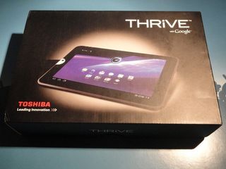
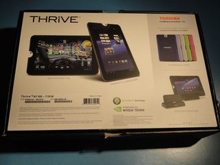
At first glance, the Toshiba Thrive is quite the looker. The top of the box is all black, with a slick looking picture of the front of the tablet. It's all very dark, mysterious, and thin looking. Black is a thinning color, after all.
The kicker is when you actually take it out of the box. Then you see it's not thin. Well, not thin compared to what's out there already.
Be an expert in 5 minutes
Get the latest news from Android Central, your trusted companion in the world of Android

That picture might give you the impression the Thrive is skinny. Compared to Apple's offering, and the current gold standard for thin and sexy, the Samsung Galaxy Tab 10.1, the Thrive looks a bit chunky, coming it at 272 x 175 x 16mm.
In the grand scheme of things, 16mm is actually quite small. When your thinnest competitor is a sleek 8.6mm, though, you're without a doubt the bigger of the two, by almost double. Despite the thickness, the Thrive still feels great in the hands. Yes, it's thicker. Yes, it's a (little bit) heavier. No, it will not dramatically ruin your experience. To say otherwise is hogwash.
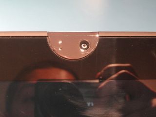
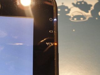
The front of the Thrive is one smooth slate, save for the slightly raised silver semi-circle that surrounds the front-facing camera. The standard Honeycomb configuration is present, so there's not a physical button to be seen, front-side. If you're holding the tablet in portrait mode, your power, charging, and Wi-fi notification lights are on the right bezel.
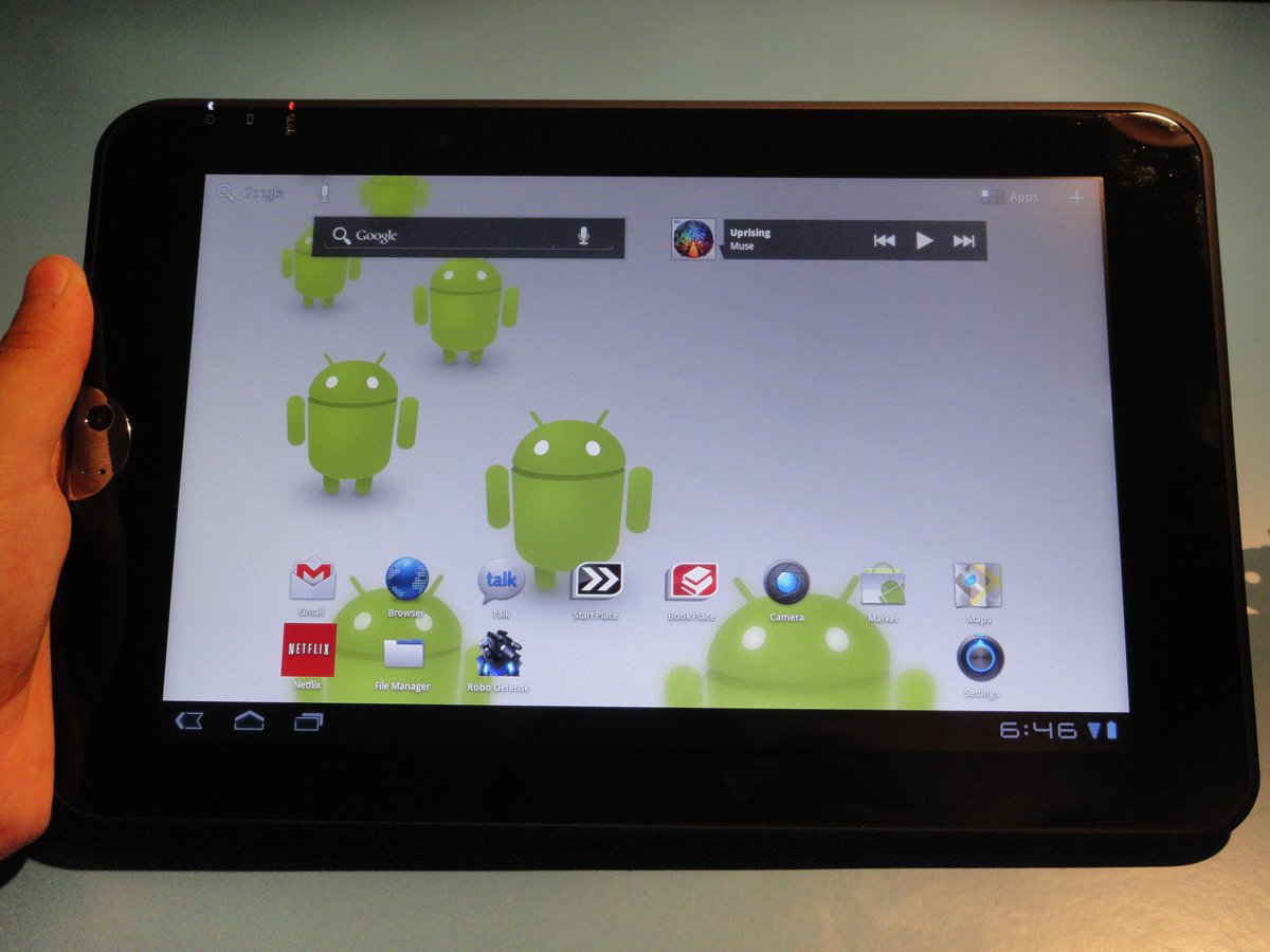
The screen is the standard 10-inch resolution (1280 x 800), and while Toshiba didn't rattle any cages by maintaining the status quo, they made a great decision in going with an IPS display. The colors have been really vivid in all my time spent browsing and toying around (the white wallpaper seen above illustrates the point) and I'm definitely impressed with it.
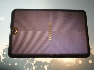
The Thrive is also sporting rounded corners, a la every-new-Android-device-that's-coming-out-these-days, and also has a grip-textured back instead of any matte finishes or completely plastic designs. What the leaves you is nothing but glass on the front and ribbed, gripping material on the back. It's a smart move, especially considering that there's more material to get your hands on and a bit more weight, so giving you something to really latch onto and feel secure while handling your device is superb.
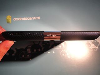
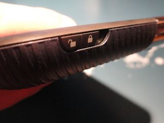
The top bezel is fairly simple, holding the reflective plastic, clasp-looking thing that houses both cameras. On the right side you've got a sliding lock to prevent the back cover from being taken off. Typically, I'd probably keep this locked, but because of that nasty wake-lock issue, I found myself having to battery pull a couple of times. Fortunately, even if you move into landscape position, there's still nothing you'll be regularly using here.
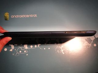
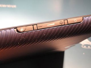
The right-hand bezel has our more oft-used functions, like the volume rocker and the power button. This is also where the aforementioned status lights are, if you're looking at the front of the screen. The volume rocker has a nice, clicky feel to it, as does the power button. It also works well in portrait (press up for more volume), but when rotated into portrait, the volume rocker becomes opposite the on-screen indicator. Is it a deal-breaker? No, but it's a little difference, and spending five minutes with it in landscape will get you trained, but it's there so I had to mention it.
Due south of the volume rocker is an orientation lock. For a while, I never bothered with it, but when I accidentally slid it into lock position and couldn't figure out why my tablet wasn't rotating our of portrait, I did some investigating. It's a nifty addition, if you're in a position where you're getting a lot of accidental rotation, I guess.
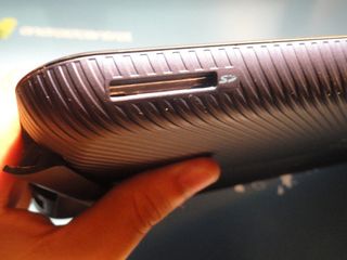
Slide towards the opposite side of this bezel and you'll meet one of the Thrive's first specialties: the SD card slot. No, not microSD. A full-size, ready-to-go, SD card slot. Click in an SD card (think similar to a digital camera) and you'll get a notification next to the clock, saying your card was detected. You might require a reboot for your storage to show up on the "Storage" menu in the settings, but it's definitely there and it works.
Exploring with a file manager showed the SD card, ready and waiting, which was awesome. Unfortunately, you can't move things on and off the SD while it's in the tablet (say, if you plugged the Thrive into a computer), but as we all know, that's a Honeycomb limitation, not a Thrive one, so don't let it tarnish your opinion on the Thrive's functionality.
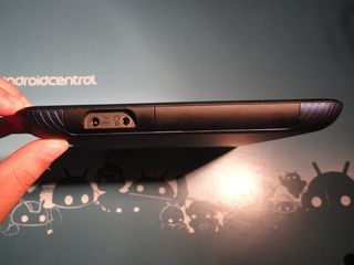
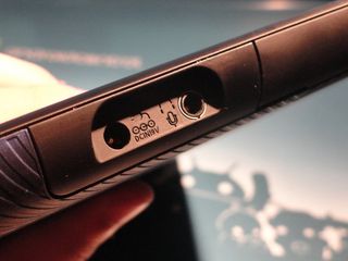
At first glance, the bottom bezel is pretty boring. Uncovered, you've got your charging input and a headphone jack. If you'll notice, though, there's what seems to be a removable panel to the right of said headphone jack. And removable it is.
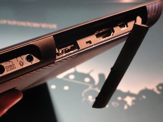
Pop that sucker open and you'll see three of the Thrive's biggest selling points: a full-sized USB port, an HDMI port, and a mini-USB port. The full-sized USB port works like a charm. Plug in a thumb drive and watch it get detected. If you don't like the SD card route, you've definitely got options. The HDMI port is so standard these-a-days, but it's nice to not have to grab an adapter just to use it.
And the microUSB? I imagine it's suppose to work with the included PC-sync cable, and in that regard, it does, mostly. I'm not sure if this is a widespread issue or if my unit is just a little out of whack, but if I tried using the tab at any point while it was plugged into my computer, the cable would jiggle loose and disconnect. My only way of syncing was leaving it flat on my desk, and while it's not terrible, I'd love to hear this is unique to me and not something everyone can expect.
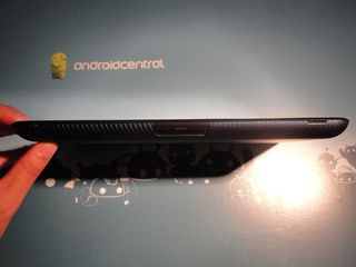
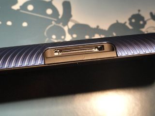
Move onto the last bezel of the four and you'll see two speakers (one on each end) and what looks like a suspiciously removable cover. This cover is actually a huge pain to take off, requiring really long nails and/or something longer and skinnier to actually complete the task once you've got it about halfway but your not-even-fat fingers keep pushing it back down, but I digress...
When you've finally got the cover off, there's a connecting port staring back at you! For what? Accessories, I'm hoping. Give me a keyboard I can use with this while it's in landscape mode and I'll be a happy man. That's not to say the virtual keyboard isn't good, I'm just a product of the tactile feel generation, and not having to lean the Thrive on my legs would be a huge boon.
As for those speakers, they're good, but not great. Muse sounded pretty good in my sound tests, and while it's not really bass-heavy, it's workable. Why Toshiba opted to put the speakers on the bottom is beyond me, but since you can rotate any which way you'd like, you can totally have them pointing upwards and your screen will adjust accordingly.
What's under the hood
The Toshiba Thrive launches with the same processor as every other Android tablet out there, the NVIDIA Tegra 2, clocked at 1GHz. Yeah, it's stock, but those two dual cores are still fast, and I've got no problem with it. It seems especially responsive, and while I'll admit I've only had limited use on a Galaxy Tab 10.1, the occasional screen lag between quick swiping seen there hasn't presented itself once on the Thrive. Is it a bit of optimization? Hard to say, but the performance is completely there, and that's what matters.
The unit that arrived on my doorstep is a 16GB version, but there's also 8GB and 32GB versions as well. For those worried about running out of space, remember the hardware: where there's a will spare SD card or USB storage device, there's a way.
The battery is listed as 23 W-hr, but a quick look at the actual battery says 2030 mAh. It might not seem like much (and maybe it's all part of Toshiba's plan to have you buy more hot-swappable batteries), but it performs well. I've been getting a day of use out of it without problem, simulating moderate use. Checking email, web surfing, and Twitter aren't really big battery wasters, so it'll be alright.
If you opt to watch Netflix all day, you're probably going to have to plug in, charge more often, or buy a battery. But leaving mine on overnight and having it still with plenty of battery left so I can Tweet my heart out the next day is almost enough for me.
The software
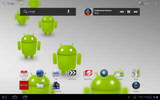
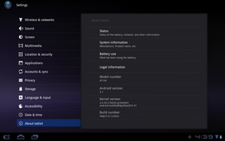
The Thrive launches with Android 3.1 on it, with all of it's goodies like Google Videos. Toshiba's also been pretty proactive about system updates, with a pre-release update and not one but two system updates while I've had the unit in my possession.
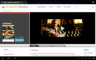

As for Google Videos, no, there's still no tablet app in the Market, but the workaround menno uses still works. As long as you use the web browser, you can rent and watch movies without issue. Limitless played without issues, for those interested.
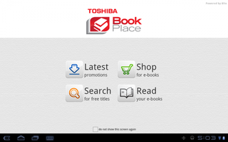
There also are couple of Toshiba-specific apps, like App Place and Book Place, which are just what they sound like.
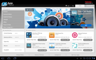
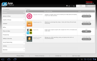

App Place is Toshiba's app store, and it definitely bears some striking resemblances to our own beloved Android Market. I definitely appreciate a 60-day trial (instead of an outright purchase), but if you look closely, you'll notice it's not a trial at all, but a "60-day trail." Yes, it's a little niggle, but something I'd still definitely fix in an OTA.
Book Place looks to be Toshiba's entry into the e-books market, and it seems pretty clean and functional. You can hit up the latest promotions to see all the books under $4, and you're also given a few sample books to toy around with as well.
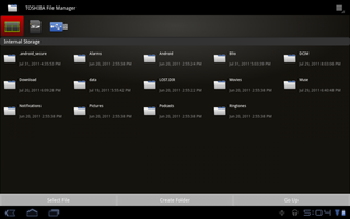
Probably the best Toshiba-branded app of the bunch is their file manager. The Toshiba file manager has a clean, intuitive interface, much like any of the HD, tablet-centric file managers in the Market, but also has options to view your USB or SD card's storage as well. In my experience, checking what's on external storage works like a charm. Other than that, there's not anything revolutionary, software-side.
The cameras
The Thrive's 5MP camera is pretty similar to everything you might expect from a camera on a mobile device. It shoots in 720p, takes some decently clear pictures in bright sunlight, doesn't include a flash, and rapidly loses quality as you lose sources of light.
That being said, I'll let the pictures do the talking for me. (Yes, Longhorn Gnome did lose some of his hat.)


There's also a front-facing camera, rocking a full 2-megapixels, that isn't half bad. There's also the included Honeycomb effect options, in case you feel like making yourself look worse than you already do.


For video recording, the Thrive will come through in a pinch, but it wouldn't be my go-to device. Even in pretty lit conditions, the quality isn't high enough to warrant repeated use, and I experienced some stuttering on playback that I haven't seen on other devices. Simply put, it's ok, but not quite good enough.
Other odds and ends
Seeing as how we've got the whole hot-swappable battery thing, I had to at least mention the hot-swappable backplates. You pop off the backplate to get to the battery, but because Toshiba is all about making money you being you, they also let you purchase different colors of backplate to truly personalize the tablet experience.
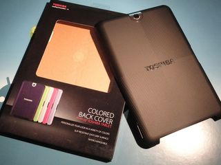
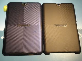
By default, your Thrive comes with black, but I was lucky enough to have one called "Blue Moon" included with my shipment, so, blue being my favorite color, I slapped that on in a heartbeat. It's not a big deal, but in the world of white/black and white/grey, it's a nice touch, barring you don't mind spending a little extra dough.
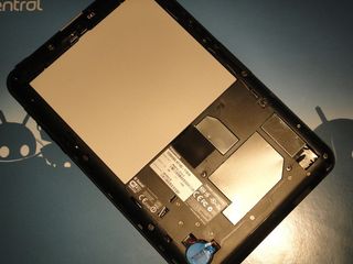
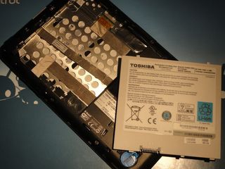
And the battery? It's locked into the back of the case by two locks. Sure, they're slider locks, and they're easy to undo (which is good for the consumer), but they're locks nonetheless. The batteries don't come cheap ($70-$90, depending on where you look), but it's nice to see someone giving us the option to be free from power cables.
The wrap-up
It's still hard to quite place the Thrive. Toshiba calls it a "more complete tablet experience." But is it? Not exactly. It's not that the Thrive is a bad tablet, it's just not breaking new ground by adding a removable battery and ports.
As far as tablet functionality goes, I think the Thrive is right up there with the best of them. The Xoom, the ASUS Transformer, or the Galaxy Tab 10.1, to name a few, all are close enough to one another (and the Thrive) that personal choices are going to determine what model you go for.
Is it a bit thick for some? I guess so. Compared to the standard-bearers of Android tabletness, the Thrive is bigger. Is it heavy? No, and I think everyone who says it's "too heavy to read with" or "too heavy to watch movies on" is fooling themselves. But if you want the feeling of something a bit more substantial in your hands, something that doesn't feel like it'll readily slip and fall, or something with a nice, grip-textured back, the Thrive is right up your alley.
Would we change anything? The thickness, maybe, but then you're looking at every other Android tablet out there right now. Accessories coming down the pipeline (soon) would be exciting, but Toshiba at least dared to be different, and that's commendable.
Maybe the Thrive isn't for you. But it's the tablet for somebody. And as well as it performs, it should be.

