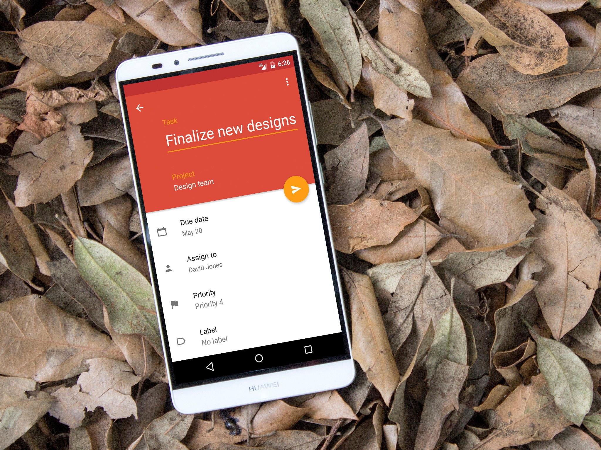
Todoist's Material re-design makes task management look better than ever


Before it pushes out to the masses through the Google Play Store, the new version is going through a beta testing phase that anyone can apply to take part in (links for that at the bottom of this post.) One of Todoist's strongest points is its powerful feature set, something that has won it fans the world over. It's about as cross-platform as a service like this could get with apps on pretty much everything, web apps, plugins, Android Wear support and much, much more. But, since the advent of Material Design with the arrival of Lollipop, it's not hard to say the Android app had a distinctly 'last-gen' feel about it.
Which isn't the end of the world, since the features were still there.
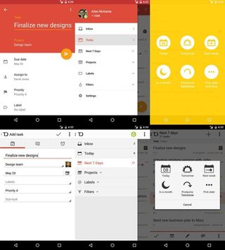
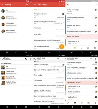
But all that's about to change. As you'll see from the old vs new shots above and below Todoist for Android is getting pretty. Really pretty. Thankfully for Todoist, at least, the beauty is more than skin deep and beneath the new paint job the same great app resides. It's been brought right up to date.
If you want to test it out for yourselves ahead of the general release, hit the link below and follow the instructions. It won't be too long of a wait until everyone gets it, however, if you're feeling less adventurous.

Be an expert in 5 minutes
Get the latest news from Android Central, your trusted companion in the world of Android
