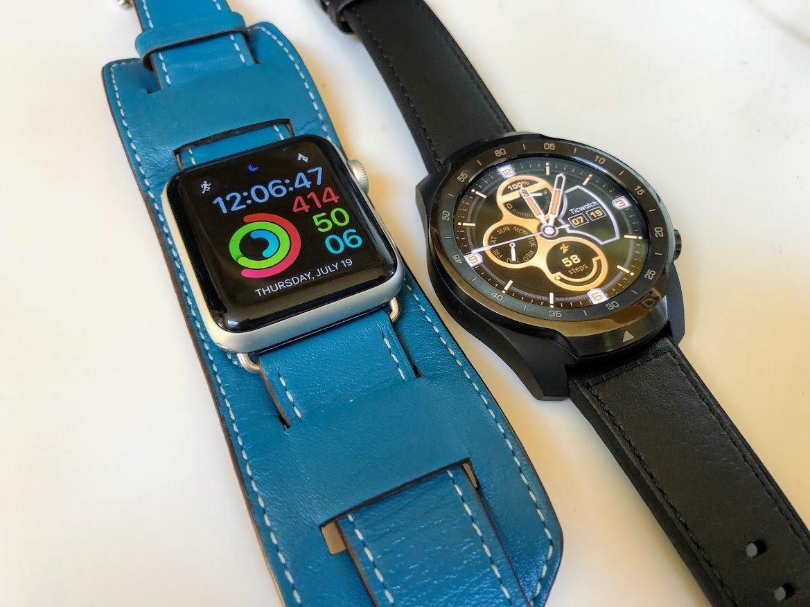
I've been an active Apple Watch user for 260 days. Not a lot compared to some of the other smartwatch folks around me, but enough for me to know a fair bit about the strengths and weaknesses of the platform through my daily use. I'm largely a fan of the way Apple does things on the Watch, but like most smartwatch owners I find myself never truly happy with display performance in daylight or the battery after a day of constant use. Neither are easy problems to solve, and the watches offering solutions to date have compromises in other areas that make them downright unpleasant to wear.
The folks at Mobvoi got my attention recently with its TicWatch Pro, a watch running Google's Wear OS promising between five and thirty days of battery life in certain modes and, a special display which works perfectly even in direct sunlight. After a week of using this new watch, I find myself ready to call TicWatch Pro the best Wear OS watch I have ever used. But compared directly to my Apple Watch, the title of best overall is less easily won.
So much more than round vs. square
Any time you compare anything to the Apple Watch, the initial wave of reactions are the same. People on Twitter, in droves, respond to photos of the two watches side by side with a comment about how round displays actually look like watches and are therefore better. I think it's clear by Apple's sales record with the Watch so far that not as many people care about round vs. square as these folks might think, but it remains a talking point in the general public. Personally, the physical shape of either watch doesn't impact me one way or the other. I've never really worn traditional watches, and I don't wear a TicWatch Pro or an Apple Watch to tell me the time. These are tiny computers on my wrist to give me a deeper look into my digital self. From acting as a trusty notification dumpster to a fitness companion, I don't need these things to look like watches.
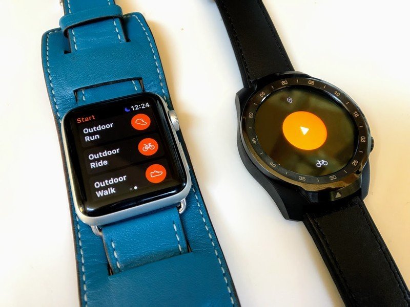
Apple's third generation Watch display is impressive, but the TicWatch Pro display is on an entirely different level functionally.
What I will say is, because the TicWatch Pro is round, it feels noticeably larger on my wrist than the Apple Watch. TicWatch Pro isn't appreciably thicker or taller, but the design feels roughly the same as it does when I'm wearing a leather cuff watch band on my Apple Watch. Since I wear a cuff-style band frequently, the size of the TicWatch Pro doesn't feel particularly big. But on those with smaller wrists, or those who prefer the smaller of the two Apple Watches, the difference will be significant.
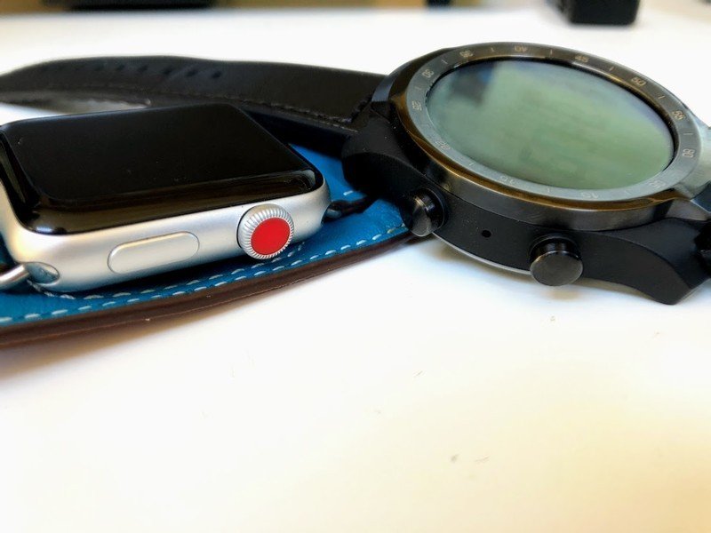
TicWatch Pro and Apple Watch both have a pair of buttons for use on the side, but only Apple's watch has a rotating crown. I admit I almost never use the rotating crown on my Apple Watch, but those who take advantage of not needing to rub your finger on the display are going to notice it missing on the TicWatch. The secondary button on the TicWatch Pro is entirely programmable, though, which I really like. I enjoy having a shortcut to Strava on my watch, and the physical button is more convenient for me than adding a Complication to one of the Apple Watch faces.
The main event in comparing these two watches is the display. Apple's third-generation Watch display is impressive, but the TicWatch Pro display is on an entirely different level functionally. It's called a "dual layer" display, with one layer being a fairly standard-looking round AMOLED display. That second layer is using Film compensated Super Twisted Nematic (FSTN) LCD tech, and it exists specifically to deliver high-contrast black and white displays at much wider viewing angles than anything else. And wow does it work well. This secondary display is on when the AMOLED display is off, which means when I'm on my bike I can glance down and my wrist and there's actually information I care about. I don't have to lift my arm from the handlebars, or from my keyboard while typing, to gain access to the information I want.
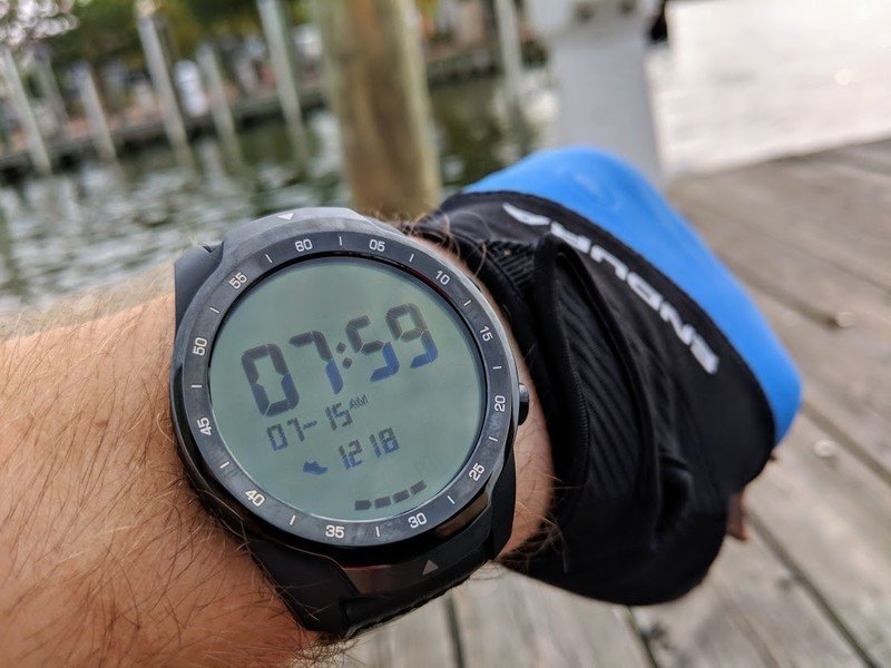
When I do lift my wrist to see the full color display, the time it takes for the watch to transition from FSTN LCD to AMOLED is about the same wait time it takes for the Apple Watch to wake up when I lift my wrist. Which is to say it's not as fast as I would like, but it gets the job done. There's never a time when the display is unresponsive, and if my wrist is still I can push a button on the bezel or touch the display to wake it as well, but there's never a time when some amount of information is being displayed on this watch and I'm a fan of that.
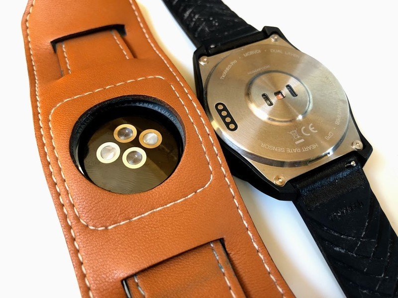
The other thing of note regarding the hardware is the method of charging. Both of these watches require you to use a proprietary dock to charge the watch, but by nature of its popularity, the Apple Watch charger is significantly easier to replace when you need to. The charger for the TicWatch Pro is also a pin-based charger instead of the smooth magnetic-seal wireless charger Apple is using. I personally prefer Apple's charger, but the use of pins instead of a fully wireless set up on the TicWatch is a real shame. Other Wear OS watches with wireless charging have been found to work with a host of third-party chargers, and it would have been nice to see this watch do the same.
Apps, watch faces, gestures, and everything in between
These little wrist computers need to earn that spot on my wrist, and for me, that means delivering information when I want it and leaving me alone the rest of the time. While watchOS and Wear OS both have great notification controls to keep apps from pestering me when I'm busy, and Theater or Do Not Disturb modes when I really don't want to feel that vibration at my wrist, delivering information is another thing entirely.
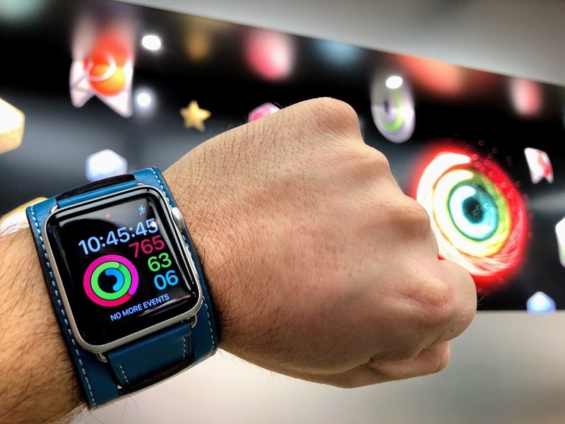
Apple doesn't allow third-party developers to build faces for watchOS. The options you get from Apple are what you have available to you, and nearly all of them can be adjusted by adding Complications with additional information or links to apps you want shortcuts to. This is fine, but it means I'm only ever going to use the Activity Rings face on my Apple Watch. That is the information I care about the most, and this face is the only way to show that information with the detail I like. Wear OS takes a different approach, letting just about anyone make a face for these watches. It means I have access to my body tracking data in many different formats, with a ton of visual flourish. I like having access to so many options, though very few of these third-party faces have any customization options at all which is just limiting in a different way.
Apple's biggest strength against Google right now with its Watch platform is popularity.
Both Wear OS and watchOS do a great job delivering me notification I can interact with, but only Wear OS makes that interactivity possible with just my wrist. Gesture controls in Wear OS remain one of the biggest strong points the platform has, especially when I'm on my bike. Being able to dismiss a notification with a flick of my wrist, or scroll further into a text message with a simple wrist twist, is tremendously convenient. It means I don't have to slow down, and don't have to take my other hand away from its task. This is something Apple really should implement sooner rather than later, especially as the watchOS platform continues to offer features for fitness-focused folks, because it makes a huge difference in how convenient a lot of features actually are.
Apple's biggest strength against Google right now with its Watch platform is popularity. Developers know watchOS is where the people are, and that's where the energy for optimizing third-party apps goes. Strava on Wear OS is a prime example. The watchOS counterpart displays an order of magnitude more useful information about my ride while I'm moving, and is generally more stable for things like auto-pausing. The Wear OS app straight up isn't very good, which is a shame. Wear OS apps, in general, are at least a generation behind watchOS when it comes to things like optimizations for information density and battery performance.
On the subject of battery performance, a few notes about that exciting "5 to 30 day" experience on the TicWatch Pro. Mobvoi includes these numbers on the box with a caveat, it only really applies to when the watch is in one of two low power modes. These special modes turn off the color display and leave you with the always-on LCD, effectively blocking you access to most of the things which make the watch useful. While it is amazing that I can flip the watch into these low power modes and know it will still function for much longer than a day or two, the battery drain when you're actually using the watch is almost identical to the Apple Watch. I get a little over two full days out of it if I'm not using it for much, but four to five hours on my bike with Strava running will cut the battery down to 50%.
Finally, virtual assistants. To be perfectly honest, the less said about Siri on the Watch the better. I know things are going to be much better in the next generation of watchOS, but Google Assistant is more capable in every possible way on the TicWatch Pro. That's another one of those things that can be a big deal when you don't want to reach for your phone because you're driving and want that hands-free experience. I will say that, in comparing the two side by side, the microphones on the Apple Watch did a noticeably better job translating my speech to text when outdoors.
Which should you buy? It depends
Apple Watch is almost always the best experience for people who live entirely in the Apple ecosystem. It meshes better with its software, and the level of polish in the overall Apple experience can't be discounted. But if you lean into the Google ecosystem from your iPhone, and a MacBook isn't your primary computer, and you're not especially slender in the wrist, the TicWatch Pro is the first general non-Apple watch I've been genuinely happy using with my iPhone. The layered display tech is exceptional, the size is just right for my needs, and while the apps aren't all as functional as I'd like there's a lot to love about the Wear OS ecosystem.
If you're not totally sold on an Apple Watch and want something a little different, I don't think there's a better place to spend your $250.
"Hey Russell, what Apple Watch strap is that?" - Check out the $16 Nickwea Apple Watch cuff on Amazon!
