Telling time is a colorful affair with the Primary Colors watch face on Android Wear

There are Watch faces on Android Wear that stand out as something seriously unique. Some of them require a healthy relationship with binary, while others rely on simple glance memorization to help you get the time. Among the ranks of the latter is Primary Colors Watch Face, and it really does stand out. With a colorful twist on how to tell time, it's also got a few customization features to make sure it displays to your satisfaction.
Let's take a look.

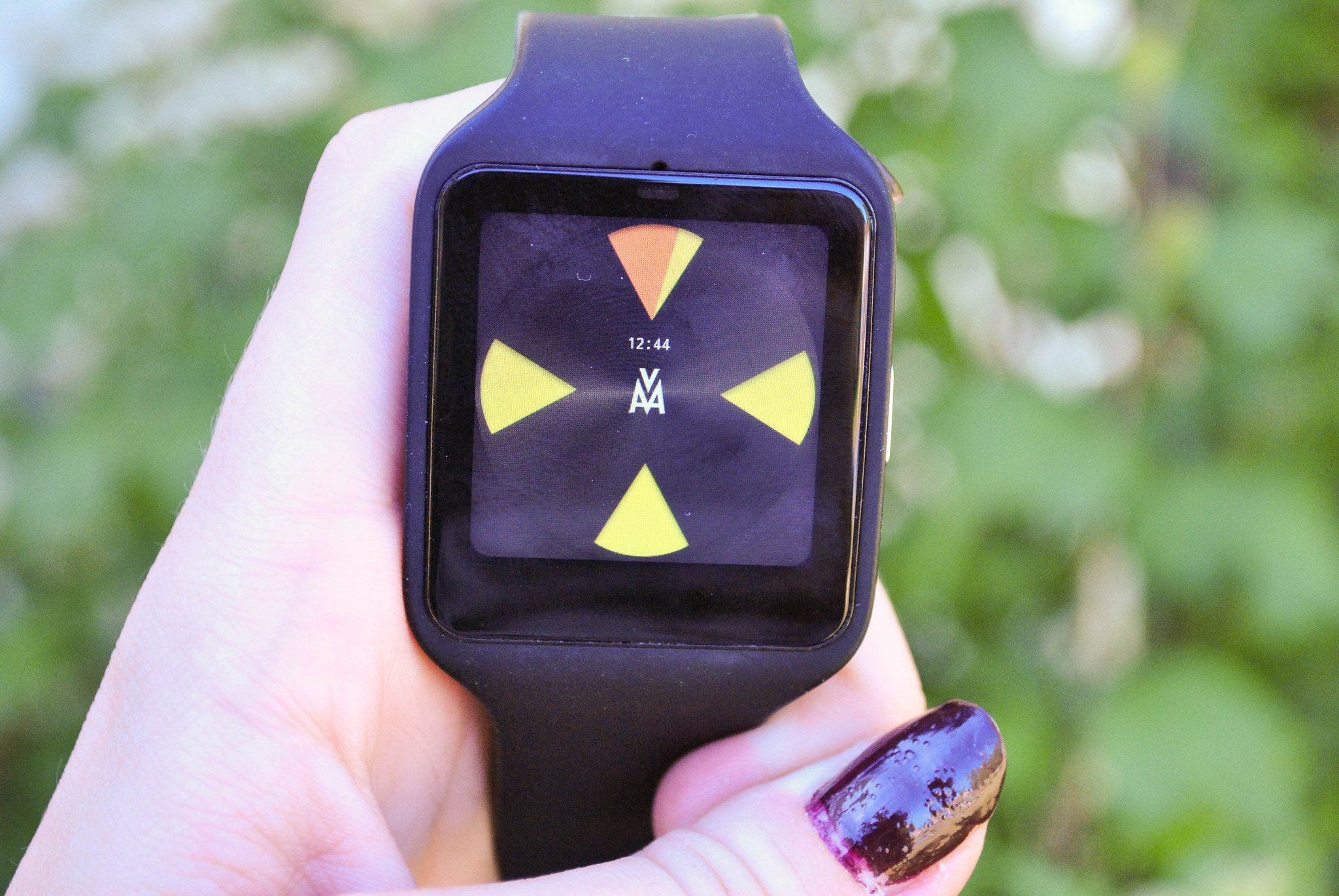
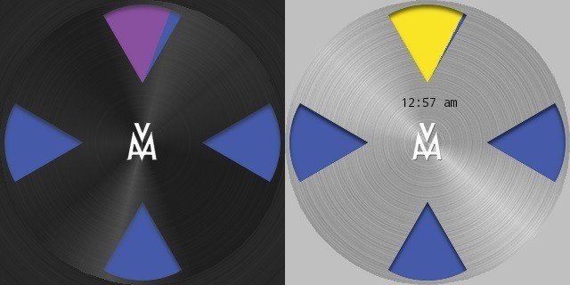
Primary Colors is a default black background with bright cones of color that appear where 12, 3, 6, and 9 would usually appear. The colors that appear within the cones can't be adjusted, but different colors dominate at different periods of the day or when you switch between the 12 and 24 hour mode. There really isn't much to see here, and you can tell that it's a specific design choice. It works well too, telling time using colors without anything else displayed on your smartwatch screen. It's a fantastic watch face for anyone who enjoys something with a futuristic flair, without being weighed down in customization options.
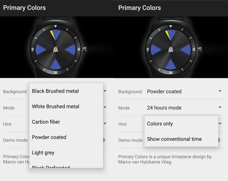
You do get access to a few features that can adjust the ways things look by using your smartphone. There aren't many options, and all of them retain the clean and minimal look that helps to define this watch face. You can change the background, switch between 12 or 24 hour mode, and give a digital readout of the time. There is also a toggle switch to turn a demo mode on and off, which helps to show you how the colors on your smartwatch tell the time.

Reading the time using just the intended method of the colored cones is mostly something you have to teach yourself to do at a glance. Out of the box it can be a bit pesky. Each cone counts as an hour and will slowly fill with color to show the passing of time. This is not ideal to begin with since there are only 4 cones, which can make it difficult to tell what time it is later in the evening. The color that fills them helps to denote what time it is, both by how full the cone is and the color which is linked to a particular hour. It's not particularly efficient, or easy to read. You can view the demo mode on your smartwatch which will show the various colors and passage of time at an advanced rate, to give you a visual example. Overall the colors aren't a great way to tell the time, and we'd suggest enabling the digital time readout at first.
If you've been looking for something futuristic, and different for your watch face, then make sure you check out the Primary Colors watch face. It's available now for free on the Google Play Store and might be worth your time. It's not necessarily going to be a great choice for everyone, but if you're in the market for something really different, this could be it. Are you a fan of the Primary Color watch face, or do you prefer something more traditional when you check your smartwatch?
Be an expert in 5 minutes
Get the latest news from Android Central, your trusted companion in the world of Android
Jen is a staff writer who spends her time researching the products you didn't know you needed. She's also a fantasy novelist and has a serious Civ VI addiction. You can follow her on Twitter.

