Tapatalk 4 beta released, we go hands-on!
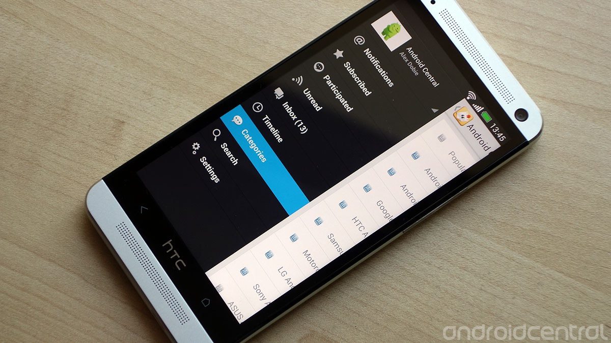
A fresh UI, new features and a way to manage all your forum accounts in the new Tapatalk 4 beta
Tapatalk should be a familiar name to anyone who spends time browsing forums on their Android phone. It’s designed to rework the often tedious process of navigating pages, forums and threads on a small screen, providing a cleaner, phone-friendly layout and some unique features to boot.
Today the Tapatalk team has released the first beta build of an all-new version of their app, Tapatalk 4. We’ve had the chance to preview the new Tapatalk for several days, and get to grips with all the new features. So let's take a look at what’s new in Tapatalk 4 beta. We've got video and more after the break.
A new, cleaner ‘Holo’ layout
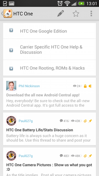
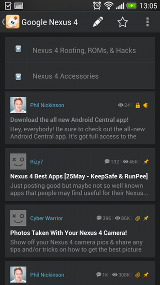
The new version of Tapatalk is designed around the Android 4.0 API level. That means you’ll need a phone running Ice Cream Sandwich or later to use it, but building atop newer Android APIs allows for more advanced features, including the completely re-tooled layout. Tapatalk 4 follows Android’s “Holo” design guidelines -- a “Holo light” style is used by default, but a dark option is also available. (This can also help you save battery power on devices with AMOLED screens.)
Tapatalk 4 looks, feels and behaves like a proper, native Android app. There’s an action bar up top, a slide-out menu bar of the sort used by many Google apps, and individual forum posts are arranged in a card layout not unlike those found in Google Now. It’s also a speedy performer and easy to navigate, which helps.
The move up to a higher Android API level also allows Tapatalk to utilize push notifications, as opposed to more battery-intensive pull notifications.
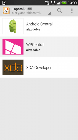
Single sign-in with Tapatalk ID
As of Tapatalk 4, you can use a single login to manage all your various forum accounts. (Forum owners will have to update to the latest version of the plugin to enable this.) Sign in with a Tapatalk ID and your app will be populated with a list of associated accounts, even if it’s the first time you’ve signed in on that device. This makes life a good deal easier if you have multiple devices -- or if you’re a power user constantly switching between ROMs on your phone.
Get the top Black Friday deals right in your inbox: Sign up now!
Receive the hottest deals and product recommendations alongside the biggest tech news from the Android Central team straight to your inbox!
New posting and viewing experience
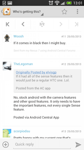
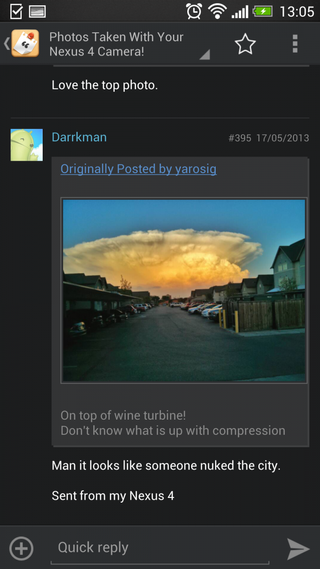
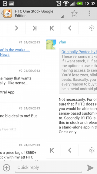
As we’ve already mentioned, posts and threads are arranged into a card-like layout, and once you’re into a thread you can easily change pages by swiping left and right. It’s also possible to backtrack using the dropdown list in the action bar up top and head back to the parent forum.
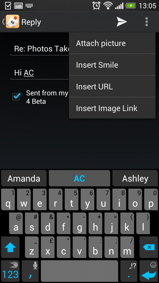
When it comes to posting messages, you can add a quick reply down below, or press the plus icon to add more detail, including smilies, URLs and images -- and the Tapatalk team has evidently been busy with new image features in this release.
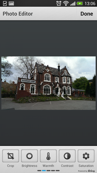
When you post attach a photo, you can apply a wide range of Instagram-like effects, add text, rotate, crop, and tweak things like contrast, saturation, sharpness through an Aviary-powered photo editor. You can even draw on top of your photos if you like.
All in all, it’s a worthy upgrade to the leading forum app for Android, with plenty of new features to get stuck into and a clean new UI that’ll please Android purists. The Tapatalk 4 public beta is available now on Google Play -- hit the Play Store link at the top of this post to grab the app. Share your thoughts down in the comments -- or better still on the Android Central forums through the app itself.

Alex was with Android Central for over a decade, producing written and video content for the site, and served as global Executive Editor from 2016 to 2022.