Tackling 'fragmentation': Developers sound off on supporting multiple screens
Get the latest news from Android Central, your trusted companion in the world of Android
You are now subscribed
Your newsletter sign-up was successful
Android runs on a variety of devices, which means it also runs on a variety of screen sizes and resolutions. Lots of folks call this "fragmentation." Never mind the fact that they've been using products designed and developed the same way for years on their desktop. Apparently if everything isn't exactly the same it gets the "fragmentation" label.
There are different ways to tackle the problems that arise when you use screens with different sizes and densities. Apple has separate listings for apps designed for the iPhone versus the iPad. Microsoft creates a new eco-system for its big screen devices. Android provides a way for developers to make the same app work differently for different screens. There's good and bad about each method, but we're going to focus on Android here.
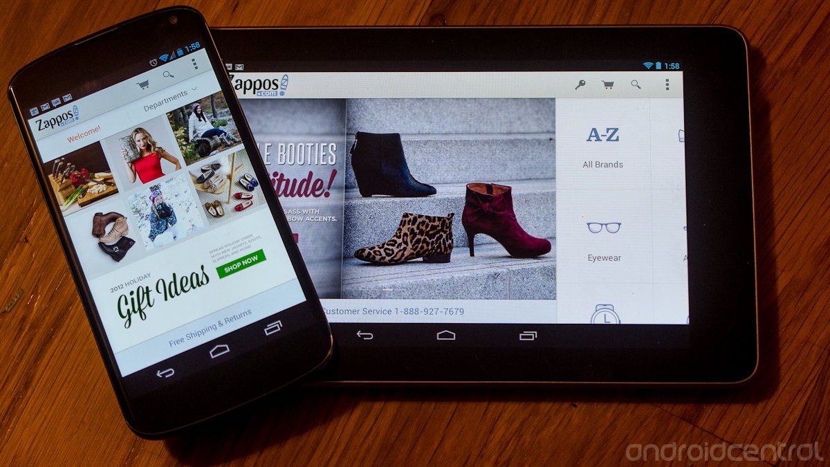
In Android, applications can adjust the layout for different size screens as well as resolution. This is all built in, but there are a few things developers need to declare in their code to make the app look good. The thing to keep in mind is how screen size and density will change the look of the app. The Droid DNA has a higher-res screen than the Motorola XOOM tablet, but we don't want to see a tablet layout for apps on the phone-sized screen.
Article continues belowA developer needs to provide assets (images) that are high enough quality to look sharp at high resolution (never mind insanely high resolution), and be sure to use density independent pixel units when designing their layout. This is what keeps things like buttons and other controls from being really big on low density screens like the Galaxy S2, or from being really tiny on high density screens like the DNA.
It sounds complicated, but most of this stuff is done for you when coding an app. All the developer needs to do is make the right declarations, and provide the right assets to support any size (both physical and resolution) or layout. Even multiple layout apps like the Google+ app use the same code to cover every conceivable screen.
We're not trying to judge developers here. Writing apps is tough. The Android developers have been preaching all this since the release of Gingerbread, but how practical is it? We asked a few developers about it, see what they had to say after the break.
More: Google's Android developer site.
Get the latest news from Android Central, your trusted companion in the world of Android
We asked a handful of developers (both big and small) a couple basic questions on the subject.
- How difficult is it to adhere to the guidelines?
- It looks easy on paper, but are there any special issues you've seen or parts that Google hasn't covered?
- How did this affect development time and costs, if at all?
- Anything further about the subject you'd like to share?
I tried to make the questions as neutral as possible so that we don't go into this with some bias in place. When in doubt, you ask the people who know, right? I've done my fair share of programming, but coding in Java and building Android apps is very different from writing code in C or machine code, or even Perl. There are nuances I don't understand, even if I get the general methods of building an app.
I imagine a good number of you guys are like me and don't know the intricacies of building Android apps. We only see what the Android developers say, and they make it sound easy. For them, it probably is -- they've been writing this stuff from the ground up since 2007. Let's see what the folks who have been able to follow them have to say.
Joe Simpson (@kennydude) -- Boid
Joe is a member of Team Boid, and also publishes applications on his own. He (and the rest of his team) are a great example of independent developers with a passion for Android who have cranked out some amazing applications.
Following the guidelines is fairly difficult, especially if you want a lean app but people want back-compatibility. One of the most annoying things is seeing what something looks like on d.android.com/design [Google's Android developer design site] but nothing on how to actually do that.A weak point is refreshing when you physically can't use GCM [Google Cloud Messaging] due to Twitter, and you don't want to use PtR [Pull to Refresh]. Also, Google's apps make up their own guidelines. Take the slide-in pane for example, Google+ does it differently than YouTube (although I know the support library is going to hopefully settle this).Also, you can get to a point and there is no documentation on something (EdgeEffect for example).I'm a student, so costs are something I don't look it, and yeah it takes time, but your users will love you. Basically, the Live Shows (ADiA, App Clinic, Office Hours) are a must (unfortunately) although they can't offer feedback about Google's apps.
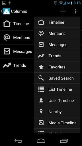
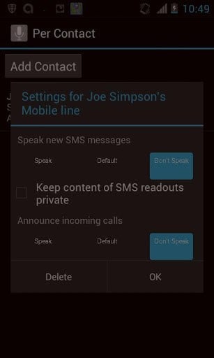
Boid is soon to go open-source (yay!), and you can find the app itself in Google Play. You'll also find all of Joe's apps (there's some jewels there) right here.
Christophe Versieux -- BeTrains - SNCB Belgium; HoloEverywhere
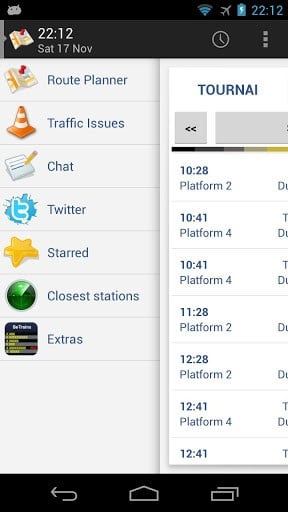
Christophe has built numerous Android applications, including BeTrains - SNCB Belguim -- an app with a gorgeous layout that shows what can be done with a well-built application. While most in the US will never use it (it's a train schedule app for Belgian rails) it's worth installing just to see how well it's done. The folks in western Europe certainly know about this one.
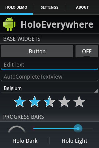
In addition, he has co-developed HoloEverywhere, a library that other developers can use to build Holo style applications for Android 2.1 and higher. With many phones still running Gingerbread, this is a real treat for developers who want to keep their apps looking current.
It's not difficult at all. Seriously. The difficult part come when the customer asks to get away from those guidelines!I remember a customer that wanted me to put tabs on the bottom of the screen, iPhone buttons everywhere, iPhone-style toggle and this project was really hard to achieve and I really lost a lot of time and money on it.I was really angry at him when he asked all these stupid stuff, and he just thought I was a lazy developer.I have now a lot of contact with him and we are totally rewriting his app, create awesome code by removing all these useless features and creating a "pure" Android app. The customers and companies just need to be aware of those guidelines, I strongly believe.Libraries like ActionBarSherlock, HoloEverywhere (my creation), UnifiedPreferences, and SlidingMenu are really easy to use and provide in a few lines of code an awesome user experience.Time and cost, as I said are minimized by following Google guidelines. Fragments and layout folders are really easy to use (and more important to re-use) : a tablet app just grab piece of code from the phone layout and nothing must be rewritten. Small changes in the phone app are immediately reflected in tablet app, as the same Fragment is used.Some amazing projects are created by the community, not always by Google. Some people, very active on Google+ like Roman Nurik (Google), Reto Meier (Google) Juhani Lehtimäki, Jake Wharton, Taylor Ling, .. (I am always afraid to forget important people) are very instructive. Developers just need to know where to look and Android development will be easy for them!
You can find BeTrains on Google Play, and you'll want to take a look at HoloEverywhere if you're interested in Android development.
Matthew Runo -- Zappos
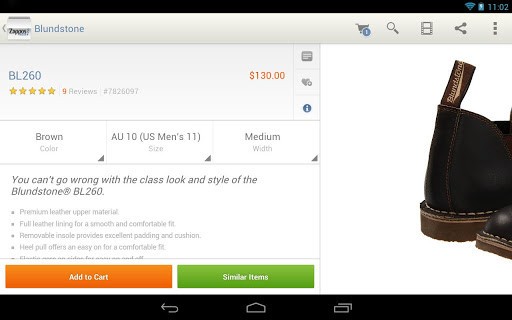
In contrast to some of the smaller independent developers we talked with, we also heard from Matthew at Zappos. Zappos is a web retail corporation and likely has a dedicated budget for design on both their website as well as their applications. It's also a company that I purchase from regularly, but this had no bearing and the Matthew was unaware that I am a frequent customer when he volunteered.
At Zappos, since we're a retailer, we have to stick first and foremost to our own brand. Wacky, fun, and a little off the wall. That said, both of us are strong believers in the Android design guidelines -- and everything that we do in the UI is taken from the spirit of those rules. A year ago, our app was mostly an iOS port from how it looked and worked. Today, it's (I think) a gem of what you can do in Android. We adhere to the guidelines whenever possible - and our designers work from them as a starting point.The design guidelines are not a be all and end all - in the end they're just there to try to push along the design of android apps so that they're more consistent. We've found that most of the common "new" open source libraries that we've used have ended up as part of the guidelines (sliding menu, crouton).The guidelines should never be a hold-back. Certain things -- overall navigation -- need to be consistent so that your app "just works." Everything else -- start at the guidelines and run with your design. We want our app to be OUR APP -- so we can't just do the baseline holo theme.This year we have basically started from a ground up rewrite of our app to work with fragments. In the past 6 months we've worked hard to add 7" tablet support, and we're currently working on 10" support. The hardest thing to do is testing on devices, but we have a great QA team that helps with that. We have had 2 people working full time on our app since August or so, before that it was 1 full time person. Bottom line is, I think, the android design guidelines help us streamline our process - and thereby reduce costs. Let's face it, most designers from from iOS - so having a great resource like design.android.com is a wonderful help to get them kickstarted in the android ecosystem.
I can say that Zappos' design choices work well, and my wife has a closet full of clothes, purses, and boots that reinforce my claim. Check out their Android app from Google Play.
Josh Burton -- jRemote
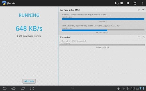
Josh has authored numerous small applications for Android, and his jRemote application (it's a controller for the popular jDownloader PC program) is a perfect example of how to use layouts to create an app that looks great on both the phone and a tablet. It maximizes the use of the device screen, and gives you the information you're looking for exactly how you would expect it.
Adhering to the design guidelines is pretty straight forward, as long as you stick to them from the get go. Developing an entire app and then at the end going back and trying to implement fragments/tablet layouts etc is going to be a waste of time, effort, and frustration. But if you plan out your app, develop using fragments from the start, and create your resources for all the right dpi buckets, it makes developing a breeze, and you really don't need to spend much time thinking about the guidelines at all. And if you do get stuck, the design docs are only a click away. They are a great resource. It really frustrates me that so many devices don't have tablet layouts. If your app is built using fragments, adding a tablet layout can be done in 30 minutes. Honestly, it's that easy.I think for a lot of developers, they don't have tablet devices to test on, and using the emulator can be a pain. But the new ADT tools just released make it a lot easier. The multi configuration view in the layout editor means you can see what your layout looks like on 5-6 different screen sizes all at once. And its fast. Of course you will still need to test on an emulator/device eventually, but it definitely speeds up the workflow.
jDownloader is a handy program to use on your desktop, and jRemote looks like a wonderful way to control it. If nothing else, download it from Google Play and have a look just to see how an app can be simple and beautiful at the same time.
We heard from plenty of other developers who pretty much say the same things. We're just out of room here to list them all out. The gist of it all is that if you plan ahead, the Android developer guidelines really do work for most cases. We're glad to hear it, and will continue to enjoy great apps and support hard working developers.

Jerry is an amateur woodworker and struggling shade tree mechanic. There's nothing he can't take apart, but many things he can't reassemble. You'll find him writing and speaking his loud opinion on Android Central and occasionally on Threads.
