Amazon Prime Video gets a modern facelift with a new 'Super Carousel' and more
An update to Amazon Prime Video brings a much-needed UI redesign.
What you need to know
- Amazon is launching a newly redesigned UI for its Prime Video streaming service.
- The UI features a simplified navigation menu, a new Live TV page, and redesigned carousels for better content discovery.
- The redesign will roll out first on Fire TVs and Android phones, with iOS and the web to follow.
With "The Lord of the Rings: The Rings of Power" a mere couple of months away, Amazon is giving its Prime Video streaming service an upgrade with a new look.
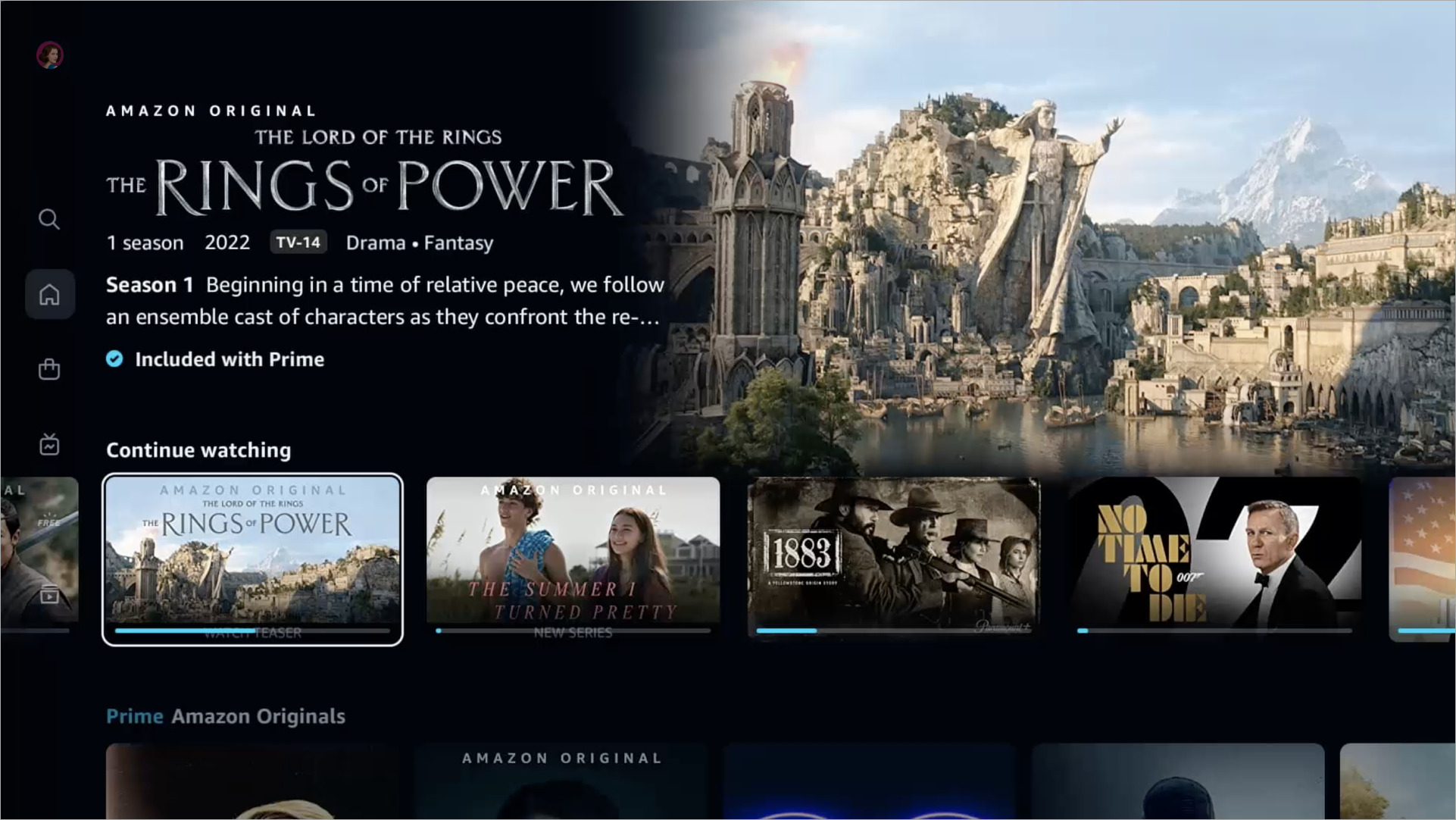
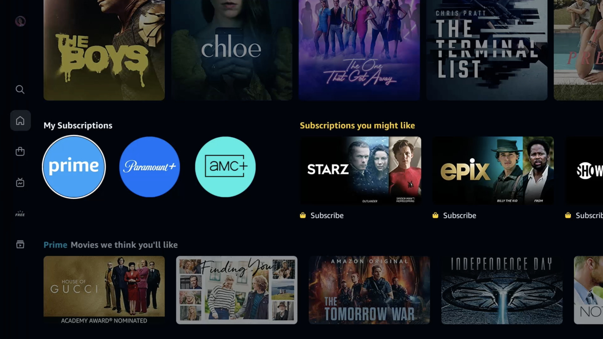
The update, which was announced on Monday, modernizes Prime Video for easy navigation and even easier ways to discover content. For starters, the navigation menu has been moved from the top to the left with fewer options to select from, such as Home, Store, Find, Live TV, Free with Ads, and My Stuff. You'll notice that options such as "Movies" and "TV Shows" aren't included, but that's because they're being included as sub-navigation options when browsing for something to watch.
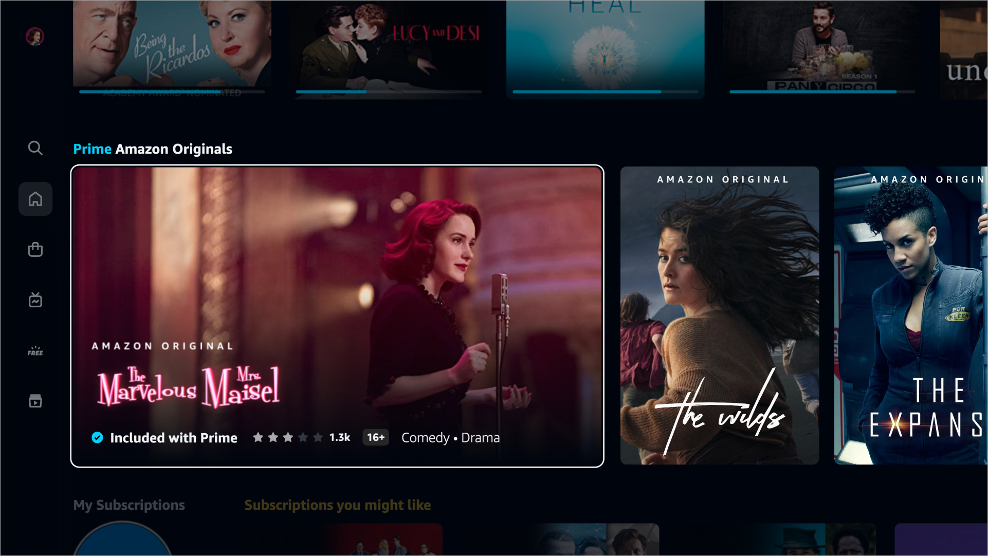
Another significant change is to the carousels. While the current UI is uncomplicated with the same sized rows, the new UI will better highlight the content you're already into and content you might want to get into. The Continue Watching row will include a progress bar to show you where you left off, while a new "Super Carousel" displays large cards to showcase featured content.
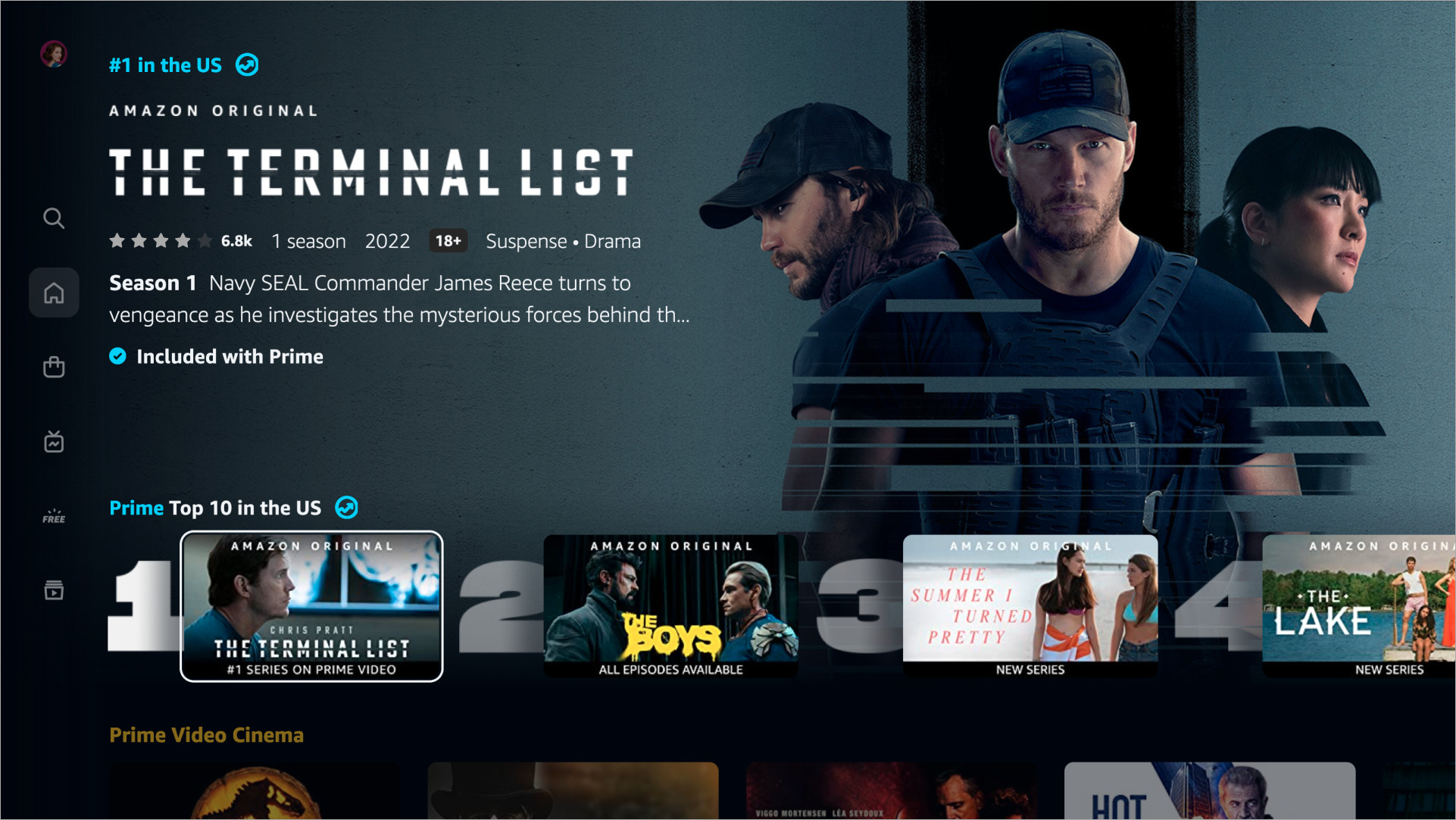
And in case you need a bit more help finding content to watch, Prime video's Top 10 List will give you an easy look at what's trending so you can stay up-to-date on the latest and greatest shows and movies.
For Prime members with additional subscriptions to services like Starz and Paramount+, this content can be easily accessed through the "My Subscriptions" row. Prime Video also has a new Live TV page that presents sports and other programs in an easily recognizable guide for easy channel surfing.
Lastly, the Find search function has been overhauled to give users plenty of ways to find what they're looking for, from categories to filters, with content easily marked so you'll know what content you have free access to.
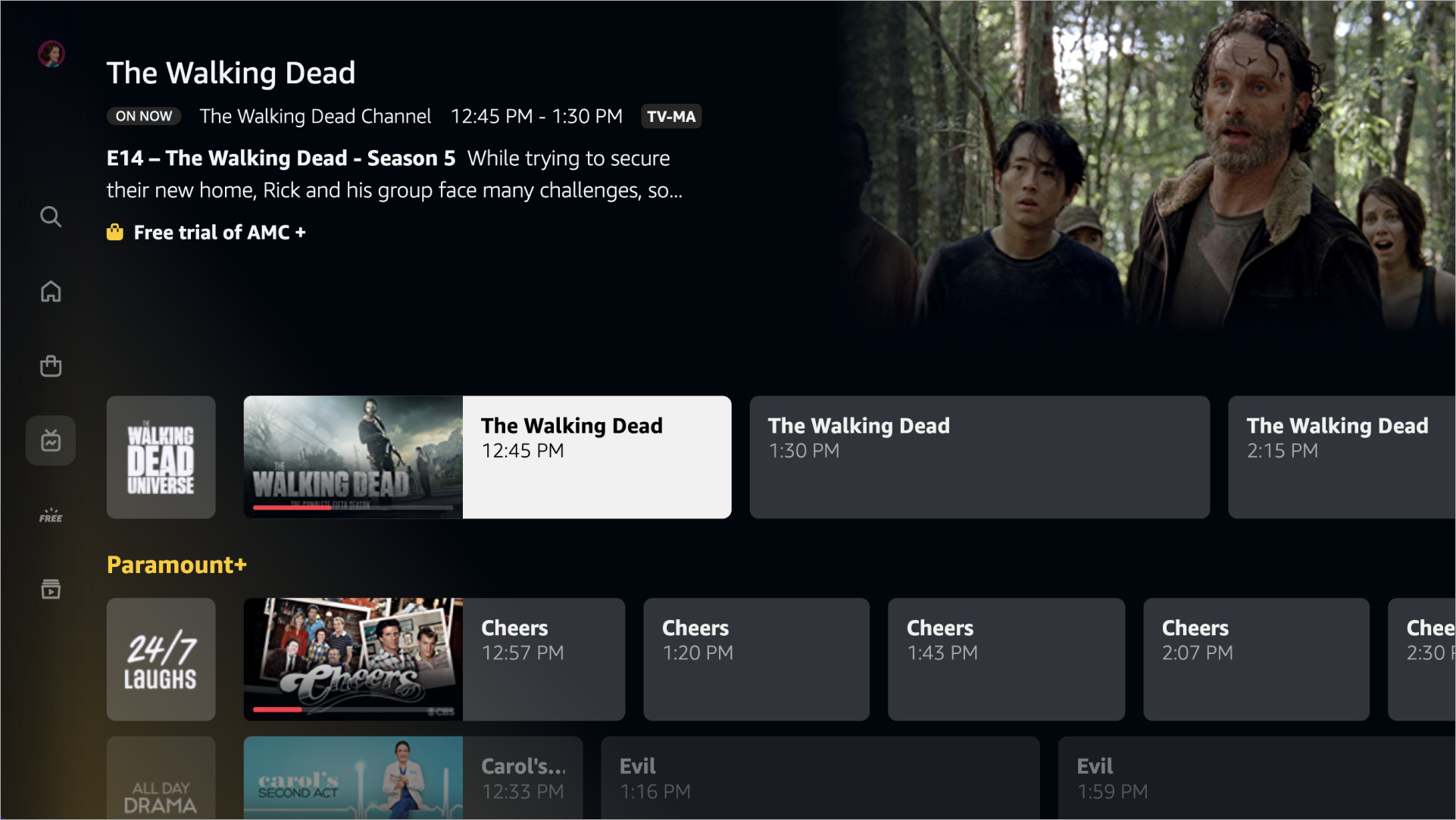
These changes mirror the recent updates made to Amazon's Fire TV UI, which focused on simplified navigation, personalization, and an easy way to access live TV.
Be an expert in 5 minutes
Get the latest news from Android Central, your trusted companion in the world of Android
"We are redesigning the Prime Video experience to highlight our broad selection of content and to make it easier for customers to find the content they love," Amazon says in a blog post on Monday.
"The new Prime Video experience presents content with rich, immersive imagery, thoughtful details, and a new color palette. Our new carousels also showcase titles in a way that makes the experience less busy and overwhelming for our customers."
Amazon says these changes are arriving this week on the Android app and "living room" devices such as smart TVs like Amazon's Fire TV devices, with iOS and the web to follow.
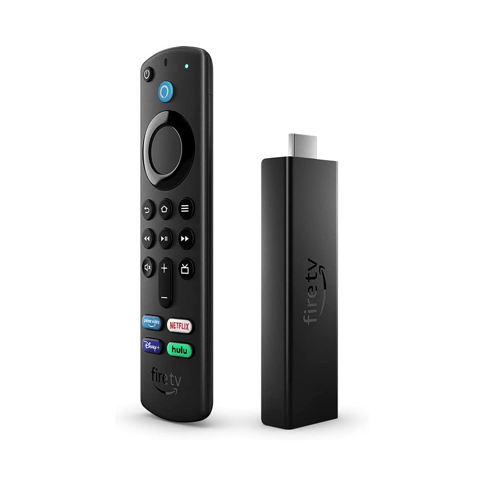
The Fire TV Stick 4K Max is Amazon's most powerful streaming stick thanks to Wi-Fi 6 support for faster, more stable streaming, HDR and Dolby Atmos support, and the Alexa Voice Remote to make navigation a breeze.

Derrek is the managing editor of Android Central, helping to guide the site's editorial content and direction to reach and resonate with readers, old and new, who are just as passionate about tech as we are. He's been obsessed with mobile technology since he was 12, when he discovered the Nokia N90, and his love of flip phones and new form factors continues to this day. As a fitness enthusiast, he has always been curious about the intersection of tech and fitness. When he's not working, he's probably working out.
