Stitcher Radio receives complete UI overhaul
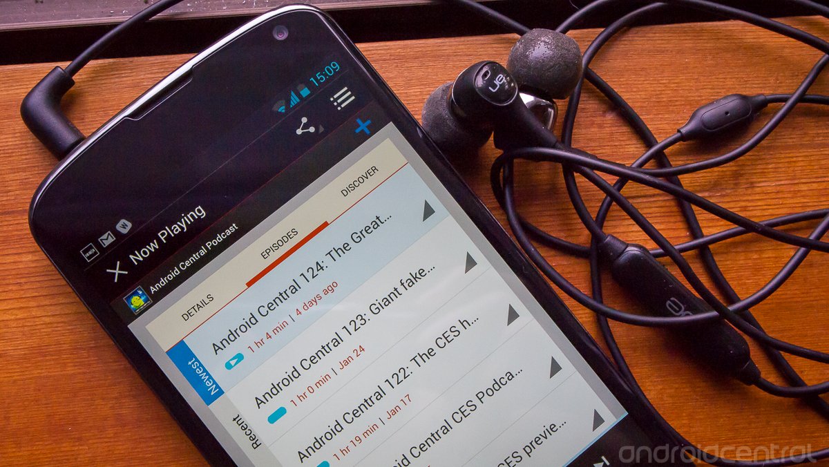
Stitcher Radio isn't a new app by any means, but it's been completely redesigned so extensively it might as well be considered new. It may have "radio" in the app name, but there's much more on offer here than just that. We took a look at Stitcher back in August and thought it was pretty good, and now it's just been thrust back to the top with a complete UI overhaul.
Hang around after the break and see everything the new Stitcher Radio has to offer.
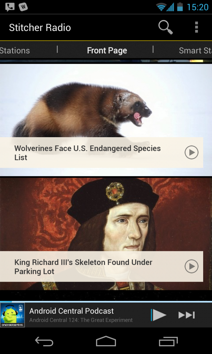
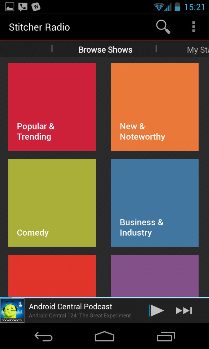
Stitcher really does so much more than just radio, and is starting to position itself as a centralized radio, news and podcast aggregation service. After spending some time with version 3.0 of the app they seem to be doing a pretty good job of it. The new UI is clean and holo-inspired, and the entire app is notably smooth and bug-free. Stitcher takes the standard holo theme and adds a touch of flare with different backgrounds and color highlights, which is a nice touch.
The new homescreen is a horizontal tabbed view if the different available categories, with the primary one being a "Front Page" view with popular clips on it. This is where you'll find news and interesting stories that are being highlighted. You can make a single tap to start playing anything on the list. Swiping to either side takes you into different forms of content. To the left you'll find "My Stations", where you can manage sources of your own. You can group stations of certain types into playlists, or if you prefer to have them all in one you can stick with a "Favorites Playlist" section. New shows, podcasts and radio channels can be added from the "Browse Shows" tab one more swipe over to the left, or from the universal search key that is persistent at the top of the app.
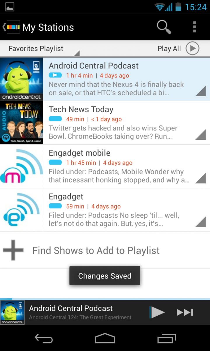
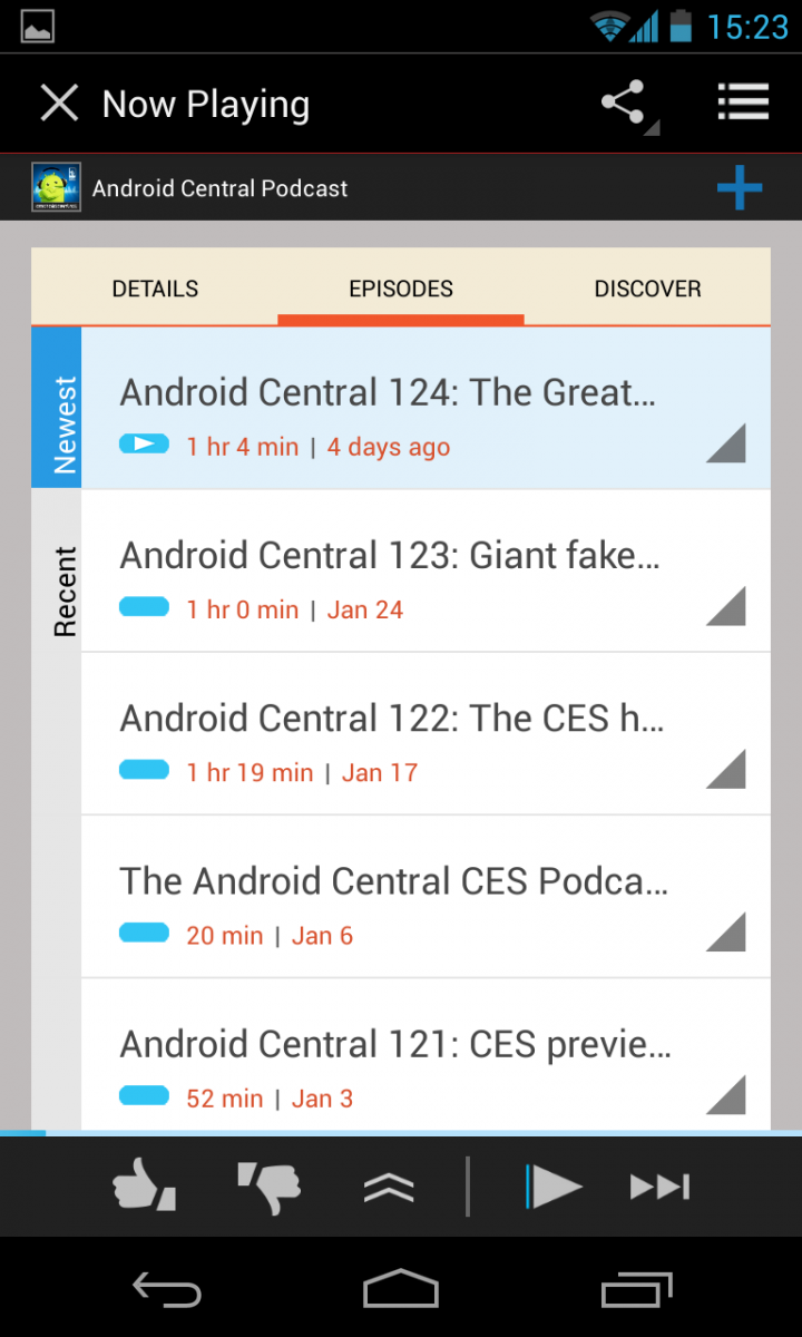
The complete UI rewrite is just as apparent in the playlist screen, which shows all of your new and unlistened items. Items can be played in one tap from the "Play All" button at the top, or you can dive into each feed to get information about the episode before you play it. Tapping the colored corner in the bottom left of each feed gives you advanced functions to get more info, play or share the episode.
Episodes are streamed as soon as you tap the button to play, and you get miniature play controls at the bottom of the screen even as you browse around to other parts of the app. If you exit back to the homescreen, you can continue to control playback with a Jelly Bean-style expandable notification that has play/pause, 30 second rewind and skip buttons.
With all of the great functionality in the new version of Stitcher's app, you may forget that there's a full-featured web version of the service as well. After signing in on the web, you can manage your playlists, listen and browse content all in one place on the site. This is one feature that can draw in both casual and power users alike, and really makes Stitcher feel like more of a service than a stand-alone app.
Be an expert in 5 minutes
Get the latest news from Android Central, your trusted companion in the world of Android
The idea of Stitcher Radio can be tough to grasp at first because it attempts to aggregate so many sources, but it can be quite compelling for users looking to get podcasts, radio and other new content without caring what specific medium the original content is from. Stitcher does a great job of pulling in different sources and presenting them as simple stories or episodes, not as separate radio, news and podcast feeds.
On top of a great selection of sources and content, Stitcher now wraps it all up in a beautifully designed interface that operates as well as it looks.
Andrew was an Executive Editor, U.S. at Android Central between 2012 and 2020.

