Springpad for Android helps you make social lists for everything
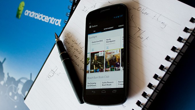
Springpad has been offering a social note service to Android owners for a long time now, with particular emphasis on a smooth, polished app design and a solid web counterpart. The Android app was recently featured on the Google Play store, so we decided to take it for a spin.
Springpad users create notebooks that are either public or private, and revolve around particular subjects. There are different types of notebook items based on activity (tasks, events, check lists) or subject matter (books, movies, music, places, and boatloads more). The kind of content added to these notebooks extends far beyond simple text - photos, audio, and locations can all be used. All of that being said, it's easy to see Springpad as the spiritual love child of Evernote and Pinterest. Maybe Path was a foster parent for awhile.
Function
Initially, it was hard wrapping my head around the structure of Springpad; it seemed like individual items had to be on lists, which were then tucked into notepads, but as it turns out lists can be "unfiled" and floating freely, which makes a lot more sense for light stuff such as grocery lists. Collections of items can be clustered into notebooks like "Home Renovation" and then broken down into "tools I need to buy", "design ideas", "relevant contractors," for example.
The sheer volume of content combinations within notebooks simultaneously limits and expands how well Springboard can act as a workflow partner. Any given notebook can have a plain text note, a location, an image, an event - a dizzying array, and one that can quickly derail any productive use if a user isn't sure how they should all relate to one another.
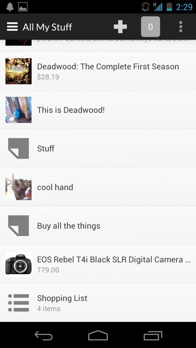
Even with a few content types having tailored experiences, some are fairly shoddy. Tasks don't show status (in-progress, delayed, completed, etc.), and though you can add timely reminders for items, they don't integrate with the native calendar app. Meanwhile, Bookmark items have a "done" button, complete with a review mechanism for those that have "done" a bookmark. I don't know about you, but I rarely have the need to "do" a bookmark. A few of the notebook types, such as the default Gadget Wish List, includes Want and Have buttons along with the standard favorite button; for outside viewers, that makes sense, but they feel redundant to have active for the person who posted it to the notebook.
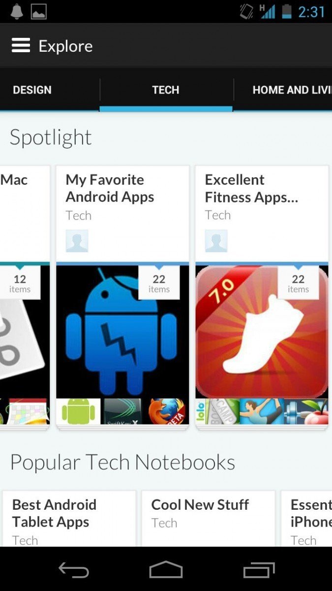
I'm still not convinced in the larger social network Springpad is attempting to foster, either. Public notebooks are categorized and tagged by their creators, while outsiders can subscribe to them, "spring" individual items to their own notebooks, leave comments, and mark them as favorites for future reference. Even the commenting section is overdone with the ability to leave audio comments. Images I understand, but under what circumstance would you want to record yourself as a comment to someone else's post? Is that something people do? Other users can also be given rights to post to specific notebooks, which can be handy for collaborating on projects large and small.
I tend to use Foursquare when socializing around locations, GetGlue when socializing around movies, Foodspotting for meals, Pinterest for building wishlists, and Facebook for sharing cool stuff online. Given, that's fragmented, but I know that the communities on those networks are avid about the subject matter, and the app experience is tailored to each individual activity. Meanwhile, Springpad is trying to do everything, but excels at little.
Be an expert in 5 minutes
Get the latest news from Android Central, your trusted companion in the world of Android
Style
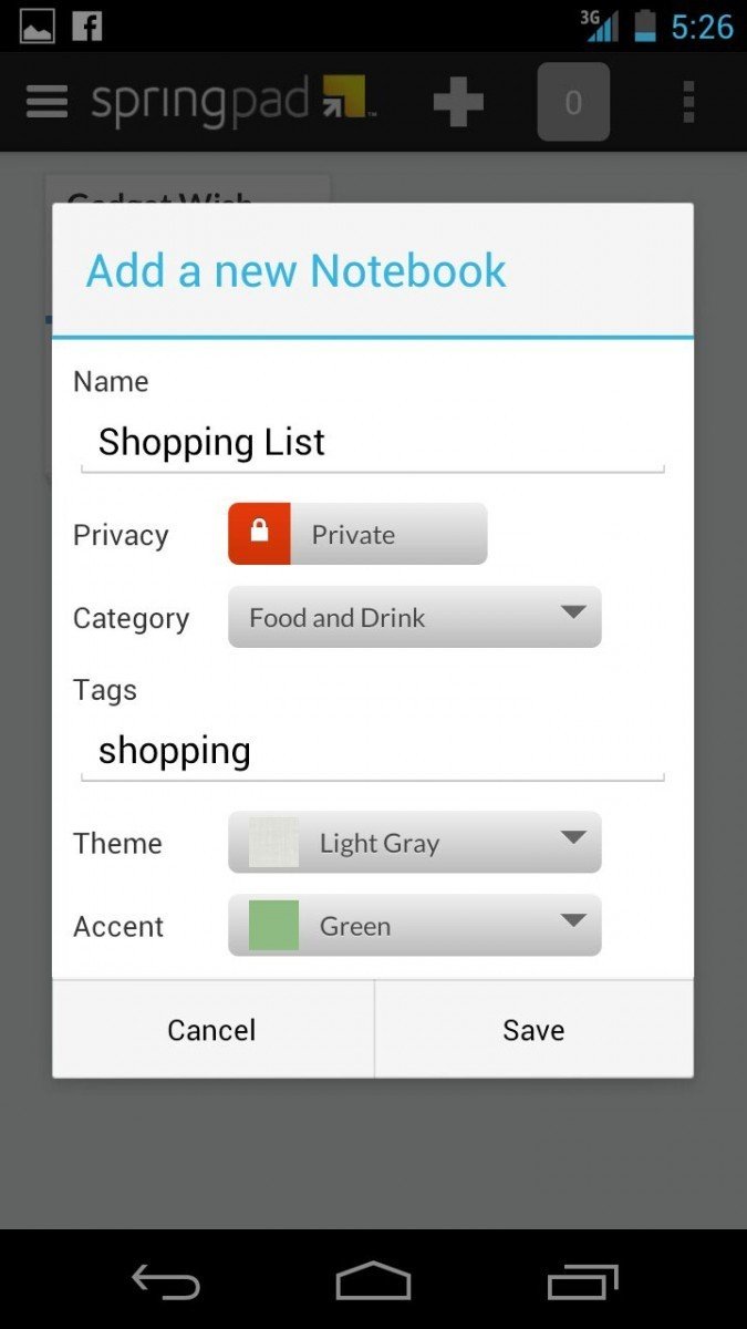
There's a lot of thought put into how each notebook looks and behaves. There are a bunch of color options for backgrounds and highlights which persist through both mobile and web iterations of Springpad. In the web view, you can even designate which kinds of navigation tabs are shown for each notebook and set the default viewing style. Much like the wealth of functionality, however, the styling options on the web can get overwhelming, and I quickly lost any patience to bother with them.
The layout of the mobile app is very clean, and the notebook view offers excellent at-a-glance status of privacy and recent content additions. The "quick add" button lets you get right ot posting items without having to chew through a lot of options, and simple usability touches like a long-press to initiate a deletion is really nice. There's a left-side pane with fly-out navigation options that are sensible and easy to use.
The good
- Can showcase wide variety of content
- High degree of user customization
The bad
- Overzealous breadth
Conclusion
The breadth of Springpad's utility can easily get overwhelming, and ultimately muddles specific use cases. In theory, Springpad could handle a lot of different things, from sharing pictures with friends or building wishlists, to staying on task day-ot-day and planning long-term projects. However, my gut reaction is to dive into easily identifiable, dedicated applications for each of these tasks. Trying to remember if Springpad is robust enough to handle any given situation can be a chore.
There's certainly hope for Springpad, since there are lots of partner possibilities; they already pull in Pricegrabber information for shopping lists, Amazon for product listings, and Rotten Tomatoes for movie reviews,. It's just hard to imagine "Spring It" as ever showing up as a sharing option on websites right next to Facebook, Twitter, and Reddit - namely because it would take a half hour to figure out which notebook to publish to, as what kind of content, and how to tag it.
For those that are looking for an all-in-one, social, cloud-based listing solution, Springpad may do the trick. Just make sure you have a very clear idea what you want to use it for, otherwise you will be buried in an avalanche of posting options.
Download: Springpad

