Spotify no longer sucks on Android tablets and Chromebooks
What you need to know
- Spotify is rolling out a new update with a tablet-optimized design on Android.
- The updated UI on Android is similar to the one that was rolled out to iPads late last year.
- Key highlights of the new design include larger album art and easier access to Spotify Connect.
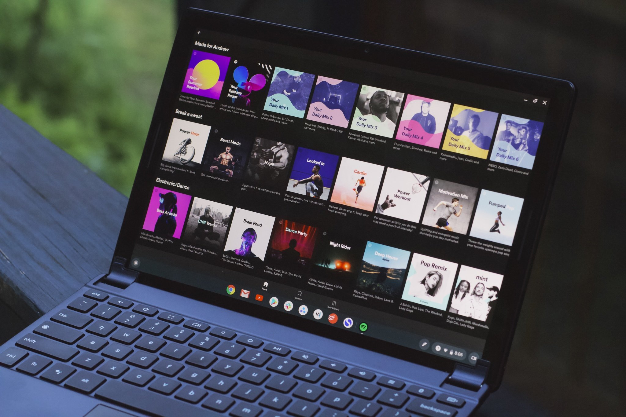
Spotify has finally refreshed its UI design for Android tablets and Chromebooks. According to a report from Android Police, the updated design has started showing up on the latest version of the Spotify app on Android tablets and select Chromebooks.
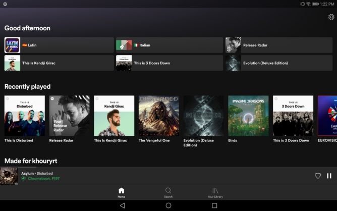
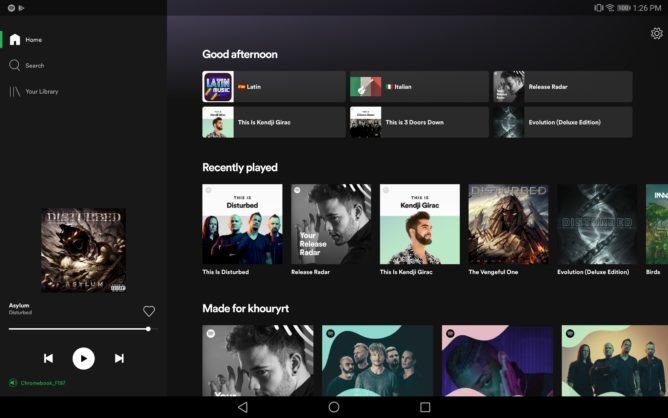
Until now, the Spotify app wasn't optimized for Android tablets and Chromebooks. The latest update, however, comes with several changes that help provide a much better user experience than before. As can be seen in the screenshots below, the refreshed UI includes larger album art, rewind and skip buttons that stay put all the time, and easier access to Spotify Connect. The front size, though, is still too small for Chromebooks that feature high-resolution displays.
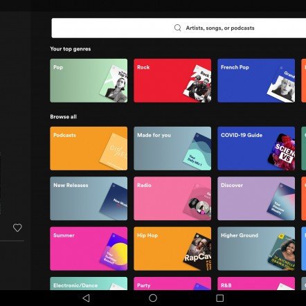
At this point, however, it is unclear if the update is rolling out to everyone or if these changes are part of a limited server-side rollout. If you are running the latest version of the app on your Android tablet or Chromebook and still do not see new UI, you could try joining the beta program on the Play Store. We will be updating this post when Spotify confirms a wider rollout.

Spotify Premium
Spotify is, without a doubt, one of the best music streaming services out there. With Spotify Premium, you can enjoy ad-free access to millions of songs, and download all your favorite songs to listen to them offline.
Be an expert in 5 minutes
Get the latest news from Android Central, your trusted companion in the world of Android

