Most of us here in the U.S. have had to look at our European neighbors in envy when it comes to high-end Sony devices. For whatever reason, the Japanese company just hasn't seemed to break in to the U.S. market. That ends today, with the availability of the Xperia Z3 on Verizon.
Actually, it's the Z3v were talking about here today. We've already reviewed the proper Z3 and Z3 Compact, and it turns out that little difference in the name denotes quite a big difference in look and feel. We're only a half-year beyond the Xperia Z2, and the Z3v strangely sort of finds itself stuck between the last generation and this newer update.
So is the phone in No Man's Land? Or is it worth your time and money? Late's take a look in this, our Verizon Sony Xperia Z3v review.
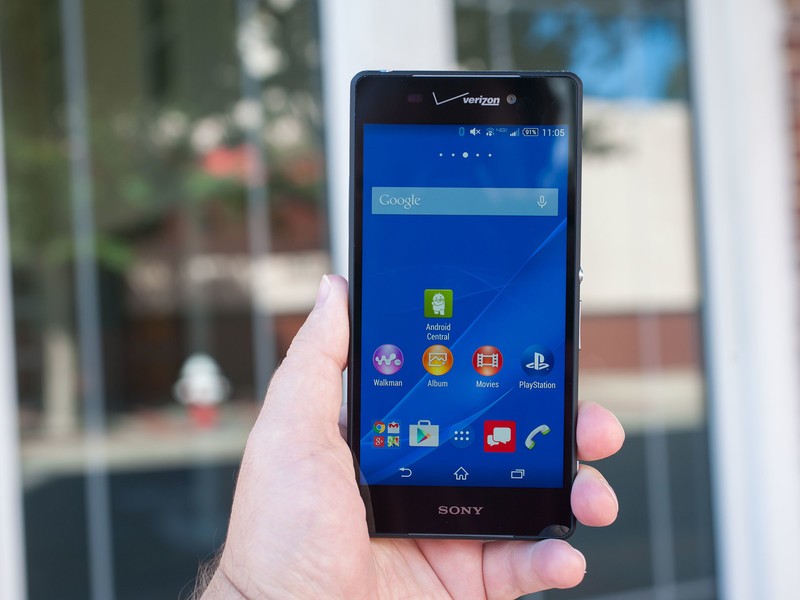
About this review
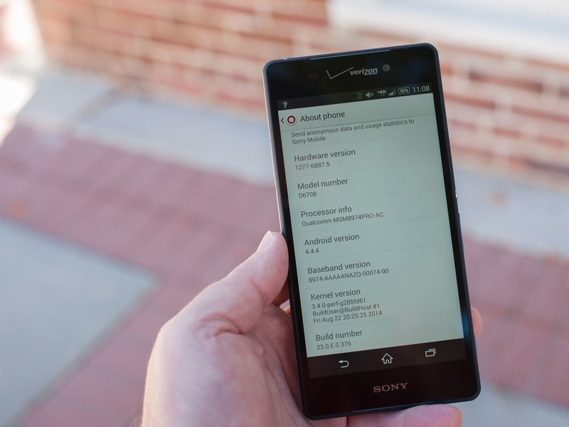
We're writing this review after using the Xperia Z3v exclusively, as supplied by Sony and Verizon, for a little more than a week. It's running Android 4.4.4 KitKat, and software build 23.0.E.0.376.
I've used the phone extensively in my usual stomping ground of Pensacola, Fla., as well as in suburban Chicago. And a few points in between.
What I don't have is a great sense for Sony phones in general. As mentioned, this phone marks the return of Sony to the mainstream U.S., and so I feel like I'm coming into this a little blind. But maybe that's a good thing — I've got no real expectations here, and no leftover regrets just months after the release of the Xperia Z2.
Xperia Z3v hardware
Wait, is this an Xperia Z2?
This is a Z3 in name, but the stylings very much look more like the Z2. It's solid, but not all that exciting to use.
Sony's build quality hasn't really been in question of late. The Xperia line has generally been a premium one, and that continues in the Z3v. That said, something's just ... off here. This is a Z3 in name, but the stylings very much look more like the Z2 — again, all of 8 months old or so — than the rounder, sleeker Z3. Why'd Verizon go that route? Maybe it was necessary to include Qi wireless charging. Or maybe Verizon simply wanted a visual difference as to not look quite so much like the new iPhone 6.
But what you're left with is a phone that's more blocky than what you'd expect if you've been following the Xperia Z3. It's a big slab of glass, both front and back, with rounded corners, that telltale Sony power button on the side, and beveled edges. But it's lacking that roundness of the new model, and that's a shame. The beveled soft-touch edges break up the smooth lines of the Z3 proper, and not in a good way. They give you a little bit of grip, though, which is nice, since the rest of the phone is glass. We haven't had too much trouble with it sliding off tables like we have similar phones, though.
Is this weird hybrid design a deal-breaker? Not hardly. But it's a bit odd, and more than a little disappointing. It just doesn't evoke any sort of emotional response. Here's this big blocky phone. I'm using it. Yay.
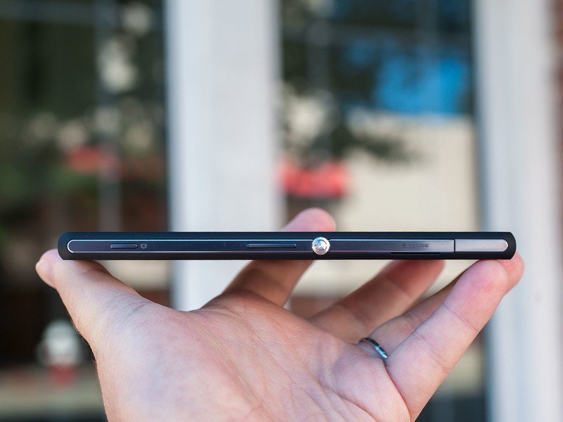
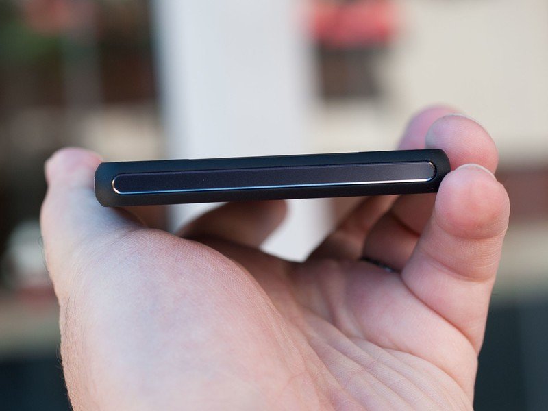
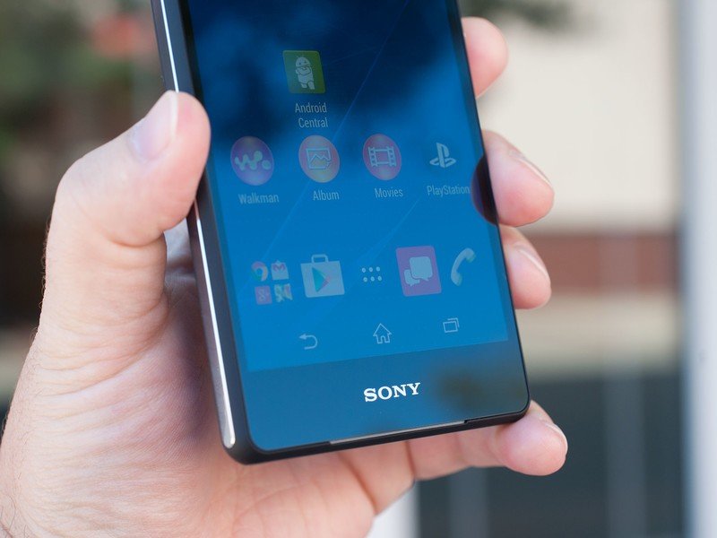
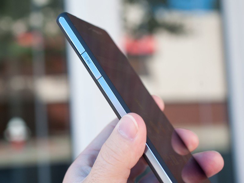
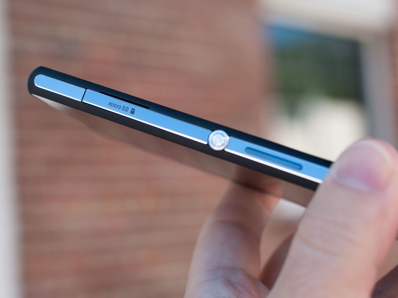
That said, the physical differences also mean that the metal banding is pretty continuous around the phone (save of for the corners), and it's quite striking in its own right. The metal bands help camouflage the doors for the SIM card, and micro SD card, both of which can be opened with a fingernail and are well-sealed, as part of the phone's waterproofing capability. The microUSB port is hidden behind an unlabeled flap to to the SIM card. That's going to confuse folks to no end. But on the other hand it'll probably help push the Qi charging, and that's not a bad thing.
And you'll also find a dedicated camera button on the right-hand side, a nice addition given the importance Sony places on the camera in its Xperia phones.
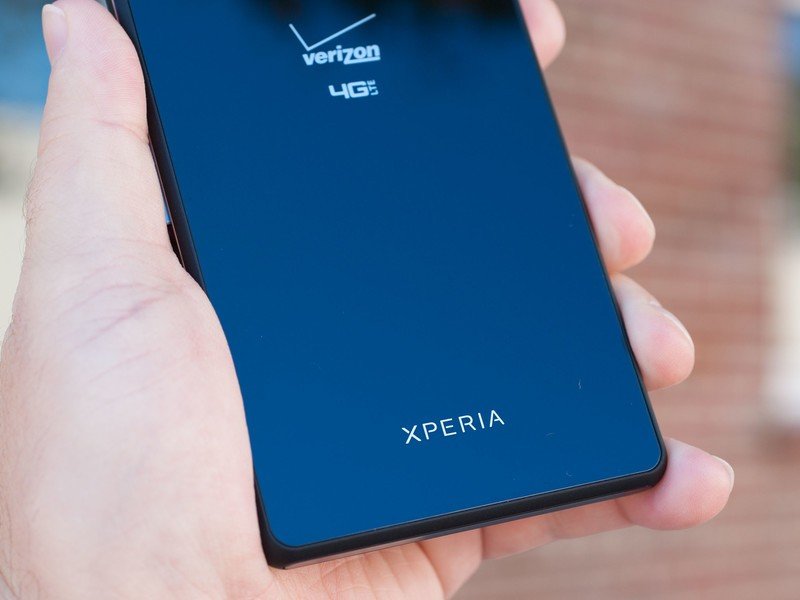
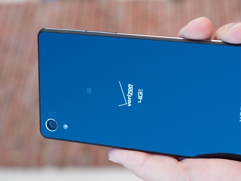
We don't usually talk too much about the logos on a phone, except when we want to gripe about them, and Verizon's unsurprisingly and unabashedly all over the Z3v. Same with the Sony and Xperia logos. But they're actually pretty stylish, with their reflectivity standing out as a design point instead of just a logo slapped on a phone. It's still a bit NASCAR-ish, but at least it doesn't look as out of place as it has on other phones.
Also out front you'll find front-facing stereo speakers. They're extremely slim, and we wouldn't blame you if you missed them. But they're also surprisingly good. We're not quite into HTC BoomSound territory — the HTC One M8 still rules that roost, both in terms of volume and depth — but Sony's got itself an excellent-sounding phone here. Our only complaint is that the top speaker (which also serves as the earpiece for phone calls, naturally) tends to reverberate through the rear of the phone. It's a small thing to be sure, but noticeable when you're holding it.
There's a neat little notification light tucked up in that top speaker, too. It's much cooler than just a tiny notification LED, but it's also pretty conspicuous at night, if you leave your phone on a nightstand or some other place it might bother you in the dark. And to that end there's no true do-not-disturb mode. You can, however, turn off the notifications altogether, which is what I've done. (Hopefully Sony keeps the built-in DnD feature when the Z3v gets its update to Android 5.0 Lollipop.) And Sony does, however some Tasker-like options with its "Smart Connect" app, so you can set events to activate different features. (Plug in headphones and a music app will launch, for example.) You're able to do a fair amount of customizing here.
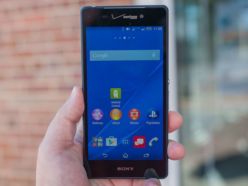
Colors are crisp and clear with the default settings, and it's extremely good outdoors in direct sunlight.
The display is a 5.2-inch "TRILUMINOUS" panel at 1080p resolution, and that's been plenty dense enough for our discerning eyes, to say nothing about not being as power-hungry as the newer QHD screens. It's also extremely good. Colors are crisp and clear with the default settings, and it's extremely good outdoors in direct sunlight though (nerd alert!) you do tend to notice the dots in the digitizer pretty quickly. If you don't like how the display looks, or if you think you can do it better than Sony, you've got a few options at your disposal. By default the "X-Reality" mode is turned on, which Sony says "makes images clear and vibrant." Or you can choose "Super-vivid mode," which "makes colors stand out to get super-vivid images." Or you can turn both off. I left it on the default, as things looked just fine to me.
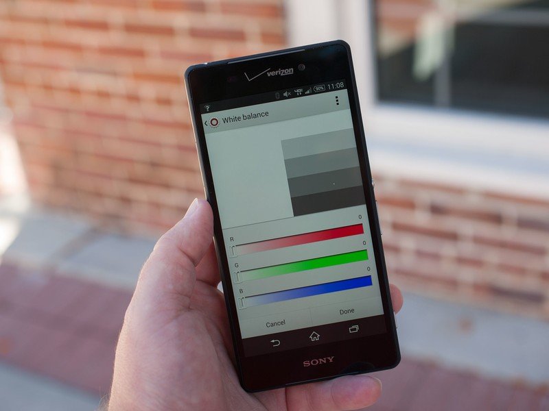
Or if you're really into this display stuff, you can manually adjust the white balance to your liking. I was perfectly fine with the default, though.
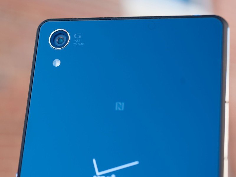
'Round back is another huge tract of glass, logos from Verizon, Xperia and NFC (Sony's always been in tight with that consortium) and the 21-megapixel camera, recessed ever so slightly. Even with the tramp stamps it's still a pretty striking back, with they silver contrasting the black.
There's something oddly familiar about this, and it took me a little while to figure it out. Think of a more blocky Nexus 4. Huge tracts of glass on the front and back, with soft-touch bezeled sides. That's what you've got here in the Z3v. It's lacking the ergonomics of the Nexus 4 — and certainly of the better-designed phones of the past 18 months. The weight and heft are good, overall making the Z3v feel like the solid, post-modern phone it is. It's just lacking a bit of that human touch we've come to know from the likes of Samsung, HTC and Motorola.
What's under the hood
We're still atop the hardware plateau, the point at which we can (and will) list the specs of a device and tell you that it runs just fine under load, just fine during day-to-day activities, and and the 3,200 mAh battery should get you through a full day, or pretty close to it. (A poor network connection will still muck up the works, of course.) In an office or home environment with Wifi a-plenty, you should easily be able to get from breakfast to bedtime on a single charger. Use your phone more and that'll go down, obviously. The inclusion of Qi wireless charging makes topping off easier, especially since you won't have to mess with the hidden USB port under that weather-sealed flap.
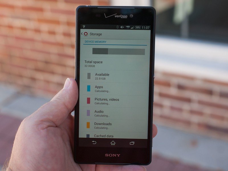
The finer points include a Qualcomm Snapdragon 801 processor with Adreno 330 GPU, 3 gigabytes of RAM and 32 gigabytes of built-in storage. (Remember that you've got up to another 128GB via the microSD card as well.) All the usual bells and whistles — Bluetooth 4.0, ANT+, MHL s support and Miracast are all included.

Xperia Z3v software
It's Sony's show, with media and gaming the start
As we mentioned, the Z3v is running Android 4.4.4 KitKat — yes, Sony's already promised an update to Android 5.0 Lollipop — that's been heavily customized by Sony. No surprise there, it's just pretty striking if you're coming from more stock devices. From the launcher to the recent apps (aka multitasking) to the notification shade, camera, gallery and settings, there's not a whole lot that's been untouched by Sony here.
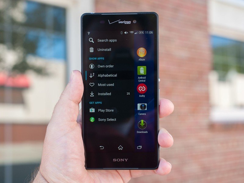
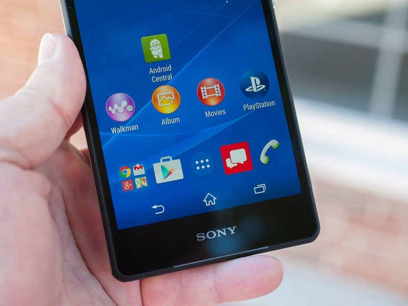
The launcher is a solid mix of Sony and Verizon. You've got the former's suite of custom apps, from the clock to the productivity software. And you've got all of the usual Verizon bloatware, from apps that help you manage your account and retrieve voicemail, to the Amazon suite that it's including in all its phones .And you've got the pullout that's at the far-left in the app drawer, giving you shortcuts to more applications options. From it you can search your apps, uninstall apps, choose how they're ordered in the app drawer (custom, alphabetically, by most used or by "installed"), and you'll find shortcuts to the Google Play Store or Sony's own "Sony Select" store.

The lock screen's pretty basic. You get a clock with the day and date, and a shortcut to drag to open the camera app. (You can later customize that in the camera app itself to either merely open the camera, open and fire off a still pic, or open and start recording video. Or you can just shut it off altogether, making the lock screen even more basic.
If you want to et to Google Now, you'll need to pull up from the home button — but you'll also find a shortcut to Sony's "What's New" section for music, movies, apps and games.
Hit the recent apps button and you'll find the apps that you've been working in, as well as a "Small Apps" section. Expand it and you'll have shortcuts to Sony's take on a multi-window system, where apps open in a smaller form, sort of like widgets. You can add and remove these "Small Apps" as you like. It's a neat little implementation.
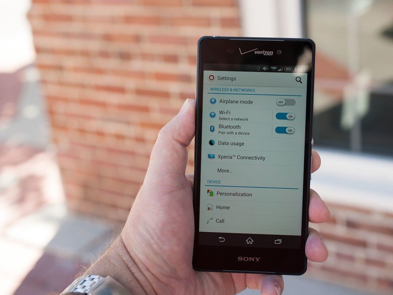
It's worth spending some time in the settings, even if you're a longtime Android user. In addition to the display options previously mentioned, there's you're also able to turn on a double-tap-to-wake feature. (I haven't noticed any real difference in battery life with it turned on, but, yes, it will use a little.)
We haven't mentioned too much about the PlayStation functionality of the Z3v because it's not actually available yet while we're writing this review. But it will be there, we have seen it demoed briefly at Sony and Verizon's announcement event, and if you're a big PS4 user, being able to hop from the console to your phone (or vice-versa) is a compelling reason to get this phone.
Xperia Z3v cameras
Oversampling ahoy
Sony's long provided above-average cameras, and this is my first time really getting some experience with one. The Z3v is rocking a 21-megapixel shooter on the back, using Sony's 27mm wide-angle "Sony G lens." The catch is that is by default your shots are downsampled to 3840 by 2160 — 8 megapixels. That's more than enough for sharing on the Internet, and you can always change the resolution to something higher if you want. I found the default to be just fine for what I do.
There's a whole lot going on with this camera, actually. The default finds you in "Superior Auto" mode. (Those of you who have used Sony's more traditional camera will remember this mode.) It looks at what you'er shooting and then applies the settings it thinks are best. I'm typically a default shooter. That is, I want it to be quick, and I want the end result to be pretty good. And I don't want to have to think too much about it. So I generally stay away from anything that says "Manual."
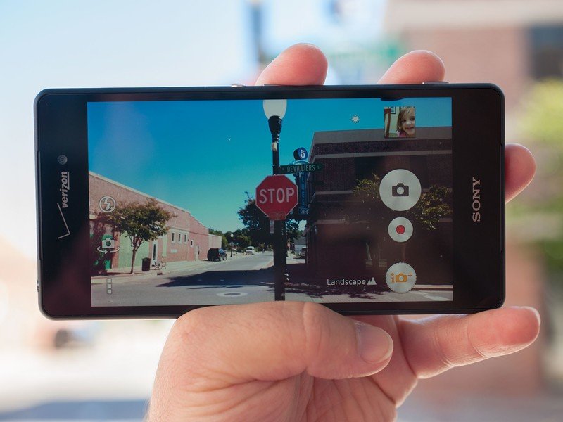
Superior Auto is good enough for most shots, while Manual gives you granular control of pretty much everything.
But you're going to need to get into the Manual mode here on the Z3v. That said, Superior Auto was pretty good for most shots, though the couple of bleary days I spent in suburban Chicago seemed to blow out the gray sky a little bit. There are a number of other "modes" you can explore — this is how you get quick access to panorama modes or 4K video, for example. But other things like HDR and a dedicated backlight mode will be found under "Scenes" when you're in manual mode. It took me a few days to find them there, actually. Some of that I think is because the UI of Sony's "Modes" section almost looks like a mall, and in its own right it is, mixing currently available features that have their own names ("Time Shift Video" is what you're looking for if you just want a simple slow-motion recording) and are right next to other options you can download — and those a really just other camera apps.
The Album app (aka the gallery) also has a ton of options to explore. It'll sort your shots by folders, favorites or faces, in addition to the usual "here are all my picture" mode. Or it'll do it by location, which looks and feels a lot like how Instagram does it. You can build slideshows with it as well.
In other words, Sony's packed a whole lot into this camera, but often under new names and in ways you might not expect. It's a really good, really functional camera — it just takes some getting used to is all. And don't forget that you've got that physical shutter button that can be used to launch the camera app as well as take a picture.
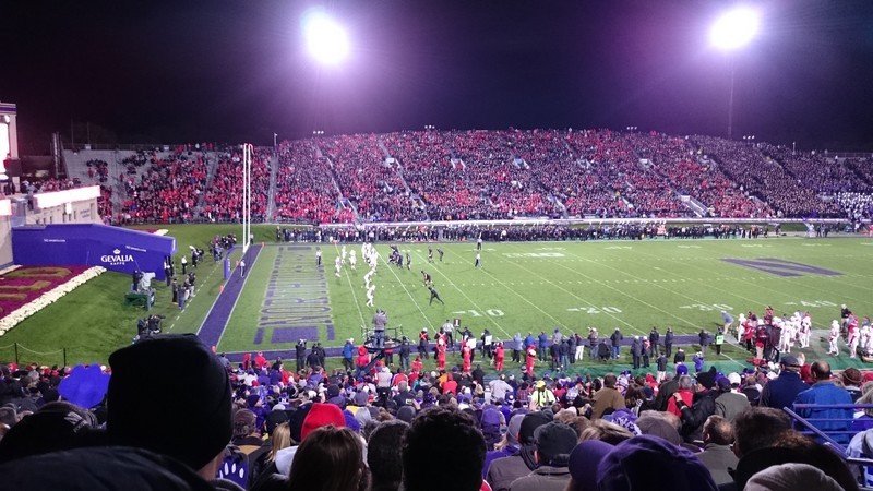
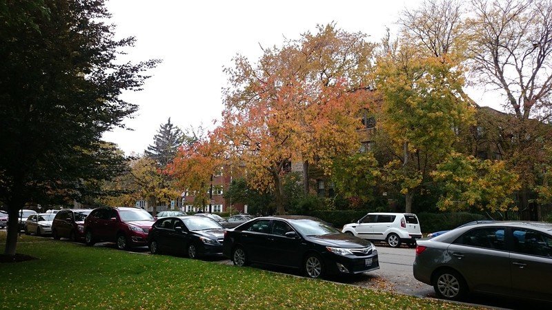
Now on to the really important stuff: The sample shots.






A few other odds and ends
- Sony's keyboard is pretty usable. I'm still used to third-party keyboards, particularly for the prediction, but Sony's is nicely laid out and has a good feel to it.
- No problems making calls on this phone. Verizon worked as well as it always does.
- But, again, that top speaker reverberates throughout the whole top half of the phone, even when you're not using it as a speakerphone.
- Bluetooth and GPS worked as expected.
- Sony has its own updates section for its apps. (An app to update the apps, actually.)
- Softcard (the payment app formerly known as ISIS) is on board. I've still never used it.
- Sony's got its own "Lifelog" health tracker, which you sign into using a Sony ID that I really don't want to have to sign up for.
- Sony's accessibility options are pretty pitiful, given all the other features on the phone. Just the basics here.
- Because someone always asks, yes, toss in an AT&T SIM and the phone recognizes the AT&T network. You'll have to mess with the APN setting, though.
- No, you don't get simultaneous voice and data, at least not without VOLTE. Which the phone doesn't yet have.
- The phone's status menu tells whether the Xperia Z3v is rooted.

Xperia Z3v: The Bottom Line
Not quite a Z3, but still pretty good
I'm still not entirely sure what I expected in the Xperia Z3v. I suppose I thought I'd be getting a Z3, with the Z3 design. Instead, I got something that looks and feels more like a Z2, with slightly better internals and newer software. And that's not really a bad thing, it's just not an Xperia Z3. And that's a little disappointing. I dare say it's almost boring to hold.
This isn't the Z3 you might have expected, and the design isn't all that inspiring, but it is a feature-filled and powerful Android smartphone.
So what do we have? A powerful Android smartphone filled with all kinds of features. Most you'll also find on other smartphones, but Sony's done well to leave its mark on things. If you're into the PlayStation 4 and want to take some of that gaming experience mobile, then the Z3v will be the phone to get. Well, if you're on Verizon, that is. (And, again, the PS features weren't complete at the time of this writing.)
The Z3v has a much more industrial feel than I expected, and it's just not as much nice to hold as recent releases from Samsung, HTC and Motorola.
You've also got a phone with a very good camera. It's a little more complex and not as easy to use as other phones, but the end result is usually worth it, and Sony does its best to simplify things with its "Superior Auto" mode.
Really, the best way to sum up the Xperia Z3v may be this: It's good to see Sony back on U.S. carriers. But it's a shame Verizon didn't go with the best phone Sony has to offer, even if it really only missed in superficial ways.


