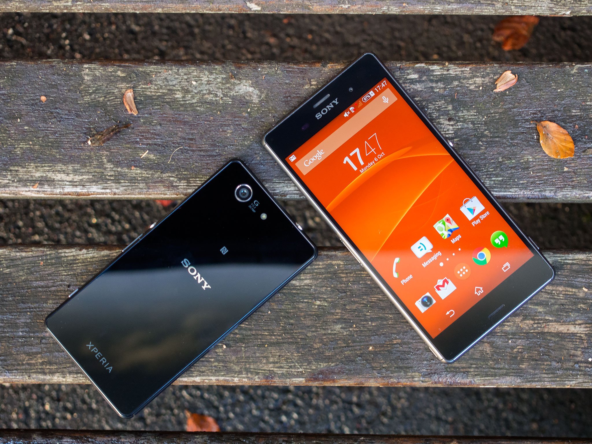
Over the past year, Sony has shown a quiet determination to claw its way to the top of the smartphone food chain. The Japanese electronics giant may be in a sticky financial situation at present, but in 2014 it's fielded some of the most compelling high-end smartphones on the market. At CES this January it was the first big Android player to offer a true flagship smartphone in a smaller form factor with the Xperia Z1 Compact. A few months later it improved on the Z1 in a few important areas with the Xperia Z2, one of the most balanced Android flagships of the year.
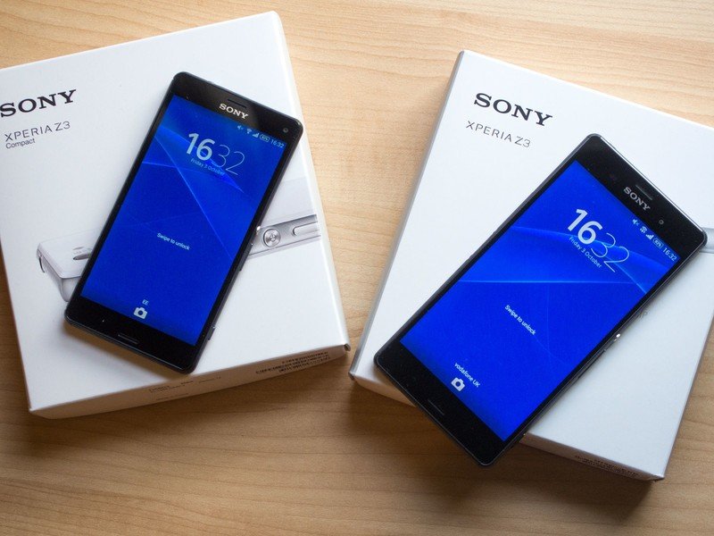
Six months later, Sony's back with another fall refresh, and two new smartphones in different form factors. There's the Xperia Z3, the latest iterative update for Sony's Z series, and the Xperia Z3 Compact, which takes the guts of the Z3 and transplants them into a smaller chassis.
Given the similarities between the two, the Xperia Z3 and Z3 Compact call for a different kind of review, and as such we're going to present a mega-review of sorts, covering all the usual areas, as well as the differences between the two.
Read on to find out how Sony's latest handsets shape up.
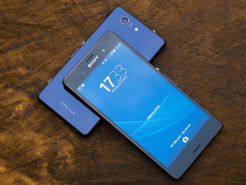
About this review
We're publishing this review after a week with the global unlocked Xperia Z3 (D6603) and Xperia Z3 Compact (D5803) on the EE network in the UK, in areas with good LTE coverage. Our review units were running software version 23.0.A.2.105.
Thanks to Clove Technology for providing the Sony Xperia Z3 for review. Clove is selling the Xperia Z3 for £515 inc. VAT, and the smaller Z3 Compact for £349 inc. VAT.
Xperia Z3 + Z3 Compact hardware
Not your average rectangles
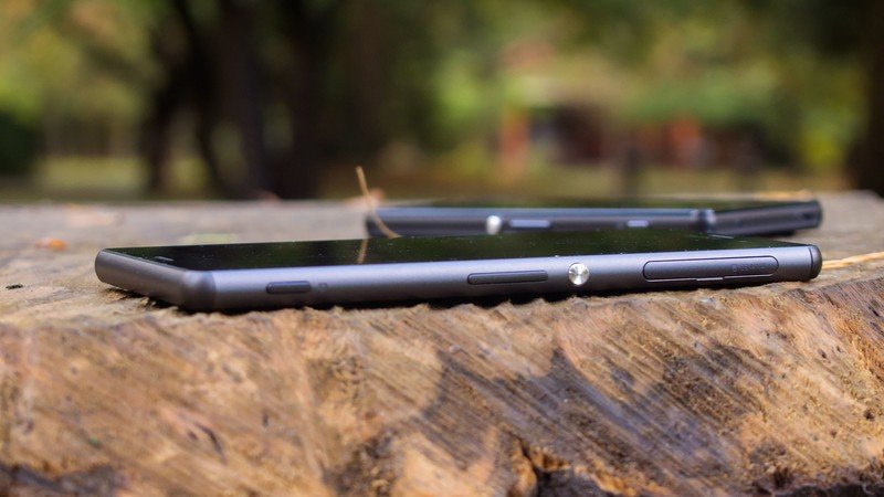
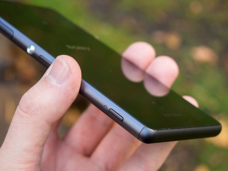
The Xperia Z3 series represents the latest evolution of Sony's "Omnibalance" design language, introduced over two years ago with the original Xperia Z. Since then it's undergone several iterative changes — first introducing metal to the mix, then making things slimmer and curvier — but the essence of this flat, squared-off look has remained: a stylized band sandwiched between two stark sheets of glass. And for its late 2014 offerings, Sony has paid close attention to the ergonomics and in-hand feel of its new smartphones.
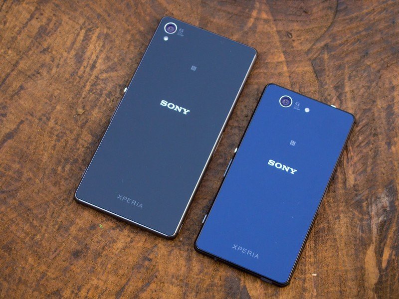
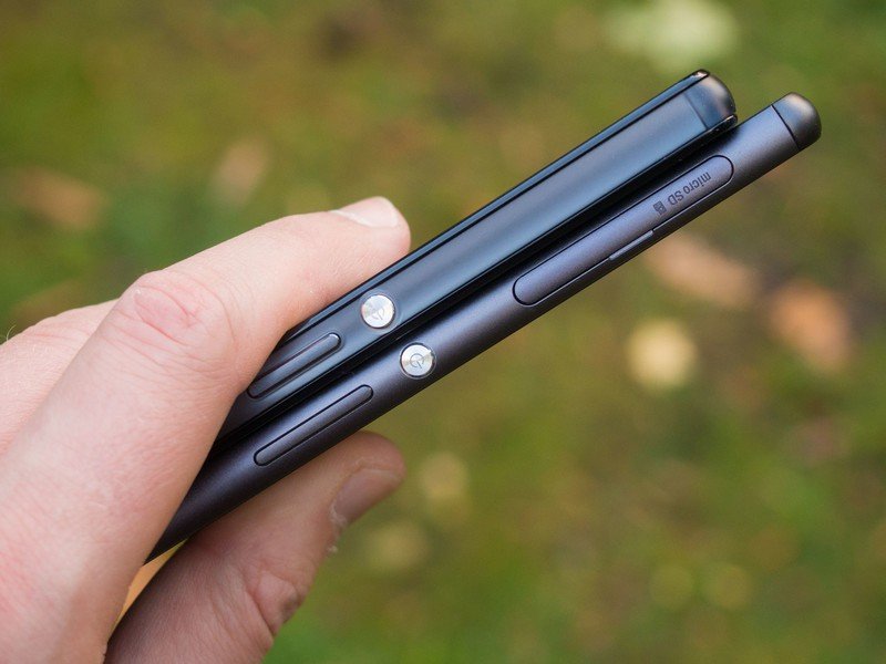
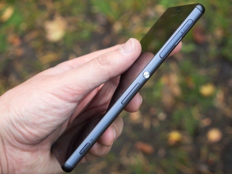
The full-sized Xperia Z3, a 5.2-inch beast, retains the metal band of previous generations, but morphs it into a much less cumbersome package. For starters it's noticeably thinner, narrower and lighter than its predecessor. The visual difference isn't huge, but it's enough that the in-hand feel is much improved. This is no longer a jagged, angular piece of metal jutting into your palm, instead it feels like a device designed in deference to the human hand.
The front and back remain more or less unchanged from previous Sony designs — it's pretty much just glass on both sides, with a smattering of Sony branding. With double the glass comes double the opportunity for breakage if you're unfortunate enough to drop the device, however.
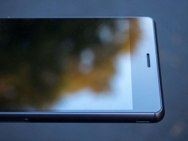
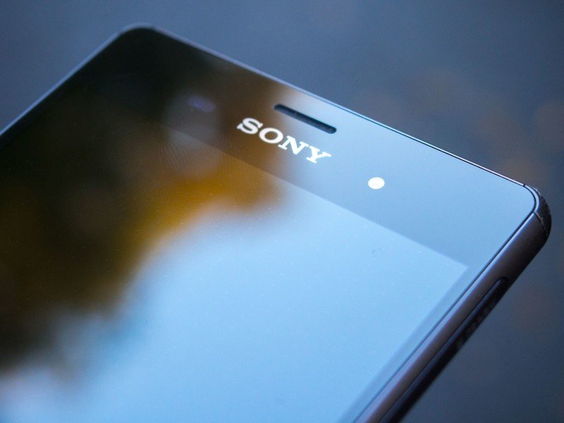
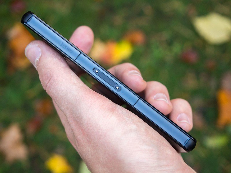
The same, but sleeker, slimmer, rounder and easier to hold.
Front-facing speakers have become increasingly popular since the arrival of the HTC One M7, and Sony continues this trend in its latest products. The Z3 and Z3 Compact's speakers are plenty loud, so you'll easily hear notifications and ringtones if the device is in your pocket. However they don't match up to the bass offered by HTC, and sound relatively tinny next to the M8.
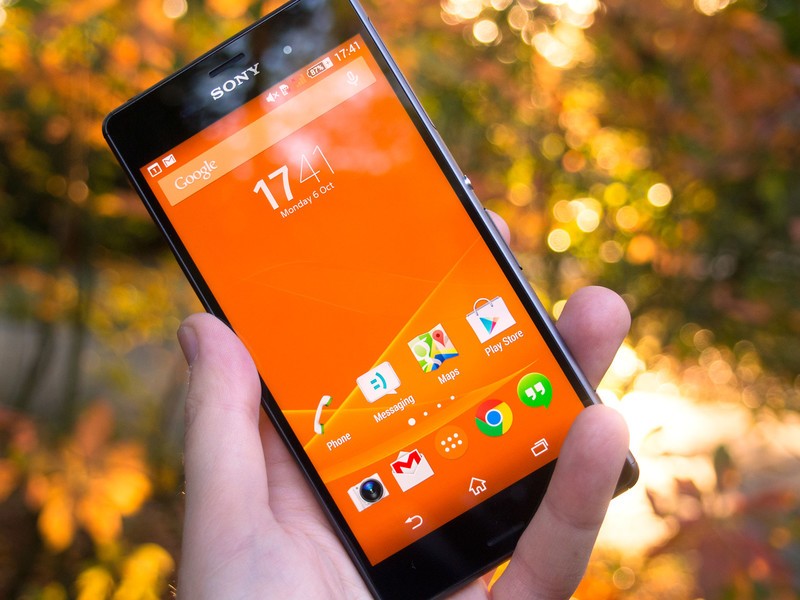
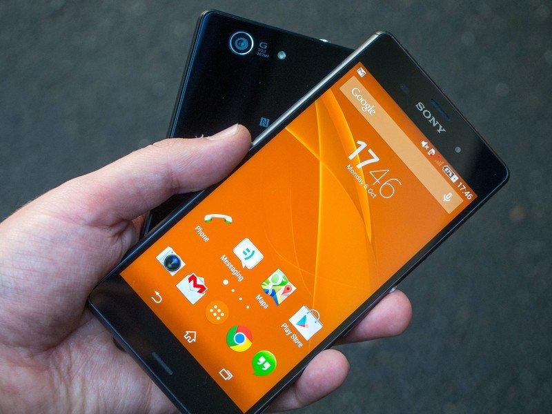
As for the displays themselves, Sony's sticking with a 5.2-inch measurement and 1080p resolution for its larger handset, the same on paper as the Z2. However the numbers don't tell the full story — the Z3's display is better-looking than its predecessor by an order of magnitude. Everything about it is a marked improvement — colors are brighter and more vibrant, without being excessively over-saturated. Whites appear brighter and cleaner (though you can still tweak white balance in the display menu.) And daylight visibility, an area of relative weakness last time around, is far superior on the Z3. All in all, this is one of the best-looking screens on an Android phone.
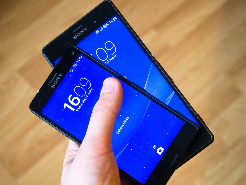
Much of this praise can be heaped on the Z3 Compact, too. For its smaller offering, Sony switches to a 4.6-inch 720p panel that looks almost as good as its big brother's. If we had to nit-pick we'd say colors appear slightly duller on the Z3 Compact, but this is a difference you'll only notice with both side by side. (And given the smaller size and lower pixel density of the Compact, it's not an entirely fair fight.)
It's also a significant achievement that the Z3 Compact has upped its screen resolution and battery capacity while maintaining the same footprint as the six-month-old Z1 Compact. Buyers of Sony's second-gen Compact will get much more bang for their buck — a fantastic body-to-screen ratio, and an enormous battery in a relatively small device.
The rounded band is another significant point of difference between the big and little Z3s. The more premium-feeling aluminum frame is exclusive to the larger Z3, while the Z3 Compact makes do with a soft plastic trim. There's no denying the bigger phone feels classier, but the Compact's plastic edges have their benefits. It feels almost unnaturally light, much more so than the Z1 Compact, and its edges are also grippier, making in-hand slippage less likely. The trim on both models is separated out into segments, with subtle joins evident on the corners, so it's not quite as continuous as before.
The Z3's 1080p display is better than its predecessor's by an order of magnitude. And the Compact's 720p screen is pretty damn good too.
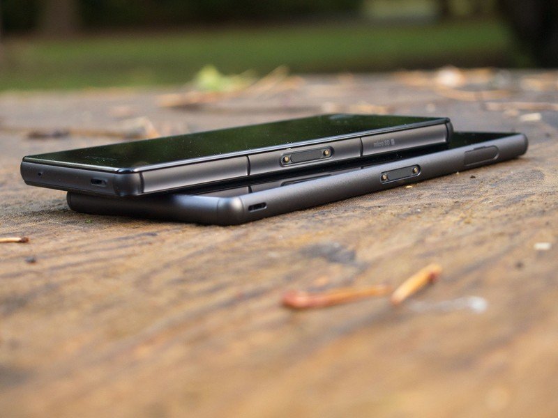
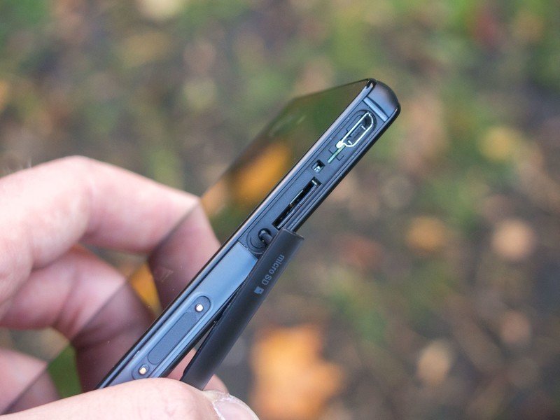
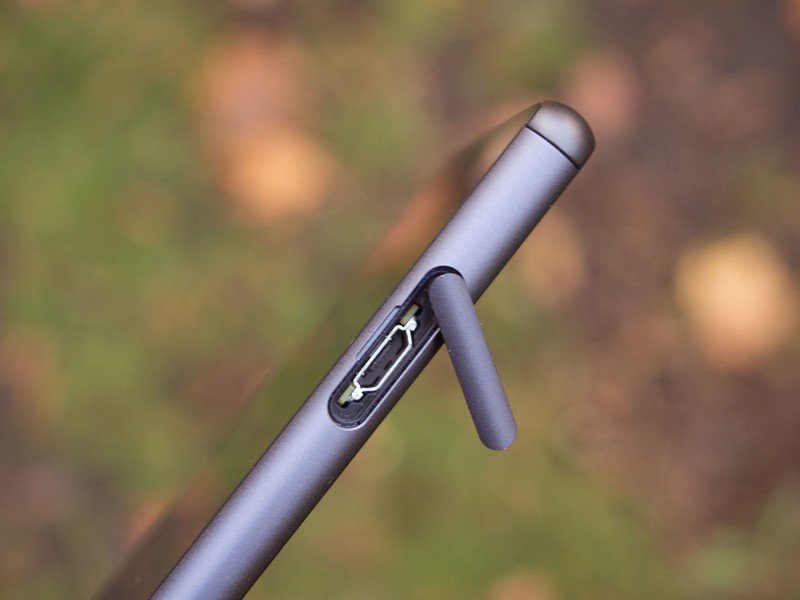
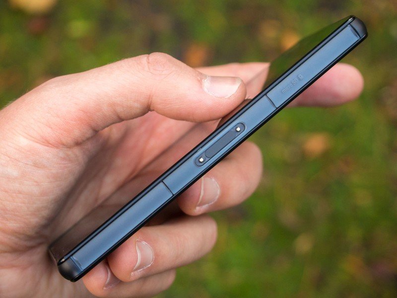
On both models you'll find microUSB, microSD and nanoSIM slots concealed behind large protective doors, sealed to protect against water and dust. On the Compact, these are relatively large and plasticky, and pretty unsightly when they're open.
On the full-sized Z3, though, these have been slimmed down, making them less noticeable, and fitting more elegantly into the overall design. In fact, there's much less visual clutter going on in general, which makes the 5.2-incher seem more thoughtfully-designed and less clunky.
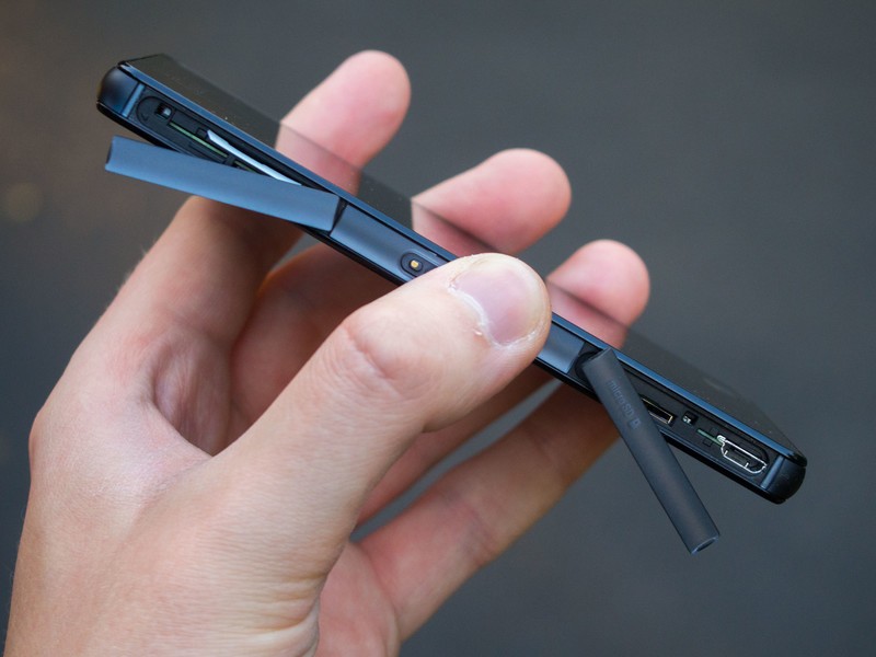
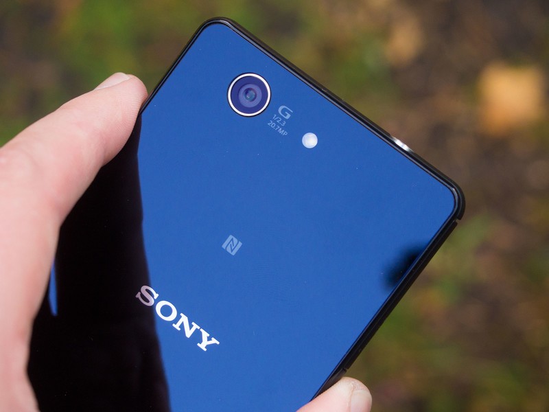
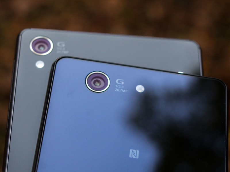
Elsewhere, the general placement of stuff hasn't changed too much. Both Z3s include magnetic charging ports for use with Sony's aftermarket magnetic dock. And around the back there's a 20.7-megapixel camera that sits flush with the glass back. The only real bumps you'll come across are the side-mounted power and volume keys.
With the user experience and internals being so similar, the decision between the Xperia Z3 and Z3 Compact mostly comes down to which size you prefer. The Z3 Compact may be the answer for buyers seeking high-end performance in a device that's not gigantic. But we've been surprised by how great an impact the small design changes have made to the full-sized Xperia Z3. Millimeters trimmed down here and there, together with the inclusion of curvy corners, have made this easier to one-hand than any Z-series flagship.
Performance and specifications
Bigger numbers only tell part of the story
Both Z3s are powered by Qualcomm Snapdragon 801 processors at 2.5GHz — a small bump from the previous generation. Snapdragon 801 is a proven chip at this point, and while it's not an earth-shattering improvement upon the computational power of the Z2, both the Z3 and Z3 Compact feel quicker than earlier Sony phones. Most of this can be attributed to touch responsiveness, an area where Sony's made substantial improvements this time around. Touch input on the Z3 doesn't exhibit the weird fuzziness of the Z2, and many of the occasional delays from that phone — for instance, in the recent apps menu — are gone too. Whether this is due to hardware or software is unclear; either way, these feel like faster phones than their forebears.
The regular Z3 includes 3GB of RAM, still the most we've seen — or are likely to see until 64-bit phones arrive — in an Android handset. On the Z3 Compact you'll downsize to 2GB, though we've found this makes virtually no difference in day-to-day use. That said, the extra gigabyte of the Z3 should provide extra breathing room for memory-heavy apps.
Our only real hardware complaint is 16GB cap on internal storage.
As for the other type of memory, both phones come with just 16GB of storage, at least in Europe, where they're currently available. As apps and games become larger, and Android itself becomes heavier, it's increasingly difficult to justify limiting internal storage in this way.
Nevertheless, most users shouldn't find the available 11GB and change too claustrophobic — and there's also the option to offload some stuff, including certain apps, to a microSD card. (And as an aside, we should note that it looks like the T-Mobile U.S. Z3 variant will ship with 32GB of storage, as the Z1s did.)
Naturally, both phones also pack batteries of different capacities — 2,600mAh in the Z3 Compact, 3,100mAh in the larger model — meaning there's ample power on offer. And while the Z3 actually includes a slightly smaller battery than the Z2, it more than makes up for this with power savings in other areas. As we'll discuss later, both devices offer best-in-class longevity.
Both Z3s include a full complement of connectivity features too — Wifi 802.11ac, Bluetooth 4.0 with aptX and 4G LTE. Like earlier Sony phones you'll get a whooping 10 bands of LTE coverage on the global Z3 and Z3 Compact models — Bands 1, 2, 3, 4, 5, 7, 8, 13, 17, 20 — meaning you're good for most European networks, and AT&T and T-Mobile in the U.S.
| Sony Xperia Z3 | Sony Xperia Z3 Compact | |
|---|---|---|
| Weight | 163 grams | 129 grams |
| Dimensions | 146 x 72 x 7.3 mm | 127 x 64.9 x 8.6 mm |
| Battery | 3200mAh | 2600mAh |
| Display | 5.2-inch 1080p | 4.6-inch 720p |
| OS | Android 4.4.4 KitKat | Android 4.4.4. KitKat |
| CPU | Snapdragon 801 2.5GHz | Snapdragon 801 2.5GHz |
| RAM | 3GB | 2GB |
| Storage | 16GB (global version) | 16GB (global version) |
| Rear Camera | 20.7-megapixel Exmor RS | 20.7-megapixel Exmor RS |
| Front Camera | 2.2MP | 2.2MP |
| Durability | Waterproof and dust tight (IP65 and IP68) | Waterproof and dust tight (IP65 and IP68) |
| Colors | White, black, green, copper | White, black, red, green |
Software and apps
Android, Sony style
Unlike rivals such as Samsung, HTC and LG, Sony has been mostly content slowly evolving its smartphone software over the past few years. Perhaps it's due to the need to maintain parity with the company's other products. Perhaps it's just not time for a major change yet. In either case, the Xperia Z3's software is best described up as the sum of many small changes. First of all, we're up to Android 4.4 KitKat, which at the time of writing is still the latest version of the OS.
At this point it's worth mentioning that the software on both devices is essentially identical, right down the firmware version. Aside from the screen resolution, we noticed no difference in the apps or feature sets loaded on the Z3 and Z3 Compact.
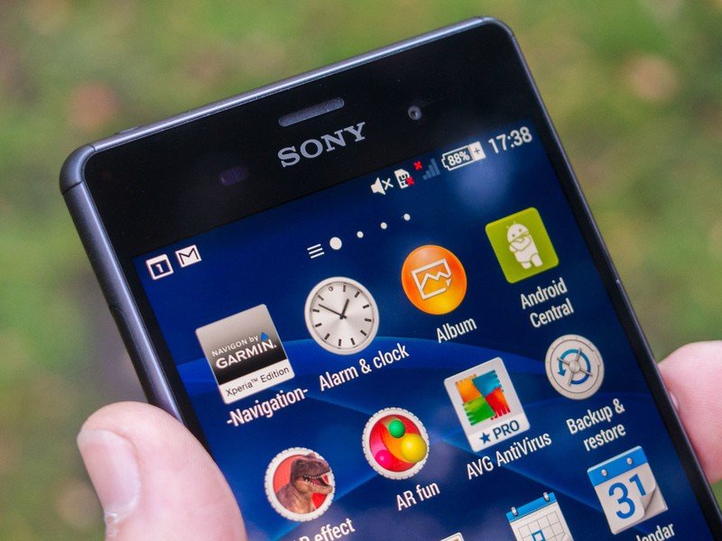
The Xperia Z3's software represents a marriage of the Sony and Google design languages.
Visually, Sony's UI still doesn't stray too far from vanilla Android, and there've been a few changes this time around to bring it in line with Google's design language. The Sony home screen setup has evolved to look a little more like the Google Now Launcher, with a persistent (though disableable) Google Search bar up top, larger icons and use of the Roboto Condensed font. Elsewhere though, it's clearly Sony running the show, with PS4-style energy spiral animations and the company's own "SOMA" font, along with a familiar loadout of icons.
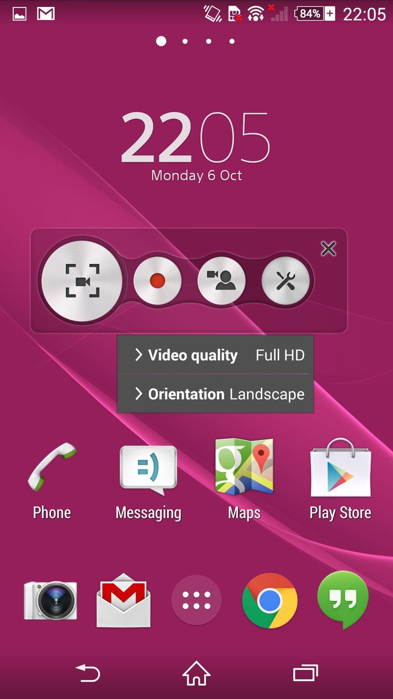
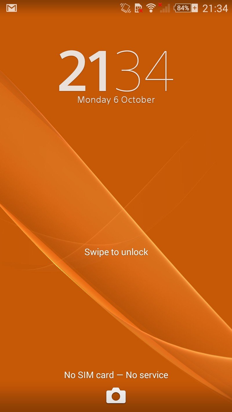
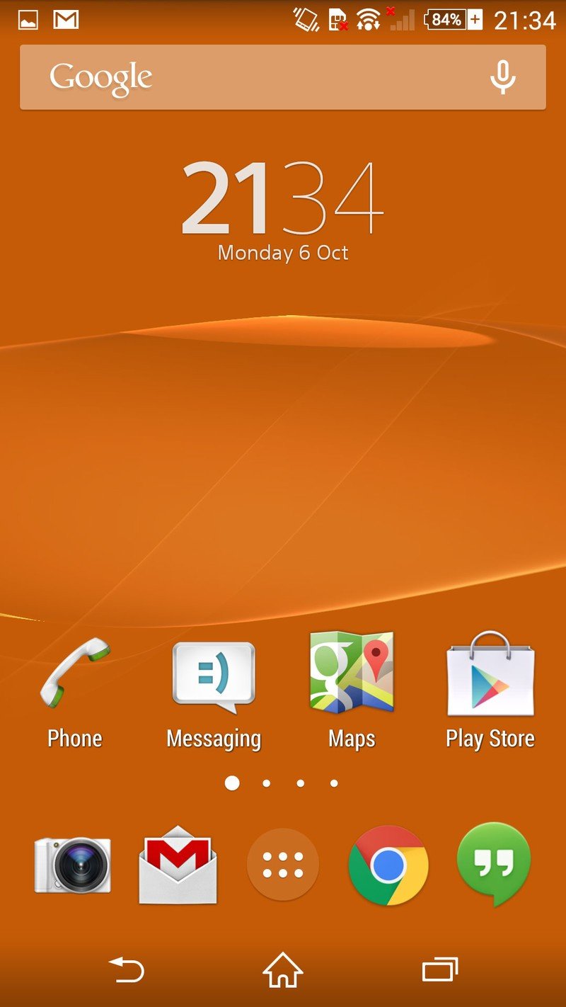
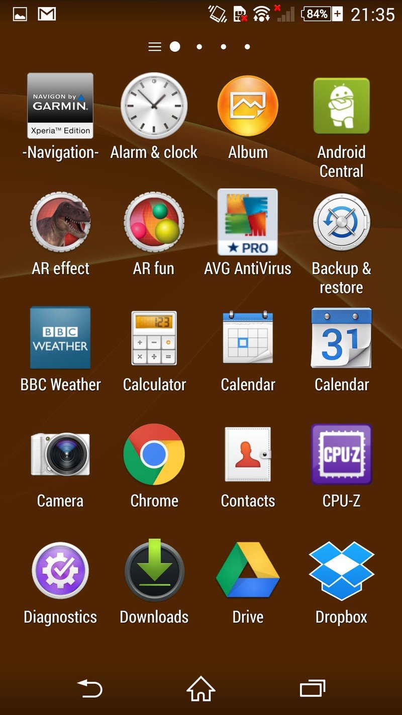

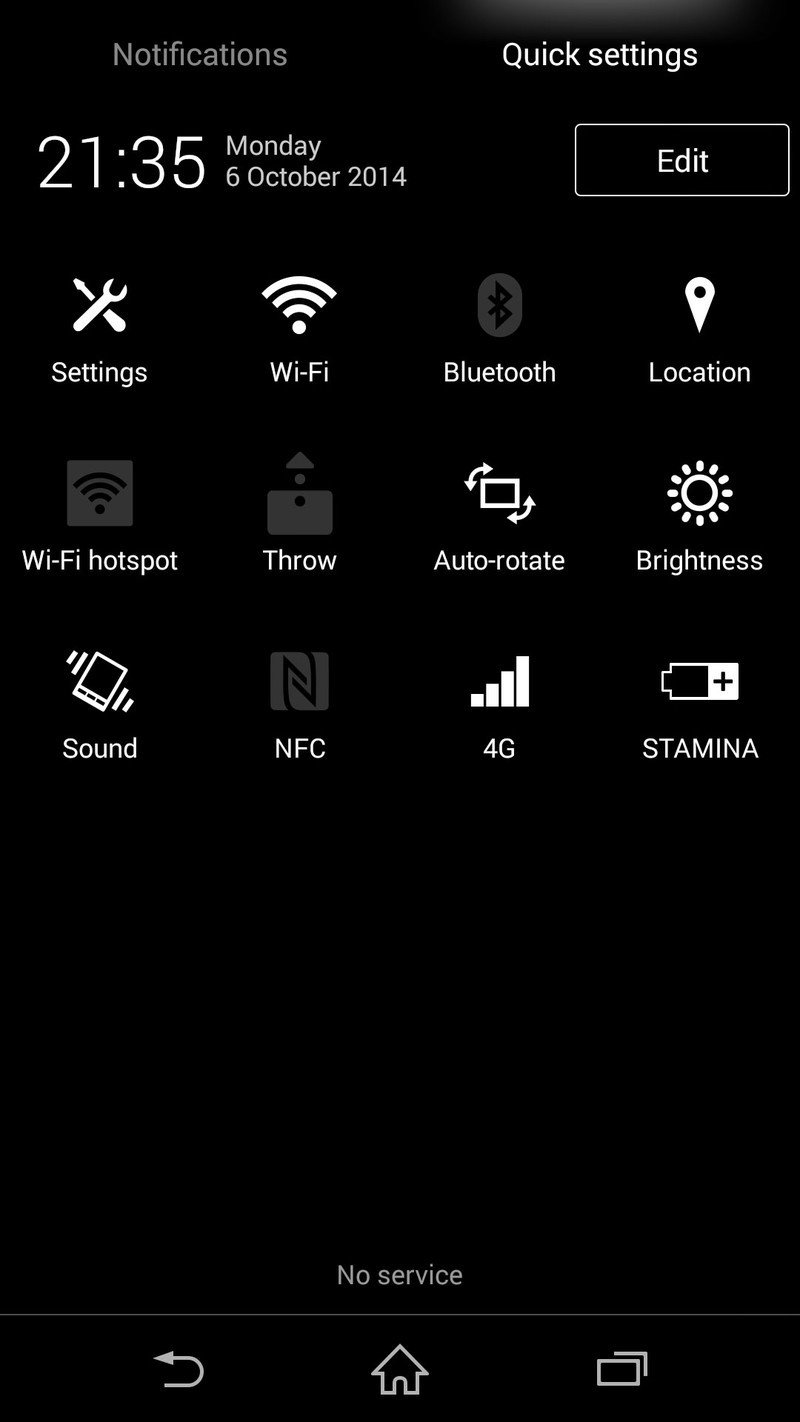
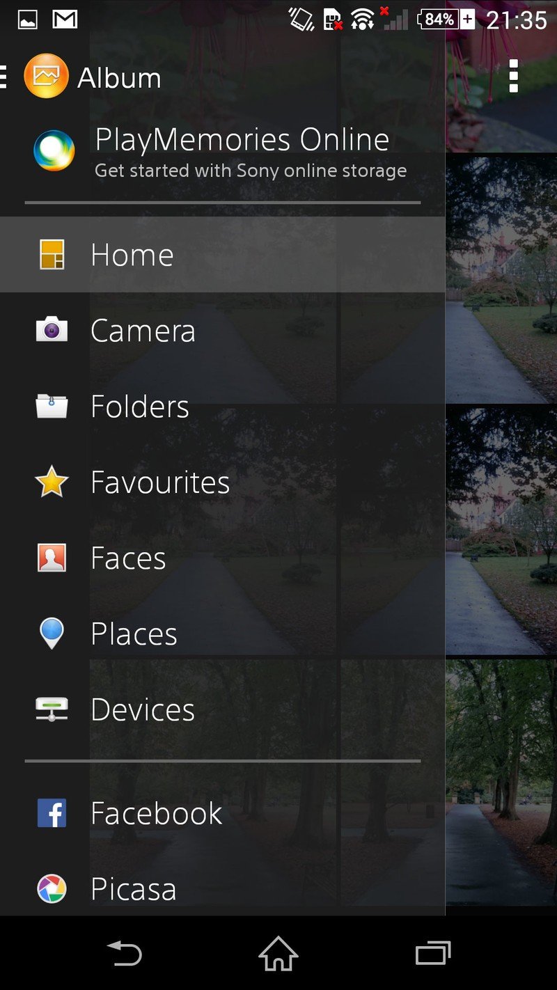
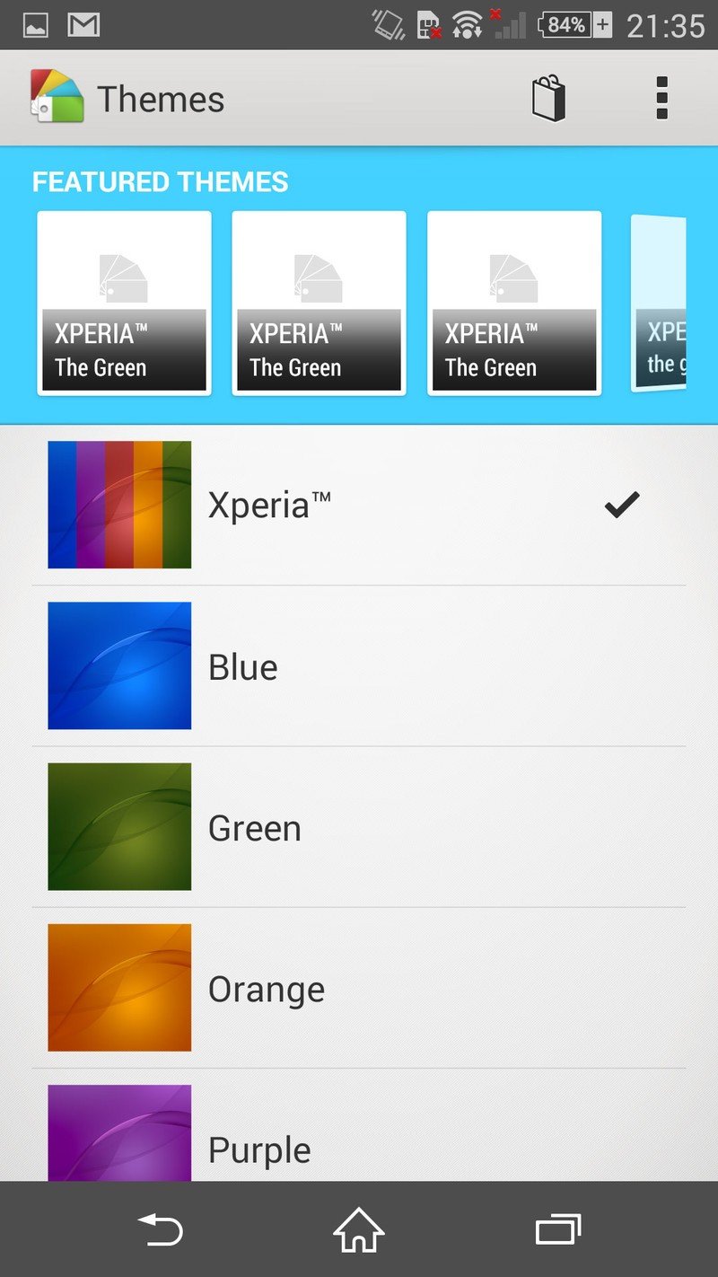
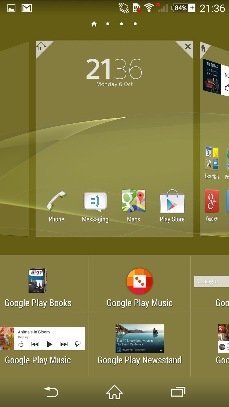
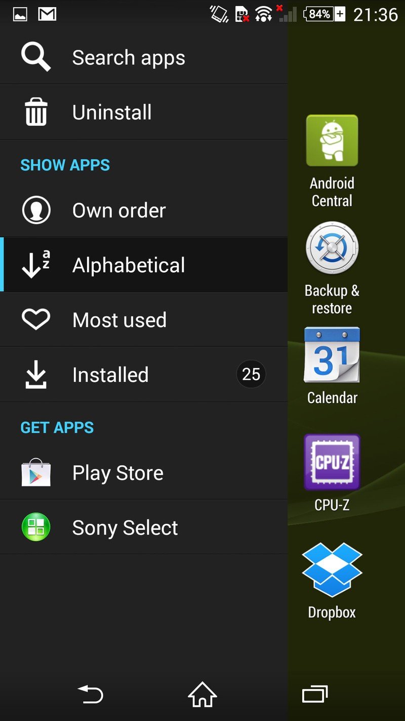
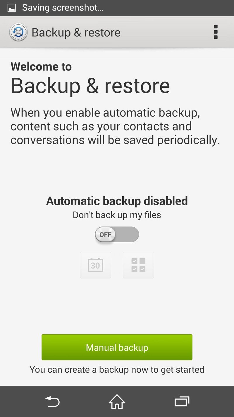
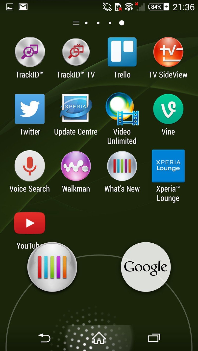
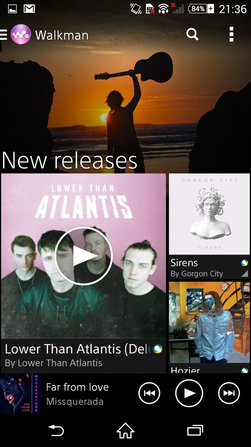
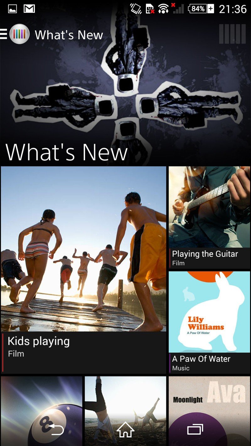
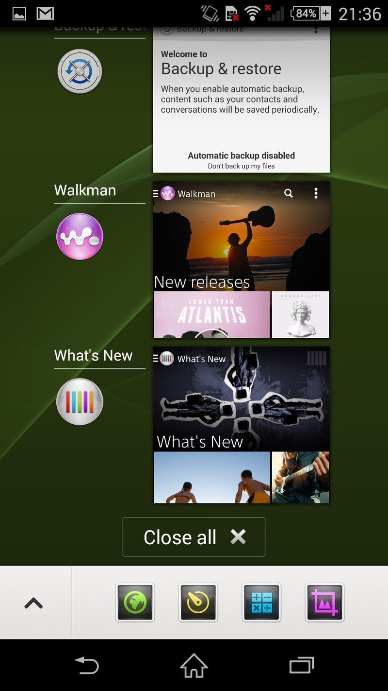
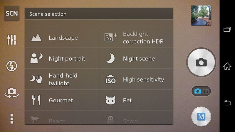
It's a pleasing UI that doesn't overwhelm with bright colors the way some competitors do. Sony's apps, menus and graphics fit into a cohesive whole, even if the manufacturer's own design language is somewhat at odds with Android's. The biggest example of this is probably Sony's icons — these are essentially true-to-life representations of real-life objects, rather than the more stylized, geometric interpretations seen elsewhere. Neither is necessarily right or wrong, but the two styles look somewhat odd when put together.
Sony's core apps continue to hook into its content and cloud ecosystems, making the Xperia Z3 series an ideal fit for anyone already invested in Music Unlimited, Video Unlimited or PlayMemories. What's more, Sony's default Album and Walkman are among the better-designed manufacturer-build apps we've seen, with a visual style marrying the Sony style and Android's design guidelines.
Overall, Sony's software continues to maintain a balance between speed, feature set and design. But with Android L and an all-new approach to Android UI design launching imminently, we have to wonder if it's time for Sony to be thinking about a comprehensive redesign.
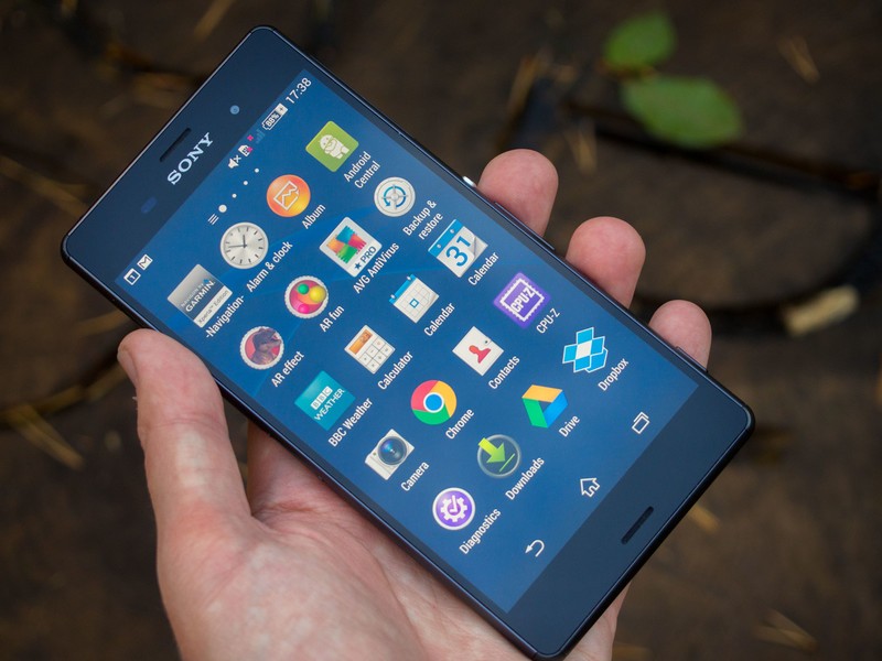
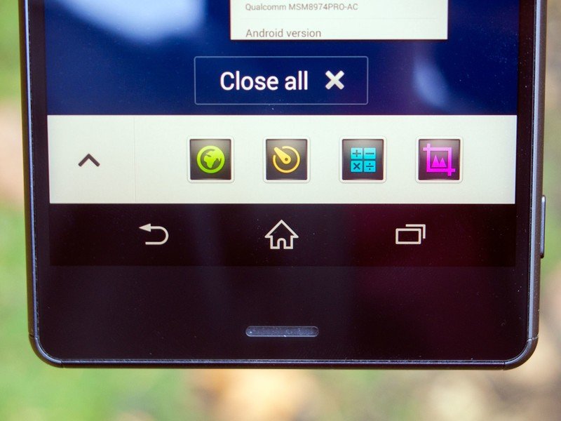
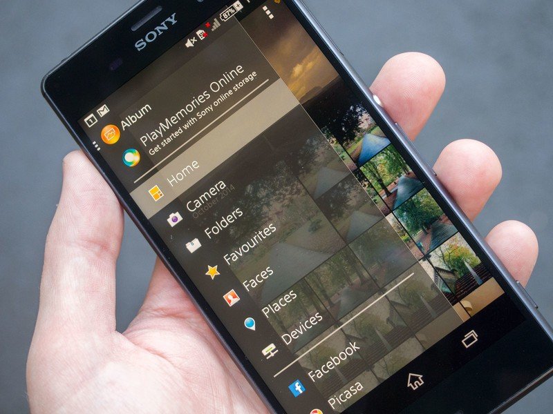
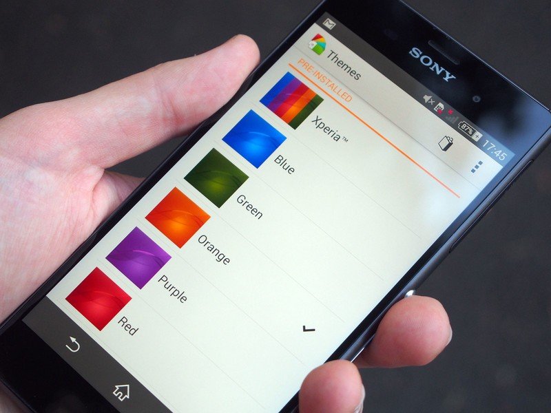
Some additional software bits worth noting:
- Sony's built in its own screen record function, accessible through the power menu. There are some limitations built in to stop you recording phone calls or other sensitive content, but otherwise it's really well done — and certainly easier than using the command line like other KitKat phones require.
- Sony's Movie Creator app, available as a download for some other Xperia handsets, brings HTC Zoe-style video highlights to the Z3, with daily, weekly or monthly highlights available depending on how you use the camera.
- There's also a wealth of power-saving features, which we'll explore in the next section.
- Once you disable the persistent Google search bar in the stock launcher, you have to go into App settings and clear data to bring it back, which is completely insane. Was there no room for an extra checkbox somewhere?
- You can now set the color of the "Xperia" live wallpaper, so it's not constantly cycling through a rainbow of colors.
- The "What's New" orb introduced on the Xperia Z2 in the swipe-up menu alongside Google Now is still present, with no way to turn it off. It's not a huge deal, but a minor irritant if you're not into getting all your entertainment content from Sony.

Xperia Z3 series battery life
Epic longevity
Over the past year battery life has emerged as a major strength for high-end Sony phones, with the company's squared-off smartphone designs providing more space to pack in bigger and bigger batteries. With the Xperia Z3 series, Sony's marketing department is heavily exploiting the phones' longevity, claiming they offer "two day" battery life. And it's no exaggeration.
Both flavors of Z3 boast absolutely phenomenal battery life.
For all intents and purposes it's impossible to kill off either Z3 in under a day, even with the heaviest of use. Both phones delivered best-in-class longevity, regularly totalling more than 18 hours of heavy usage between charges, with between 6 and 7 hours of screen-on time. During this time we were hopping between Wifi and LTE and using a standard loadout of apps — Chrome for web browsing, as well as various social apps, and taking a handful of photos from the rear camera.
With similar usage, most high-end Android phones don't fare anywhere near as well. In fact some, like the Samsung Galaxy Alpha, last around half as long. So if battery life is a deciding factor in your smartphone purchasing decision, Sony has two really great options for you here.
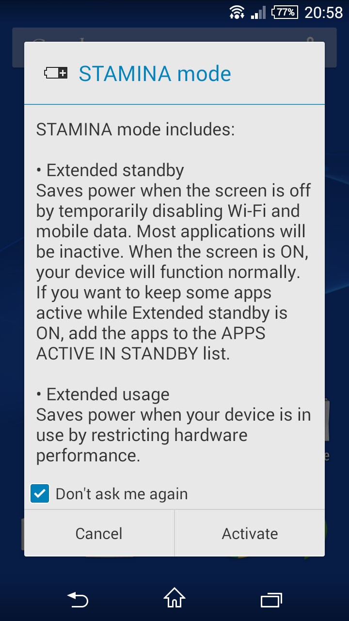
But there's more than sheer hardware power on offer here. Sony's also expanded its already comprehensive array of power management options. There's Stamina mode, a well-known Sony feature that disables background data usage when the screen is off. And new on the Z3 is Ultra Stamina mode, which like similar offerings from Samsung and HTC, basically turns your Z3 into a glorified featurephone, with battery life to match. Many of the higher-level features of the phone are disabled, leaving you with phone, SMS, calendar, clock, calculator and FM radio at your disposal, in addition to the camera and gallery apps. Like similar features from rival manufacturers, it's a last resort, and during our testing we never had to reason to use it.
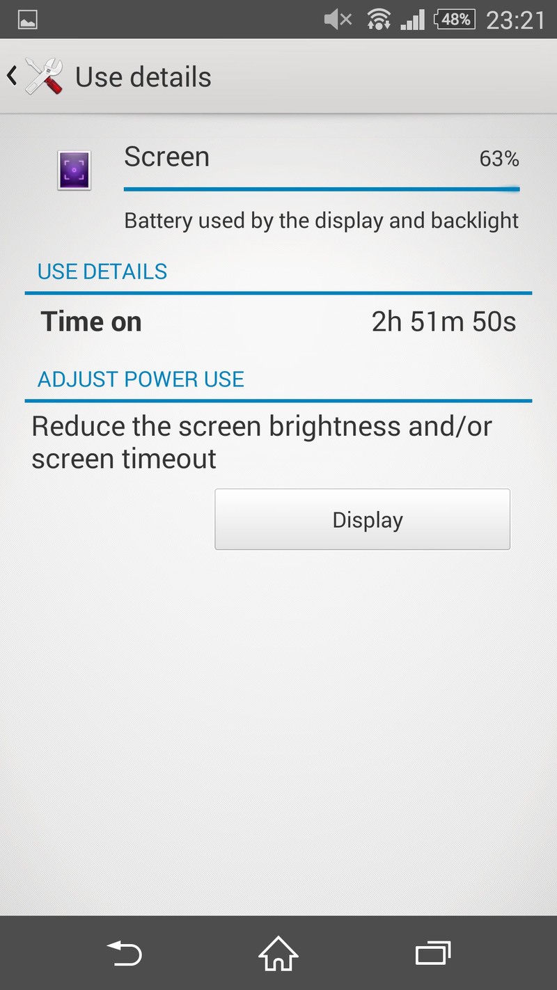

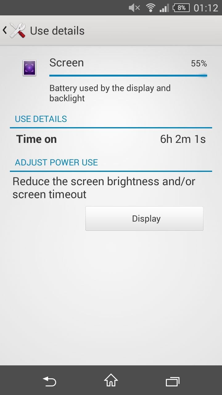
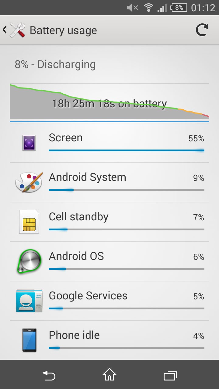
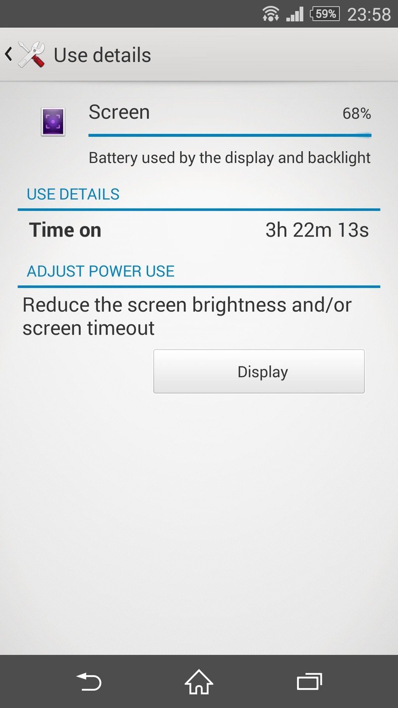
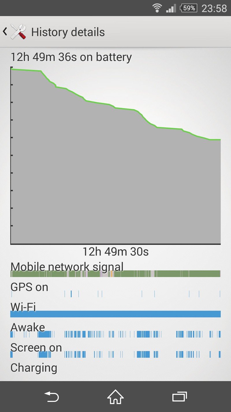
On top of that there's a special low battery mode which can disable many of the phone's connectivity features to save that precious last few percent of battery. And a new battery shaming screen allows you to track down apps that might be misbehaving and running down your battery. (Similar to the "Apps Using Significant Energy" readout in Apple's OS X.)
So between all these features there should be no excuse for running out of juice.
Finally, we should note that we didn't see any significant divergence in battery life between the Z3 and Z3 Compact — both models performed admirably. Whichever one you pick up, you won't see any major difference in battery life outside of synthetic benchmarks.
Xperia Z3 series cameras
More of the same
It's been just a year since Sony introduced its 20.7-megapixel Exmor RS sensor in the Xperia Z1, but the company's strategy of constant, half-yearly updates has seen this camera grace three flagship phones already. In the past we've praised Sony's high-resolution shooter for its general versatility and oversampling capabilities, not to mention the vast array of features the ever-expanding camera app.
And all of that is true of the Z3 and Z3 Compact's rear camera, a similar 20.7-megapixel setup behind a slightly wider-angle lens, with an expanded ISO range — up to 12800. That's backed up by a relatively run-of-the-mill 2.2-megapixel front-facer, which performs adequately — though selfies quickly become blotchy if you're shooting in the dark.
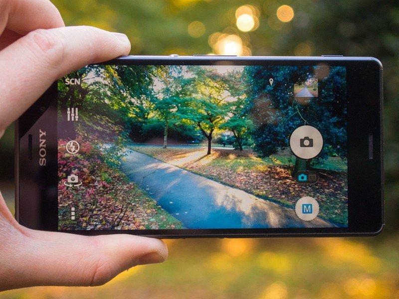
Despite these token changes to the rear camera, the experience on offer is barely any different to that of the Xperia Z2, or even the year-old Xperia Z1. And while it's still a perfectly decent smartphone camera, Sony risks moving backwards relative to its competitors by standing still in such an important area.
By standing still in such an important area, Sony moves backwards relative to everyone else.
Nevertheless, there's plenty to like here: fast capture speeds, good-looking shots in a wide range of lighting conditions, even in relatively low light. Superior Auto does a great job of locking down settings and scene modes for a wide variety of situations. By default, the camera shoots images at 8 megapixels, leaving you with some room to zoom in and capture more detail before reaching the limit of the sensor. You can also capture images at the full 20 megapixels (or 16 in 16:9 orientation), though you'll do so without the help of any scene modes, or Superior Auto's scene-detection trickery.

And for advanced users, there's no end of tweaking options to be found in the comprehensive Manual shooting mode. There are 18 shooting modes available, along with the usual white balance and EV (exposure value) tweaks, a host of different flash options and additional features like HDR, various focus modes, ISO and metering tweaks and much more. It's the antithesis of the iPhone's "just shoot" camera app — but for more advanced users that might not be a bad thing.
Beyond the basics, the Z3's camera offers a range of plug-in camera apps for different situations, including panorama, burst captures and a range of neat AR (augmented reality) modes that can add characters and interactive objects to your viewfinder.
Both Z3 models also support video recording at up to 4K resolution through the specialized 4K recording mode, or 1080p in regular video mode. When shooting at 4K you'll sacrifice the stabilization and customization options available at lower resolutions, and the camera app also warns that recording may discontinue due to heat buildup — not exactly the most encouraging message dialog we've ever seen.
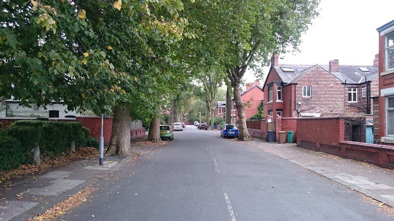
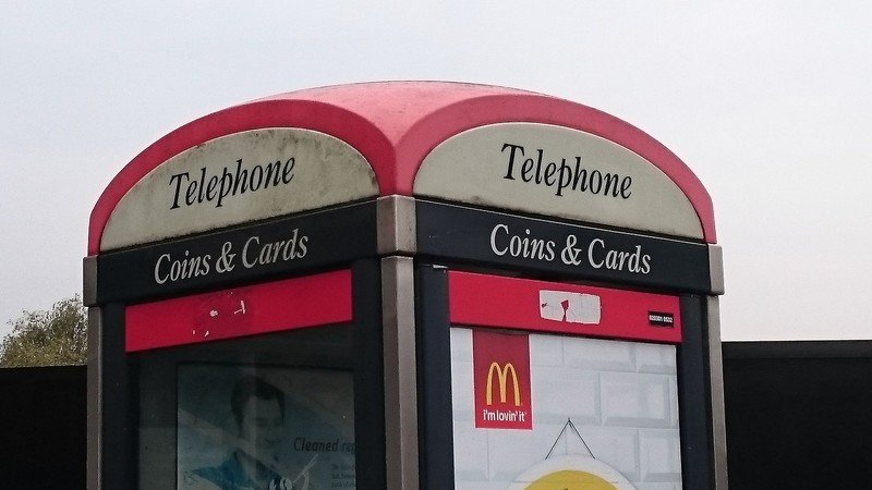




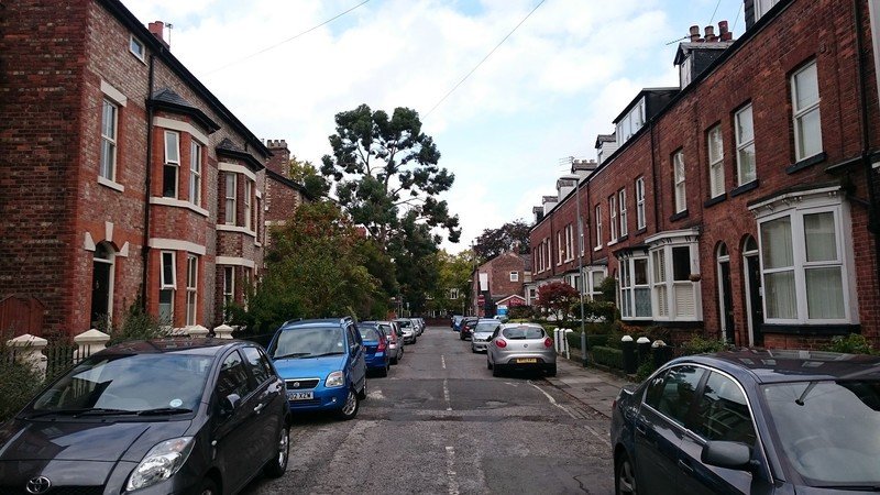
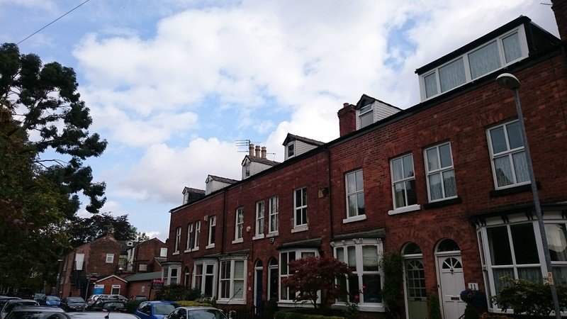


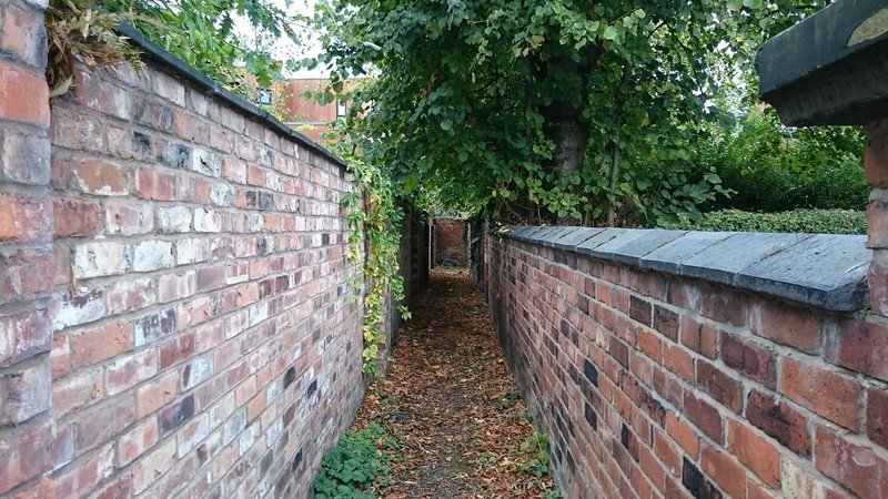







On the whole, though, the Z3's camera captures good-looking video footage at both 1080p and 4K, with no real complaints in terms of bit rate, color quality or dynamic range. The lack of optical stabilization means the Z3's video camera is more susceptible to hand motion than competitors like the LG G3, but there's a software stabilization option to compensate for this. In addition, there's an HDR video mode that's up there with the best from Samsung and others, though certain scenes do take on a slightly trippy quality with HDR video enabled.
Like its predecessor — and its predecessor's predecessor — the Z3 camera's main weakness seems to stem from its relatively small pixel size. Image quality can degrade rapidly in twilight conditions, leading to blurred shots, or images where there's just not much fine detail to be seen, even at full resolution. What's more, in the past year we've seen plenty of devices that are better in these conditions.
Ultimately what you're getting is still a pretty good smartphone camera, but there's no hiding the fact that Sony's 20-megapixel shooter is starting to show its age. It maybe one of the better ones for now, but the competition's become fiercer than ever over the past year.
Xperia Z3 + Z3 Compact: The Bottom Line
Two of the best ...
Now is a great time to be buying a smartphone. As 2014 draws to a close we've seen some incredible hardware from the top-tier manufacturers, and even some lesser-known brands. So for those of us who live and breath mobile tech it's become ever harder to nail down a single Android phone that's great at everything. It's hard to go wrong with many of the current flagships, but each of them has its own quirks, and in many cases there are fatal flaws to be found. The HTC One M8? Camera's not so hot. Galaxy S5? Plasticky design and bad low-light photos. Moto X? So-so camera and iffy battery life.
The Sony Xperia Z2 was one of the more balanced phones of the year in terms of doing a lot of stuff really well, and the same is true of its successors. As Sony slowly chips away at its remaining weaknesses, there are fewer outstanding gripes — and there's really nothing either of these phones is bad at. Whatever you think of Sony's aggressive six-monthly refresh cycle, you can't argue with the results.
Our biggest complaint is probably the camera — not because it's bad, just because Sony's allowed the Android-based competition to catch up with it over the past year. Because the core camera hardware has barely changed, image quality too exhibits the same quirks as the Z2, and to a certain extent the Z1. If Sony is to take market share away from Samsung and Apple, its imaging capabilities need to keep pace with its release schedule.

As great as the full-sized Z3 is, its little brother could be the real jewel in Sony's crown.
On paper the Xperia Z3 isn't a huge upgrade from the Z2, but its strengths lie in ways that can't be measured by comparing specifications. The size, shape and design, for instance, are all huge improvements. It's still a big phone, but it's a big, sleek phone rather than a brick with a screen on the front. Touch responsiveness is noticeably better, and the display is one of the best we've seen on a smartphone.
As good as the full-sized Z3 is, the Z3 Compact, could be the real star of the show. Priced competitively — available for as little as £350 off-contract in the UK — and offering many of the perks of its big brother, the Compact is the only real option for Android fans looking for a device to rival the iPhone 6 — a sub-five-inch device with flagship credentials.
And as much as the choice between these two phones comes down to personal taste, there's really no wrong choice to make.

Alex was with Android Central for over a decade, producing written and video content for the site, and served as global Executive Editor from 2016 to 2022.
