Sony Xperia Z1 review
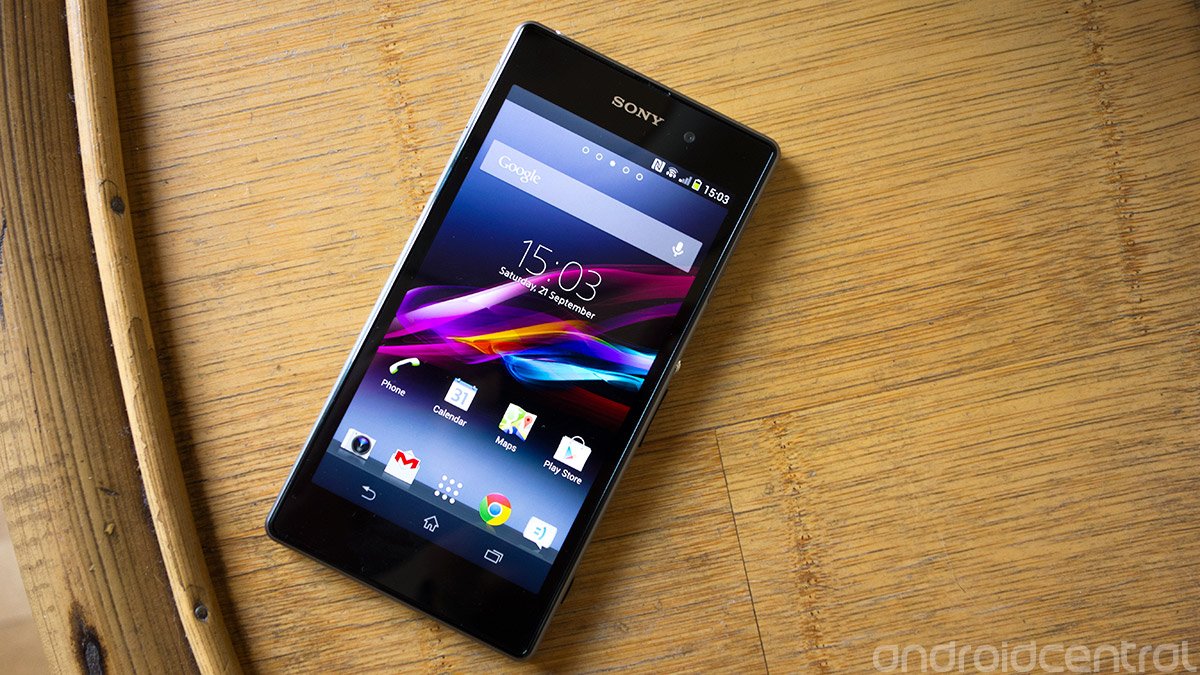
Sony’s enormous new flagship handset is its best phone yet — but it’s not without a few frustrating issues
Despite its lack of any meaningful presence in the U.S. smartphone market, Sony Mobile is a big deal in Europe and Asia, where its flagship Xperia Z has been on sale since early March. One of the early highlights of the Android year, the original Xperia Z was a very capable device with one or two outstanding features — but it was quickly overshadowed by the might of the HTC One and Samsung Galaxy S4.
Now, as 2013 draws to a close, we’re witnessing the emergence of a new breed of Android smartphone, with bigger screens than ever, fast new Snapdragon 800 chips from Qualcomm and larger batteries than we’ve seen before. It’s natural, then, that Sony’s follow-up to its 5-inch Xperia Z should fit into this category. Say hello to the Xperia Z1.
When the Z1 — previously known by its codename of “Honami” — was finally unveiled at IFA 2013 it felt like we were being reintroduced to an old friend. That’s because a lengthy prelude of leaks had already clued us into key Z1 features like its “Triluminos” display, aluminum frame and 20.7-megapixel camera. So now that we finally have the device in our hands, it’s time to see how it measures up. Join us after the break as we kick off our exhaustive review of the Sony Xperia Z1.
Pros
- Excellent build quality, super-fast UI performance and fluid UI, great camera performance in most areas, well-designed software.
Cons
- Bulky chassis with large bezels, poor display viewing angles, software bugs. Camera produces hit-and-miss results in low-light conditions.
The Bottom Line
Not only is the Xperia Z1 Sony’s best phone, it’s a great phone by any standard. The competition is fiercer than ever — and there’s no shortage of great Android phones right now — but we don’t think you’ll be disappointed if you pick up Sony’s new high-end beast.
Be an expert in 5 minutes
Get the latest news from Android Central, your trusted companion in the world of Android
| Video walkthroughHardware reviewSoftware reviewCamera reviewBattery lifeWrap-up | Initial hands-onGallery of photo and video samples |
Video walkthrough
Sony Xperia Z1 hardware
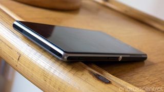
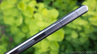
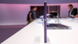
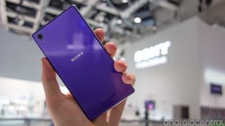
To the untrained eye, the Xperia Z1 is all but identical to its predecessor. But the similar glass-backed chassis and matte trim design hide the many subtle differences that become apparent when you pick up the phone. Firstly, there’s the much-improved aluminum frame, which makes the experience of holding and pocketing the device so much more pleasant than before. The earlier model had a very angular frame finished in soft-touch plastic, which wasn’t particularly comfortable to hold. This time around the curved metal sides make for a much-improved ergonomic experience — which is to say it doesn’t stick in the corner of your hand or pockets anywhere near as much.
The curved metal sides make for a much-improved ergonomic experience
So the Xperia Z1 represents an evolution of Sony’s “omnibalance” design language, which debuted earlier in the year on the Xperia Z and Tablet Z. It’s another flat, symmetrical, blocky handset — though one that looks and feels much more solid than earlier Sony offerings. In fact, we’d say it’s the best-built Sony phone we’ve seen so far. But we have to take issue with one of the manufacturer’s design decisions, and our main gripe has to do with the invisible, non-removable plastic sheets attached to the phone’s front and back. Presumably they’re there to provide some additional protection for the screen and the back, but they also have the effect of making the phone feel way more plasticky than it should, in addition to being a magnet for fingerprints and lint. Sadly, here’s a metal and glass phone that feels like plastic.
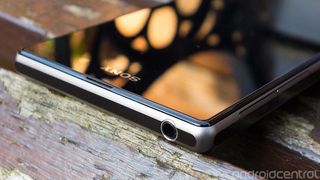
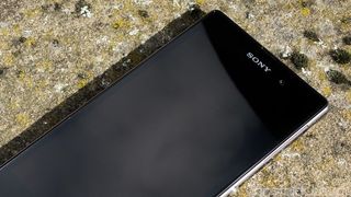
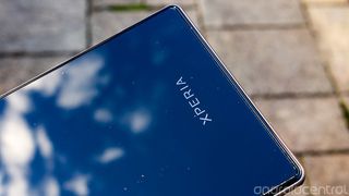
The front and back of the Xperia Z1 are mostly featureless, save for some Sony, Xperia and NFC branding — and a cutout for the 20.7-megapixel rear camera, which is flush with the glass back. The Z1 has the most going on around its metal trim, with each side of the phone housing ports, connectors and other gubbins.
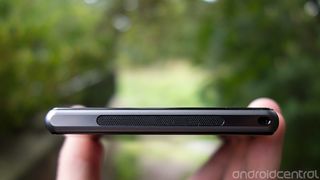
Down below is the device’s single loudspeaker. More sensibly placed than the Xperia Z’s speaker, it’s still possible to cover this with your hand in landscape orientation if you’re not careful. It’s reasonably loud and not too tinny, but it’s no HTC BoomSound, even with software tricks like XLOUD enhancements turned on.
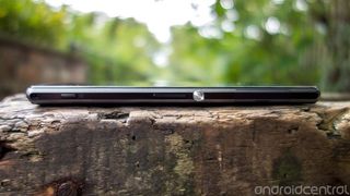
The right edge is where you’ll find the majority of the Z1’s buttons — there’s Sony’s trademark rounded metal power button above a volume rocker and two-stage shutter key, which also serves as a camera shortcut button. Sony’s button placement here is just right, with everything within easy reach.
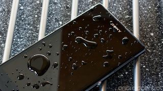
Above that there’s a clip-out area which houses the microSIM slot. Up top is the headphone jack, thankfully no longer hidden behind a plastic flap. The phone is still water and dust-resistant however — in fact, with a rating of IP58 it’s slightly more resilient than the original Xperia Z.
Some stuff is still hidden away behind those plastic seals, to protect sensitive electronics it from the elements. The microSD and microUSB slots, found on the left side, are tucked away behind protective doors. And yes, that means you’ll have to deal with this when you want to change the phone, though there is an alternative — further down there’s an exposed magnetic charging port which can be used with Sony’s official Z1 charging dock.
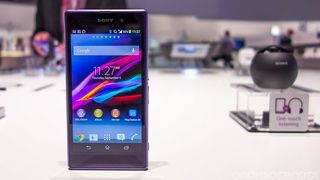
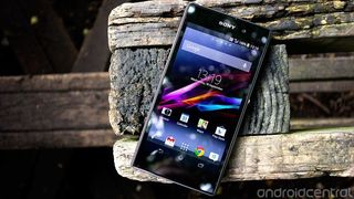
The front of the Xperia Z1 is pure screen — no physical or capacitive buttons, no unsightly speaker grille (it’s disguised between the screen and the outer trim) — just the 5-inch display, the Sony logo and if you look really hard, the 2-megapixel front-facing camera. That’s been a major part of Sony’s design philosophy for the past year, and like the Xperia Z before it, the Z1 simply places a screen into users’ hands.
With the large screen comes an awful lot of empty bezel, particularly at the top and bottom of the device
But with the large screen comes an awful lot of empty bezel, particularly at the top and bottom of the device. And combined with the already sizeable display this can present some real usability problems, especially if you’ve got small hands. One-handed use is much more challenging than on rival 5-inchers like Samsung’s Galaxy S4, with the space at the bottom of the screen making it more difficult to reach the top row of keys on the on-screen keyboard. The improved industrial design means the Z1 isn’t quite the ergonomic disaster that was its predecessor, but it’s a very large phone nonetheless, and that fact alone presents its own issues — one of them being one-handed operation. That’s not helped by the large lower bezel, which means your thumb needs to reach much further to touch the display.
We’re dancing around the screen here, so let’s talk display quality. The Xperia Z1 packs a 5-inch, 1920x1080 LCD display with Sony’s “Triluminos” technology. Sony smartphone displays of the past have suffered from washed-out colors and poor viewing angles, and while we’d like to say these issues are solved on the company’s latest flagship device, that’s not quite true. The Xperia Z1’s screen looks fantastic when viewed head-on, but like so many Sony phones, tilting the device in any direction will quickly distort the colors. As you’ll probably be looking at the phone from the front most of the time, it’s not a deal-breaker. However the fact that Sony — with all its decades of experience making high-end televisions and other displays — still can’t get smartphone viewing angles right is something of an oddity.
But let’s assume you’re holding the phone directly in front of you. You’re going to be treated to image quality that’s very close to some of the best smartphone displays out there, if not quite up to the insane brightness, vividness and clarity of the HTC One and LG G2. Nevertheless, the Z1’s display produces bright whites, colors that pop without being overblown, and near pitch blacks. Sony’s “X Reality for Mobile” software also kicks into action when viewing movies and photos, boosting contrast and reducing visible noise.
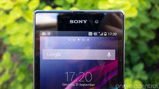
Bottom line — we’d certainly have no problems using this screen for our mobile entertainment needs across the life of a two-year contract.
Qualcomm’s latest chip delivers what feels like a generational leap in performance.
Powering the Xperia Z1 is the latest Qualcomm Snapdragon 800 CPU, one of the fastest chips you’ll find in an Android smartphone, and a component that places the phone at the very top of the Android hardware hierarchy. That’s backed up by 2GB of RAM and 16GB of internal storage, of which just over 11GB is available to use. The internal storage can be expanded through the microSD slot, and while the camera app can save photos and video to the external card, there’s no option to move apps there.
As we’ve seen from other Snapdragon 800 devices like the LG G2, Qualcomm’s latest chip delivers what feels like a generational leap in performance. Animations fly by effortlessly, apps load instantly, and gaming performance in demanding titles like Need for Speed: Most Wanted is as smooth as we’ve seen on an Android device. Previous Sony phones haven’t always hit the mark when it comes to performance; thankfully that’s not the case with the Xperia Z1.
The Xperia Z1 has all the connectivity options you’d expect from a high-end smartphone. There’s Wifi a/b/g/n/ac and Bluetooth 4.0, as well as DC-HSDPA and LTE support. The LTE-capable version we’re reviewing (model number C6903) supports LTE bands 1, 2, 3, 4, 5, 7, 8 and 20, as well as penta-band HSPA, according to Sony’s official whitepaper. That means in addition to most European networks the device should have full coverage on T-Mobile U.S.
And finally, should you wish to actually make phone calls on this phone you shouldn’t run into any issues. Phone calls came through loud and clear, and we didn’t notice any unwelcome distortions in our conversations.
Sony Xperia Z1 software and OS
The Sony Xperia Z1 runs Android 4.2.2 Jelly Bean alongside the latest iteration of Sony’s UI. The manufacturer’s “skin” has evolved somewhat since we last saw it on the Xperia Z and Xperia SP, mostly gaining additional graphical flourishes and sweeping animations that make for a more pleasant visual experience. Certain on-screen elements, such as home screen widgets and menu lists, have grown subtly rounded corners, and there are more lighter tones to be found throughout the UI. Overall, Sony’s latest software has a warmer, more welcoming feel to it.
Sony’s latest software has a warmer, more welcoming feel to it
On the whole, though, Sony’s still toeing close to Google’s “Holo” design language, and that’s particularly evident through its use of on-screen buttons. An easy swipe-up gesture gets you to Google Now, and app-switching is just a button away. Sony’s “small apps” are back too — little windowed apps found in the task-switching menu that can be moved, expanded or minimized down to the side of the screen. The number of built-in options is limited, and perhaps for that reason it’s now possible to turn regular home screen widgets into small apps if you want.
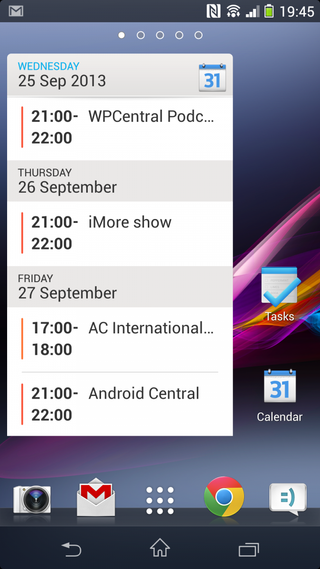
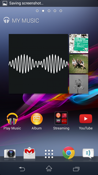
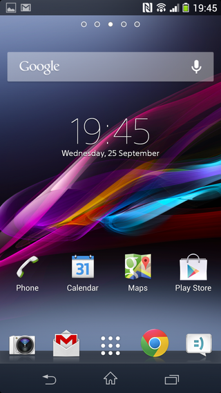
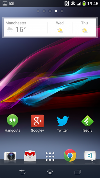
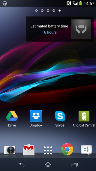
A couple of other visual things worth noting — certain Sony apps like the launcher, messaging apps and dialer take control of the on-screen buttons and notification bar, making them transparent. The outer corners of the screen also become rounded in these apps, which is a nice bit of visual consistency.
We found ourselves stumbling across all sorts of useful little features in the new Sony software
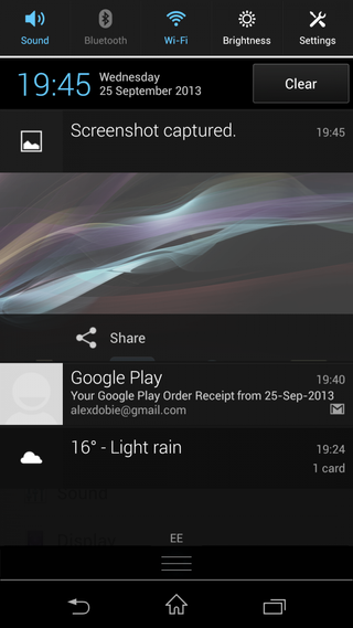
The standard Android 4.2 quick controls aren’t present in the usual way, but instead you get a customizable selection of buttons at the top of the notification shade at all times. Options, customizable under Settings > Personalization, include the usual connectivity and brightness options, as well as Wifi hotspot, airplane mode, auto-rotation, roaming, battery “stamina” mode and a 4G toggle.
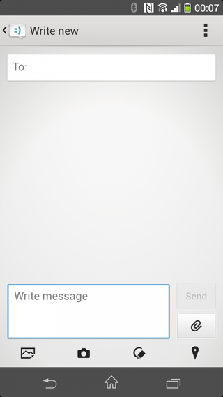
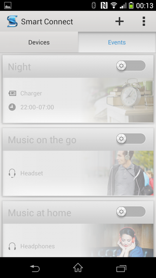
In fact, we found ourselves stumbling across all sorts of useful little features in the new Sony software. The messaging app, for instance, now has buttons allowing you to directly share a drawn sketch or your location, as well as photos or saved images. Similarly, Sony’s “smart actions” is back, allowing you to automate certain tasks on the phone, such as muting the speaker when charging at night.
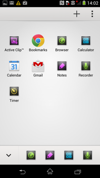
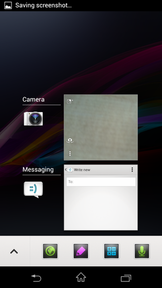
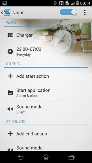
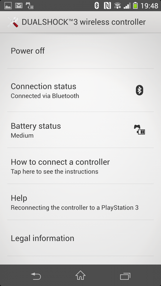
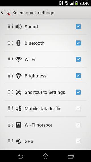
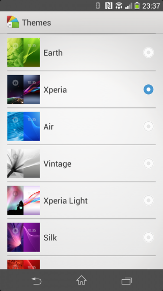
The Xperia theme engine, which dates all the way back to the Xperia Arc, is alive and well on the company’s latest handset. There are eight themes included, each based around a different color, and they include a home screen and lock screen background, as well as accent colors which are displayed in the system UI and certain Sony apps.
Sony’s suite of bundled apps is all about connecting you to various parts of the company’s content ecosystems. Naturally, that includes PlayStation Mobile for gaming — though pickings remain comparatively slim here compared to the selection on Google Play. You can also link your PlayStation 3 controllers to the device and use them to play games, but you’ll need to provide your own USB OTG cable to pair the gamepad. At the same time, if you’ve got an Xperia tablet, the Z1’s “Throw” function allows you to quickly fire content between devices.
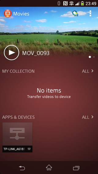
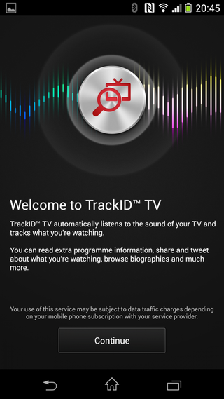
For movies and music, you’ve got Music Unlimited and Video Unlimited, which hook into the Walkman music app and “Movies” app respectively. Sony’s done a great job at linking these services into the phone’s software in a way that makes you want to use them. Although as an alternative, Google’s Play Music and Play Movies are also preloaded.
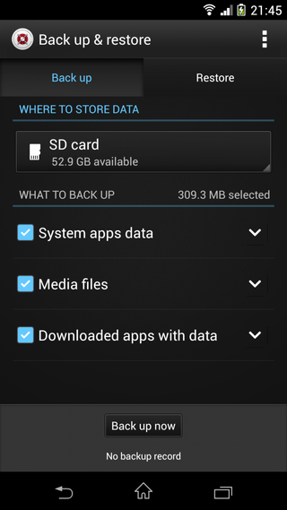
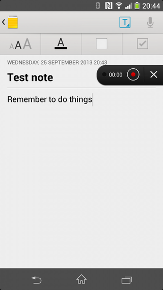
Sony’s app suite welcomes a handful of new additions on the Xperia Z1. First up is a dedicated Notes app, which lacks any kind of online sync functionality, but can arrange written notes and voice notes in an attractive grid formation. And the Sketch app has made it across from the Xperia Z Ultra, allowing you to draw funny faces or annotate your photos.
So on the whole, we feel like Sony’s UI represents a happy compromise between Sony’s ecosystem and design values and Google’s visual styles. Unless you’re a particularly ardent fan of stock Android’s “Holo” look and feel then we suspect you won’t find much to complain about on the Xperia Z1. What’s more, UI performance is as smooth as we’ve seen on any Android phone thanks to that Snapdragon 800 CPU. In day-to-day use, we have no real complaints.
But we do need mention the few stability issues we ran into in our week or so with the handset. On a couple of occasions we came across a software issue which froze the phone, forcing us to restart it. On our second day with the device, a more serious issue, seemingly involving the backlight controls, prevented the phone from powering on the screen once it went to sleep. A factory reset solved this problem, but to restart it in this instance we had to resort to hooking the phone up to a computer and using the command line — something the average phone user should never have to worry about.
A little online research reveals that the original Xperia Z suffered from similar issues around its launch. Hopefully Sony can get a fix for these bugs pushed out in the near future.
Sony Xperia Z1 camera
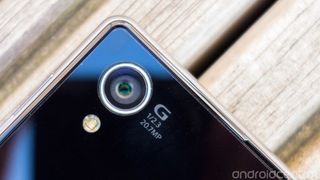
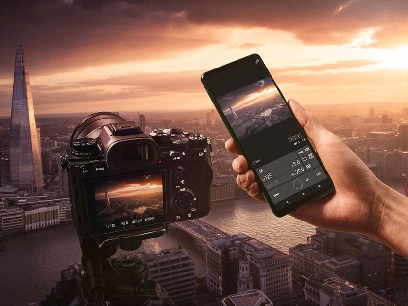
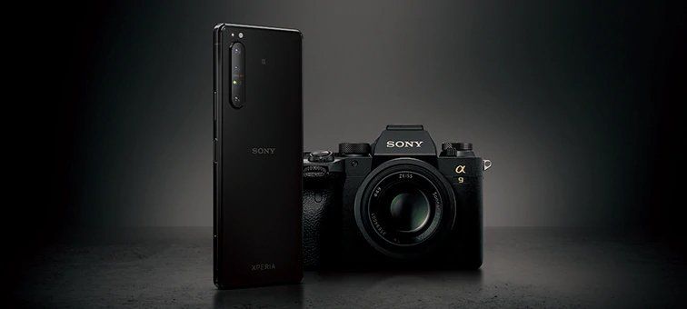
Here’s where things really get interesting — the Xperia Z1 packs a 20.7-megapixel, 1/2.3-inch Exmor RS sensor behind a Sony G lens. That gives it the highest megapixel count of any Android smartphone — and that’s paired with a re-tooled Sony camera app that incorporates many features from the company’s range of standalone cameras. There’s also a dedicated two-stage camera button — always a plus on an imaging-centric phone.


Xperia Z1 sample shot gallery
Image quality from the Z1 is generally good across the board — and really great in some instances
And as we’ve come to expect from Sony, image quality from the Z1 is generally good across the board — and really great in some instances. Relative strengths and weaknesses are similar to those of earlier Sony cameraphones. The Z1 can take some stunning close-up shots — and shoot in 20MP with enough lighting and you’ll capture an incredible amount of detail. However low-light performance was mediocre and we found it difficult to avoid blurry shots using the built-in night mode.
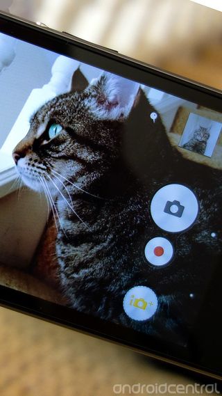
Despite the presence of a 20-plus megapixel camera, the Sony camera app is focused on taking oversampled images at eight megapixels (in either 4:3 or 16:9 aspect ratios). It’s the same principle (pixel binning) that Nokia’s employing on its latest Lumia 1020 handset — get a more accurate image at a reasonable resolution by combining several pixels into one.
You’ll still get good photos if you choose to shoot at the full 20.7 megapixels, but viewed alongside equivalent shots from the Galaxy S4, which has a 13-megapixel sensor, not much more fine detail was captured. So clearly the Xperia Z1’s camera is strongest when it’s churning out oversampled 8-megapixel images. This also gives you a the freedom to use digital zoom without losing much, if any image quality, as there’s extra resolution to drill down into (you’ll see this in some of our sample shots.)
Most of the time you’ll get great-looking 8-megapixel images from the Z1. And at any resolution there’s less visible noise present than in photos from the original Xperia Z. But unfortunately Sony’s camera just isn’t quite as consistent as its high-end rivals. We noticed bizarre autofocus issues in some landscape shots, where the camera would be unable to focus for no apparent reason, leading to fuzzy photos. And while visible noise isn't much of a problem anymore, Sony's camera still compresses its images more than we'd like, which can take a toll on fine detail.
The camera is particularly vulnerable to hand motion of any kind
Similarly, the camera is particularly vulnerable to hand motion of any kind — perhaps because of its placement right on the corner of the phone, perhaps because of the lack of optical image stabilization (OIS). Either way, it’s easier to get motion-blurred images than it is with rivals like the Galaxy S4, even with the Steady Shot software stabilization feature turned on.
The Z1’s camera produces okay-looking low light images, but again, that image-blurring problem is even more apparent in night shots. So there’s no immediate danger of the Xperia Z1 stealing the HTC One’s low-light crown.
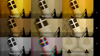
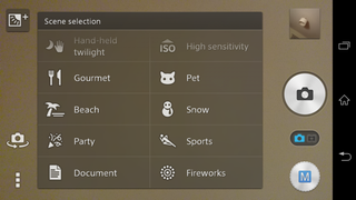
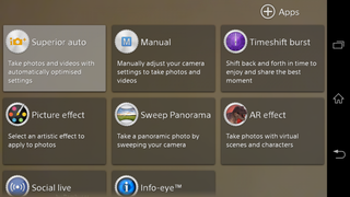
As we mentioned, Sony’s overhauled its camera app on the Xperia Z1, introducing new extensible features and a wealth of shooting options. Most users will live in Superior Auto mode most of the time — that’s the setting that does all the number-crunching for you and spits out good-looking 8-megapixel, 16:9 photos. But there’s also manual mode, which lets you crank it all the way up to 20.7 megapixels or apply a bunch of different scene modes — though not at the same time. And you get the usual panorama, artsy filters and a time-shift modes, too.

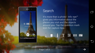
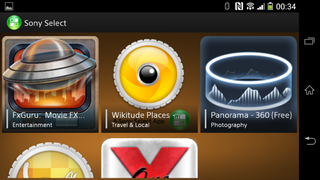
Sony’s also doing a lot of new stuff with AR (augmented reality) this time around. There are a few fun little AR modes that add characters, including leprechauns and dinosaurs, to your photos. But perhaps more useful is Info-Eye, which can tell you more information about the stuff you’re shooting — a little like Google Goggles. Even better more plug-in “apps” for the camera can be downloaded through Sony Select, and they’ll appear automatically in the camera app.
Video performance on the Xperia Z1 is solid across the board — not much to complain about, and you get smooth 1080p footage at 30 frames per second, even in relatively low light. There’s also plenty of fine detail in day shots, in contrast to the aggressive noise-scrubbing we’ve witnessed on some earlier Sony phone video cameras. Again, the lack of hardware stabilization is noticeable in video footage shot on the Z1, as motion isn’t as smooth as on rival handsets with OIS.
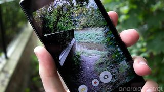
Finally, we should mention an issue which cropped up again and again in our use of the Zperia Z1’s camera, and that’s the placement of the camera module itself. It’s right on the top left corner of the phone, and that means it’s extremely easy to cover the edge of it without realizing it. It’s something you soon adjust to, but a niggling issue nonetheless.
Don't forget to check out our sample photo gallery for more images from the Xperia Z1.
Battery life
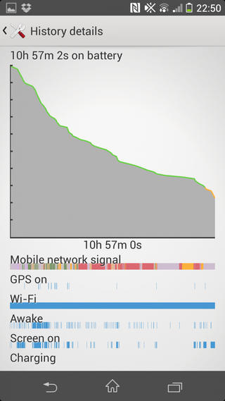
We managed 11 hours of heavy use before hitting the 23 percent mark
The Xperia Z1 packs a gigantic 3000mAh internal battery, which is among the largest on a mainstream Android phone — though this is a rather large mainstream Android phone we’re dealing with here.
But even with a 5-inch display to power, along with a beastly CPU and LTE radios, the Xperia Z1’s battery performance didn’t disappoint. With heavy use consisting of a couple of hours web browsing over LTE and HSPA+, taking 100+ photos and five minutes or so of HD video, around an hour of streaming Google Play Music over mobile data and frequent checking of emails and social networks, we managed 11 hours of heavy use before hitting the 23 percent mark. That included two hours and 18 minutes of screen-on time.
With more conservative use on mostly Wifi networks, we were easily able to get through a full day of use with plenty of juice to spare.
Sony’s Android-based software also provides a few tricks to extend battery life, and it’s mostly stuff we’ve seen before on the Xperia Z and Tablet Z. There’s “Stamina” mode, which disables background data when the screen is off. (It’s possible to allow certain apps through using a whitelist feature.) You can also automatically disable certain functions like mobile data, and dim the screen brightness when battery power is low.
So while you shouldn’t need to worry about the Xperia Z1 getting you through a normal working day, there’s software to help if it’s going to be a long one.
Wrap-up
The Xperia Z1 is easily Sony’s best smartphone yet, and deserving of a place on our list of top Android smartphones, alongside the likes of the Galaxy S4, HTC One, Moto X and LG G2. The Japanese manufacturer has made huge advances in build quality and software responsiveness
The Xperia Z1 introduces much-improved build quality, top-notch internals and subtly enhanced software. Importantly, Sony’s no longer behind the curve when it comes to raw hardware specs — though as evidenced by the screen’s viewing angle issues, it still has some catching up to do in places.
Purchasing a smartphone to use throughout the life of a multi-year contract is as much about personal preference as anything, but the main reason not to buy the Xperia Z1 might be its sheer size. It’s a big, chunky phone with big, chunky bezels, and that’s not going to be for everyone. In design terms, it’s the antithesis of the smaller, ergonomic Moto X.
Equally, we were less than thrilled to find a couple of major software issues affecting the Xperia Z1. Show-stopping bugs that require a factory reset to resolve simply shouldn’t be in shipping software. Hopefully the first OTA update now reaching some handsets will fix this.
We don’t think you’ll be disappointed if you pick up Sony’s new high-end beast
Sony’s doing some great things with the Xperia Z1’s camera. The move towards pixel-binning and oversampled 8-megapixel images is a step in the right direction, and has allowed us to take some really awesome shots. At the same time the Z1’s camera seems slightly less reliable as an all-rounder than Samsung’s Galaxy S4 — mainly that’s down to the finicky autofocus and some other software gripes.
Overall, it’s a firm recommendation. Not only is the Xperia Z1 Sony’s best phone, it’s a great phone by any standard. The competition is fiercer than ever — and there’s no shortage of great Android phones right now — but we don’t think you’ll be disappointed if you pick up Sony’s new high-end beast.
Thanks to Clove Technology for providing the Sony Xperia Z1 for review.

Alex was with Android Central for over a decade, producing written and video content for the site, and served as global Executive Editor from 2016 to 2022.
