Sony Xperia 1, Xperia 10 and Xperia 10 Plus hands-on: A new (tall-screened) era

Sony's mobile division hasn't done particularly well as of late, and many feel its stale design and features with subpar execution match with the end results. With new management in the ranks and a renewed sense of unity with the rest of the Sony organization, Sony Mobile has three new phones that are trying to reboot the business: the Xperia 1, Xperia 10 and Xperia 10 Plus.
The phones introduce a new aspect ratio that changes the identity of Sony phones, and lean more heavily on Sony's overall strengths in displays, imaging and entertainment. Here's how it all comes together.
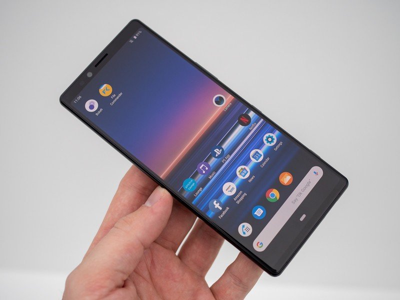
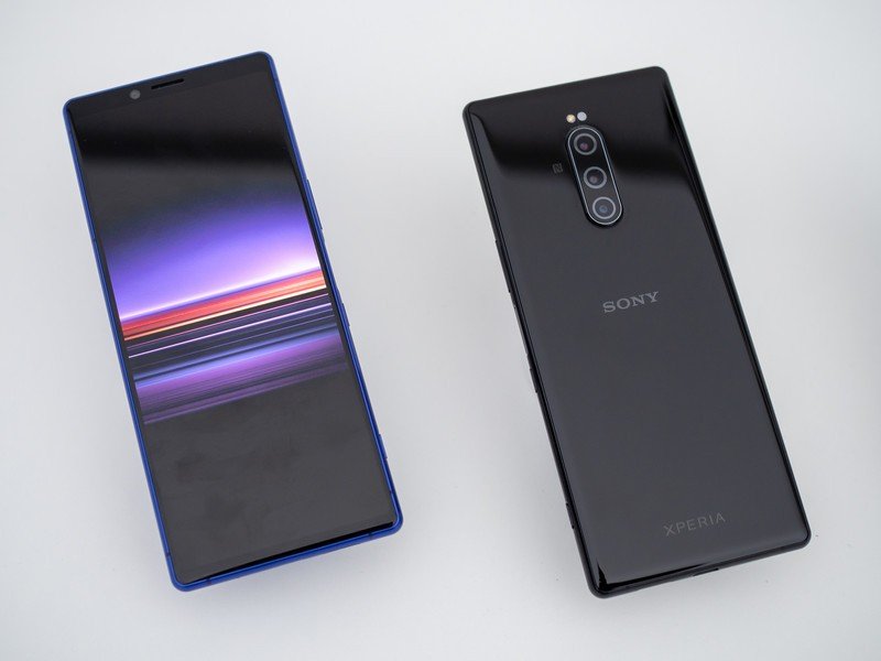
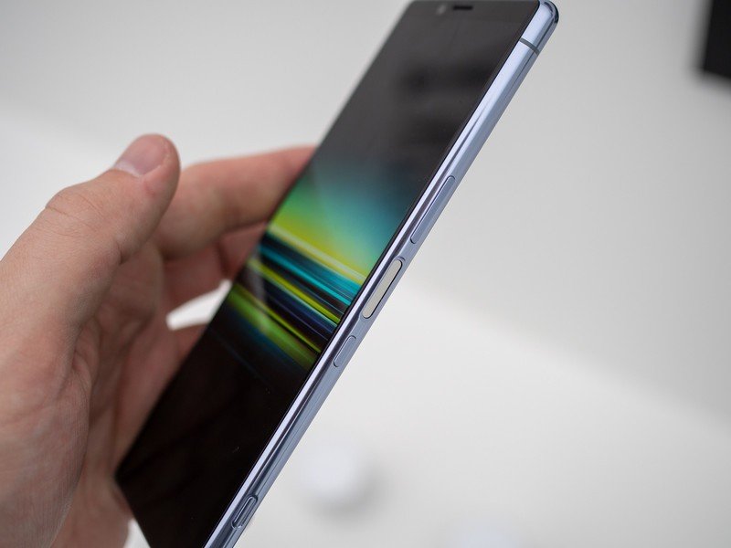
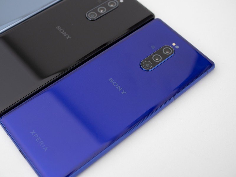
The Xperia 1 is obviously the standout device, as it takes the new top position for Sony phones. Its most striking differentiator is the display: a crazy 21:9 aspect ratio 4K HDR OLED panel at a rather large 6.5 inches defines the whole aesthetic of the phone. The OLED looks amazing (at least indoors), and Sony puts a large importance on being able to offer 4K resolution and great color accuracy. (See our initial article on the Sony announcements for a full breakdown on the specs.)
Whether you believe in the 21:9 hype or not, this is a beautiful display.
But just as important to Sony is the 21:9 aspect ratio, which is far and away the tallest ratio I've seen in a phone. Sony's promoting as being a synergy with its entertainment business because so much video is shifting to at least 2:1 if not 21:9 itself. On the face of it, it makes sense — when you're watching a 4K video shot in 21:9, it looks absolutely amazing on this screen. Just how often you do that will depend on your viewing habits. But there are of course other benefits, like gaming on the wider screen with on-screen controls that don't obscure as much of your view; or seeing more of a webpage or feed with less scrolling.
Sony is carrying the 21:9 theme over to the camera, once again leaning on its entertainment and photography businesses. The phone is set up to record 4K video in 21:9 (16:9 is also available), and has an extensive pro mode that offers tons of manual shooting options and filters developed in house. The triple-camera setup follows the modern theme of a telephoto, standard and ultra-wide lens arrangement — and I'm happy to report that Sony has added OIS! What a relief.
Unfortunately the phones available at the MWC trade show didn't have fully functional software, so Sony wasn't comfortable letting anyone use them outside of controlled demos. So we just have to wait before we can form a full opinion on the complete package.
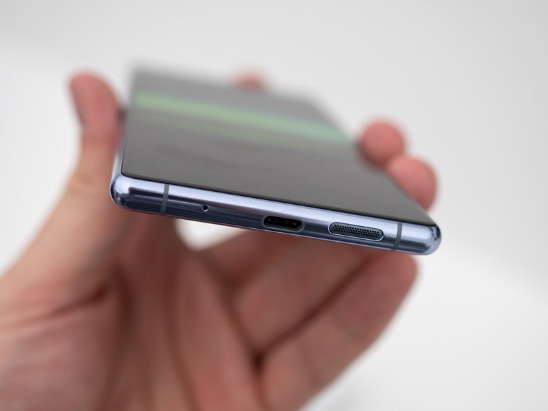
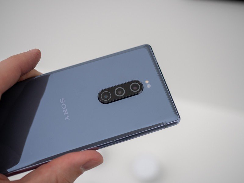
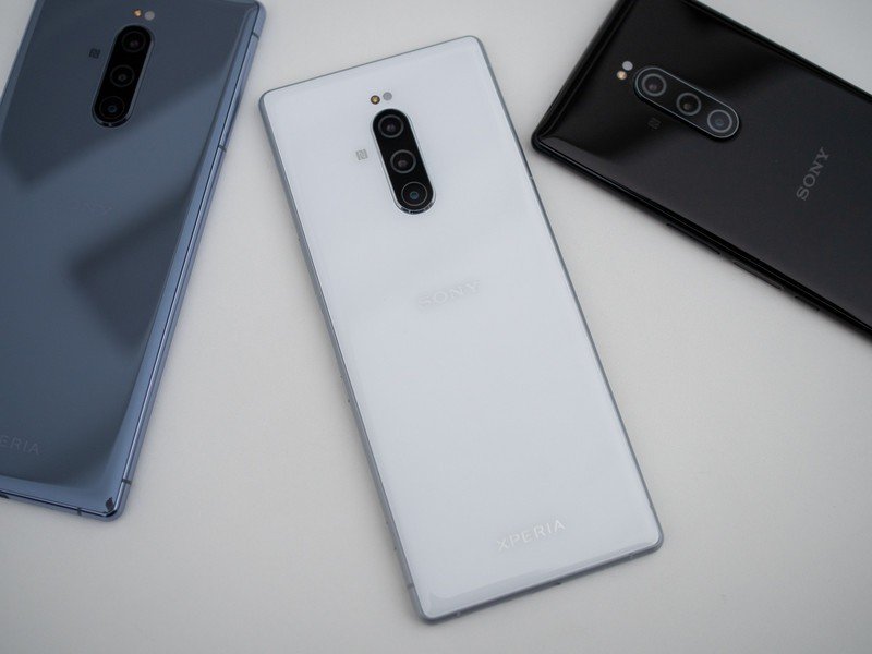
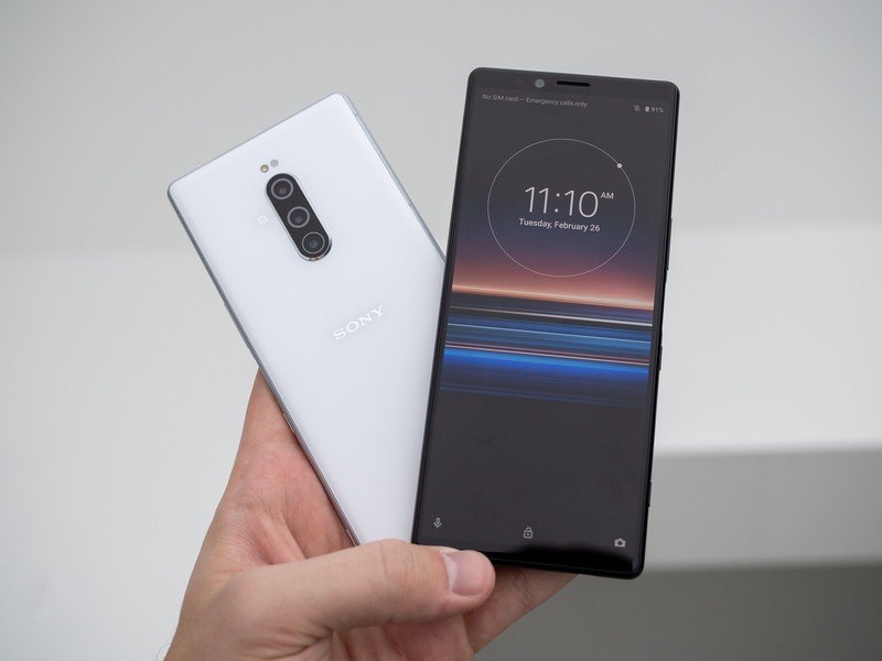
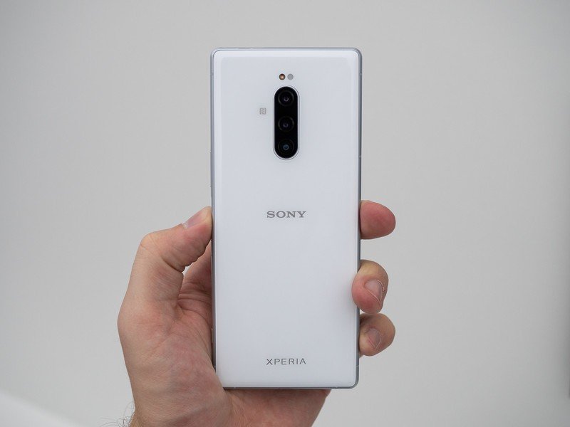
The phone is tall. Really tall. But I think you'd get used to it.
The aspect ratio is immediately noticeable as something different than you're used to — even compared to other "tall" phones. The Xperia 1 is taller than the already large Galaxy S10+, but in return is actually narrower and easier to grip; it just requires some acrobatics to reach the top of the screen with your thumb. Once you get over the initial odd feeling of the aspect ratio, I assume it'll feel normal.
Be an expert in 5 minutes
Get the latest news from Android Central, your trusted companion in the world of Android
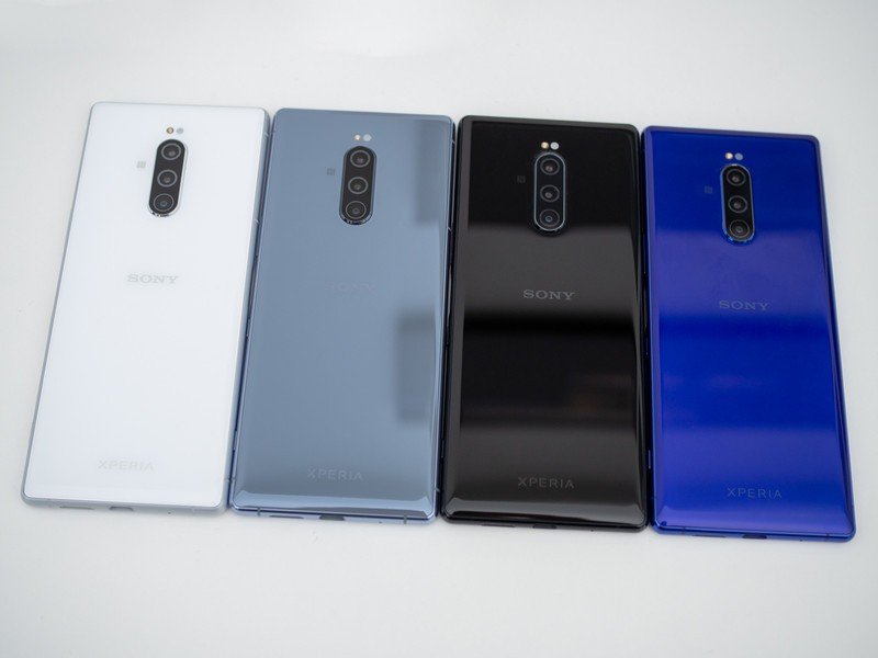
The rest of the hardware is very nice. And very Sony. The design ID has evolved considerably even from the Xperia XZ3, with more gently curved glass on the front and back, and a nicely rounded metal frame that seemed easy to grip. The fingerprint sensor also moved back to the side of the phone, though it's separate from the power button. The color palette is basic, aside from a deep blue/purple that's a throwback to some of the older Xperia phones and their bold colors. I particularly like the grey model.
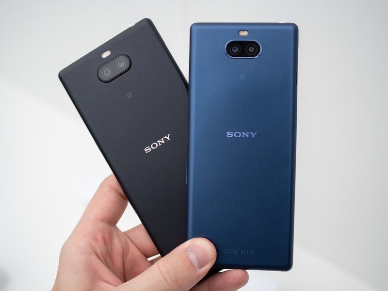
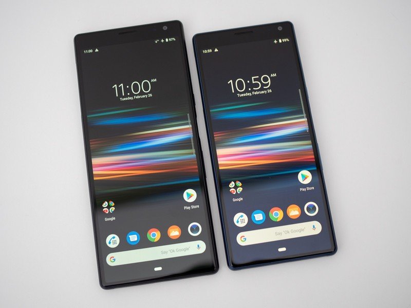
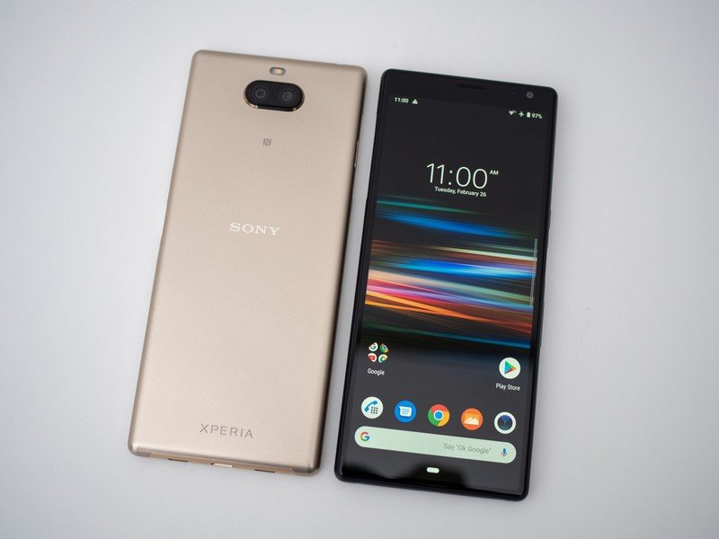
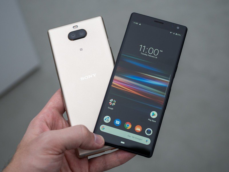
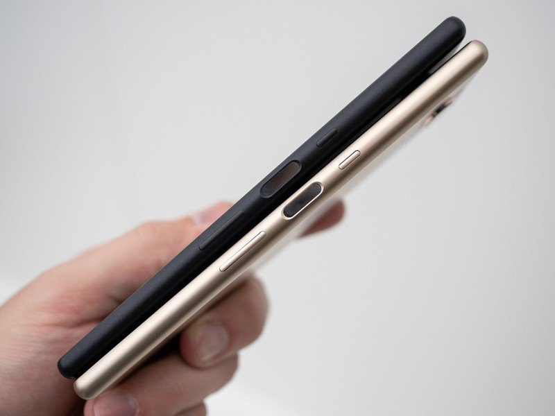
This is a new direction for Sony, and it actually looks pretty promising.
After playing with the Xperia 1 for a while, it was quite the downgrade in experience to switch over to the more typical Xperia 10 and Xperia 10 Plus — although these mid-range models, coming in at $349 and $429, are arguably just as important as the high-end Xperia 1. They fill out the range by incorporating the same 21:9 aspect ratio, though the screens aren't nearly as nice and are just 1080p. The 6.5-inch Xperia 10 Plus and 6-inch Xperia 10 give off the same vibe as the Xperia 1 at a glance, but the metal back is gone and the cameras switch back to basic 12 and 13MP units supported by an additional smaller camera for depth information. Their 2870 and 3000mAh batteries are a tad on the small size considering the overall size of the phones, but Sony has typically offered great battery life for the size.
As a set, the new Xperia lineup clearly points toward a new chapter in the Sony Mobile story. At this point there isn't really anywhere to go but up, but I'm excited that we're seeing a fresh design language and lots of new ideas that aren't simply a refresh of the same phone(s) in a twice-yearly cadence. We'll see the Xperia 10 and 10 Plus in mid-march, but will be waiting a few months to see if the Xperia 1 can play ball with the big competitors of 2019.
Andrew was an Executive Editor, U.S. at Android Central between 2012 and 2020.

