AC
Score
4.5
Smart Launcher has been around for years, known for its iconic Flower home screen and categorically-sorted app drawer. It's long been a stable — if a little bit boring — launcher, but if you haven't given it a look since it upgraded to Smart Launcher 5 back in March, stop what you're doing and go download it. Whether you're interested in a setup that's as quick as it is beautiful or being able to get your widgets and icons exactly the way you want them, Smart Launcher 5 is worth a fresh look.
A deceptively simple home screen
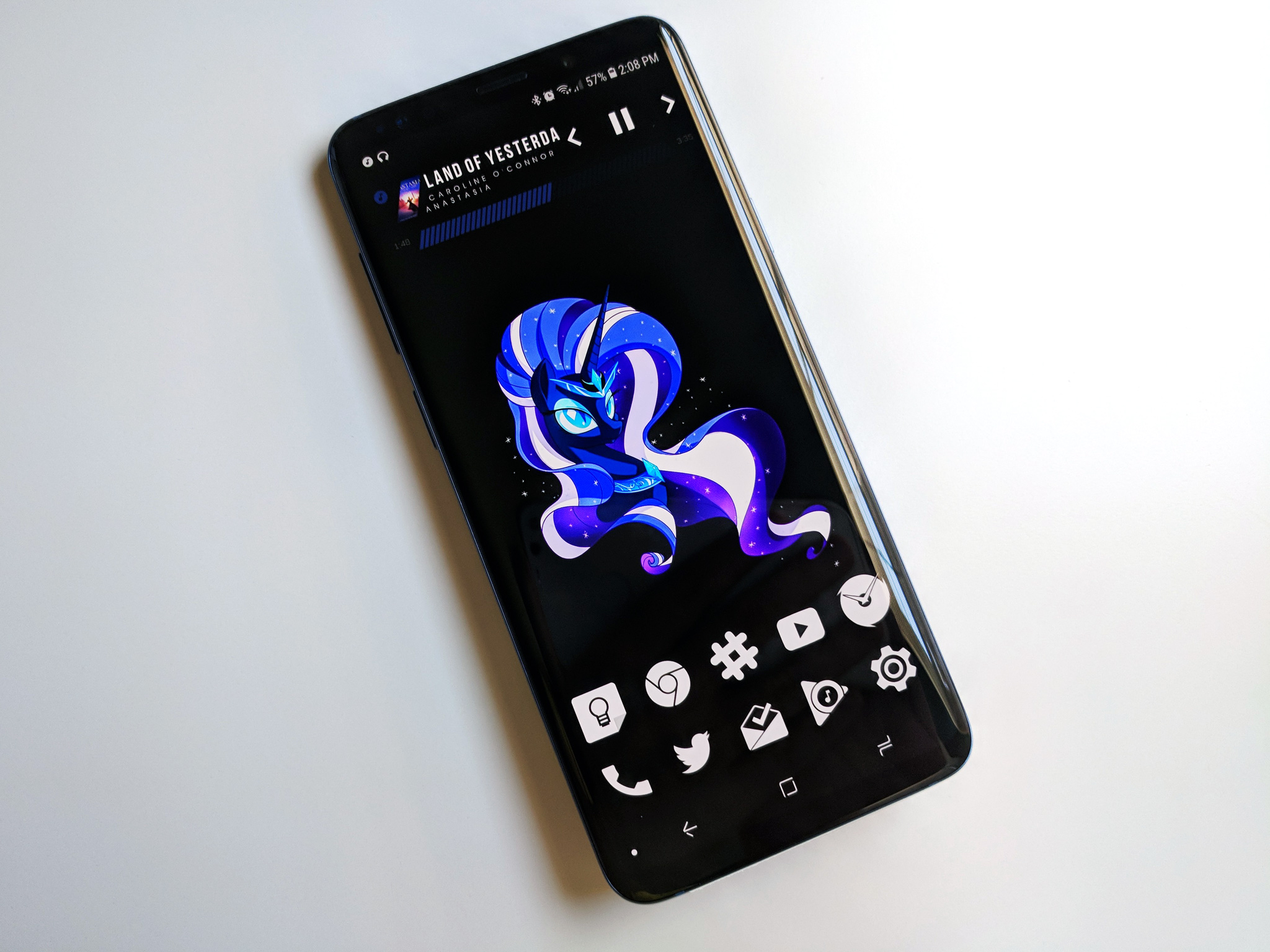
The home screen on Smart Launcher 5 can be broken down into three easy elements: the icons, Smart Search, and widgets. Most launchers allow you to place app shortcuts in any open grid space on the home screen; Smart Launcher, however, places your icons automatically based on one of the four available icon layouts: the default Grid, SL3's iconic Flower, single-hand-friendly Arch, and the experimental HoneyComb.
You can reorder the icons in your chosen pattern but cannot place them outside the pattern. It's unusual, but most users stack their icons in rows at the bottom of the screen anyway, so this will work for them.
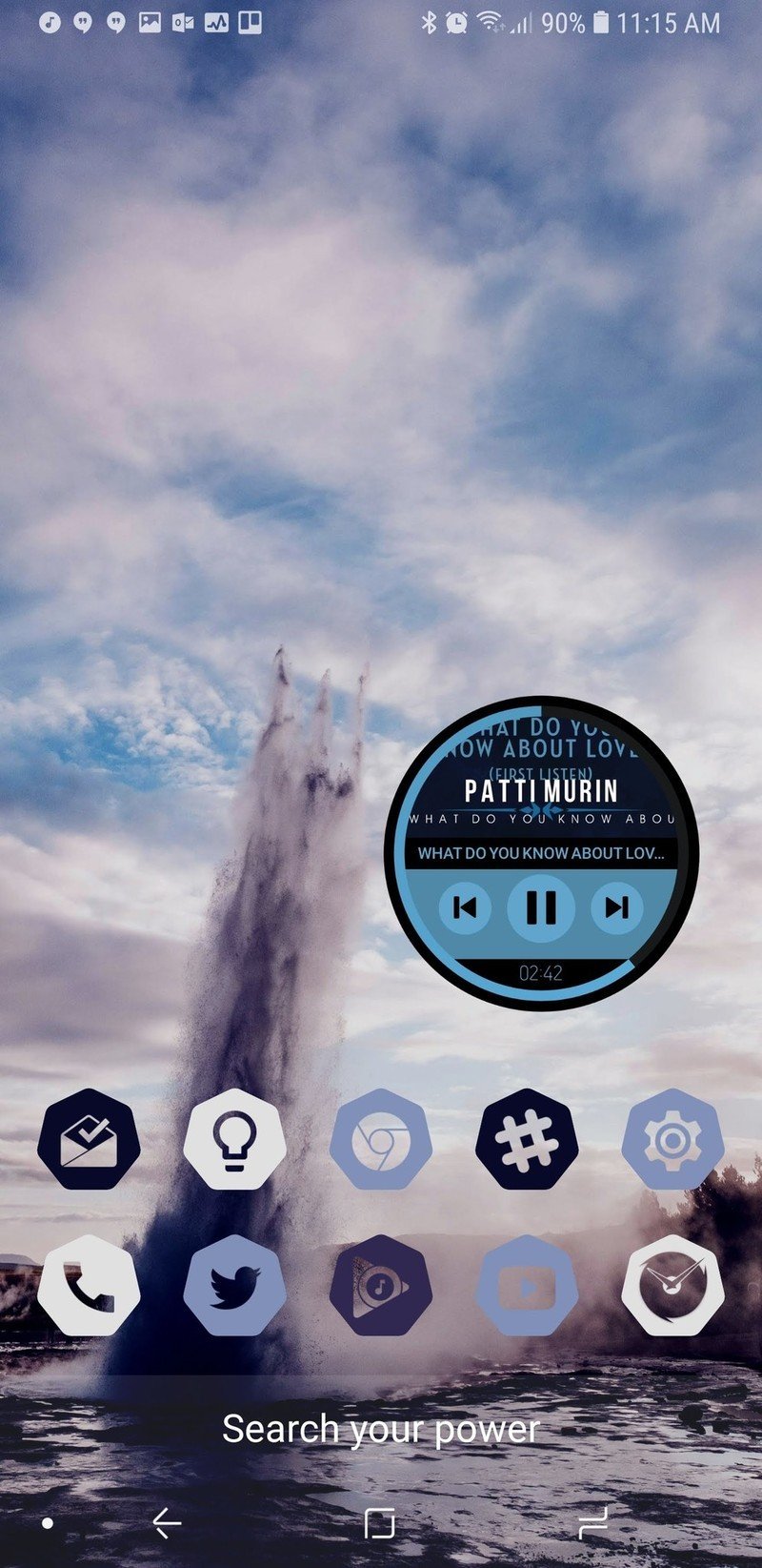
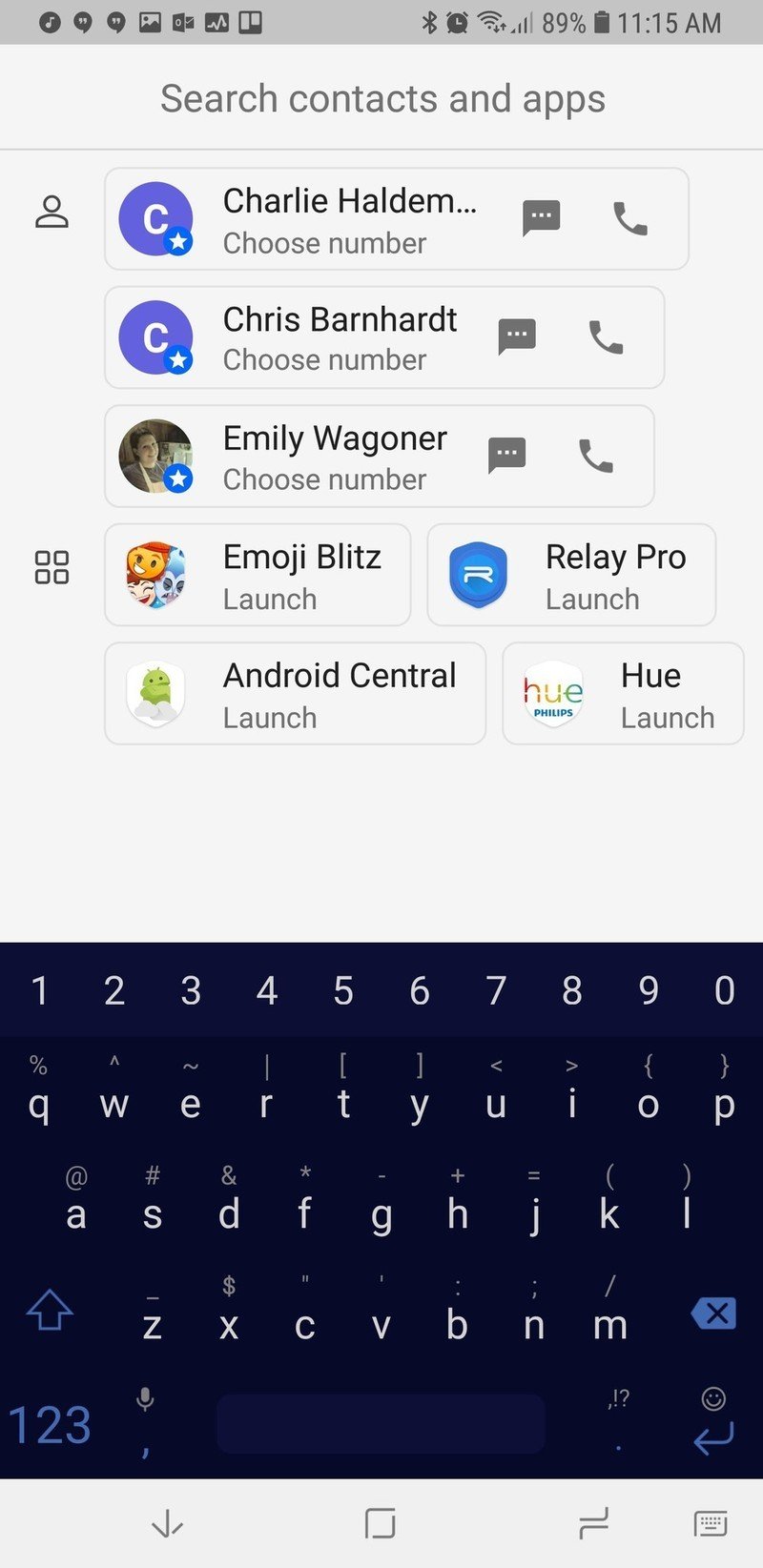
The second aspect of the home screen is the newly redesigned Smart Search. Smart Search is now the default swipe up gesture on your home screen in addition to a tastefully subtle search bar in the dock, which can be disabled. The Smart Search page has also been redone, presenting some of your most used apps, favorite contacts, and of course web searches. The smart search screen is blindingly white, and while I wish it would take on the same Ambient Theme the app drawer does, the Smart Search screen is here to help you find things quickly, not to be easy on your eyes at 2 am.
Smart Launcher 5 takes widgets to the next level — a gridless level.
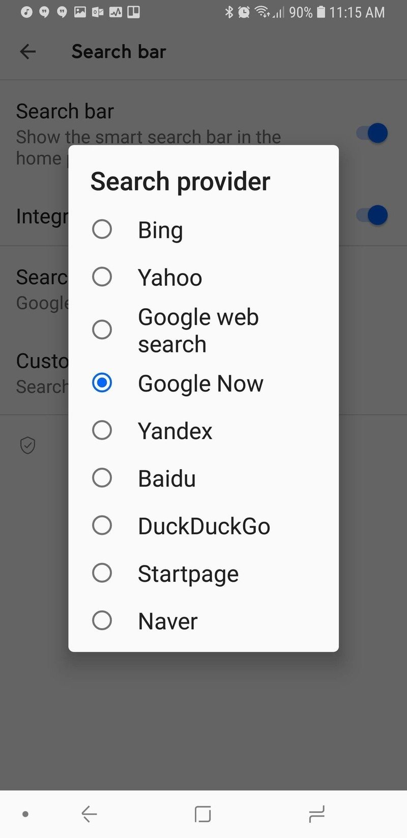
You can also switch search sources for Smart Search, so you can use Bing, Yahoo, DuckDuckGo, and a slew of other search options if you don't want to use the standard Startpage.
You can even set Google Feed as the source, but you can't set Google Assistant as the search source yet. If you're a Smart Launcher Pro user, you can also change the display text of the Smart Search bar, setting it to a helpful hint or to a motto or quote to help the bar fit in with your theme better.
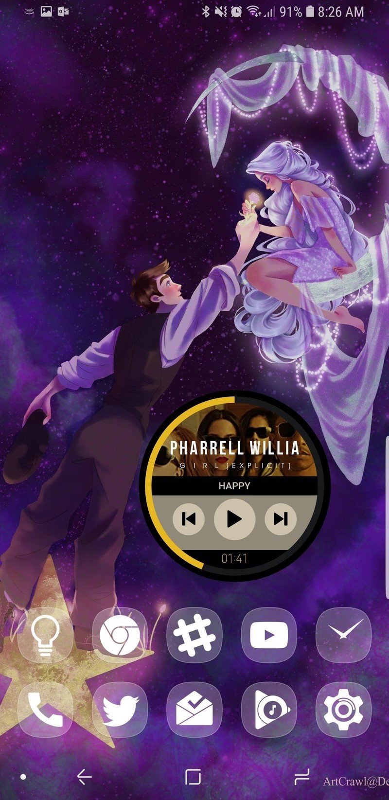
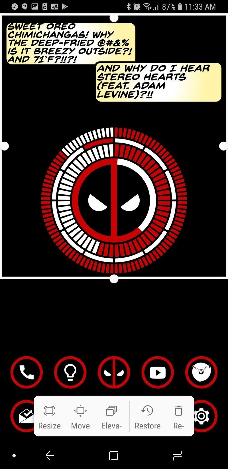
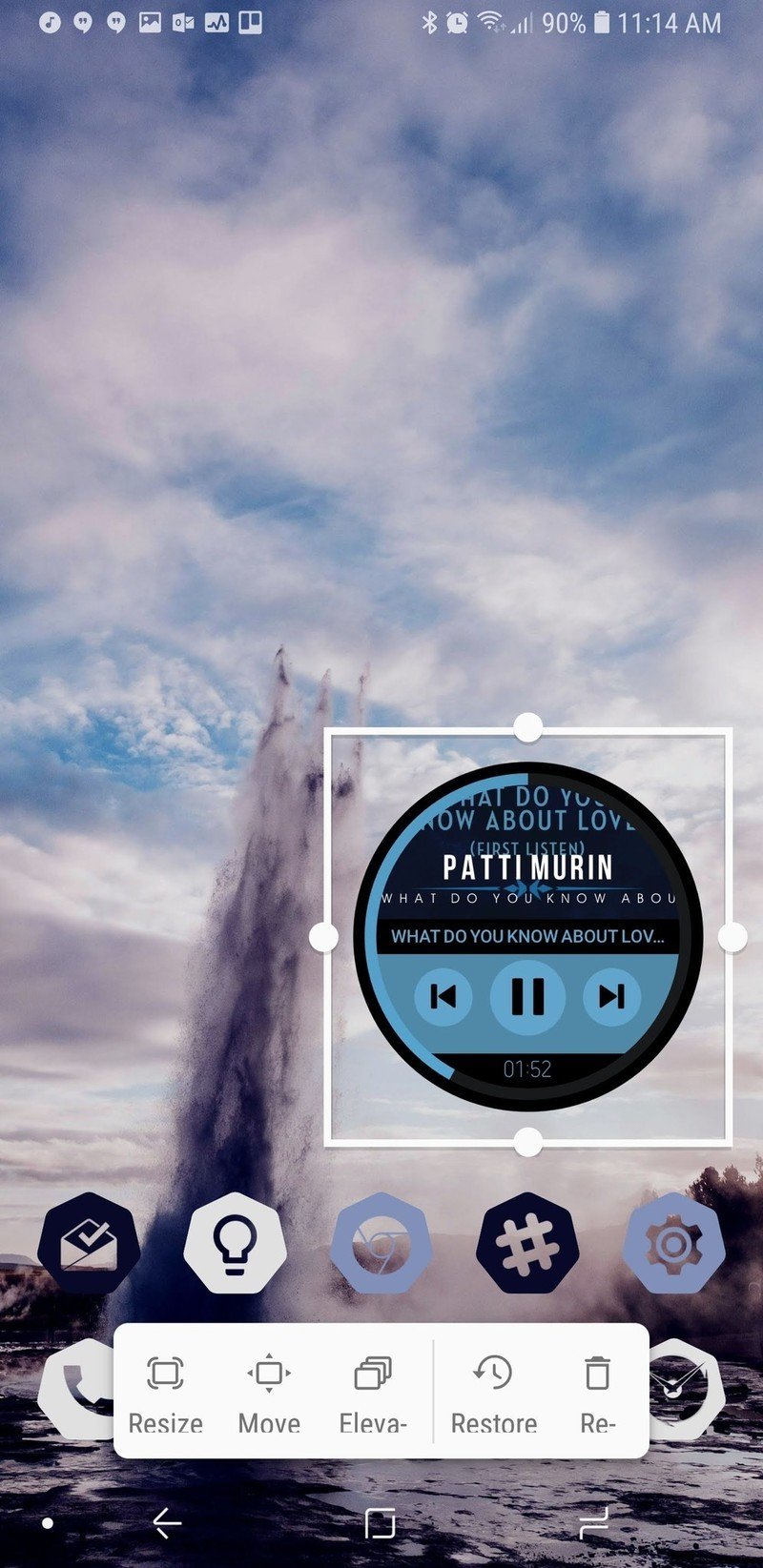
We then come to the final component of the home screen: widgets. Boy, howdy, have widgets on Smart Launcher 5 gone to infinity and beyond. Since Smart Launcher doesn't use the traditional grid system for widgets, that means you can resize widgets to be exactly as big or small as you want and line them perfectly with your wallpaper.
The only downside for widgets might be that you can only have multiple widgets on a page if you pay for Smart Launcher Pro, which you should absolutely do anyway to unlock the full potential we'll be talking about a little later.
A very complex app drawer
Smart Launcher has long stood out for its categorically sorted app drawer, and that drawer is still smartly sorted, if a bit more smartly dressed now. Smart Launcher pulls a color from your wallpaper to Ambient Theme your app drawer so that no matter your wallpaper, your app drawer fits it.
If you're not a fan of the category app drawer, you can also disable categories for the traditional all apps together app drawer, but you should at least give the categories a chance.
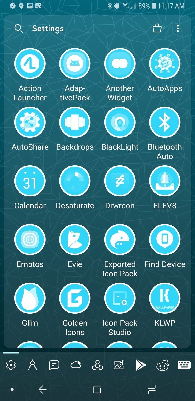
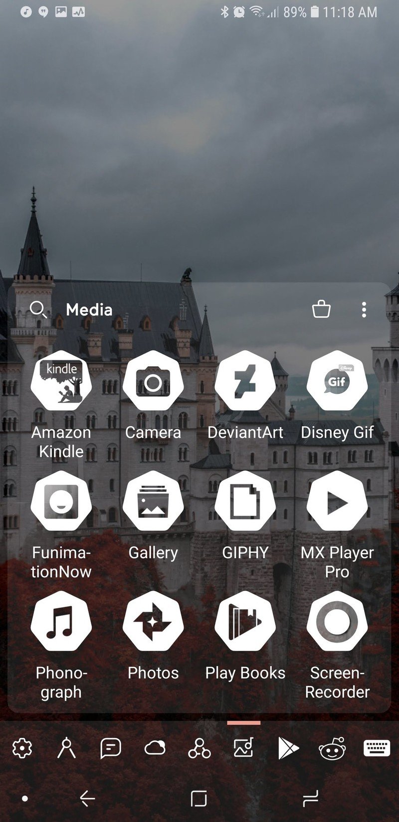
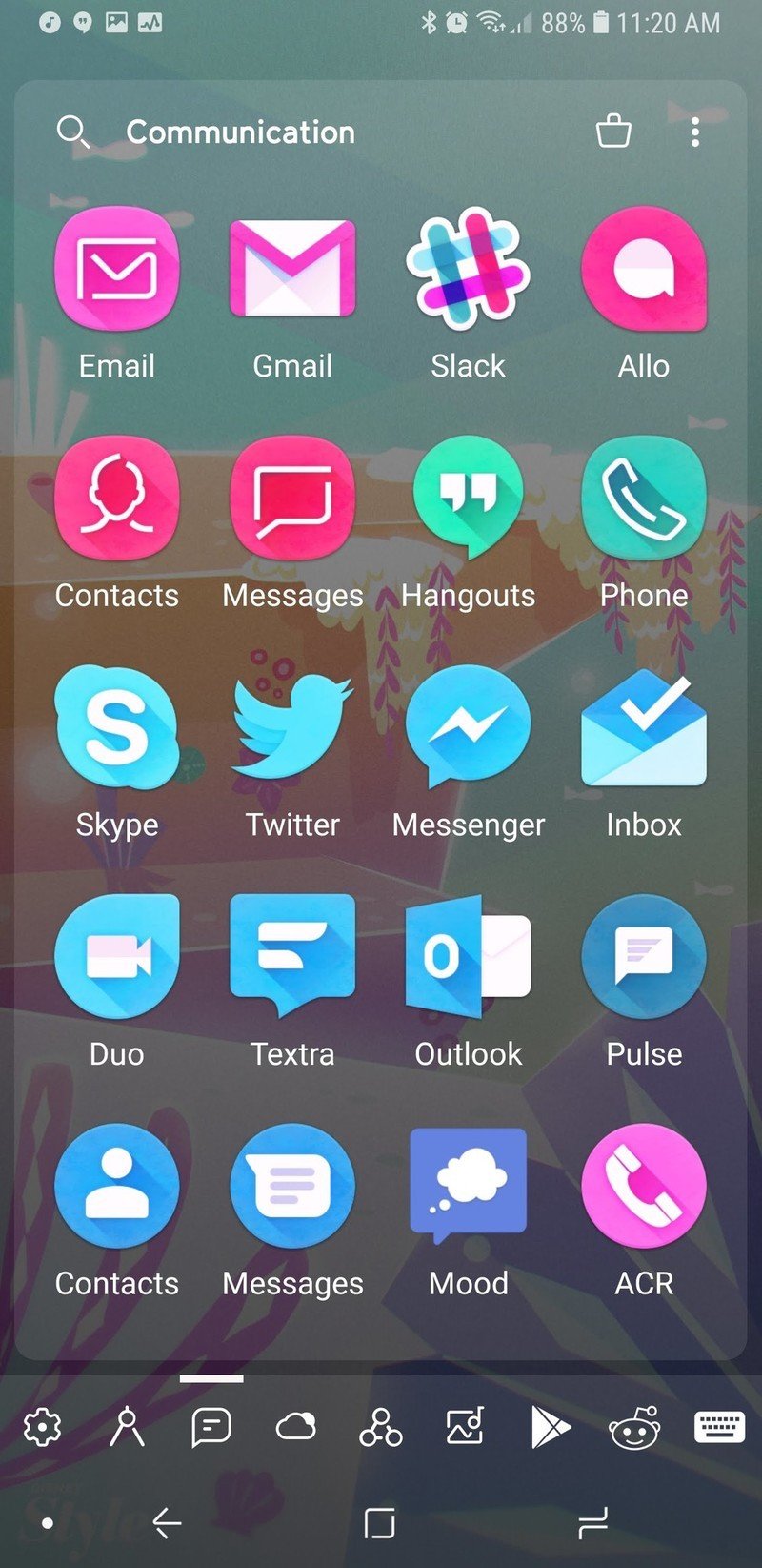
By default, Smart Launcher will have several default categories that it will sort your apps into based on what you have installed. I, for instance, have a lot of theming and customization apps installed, so my two fullest categories are Settings and Utilities, whereas my Media and Entertainment tabs were rather light. Thankfully, you can switch apps between tabs easily enough to help balance things out.
Customization is the name of the game here, and that's why I recommend you upgrade to the Pro version for a few bucks.
If you purchase Smart Launcher Pro, you can add and remove categories, letting you do brilliant things like sequestering your work apps so that you're not tempted to check them on the weekend. I have loved custom tabs because I can keep all the apps I'm reviewing for Best Apps roundups together for easy browsing and comparison.
Smart Launcher Pro users also have a few more sorting options within your categories. You can choose to sort by name, by most used, and then there's also sorting 'by user', which is just a polite way of saying you can arrange it, however, the heck you want.
If you're feeling especially vibrant, you can also sort apps by icon color, giving you a rainbow app drawer and the easiest Pride theme ever. If you're using an icon pack with a warped color palette, like Unicorn or Retrorika, you can get different sorts than you would with the normal Adaptive icons.
Well, I wouldn't call the Adaptive icons in Smart Launcher 5 "normal".
A gateway launcher to customization
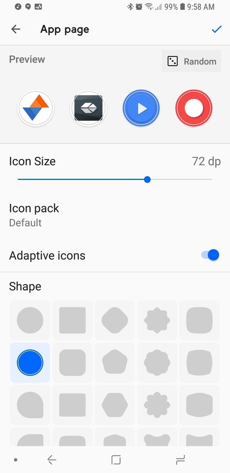
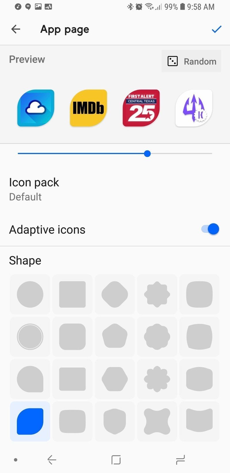
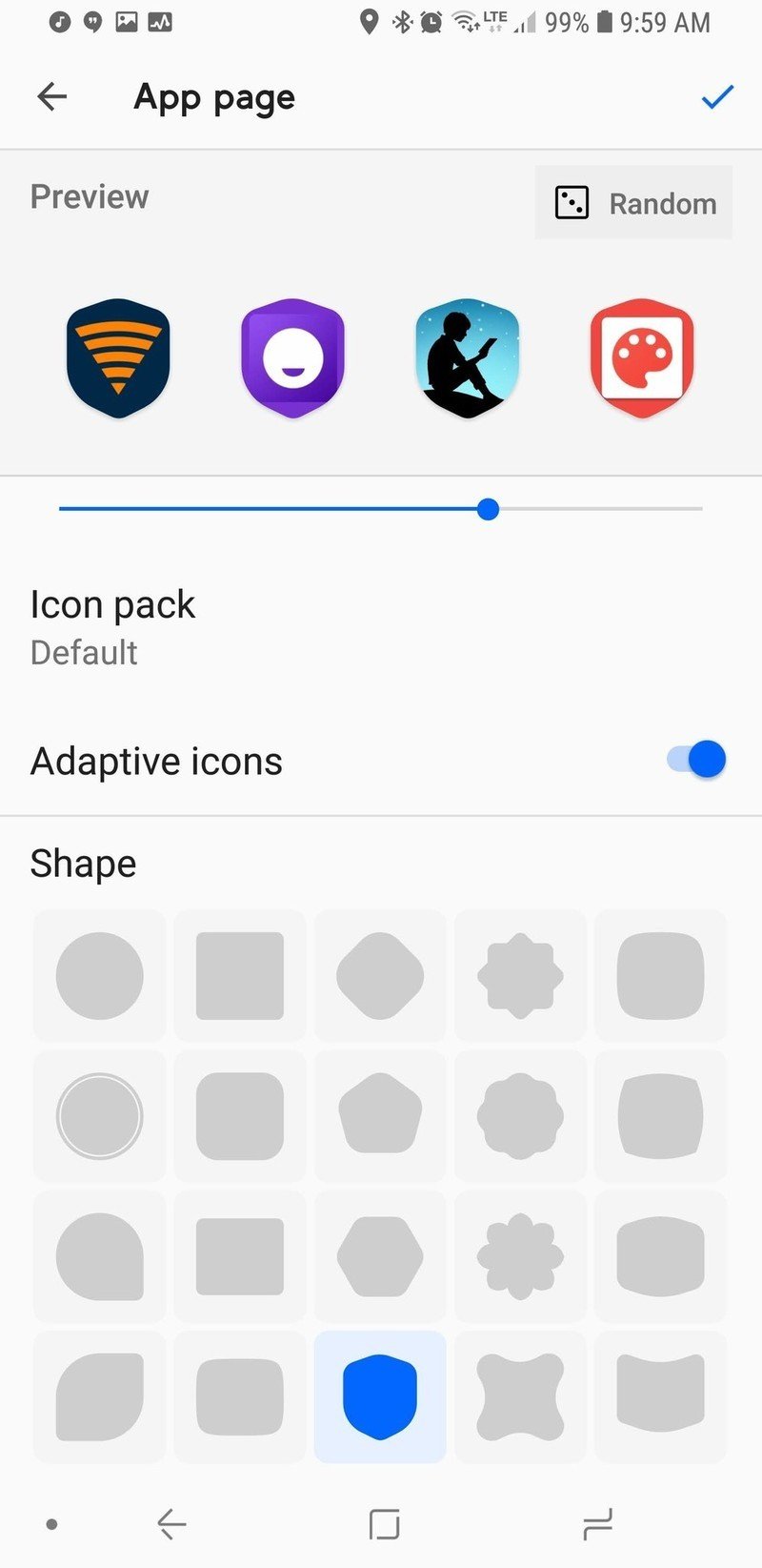
Smart Launcher 5's icons not only take Adaptive Icons to new heights, they can also surpass them entirely with one of Smart Launcher's side apps. Most launchers only have four to five shape choices for Adaptive Icons.
Smart Launcher 5 has the traditional five available to free users, but Pro users can choose from 20 shapes, including shields, leaves, flowers, and a plethora of polygons, and you can tap the Random button to change the preview icons to other apps on your device, letting you see how each of your icons will look with a particular shape or style.
Want to really get creative with your icons in Smart Launcher? Try Icon Pack Studio.
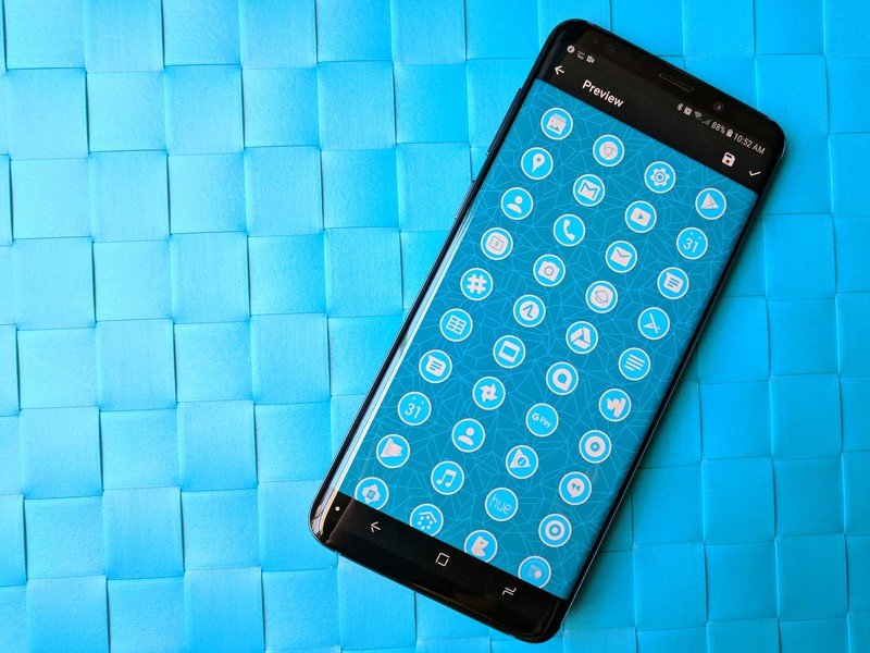
Icon Pack Studio goes five steps beyond Adaptive Icons by letting users customize and build your own personalized icon packs using an expansive icon base and a top-notch masking system to produce icon packs that fit your theme or wallpaper to a T. You can even add fun effects to give yourself a metallic icon pack, custom drop shadows, and build an icon pack that will switch colors as you switch wallpapers.
Icon Pack Studio is here to do what Adaptive icons can't
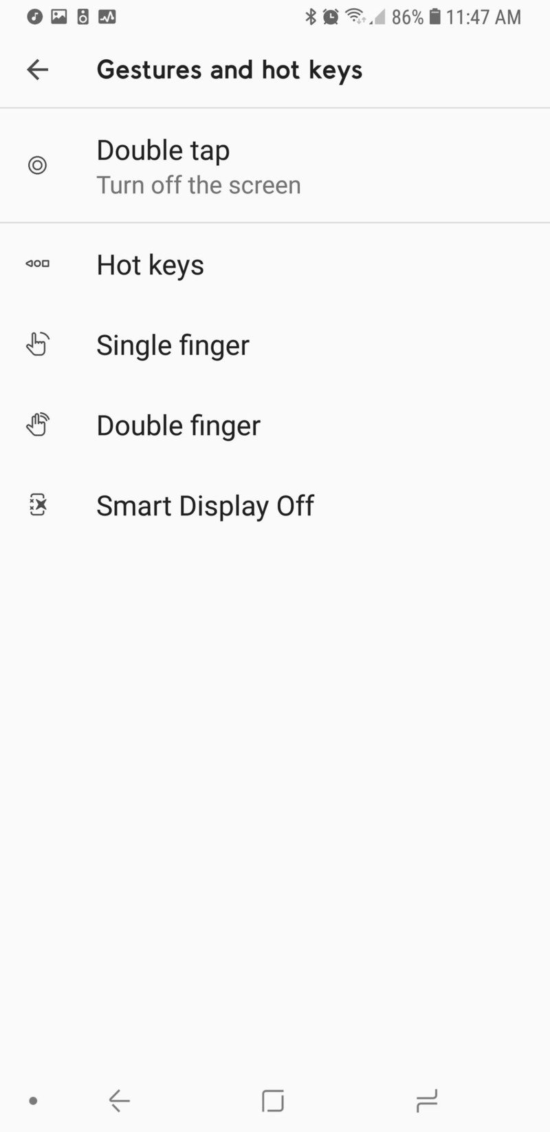
Smart Launcher extends the same philosophy to Gestures that it does to Adaptive icons: Free users have access to the more basic gesture shortcuts, and then the more complex shortcuts are available to Pro users.
You can set double-tap to sleep the screen with a timeout to avoid interfering with Smart Lock, just like Nova Launcher and Evie Launcher. Then there's Smart Display Off, which puts your screen to sleep when you set the phone down on a flat surface. If you tend to set your phone down and keep using it like I do, this feature can go from awesome to annoying in five seconds flat, but it's an interesting idea.
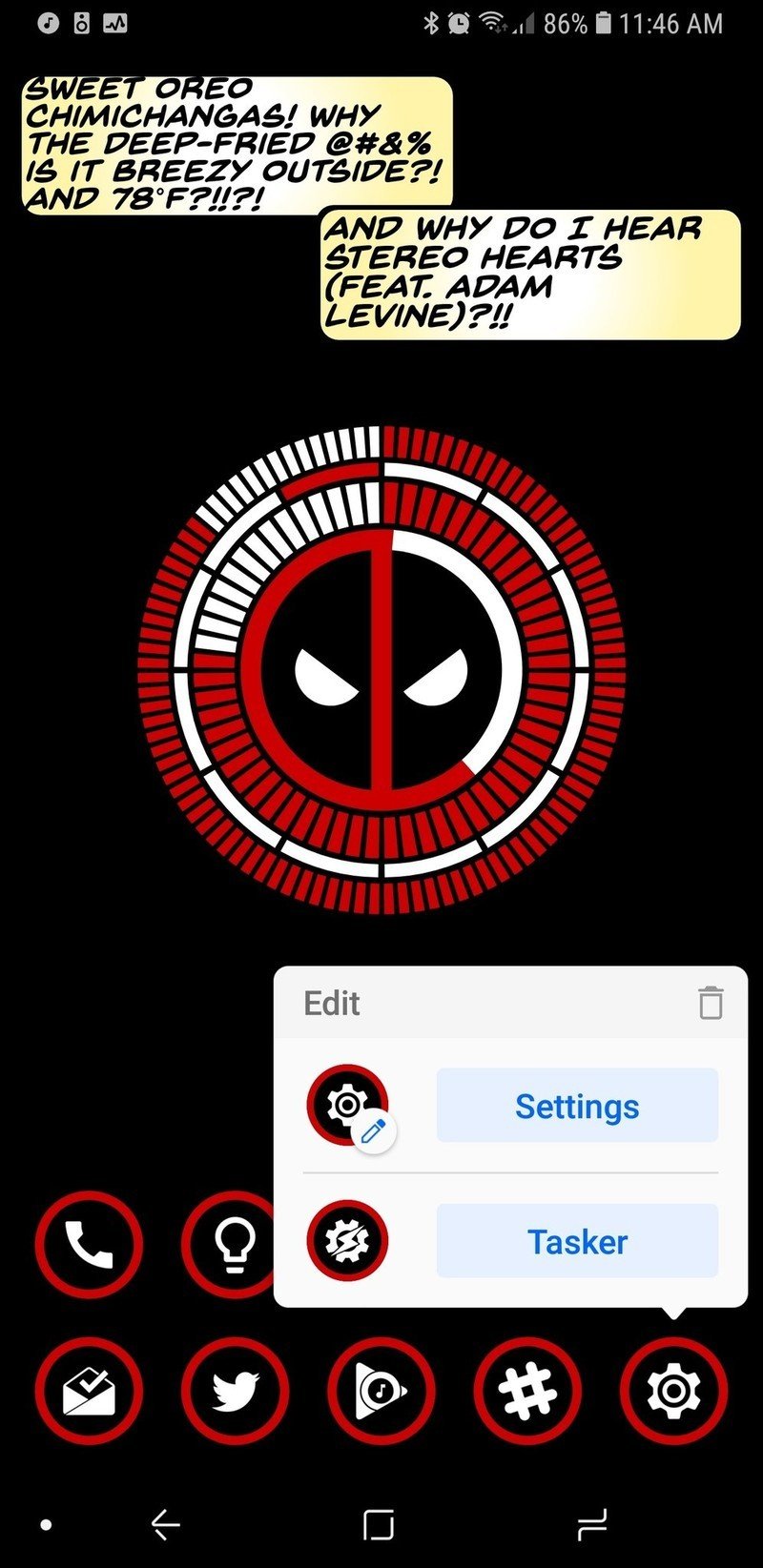
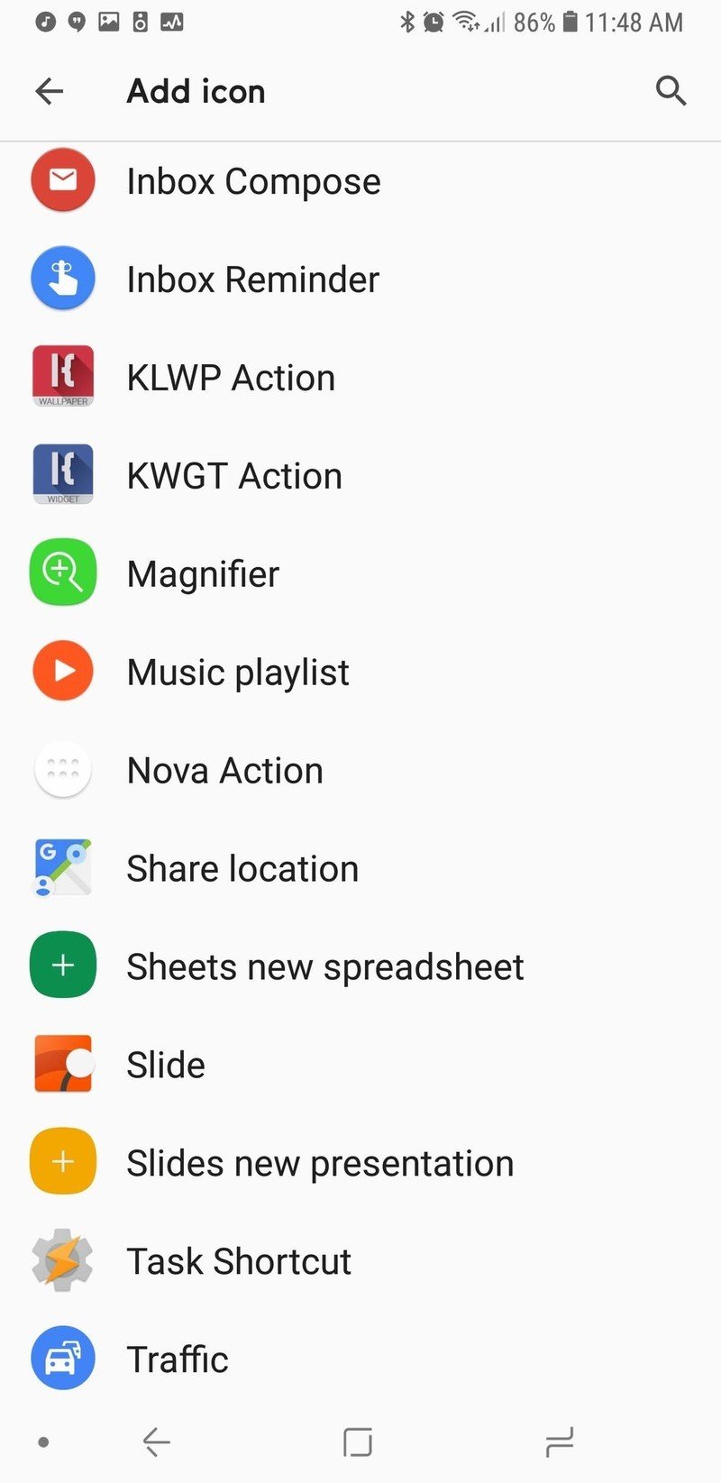
Even if you don't go in for a lot of complicated gestures and fancy icons, Smart Launcher 5 has a tiny bit of customization that every user should take advantage of: Double tap icons. The icons on your homepage can add a double-tap action that can open another app or fire off an Android Shortcut — like a Tasker shortcut or a Direct Dial.
Pro users can even open a pop-up widget with a double-tap, and you can set any widget to open with a double-tap, not just widgets from that app. Several launchers have a similar feature which lets users swipe on an app shortcut to trigger a widget, app shortcut, or folder, but the double-tap on Smart Launcher 5 is much more intuitive. Long-pressing on a home screen app will also bring up their App Shortcuts.
A smart way to stand out in a crowded launcher market
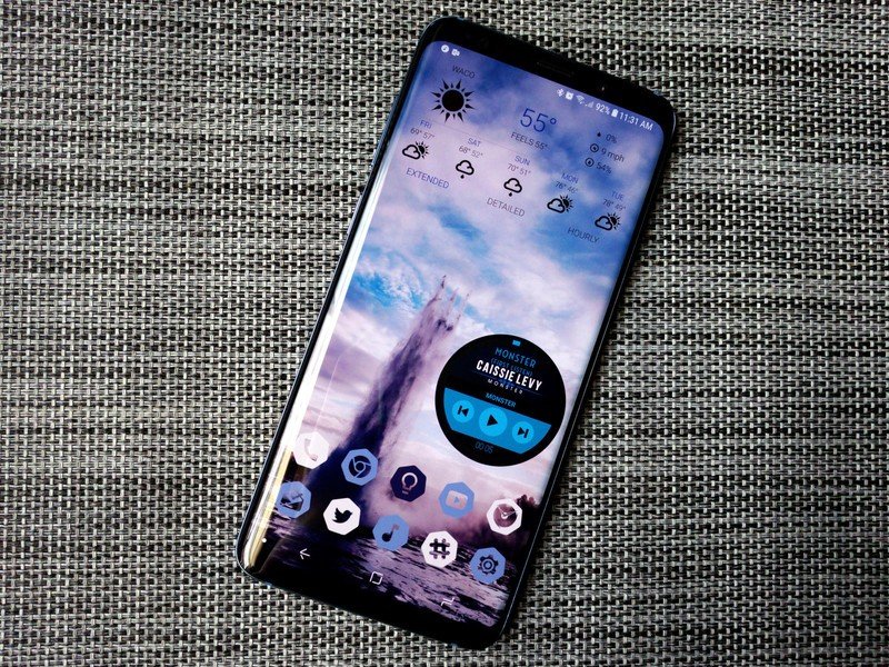
Smart Launcher 5 has a lot here to like, from a responsive and comprehensive categorical app drawer to some of the most precise widget placement on Android to the most diverse icon options on the market. Want a search bar that links to something other than Google? Smart Search can use the engine you prefer. Want your apps sorted just the way you like? Smart Launcher Pro will let you sort everything your way. Like having a minimal home screen but want more functionality? Go nuts with Smart Launcher's double-tap icons and gestures.
Smart Launcher has been one of our favorite launchers for years, and this year, it is reaching new heights. So, is Smart Launcher smart enough to fit your lifestyle and Android style? Tell us in the comments, and show up what awesome themes you're rocking with it.
Ara Wagoner was a staff writer at Android Central. She themes phones and pokes YouTube Music with a stick. When she's not writing about cases, Chromebooks, or customization, she's wandering around Walt Disney World. If you see her without headphones, RUN. You can follow her on Twitter at @arawagco.
