The Android smartwatch ecosystem is improbably competitive again, after a couple years of stagnation where the Wear OS, née Android Wear, ecosystem was practically left for dead.
The invigoration came not from tech companies like Motorola or LG, which led the charge over four years ago, but from Fossil Group — owners of so many well-known watch brands it's hard to keep track — and other lifestyle companies that have aligned themselves with Google in an attempt to ward off the insidious reach of the Apple Watch into their entrenched market share.
Skagen, like parent Fossil, has taken a couple of generations to get its offerings on the right footing, but with the Falster 2, the company has created something close to the ideal smartwatch for my needs. But it's also a smartwatch built on last-generation hardware, with a processor that's about to be replaced with something a lot more battery-friendly. At $275, should you buy this year's Falster, or wait until the inevitable 2019 update?
Skagen Falster 2 What ticks
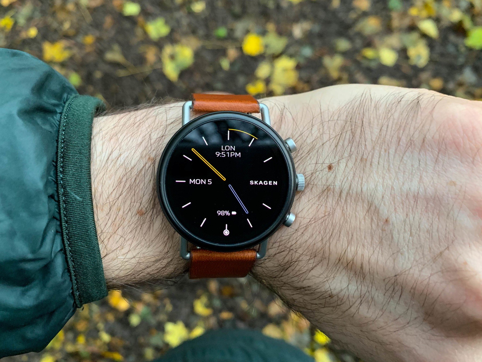
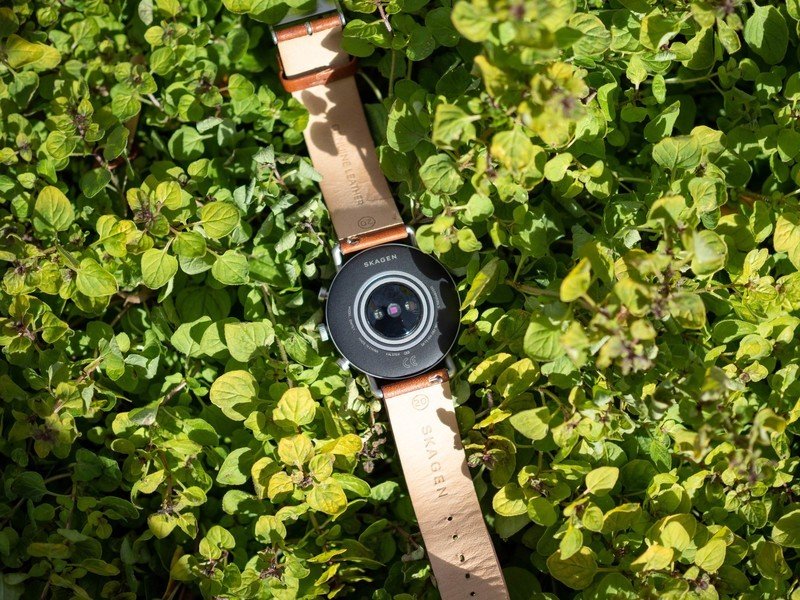
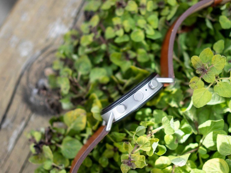
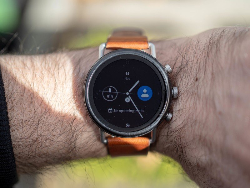
There's a lot to like about Skagen's latest smartwatch, from its bright and sharp 1.2-inch OLED display to its opinionated lug design and tightly-coiled digital crown. Skagen did a number of things to improve the aesthetics of its smartwatch sequel, from eliminating the unsightly protrusion around the bezel to reducing the bezel's size itself. If you were a fan of the first Falster's minimalism, this one is even more monolithic, at least from a top-down perspective.
| Category | Spec |
|---|---|
| Price | $275-$295 |
| SoC | Snapdragon 2100 SoC |
| Memory | 512MB RAM, 4GB storage |
| Dimensions | 40mm case, 11mm thick |
| Band | 20mm replaceable |
| Connectivity | Bluetooth 4.1 LE, 802.11n |
| Battery | 300mAh |
| IP rating | IP67, 3ATM |
But the right side has been overhauled, and the changes are welcome. Instead of a single button to return home, the Falster 2 has three buttons, including a prominent crown that facilitates scrolling through the vertical-friendly Wear OS software. The two other buttons can be programmed to launch particular apps or activate shortcuts, which sounds lovely in theory but in practice I rarely use them. Your curiosity may vary.
The Falster 2 also fills in a bunch of omissions from the original, including a heart-rate monitor, onboard GPS, and NFC for Google Pay. These are all table stakes for Wear OS devices in 2018, but their addition rounds out the value proposition of a smartwatch that starts at $275. While my review unit came with a brushed silver case and brown leather band, there is a black case/black silicone strap option for the more actively inclined. With Google Fit's recent retro...fit, and its prominent position in Wear OS's workflow, I'm now more inclined to use the once-ignored service, but it's still no match for Apple's or Fitbit's robust social features.
The new features bring the Falster 2 to the same level as most high-end smartwatches, but its improved looks elevate it beyond them.
To test out the new features, I left my phone at home and tracked a run using Google Maps, stopping at a coffee shop to pay with Google Pay, and everything worked without a hitch. I even downloaded some songs to the watch from Play Music, though the process was made convoluted by the fact that, because there's no built-in speaker on the Falster 2, I had to pair Bluetooth headphones first to get it to work.
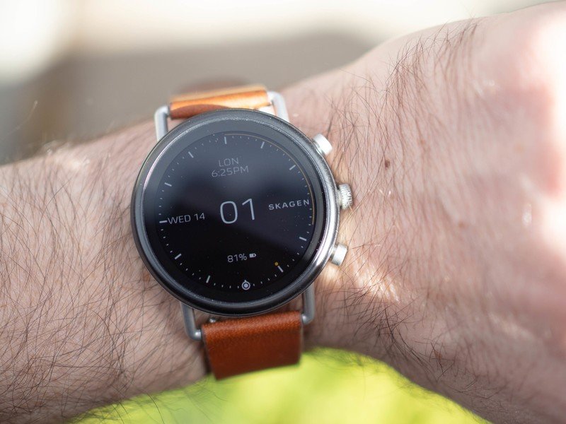
The thing about using any smartwatch running Wear OS these days is that you have to go in with measured expectations. If, like me, you love Skagen's aesthetic and have been wearing them for years, it's an easy transition to move to something like a Falster 2 (though if the watch is too chunky, I'd recommend one of the company's excellent hybrid timepieces. With Skagen's six superb minimalist (and surprisingly customizable) watch faces, the Falster 2 is the perfect antidote to the oversized, garish smartwatches endorsed by other lifestyle brands.
Skagen Falster 2 What falters
There's a lot to like about the Falster 2, but its downsides are endemic to the Wear OS ecosystem in general. Because the watch, announced after Qualcomm's upcoming and upgraded Snapdragon Wear 3100 SoC, uses the old as hell aging Wear 2100 chip, the wearable is missing a true low-power mode to extend battery life beyond 36-hours. And that's exactly the uptime I regularly achieved with the Falster 2.
Worse are the performance problems that seemingly migrated from the original Falster. By default — and to save precious battery juice — the watch's screen remains off until you lift your arm to check the time. But for some reason, either because of a poorly-calibrated accelerometer or buggy software, the watch doesn't register that movement until a full second or two after it's performed, which means you're waiting, arm lifted as if in a sling, until the dang screen turns on.
I fixed this by enabling Wear OS's Always-on Display feature, but that affects battery even more adversely, lowering my battery to just under 24 hours. In other words, if you had any hope of the Falster 2 fixing its predecessor's battery woes, you're out of luck.
That said, battery life is only woeful if you truly hate charging your devices every night. I've set the newly-improved magnetic charger next to my bed next to my phone's charger and top it up every night and don't really think about the watch's uptime beyond ensuring that I give it an extra top-up when I engage the GPS. Sure, I'd have liked it to last three days like the Galaxy Watch or seven like the Fitbit Ionic, but this is Wear OS, and 24 to 36 hours is about what you can expect.
Less forgivable is the constant performance inconsistency. Some days the watch will hop along briskly, dashing between notifications and open apps with aplomb. Other times, the watch slows to a crawl, adversely affected by some phantom background process. There doesn't appear to be any rhyme or reason to this behavior, but it consistently annoys me. And keep in mind, this is with the new Wear OS 2.1 update — the one that vastly improves the operating system's navigation and, ostensibly, its performance. The watch shipped with Wear OS 2.0 and was upgraded to this new layout a few weeks after I received the unit, but it did nothing to alleviate its performance problems. Here's hoping for a quick resolution because at $275, this thing ain't cheap.
Skagen Falster 2 Should you buy it?
I'm able to look past this watch's downsides because, for the most part, it does what I need it to do, and generally does it pretty well. That it corrects the omissions of the original while also improving its looks is bonus. That is ships with a now-ancient processor and has software slowdown taints those benefits.
Given that competitors like the TicWatch Pro are cheaper and more robust (though considerably uglier in my opinion) and the Fossil Sport, which rocks an upgraded Snapdragon Wear 3100, is only $255, I qualify my recommendation of the Falster 2 with its aesthetic value. If, like me, you love how it looks, it will probably bring you joy every time you look down at its rounded minimalism. If you're more specs-inclined, or need longer battery life, or a bigger screen, I'd probably direct you to one of the smartwatches I mentioned above.
That said, you'll have to pry the Falster 2 from my wrist — it brings me joy whenever I look down at it, and these days, after years of testing gadgets, that's primarily what I want.
Daniel Bader was a former Android Central Editor-in-Chief and Executive Editor for iMore and Windows Central.
