Silk Wallet Slayer Case review: Weirdly in love with this case
Tech companies have been telling me for almost a decade now that we're all right around the corner from leaving the traditional wallet behind. Yet here I sit, early 2019, and that flap of leather still rests in my back right pocket ready to be summoned at a moment's notice. There have certainly been times where I could get away with using my phone for payments, but I still have a few other cards that have to be physical cards for right now.
What has happened in the last couple of years is a general streamlining of my card carrying system. Slim wallets are increasingly appealing, especially since I rarely take cash with my anywhere anymore. With that transition taking hold, the folks at Silk made a case for people who think they can get away with leaving the house with three or fewer cards. And while I was skeptical at first, it turns out I am exactly the person this case was made for.
The Good
- Great grippy texture
- Clever kickstand design
- Cards are secure but easy to access
- Several designs available
The Bad
- Wireless charging isn't available with the case on
- Wireless payments stop working
- Adds a little bulk
Silk Wallet Slayer case What I like
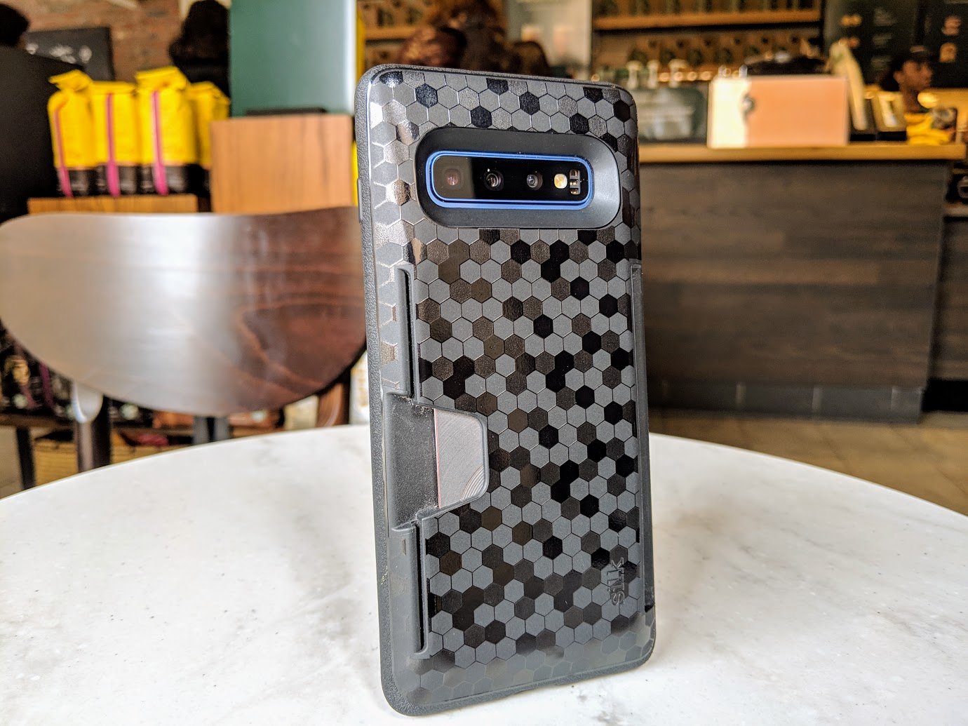
Unlike most folio-style wallet cases, this Silk Wallet Slayer doesn't immediately look like a wallet case when you look at it. Which is great, because it makes my phone less of a target. I don't usually let my phone out of my sight anyway, so having my cards and my phone together ensures I never misplace either. On the other hand, if I do happen to lose my phone I have effectively lost everything, so having the case not advertise that it is also a wallet is something I'm a fan of.

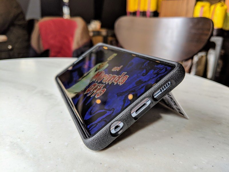
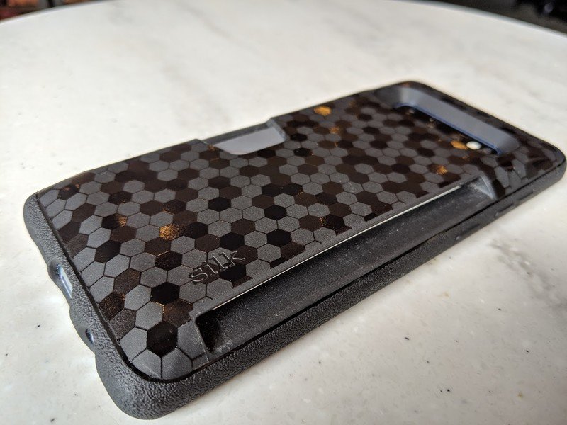
The narrow slot on the side of the case can hold up to three cards without bulging or feeling stuck, but accessing those cards is quite easy. You can push on the opposite side and the cards will slide out with ease, but a small piece of plastic in between the back of the case and the card section keeps the cards secure even if there's a single card in there. You also get a wider than necessary case slot, which Silk included on purpose to act as a kickstand. You just take a card out, wedge it in this space, and suddenly your phone is at just the right angle to watch a show or play a game. It's a simple, fairly elegant system that isn't unique to this case, but works well with the overall design.
As a case, Silk's design is simple and effective. There's a slight lip around the front of the phone to protect the Galaxy S10 if you place it face down. The cut-outs for the microphone, headphone jack, speakers, power adapter, and cameras all look nice and don't get in the way. The button covers for everything give you just enough flex to know you can press the buttons on the phone securely with no wiggle. It's a simple, straightforward case that works well.
Be an expert in 5 minutes
Get the latest news from Android Central, your trusted companion in the world of Android
Silk has multiple designs for the Wallet Slayer model, but my personal favorite is the Chef's Special. I'm not sure what that name means, but this octagonal texture with some glossy and some matte looks great and adds a lot of texture to the back of the case. The matte sides of the case are plenty grippy, but the texture of these cases on the back makes the whole thing enjoyable to hold and use.
Silk Wallet Slayer case What I don't like
This wallet case lets me put three cards in the back of the phone, which most of the time I found myself surprisingly enjoying quite a bit. Being able to just grab my phone and go was weirdly freeing, not something I had ever really given a lot of thought to. I've never really been a wallet case kind of person before, so enjoying this model as much as I did caught me by surprise.
That having been said, I still have three cards on the back of my phone. That means wireless charging and wireless payments become challenging. Even with no cards in the wallet section, there's too much space between the back of the case and the wireless charging pad to make sure everything works as expected. And because at least one of the cards I bring with my everywhere also has an NFC token in it, I am stuck in a situation where neither NFC payment system works as expected. I find myself removing this case each night to use my wireless charger, which I don't mind, but it's an extra step in using wireless payment systems which means I frequently decide it's just not worth it to use that feature when this case is on.
This doesn't bother me a ton, but it's worth pointing out this case design does add a bit of bulk to the Galaxy S10. The design of the actual case parts make the phone feel more like you've got a slim case onboard, but the rest of the case with the cards inside make you feel like you're using a rugged case. Silk tries to compensate for this by tapering the sides so you only really feel that bulk if you're gripping the middle of the case with one hand, but it's certainly noticeable.
Silk Wallet Slayer case Should you buy it?
This is a great case, as cases go. There's a clear focus on functionality and privacy, and I appreciate that. Silk made a wallet case for people who don't really like wallet cases, which is just plain cool. And with multiple designs available, there's a good chance you'll find a color or texture that fits your personal preference.
4 out of 5
That said, if you really care about wireless charging or Samsung Pay, there's a good chance this isn't the case for you.
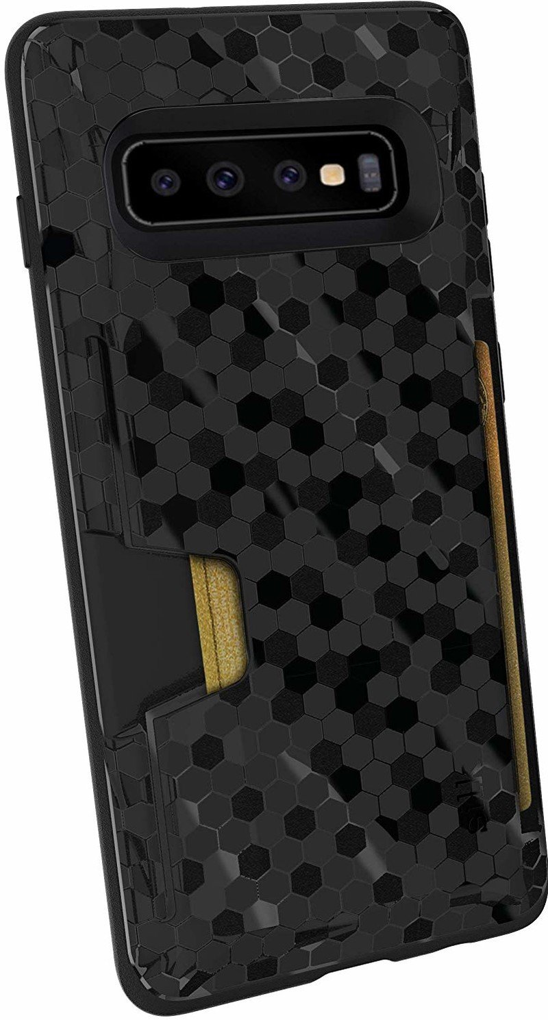
Silk Wallet Slayer
If all you need to get through the day is three of fewer cards, Silk lets you ditch the wallet entirely. But like any other wallet case, there are some trade-offs.

