The beautiful screen on the new Android phones calls out to be touched. But maybe not by your fingers. We have all found, at one time or another, that touching the screen leaves fingerprints and grime on the screen. We have also found that our fingers are fat and clumsy when it comes to painting and writing.
So, we need something with a capacitive end or nib to touch the screen in a far more precise way to really take advantage of some of the newer apps. Enter the SGP Kuel H12 stylus. It's got the look and feel of a pen, minus all the messy ink. For this review, we're going to use apps like Sketchbook Mobile, Note Everything and Handwrite to judge the overall qualities of the stylus.
Read on for our full H12 stylus review!
Criteria for judging a stylus
Think back to the first time you held a fine pen in your hands – not a BIC or a PaperMate pen - but something really fine; think Montblanc, or Waterman. Remember how you picked it up – ever so carefully; how you felt the weight and balance of the instrument. Think about how the ink flowed from the nib onto the paper. A quality pen helps your writing; a quality stylus helps your app experience.
The criteria for judging the stylus will be:
- Ergonomics
- Appearance and finish
- Nib/tip and sense of flow on the screen
- Handwriting precision
- Drawing/painting capabilities
Ergonomics
A fine stylus, like a fine pen, just feels right in the hand. The H12 is a fine stylus. The H12 employs a twist mechanism to open. There are several benefits to this design. First off, you don’t have to remove a cap -- which means you don't have to worry about losing one. Secondly, because you can twist the H12 closed, the nib -- the most fragile part of any stylus -- is protected when it sits in a pocket or purse.
When you hold the H12, it feels nicely balanced. The weight is evenly distributed above and below the middle of the stylus where the twist mechanism lies. The H12 is about the same thickness as a nice ballpoint pen.
Be an expert in 5 minutes
Get the latest news from Android Central, your trusted companion in the world of Android
The H12 would not be considered “heavy” or is it is light in weight. Rather, it is substantial and solid feeling but not too heavy as to cause fatigue if used for long periods of time. Its length is just a bit shorter than a typical ballpoint pen. The satin finish is easy to grip and there are no sharp edges to worry about with this stylus.
Appearance and finish
The H12 has the look of a premium product, which is no small feat at a very reasonable price of $19.99. My H12 is black with silver accents. While I didn’t notice any flaking or chipping in the finish of the Stylus, the lettering of the Kuel name was starting to wear off after a few weeks of use, but otherwise it maintained a nice satin finish with little signs of wear.
The H12 has a traditional pen clip towards the top, which is both functional and aesthetically pleasing. Sitting in a pocket, the H12 really does look like a nice pen.
Build quality is great for this stylus. The weight really gives it a sold feel and the twist mechanism requires just enough pressure to feel as though it is very well made and designed and will last for many “twistings.”
Nib/Tip and flow on screen
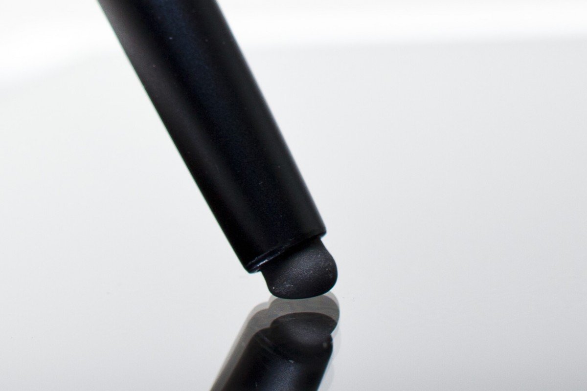
The H12 uses a special silicon tip with a high polymer abrasion resistant coating. The tip is both soft and spongy to the touch. The nib would be considered a moderate size at about 6mm in diameter.
Because the nib of the H12 (and that of most styli) is considerably larger than the tip of a “pen,” there is always the initial feeling that the stylus will somehow not be precise. With the H12, those concerns are allayed with first touch to the screen.
In each of the apps tested with the SGP H12, the feeling was one of precision and confidence when using the stylus for both writing and drawing. Very little pressure was needed to initiate the feeling of ink flowing from the stylus onto the iPad.
The “secret ingredient” of the H12 is that right below the cushioned silicon tip is a harder tip inside. When I pressed just a bit harder on the screen, I could feel this narrower tip make contact with the screen and give me even more precision when writing or drawing thin and straight lines.
There was no lag when writing on the screen with the H12. Perhaps the ultimate compliment to the stylus was when my wife looked at a note I had written in Handwrite and commented: “I can’t read that, it looks exactly like your regular, terrible handwriting!”
Handwriting precision
I tried a number of tests to examine handwriting precision. From creating numbered lists, to tracing objects, to writing longer sentences – the H12 did not disappoint.
I really had the illusion that I was writing on my screen when using the H12.
If, when drawing a line of text, I paused in the middle of my stroke and then continued, the area in which I paused looked to contain more “ink” – just like writing with a fountain pen. When starting a stroke from top to bottom, as I lifted up the H12 at the bottom of the writing stroke, it looks like more “ink” is at the very bottom – much in the fashion of a real pen. It makes sense, because as you end your stroke, you tend to put a bit more pressure on the pen, which increases the flow of ink.
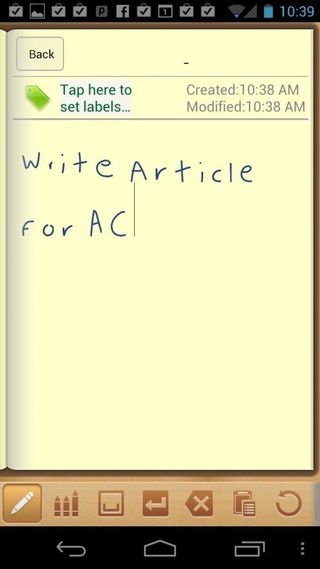
The overall experience of writing with the H12 fell somewhere between writing with a roller ball and writing with a wider nibbed fountain pen – just in the sweet spot for my tastes.
Drawing/painting capabilities
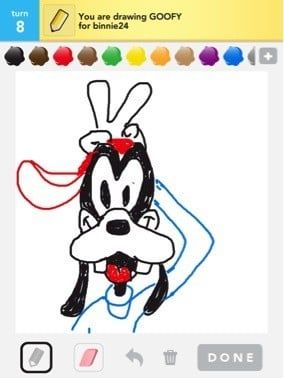
There are two categories of drawing apps for Android devices; casual drawing apps/games and true artistic expression apps. The H12 excelled at casual drawing apps like Draw Something by OMGPOP.
This is really the perfect stylus for quickly drawing a Pictionary type drawing. I tried each of the “marker” sizes in the game and all the colors and using the H12 was both precise and quick – just what you need in a casual game.
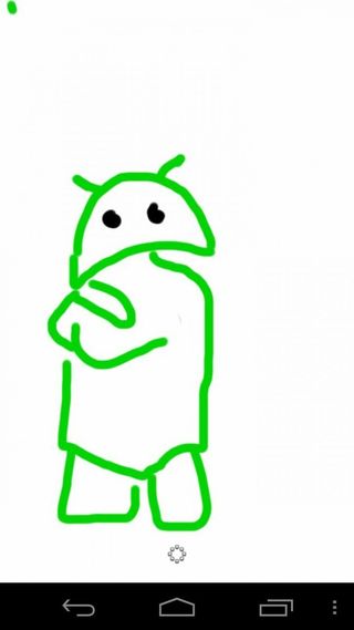
In Sketchbook Mobile, the H12 was certainly acceptable for creating decent works of art. Each of the “tools” – pencil, sketch pen, brush, Outline, Draw and Write tools worked well with the H12. There was some hesitation in using the watercolor-like tool – in that more pressure was needed to really sketch and do things like shading when creating a picture. Most of the tools felt like their real life counterparts in terms of pressure, friction and flow.
The wrap-up
Styluses are an emerging category and finding the right criteria on which to judge them can be tricky. Based on the stylus pens I have seen so far, there appear to be three distinct categories; those that excel at writing, those that excel at drawing and those that work well as a multi-use stylus for writing, drawing and basic navigation on the smartphone or tablet.
The Kuel H12 is very good for writing. For apps like Note Everything and Handwrite, this would be a very good stylus to use. Writing is precise and legible and the flow on the screen is quite good.
The H12 is also fine for drawing and painting apps like Sketchbook Mobile. It is certainly passable for the occasional artist, but true hard-core artists may want to look at more of a specialty stylus for artwork.
Where the H12 really excels is in the area that will matter most to the majority of stylus users – this is an excellent multi-purpose stylus. Using the H12 instead of my finger to navigate your Android phone or tablet, activate apps, type on the keyboard in addition to using it for Handwrite and Sketchbook Mobile made this a very versatile stylus.
The good
- Great multipurpose stylus
- Sturdy construction
- Quality nib with nice pointed tip below
- Great for writing and general navigation
The bad
- Struggled a bit in drawing/painting apps
- No replaceable nib
The verdict
The Kuel H12 is certainly among the very best stylus pens on the market today. For general, multi-purpose use you can’t go wrong with this well crafted, nice feeling stylus pen.
Do you use a stylus on your Android phone or tablet? Have a favorite? Let us know in this forum thread.

