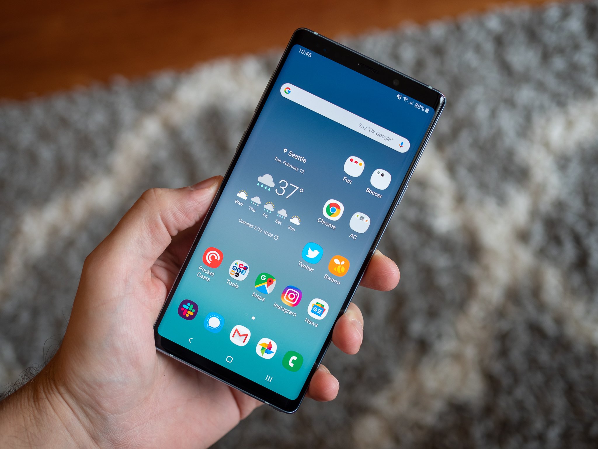
The update to Android 9 Pie with a new One UI interface is the biggest visual change Samsung has pushed to its phones in years. Alongside all of the requisite improvements you expect with any software update, Samsung's Pie release makes substantial changes to the look and operation of the entire software experience. But naturally, much of Samsung's legacy software is here to stay as well, making sure you'll never forget what kind of phone you're using.
This is how it all comes together in Samsung's latest software: One UI and Android 9 Pie.
Samsung One UI What I like
Every couple generations, Samsung makes a big step forward in software design and capabilities. I'd argue that Samsung's software got good starting with Android 5.0 Lollipop on the Galaxy S6; but it really only stepped up to being great with Android 7.0 Nougat on the Galaxy S8. One UI with Android 9 Pie is undoubtedly another major step forward.
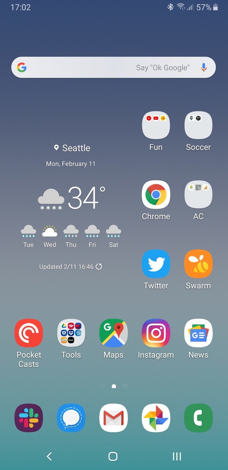
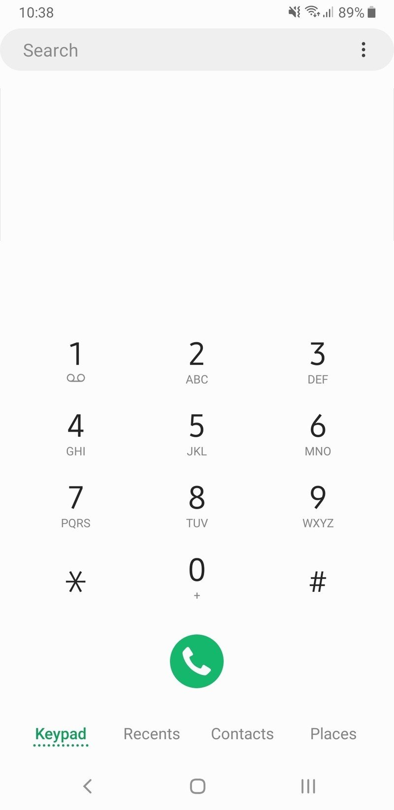
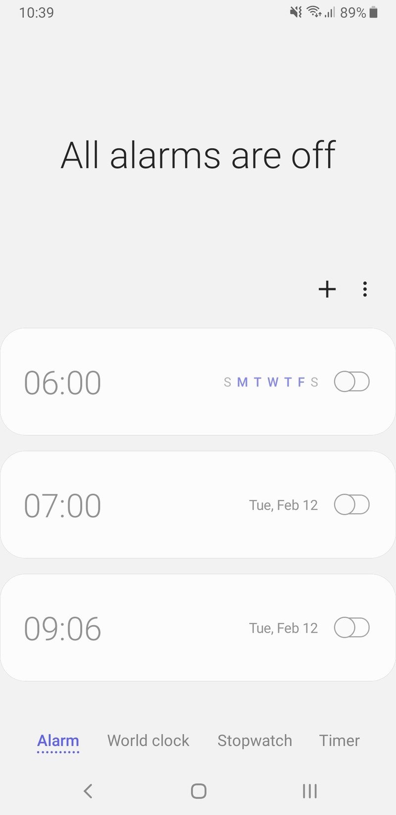
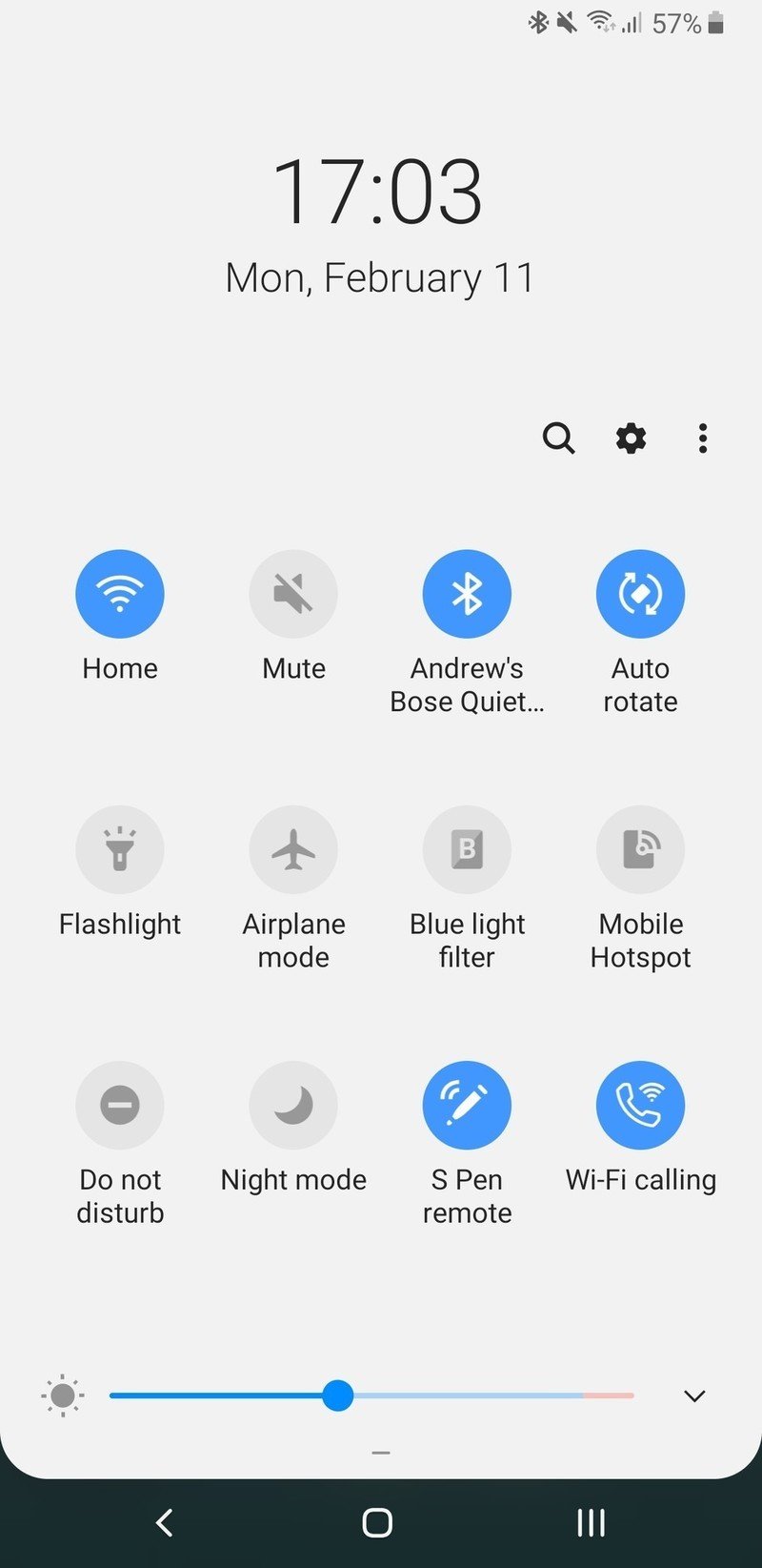
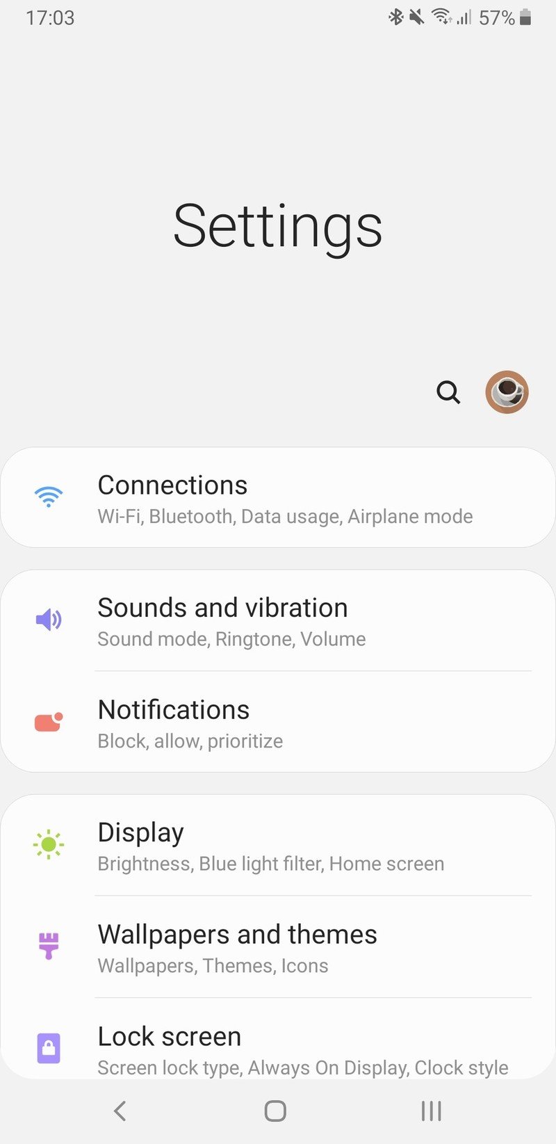
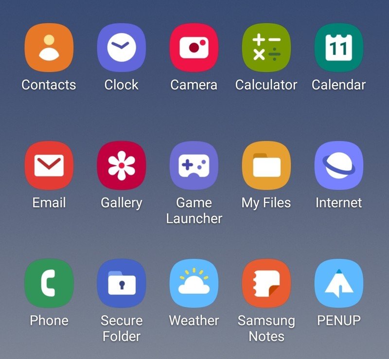
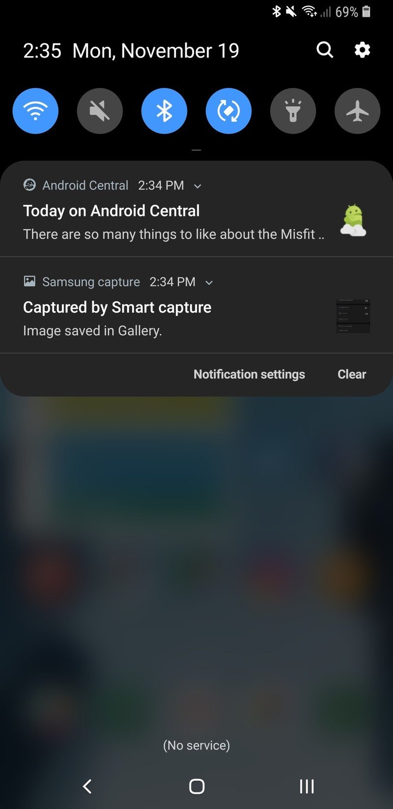
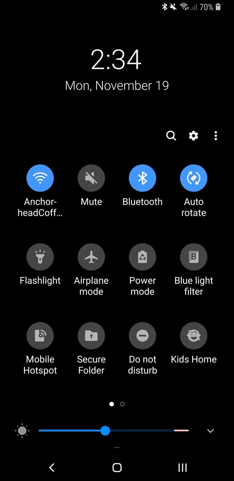
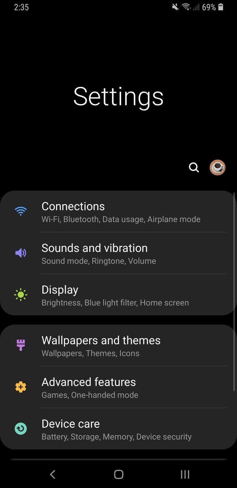
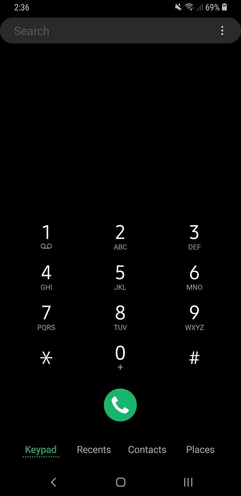
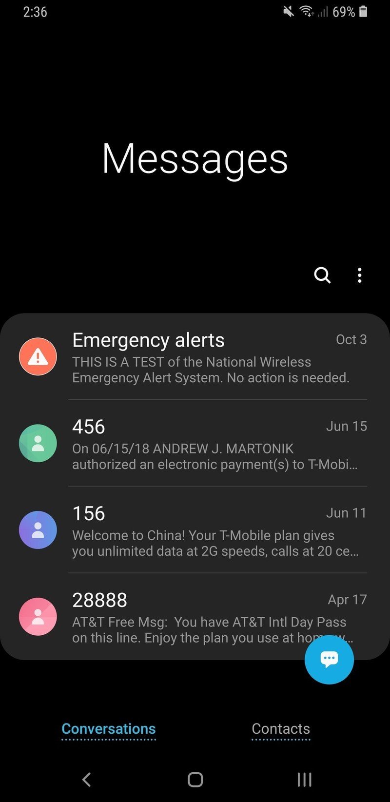
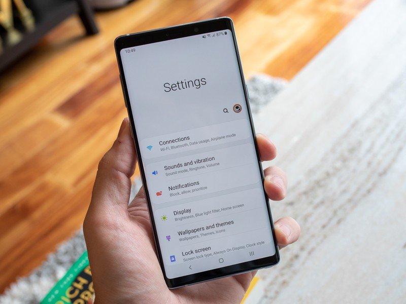
Article continues belowOne UI is effectively a complete redo of Samsung's interface, colors and iconography from top to bottom. Far more than a coat of paint. The software is even further flattened, and puts emphasis on whites and greys with liberal use of soft-radius corners and negative space. In many ways One UI follows Google's Material Design principles — take a look at a Pixel 3 alongside a Note 9 and there are striking similarities in the notification shade, settings, multitasking screen and menus. Visually, this is the best software Samsung has ever made. The consistency of design implementation across the interface and apps is near-perfect, and it feels light and modern both at a glance and with use.
The improvements aren't limited to style; they also have some substance. The biggest change in principles across the entirety of the interface is the move to bring interaction points further down on the screen so you don't have to reach to the top of the phone as often. Throughout the interface and Samsung's own apps, the main interaction points have effectively shifted down to only fill the bottom two-thirds of the screen — the top third, in return, is mostly for viewing rather than touching.
This leads to some awkward blank space at the top of many apps, but when you stop thinking about it and realize the benefits of not having to reach the top of the screen — on increasingly tall phones — it makes a ton of sense. The paradigm of course breaks down when you use third-party apps, but Samsung has done everything it can for its own software to make things a bit more one-handed friendly without having to jump into the dedicated one-handed mode as often.
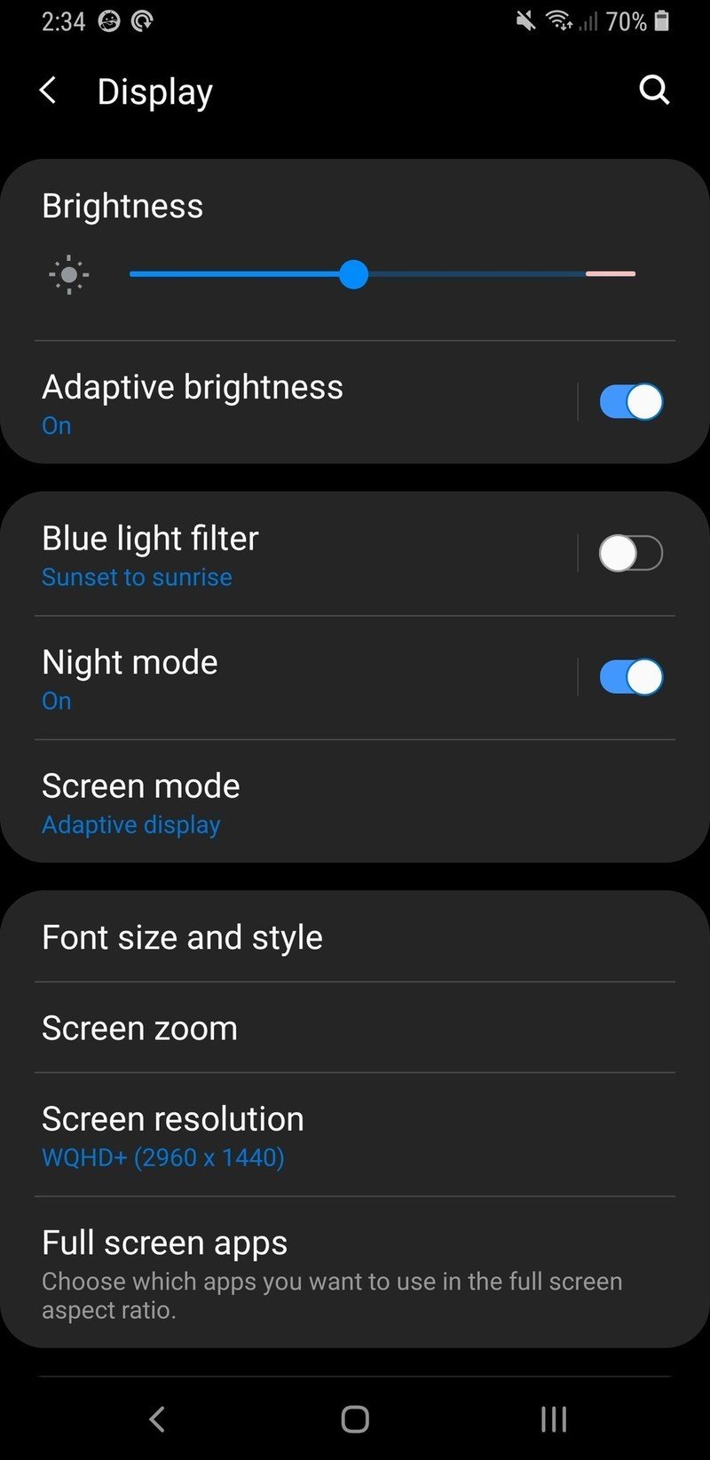
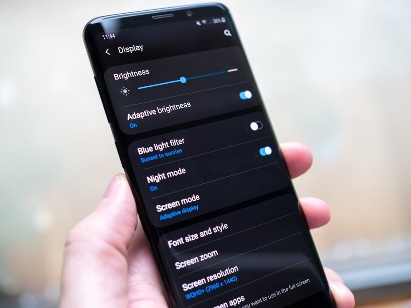
This is also the first Samsung software to incorporate a full dark mode option, available at the tap of a button. It isn't as customizable as what OnePlus offers, nor is it dynamic like Google's, but it's miles ahead of having to apply a system-wide third-party theme as before. The dark mode is actually called "Night Mode" and is ostensibly designed to be used at night to reduce eye strain, but it's completely separate from the blue light filter and can be turned on manually or set to a schedule. And unlike the theme approach, night mode touches every part of the system and Samsung's apps for a complete black-out look. Not everyone is a fan of dark mode, but the contingent of dark mode fans is too big to ignore at this point.
Get the latest news from Android Central, your trusted companion in the world of Android
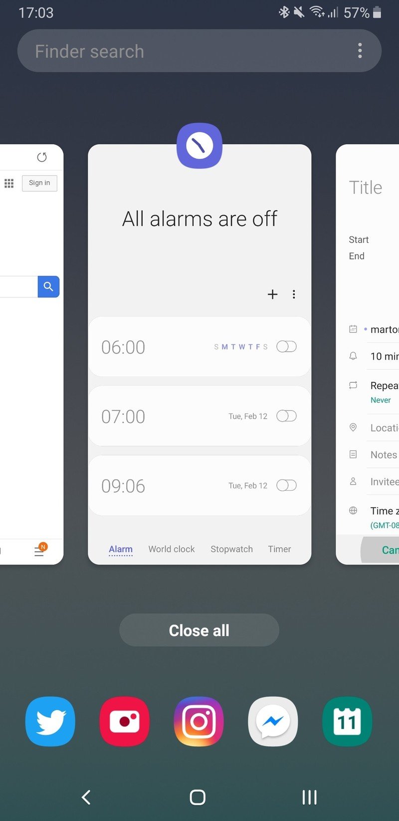
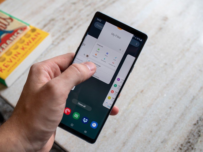
Although conservative, Samsung's first step into the world of gesture-based navigation is successful. It (smartly) chose not to fully implement Google's navigation system, nor did it go its own way with something altogether new and elaborate — the result is a navigation system with copious options that help blend the best of Oreo and Pie. Critically, if you want to keep things exactly as they were you can hold onto three-button navigation (and yes, you can swap the back and recents buttons). But Samsung included Pie's home button left-to-right swipe gesture for quick multitasking, while also retaining the recents button. If you prefer to save some screen real estate, you can replace all three buttons with simple swipe-up gestures in their place. No complicated mix of multiple gestures or different lengths of swipes; just a straightforward replication of what you know from the buttons.
The entire interface looks better, is easier to use, and simply integrates Pie's gestures and multitasking.
No matter how you get there, the multitasking screen itself looks near-identical to Google's own, with horizontal cards and smartly predicted app suggestions at the bottom of the screen. Some decry the lower information density in this view compared to the old Rolodex-style interface. But this is far more user-friendly and provides quick access to the last three apps you used, plus suggested apps, which is what most people want most of the time. Samsung managed to incorporate gestures and many of Android 9 Pie's native multitasking features cleverly, while retaining the old options for those who update from Oreo — it's the best of both worlds.
One UI is filled with lots of little tweaks strewn about its apps, but these have far less impact on the daily experience that's so often dominated by third-party apps people often prefer over Samsung's built-in options. The camera app got some of the biggest user-facing changes, but for the most part all of the apps were simply redesigned to fit the new design language rather than dramatically change their function. But it shows that Samsung is continuing to focus on visual consistency across its apps — even if not everyone uses them.
Samsung One UI What's not great
One thing that's remained constant through every revolutionary Samsung software update is that it's still undeniably "Samsung" software. It should come as no surprise that the prior statement kicks off the section of this review where I talk about things that aren't so great. The biggest issues with One UI have nothing to do with what Samsung did in this generation — the issues are completely rooted in Samsung's software legacy.
Samsung's Pie software still suffers from extreme amounts of cruft throughout the system.
Samsung's Pie software still suffers from extreme amounts of cruft throughout the system, with overly-complicated settings and duplicative apps. And while some basic functions have been lifted to the surface, changing many aspects of the phone still requires jumping through several layers of settings to tweak things how you want. Samsung's launcher still shows a few glimpses of the "old" Samsung, with folders that don't adhere to One UI design and a general aesthetic that feels stuck in the past. Throughout One UI, you see a lot of the experience that remains functionally unchanged from the previous version.
One UI and Pie also didn't address many bugs (or at least, issues) from Oreo; for example, Pie still offers poor auto brightness management in dark environments, often blasting the screen up near max brightness in a dark room. And multi-colored media notifications still clash heavily with the notification shade. Drill down through the software and you still find these little issues haven't been fixed, but are things that should be addressed in a platform update.
Despite many visual improvements, the always on display and lock screen feel stuck in the past.
Despite many of the visual improvements to the lock screen experience, Samsung hasn't really changed or improved the functionality of either the lock screen or always on display in years. What was once a strength now feels like an old take on the idea, with Google, OnePlus, Motorola and others all doing a better job of integrating the always-on (or ambient) display with the lock screen. Samsung's always on display, lock screen and home screen feel like distinctly different experiences layered on each other, rather than different parts of the same interface — the jump from one to the other is not visually seamless nor particularly useful, and the lock screen's disjointed take on "widgets" and displaying notifications is clunky at best.
And I know it's a small thing, but Samsung's suite of ringtones and notification sounds feel stuck in the Galaxy S5 era; it's time for a refresh. Some of the core system sounds have been updated, but the rest feel a bit too ... cartoonish for my taste. Samsung's software is no longer bright, colorful and playful as it once was, but the sounds it offers are very much stuck in that time period.
All of Samsung's best design ideas from 2018 can't escape over a decade of built-up Samsung cruft. Now I freely admit that the level of hack-and-slash gutting of Samsung's software that would be required to actually streamline it is probably impossible at this point; but it's important to recognize that just because One UI looks appreciably better doesn't mean that it's free from all of Samsung's years of baggage.
The future of Samsung's software
Samsung's Android 9 Pie release, with the new One UI interface and features, is something every Samsung phone owner should look forward to. Whether you have an older phone and will need to buy a Galaxy S10 to get it, or are patiently waiting for an update on the Galaxy S8 or Galaxy Note 8. One UI is easily Samsung's most cohesive and visually impressive version of its operating system, even if it is bogged down by the baggage of versions that came before it.
The software changes are more than skin deep with One UI. Yes it's beautiful, more modern feeling, and more consistent; but it's also functionally better for one-handed use and has little feature improvements sprinkled throughout. Its new navigation design perfectly integrates the best of Oreo and Pie. And aside from a few wonky icons that some people aren't fans of, the visual changes are a welcomed breath of fresh air that actually follows Google's own design guidelines. This is software you'll want on your phone, and it's a great sign of how far Samsung's come with its software design in over a decade of making high-end smartphones.

Andrew was an Executive Editor, U.S. at Android Central between 2012 and 2020.
