Samsung helped launch the idea of a modern smartwatch to general consumers when it unveiled the original Galaxy Gear. That was in September 2013, if you can believe it, and since then Samsung has launched four more smartwatches — the Gear 2, Gear 2 Neo, Gear Fit and Gear Live. And here we are just over a year after its first smartwatch, and Samsung launched its sixth — the Gear S.

Going in the opposite direction of the "less is more" philosophy of Android Wear, Samsung is simply going with more on the Gear S. It has a huge 2-inch curved AMOLED display, piles of features and a bevy of health-related sensors on board. Samsung even went a step further, including standalone Wifi and 3G support so you can leave your phone at home and go watch-only when needed.
Calling this a "smartwatch" actually sells it short a bit — the Gear S is a full smartphone on your wrist. Read on and see how Samsung pulled it together in our full Gear S review.
About this review
We're writing this review after a week using a black AT&T model of the Gear S. We received one small software update on the watch as soon as we started it up, but had no further updates during the review. For a vast majority of the review the Gear S was connected over Bluetooth to a Galaxy Note Edge, though we also spent a small amount of time connected directly to a Wifi network as well as AT&T's mobile network.
Samsung Gear S hardware
It's way cool — but also way big
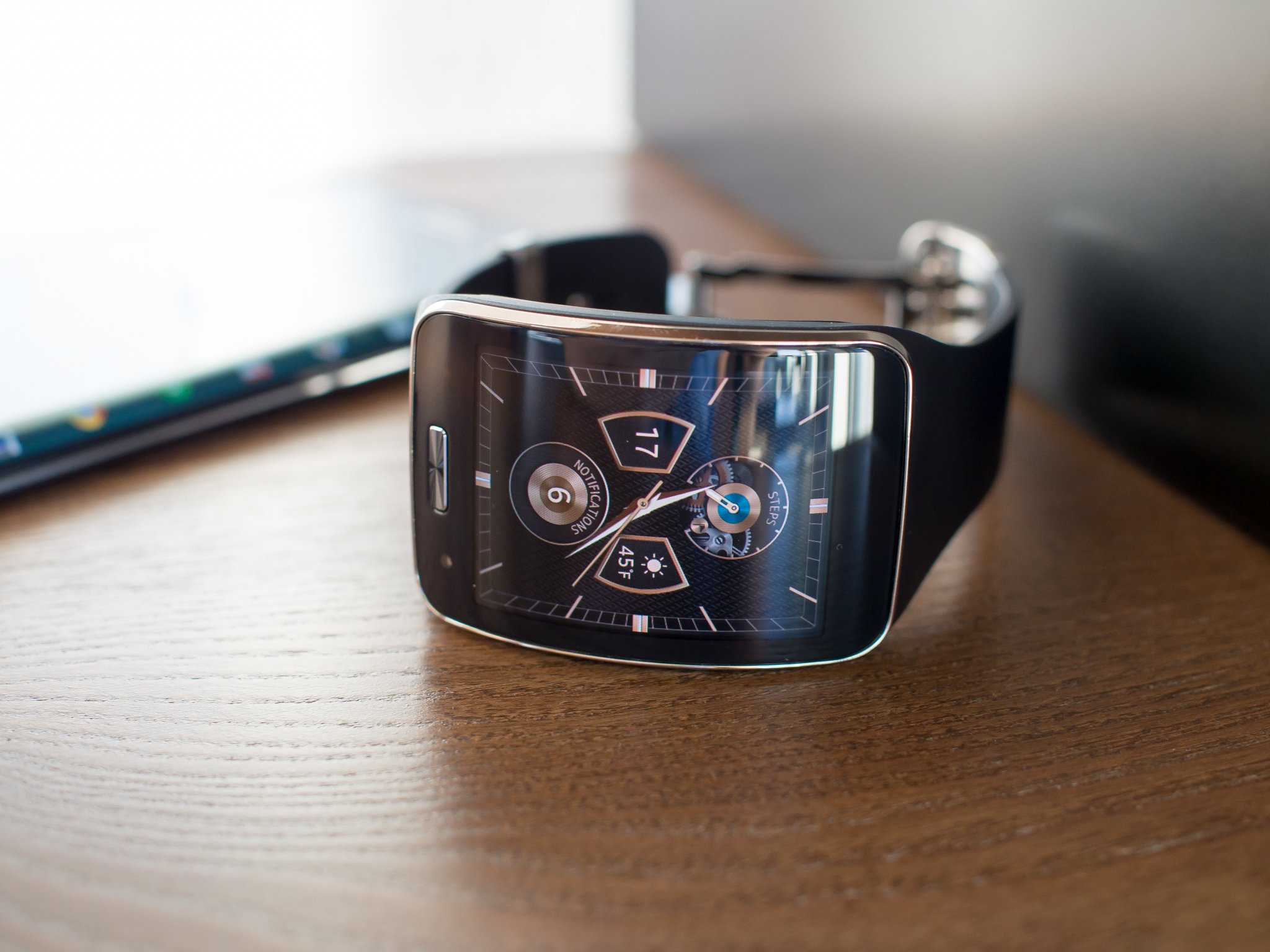
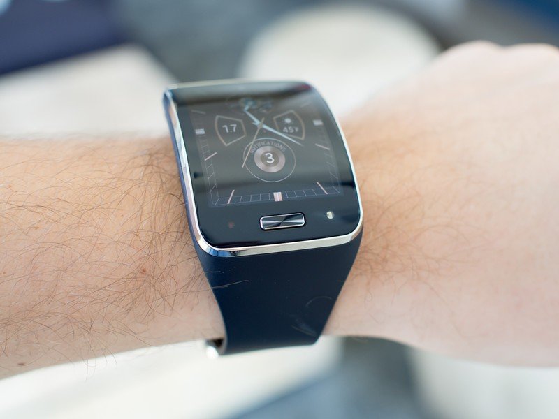
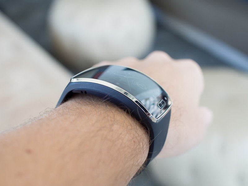
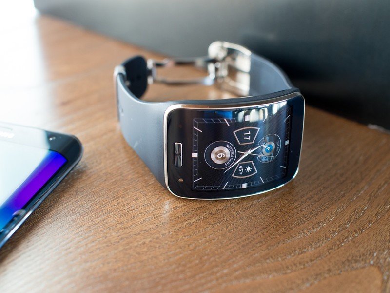
The big standout feature of the Gear S is its massive 2-inch rectangular display, which quite easily dwarfs the roughly 1.4-inch square (or round) displays on other recent smartwatches. Not only is it large for a watch, but it's also curved — and this isn't just curved glass on top of a flat display. Just like the Gear Fit, the display itself is curved along with the rest of the watch to better fit the wrist.
The AMOLED panel comes in at 360x480 resolution and is crisp and bright, as you'd expect from a Samsung display nowadays. True automatic brightness is also included thanks to an ambient light sensor, helping crank things up when you're outside in bright situations. Even with max brightness the screen still suffers from glare outside like most other glass-covered displays on smartwatches, and the curve doesn't really help with that since it's tougher to judge the reflections.
A huge display with an appropriately huge body around it.
Samsung surrounded this huge display with some equally large bezels, making the entire face of the watch much larger than many people will be comfortable having on their wrist. The bottom bezel holds extra functionality with the UV sensor and ambient light sensor flanking a rectangular physical home button — yes, even on a watch — that matches ones you'd find on any Samsung phone today.
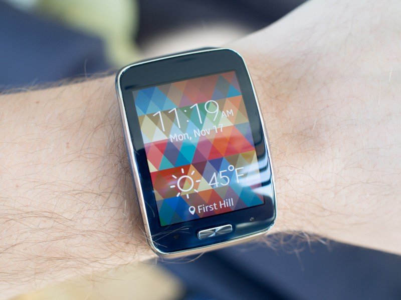
The left side of the watch houses a small pinhole microphone for voice actions and making calls, while a small speaker grille sits on the right for all sorts of sound output. It's just barely loud enough to hear people on calls, but there's never going to be any reason to do more with it anyway.
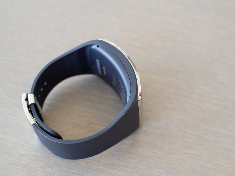
In contrast to previous Samsung watches the band of the Gear S doesn't hold any electronics and is actually easily removable from the watch itself without tools — that makes it easy to swap bands, but the selection is limited to Samsung's own offerings. The entire band is a solid piece of semi-flexible rubber that grips around the watch face and flows continuously down both sides to the standard clasp. The metal clasp is adjustable to 10 different sizes, and gets small enough for wrists that would have no business having such a large watch on them.
The band is proprietary, so you're going to be stuck with Samsung's offerings.
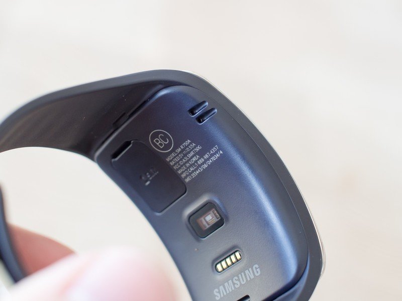
The band feels pretty good as far as rubber ones go, and it just feels like a sport watch in that sense, but it isn't as flexible as some out there. And because of its styling and proprietary form you won't be swapping this for anything but a rubberized band, which can limit you in ways you wouldn't be with some of the more "standard" smartwatches out there. The hard plastic body of the watch itself is curved well for larger wrists, but may rest awkwardly on smaller ones. A quick glance on the underside of the watch shows a heart rate sensor, pins for the charging cradle and a small cover for the SIM card slot.
Speeds and feeds
In addition to the standard accelerometer, compass and gyroscope you'll find on most smartwatches today, the Gear S goes over the top by adding a heart rate sensor, UV sensor, GPS and even a barometer. Those last two come in handy when you're away from your phone and need location information, while the other sensors help boost the S Health functionality of the Gear S.
The rest of the internal specs round out just like other smartwatches released this year — a dual-core 1GHz processor, 512MB of RAM, 4GB of internal storage and a 300mAh battery.
On the connectivity side the Gear S has Bluetooth 4.1 as its main connection option to your supported Samsung phone. But it also has standalone Wifi (b/g/n) and a Micro SIM slot for use with 2G and 3G networks for when you're out of Bluetooth range — we'll get to this a bit more later.
Samsung Gear S software
A complicated experience, worsened by performance issues
It's clear that Tizen — Samsung's in-house, customized operating system — is the way of the future for its wearables.
Just like we saw with the last two Gear watches, the Gear S runs Samsung's own "Tizen-based wearable platform" — but the naming isn't as important as what it enables Samsung to do. This is a completely custom system and interface that Samsung has made to look and feel exactly how it wants, without the limits of someone else making the software, and for better or worse.
Trying to run phone-like software on your watch is a bad idea. Full stop.
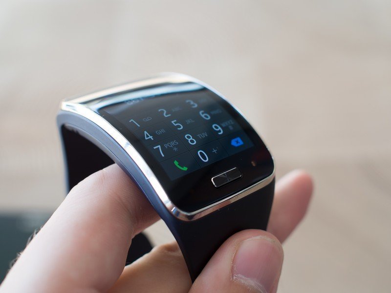
The interface is quite a bit busier than that of Android Wear, but isn't impossible to figure out by any stretch. Your main interface is a clock, with a swipe to the left putting you in the "widget" area where you can scroll through a handful of information-dense experiences. Swiping right from the clock shows a list of notifications, and additional swipes that direction go through full-screen readouts of each notification. A swipe up from the bottom bezel brings you into the app launcher (yes, separate from the widgets and notifications), and a swipe down on the clock gives you a quick settings panel for sound, vibration, battery state and connection information.
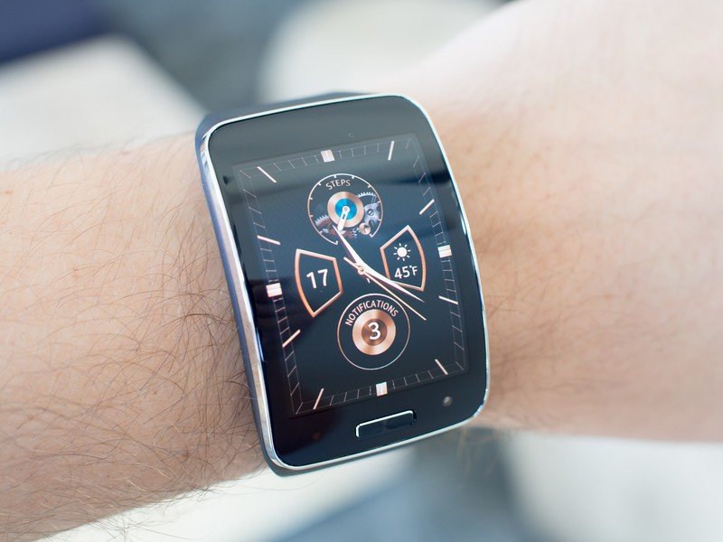
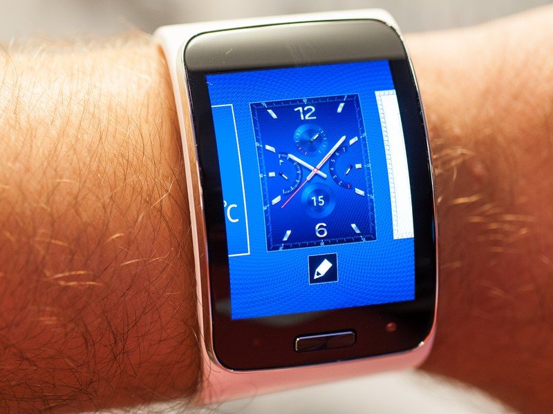
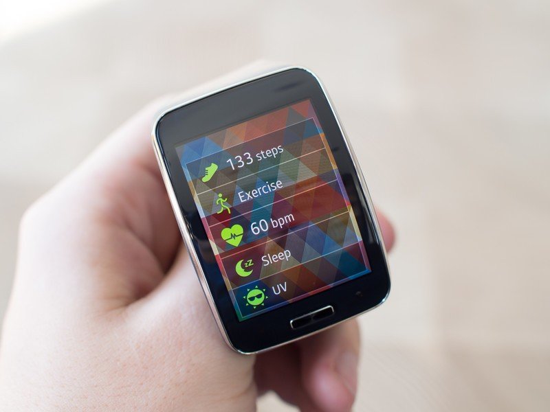
In terms of watch faces you can choose from 13 pre-loaded (and in many cases editable) faces or download more from the Galaxy Apps store, though the selection of third-party faces wasn't amazing. The set of widgets to the right of the watch face are customizable, and you can choose to add any of the available ones: S Health, a full-on news reader, calendar agenda, contacts, weather, a music player and settings shortcuts.
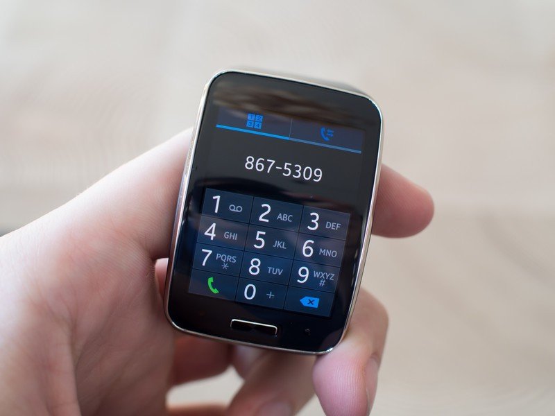
You can reorganize the app drawer by long pressing icons, just like a phone, and even dive deep into several layers of settings to customize everything. You can change the color of the interface, sound profiles, brightness controls, connection preferences, do not disturb mode, home button shortcuts, a privacy lock, motion controls and power saving modes. All from the watch.
It takes time to wrap your head around everything happening on this watch.
Okay, maybe that is kind of complicated. The interface feels far more like it was made for a 2-inch smartphone than a watch, and in many ways is cluttered and packed with unnecessary features. Trying to navigate through several layers of interface with taps and swipes on a small display is frustrating, for sure, and the Gear S takes a good long while to "figure out."
Notifications
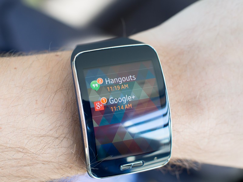
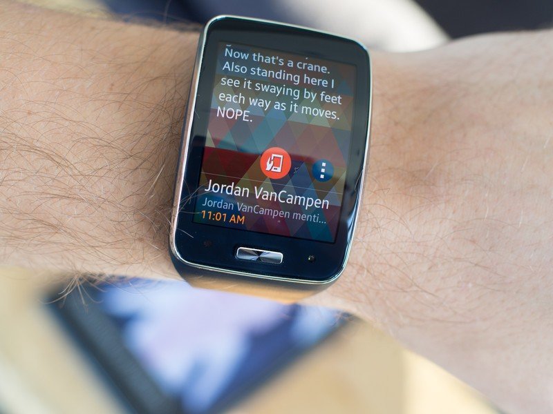
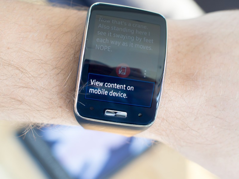
The Gear S takes in notifications from as few or as many apps on your phone as you want, defined in the settings, and displays them on the watch. Unlike previous watches from the company the Gear S actually shows full content of every notification, even long emails, messages or comments, but the big problem here is syncing.
It's simply inexcusable to not have two-way notification sync on your watch.
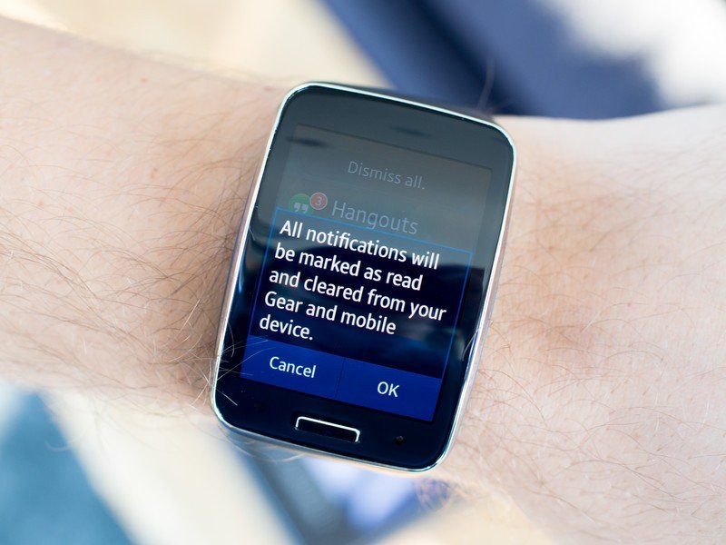
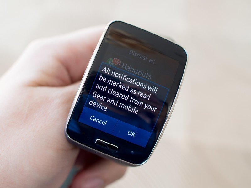
When you receive a notification on your phone, and therefore Gear S, the state of those notifications is not synced. If you read on the watch and clear it — a two tap affair, by the way — the notification is cleared on the phone. But the opposite isn't true — clearing notifications on the phone has no effect on the watch, leaving the wearable to pile up dozens of "unread" (but not really) notifications.

Being that most people are far more likely to interact with notifications on their phone it doesn't make a whole lot of sense to not have two-way sync, and it means you have to hop into the notifications on your Gear S and perform a swipe and tap to "dismiss all" on the pile of old data. It also means you often look at your wrist thinking you have unread information, when really it could be hours (or days) old.
It's such a far cry from the perfect notification sync that I've gotten accustomed to on Android Wear, and it's just a downright bad experience. There's no need to have to manage your watch like that — it's almost constantly connected to a phone and should use that power to sync notifications.
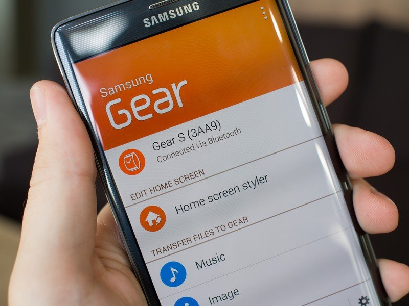
Gear Manager app
Even though it isn't running Android, Samsung has the Gear S working flawlessly with its Android devices thanks to the Gear Manager app.
And yes, the Gear S only works with Samsung phones, which I can disagree with and completely understand at the same time. As someone who regularly uses non-Samsung phones it's a deal killer, obviously, and I don't like the idea that my chosen smartwatch locks me in completely to just one manufacturer. At least with Android Wear I have my choice of any Android phone, and with Pebble either Android or iOS. But from Samsung's perspective, there's little reason to let people use the Gear S (or any other Gear) with non-Samsung devices — manufacturer lock-in is profitable.
The Gear S may be powerful, but the Gear Manager is still a necessary crutch.
And even though the Gear S is marketed as a smartwatch that can work independently of your phone, that's nowhere near the case. Right out of the box you'll need to sync the Gear S with your Samsung phone just to get started, as well as use that phone for loading apps to the watch, receiving notifications from the phone and downloading any offline content.
A direct Bluetooth connection to your phone is still the primary connection option for the Gear S as well, even though it does have built-in Wifi and 3G connectivity. Wifi works just as you'd expect, even if typing in your password on a tiny on-screen keyboard is tough, and the 3G connection (via an AT&T SIM in my case) kicks in whenever Bluetooth and Wifi aren't available so long as you've paid for the proper plan from your carrier.
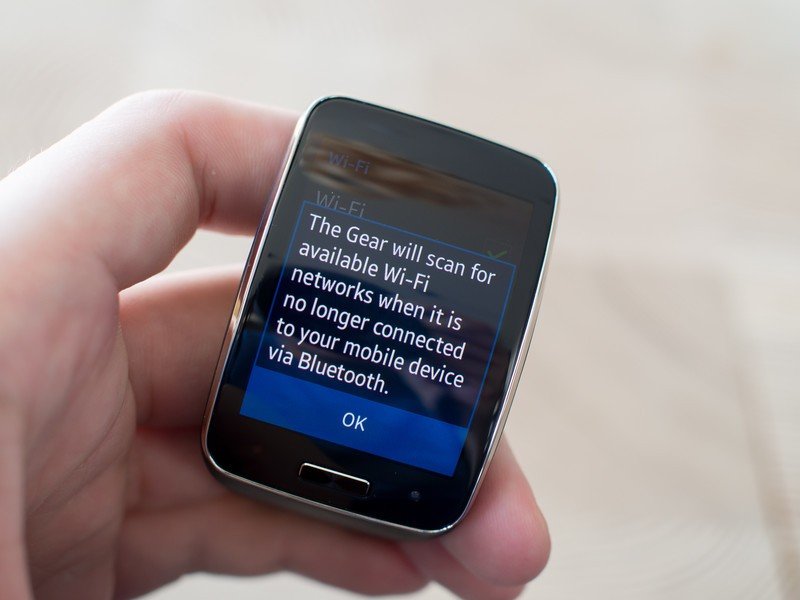
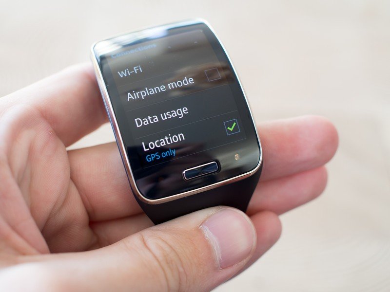
The Gear Manager app will keep your watch connected to the phone via Bluetooth but can also handle a "remote connection" to the watch via Wifi or 3G when the devices are separated. With a remote connection you can still get notifications from your phone, which is neat, as well as manage call and text forwarding if you have a SIM card in the watch.
Because you're still reliant on the Gear Manager app for passing off data to the watch even when its physically separated from the phone, it's hard to call the Gear S a truly "independent" device in any way. Yes you can get out of Bluetooth range of your phone, and yes the Gear S will still do some things, but unless you have a Samsung phone running Gear Manager somewhere, you won't be getting much out of your watch.
Performance
It's very clear that you can do a whole lot on the Gear S, but in the end it's still using very similar parts to other smartwatches out there that do far less. Whether it's a lack of horsepower or how well the software is optimized for it, the Gear S feels a bit sluggish throughout its interface.
There's a downside to doing this much on the watch — performance suffers.
Whether it's moving through the basic interface, checking on notifications or pulling up a more intense app, there's a perceptible amount of slowdown and jank when using the Gear S. It isn't something that particularly impacts getting things done on the watch, but it does make it feel like it's not responding to your input properly. You swipe and visibly see the slowdown happening behind your finger — it feels bad, and it looks bad.
I never had full-on crashes or frozen apps, but when everything you do on the watch feels slower than it should, it doesn't instill you with confidence that you have a high-end device that can handle anything you throw at it.
Daily use and battery life
It takes a certain type of person to want this device
After having the Gear S strapped to my wrist for some time now, fully replacing my daily use of the LG G Watch, I'm generally convinced that Samsung is trying to do too much here. Having such a complex user interface on a screen this small — even though it's large by watch standards — is confusing and tough to navigate. At the same time it also seems to be too much for the hardware to handle, as the visual sluggishness is hard not to see.
Samsung did decide to keep all of these features in the watch, though, and it somewhat necessitated the need for such a large device. For as frustrating as it can be to navigate on a 2-inch screen, it'd be impossible on a 1.5-inch screen. The case also needs to be larger to handle a speaker, microphone, cellular and Wifi radios, heart rate sensor and several other components — there's a lot going on under that curved glass.
Such a massive feature set necessitates a large device — it's up to you to decide if it's too big.
Whether the Gear S is physically too large for your wrist is another concern, though a much more subjective one. I have large wrists and often wear large watches, and I wasn't super bothered by the size of the Gear S, really, aside from it not fitting under some of my long-sleeved coats. I could see the size being an issue for those with smaller wrists, though.
And no matter the size of your wrist, it's going to be a noticeably large device sitting there all the time. At that point it's going to come down to whether or not you see the tradeoffs as being worth having such a large watch — do you really need to make phone calls and read world news stories on your wrist? Chances are you don't.
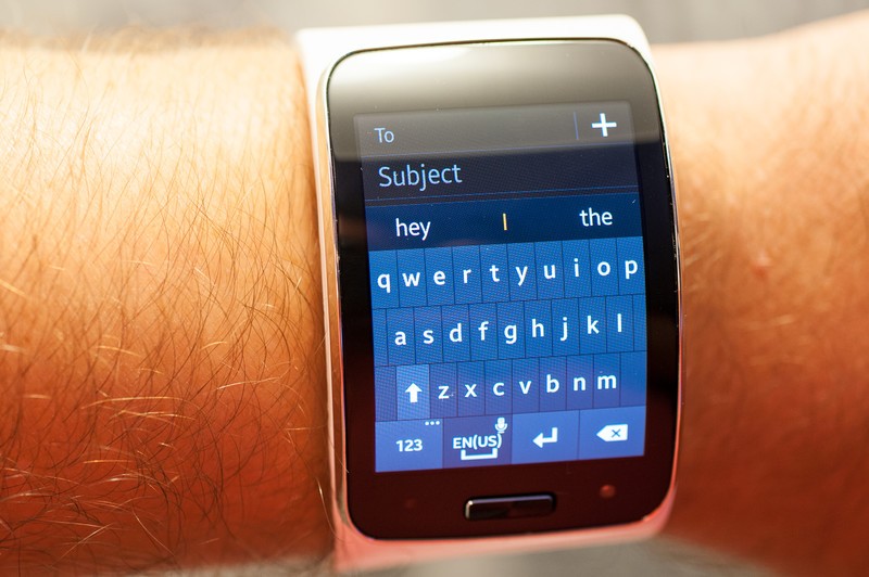
Communicating from your wrist without a phone
Samsung is taking the idea of the smartwatch as an extension of your phone to the next level with the Gear S, letting it make calls on its own. If you put a SIM card in your Gear S — the big four U.S. carriers even have special service plans for it — you can handle calls via your actual phone number with call forwarding. The microphone and speaker sound about as good as making a speakerphone call from any phone, actually, though it's tough to get over the stigma of talking to your wrist in public.
Calls work, but it's tough to get over the stigma of talking to your wrist in public.
As for texts and emails from the Gear S, I really can't find any reason to use these features. Voice dictation just isn't good enough to handle input consistently, and using the laughably small built-in keyboard on the Gear S is an exercise in frustration.
The biggest thing I can say about using the Gear S on its own for communication is that you can do it, but it's not going to be a life-changing experience. And considering how often you need to get the Gear S back within range of your phone, as I covered earlier, I'm not entirely sure how useful it is to have the standalone capabilities.
Battery life
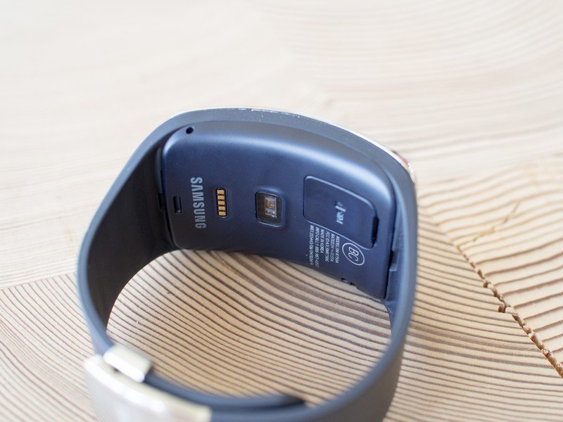
The fact that the Gear S only has a 300mAh battery inside a watch that can do so much had me worried at first, but it turns out to have good battery life. I had no problem using it for two full days on a charge when connected on Bluetooth, or a little less when I spent more time with Wifi or 3G going alone.
Samsung includes one of its standard clip-on charging cradles for the Gear S that's very similar to its other watches, and I have to say its one of the weaker designs available today. In contrast to what LG and Motorola are doing with standalone docks, the clunky charger just isn't as elegant. The clips attaching it to the watch are prime points for breaking off, and when it is attached and charging your watch is just sitting there awkwardly on the table with a wire coming off of it. There are better ways to do this.
But if you don't have to use it all the time, just every other night, it's hard to complain too much — let's just hope the chargers improve on future models.
Samsung Gear S: The Bottom Line
How much does a smartwatch really need to do?
The Gear S is an incredibly interesting device that really pushes the boundaries of what can be done with a smartwatch today. It's quite a feat to see something in a watch-like form factor with a 2-inch display be capable of doing all of the basic tasks of a smartphone, even if it does have some compromises in implementation.

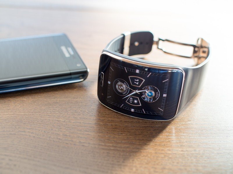
In many ways I appreciate what Samsung is trying with the Gear S, and I know there are more than a few people out there who will see the appeal of having so much power in a tiny device on your wrist that — at least for short periods of time — doesn't need a smartphone nearby. The biggest issues with this particular device are in execution.
The Gear S can make it two days on a charge, do just about anything you could want on a watch and has a really nice looking display. But when you turn that display on, you're greeted by software that lacks the polish I expect on a modern wearable, while also being sluggish and somewhat unintuitive for a device with a small (relative to phones) display. It's just too big of a tradeoff to make for most people — especially if they just want a simple smartwatch experience.
And in the end the Gear S only works with Samsung phones, instantly cutting out potential buyers who use some of the great devices out there that aren't made by Samsung — and that's limiting the already small number of people out there who want a watch of this style, size and capability.
If you really need your smartwatch to act more like a small phone on your wrist, with all of the power and compromises that entails, the Gear S is going to be worth looking at. But even for those people the $349 price, plus $5 or $10 per month for a mobile service plan, may be a deciding factor against it. And for most people out there who just want to have a simpler smartwatch that's a pure extension of their phone, there are far better — and cheaper — options to consider.

Alex was with Android Central for over a decade, producing written and video content for the site, and served as global Executive Editor from 2016 to 2022.
