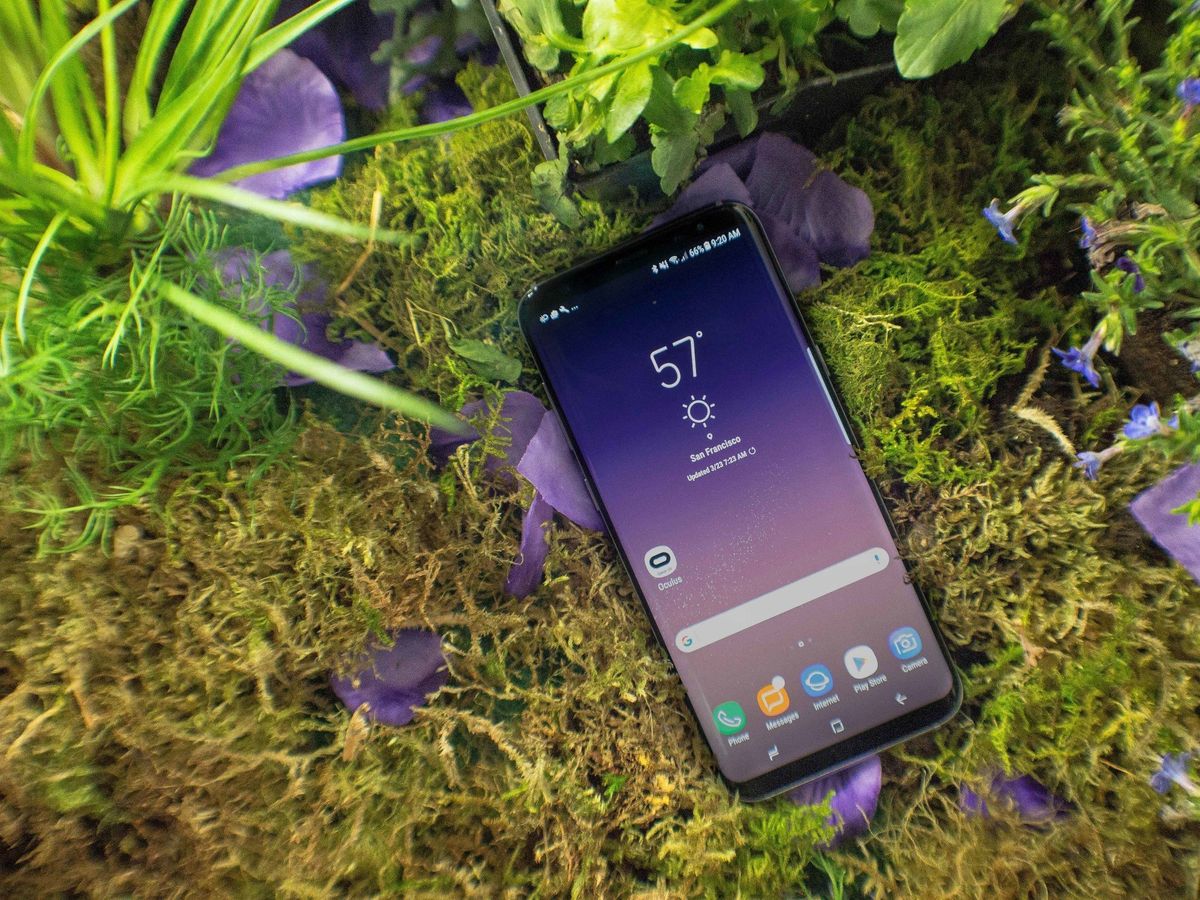
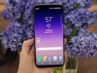
Gone are the days of Samsung's overly saturated blue-hued interface. You no longer have to deal with backward navigation keys, either, not if you don't want to. The newly retrofitted version of Samsung's software on the Galaxy S8 is cleaner and easier on the eyes. Finally, it all feels so cohesive.
But as Google's Android is getting better and more feature-filled by the version number, do the manufacturers behind Android smartphones really need to put their own spin on things? No, but Samsung is going to do it anyway, in addition to selling you on the necessity of its virtual assistant and built-in animated GIF-making abilities. Despite all the strides Samsung has made in overhauling its interface design, it's still bundling in stuff with its smartphones, not all of which you'll end up using.
It's nice
A simpler user interface
The interface you'll see on the Galaxy S8 and S8+ is a remnant of the Galaxy Note 7's software, though it also made a cameo on the Galaxy Tab S3. It's different than what came standard on last year's Galaxy S7, which was still very blue in some places. It was obvious Samsung was still transitioning.
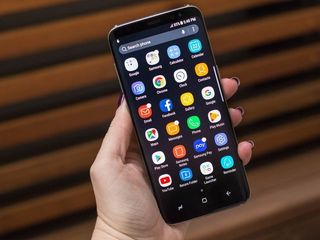
The Nougat version of Samsung's UI tells a different story, however; a novella, if you will, of a company that's finally figured it out. The interface is white and black, with gray hues speckled throughout. It's the equivalent of wearing a brightly colored blazer on top of an all-black outfit, except that the blazer is the actual chassis of the Galaxy S8. The interface is simple and subdued so that the hardware can stand out, essentially justifying the cost of the device.


The Galaxy S8 runs Nougat, though it's unclear if it will eventually ship with Android 7.0 or 7.1. (Software on the units we used said 7.0, while we were told to expect 7.1 on retail units.) You'll have access to many of the same features as your stock Android-wielding pals, including direct replies in the notification shade and customizable quick settings, though Samsung's already offered that for some time. The Galaxy S8 also marks the permanent installment of the Edge panels, in addition to the return of the Secure Folder, Game Launcher, and Samsung Pay.
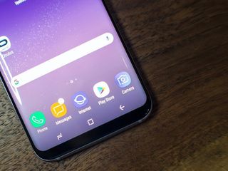
Samsung's new software has also adopted the on-screen navigation bar in use by most other companies, though not without putting its own spin on it. In order to make longtime Samsung fans feel at home the on-screen home button triggers improved haptic feedback that feels more like a "real" button than typical haptics that use a simple vibration motor, not unlike what Apple's doing on the iPhone 7. It's satisfying, particularly if you relied on the tactile feel of the home button on older Galaxy devices.
This isn't a perfect replacement for the physical button, but on the whole it's better.
You won't be able to unlock the Galaxy S8 with a simple press of the home button, of course, because the fingerprint sensor has been moved to the back of the phone next to the camera. This is where it starts to get confusing in terms of actually reaching up there ... but that's something for you to figure out when you hold the phone.
Regardless, you now get all of the benefits of on-screen navigation on the Galaxy — including saving bezel space, but also having buttons that can rotate, change and hide depending on what's on the screen. Thankfully, you can also choose how you want your navigation buttons displayed — whether you prefer to have the back button on the left side, or stick with Samsung's typical (backward) setup. It's nice to see Samsung finally offer the choice.

B-I-X-B-Y
Meet Bixby
Bixby is a major part of the Galaxy S8's marketing story, and it's not supposed to be a competitor for Google Assistant. Bixby is not a search engine; it's an assistant, one you can command to help you navigate your interface. Eventually, Bixby will know more about you and the way you use your smartphone, and it will adjust accordingly. The idea is that Bixby should be able to predict what's coming before you even ask it to.
Does this work? We don't know yet, as the Galaxy S8 units in our demonstration were offline. But we do know it's a major part of the Galaxy S8 and S8+, especially if you consider there's a dedicated hardware button on the device you can press to activate.
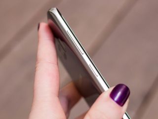

Bixby also comes with a shelf, akin to Google Now. It lives on the leftmost side of the Home screen, and it integrates with the apps you have installed. Bixby's feed will keep you privy of appointments, the weather, and how you're performing in S Health. It morphs contextually depending on your location and the time of day, and you can curate what shows up in the feed.
You can curate what shows up in the feed based on the apps and services you have installed.
You can continue to utilize Google's voice assistant alongside Bixby as long as you don't mind a bit of overlap. I'll be curious to see how calling out to Google and Bixby in tandem works out, as well as which one plays the nicest with third-party apps. Overall, I imagine it'll be difficult to ignore Bixby's assistant on the Galaxy S8 if you choose not to use it, considering the blatant hardware button dedicated to its existence.
Extra features
A few borrowed S Pen abilities
The Galaxy Note 7 will forever live on in our hearts as the phablet smartphone that could have been. It'll be a while until that fiery scandal is laid to rest, and though I like that the Galaxy S8 now carries the torch for some of the features that had made the Note 7 so verifiably neat, some of them don't seem worth using unless there's a stylus involved.
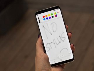
Take the Samsung Notes app, for instance, which definitely seems out of place on the Galaxy S8. I can see why Samsung included it — bigger display! — but it's not fun to use without the S Pen. A cheap stylus won't do, either.
You'll like using Smart select, though, which is another a remnant leftover from the Note 7. It makes it significantly easier to grab a cropped screenshot. There is also an animated GIF feature you can use to capture a few seconds of a homemade movie or YouTube video.
Security
(Re-)introducing iris recognition
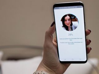
Samsung has always attempted to herald itself as the secure Android platform; the one that you can rely on when Google is having trouble getting its act straight. In this instance, it's pushing the Galaxy S8's iris recognition abilities, which took me a while to figure out and wasn't as futuristic-seeming as the movies had promised. It's not the fastest unlock feature — I mean, it's fast at detecting my irises, but I still had to let the Galaxy S8 know I wanted to unlock it before it started scanning.
There are other ways to unlock the phone, too. You can use the fingerprint scanner on the back, which is harder to reach for on the taller Galaxy S8+, or set up the iris scanner, which is yet another remnant of the Note 7. It's just as quick to use as it was on its predecessor, though I'm curious to truly time each of the various security methods to see which one is the fastest. If my future smartphone is going to have all these newfangled security features, I want them to be fast!
For millennials
New features in the camera app
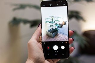
The Galaxy S8's camera interface has been slightly tweaked again, this time in an effort to covertly add a few new features. A slight tilt of the shutter button to the left or right will adjust the exposure; a swipe to the right will bring up the various camera modes; a swipe to the left will engage the video mode.
You may also notice a cuddly little teddy bear icon visible on the camera interface. Tapping this will bring up various augmented reality effects you can use inside the Samsung camera app. They're silly, they're fun, and they're absolutely reminiscent of Snapchat's filters. If you use the Samsung camera app to give yourself rabbit ears, it won't translate too well to Snapchat because of that app's finicky import feature. But you can use the filters everywhere else, including Instagram Stories.
Extra stuff
Samsung DeX
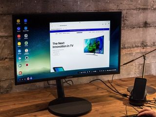
The Samsung DeX capabilities require separately sold hardware to work in the first place, but it's an interesting look at what Samsung is attempting under the hood of its Android devices. In this instance, it's equipped the Galaxy S8 and S8+ with computer-like abilities, so that you can plug in the phone into a dock of sorts and "unlock" a half-baked desktop operating system.
The dock offers two USB ports and Bluetooth connectivity for peripherals, and it charges the Galaxy S8 while it's in use. But its operating system is proprietary and doesn't work with any Windows or Mac apps. There are a few name brand apps you can use with DeX, like Microsoft Office and Adobe Photoshop, but they've been optimized for the Galaxy S8's mobile processor.
Samsung Galaxy S8
Coming soon
The smartphone show isn't just about putting the best device forward; it's about the message it transmits to others who see you using that phone. Will part of that messaging include Bixby? Unlike Apple's Siri and Amazon's Alexa, probably not. I imagine the question most people will ask instead is, "Hey, is that the phone that blows up?"
In all seriousness, I wonder if perhaps I'd feel differently towards the software on the Galaxy S8 if it weren't for the fiery battery fiasco that preceded it. The new features that come with it are mostly fine additions, but they seem so underwhelming following all that drama. Why do I want another device assistant, when Google keeps selling me on its Assistant? And if I continue to wield Samsung devices, do I have to subscribe into that ecosystem to keep reaping the benefits? There are surely answers to all of these questions, but we'll have to hang tight until the Galaxy S8 goes on sale April 21.
Florence Ion was formerly an editor and columnist at Android Central. She writes about Android-powered devices of all types and explores their usefulness in her everyday life. You can follow her on Twitter or watch her Tuesday nights on All About Android.
