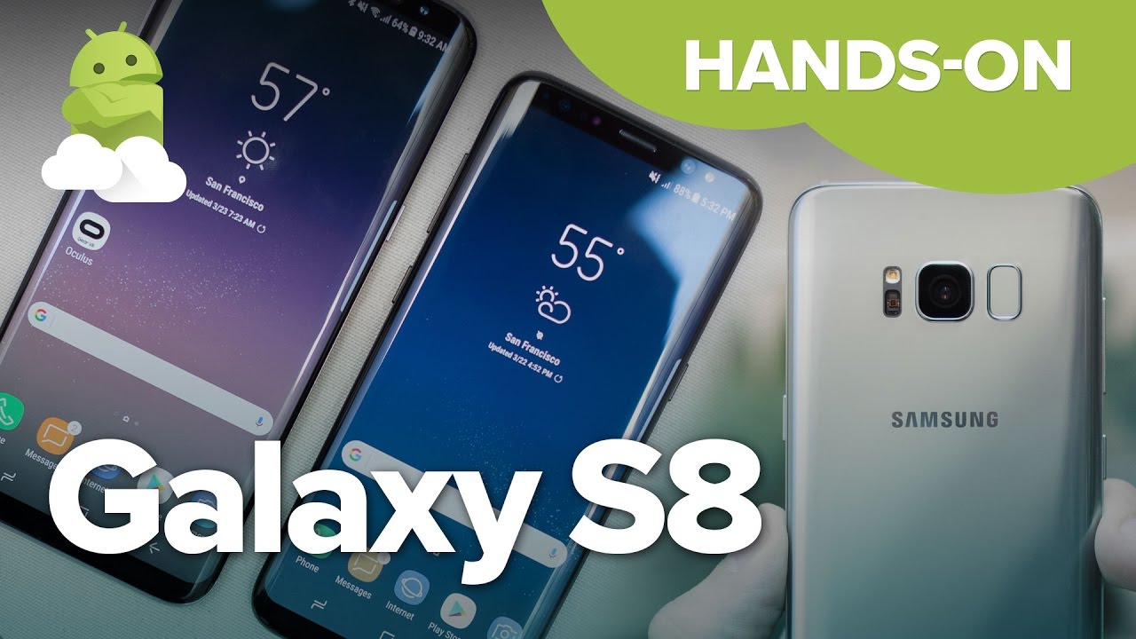
Samsung Galaxy S8 and S8+ hands-on preview
Despite 2016's late stumble with that phone, Samsung is still on top of the Android world. Part of that is due to its extreme popularity in the mid- and low-end phones that sell in dramatic numbers around the world, but it all falls under the halo of the flagship Galaxy S line. Last year's Galaxy S7 was (and still is) a great phone that cut back on gimmicks to just provide a fantastic overall experience that did just about everything the market wanted. There weren't many shortcomings to speak of — so how do you keep people interested, without giving up the things that brought you so much success?
For fear of looking like it's standing still, Samsung took a proven platform and refined it, keeping everything that made the Galaxy S7 and S7 edge so popular while adding a handful of big features that will keep people interested. The Galaxy S8 and S8+ are undeniably successors to the Samsung Galaxy S line in terms of looks, but make legitimately good moves toward usability. The same goes for the software, where a couple of big features and design changes lay on top of a familiar interface to the hundreds of millions of current Galaxy owners.
It can be tough to stay on top for long, but Samsung wants to keep pushing even though it's ahead. The Galaxy S8 and S8+ are how it does it — here are our first impressions of the phones.
Get up to speed
Galaxy S8 and S8+ Hands-on video
The latest flagships from Samsung are easily the biggest Android phones of the year in terms of influence and sales at the top end of the market, and that means there's a whole lot you'll want to learn. Kick it all off with our hands-on preview video, then read along for more details on what Samsung has to offer in 2017!
Gorgeous refresh
Galaxy S8 and S8+ Hardware
"Cool new Galaxy!" is a thing people say today, much in the same way they'd remark if you were carrying a fresh iPhone the day you took it out of its box. The brand identity of Samsung's last two generations of Galaxy S line cannot be overlooked, and it isn't taking this for granted. That's undoubtedly why the Galaxy S8 and S8+ look so similar to their predecessors, even if it's frustrating to the smartphone nerds among us who want to see altogether new designs year after year.
Be an expert in 5 minutes
Get the latest news from Android Central, your trusted companion in the world of Android
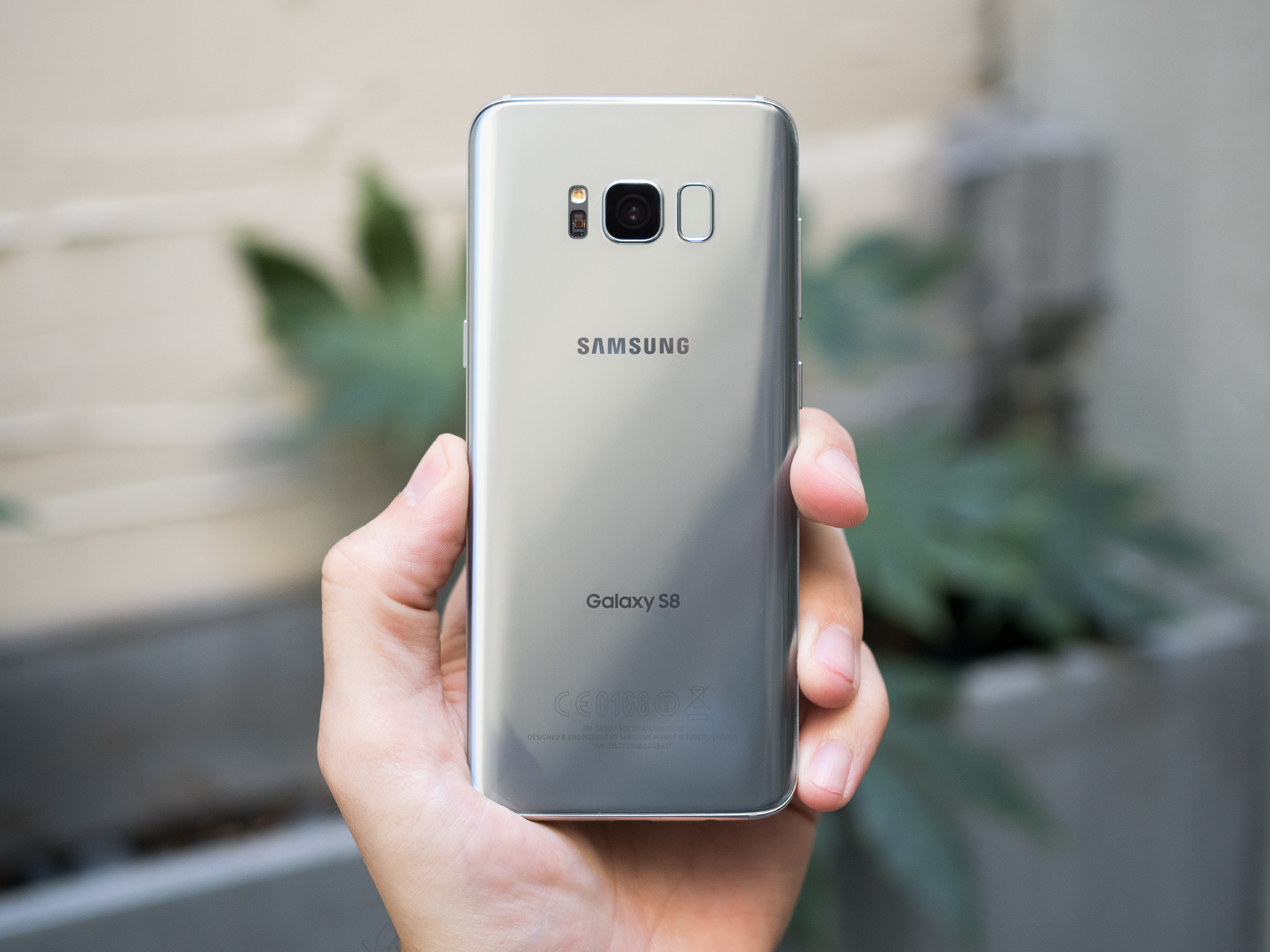
This is a distinctly 'Samsung' design, simply refined for 2017.
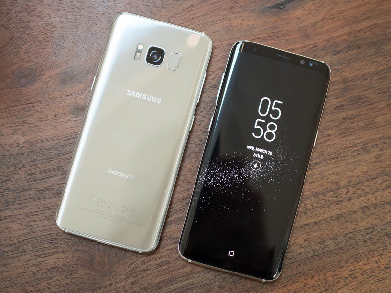
At a glance, from any given angle you'd be hard-pressed to immediately pick out the "new" phone between the Galaxy S8 and S7 series of devices. Yes the Galaxy S8 and S8+ are gorgeous phones, but they use the same recipe as 2016 — with just a slightly different proportion of the ingredients. Finely milled metal and curved glass are mixed together, and in 2017 there's simply a whole lot more glass.
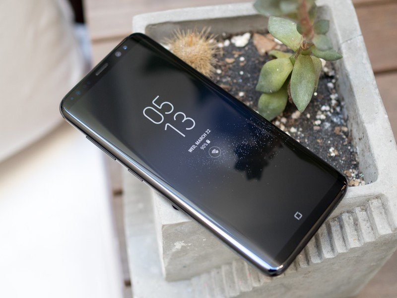
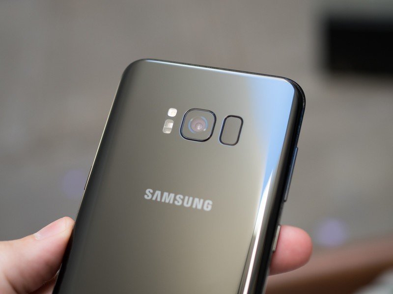
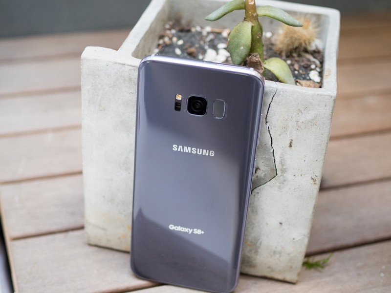
83% of the front of the Galaxy S8 is usable screen real estate, which as you can see in the photos means there's minimal bezel to speak of on the left and right sides of the display. Even the top and bottom have shrunk, nearing the point on the top bezel where you can't go much smaller assuming you want a front-facing camera, sensors and call speaker. That top bezel is so thin that Samsung even sacrificed its bold SAMSUNG branding that has graced the top of every previous Galaxy S phone — leaving the silkscreen logo on the back to stand alone. On the bottom, the home button and capacitive navigation keys have been abandoned — perhaps the only part of this design that is a clear departure from previous Galaxy S phones.
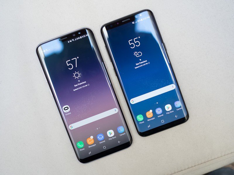
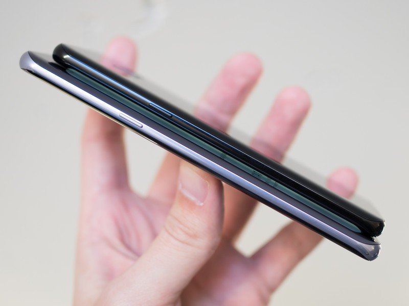
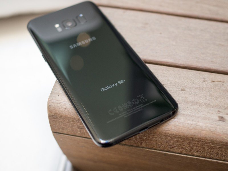
The shrinking bezels align with the change in display aspect ratio foreshadowed by the LG G6 — Samsung has moved to a super-tall 18.5:9 aspect ratio, making the Galaxy S8 actually narrower than the Galaxy S7, but notably taller thanks to its diagonal screen measurement of 5.8-inches to the GS7's 5.1-inches. The display corners are also curved, just like the LG G6 ... which doesn't add much but a neat bit of symmetry to the curved corners of the phone. But even with much smaller bezels, both the Galaxy S8 and S8+ are still quite tall compared to traditional 16:9 phones — the GS8+, in particular, seemed tough to manage in one hand in my brief time with it.
The screens are bigger, taller and equally curved on both models.
2017 also marks the death of "edge" branding within the Galaxy line, as both the Galaxy S8 and S8+ are technically edge phones, sporting dual-curved displays of the more subtle variety closer to the Galaxy Note 7 than the more dramatic Galaxy S7 edge. And with this distinction gone, it means the two models are nearly identical — with only the size of the screen (5.8-inch vs. 6.2-inch) and battery (3000mAh vs. 3500mAh) being differentiators.
Whether flat or curved, these displays look fantastic — and you shouldn't be surprised at this point that Samsung can make an industry-leading AMOLED panel. Not having spent a large amount of time with it I can't speak to its visibility in fringe situations like harsh sunlight or very dim areas, but based on what I have seen I have no doubts about its abilities. In both screen sizes the resolution is "QHD+" which means 2960x1440 — so that's 400 pixels taller than your typical 2560x1440 screen.
More: Complete Galaxy S8 and S8+ specs
The hardware is simply wonderful, even if it isn't a massive departure from 2016.
What metal remains in the bodies of the Galaxy S8 and S8+ has been polished to a sheen rather than left in a more raw state, making for a more seamless look from the slick glass to the now-slick metal. The change is most dramatic on the black and silver color variations, in which there's little differentiation in the colors between the two materials. The colors all around are more subdued yet iterative takes on the Galaxy S7's available palette, with black, gold, silver and blue making a return — the one new color, "orchid grey," is a subtle purple-grey combo that's simply wonderful.

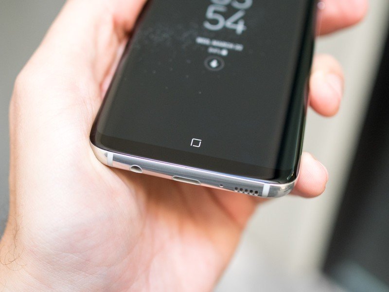
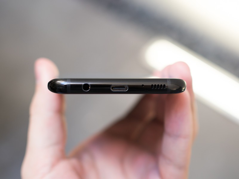
The Galaxy S8 and S8+ are really beautiful pieces of technology in either size, but much has remained the same from the Galaxy S7 and Galaxy S6. Within the proper proportions, the volume and power buttons have stayed put on the sides, and the combination of a headset jack, data port (now USB-C, of course) and speaker are on the bottom.
For everything that was added, Samsung didn't take away a single hardware spec or feature.
The core tenets of what Samsung calls the "Galaxy foundation" are still here as well. That means you're getting an SD card slot, IP68 waterproofing and biometric security — all table stakes for Samsung at this point. A core point of that foundation is also the camera experience, which is big point of strength for Samsung. The Galaxy S8 and S8+ have the same camera hardware as last year, meaning we're looking at a 12MP "Dual Pixel" arrangement with an f/1.7 lens, leaving any improvement in quality to the new ISP (image signal processor) of the new Qualcomm and Exynos SoCs in the phones, as well as software improvements. Samsung says it has improved blur reduction simply by changing the processing, and as we've seen recently with the LG G6 and Google Pixel, a whole lot can be done in software nowadays.
Samsung has to prove that camera processing improvements alone are enough.
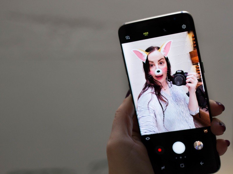
On the other side of the phone, the camera is a complete overhaul. Samsung moved to a new 8MP sensor with a bright f/1.7 lens that finally includes auto focus, something that you very rarely see even on high-end phones. A welcomed improvement that will make each and every selfie look better.
The Galaxy S8's hardware runs the risk of not moving the needle those who haven't necessarily been drawn to the Galaxy S6 and S7 in the past, but it's clear at this point that there are hundreds of millions of people who over the years have decided they do indeed like the modern Galaxy styling. Samsung managed to make the Galaxy S8 bigger without making it unmanageable, and the Galaxy S8+ is a secondary option that gives people who want more screen the full experience in a larger footprint. All the while, these phones didn't lose a single feature the original Galaxy S7 and S7 edge had.
More of the same
Galaxy S8 and S8+ Software and experience
In continuing with its messaging about the "Galaxy foundation," Samsung isn't really playing the specs game anymore — at least, it isn't marketing the specs game. The Galaxy S8 and S8+ have the specs you need, but Samsung isn't adding more just for the sake of more — the focus is on providing the experience people expect from a top-end phone. You're getting top-of-the line processors in the Qualcomm Snapdragon 835 or Exynos 8895 and double the base storage to 64GB — but at the same time, it's staying put at 4GB of RAM and battery capacities that haven't increased from the Galaxy S7 generation.
To most people, the amount of RAM and precise size of the battery don't really matter — what does matter is performance, and there's a great chance that with either the Snapdragon 835 or Exynos 8895 paired with 4GB will do great. And doubling the base storage to 64GB while keeping the SD card slot is a nod to helping you store everything today and in a year when your apps and media appetite grow.
See everything new in the Galaxy S8's software!
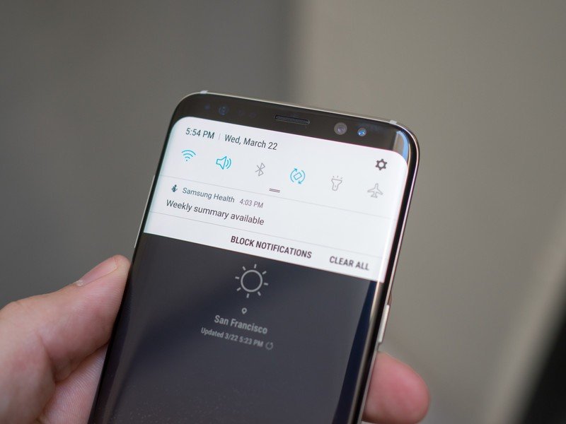
Samsung always packs a ton of features in its software, and the Galaxy S8 and S8+ are no exception. To get up to speed with everything that's new in the software, be sure to read our full breakdown here!
Read our complete Galaxy S8 software breakdown!
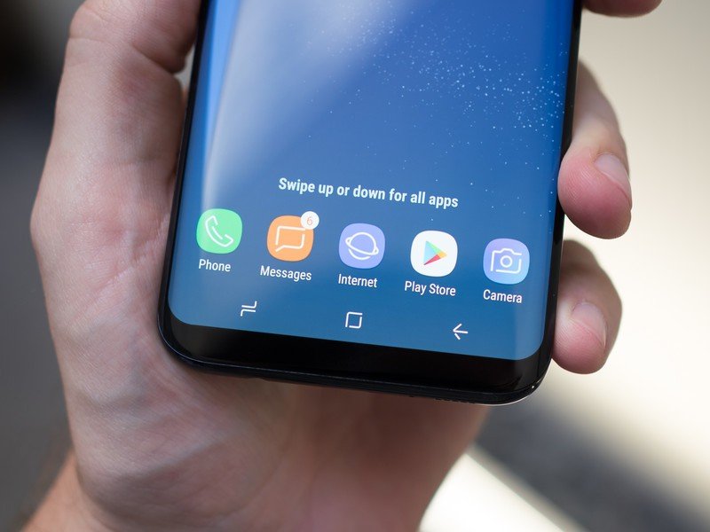
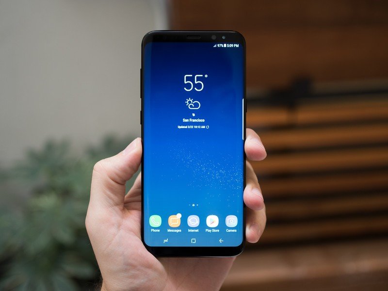
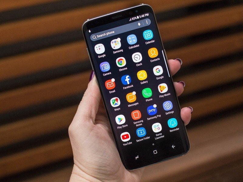
And on the software side, Samsung is working with a known quantity, building on Android 7.0 Nougat that looks and acts much the same as the updates that have rolled out to the Galaxy S7 and S7 edge. (I was also told the intention is to launch with Android 7.1 — we'll see how that works out.) That means you're going to find mostly white and grey interface elements, along with pops of color throughout for icons and big touch points. The launcher has dropped an app drawer button but retained the drawer itself using a swipe-up gesture, just like Google's Pixel Launcher, and that kinda of subtlety can be found throughout the interface with a bit more transparency used all around in place of explicitly huge buttons.
Samsung's software is good, clean and fast. Let's hope carriers don't mess it up too much.
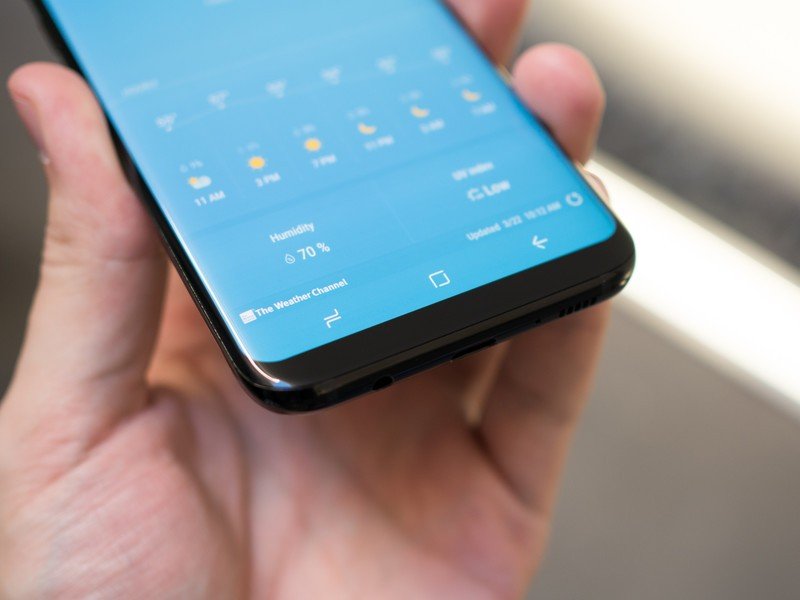
Samsung is, for the first time, using an on-screen navigation bar with soft keys, which is something I'd bet Google is happy about — this basically leaves HTC as the final "big" name that doesn't at least give you an option for on-screen buttons. To help soothe those who felt so attached to the physical home button you'll still find the home button present on the always-on display you can push to bring up the lock screen. Samsung achieves this without "accidental" touches by using pressure-sensitive technology to make you press harder to activate the button on the always-on display.
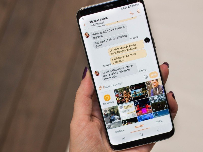
It isn't clear that Samsung intends to use this pressure sensitivity anywhere else in the interface, though, and during my brief time with the phones in the company of Samsung representatives nobody even mentioned the feature. The second part of the equation is a much-improved haptic feedback engine that gives you more of a physical feeling when pressing the button — very similarly to Apple's new iPhone 7 home button and MacBook Pro trackpad. The pressure sensitivity and improved haptic feedback are welcomed additions, but it feels a bit odd to not see the functionality expand beyond the home button. Maybe that's a sleeper feature waiting to be enabled in the future.
Pressure sensitivity and improved haptics are great — but they aren't used throughout the interface yet.
The Galaxy S8 and S8+'s tiny bezels necessitated the move to on-screen buttons, which also means it had to move its fingerprint sensor to the back of the phone. Rumor has it that Samsung wanted to get some sort of under-glass fingerprint sensing into the Galaxy S8, and when the technology wasn't ready ... well, we got this. The fingerprint sensor is placed next to the camera, which on these extra-tall phones is way up there. Those who hold their phone in their left hand are in double trouble as they have to reach up and around the camera lens to access it. It's likely to make it even harder to keep the camera lens clean, and Samsung's camera software even has a warning reminding you to clean your lens when it notices it's dirty.
Thanks to the precarious placement of the sensor, it makes sense that Samsung is really high on its iris scanning technology. Whether it's through a change of hardware or software, the iris scanner is much faster than the Galaxy Note 7's, which is a welcomed change. Of course I was using it in good lighting and for a short amount of time, but it recognized quickly and unlocked right away. Now, how will it do when viewing my eyes from the side, at night and while I'm walking down the street? Undoubtedly it will have less precision than just touching the fingerprint sensor. This is one that will take more real-world use to see how it does over time.
Bixby
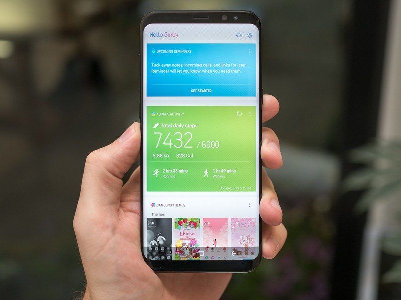
Voice is viewed as the next big thing right now, and not to be left out Samsung created Bixby — and it was so excited about it there was actually a pre-announcement before the Galaxy S8. It's easy to initially think that because Bixby is a voice interface that it competes with Google Assistant and Alexa, but Samsung actually sees it entirely differently.
Bixby isn't an AI assistant per se, but a new way to interact with all parts of your phone.
While Bixby does do some predictive intelligence, it isn't so much an "assistant" as it is a new way to interact with your phone via voice in order to replace touch entirely. Bixby is designed to be an ever-present voice layer that you can talk to at any time and have it navigate the phone's interface for you. For example, while in the Gallery app you can hold down the "Bixby button" — a hard key underneath the volume keys — and say "show me my photos from Barcelona" to get results. When viewing an image, you could say "apply a black and white filter, and rotate it to the left." These are things you could do with touch, but you can speak to Bixby instead and have it do the actions for you — be it because you don't have the ability to touch the screen at that moment, or you just don't know how to do the function with touch.
Beyond being able to navigate through every corner of "a handful" of Samsung's own apps, the company is really bullish on Bixby because of the way it handles contextual and incomplete information. Bixby knows where you are when you request something, and can act accordingly rather than starting from scratch. If it doesn't completely understand your request, Bixby is also able to get you part of the way there rather than failing entirely and requiring another complete request.
If Samsung thinks people have trouble using its apps, maybe it should just make its apps easier to use.
Now, skeptics would say that if your interface is so hard to use with touch that you need a voice assistant to replicate those movements for you ... well, maybe your interface should be simpler. And, as a generally skeptical person myself, I agree entirely. While I immediately see the value in using Bixby for accessibility and the handful of times when you actually just can't touch the display, I see no reason why I would stand there, holding my phone, and choose to press the Bixby button to ask it to do something in the app I'm currently looking at. It would be useful in an informative tutorial sense, but ideally I would want to learn for myself how to do things with touch rather than relying on Bixby to navigate apps for me.
It's clear there's an intense amount of time and engineering being put behind Bixby, but right now it's a neat demo of voice technology and that's about it. The fact that Bixby supports over 50 languages is fantastic, and the demoes I saw did work, but I'm not quite seeing the real-world value of telling Bixby to do things rather than just using apps myself. If Samsung thinks people have trouble using its apps, maybe it should just make its apps easier to use.
DeX
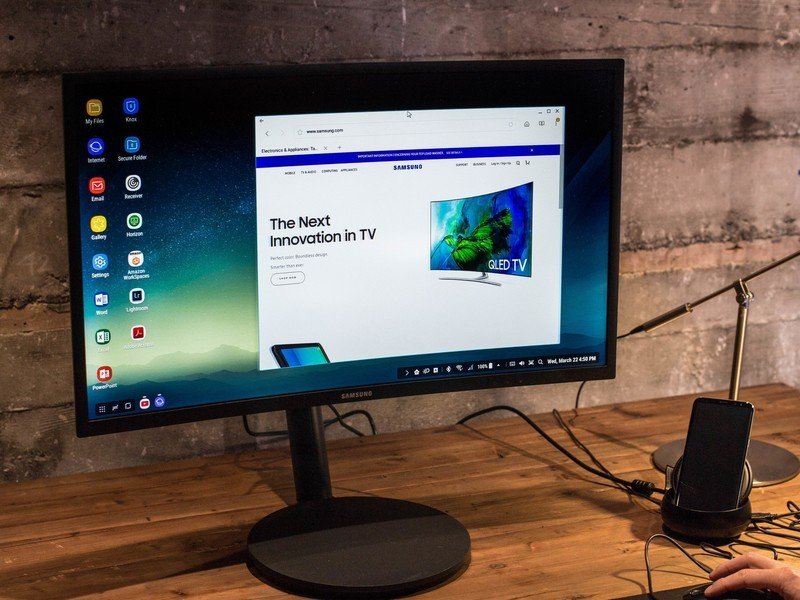
DeX is the first big software feature differentiator on the Galaxy S8 and S8+, and it's one that leaked the least going into the phone's release. It lets your Galaxy S8 or S8+ dock into a little breakout box that connects to a traditional computer monitor, keyboard and mouse to bring your phone's power to a bigger screen for vastly improved productivity. When docked, the monitor will display a desktop-like representation of your phone screen (rather than a tablet view, as some would guess), with app icons along the left, a "start" menu of sorts with commonly used apps and a full status bar in the bottom-right corner.
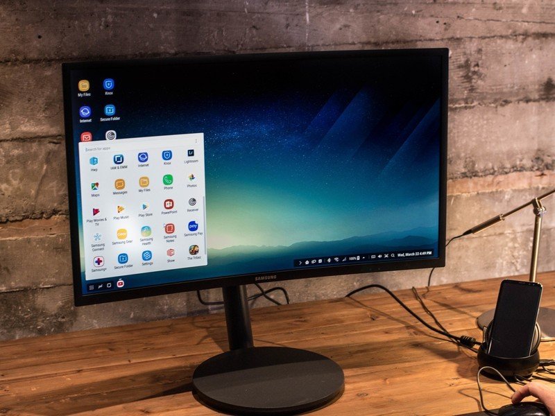
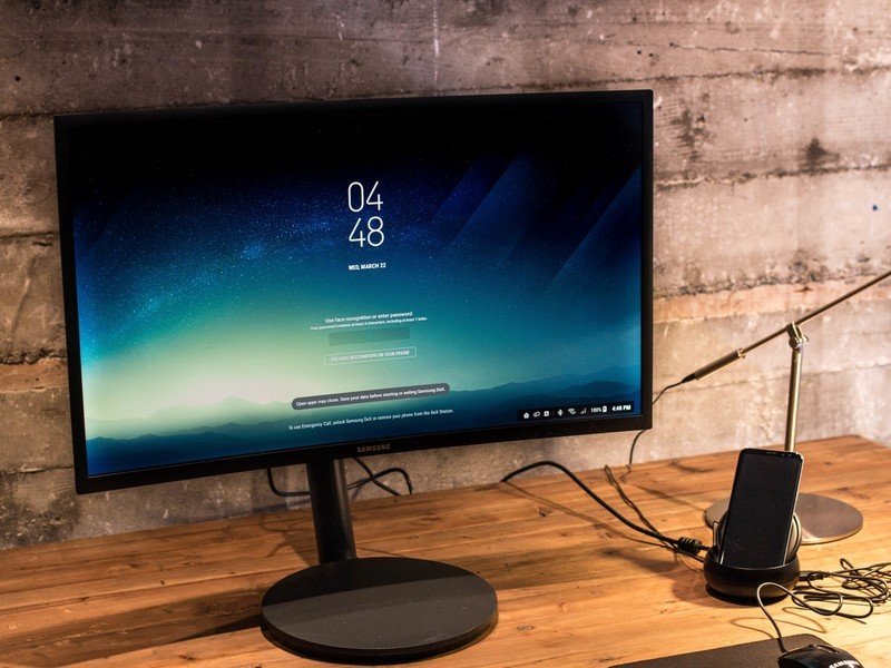
The Galaxy S8 definitely has enough power for DeX, the questions are all about app support.
Android has long supported external keyboards and mice, so that's not a problem at all here. But app support is a real question. Samsung says it has designed its own apps to work in fully resizable windows, and has also struck deals with Adobe and Microsoft to make sure apps like Lightroom, Word, Excel and Powerpoint (still the mobile apps, mind you) look good on the big screen and can also be resized.
It wasn't hard to see the utility of plugging in a phone to this setup and instantly browsing in Samsung's own Internet browser while typing in a Word window and even replying to text messages. The question is, how long will it take for other app developers to get on board and make sure their apps run great on DeX? That's going to make a big difference in how much people will consider using this.
Then, of course, is the next question of how often you're going to be in a situation in which it makes sense to use DeX connected to a keyboard, mouse and monitor rather than just using a computer that's likely already attached to those peripherals. While DeX running on the power of a Galaxy S8 or S8+ would absolutely do the job for casual users ... those are precisely the type of users who don't want to have a keyboard, mouse and monitor. They just want a laptop — and probably a Chromebook at that.
Another winner, it seems
More Galaxy S8 to explore
We've only just scratched the surface on the Galaxy S8 and S8+. With the phones going up for pre-order on March 30 and released on April 21, we have a few weeks to wait before they're broadly available and can start to truly dive deeply into all of their features.
But even without seeing the phones for a deep evaluation, there's a whole lot to be excited about. Samsung continues to make some of the most gorgeous and perfectly executed hardware in the industry today, punctuated by a fantastic display that is now surrounded by even smaller bezels. You get more screen than ever before, and can choose between two sizes of phones with no differentiation in specs or capabilities aside from the battery capacity.
Samsung added to the experience without taking away a single piece of what made the Galaxy S7 great.
A year on from the all-around hit of the Galaxy S7 and S7 edge, Samsung added the latest top-end processors, more base storage, new iris scanning capabilities, the foundation for whole-phone voice control and a new desktop docking system. At the same time, it didn't take away a single feature that made the Galaxy S7 series great — you still get waterproofing, an SD card slot, fast charging, wireless charging, a known great camera and integration with Samsung's vast ecosystem of products and services.
Even if you (understandably) aren't entirely sold on Bixby's abilities or the idea of using DeX to replace your desktop computer, you can absolutely look past those features to see a fantastic overall phone. Fringe features aside, Samsung is still absolutely nailing the basics with the Galaxy S8 and S8+, providing the features and performance you expect out of a high-end phone while also giving you a great hardware that's wonderful to both see and hold. As always you're going to pay handsomely for Samsung's top-of-the-line experience, but as was the case last year you're going to get your money's worth here.
Andrew was an Executive Editor, U.S. at Android Central between 2012 and 2020.
