Samsung Galaxy S8 and S8+ review: Such great heights
The quick take
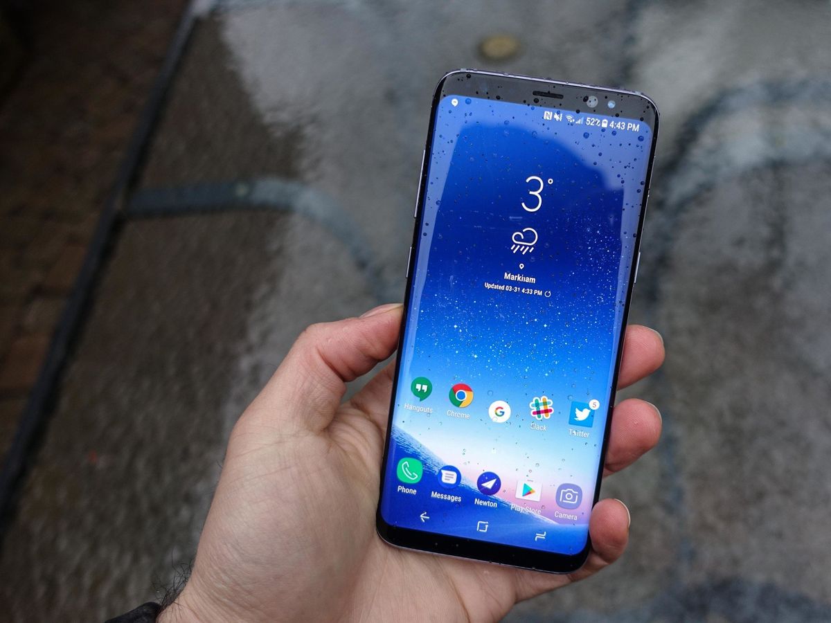
The Galaxy S8 isn't quite as revolutionary as its Infinity Display lets on, but the phone, and its larger Galaxy S8+ counterpart, is a definitive statement of Samsung's dominance in the mobile space. Along with the elimination of the home button, Samsung is all-in on curves, and barrelling towards a future of ultra-minimalism.
The Good
- Best-in-class AMOLED screen
- Great performance
- Reliable camera in almost every circumstance
- Waterproofing
- Surprisingly good battery life
- Loud mono speaker
- Restrained, minimal software touches
The Bad
- Rear fingerprint sensor is poorly placed
- Face biometrics are fast, but not always reliable
- Bixby is undercooked
- The most slippery phone ever
- Based on S7 timeline, updates are going to be slow
Two phones, one review
Samsung Galaxy S8 and Galaxy S8+ Full review
Samsung never slows down. In a year that saw the company stand by a vice chairman who was arrested for bribery, and a phone that caught fire, it also managed to sell an insane number of handsets, and earn gobs of profit in its best-ever quarter.
That the Galaxy S8 feels like such a complete thought out of the box likely speaks to how long the phone was in development, long before the Note 7 was released and recalled, and likely before the company realized that the Galaxy S7 edge was the de facto flagship of 2016.
In this review, we're going to be referring to the Galaxy S8 and S8+ interchangeably because, for all intents and purposes, and unlike last year, they are one phone in two sizes.
Be an expert in 5 minutes
Get the latest news from Android Central, your trusted companion in the world of Android
That's due to a renewed focus on fundamentals, on sticking with what works and evolving the experience in small, meaningful ways. There are regressions, in one major and one minor way, but we'll get to that.
About this review
I (Daniel Bader) have been using the Galaxy S8 and Galaxy S8+ at different times for a total of two weeks, spanning New York, NY and Toronto, Ontario. Both models are unlocked Canadian models connected to AT&T in the U.S. or Rogers in Canada, with Snapdragon 835 processors and Sony IMX camera sensors.
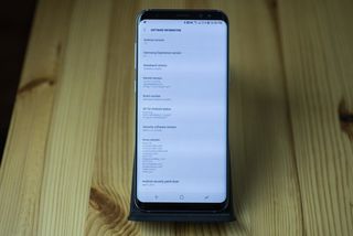
One day prior to the review embargo, Samsung released a small update for the Galaxy S8 and S8+ updating the software to Build G950WVLU1AQD9. The update prepared the units for Bixby Voice (which still doesn't work) and updated the security patch to April 1, 2017. It also closed the loophole to allow remapping of the Bixby button.
A Fitbit Alta HR was connected to the phones during the review period.
Samsung Galaxy S8 + S8+ video review
Take a look at our video review. While it only showcases the larger Galaxy S8+, the thoughts are applicable to both phones.
Line items
Samsung Galaxy S8 and S8+ Specs
| Category | Galaxy S8 | Galaxy S8+ |
|---|---|---|
| Operating System | Android 7.0 Nougat | Android 7.0 Nougat |
| Display | 5.8-inch AMOLED2960x1440 (570 ppi) | 6.2-inch AMOLED2960x1440 (529 ppi) |
| Processor | Qualcomm Snapdragon 835or Samsung Exynos 8895 | Qualcomm Snapdragon 835or Samsung Exynos 8895 |
| Storage | 64GB (UFS 2.1) | 64GB (UFS 2.1) |
| Expandable | microSD up to 256GB | microSD up to 256GB |
| RAM | 4GB | 4GB |
| Rear Camera | 12MP Dual Pixel, f/1.71.4-micron pixelsOIS | 12MP Dual Pixel, f/1.71.4-micron pixelsOIS |
| Front Camera | 8MP, f/1.7auto focus | 8MP, f/1.7auto focus |
| Connectivity | Wi-Fi 802.11ac MIMOBluetooth 5.0NFC, GPS, Glonass, Galileo, BeiDouLTE Cat.16 | Wi-Fi 802.11ac MIMOBluetooth 5.0NFC, GPS, Glonass, Galileo BeiDouLTE Cat.16 |
| Charging | USB-CFast chargingQi wirelessPowermat wireless | USB-CFast chargingQi wirelessPowermat wireless |
| Battery | 3000mAh | 3500mAh |
| Water resistance | IP68 rating | IP68 rating |
| Security | One-touch fingerprint sensorIris scannerSamsung KNOX | One-touch fingerprint sensorIris scannerSamsung KNOX |
| Dimensions | 148.9 x 68.1 x 8 mm | 159.5 x 73.4 x 8.1 mm |
| Weight | 155 g | 173 g |
The main takeaway here, and the reason we feel comfortable combining the two phones into a single review is because, unlike their predecessors, the S8 and S8+ are merely two sizes, and even then, aren't that drastically different. The Galaxy S8 is 5.8 inches, with a new 18.5:9 aspect ratio; the S8+ is 6.2 inches, which makes it a bit taller and slightly wider, with a battery 16% larger.
Would you look at that
Samsung Galaxy S8 and S8+ Hardware
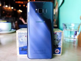
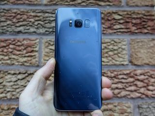
Since 2016, Samsung has built its flagship phones with aluminum frames and glass fronts and backs. And as good as the Galaxy S6 series was, the refinement in this year's phones is noticeable. The curved glass front meets the metal frame at the same gradual angle as the back, which maintains symmetry that debuted on the Note 7, but here looks even better.
Part of that comes down to Samsung's color choices — color-matched metal around the Midnight Black model, or muted purple hue of the Orchid Gray — but much of it is about curves.
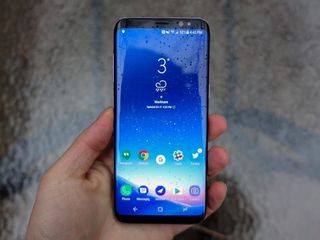
The corners curve; the display curves; the glass curves. This is a phone that has no sharp corners, nowhere to focus our attention away from the massive screen. If you think back to the proposition of the Galaxy S3, all the way back in 2012, Samsung wanted the focus on its "pebble design" and Nature UX. This phone, five years later, is the culmination of that journey, for better or worse.
That shape and choice of materials also lends the phone an unprecedented slipperiness. You probably shouldn't try to nestle the Galaxy S8 in the crook of your neck while you're talking on the phone. After a few hours — sometimes a few minutes, even — the phone will be fingerprint-smudged and slippery, so if you're clumsy you will probably want to invest in a case, or a microfiber cloth.


But hold it in your hand, and it feels fantastic. You're getting either a 5.8-inch or 6.2-inch QHD+ display, but both use Samsung's latest AMOLED panels, at a 2960x1440 resolution. We're not going to get bogged down by semantics, but as Alex Dobie points out, the screens themselves are not their exact sizes; instead, they're closer to 5.3 and 5.7 inches if you compare them to traditional 16:9 screens. Whatever the case, you're getting more vertical realestate in a phone you can hold and use in one hand. The larger of the two, the S8+, is a little less amenable to single-paw use, but it's still far narrower than something like the Pixel XL, and has far more usable screen real estate.
The screens are amazing. Great viewing angles are expected these days, but Samsung has once again found a way to make the Super AMOLED panel on both versions of the phone bright and, more importantly, accurate. They are DCI-P3 compliant, which gives them a wider color gamut than a typical RGB palette. That, in addition to being HDR certified, makes them technically proficient, which is great, but you're also getting one of the most pleasurable viewing experiences on a phone today.
Even though wide-angle video is cut off (though some apps make minor crops to fill the display), the tradeoff is worth it. As good as the LCD panel is on the LG G6, Samsung practically owns the OLED space, and it's becoming clear that the thinner display technology is the future of mobile screens.
It really can't be overstated how beautiful this hardware is.
That screen — the so-called Infinity Display — is not a huge departure from something like the Galaxy S7's edge, but it eliminates as much of the bezels above and below the display as possible. LG did it first with the G6 — well, Xiaomi did it with the Mi Mix, and Huawei has been inching towards it for years — but this is a truly remarkable achievement nonetheless. Samsung did it, in part, because it finally removed the home button from the front of the phone, adopting on-screen navigation buttons for the first time in its history. And you can't talk about that without talking about what you're losing.
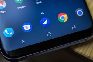
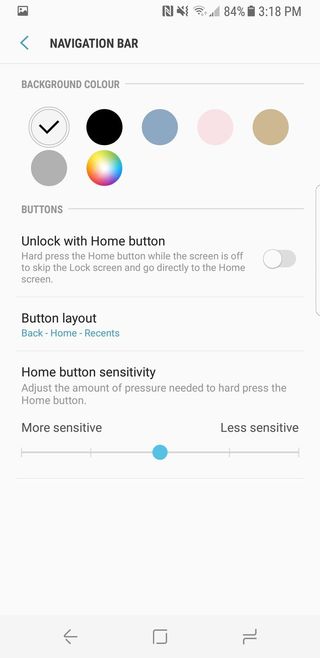
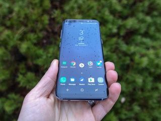
So there's no physical home button, just three on-screen navigation keys. They're in the traditional "reverse" Samsung order — recent apps, home, back — but you can change that. The achievement comes in the form of an "invisible" home button, a tactile area below the on-screen home button that offers real feedback from a precise haptic engine.
The most controversial change to the Galaxy S8 is the placement of the fingerprint sensor.
Not only does this alleviate some of the angst around losing that physical key, but it allows you to turn on the screen as you would that physical counterpart by pressing at any time — even when the display is off. That, combined with the ultra-fast face recognition built into the S8, made me miss that front-facing fingerprint sensor a lot less.
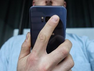
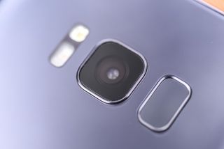
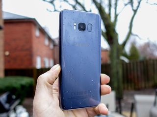
Yes, the most controversial change to the Galaxy S8 is the placement of that fingerprint sensor. Now on the back, right next to the camera, it's not quite as bad as it looks — especially on the smaller S8 — but it's still not great. Rumor has it that Samsung was working on a way to outfit the S8 with a below-the-glass biometrics, but couldn't make it work in time. And while I wish Samsung would have thrown symmetry to the wind and placed it center, below the camera, I found myself only using the fingerprint sensor when the face recognition wasn't feasible.
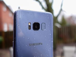
Thankfully, starting with the Galaxy S7 series and continuing here, it appears thinness is no longer a top priority for Samsung; the Galaxy S8 is 8mm thick, while the S8+ is 8.1mm, perfectly suited for a modest, but not huge, battery, and the complete elimination of a camera bump. The 12MP rear sensor on the back is completely flush with the glass, ringed by metal and flanked by an LED flash and heart rate sensor on the left and the fingerprint sensor on the right.

And, like the Note 7, the Galaxy S8 has been bestowed a USB-C port, the reversible standard that, along with fast charging and dual-mode wireless charging, suits my lifestyle perfectly. Practically all my "bag cables" are USB-C, and the fewer Micro-USB cables I need to tote around with me, the better. Samsung has also improved the single down-port speaker on the Galaxy S8, giving it some extra power that puts it on par with products like the Pixel with similar designs. It gets considerably louder than the thin speakers of the Huawei P10, OnePlus 3T and LG G6, and along with the superlative (and customizable) quality from the headphone port, reinforces the fact that despite not really talking it up, Samsung still takes audio very seriously. A nice surprise.

Aside from the bevy of sensors aligning the narrow strip of bezel atop the display, the only other major change to the Galaxy S8's design is the addition of an extra button on the left side of the phone. That's for Bixby, Samsung's AI-powered assistant, and when pressed launches Bixby Home. Soon (but not now), when held it will launch Bixby Voice, and let you dictate various commands to it.
It really can't be overstated how beautiful this hardware is. Even if the software was utter garbage (which it isn't), Samsung would get points for its mastery of form, and how far it's come from the plasticky, Band-Aid designs of the Galaxy S4 and S5. The S8 series is not some remarkable departure from its predecessor, but a consolidation of the good ideas therein with the available (and burgeoning) technologies of 2017. You'll likely see more companies release phones of this shape, size and aspect ratio this year, but none will be able to offer an AMOLED screen of this caliber (HDR certification, DCI-P3 color gamut) with a flexible display and curved glass that isn't just a gimmick (well, mostly isn't a gimmick).
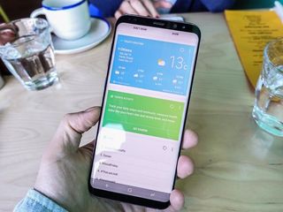
Better than it ever was
Samsung Galaxy S8 and S8+ Software
The Galaxy S8 ships with Android 7.0 running Samsung's latest Experience design: ultra-minimal, with an emphasis on white backgrounds with light blue accents. Icons are wireframes that stand out from the rest of Google's (and the rest of Android's, for that matter) Material Design leanings, and the front navigation buttons are a bizarre mess of abstract shapes that feel like they defy Google's accepted practices for no other reason than just to prove they can.
This may be the first Samsung launcher I stick with.
That said, Samsung's new launcher is pretty great, with a gesture-friendly home screen that does a lot with a little. By default, the app drawer icon is hidden, encouraging users to swipe up or down in unused space to open the still-horizontal series of apps. The changes may seem arbitrary to anyone coming from a non-Samsung phone, but current Galaxy users will see the continuity in these design decisions. For what it's worth, this is the first time I've ever used a Samsung phone without wanting to immediately throw away the launcher for something clearly better.
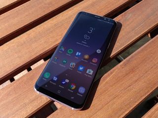
Part of that willingness to accept is thanks to Samsung's beautiful, simple Infinity live wallpapers, which assign gently shifting scenes of the cosmos to the home screen, lock screen and always-on display. Together, they form a blanket of subtle movement to the phone's curved exterior, and play well with the form, from the gradual lightening when turning on the screen to the way the stars move when shifting home screens.
They also work well with the unlocking process, which has been revamped here, and may be the single biggest point of contention about this phone.
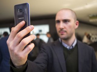
Unlocking the Galaxy S8
There are several ways to unlock the Galaxy S8, but three of them are of particular interest to me:
- Face recognition
- Iris scanning
- Fingerprint scanning
We already have an explanation of the differences between the two methods of facial authentication, but I'll recap: the former is insecure and fast; the latter is very secure and still pretty fast.
Face recognition is not new to Android, but this implementation is so much better as to be, well, unrecognizable to the average smartphone user. Because you can turn on the Galaxy S8 by tapping on the invisible home button (Samsung's term, not mine) and have the phone automatically begin scanning for a face, the sequence, while not quite as fast as a front-facing fingerprint sensor, is just as seamless, and when it works, it's a remarkable achievement.
Similarly, the S8's iris scanner, which is much better than the one on the Note 7, likely due to an improved cadre of sensors and software, is quick and reliable, and can also provide a great experience if you're willing to wait a beat more for the phone to unlock.
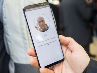
You have to choose one, though: Samsung doesn't allow the facial recognition and iris scanning to work in tandem, though either one cooperates with the fingerprint sensor if the primary method fails. The thing is — it doesn't really fail. You can turn on the display by tapping the area where the virtual home button lives and have the phone automatically scan your face or iris. I'd say that while iris scanning works quickly 90% of the time, face recognition works practically instantly 99% of the time.
More: Everything you need to know about Galaxy S8 face unlocking
I want to be clear that I'm not an apologist for an unlocking sequence that is not always as seamless as briefly placing your finger on a sensor, but in lieu of a viable alternative, Samsung's offerings are very good.
I guess the question I would ask is, Would you prefer Samsung have maintained the front-facing home button-finger sensor combo and sacrificed the scale and symmetry of the new Infinity Display? After using the phone for two weeks — after maneuvering my left or right index finger to find the awkwardly-placed fingerprint sensor next to the rear camera — I think the decision is not only justifiable, but agreeable.
A word on the fingerprint sensor itself: on the Galaxy S8, it's really not difficult to find while holding the phone normally. I have pretty normal-sized hands and, after a few hours, quickly got the hang of it. On the Galaxy S8+, that distinction is not as clear; instead, I erred on the side of relying on the face unlock, and only using the fingerprint when other methods failed, or when I needed to access biometrically-protected apps like 1Password.
Bixby
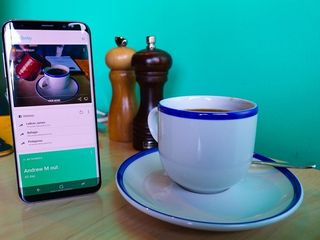
You can't talk about the Galaxy S8 without talking about Bixby, the company's AI framework that permeates the entire device. On the one hand, Bixby is a series of what amounts to plug-ins that work with existing apps, along with an integration into the Samsung Launcher, which is also accessible by pressing the dedicated button just below the volume key.
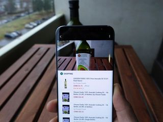
That's what Bixby is right now, and that's all I can review. But soon, with the launch of Bixby Voice, it will be much more — a voice-powered user interface that, according to Samsung, "will be able to support almost every task that the application is capable of performing using the conventional interface (ie. touch commands)."
Bixby Voice a hugely ambitious project that will take time to get right, which is likely why Samsung is delaying it until a few weeks after the S8 is launched (and also why, at first, it will be limited to a handful of apps, and only to users in the U.S. and Korea.)
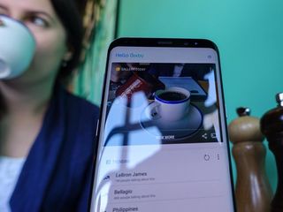
Right now, though, Bixby is three things:
- Bixby Home: A place to get all of your Samsung ecosystem stuff in one feed. From calendar entries to recent photos to upcoming Uber rides, Bixby Home is located to the left of the main home screen (and available anytime, thanks to its button), it amounts to a watered-down version of Google Now's Feed. News, trending hashtags, recent photos, Uber rides, upcoming appointments and reminders — these are all good, but not all that useful unless you're fully invested in all of Samsung's services.
- Bixby Reminders: A typical time- and location-based reminders app that integrates with Bixby Home and, soon, Voice.
- Bixby Vision: A way to identify and purchase products using your camera, this is one of the more interesting and potential-filled parts of Bixby, but as of now it's fairly limited. You can identify wines and find similar images to a given scene, or translate a word on a page, but I imagine, like Bixby's other areas right now, it will find low pickup because there are just so many real-world objects it doesn't know what to do with.

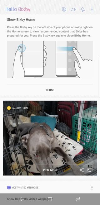

It's clear that for Samsung Bixby is a very long-term project, something that will be woven into its product design for years to come. On the phone side, we'll soon see Voice launch with support for a small number of apps in only two countries, but eventually it will expand, and Samsung will release an SDK that will give developers the opportunity to integrate Bixby Voice commands into their software.
I applaud Samsung's ambition here — it says that Bixby "will evolve from a smartphone interface to an interface for your life," — but in its current form, it's very clearly a work-in-progress, and must be assessed as such.
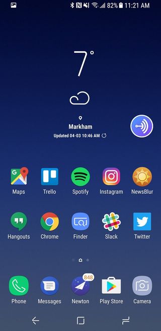
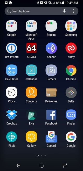



Despite having a curved screen, the Edge display features don't really add anything to the Galaxy S8.
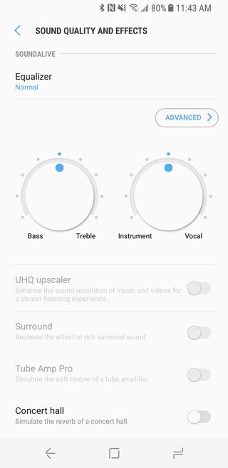
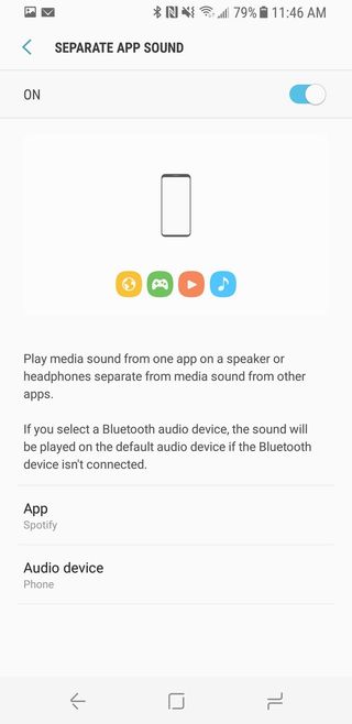
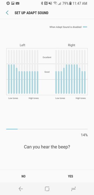
To cap off the software experience, Samsung's hidden a lot of little treats inside the menus, from the ability to color the navigation buttons to a fully-customizable audio equalizer that adapts to your particular set of headphones. There's an improved one-handed mode, especially useful on the Galaxy S8+, and the ability to swipe down on the fingerprint sensor, à la Huawei, to expose the notifications.
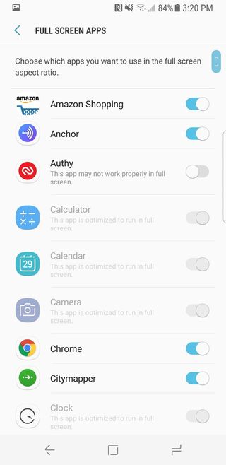
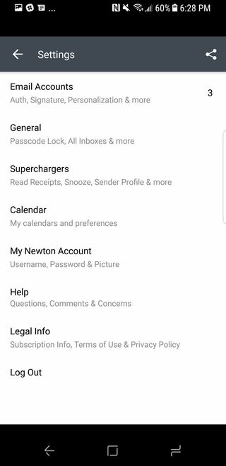
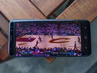
Apps that aren't optimized for the Galaxy S8's taller aspect ratio can be forced to conform — my default email app, Newton, saw no ill effects — and Samsung has taken it upon itself to optimize YouTube for the larger display, intelligently cropping content so it fills the entire 18.5:9 screen.
And popular features from previous Galaxy devices make a return here, too: Smart Stay, which debuted on the Galaxy S3, is still chugging along, while Samsung's retinue of display scaling options have been maintained from the Galaxy S7 Nougat update.
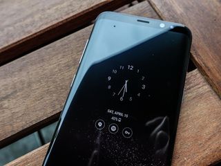
There is a new set of always-on display options, replete with what Samsung is calling FaceWidgets, a trio of swipeable widgets, from music controls to a tiny schedule, that can be accessed by double-tapping on the perennially-visible clock. The AOD itself is quite attractive, since it cooperates with those Infinity Wallpapers I mentioned, but FaceWidgets seems like it was derived from the same well-intentioned meeting that resurfaced face recognition, albeit with less admirable results.
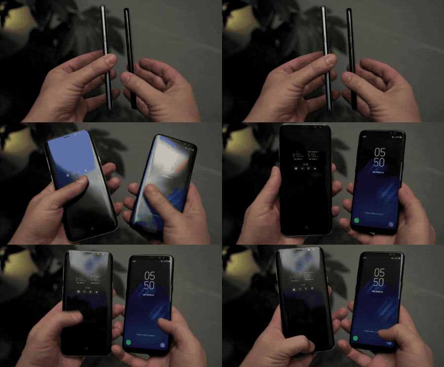
Of course, both versions of the phone come with Edge screen support this time, and while they're on by default, I find most of the options of dubious value and quickly turned them off. Still, as with the Galaxy S7 edge, a helpful screenshot annotation feature is now built into the Edge screen, allowing you to take a square or circle screenshot, or even a short video that's saved as a GIF, as you work on the phone. I really like the GIF feature, and have been using it to create some pretty great snippets, like this one.
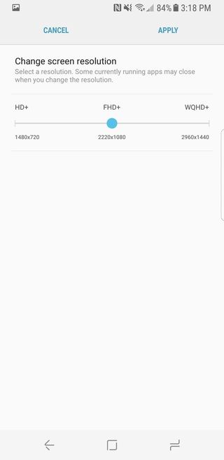
Finally, a number of battery-saving features are on board, including a default resolution of 2220x1080, another holdover from the Galaxy S7's Nougat update. This absolutely contributed to the excellent battery life I got from both the Galaxy S8 and S8+, but I want to be clear about the decision: it's almost impossible to tell the difference between 1080p and the phone's default resolution of 2960x1440, even at the most eye-straining scale.
I did eventually switch to a different launcher (Nova Launcher), and I did disable a number of what I feel are superfluous features, including the Edge screen and FaceWidgets, but the good news is that I am pretty damn happy with the way Samsung has restrained its propensity for feature bloat — or bloat of any kind, in fact. I think we can finally put to rest the notion that Samsung ruins Android; it certainly changes it, but the results are warm, accessible and fluid.
On software updates
Galaxy S8 owners have a valid concern in wondering how long Samsung will take to update the Galaxy S8 to future versions of Android. The Galaxy S7 took more than five months to begin receiving Nougat, and the unlocked model in the U.S still doesn't have it, with neither timeline nor explanation from Samsung. That doesn't instill a great amount of trust in the process, even though the company is now updating its 2015 models, the Galaxy S6 series and the Note 5, to Nougat.
Samsung has been pretty good about rolling out monthly or quarterly security updates in cooperation with all the U.S. carriers. The takeaway is that you'll probably get a major updates for a couple of years, but you'll wait — a while.
Built to last
Samsung Galaxy S8 Performance and Battery life
This is the first phone on the market with Qualcomm's Snapdragon 835 platform, which once again sees its flagship chip adorned with eight cores, along with 4GB of RAM and 64GB of UFS 2.1-based storage.
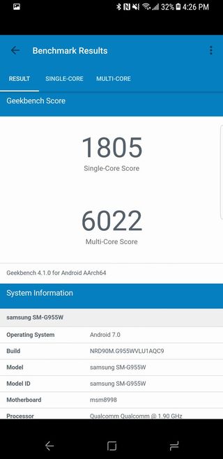
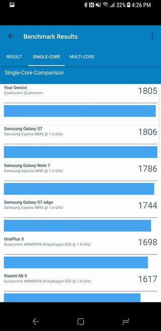
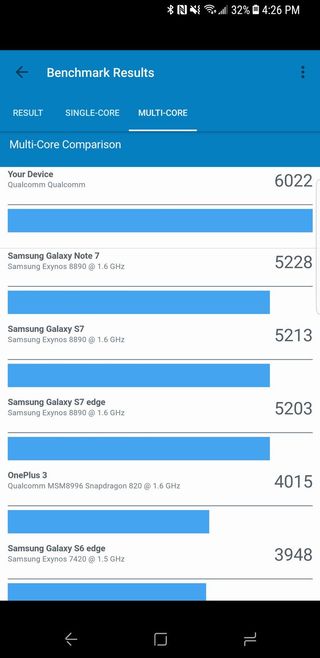
We do this every year, say that the newest phone is the fastest, and I'm sure that's true of the Galaxy S8 — Geekbench says it's around 15% faster than the Galaxy S7 — but, to be honest, I'm finding it difficult to tell the difference in performance. I was using the Galaxy S7 edge for a few weeks to prefer for this review and, post-Nougat, find that phone to be just as fast as the Galaxy S8 in daily tasks. Similarly, owners of the LG G6 decrying LG's decision to do with last year's chip don't need to worry too much.
That said, it's great to have some future-proofing built into the Galaxy S8's Snapdragon 835, and besides sheer performance benchmarks, there are a number of notable improvements to the platform.
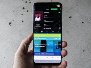
For starters, the chip is built on a 10nm process, the first of its kind aside from Samsung's own Exynos 8895 that ships in international versions of the Galaxy S8. Not only does the smaller manufacturing process mean less heat output and more efficiency, but it assures that the GPU, an updated version of Qualcomm's excellent Adreno line, has more thermal headroom to play with. For a chip that's going to be extensively used to power mobile VR experiences, the Adreno 540, which is around 25% faster than the Adreno 530 in the Snapdragon 820/821, is perfectly suited to the task.
The Snapdragon 835 also drives the Galaxy S8's improved camera experience, with an updated image signal processor that delivers cleaner photos in low light, and smoother implementations of multi-frame captures like HDR.
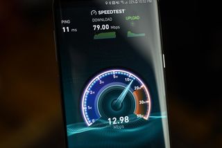
And for the handful of networks that currently support it, the Snapdragon 835, and the Galaxy S8 as a result, can reach download speeds of 1Gbps over a cellular connection. This number is largely a formality, a marketing message — no person, even standing right next to a base station with no other traffic on the network would reach 1,000Mbps over the air — but it also has implications for Qualcomm's transition to 5G, which will work far better with devices running the Snapdragon 835's X16 baseband solution, since such devices make the entire network more efficient.
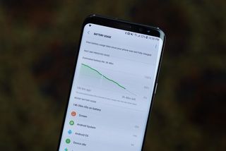
Efficiency seems to be the Snapdragon 835's defining characteristic, and that extends to the battery life. If you skipped through the previous 4,000 words to find out whether the Galaxy S8 and S8+ have improved battery life over their predecessors, I have good news.
Both phone sizes have roughly the same-sized battery cells as their 2016 equivalents — 3,000mAh for the Galaxy S8, and 3,500mAh for the Galaxy S8+. In fact, the latter's cell is 3% smaller. But both are convincingly better at lasting a full day of use, largely owing to the more efficient processor, a Super AMOLED screen that, pixel-for-pixel uses less power, and a lower default resolution that appeases both previous points.
Here's what I found:
- Galaxy S8: On most days, I got between 14 and 15 hours of mixed use, with 4.5 or 5 hours of screen-on time. I usually found myself hitting the 20% mark around 9 or 10pm with no mid-afternoon top-up. This is definitely an improvement over the Galaxy S7, but may not be enough for more intensive users.
- Galaxy S8+: On most days, I got between 17 and 18 hours of mixed use, with 6 to 6.5 hours of screen-on time. But for a couple of days where I was heavily engaging the phone, I didn't have to top-up at all during the day, and usually went to bed around midnight at 20% battery, after taking it off the charger at 7am.
Neither phone is a multi-day workhorse, but with support for both Samsung's Adaptive Fast Charging, and (unfortunately) Qualcomm's older Quick Charge 2.0 standard, in addition to fast wireless charging over both Qi or PMA, battery life is notably improved over the Galaxy S7 series.
On battery concerns
I'm not going to spend a lot of time worrying about whether the Galaxy S8 is going to alight in my pocket, or next to my bed. Samsung has spent the last seven months looking into the cause of the Note 7's fires, and the past four months explaining how it intends to ensure such a thing never happens again.
Samsung purposefully didn't push the battery capacity of the two S8 models because it feels that the Snapdragon 835 brings additive efficiencies, and because it doesn't want to take a risk on a cavalier new battery design.
Obviously, we're going to watch the Galaxy S8 more closely than some other phones for signs that its batteries may be affected, but there is nothing gained from preemptively writing off the phone because its immediate predecessor had problems.
Snap-dragon (sorry)
Samsung Galaxy S8 and S8+ Cameras
On paper, the cameras on the Galaxy S8 are only improved on the front, with an upgraded 8MP sensor with autofocus. And it's very good, especially when hunting for multiple subjects, with visible background blur and plenty of built-in Snapchat-like effects.
But there is something to be said for subtle upgrades, and that's exactly what you get with the Galaxy S8's rear 12MP sensor. On the models that ship with the Snapdragon 835, a Sony IMX333 sensor sucks up the photons, and a similar (or identical) f/1.7 lens adds the wide aperture and incredible bokeh on macros.
The focal length is actually slightly longer than the Galaxy S7, which affects framing, but it's a positive development, as the lens now distorts less in the corners, and portraits feel a little more natural, since the viewfinder fits less of the surrounding world in it.


Since the Galaxy S8 has the same fundamentals as its predecessor, it's still one of the fastest, most reliable cameras on any phone. But Samsung is now more willing to let, when Auto HDR is enabled, enable the feature in a plethora of scenarios, similar to the way Google's Pixel employs HDR. Even without HDR, Samsung now uses a feature new to the phone's upgraded image signal processor called multi-frame processing, which uses the faster, wider memory bus to seamlessly capture multiple photos every time you press the shutter button to come up with cleaner, more accurate photos.
And that's exactly what you get. If you compare the Galaxy S8's photos to the Galaxy S7, you'll immediately notice a couple of things: the Galaxy S8 employs far less artificial sharpening around edges, because the photos themselves are much sharper. Because of the improved software processing, the Galaxy S7's artificially enhanced contrast — that looks great from far away, but all but ruins the finer elements of a photo — are replaced with something that is much more indicative, both in terms of color reproduction and grain allowance, of real life.


Samsung Galaxy S8 (left) | Samsung Galaxy S7 (right)


Samsung Galaxy S8 (left) | Samsung Galaxy S7 (right)


Some people won't like this change. Much of Samsung's camera legacy of the last few years has been defined by this tendency towards hyper-sharp, overly-saturated scenes, and this is the company moving away from that. That's not to say colors are muted, or approach the level of pure canonical reproduction, but with Samsung's screens now DCI-P3 compliant and largely calibrated for accuracy, it makes sense that the camera would be similarly tuned.
So is the camera better than the Pixel, our current champion? I don't think so, at least not in absolute terms. Low-light shots, while cleaner than the S7's, are not substantially better, and are still physically limited by the 1.4-micron pixels, whereas the Pixel benefits from larger 1.55-micron openings.
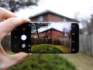
What is better than the Pixel is the camera app's opening speed, which is astoundingly fast, and the camera app itself, which has been revamped to make finding and using manual controls much faster.
Remember the old days when Samsung would fill every free pixel with some gimmicky feature that you would never use? Thankfully, the company's newfound minimalism extends to the excellent camera app, which now features a handy zoom gesture attached to the shutter button. (While there's only one sensor on here, imagine how useful such a feature would be with two sensors at different focal lengths.)


Even the built-in camera effects, stolen guiltlessly from Snapchat, are well done. A small cartoon bear icon exposes a handful of live augmented reality filters that automatically detect faces and even beckon you to "open your mouth" or "raise your eyebrows" to extend the artifice. They're fun, they're useless, and they're exactly what Samsung should have done to engage a demographic increasingly clamoring for such things.
Of course, Samsung hasn't messed with a few other good things, including the ability to shoot in 4K at 30fps, or 720p slo-mo at 240fps. Optical image stabilization is just as good as ever, though video stabilization doesn't quite match the machine learned perfection of the Google Pixel.
Unlike some of the other substantive hardware improvements, the Galaxy S8's rear camera is another solid effort, but not more.
The big one
Samsung Galaxy S8 or Galaxy S8+ Which should you buy?
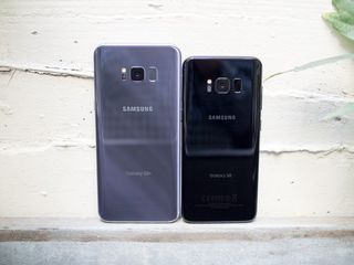
Other than screen dimensions and battery size, the Galaxy S8 and S8+ are identical. I've spent a bunch of time with both and have come to prefer the larger S8+ despite its height. It's just nicer to have that extra few hours of battery, and the additional screen real estate is a bonus. It's not exactly one-hand-friendly, but I'm used to that.
The Galaxy S8 is a little easier to maneuver in one hand, but it's still a big phone. If you're married to using the fingerprint sensor, you're going to have a much easier time consistently finding it on the smaller S8, which is to to be expected, but that minor convenience isn't enough to change my mind. I'm getting the S8+.
Colors
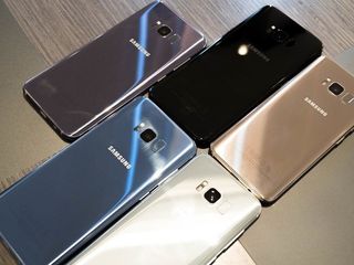
I've ordered the Galaxy S8+ in Midnight Black, which is a great look for this phone. All of the accessories in the box are color-matched, too — a nice bonus.
But I'm surprised at how much I like the Orchid Gray, which has a purple hue in most lighting situations. It doesn't catch my eye as much as the Blue Coral option, which isn't immediately available in North America, but it should be coming soon.
What color Galaxy S8 should you buy?
Don't overthink it
Samsung Galaxy S8 and S8+ Bottom line
In 2016, Samsung released a duo of phones that, despite looking very similar to their predecessors, were huge departures in important ways. The Galaxy S7 took the best parts of the Galaxy S5 and S6 and combined them into a couple of devices that Samsung thought would appeal to wildly different audiences. Turned out most people wanted the Galaxy S7 edge.
The Galaxy S8 is in many ways a lot closer to the S7 edge than it appears on the surface. Samsung has maintained so many of the features that, in retrospect, endeared the Galaxy S7 series to millions of people — waterproofing, a microSD card slot, a great low-light camera — that it was very careful about what to change.
The most obvious change is that screen, which is astoundingly good, and the banishment of the fingerprint sensor to the back. It's going to be controversial, and Samsung will rightfully get a lot of flack for where the sensor ultimately ended up, but face recognition and iris scanning are good enough to justify the change.
The subtle changes to the software, too, are mainly a complement to the screen. Every design decision, it seems, is in some way in service of this screen, which is big and beautiful and colorful and curved.
If you're not a fan of that curved screen, you're out of luck. Get the LG G6 or Google Pixel. Samsung appears to think that everyone, the millions of people who will eventually buy this phone in either size, is going to accept the change.
Should you buy it? Definitely
In either size, the Galaxy S8 is probably the best Android phone you can buy right now. It just looks so futuristic, and offers so much more usable surface area than something like the Pixel or even the Huawei P10.
The main consideration you should make is, as we say every year, you're willing to live with a phone that won't be updated nearly as regularly as something sold directly from Google. And while Samsung and LG are spearheading this tall phone trend, by the end of 2017 you'll likely see most major companies follow suit.
But as well as the Galaxy S7 has held up a year later, I'm expecting the Galaxy S8 to age just as well.
Where to buy the Galaxy S8
Right now, you're stuck getting the Galaxy S8 from a U.S. carrier — there is no unlocked model for sale just yet. That will change in May, but in the meantime you can pick up the Galaxy S8 at one of these providers.
See the other Galaxy S8 review!
There's more than one way to talk about the most talked-about phone of the year, so that's why we have two reviews! Check out Florence Ion's take on the Galaxy S8 and S8+!
Daniel Bader was a former Android Central Editor-in-Chief and Executive Editor for iMore and Windows Central.
