The quick take
The Galaxy S6 finally offers the hardware that we've long desired, and it's included a wonderful camera. But not everything is perfect — the software experience and battery life just aren't up to speed.
The Good
- Beautiful new hardware design
- Industry-leading camera quality
- A great screen in any situation
The Bad
- Battery won't hold up to intense use
- Software still doesn't live up to expectations
- Inexplicable performance hiccups
| Category | Spec |
|---|---|
| Display | 5.1-inch QHD Super AMOLED 2560x1440 resolution (577ppi) |
| Processor | Octa-core Samsung Exynos processor4x2.1GHz cores + 4x1.5GHz cores |
| RAM | 3GB RAM |
| Internal Storage | 32/64/128GB |
| Rear Camera | 16MP, ƒ/1.9 lensAuto real-time HDR, IR detect white balance, high clear zoom |
| Front Camera | 5MP ƒ/1.9 front-facing camera |
| Battery | 2550mAh battery |
| Charging | Samsung Adaptive fast charging, Qi wireless charging, Powermat wireless charging |
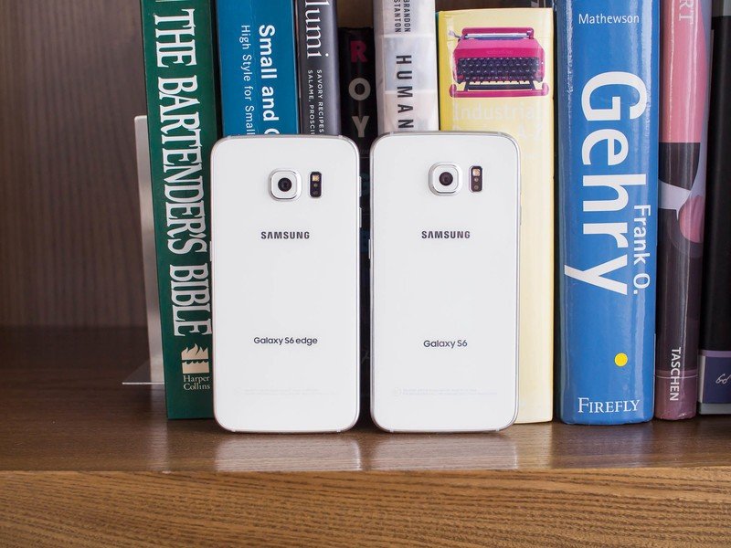
| Dimensions | Galaxy S6: 5.65 x 2.76 x 0.27 inchesGalaxy S6 Edge: 5.59 x 2.76 x 0.28 inches |
The best that Samsung's ever done.
Samsung Galaxy S6 Full Review
When a company is the leader in a given market, it's easy to become complacent, or at least appear so. When sales numbers are several times the second-place player in the market and revenues are off the charts, it's easy to maintain the status quo.
Watching the progression of Samsung's mobile device lineup the past couple of years, you got the feeling that the Korean manufacturer of everything from toaster ovens to Howitzers was content to maintain its course. Last year Samsung's complacency caught up with it, and while the Galaxy S5 was far from a flop — any company would be happy to sell half as many phones as Samsung did — it didn't exactly live up to the company's lofty expectations (or ours, frankly), all while competition in the high-end space continued to grow.
It became clear with the launch of the Galaxy Note 4 that Samsung was attempting to turn around its smartphone strategy — and that's a big ship to turn. The Galaxy S6 gets it one step closer to a complete rethinking of its device strategy, with a new hardware approach, top-notch camera experience and steps in the right direction on the software front. But as we all know, the competition hasn't been sitting still — do the Galaxy S6 and S6 edge have what it takes to keep Samsung in the lead?
We'll answer that question in our complete review. Read on.
About this review
We're writing this review after about a week using the Galaxy S6 and S6 edge, both 32GB models and running on T-Mobile in areas with good network coverage. Three days into our evaluation the phones received an software update to version UVU1AOCG. For the majority of our review period we had a Moto 360 connected to the phones over Bluetooth.
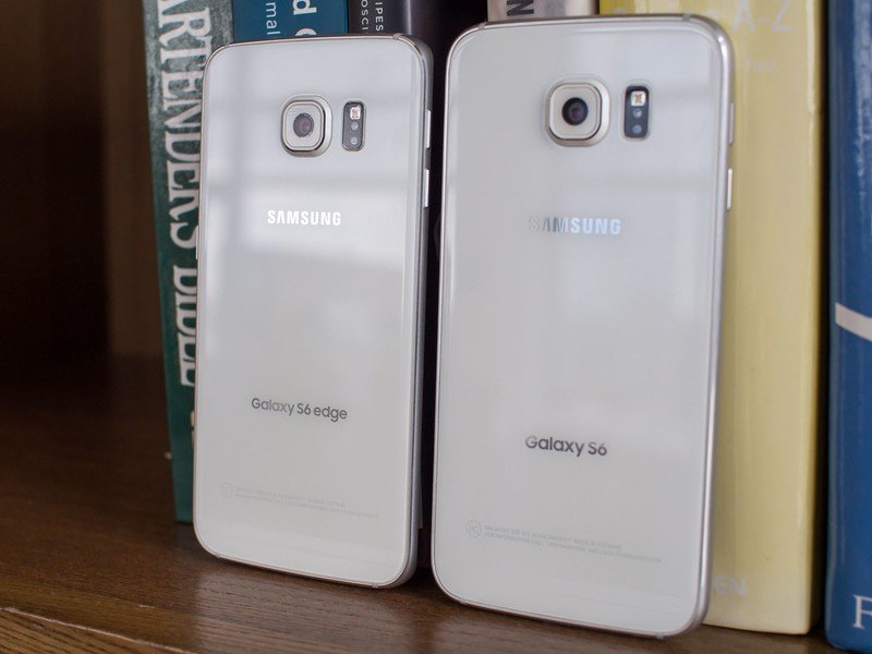
Throughout this review you'll notice we refer to the Galaxy S6 as a single device. Everything we say here can be attributed to both the S6 and S6 edge, aside from particular points where differences between the two models are pointed out.
For a good primer on these two phones, we also encourage you to read our in-depth hands-on preview where we cover many aspects of the Galaxy S6 and S6 edge in detail.
Say goodbye to plastic — and a couple creature comforts
Samsung Galaxy S6 Hardware
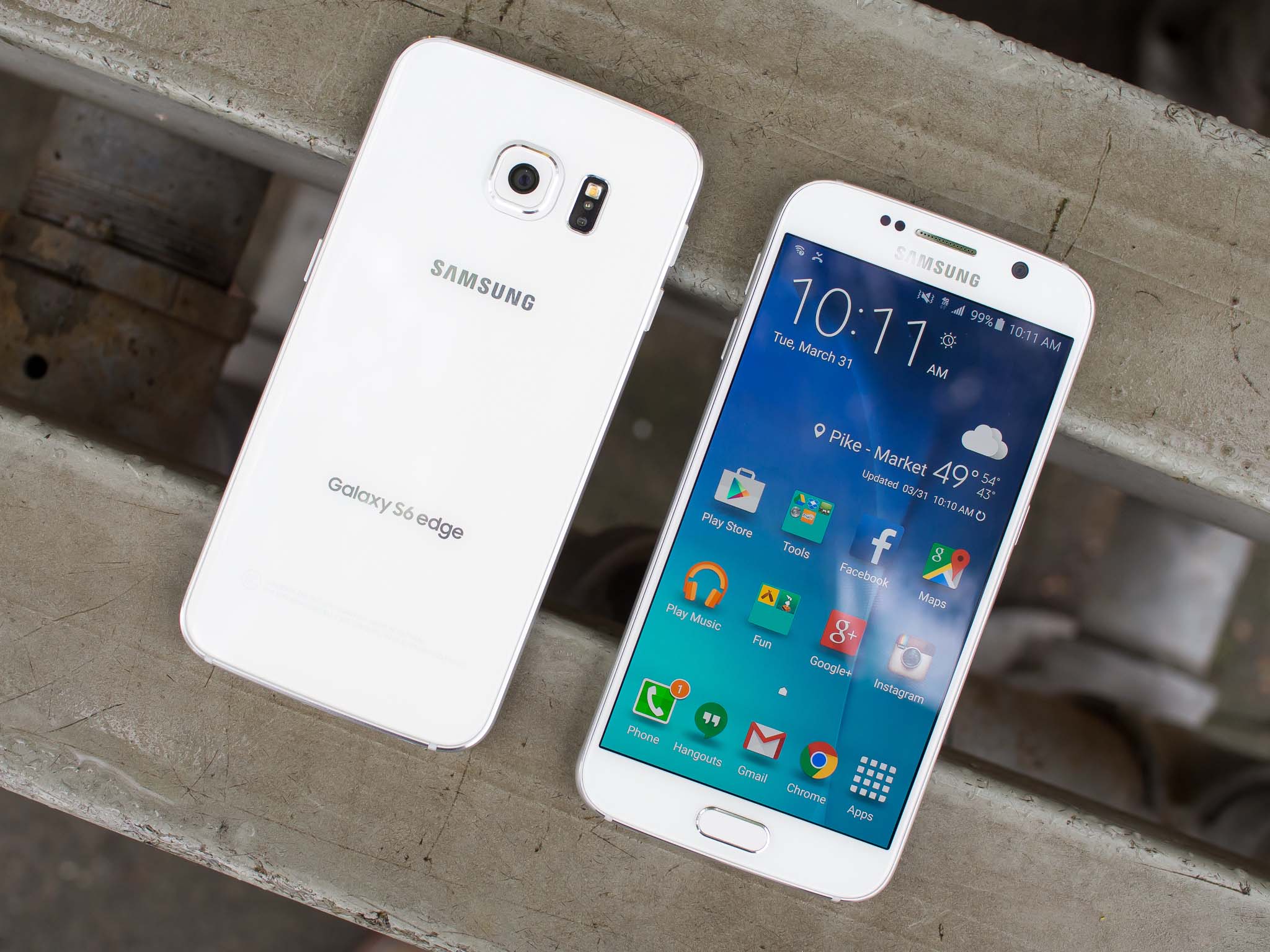
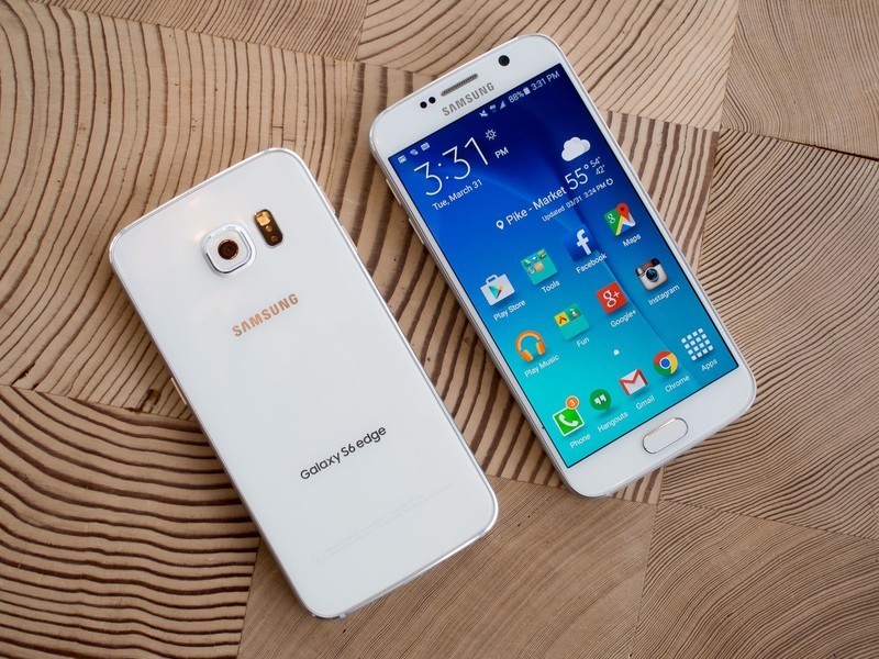
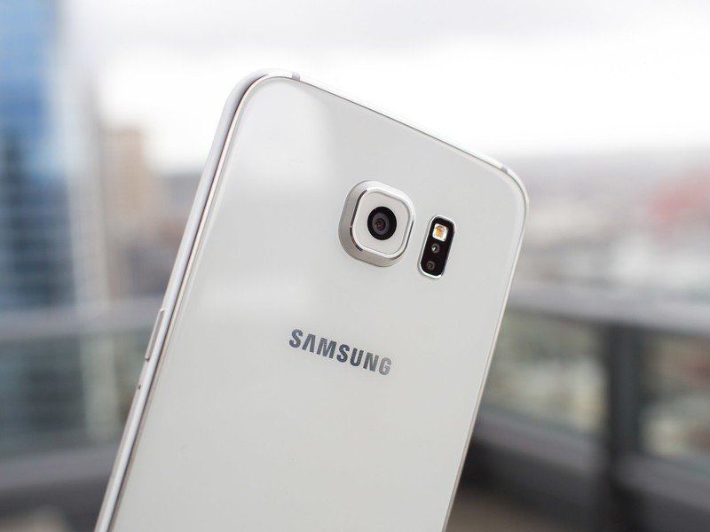
Say goodbye to cheap, flimsy plastic Samsung phones — the Galaxy S6 is here. It's no secret that the Galaxy S5 — and many earlier models — felt like a child's toy, despite costing north of $600 unlocked. Samsung has finally addressed these build quality criticisms in its 2015 flagship, and the result is something special — metal, glass, appealing colors and tight tolerances add up to a very impressive piece of technology.
Metal, glass, appealing colors and tight tolerances add up to a very impressive piece of technology.
Of course the S6 still has the general shape of most other Samsung phones — rounded corners, home button below the screen, Samsung logo below a speaker grille up top. But the shape was never the problem, it was all about the build quality and materials — and both have dramatically improved here.
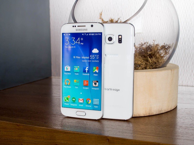
While we've all seen plenty of glass-backed phones before, that doesn't make this kind of design any less impressive when it's properly executed. Samsung has used a familiar "2.5D" technique for both the front and back glass so it flows elegantly into the metal frame. Importantly, the same super-tough Gorilla Glass 4 is used on both sides, while some other manufacturers may cheap out on the back panel.
The metal frame is also masterfully done, as it flows straight through the middle of the phone in one piece, providing extra strength. Rather than opting for perfectly round and slippery edge — like another well-known metal smartphone — flattened portions along the sides give a little extra grip. That's important, because this phone is a tad slick — the "glass and metal sandwich" design certainly looks nice, but it comes at a cost in terms of both ergonomics and durability.
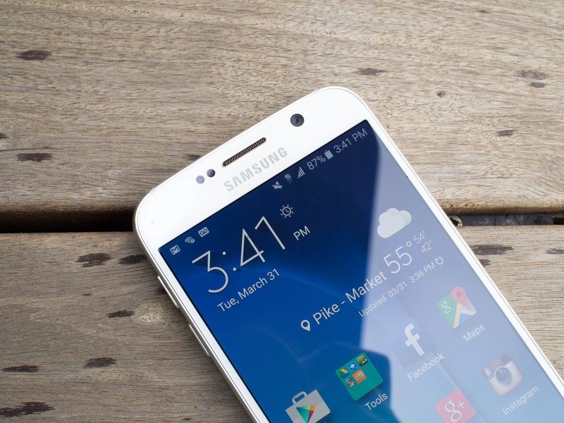
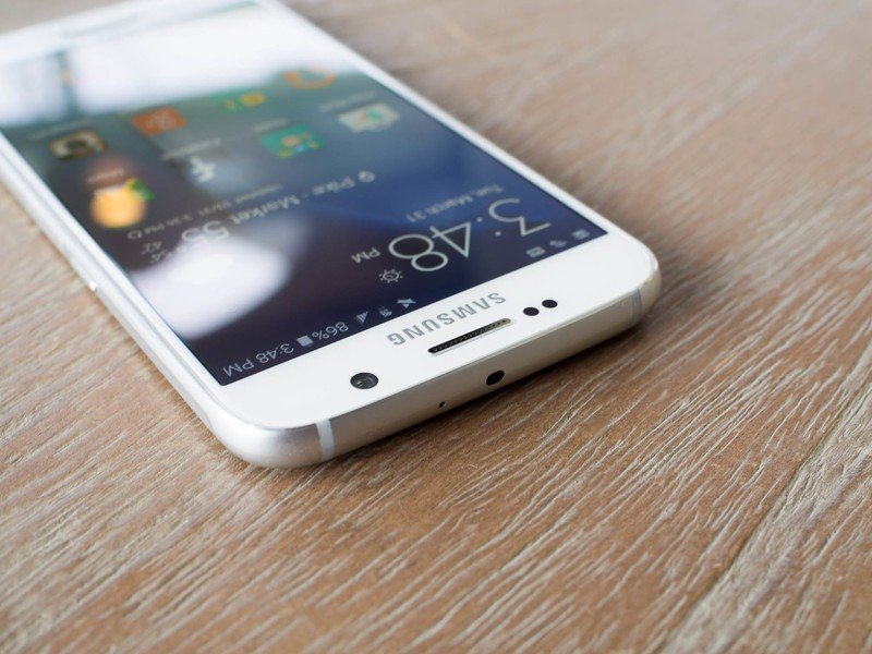
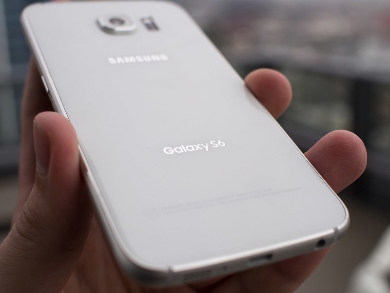
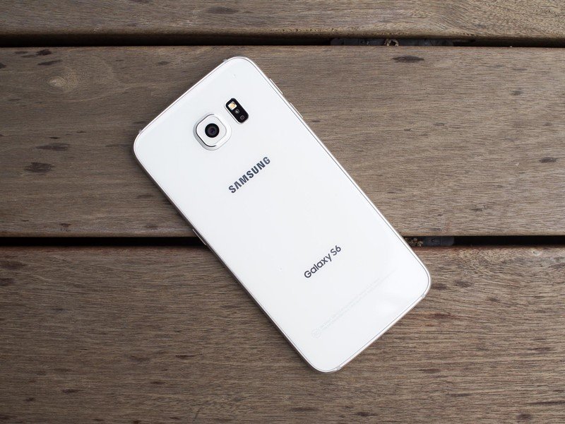
Human hands are not flat. They're flexible and made up of rounded fingers of varying sizes. That's not some huge revelation, but it's something to consider when you look at a phone that is perfectly flat on the back. A flat phone with barely-rounded edges just isn't the best shape to nestle into your hand comfortably, as anyone who's used a Nexus 4 or Xperia Z3 will quickly tell you. The Galaxy S6 hasn't cracked this particular problem — it's fairly large, flat and slick. And that means the phone just isn't as grippy or easy to hold onto as the mostly-flat but plastic Galaxy S5, or a curved metal phone like the HTC One M9 (to say nothing of the latter's anti-slip coating), or the Moto X with its curved, leather (or wood or plastic)-covered back.
I can't really say the Galaxy S6 is "comfortable" to use; instead it feels a cold piece of technology in the hand. There's nothing comforting or natural about trying to hold onto something flat and angular and just a little bit slippery — that's something you may or may not get used to with time. If you opt for the "edge" model you'll have thinner sides to hold onto. That actually helps a bit, but it doesn't change the fact that the entirety of the back of the phone is flat.
Of course if your brand new Galaxy S6 happens to jettison itself onto a hard surface, it now has twice the available glass to be broken as well. And no matter how tough Gorilla Glass 4 is, it's sure to crack given enough force — or sufficient bad luck.
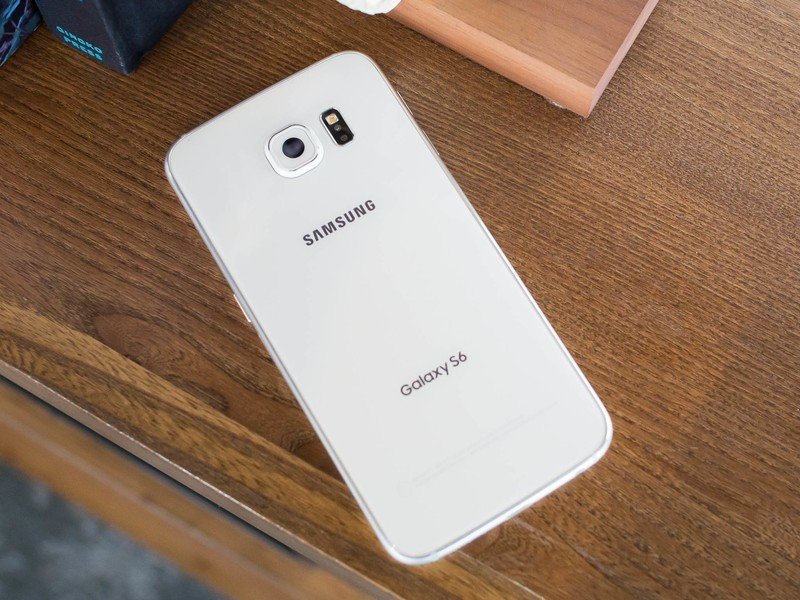
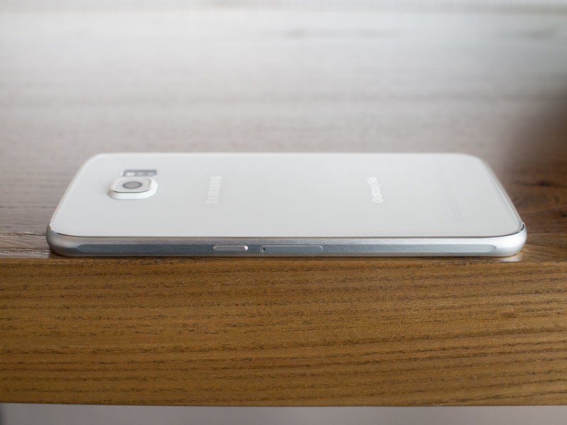
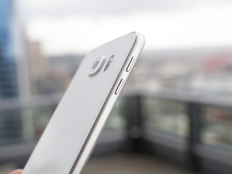
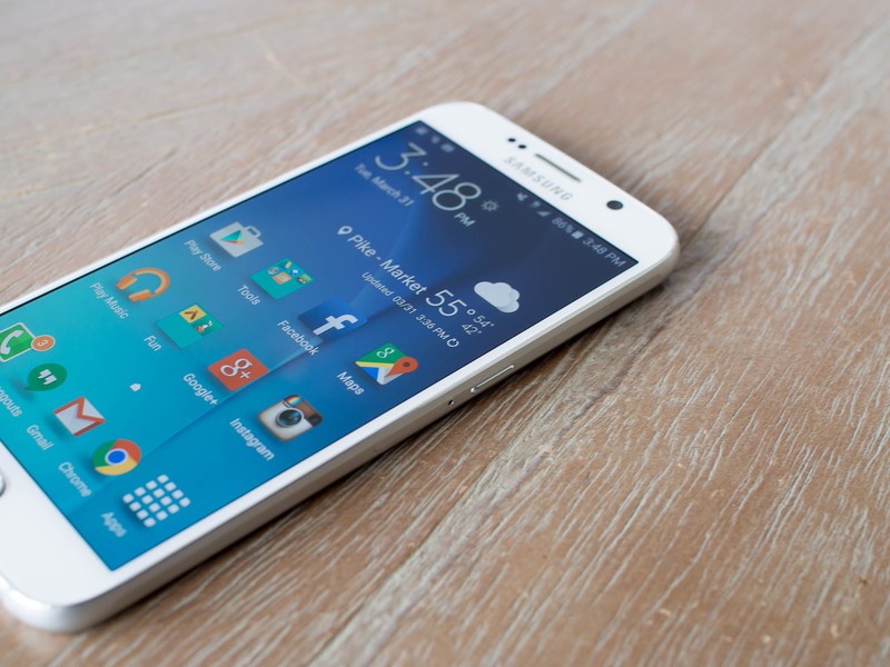
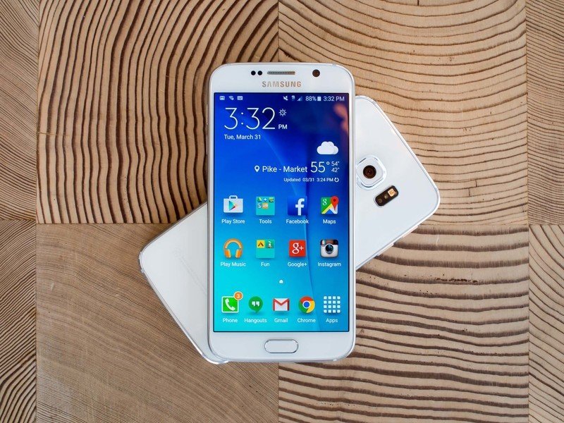
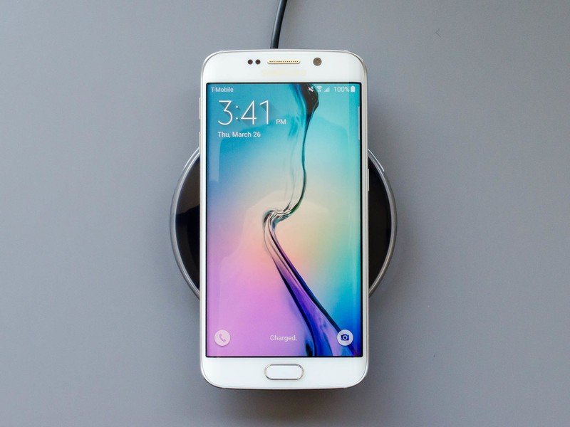
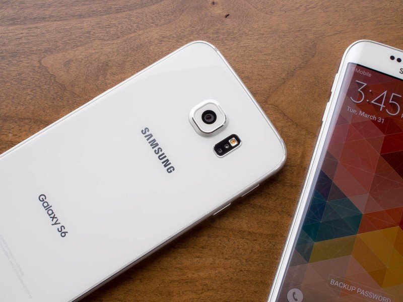
Thankfully, the protruding camera bump on the back (which isn't a big deal, or a deal of any size, really) keeps the phone from sliding off of flat surfaces like a hockey puck on a freshly Zamboni'd ice rink — something other glass-backed phones have to deal with. But there's still plenty of glass to help it slide off of many popular Qi chargers — even Samsung's own charger doesn't hold the GS6 securely for long periods of time unless you place it just right.
Ergonomic quibbles aside, it's really hard to complain about any area of the Galaxy S6's hardware or design.
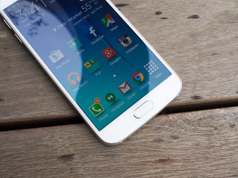
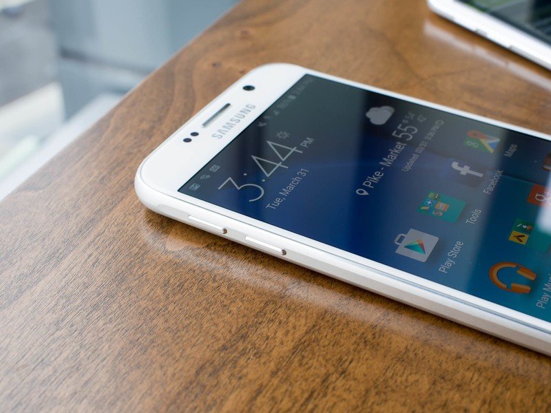
One of the most subtle changes to the design compared to previous Samsung devices is the slightly taller home button, which now houses a one-touch fingerprint sensor. No longer do you have to shift the phone awkwardly in your hand to swipe a digit across the home key. Like Apple's TouchID, just press the button to turn the screen on and leave it there a second more to unlock the device. While the software experience is still limited to phone unlocking and logging into a handful of apps and websites, it's a feature I left turned on — something I can't say about the previous swipe model.
Even with the ergonomic downside of a flat and angular phone, I find it hard to complain about any area of the Galaxy S6's hardware. It's refreshingly easy (though not entirely comfortable) to hold in the hand thanks to Samsung keeping the same 5.1-inch screen size and shaving down the bezels, uses premium materials all-round and is very well manufactured. While the Note 4 was a big step forward in hardware for Samsung, it feels like the Galaxy S6 is the final realization of that design.
A huge list of boxes to be checked
Samsung Galaxy S6 Specs
The Galaxy S6 ticks just about every box when it comes to high-end internal hardware in a 2015 smartphone. While much has be made of Samsung using its own processor rather than a Qualcomm chip, that's not something most users will (or should) care about. That high-end Exynos CPU is backed up with 3GB of very fast RAM and 32 to 128GB of storage. A brilliant 5.1-inch QHD AMOLED display is on the front as well, offering all of the features that made the Note 4's screen great — as I'll discuss in more detail later, it's every bit as bright and vivid.
The lone shortcoming here is the 2550mAh battery (or 2600 on the S6 edge), which definitely is on the small side for a flagship phone. It's about 10 percent larger than the cell on a similarly-sized Moto X (a phone not known for great battery life) and 13 percent smaller than an HTC One M9. Of course Samsung is doing its best to make up for that size by including its Adaptive Fast Charging, which works with Qualcomm Quick Charge 2.0-compatible chargers, as well as both leading wireless charging standards — Qi and Powermat.
| Category | Specification |
|---|---|
| Operating System | Android 5.0.2 Lollipop with TouchWiz |
| Display | S6: 5.1-inch QHD (2560x1440) 577ppi Super AMOLEDS6 edge: 5.1-inch QHD (2560x1440) 577ppi Super AMOLED with dual curved edges |
| Processor | Octa-core 4x2.1GHz + 4x1.5GHz 64-bit 14nm Samsung Exynos processor |
| Storage | 32GB, 64GB, 128GB (non-expandable) |
| RAM | 3GB LPDDR4 |
| Rear Camera | 16MP, OIS, ƒ/1.9, auto real-time HDR, low-light video, high clear zoom, IR detect white balance, virtual shot, slow motion, fast motion, pro mode, selective focus |
| Front Camera | 5MP, ƒ/1.9, auto real-time HDR, low-light video |
| Network | LTE Category 6 (300/50Mbps) |
| Connectivity | 802.11a/b/g/n/ac (2.4/5GHz), HT80 MIMO(2x2), 620Mbps, dual-band, Wi-Fi Direct, Mobile hotspotBluetooth 4.1 LE, A2DP, atp-X, ANT+GPS, GLONASS, NFC, IR remote, USB 2.0 |
| Sensors | Accelerometer, ambient light, barometer, compass, fingerprint, gyroscope, hall, heart rate monitor, HRM, proximity |
| Charging | USB 2.0, Powermat wireless (PMA 1.0, 4.2W output), Qi wireless (WPC 1.1, 4.6W output) |
| Battery | S6: 2550mAh (non-removable)S6 edge: 2600mAh (non-removable) |
| Dimensions | S6: 143.4mm x 70.5mm x 6.8mm / 5.65-inches x 2.78-inches x 0.27-inchesS6 Edge: 142.1mm x 70.1mm x 7.0mm / 5.59-inches x 2.76-inches x 0.28-inches |
| Weight | S6:: 138g / 4.87ozS6 edge: 132g / 4.66oz |
| Video | Formats: MP4, M4V, 3GP, 3G2, WMV, ASF, AVI, FLV, MKV, WEBM, VP9 |
| Audio | Codecs: MP3, AMR-NB, AMR-WB, AAC, AAC+, eAAC+, WMA, Vorbis, FLAC, OPUSFormats: MP3, M4A, 3GA, AAC, OGG, OGA, WAV, WMA, AMR, AWB, FLAC, MID, MIDI, XMF, MXMF, IMY, RTTTL, RTX, OTA |
| Samsung software features | Download Booster, OneDrive (115GB free storage for 2 years), OneNote, Private Mode, Quick Connect, S Health 4.0, S Finder, S Voice, Samsung Pay, Smart Manager, Sound Alive+, Themes |
| Samsung security | One-touch fingerprint scanner, KNOX management software |
| Google Mobile Services | Chrome, Drive, Gmail, Google Settings, Google+, Hangouts, Maps, Photos, Play Books, Play Games, Play Movies and TV, Play Newsstand, Play Store, Voice Search, YouTube |
| Colors | S6: white, black, gold, blueS6 edge: white, black, gold, dark green |
Samsung still tops the market in displays; the same can't be said for the speaker
Samsung Galaxy S6 Display and Speakers
At this point I'm still waiting for any manufacturer to catch up with Samsung in smartphone display quality. I couldn't find a single flaw with the 5.7-inch QHD panel on the Note 4, and my feelings carry over point-for-point now that a very similar screen has landed on the GS6, albeit in a smaller physical size.
It goes without saying that pixel density isn't a problem here at 577 pixels packed in every square inch. But the fact that the display still excels in all other areas, even at that insane resolution, is seriously impressive. Viewing angles are great, while colors and extremely vibrant without blowing out whites. Being an AMOLED panel of course blacks are nice and inky, adding to the super-high contrast experience.
Brightness is also very impressive, and the automatic brightness control was perfectly suited for my use 99 percent of the time. And of course when outside, the GS6 can kick on a direct sunlight mode to hit 600 nits of brightness — at the expense of a little contrast — so you can clearly see the screen. The only downside to point out here is that the polarization on the screen isn't completely compatible with all sunglasses. That's not a huge ding — and it's not out of the ordinary for any smartphone, really. It's just something to know going in.
The Galaxy S6's speaker is as bad as its display is great.
Unfortunately for the audiophiles among us, the speaker is as bad as the display is great. Ten small holes drilled into the bottom of the phone provide the small speaker with little room to breathe. And while Samsung is correct in stating that it's much louder than the Galaxy S5, that doesn't mean the quality has made the same jump forward.
Playing music at about 70 percent volume invoked the response of "it sounds like it's under a blanket" from my girlfriend, and I have to agree. Turning up to anything above 50 percent volume the speaker starts to blow out and get considerably tinny, which isn't ideal if you're listening to music. Thankfully at least the speaker is on the bottom, which means it isn't easily muffled when the phone is on a table. You will, however, need to mind where your fingers are. If you cover the speaker even just a little, you'll immediately know it.
Of course I couldn't expect much out of such a small speaker, but seeing what Motorola and HTC have done with front-facing speakers in relatively small packages, I have to say this is an area where Samsung is lagging behind. Expect this speaker to be good for ringtones and podcasts, but never more than a short YouTube video or single song.
A lot of good, weighed down by a long history of bad
Samsung Galaxy S6 Software and Performance
At its global launch event for the Galaxy S6, Samsung executives stood on stage in Barcelona and told a story about how they realized that their software wasn't up to speed and how the Galaxy S6 was headed on a new path. Huge slides of side-by-side screenshots with new and old software showed a big visual change, and the claim of 40 percent fewer features was an appealing one.
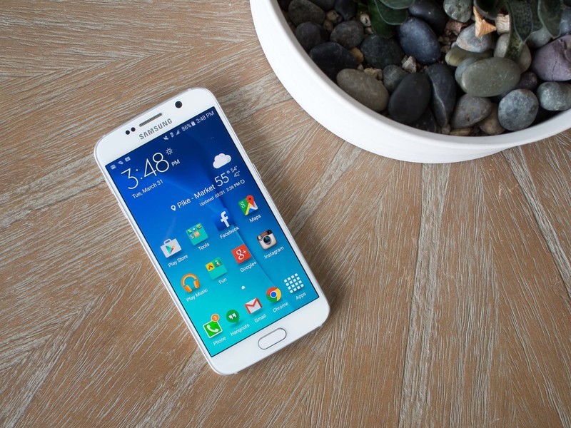
Then you get the Galaxy S6 in your hand, and you realize that even with all of that being true, things are still very familiar if you've used a Samsung phone in the past couple of years. Particularly if you have a Galaxy S5 or Note 4 that's been updated to the latest Lollipop software, what you find on the Galaxy S6 won't seem like a radical departure.
For all the changes and improvements, a lot of the new TouchWiz still feels familiar.
In terms of aesthetics, Samsung has toned back the colors a bit, gotten rid of a few more drop shadows and further streamlined to remove useless animations. But you're still faced with lots of unnecessary ... stuff ... everywhere, including bright colors, weird shadows and both under- and over-designed interface elements.
Apps that have received the most attention, like Messages and S Health, look really good, but they don't fit in well with some of the other portions of the interface that haven't yet been updated — like many icons, widgets and older apps. Thankfully the "sounds of nature" are for the most part gone, but many old vestiges of yesteryear's TouchWiz still linger here.
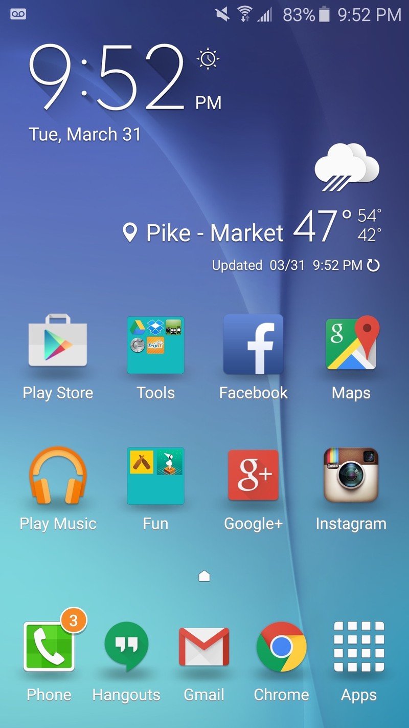
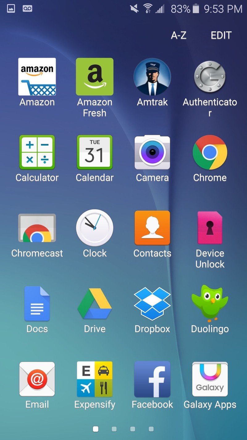
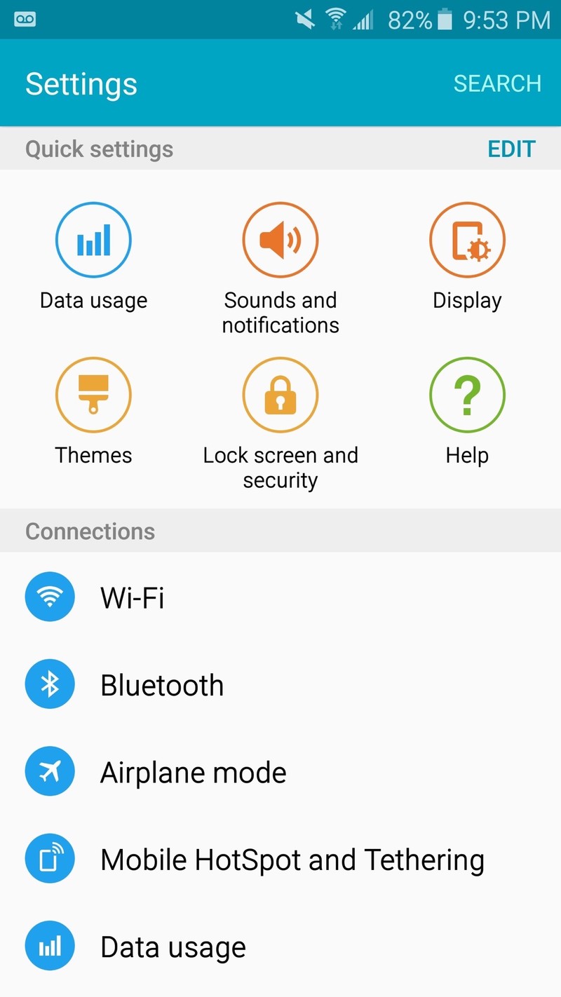
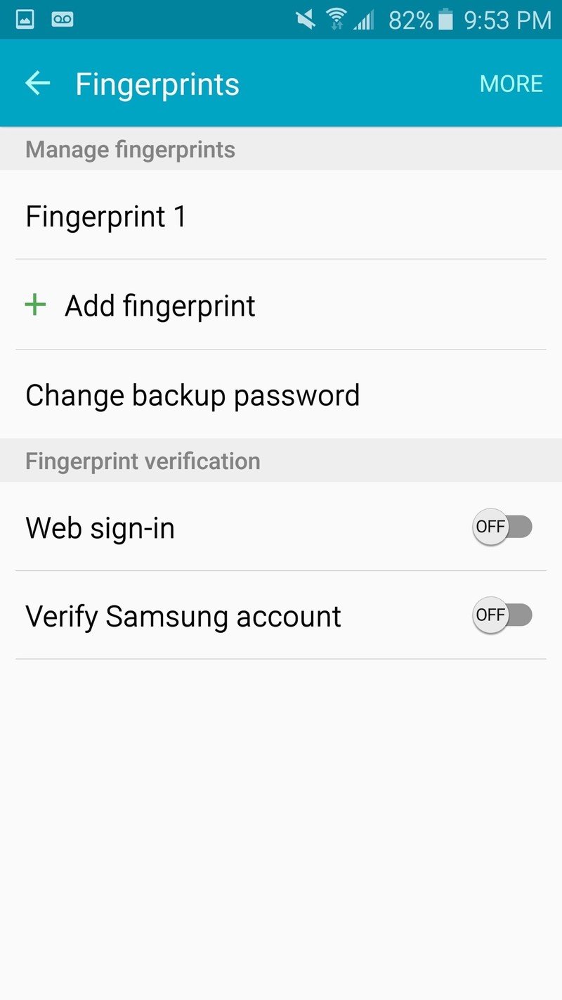
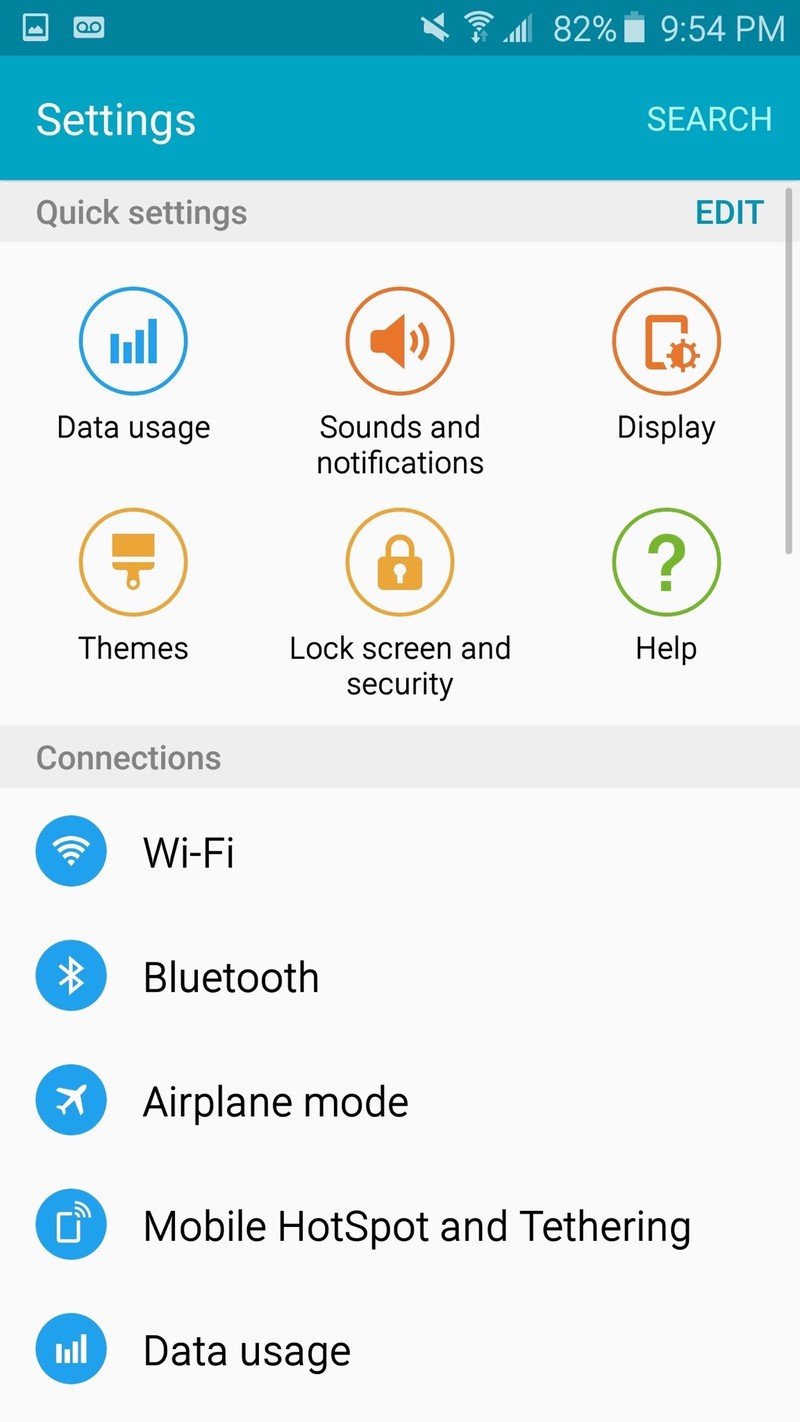
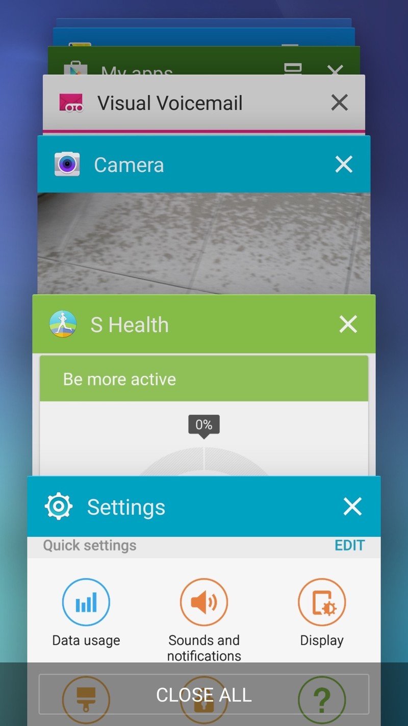
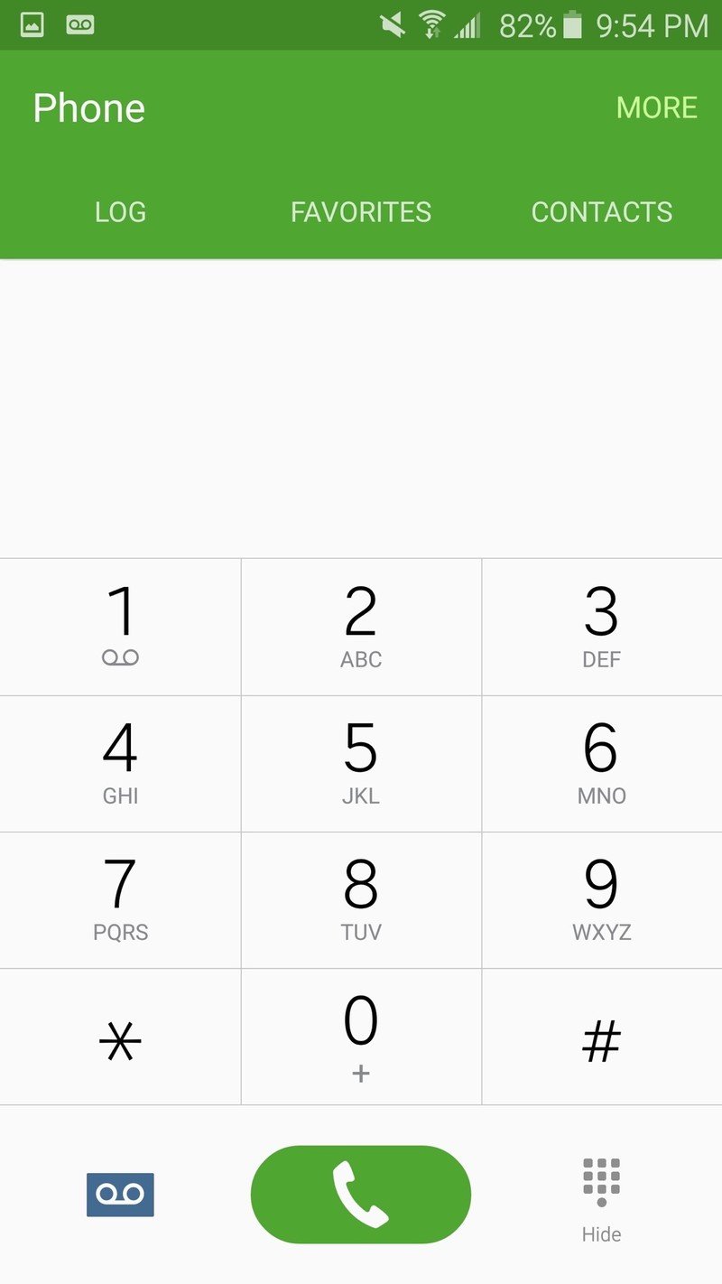

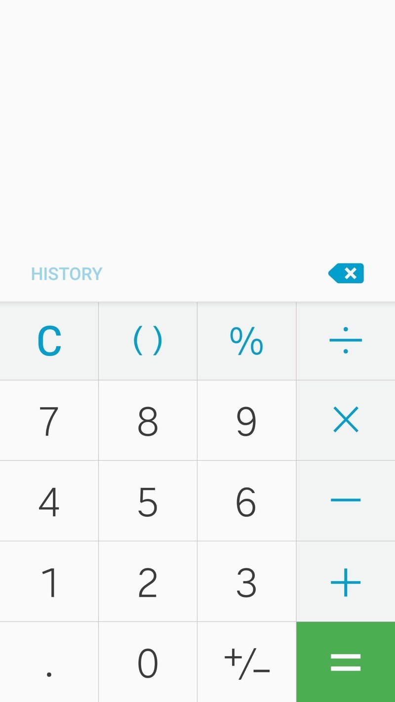

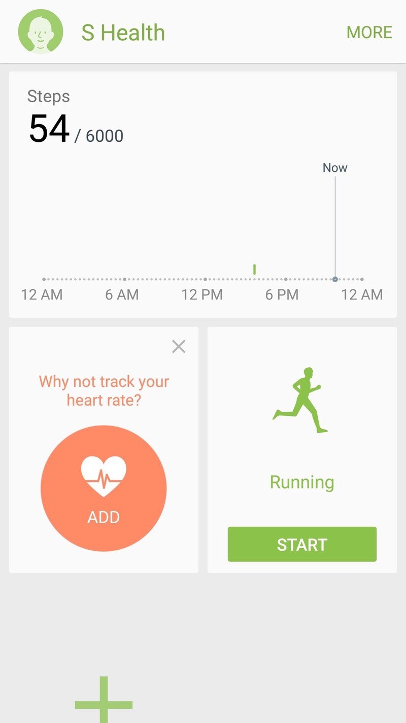
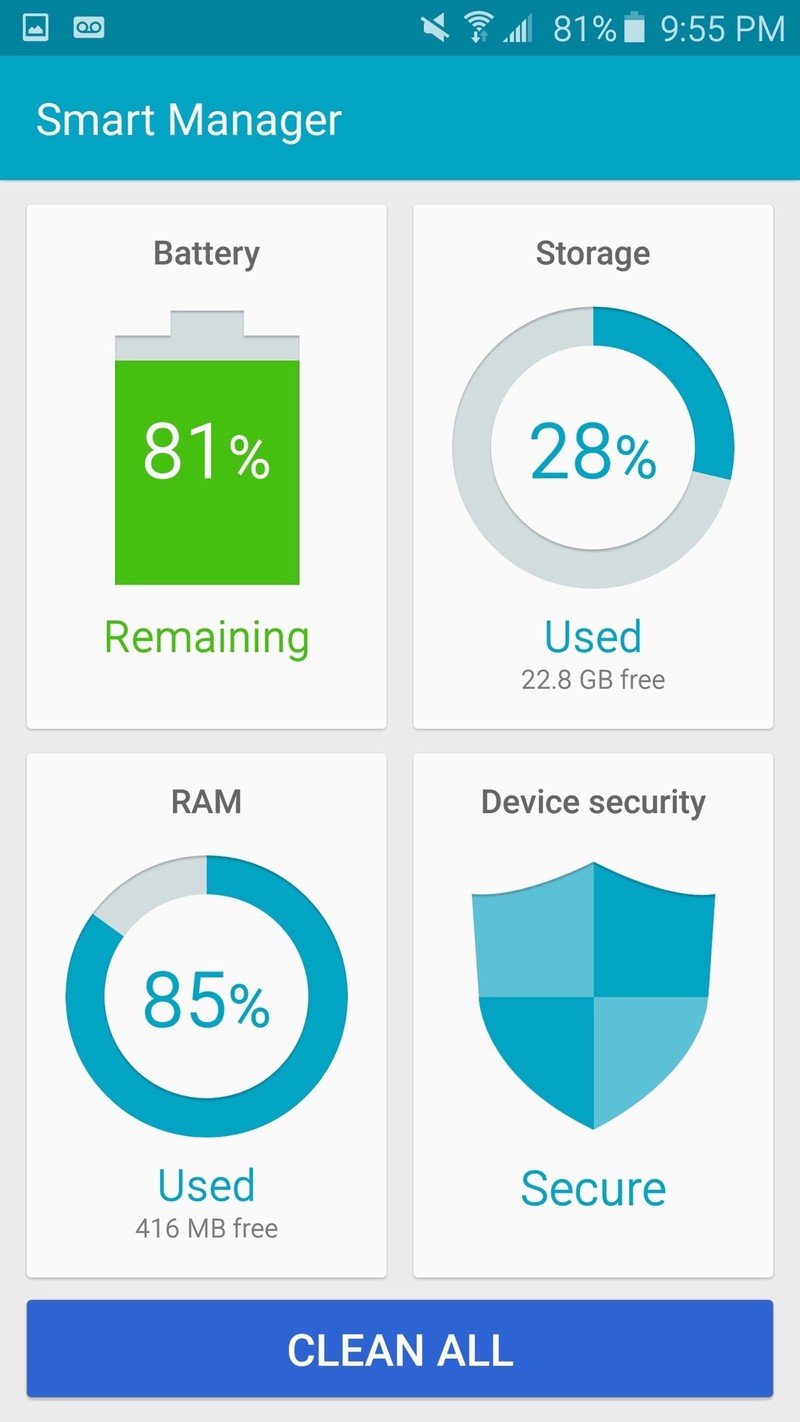
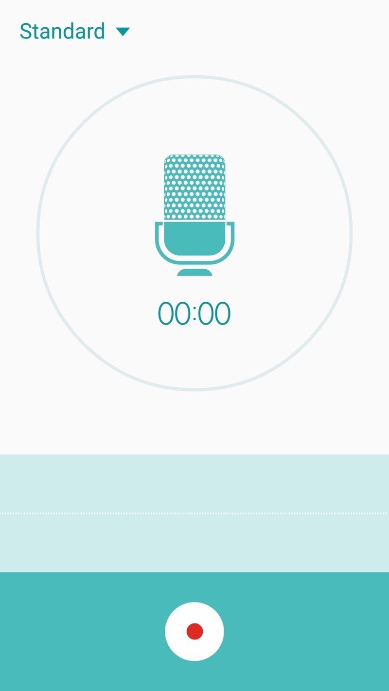

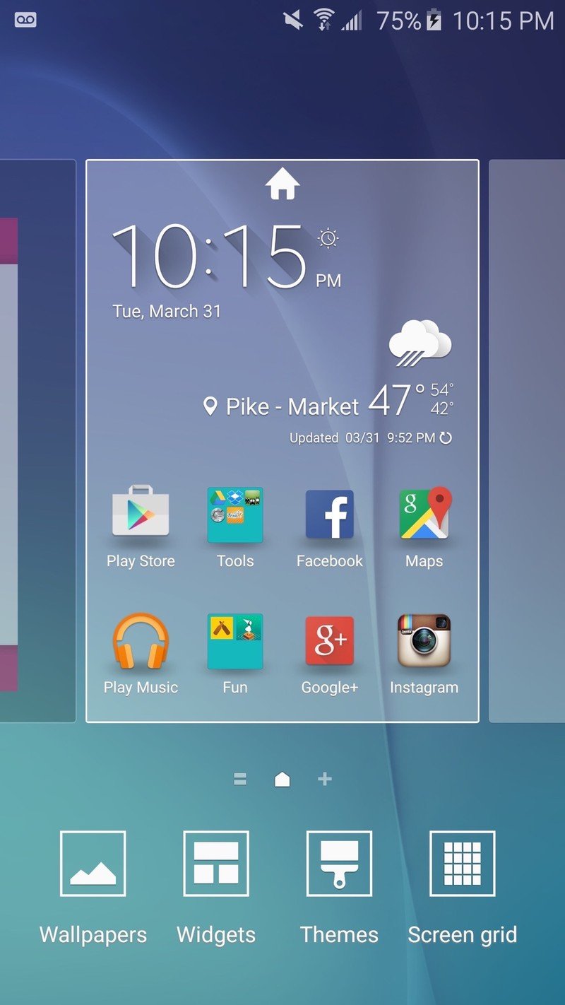
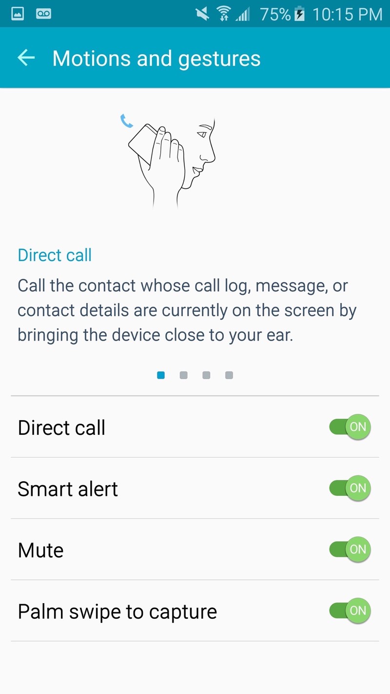
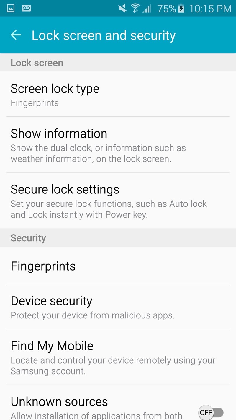
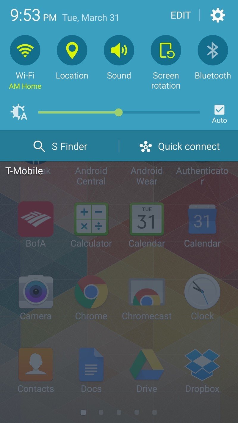
If you're coming from an earlier Samsung phone to the Galaxy S6 then that familiarity may be beneficial — and sure, Samsung can only move so fast while keeping its current user base happy. But the interface still feels like it's lacking a bit of sophistication and cohesiveness. Personally, I would rather see Samsung chase after the more modern interfaces that HTC and Motorola have on their phones in an effort to attract new customers, but doesn't look like the goal here.
And of course that point could be completely moot if Samsung decides to leverage its built-in theme engine to let users choose the design of their software. Currently the theme engine on the Galaxy S6 is limited to about a dozen Samsung-approved themes that are generally awful, but simply opening up the store to third-party submissions would be a real game-changer — Samsung would get its default look, and restless users could pick something new altogether.
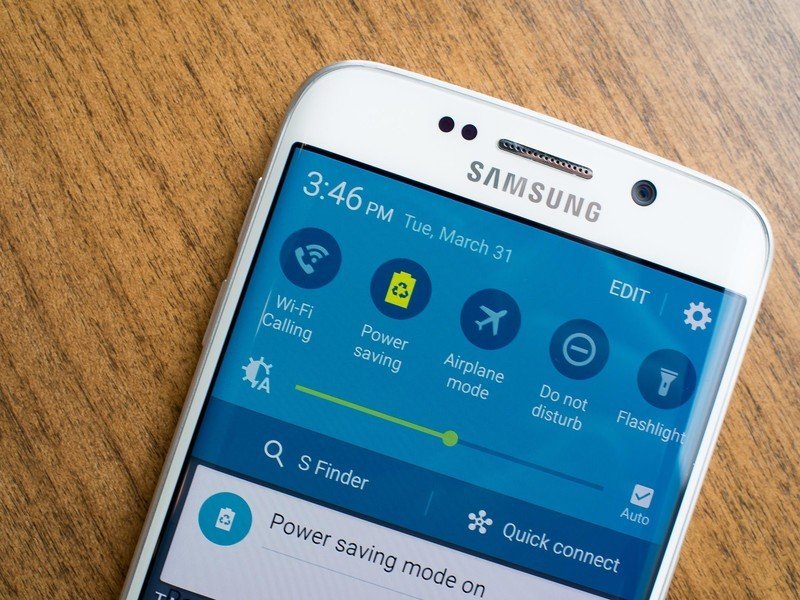
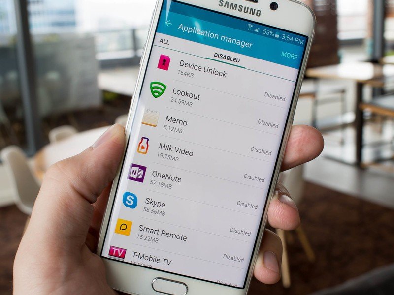
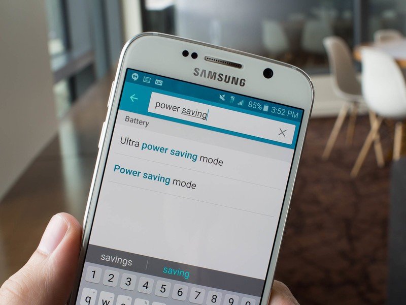
Beyond just the interface design, I can thankfully say the sheer number of features on the Galaxy S6 has been reduced significantly, and many of the features that remain are turned off by default or unable to be tweaked past their default state. That keeps new users from being overwhelmed by a flood of bells, whistles and toggles when they first start up the phone, and removes plenty of cruft that nobody wanted anyway. One major addition is Pop-up (windowed) apps capability brought over from the Note 4, but beyond that the feature set is pleasantly simplified.
So how does the slimmed-down interface translate into performance? Well, it's a bit of a mixed bag.
So how does the slimmed-down interface translate into performance? Well, it's a bit of a mixed bag. Samsung seems to have addressed long-standing issues with performance around the interface, including speeding up the multitasking view and dramatically reducing the time it takes to launch and switch apps. Animations are also smooth for transitions and hopping between different parts of the interface, and the processor seems more than capable of handling multitasking, 3D games and high-resolution media playback. Unfortunately the speed isn't ubiquitous on the Galaxy S6 — there are some slowdowns still.
Samsung's new processor is designed to intelligently hand tasks between four high-powered and four lower-powered cores for the right balance of performance and efficiency. For the most part that seems to work just fine, but I still found the phone to inexplicably slow down on occasion with mundane tasks like typing a message or scrolling through my Twitter app. That's frustrating, but it's even more frustrating when the experience is usually fast and smooth throughout the phone.
I couldn't narrow down any root cause to the slowdowns, even through factory resets and troubleshooting — but I do have to say these are things that just shouldn't be happening at this point on a flagship phone that'll cost you $650 to $1,100 outright. Samsung may have smoothed out its interface and trimmed back on years of feature creep, but after spending time with the GS6 I can tell there's still some work to do.
But to say that the small performance hiccups make the Galaxy S6 much less desirable would be an overstatement. The improvements in Samsung's software interface and experience on the GS6 far outweigh the small shortcomings in performance, and this isn't the only Android phone out there today that stutters from time to time.
A battery meant for average days, with quick charging for the not-so-average ones
Samsung Galaxy S6 Battery life
Unfortunately for those of us who like thin-and-light phones that also last a long time, battery technology hasn't quite caught up with the power requirements of high-end smartphones. Creating a powerful device that can handle all the hard work you throw at it while also staying alive the entire day is a tough nut to crack, and it's an equation that's often solved by scaling back processor performance, toning down screen demands or simply throwing a huge cell into the phone.
With a 2550mAh battery in the Galaxy S6 Samsung certainly isn't brute-forcing it with a huge cell, and with some high-end internals and a brilliant screen it definitely isn't easing up on hardware. Samsung's solution to battery life is to make the phone easy to charge, while also including a couple software tweaks that can help you make the most out of that limited battery when you're away from precious power outlets.
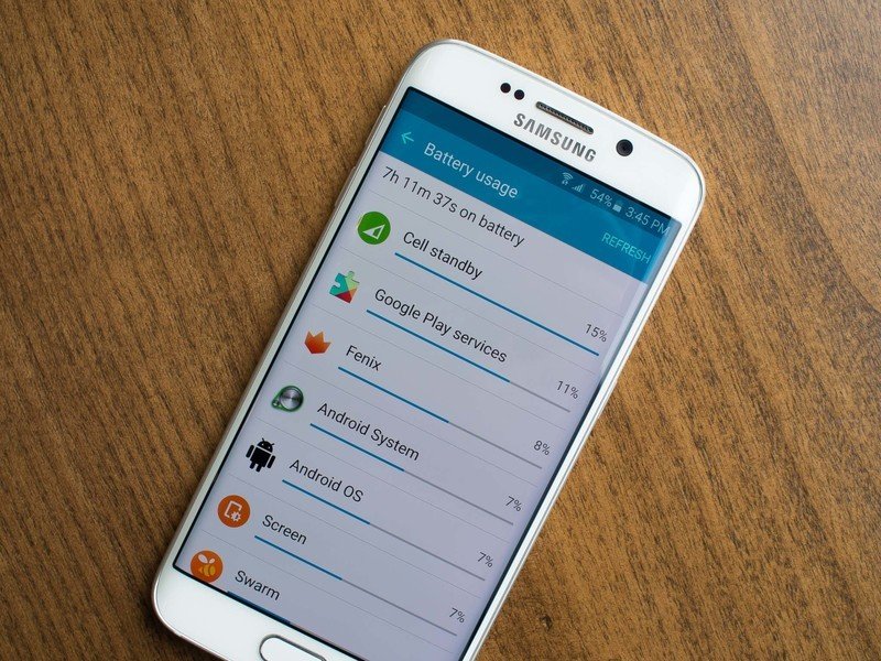
Of course most of us are away from outlets, wireless charging pads and USB cables for a large portion of the day, and that's why actual battery longevity is important. I can say that the Galaxy S6 is far from a battery champion — a title often tagged on the Note 4 — but it will be serviceable for most people with average smartphone habits.
Grabbing the phone off of its charger at 8 a.m. and having it dead as a doornail at 10 p.m. — and that's on an easy day.
In my typical daily use, which includes hefty amounts of time on Wifi, lots of notifications coming in from multiple email accounts, updates from social networks, some podcast and music listening, all with automatic screen brightness turned on, I could get about 14 hours out of a charge.
So for me that's grabbing the phone off of its charger at 8 a.m. and having it dead as a doornail at 10 p.m. — enough for an average day, but of course not every day is average. If I needed to flip on a hotspot when out of the house or spend a little time watching some YouTube videos, I could easily drain the battery in 11 hours instead. That has my phone dying at 7 p.m., and that's not good.
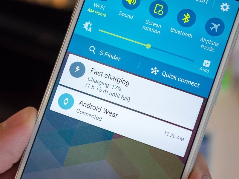
There are a few tools at your disposal for keeping the battery topped up throughout the day. Of course Samsung's built-in Adaptive Fast Charging — compatible with Quick Charge 2.0 chargers — will help, adding power at the rate of about one and a half percent per minute.
The other is either Qi or Powermat wireless charging, which is dramatically more convenient if you've invested in the up-front cost of some charging pads, but it isn't really an option when you're out of the house.
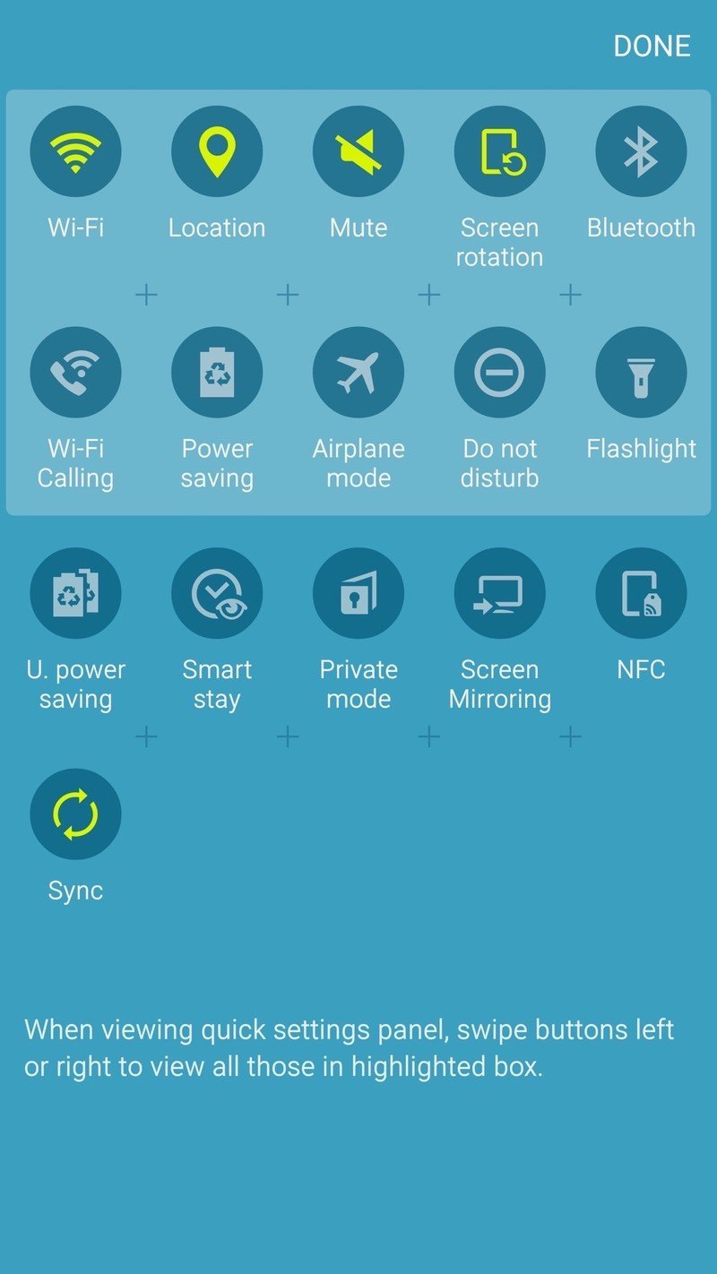
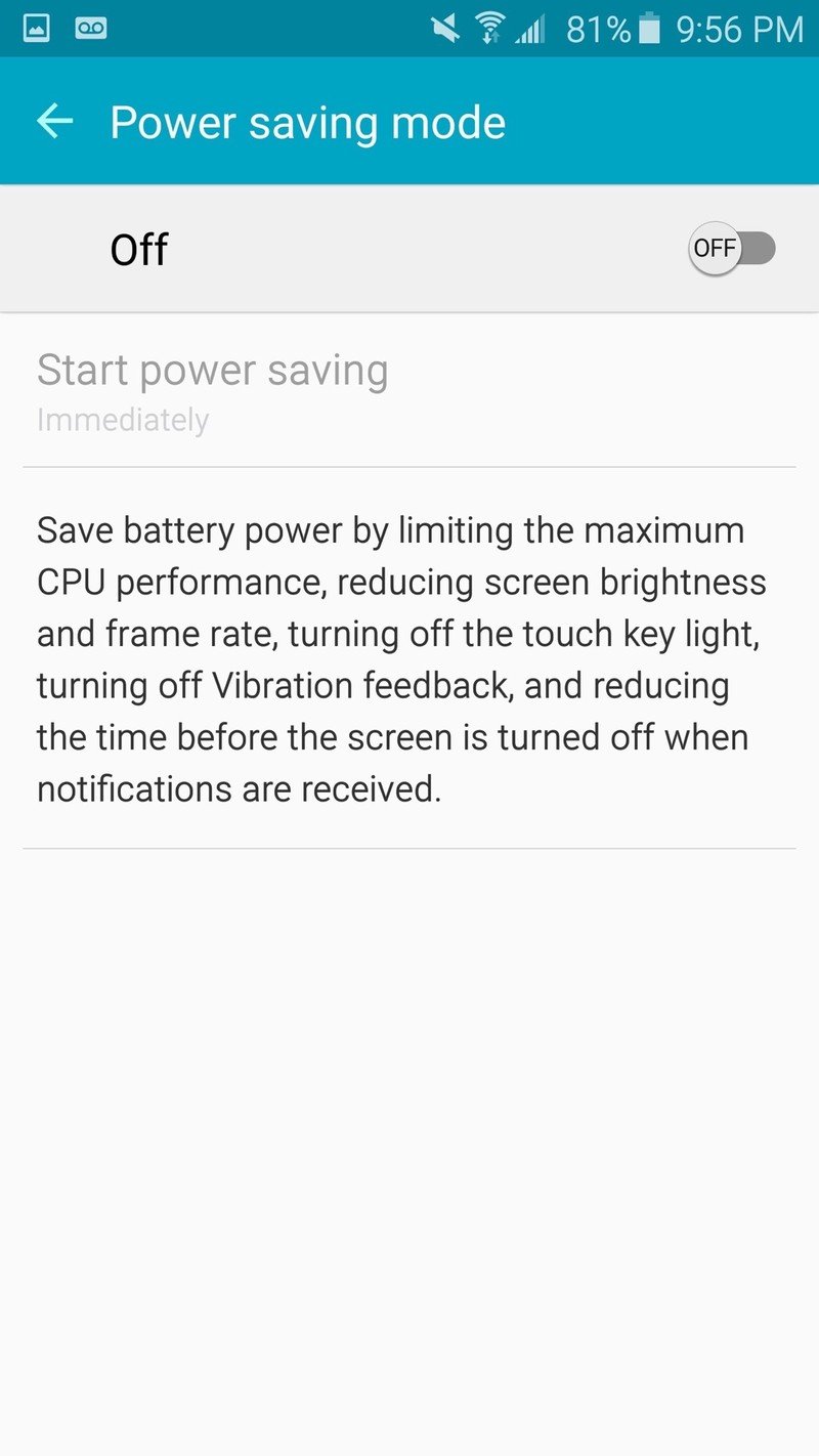
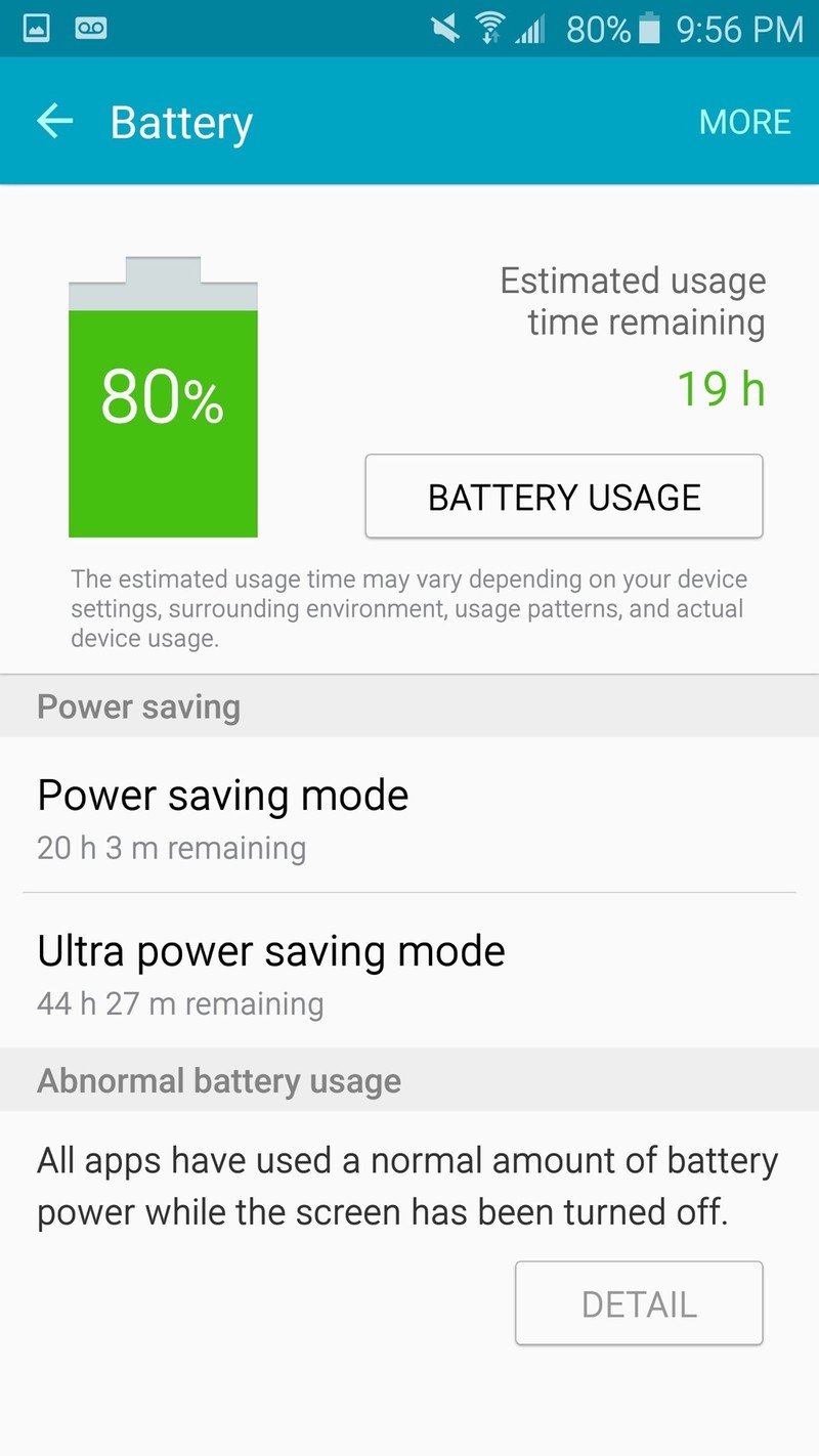
If you don't have a charger of any kind available, a quick toggle to Power Saving Mode will boost battery life about 10 percent by turning down your screen brightness, turning off vibration and scaling back processor performance. The "nuclear option" of Ultra Power Saving Mode is also available, which turns off everything but the absolute basics of the phone, including going to a greyscale display and disabling your mobile networks when not in use.
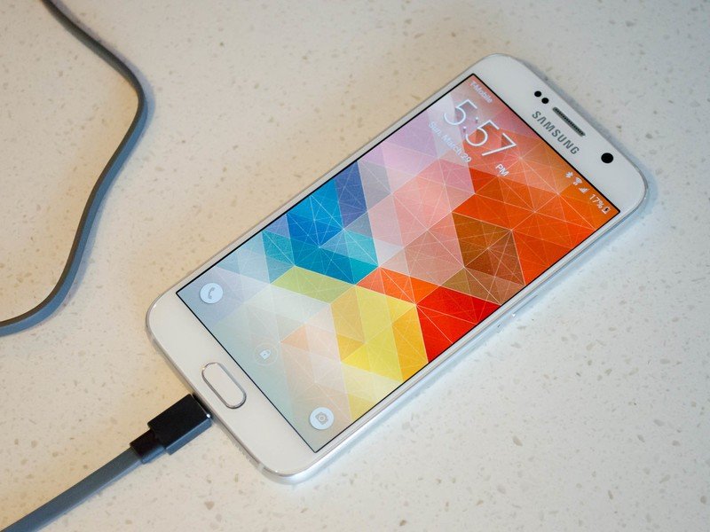
While most self-described "power users" will say that charging throughout the day is not an acceptable way to use your phone, the same isn't necessarily true of most smartphone owners. I'd say my usage is a bit heavier than the average person, and most days I could easily go to bed with battery left to spare. The other days I'd toss it on the wireless charger on my desk here and there, or if I need to know the phone is juiced up for a full night I'd plug it in for 30 minutes.
Should you have to do that on a regular basis? Probably not. Is it a big enough deal to keep you from using this otherwise good phone? That'll be up to you — everyone has a different tolerance for the annoyance caused by regular charging, and we all have different battery needs to begin with.
Your mileage may vary.
The very best all-round Android camera
Samsung Galaxy S6 Cameras
On the whole, last year's Galaxy S5 did not have a good camera. In order to make daytime photos look exceptional, Samsung threw out any hope of decent low-light photography on that device. Things got back on track with the Note 4 — a new sensor, optical image stabilization and some software processing that made that phone one of the leading mobile cameras of that year.
And in the Galaxy S6, we're looking at the same camera sensor as the Note 4 nestled behind an even faster f/1.9 lens with an overall improved camera interface — a seemingly perfect combination. The results are befitting of the hype — this is a really great camera experience.
The results are befitting of the hype — this is a really great camera experience.
The 16MP camera shoots pictures in 16:9 natively but can easily be turned "down" to a 12MP 4:3 crop (which I've done here) with no loss in quality. It can also handle video up to UHD (4K) resolution at 30 frames per second or 1080p with 60 fps, or you can go for slow-motion capture options.
For photos, the standard "Auto" mode handles everything for you nicely, including choosing HDR if the scene requires it. For more advanced users, a new "Pro" mode lets you take control with manual exposure, ISO, white balance, focal length and metering options, giving you every tweak you'd want aside from shutter speed. You can even create and save up to three custom shooting modes with the manual settings you choose.
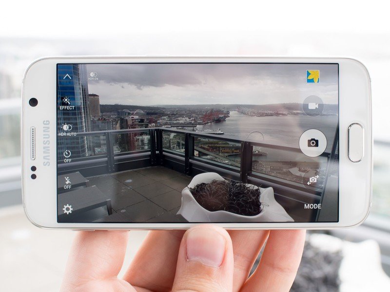
Samsung's camera interface is a lot easier to look at and use than previous iterations
The camera interface is a lot easier to look at and use than previous iterations, and very fast as well. Deeper settings for all of the modes are found in a single camera settings screen rather than in multi-layer menus in the viewfinder, and all of the most-used toggles are surfaced in appropriate locations.
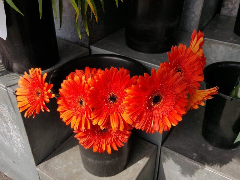
While I like the bevy of options in the Pro mode, I actually shot most of my pictures in auto and got some really great photos. In good lighting the Galaxy S6 takes exceptional photos — they're crisp without being over-processed, natural with just the right amount of punch in colors, and usually close to reality with white balancing.



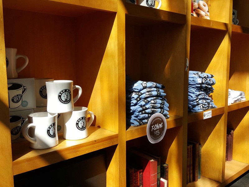
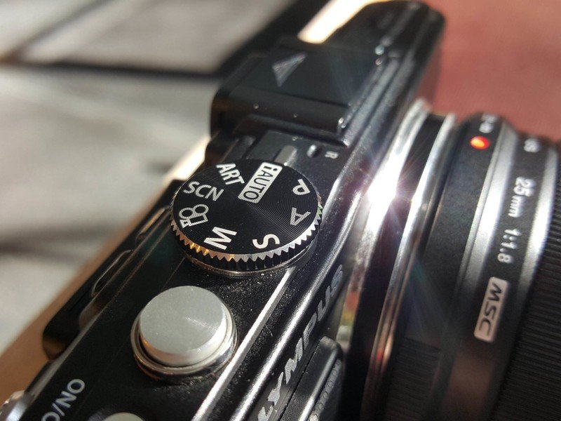


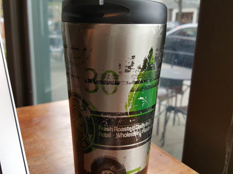

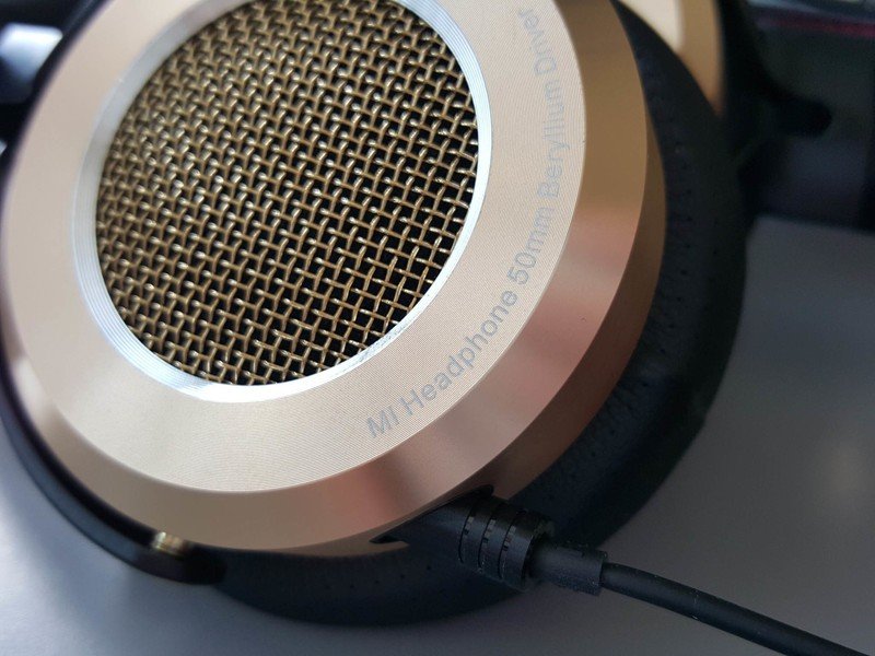




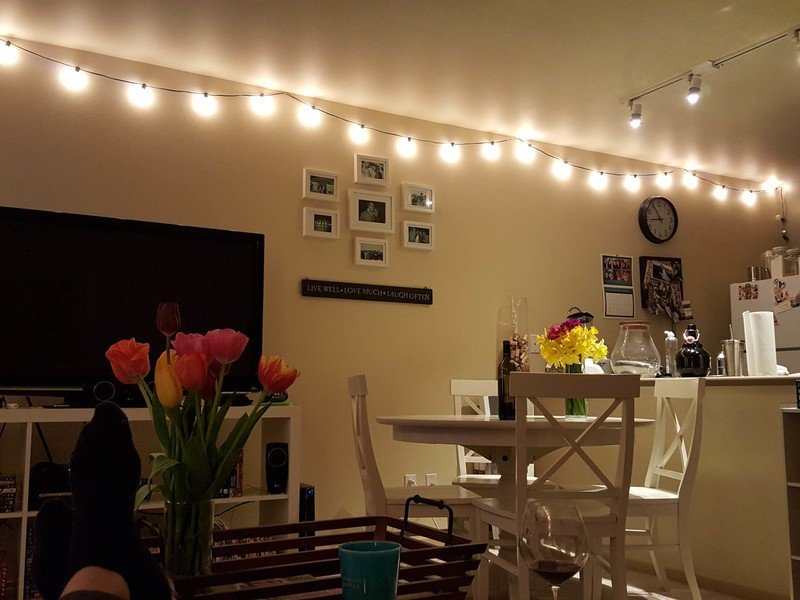

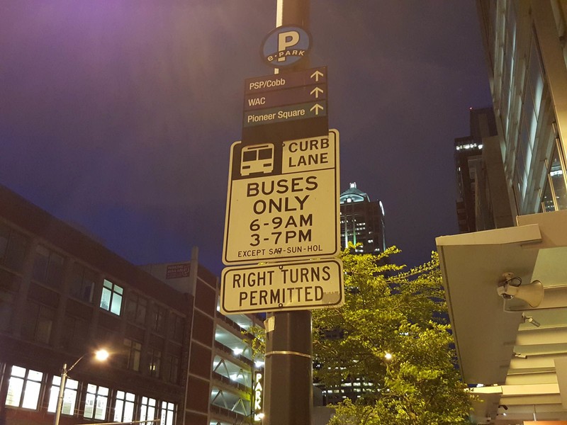
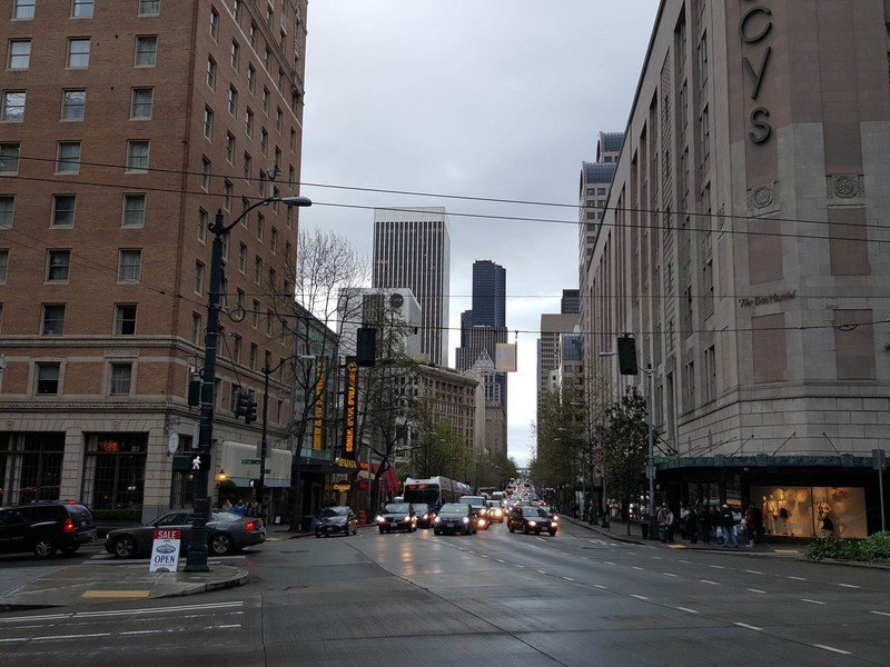

When the lights dim down, the GS6 takes advantage of its f/1.9 lens and OIS to let in more light than any other smartphone camera out there, which means lower ISOs being used and less software processing needed to smooth out shots. In particularly tough situations, like indoors at night with low amounts of light available, the GS6 can take a crisp picture quickly without any blur or long shutter speeds, which is really important for a smartphone camera. When outdoors in the evening, pictures showed a little bit of grain — as you would expect with such a small sensor. But low-light photos looked really good when viewed up-close on anything below a 25-inch screen.
I got all this way through loving the camera without even mentioning an extremely important part of the experience: the new action for launching the camera with a double press of the home button. In any app, at any time, even when the phone is locked, you can double press the home button to launch directly into the camera and start taking photos. Samsung quotes launch times of about 0.7 seconds, and I found average launch times in the one second range personally — which is not only acceptable, it's much faster than any other phone out there today.
Samsung's camera experience offers the complete package, and one that I can't really find a flaw with. The Galaxy S6 can take brilliant pictures in most lighting conditions, and does so quickly and reliably. The ceiling of the photos it can take when you spend some time with it is astronomical, and the minimum photo quality you get from random snapshots is surprisingly high as well.
Get curvy
About the S6 edge
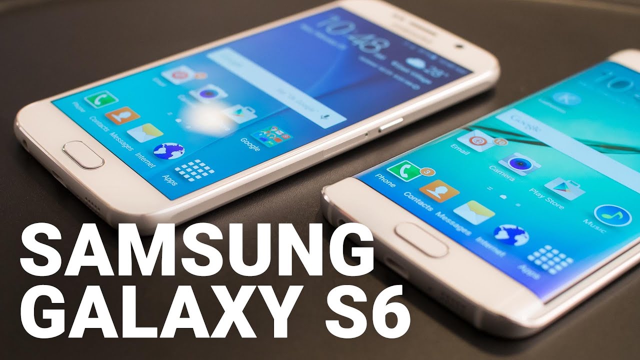
While the Galaxy S6 and S6 edge are almost identical, it's worth pointing out the additional hardware and software that sets S6 edge apart.
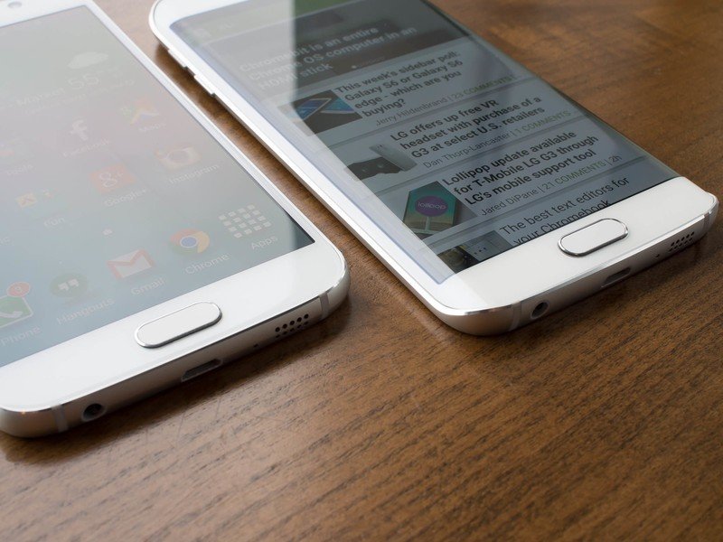
With its display sharply curved along the long edges of the phone, there's no mistaking a Galaxy S6 edge for its flatter sibling. But unlike the Galaxy Note Edge, this is the same screen size and resolution as the regular S6, simply curved on both sides. That means the phone is actually a tad narrower, even though the materials are the same.
There's a dramatic reduction in the amount of metal around the sides, and as a result is a device that's ultimately more awkward to hold.
Samsung managed to keep the power and volume buttons put on the sides, which is no small feat, but there's a dramatic reduction in the amount of metal available to wrap your hands around. The end result is a device that's ultimately more awkward to hold, and it just doesn't feel natural in your hand — even compared to the already angular Galaxy S6.
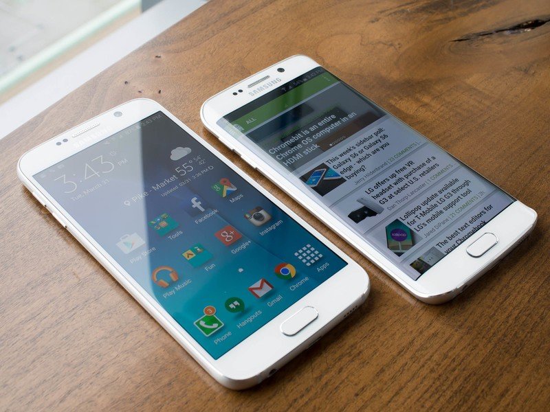
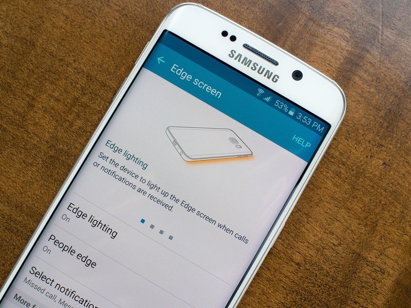
Samsung showed restraint in the software on this latest curved display, paring things back to just a few neat extras on the S6 edge.
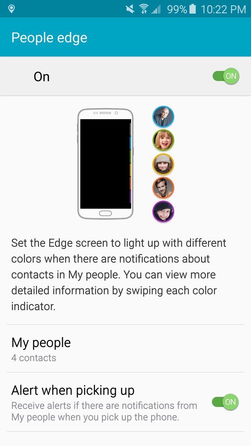
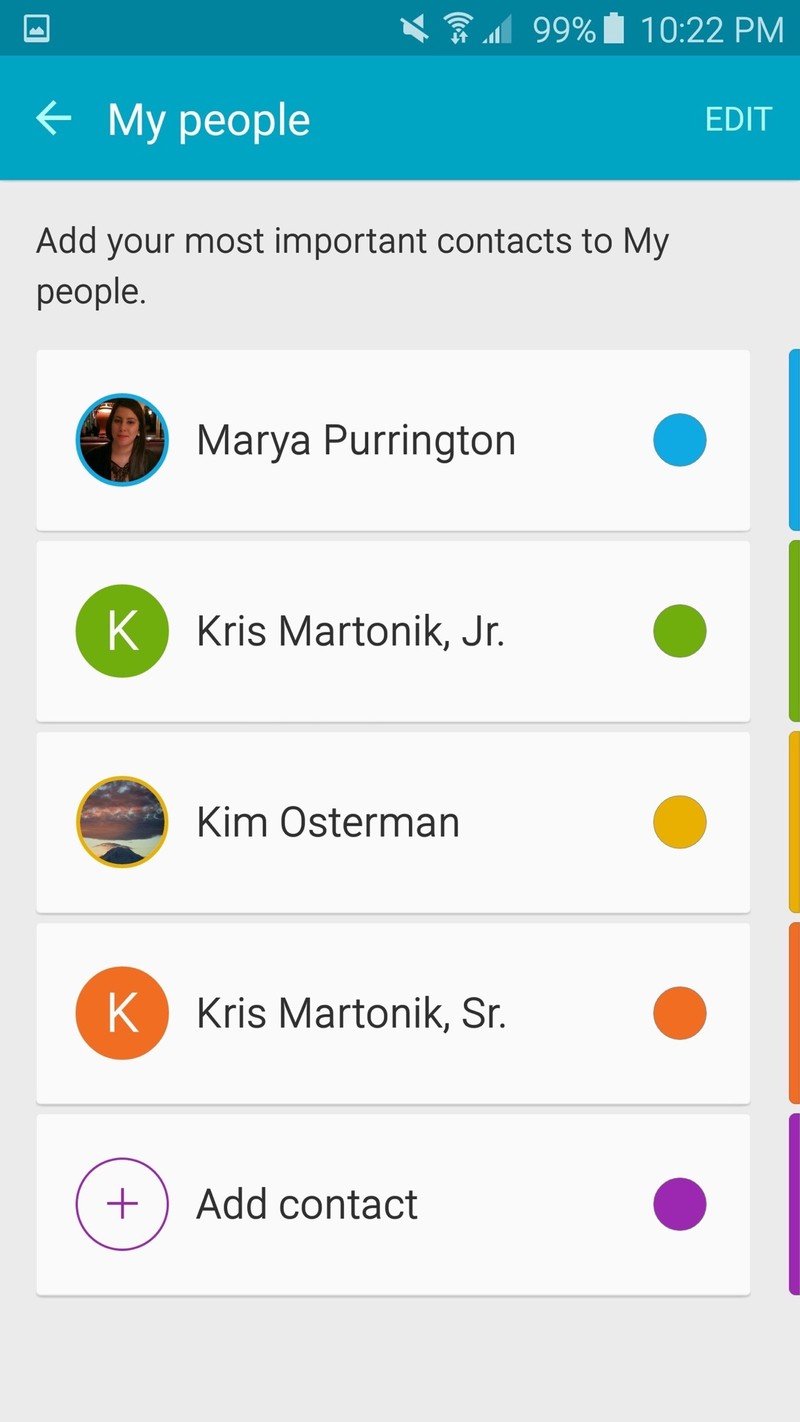
When on the home screen, you can swipe in from the top-right (or top-left, if you choose) edge to reveal a "People edge" experience. You can define up to five favorite contacts, each coordinating to a color, who show up after you swipe with quick options to call, SMS or email those people. You can define which app to use for the actions — like Hangouts for SMS or Gmail for email — which is nice, but you can't choose to add third-party apps like WhatsApp or Skype, for example.
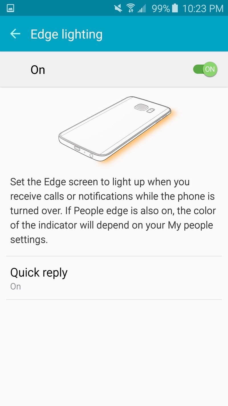
Once you've defined your favorite contacts you'll also receive notifications on the edge when you have a missed call, SMS or email from that person, so long as you use the stock SMS and Email apps. Notifications show up when you swipe in lower on the edge — again, left or right side. When your phone is locked and upside down on the table (which also mutes the phone, if you choose) the edge will light up in the color of your favorite contact when they call you as well. Thankfully, these edge swipe gestures actually work no matter what launcher you choose, so you won't be tied down to Samsung's if you prefer something else.
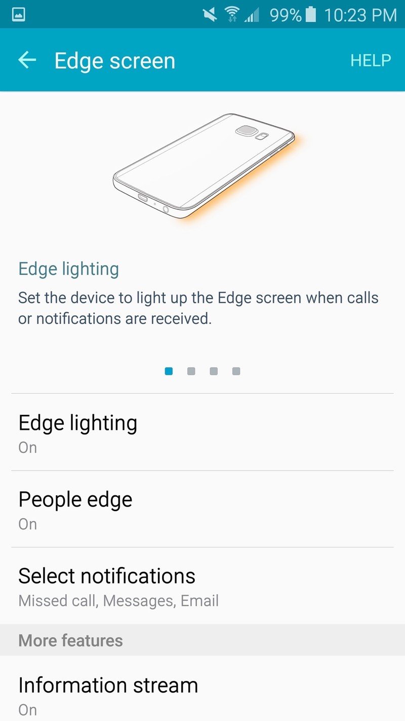
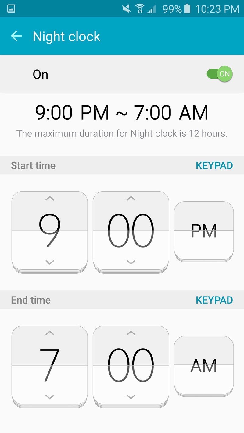
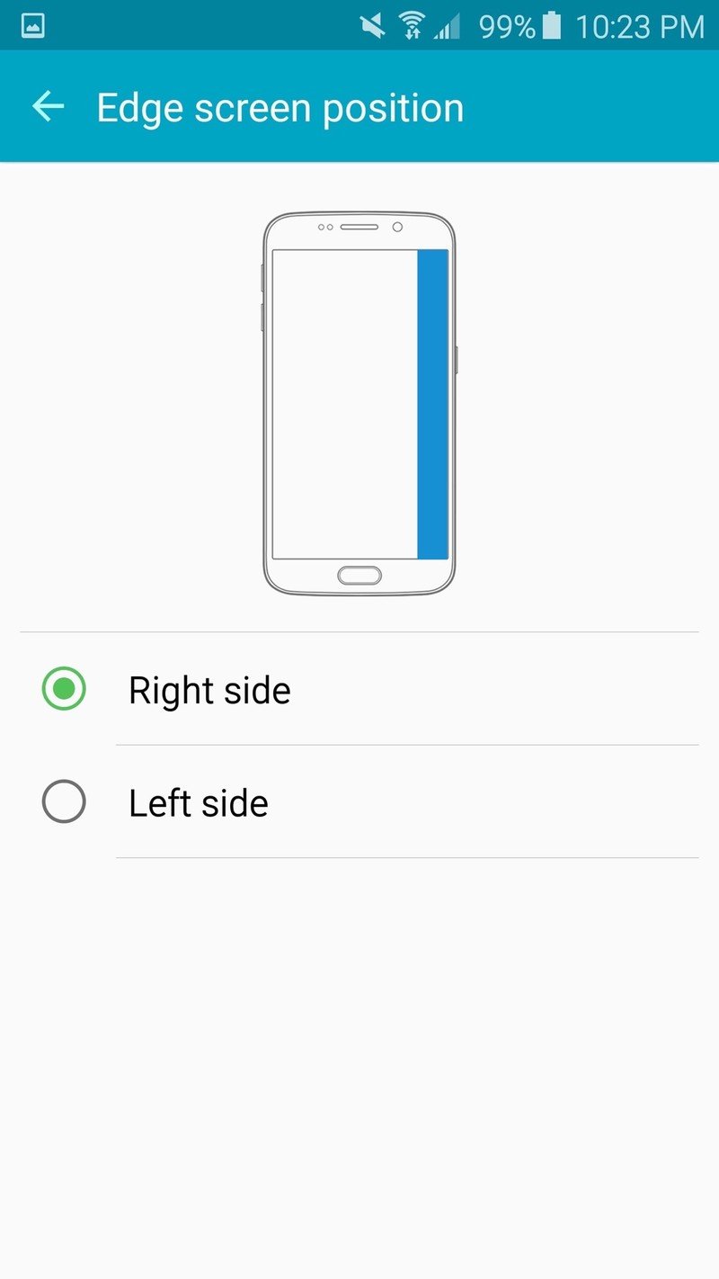
The final bit of edge-only software actually works when the screen is off, and harkens back to the Note Edge. When turned on, the "Information stream" lets you swipe between information panels on the edge to get quick updates on notifications, weather, news and tweets without turning on the full screen. It's no more useful than it was on the Note Edge, but it's definitely a cool way to show off the curved screen. Slightly more useful is the night clock mode, which will softly illuminate the edge with date, time and alarm information for up to 12 hours at a time, even when the phone isn't charging.
Samsung Galaxy S6 and S6 edge: The Bottom Line
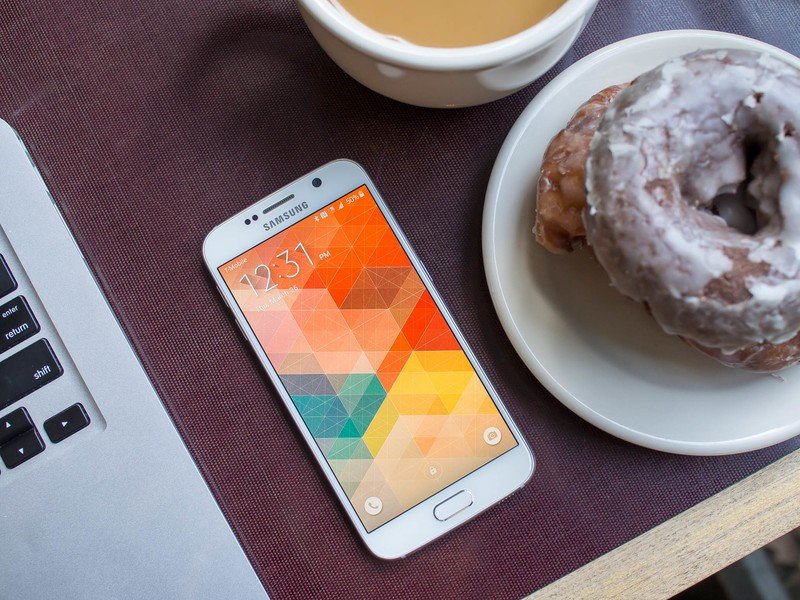
With the Galaxy S6, Samsung is for the first time in years making smartphone hardware that is on par with — or better than — what the rest of the industry is putting out. With a finely-crafted metal and glass body, the GS6 certainly looks worthy of the price tag Samsung has put on it, and that's before you get to the high-end internals and industry-leading display.
As much as Samsung nailed the hardware this year, it still feels like TouchWiz is a huge, rudderless ship.
Of course that new design means you can no longer remove the battery or expand the storage — two pain points that may turn away at least a few potential buyers. But with new fast and convenient charging options and 128GB storage capacity available, the losses aren't as large — or applicable to as many people — as they might seem.
As much as Samsung nailed the hardware this year, it still feels like TouchWiz is a huge, rudderless ship. Even with dramatic toning down of the interface, removal of superfluous features and Material-esque app redesigns, software on the GS6 still doesn't feel complete or modern. That's conveyed in the way the software looks and how it performs. And now that the hardware is up to speed it makes the software look even more lackluster by comparison.
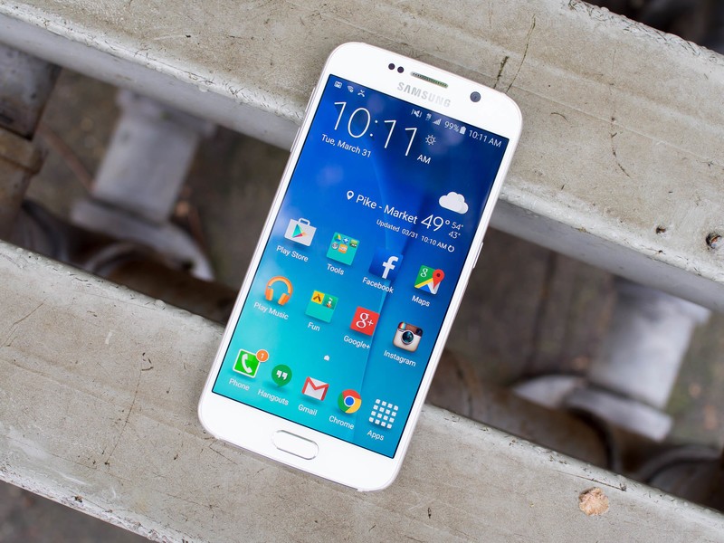
Having both a standard Galaxy S6 and a head-turning S6 edge available at the same time with the same features is a neat idea (and gets Samsung additional floor space in stores), but most people should be defaulting to the flat version. While the S6 edge offers a few novel software experiences, it comes at the cost of usability for normal smartphone actions, to say nothing of the price premium put on the model.
Even with small shortcomings in software and battery life, the Galaxy S6 is still one hell of a smartphone. It checks most or all of the boxes for those who want a high-end phone today, and then checks a few more boxes they didn't think they had. Great hardware, a fantastic camera and improved software still add up to an awesome phone.
It's safe to say Samsung has outdone itself this year. And it's hard to argue it hasn't outdone its competition as well.
Andrew was an Executive Editor, U.S. at Android Central between 2012 and 2020.
