Android Central Verdict
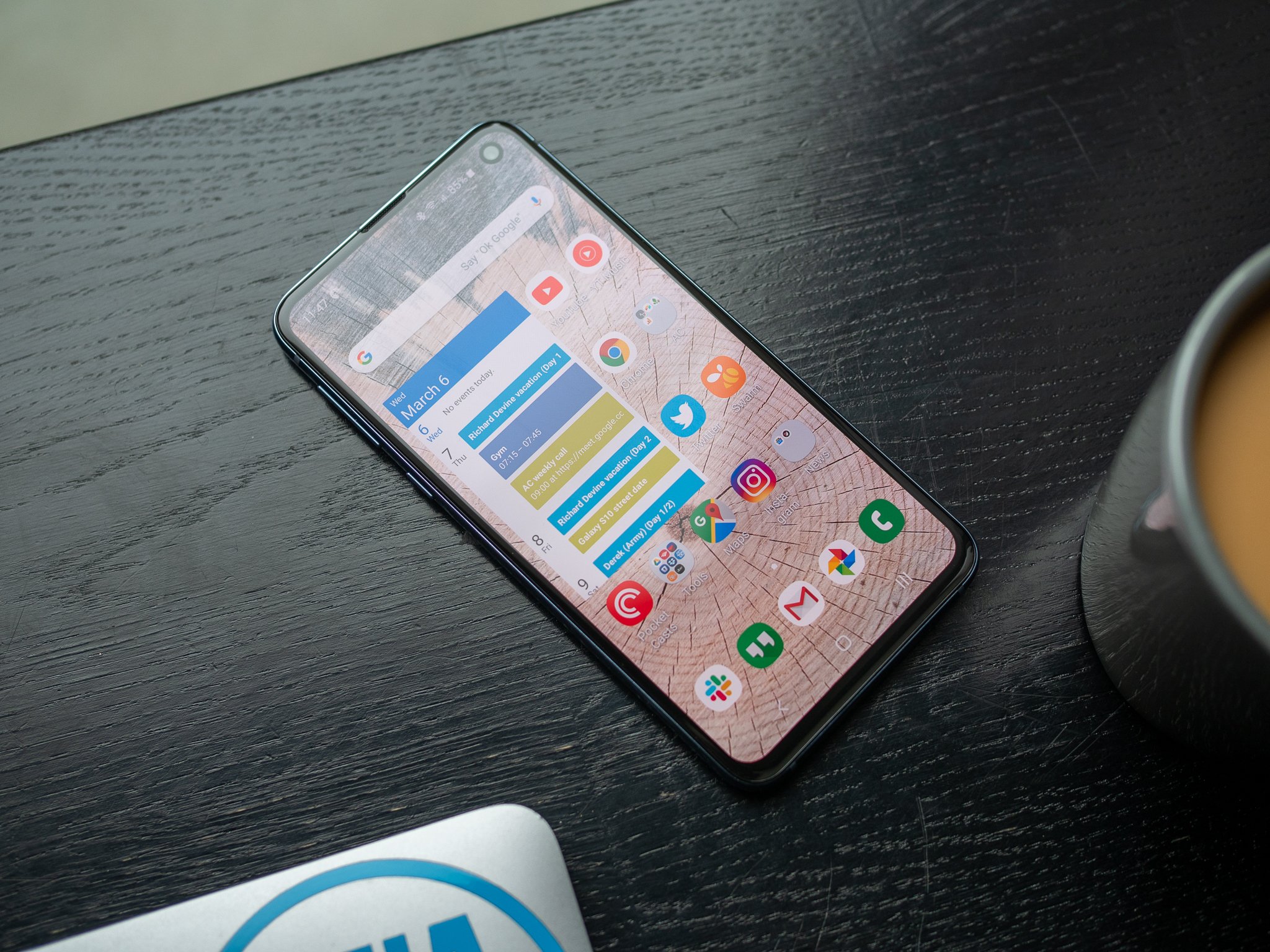
Bottom line: The Galaxy S10e is appealing as a less-expensive entry point to the Galaxy S10 family, but also as one of the few "compact" high-end phones available today. It offers a near-complete Galaxy S10 experience, and does it for considerably less money and in a size anyone can handle. You lose the stellar battery life and huge screen of the S10+, but that's a worthwhile trade-off to save considerable money and have a phone that's usable in one hand.
Pros
- +
Affordable for core GS10 experience
- +
Excellent display quality
- +
Fun ultra-wide rear camera
- +
Compact size for one-handed use
- +
Filled with hardware and software features
Cons
- -
Battery struggles with heavy use
- -
Screen feels cramped for some uses
- -
Missing telephoto lens for lossless zooming
Why you can trust Android Central
Two undeniable trends have defined the smartphone world over the last few years: smartphones are getting bigger, and they're getting more expensive. You can argue which company did the big phone first, and which pushed the envelope on pricing, but the reality is that your average phone today has a screen well north of six inches and is dangerously close to $1000.
Samsung is, of course, a significant part of this trend. The Galaxy S10, S10+, and subsequent releases are all notably larger than their predecessors, and quite a bit more expensive at the same time. But as sizes and prices move up, there's a considerable gap in the smaller and cheaper segment that has to be filled for those who don't have deep pockets — in either sense of the phrase.
Rather than let another company slide in under its price increases, Samsung went out and immediately added a new phone to its lineup to fill in where it just vacated; it made the Galaxy S10e. At its launch, it sat comfortably cheaper than the Galaxy S10, and with a 5.8-inch display, it's comfortably manageable in one hand. But at its core, it's still a "Galaxy S10" — in terms of performance, capabilities and hardware. Even today, that's a winning combination to be a complementary piece of the Galaxy family.
Samsung Galaxy S10e review: Price & availability
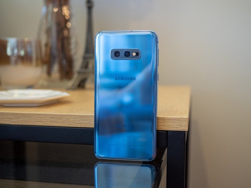
The Galaxy S10e launched on March 8, 2019 starting at $749.99 either unlocked or through various carriers in the U.S. For that money, you got 128GB of storage and 6GB of RAM, though an upgraded variant was available for $849.99 with double the storage at 256GB.
In the year since its release, the Galaxy S10e has mostly phased out of retail availability, though it can easily be found for much lower prices in refurbished condition through a number of retailers. Where they are available, new units have seen a $100 discount, bringing the starting price to approximately $600.
Samsung launched the Galaxy S10e as a colorful variant of the S10 line, offering the phone in Prism White, Prism Black, Prism Blue, Prism Green, Flamingo Pink, and Canary Yellow.
Part of the Galaxy
Samsung Galaxy S10e review: What I love
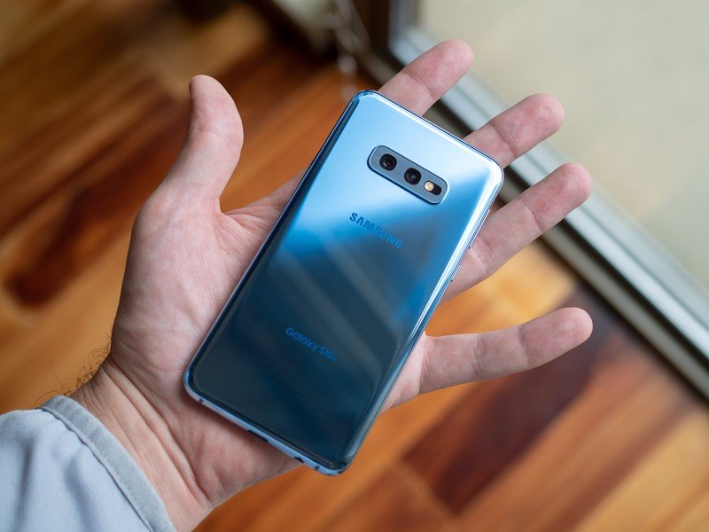
The Galaxy S10e may be immediately appealing as the "inexpensive" model in the lineup, but it's also worth considering because it's the smallest of the Galaxy S10s. The 5.8-inch display is roughly the same size as the Galaxy S9 (it has a taller 19:9 aspect ratio), but the S10e is shorter, thinner, and lighter than the preceding base model. It's a tad wider than the GS9, but that's due to the S10e lacking Samsung's hallmark "Infinity Display" with curved sides.
The S10e is a perfect size and shape to comfortably use in one hand throughout the day.
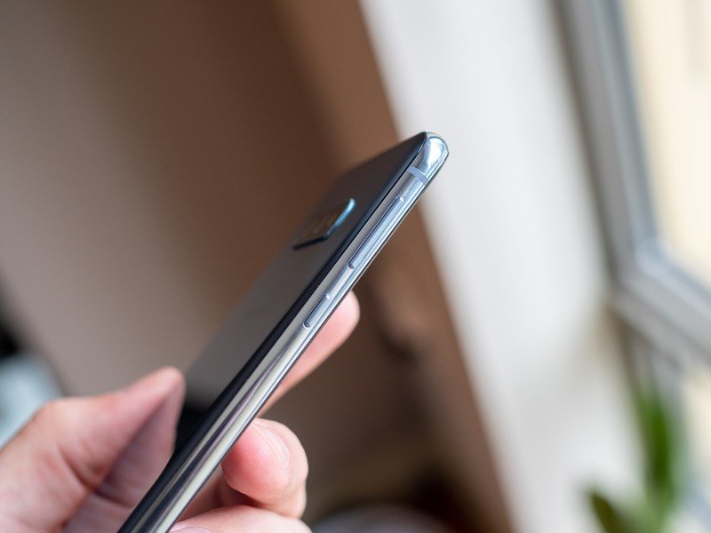
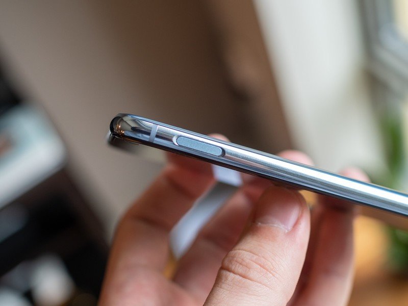
That's right, despite being a Galaxy S10 at its core, the S10e has a flat display — which once again may open up a new market of people who have up to this point resisted Samsung's curvy screens. And as an added bonus, that means there's more metal frame on the sides to securely rest in your hand. It makes the phone feel a little less svelte, but you forget about that quickly because functionally it's a bonus. With its size, shape and flat display, the S10e is very easy to hold and use in one hand without the worries of accidental palm touches that come with curves.
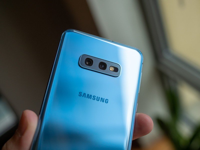
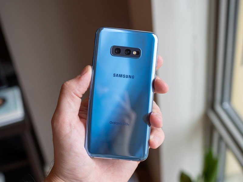
Without curved sides you get a bit more screen bezel to look at, but the display itself is still of exceptional quality just like the larger phones. It's "only" 1080p resolution, compared to 1440p on the others, but only the most intense pixel density enthusiasts will take issue with the 435 ppi (pixels per inch), even though it's over 100 ppi lower than the Galaxy S10. Samsung is clearly making the best mobile displays available today, and the gap between Samsung and the competition is even more pronounced for a phone of this price.
Functionally, this is a Galaxy S10 through and through — you're not missing out on anything important.
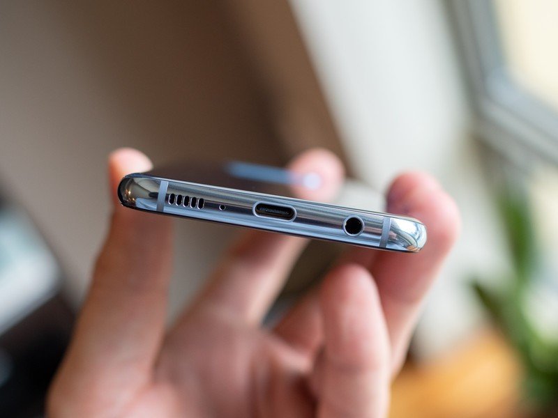
The best parts of the Galaxy S10e come from the fact that it starts as a full-fledged Galaxy S10. The Snapdragon 855 processor, 128GB of storage, microSD card slot, stereo speakers, headphone jack, IP68 resistance, fast wireless charging, and on down the list ... it's all the same components and features as the larger more expensive versions.
There are just a couple of critical drops, namely the move to 6GB of RAM (although 8GB is available with 256GB of storage) and a smaller 3100mAh battery necessitated by its smaller packaging.
Day to day, you won't know any difference in performance from the S10 with 8GB of RAM, and I don't suspect you will in the near future considering Samsung is still fully supporting the Galaxy S9 with 4GB and a majority of its recent flagships with 6GB. Everything feels just as snappy and smooth on the S10e as my previous couple weeks with the S10+, which wasn't really a worry but is important to reiterate. Nowhere in the daily use of the S10e do you feel short-changed or are reminded that you bought the "cheap" Galaxy S10.
You won't miss the telephoto camera in the least — have some fun with the ultra-wide lens.
That's true in the camera experience as well, even though the S10e lost the 2X telephoto camera on the back and secondary depth camera on the front (the latter only available on the S10+). This is no big loss, as Samsung's digital zoom is still good enough and the new 16MP wide-angle camera is far more useful and fun. Samsung lets you do the exact same "Live Focus" portrait mode effects as the other Galaxys, and the front-facing camera is still great (even though Live Focus is fully software-driven on the front-facer). This camera may not match the Pixel 3 shot-for-shot in quality, but it's super fast, consistent and fun to shoot with.
And there's one place the S10e arguably bests the S10 and S10+: its fingerprint sensor. For as futuristic and impressive the Galaxy S10's in-display fingerprint sensor is, it's a shining example of new technology not necessarily being the best technology. It's a little slower and less consistent than the capacitive sensors we've all gotten used to in the last five years, and that's exactly what the S10e has. The sensor doubles as a clicking power button on the top-right of the phone, and while it's a little higher than I'd like to see for ergonomic reasons, it's plenty easy to reach with your thumb or even left index finger. It works to pull down the notification shade, too, if that's your sort of thing. The sensor is incredibly fast and easy to trigger with even partial finger coverage.
Double-edged sword
Samsung Galaxy S10e review: What I don't like
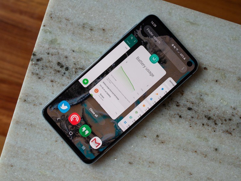
Assuming you take the Galaxy S10 lineup's core features and capabilities as a given, the only real "flaw" to be found with the S10e in particular is ... its size. Kind of paradoxical considering its compact footprint is one of its main benefits, but hear me out. After a couple weeks using the Galaxy S10+, the S10e feels a bit cramped. It's funny how quickly your perception of what the "right" size for a phone screen is can change. But if you've been using a 6-inch or larger phone, and want to buy the Galaxy S10e because of its lower price rather than for its size, you may want to seriously think about whether you want a phone this small.
If you buy the S10e for its price and not its size, remember that you may feel a bit cramped on this screen.
It was an immediate requirement to switch my home screen grid to 5x5 (up from 4x4) to downsize the icons and get more content on the screen. I also dropped the font size by an extra notch; though a suitable alternative is to drop the "screen zoom" down to its low setting to shrink everything. No matter what you do, chances are you'll want to make some changes to reduce the size of everything, lest you feel you don't have enough room to actually get things done on your phone.
Over time using the S10e you'll likely readjust your perception of phone size just as so many of us have in the other direction. And provided you have good eyesight, you may immediately find relief using the aforementioned screen adjustments. But even if you don't, you may find the smaller screen issues to be a worthwhile trade-off for getting the smaller overall footprint that's easier to manage and use more often in the first place.
The only other pain point with switching to a smaller phone is the necessary drop to a smaller battery. The 3100mAh on board is indeed slightly larger than the previous year's Galaxy S9, and the more efficient Snapdragon 855 processor helps make the most of it, but we also have to remember that the standard Galaxy S10 jumped to 3400mAh and the S10+ went all the way to 4100mAh. That leaves the S10e looking a little on the weak side.
The battery will get you through a day, but doesn't provide the same 'do anything' confidence the S10+ does.
Driving a smaller and lower-resolution display (understandably) hasn't equalized the battery drain, either. But I didn't expect the Galaxy S10e to have the same amazing longevity as the S10+ with 1000mAh less battery to use, and everyone should realize that the S10e will have the worst battery life of the three phones because of its capacity.
The Galaxy S10e would get through a full day of using the phone exactly as I did the S10+, it just did so with a little more worry about battery and a lot less left at night. Unlike the S10+, concerns over battery life led me to change a few things, like turning off always-on display (making it appear with a tap instead) and switching to power saving mode at 15% battery. With any sort of extracurricular work (a few hours streaming music, or prolonged Google Maps navigation use) I would easily hit power saving mode before turning in for the night, which is something that only happened on the longest, heaviest day of use with the Galaxy S10+. So it's not a battery champion, but it gets the job done — that's fine for this size of phone.
Great pick
Samsung Galaxy S10e review: Should you buy it?

There's little surprise that the Galaxy S10e launched priced identically to the iPhone XR. Samsung, just like Apple, recognized the need for a phone that offers a near-flagship experience with strategic cuts to hit a more affordable price. The Galaxy S10e absolutely succeeds in this mission. It is every bit a full-featured and fully capable Galaxy S10, simply shrunk down to a smaller size. You give up a few superfluous specs like a couple gigabytes of memory, ultra-high screen resolution and the telephoto camera, but otherwise retain everything that makes the Galaxy S10 so great. Sure the battery life isn't great, but you're giving that up with any smaller phone — it's tough to beat physics.
4 out of 5
The Galaxy S10e isn't the most exciting or enticing of the three Galaxy S10 models, but it provides the best value of the bunch if you're at all concerned about price. The sales pitch for the Galaxy S10e is pretty simple when you can show everything that it shares with its more expensive counterparts. And at the same time, it's actually the most desirable choice if you're someone who values a compact smartphone and doesn't want to compromise on the core capabilities of modern Galaxys that are all so appealing.
Best of all for Samsung, it's a true Galaxy S10 that adds to the overall value of the set. It doesn't need to be graded on a special scale or taken with caveats. It's a different Galaxy S10, not a worse one. And that's great for everyone.
Andrew was an Executive Editor, U.S. at Android Central between 2012 and 2020.
