For many people, the world of smartphones has two players: Samsung Galaxy and Apple iPhone. And realistically, there isn't much chance of people switching between the two in any given upgrade cycle. Samsung dominates the non-iPhone market in any location around the world that has the purchasing power to afford $1000 smartphones; and even outperforms Apple in many others.
So it's no surprise the technology world stops and stares every time Samsung refreshes the Galaxy S line. No matter what the Galaxy S10 and S10+ brought to the table, it was going to be covered and analyzed to every extent possible.
Thankfully for us all, the Galaxy S10 is a great phone — due in no small part to the reality that it's mostly unchanged from the previous year's Galaxy S9 (and even the S8 before it). Samsung once again took its dominant position in hardware, display, specs and features and simply turned it all up another level for 2019. The result is a phone that's an easy buy for just about anyone.
The Good
- Incredible smartphone display
- High-end specs
- Filled with useful hardware and software features
- Fun triple camera
- Headphone jack
The Bad
- Fingerprint sensor worse than capacitive alternatives
- Software requires tweaks and management
- Main camera doesn't match Pixel 3
- Charging speed behind the competition
Samsung Galaxy S10 Price & release date
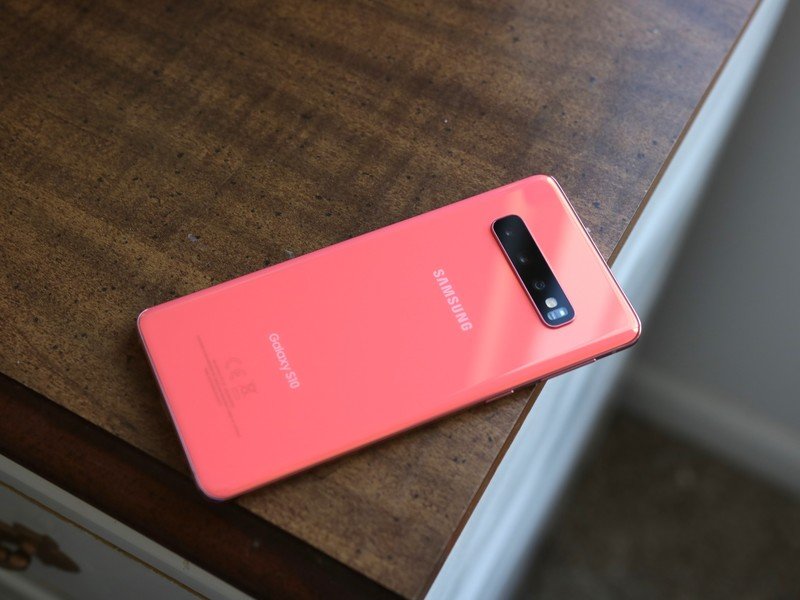
The Galaxy S10 was released alongside the larger S10+ and smaller Galaxy S10e on March 8, 2019. The phone featured top-of-the-line specs for its time, including a Snapdragon 855 processor, a curved Quad HD+ display, 8GB of RAM, and 128GB of baseline storage, expandable via microSD.
The entry-level S10 variant launched at $899, while the upgraded model with 512GB of storage initially sold for $1149. The Galaxy S10 series has since been replaced by the Galaxy S20 lineup, including the most recent Galaxy S20 FE that offers a majority of the same specs and features at a significantly lower price — though the S10 can still be found refurbished or used at even lower prices.
Though the S10 launched with Android 9 Pie, it's since been updated to Android 10 with a newer version of Samsung's One UI 2.1, and is set to receive Android 11 shortly. The Galaxy S10 is available in Prism Black, Prism Blue, Prism White, and Flamingo Pink.
Look and feel
Samsung Galaxy S10 Hardware, design and display

Samsung has iterated on this same basic design concept since the Galaxy S6, slowly changing the proportions, stretching the edges and increasing the scale with each subsequent phone. It's been a successful one to be sure; it's more than a coincidence that just about every high-end smartphone has coalesced to look like the phones Samsung's been making since 2015.
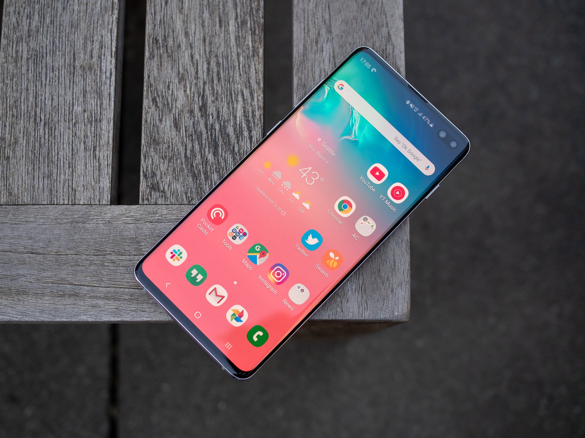
So you can't blame Samsung for keeping with what's worked so well. The Galaxy S10, and the larger Galaxy S10+ I've been using for this review, are brilliantly executed designs. The key theme of these phones is pure efficiency: getting as much hardware, as many specs, and as much capability into as compact of a body as possible. The GS10+ has the same effective screen real estate as the Note 9 from just a few months ago, yet is smaller in every dimension, 25 grams lighter, and has a larger battery.
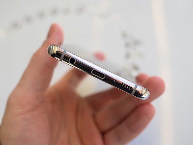
Just as impressively, you get every feature that was here before. A microSD card slot sits next to the SIM. A headphone jack accompanies the USB-C port on the bottom. Stereo speakers give you a roughly 60/40 split between the bottom and top. It's such a treat to see Samsung still standardize on these core tenets.
Samsung has eked out every millimeter of space to make the hardware efficient and filled with features.
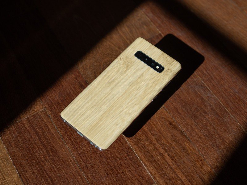
With so little space to work with, it means these phones don't necessarily have much room for extra visual flair our flourishes to catch the eyes, which basically leaves the entire task to the glass backs with their brilliant hues and color-shifting properties. And if you opt for the highest-end GS10+ models, you get a ceramic back that adds a distinct look and a noticeable increase in heft. But let's be honest, you're probably going to put a case on the phone anyway — and I wouldn't blame you, because the phone's quite slippery in the hand.
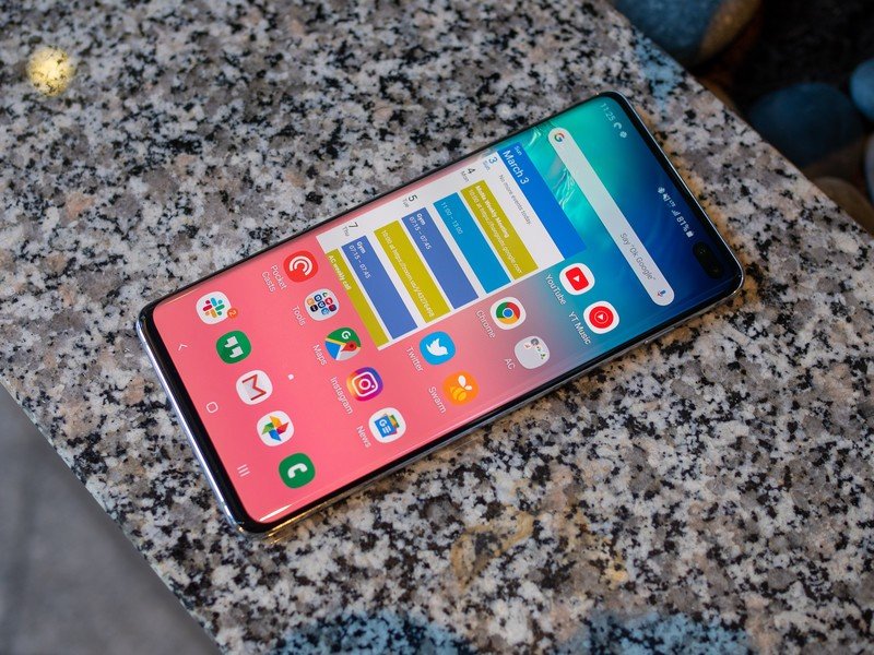
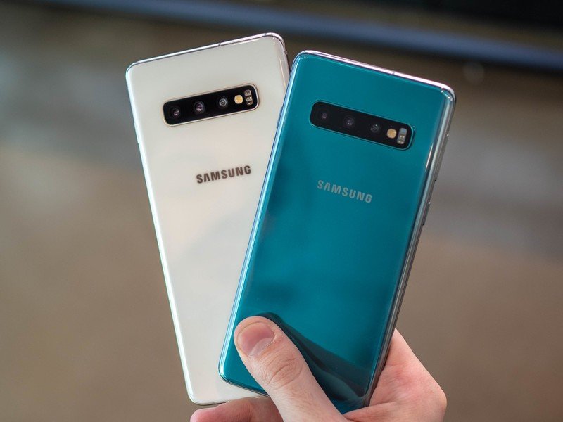
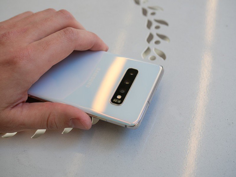
The only downside to be found with this hyper-efficient design is potential usability issues when it comes to accidental palm touches. This is the first "infinity display" curved Samsung phone I've actually had troubles with accidental touches on. Whether that's due to an even smaller amount of metal on the side of the phone, changes in its palm rejection software or some combination, it's noticeable when holding the larger Galaxy S10+ — I've been accidentally touching interface elements and inadvertently pressing keys while typing. A thin case will "solve" this problem, but after years of hearing other people complain about this with Samsung phones, I finally experienced it for myself with the latest generation.
If I have my choice of any phone in the world purely for its display, I choose the Galaxy S10.
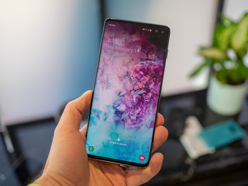
The real stunner that will take all of your attention, though, is the latest AMOLED display. Take your pick of the 6.1-inch Galaxy S10 or 6.4-inch Galaxy S10+, it doesn't matter — the display is once again amazing and the benchmark all other companies are chasing from some distance. Official testing from DisplayMate tells the technical story of how well the GS10 performs in colors, accuracy, brightness, viewing angles and reflection, but it all passes the eye test: if I have my choice of any phone in the world purely for its display, I choose the Galaxy S10.
The one aspect of Samsung's mobile displays that continuously impresses is just how bright they are while also having low reflectivity — a combination that makes visibility in direct sunlight a non-issue. Not having to shade the screen with your hand or by turning your body is something you take for granted when you use a non-Samsung phone. And you don't have to give up anything to get this great feature; the display is awesome in every other aspect at the same time.
Mixed bag
Samsung Galaxy S10 Ultrasonic fingerprint sensor
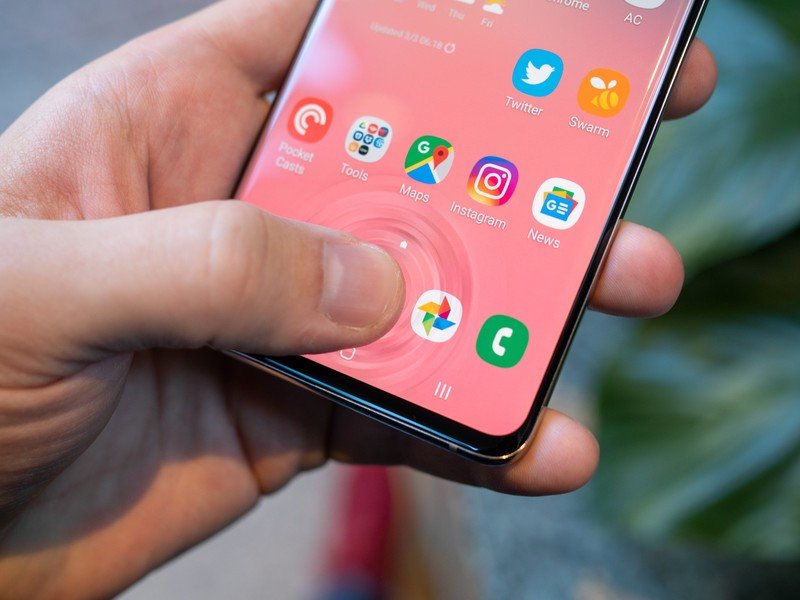
Samsung's move to an in-display fingerprint sensor is the only controversial decision it made with the S10. Actually, the only controversial things Samsung has done in the last handful of years have basically all related to biometric security. Moving the fingerprint sensor to a nonsensical place, and trying to rely on iris scanning were solid blunders in their own right. (Iris scanning is gone now, by the way.) And now, we have another attempt: an in-display fingerprint sensor. This isn't the first we've seen, but it is the first using this type of technology: ultrasonic, using sound waves, rather than optical, which uses a camera.
There is no situation in which the Galaxy S10's fingerprint sensor is faster or more consistent than the S9's.
I'll lay it out simply: the ultrasonic fingerprint sensor is better than the optical ones I've used (primarily, the OnePlus 6T), but it is not as fast, accurate or easy to use as a modern capacitive fingerprint sensor. That shouldn't really come as any surprise, as capacitive sensors are a mature technology while the in-display sensors are still relatively new. But it's worth making clear. There is no situation in which the ultrasonic fingerprint sensor has been faster or more consistent than the Galaxy S9's rear-mounted capacitive sensor. That's incredibly unfortunate.
Having the sensor in the display adds the benefit of being able to unlock your phone while it's sitting flat on a table or when you're holding it loosely and can't reach where a rear sensor would be. But the sensor requires far more effort to find the "sweet spot" where you know it'll unlock right away. I found myself pressing harder on the screen to flatten out my print, which helped, but the zone where the sensor will read is smaller than you'd think. Once you get the muscle memory down of knowing exactly where to put your thumb, it's quite fast. But it isn't as consistent as a capacitive sensor, and the time it takes to reject a bad press and then re-press is longer than we're all used to.
The in-display fingerprint sensor is a negative, perhaps the only negative of the Galaxy S10, but it doesn't (or shouldn't) reach the level of being a compromise that will cause someone to skip buying the phone. If you decide to go with the faster (read: less secure) face unlock solution you'll only see the fingerprint sensor for secure apps and purchases; and once you learn how to use this new sensor type the awkwardness of the whole situation is greatly diminished.
Triple threat
Samsung Galaxy S10 Cameras
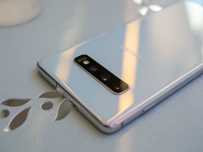
The Galaxy S10 leans on the same main and telephoto camera pairing we saw in the Galaxy S9+, though that's being a bit generous considering the main sensor hasn't changed substantially since the Galaxy S8 and the telephoto since the Note 8. That means a 12MP "Dual Pixel" sensor behind each lens, with a variable f/1.7 or f/2.4 aperture on the main and f/2.4 on the telephoto. Fine, but not necessarily new.
What's supposed to make up for the static hardware is software and processing. Samsung is yet again talking a big game about AI and an NPU (Neural Processing Unit) providing new-and-improved photo quality. It certainly succeeds in creating great-looking photos, although the level to which it has improved over the Galaxy S9 and Note 9 is entirely questionable.


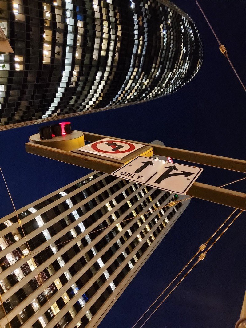





Photos are really good. I'm just struggling to find the places where they're appreciably better than the Note 9's.
The photos are really good. I'm just struggling to find the places where they're appreciably better than the great photos I've been taking with my S9+ and Note 9 for a year prior. Samsung's strengths are all still here: the camera is incredibly fast to capture in all situations, the interface is easy to use, the dynamic range and colors are fantastic, and you always get a bright and usable photo in every situation. It feels like the GS10+ is adding a little extra juice to the HDR processing, and in some situations you're getting something a bit more vivid than what the Note 9 would've done … but the margins are slim. That's not a bad thing, it's just a little disappointing when taken into the reality that the last generation was, in itself, not a huge upgrade from the year before.
That's particularly the case in really low light photos, where the GS10+ is still clearly behind the Google Pixel 3. You always get something usable in really dark scenes, but it's downright incapable of producing the mind-blowing photos a few competitors do — even with the new scene optimizer ostensibly switching to an extra-low-light mode automatically. I found the best way to get the best shots is to manually drop the exposure to keep the camera from trying so hard to brighten the image; you get a darker photo, but one that isn't blotchy and filled with chroma noise from aggressive (bad) smoothing. Considering the GS10's camera sensor has large pixels and a very wide aperture, it's surprising to see such mediocre performance in super-dark scenes where (admittedly few) other companies have figured it out.








Now here's the real fun part that makes me forget about criticisms of the main cameras: the new 16MP ultra-wide-angle camera. The 123° field of view tertiary camera is wonderful for two reasons: it provides a fun new shooting option that mirrors the human eye's field of view, and it comes with no trade-off because you still have the two main cameras. The wide-angle shooter provides a new tool to take interesting, eye-catching photos in a variety of scenarios. I loved shooting with wide-angle cameras on LG's phones, and I fell right back into my old habit with the Galaxy S10+.
The ultra-wide lens provides a whole new dynamic; and a lot of fun.
The quality isn't quite on the level of the main shooter, with a narrower aperture and no OIS, but it's still darn good whenever you have decent lighting. And again, it doesn't really matter that it doesn't match the main sensor considering you get the unique perspective provided by the lens. Novices and enthusiasts alike will enjoy the fun and flexibility of the wide-angle camera; your Instagram feed has never looked this good.
The whole Galaxy S10 series now uses this wide-angle camera, rather than the telephoto, in conjunction with the primary camera for Live Focus (portrait mode) effects, which means you don't get an aggressive crop on the field of view when you use it. Live Focus is still a mixed bag of "pretty good" and "whoa that looks bad," unfortunately, but it at least now requires less framing and thought when you want to apply these faux bokeh effects.
Even taking into account the reality of the Pixel 3 besting the Galaxy S10 in photo quality, I'd still give Samsung's latest a spot in the top three cameras available today. Where it ranks depends on how you feel about the flexibility of having multiple lenses, the speed and consistency of the camera, and all of the extra shooting modes and features in the camera app — but the complete package is worthy of high praise.
Make it yours
Samsung Galaxy S10 Software and performance
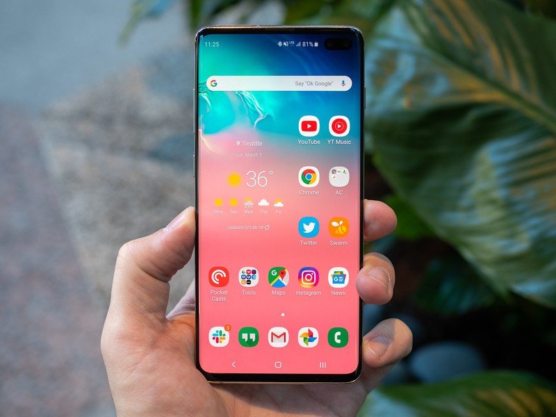
The Galaxy S10 announcement was all about its hardware and new capabilities, on account of the fact that its latest software broke cover entirely with updates that rolled out to the last two generations of Samsung flagships over the preceding month. "One UI," as it's called, is built on Android 10 and is effectively standardized across Samsung's lineup.
I thoroughly reviewed the new One UI update running on a Galaxy Note 9, and hope you'll find the time to read all of the details on the latest software to learn more. So rather than get into excruciating detail all over again here, let's hit the high points of what it's like to use the Galaxy S10's software every day.

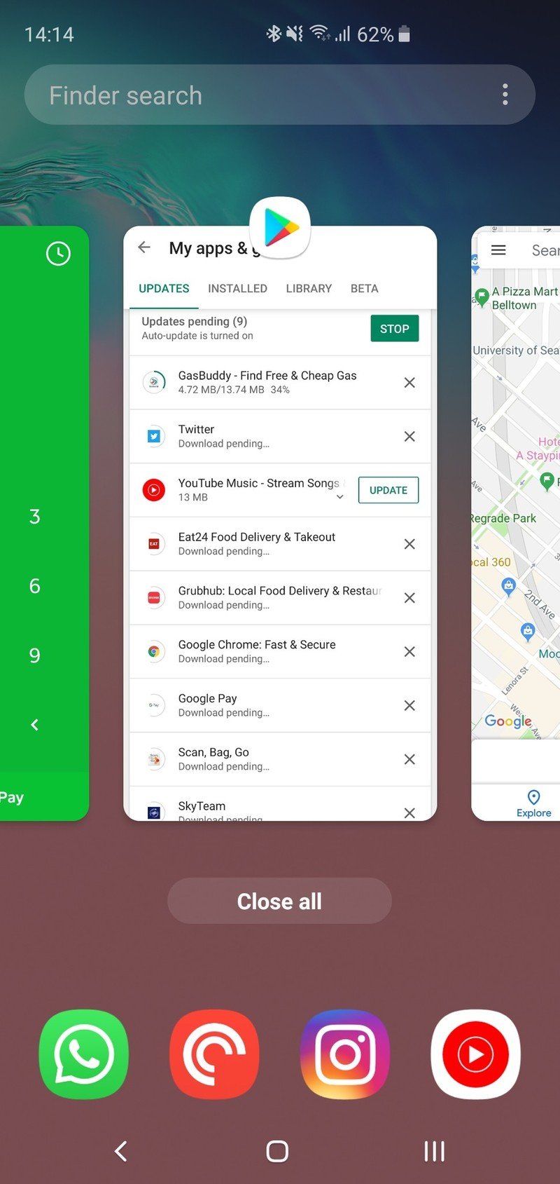
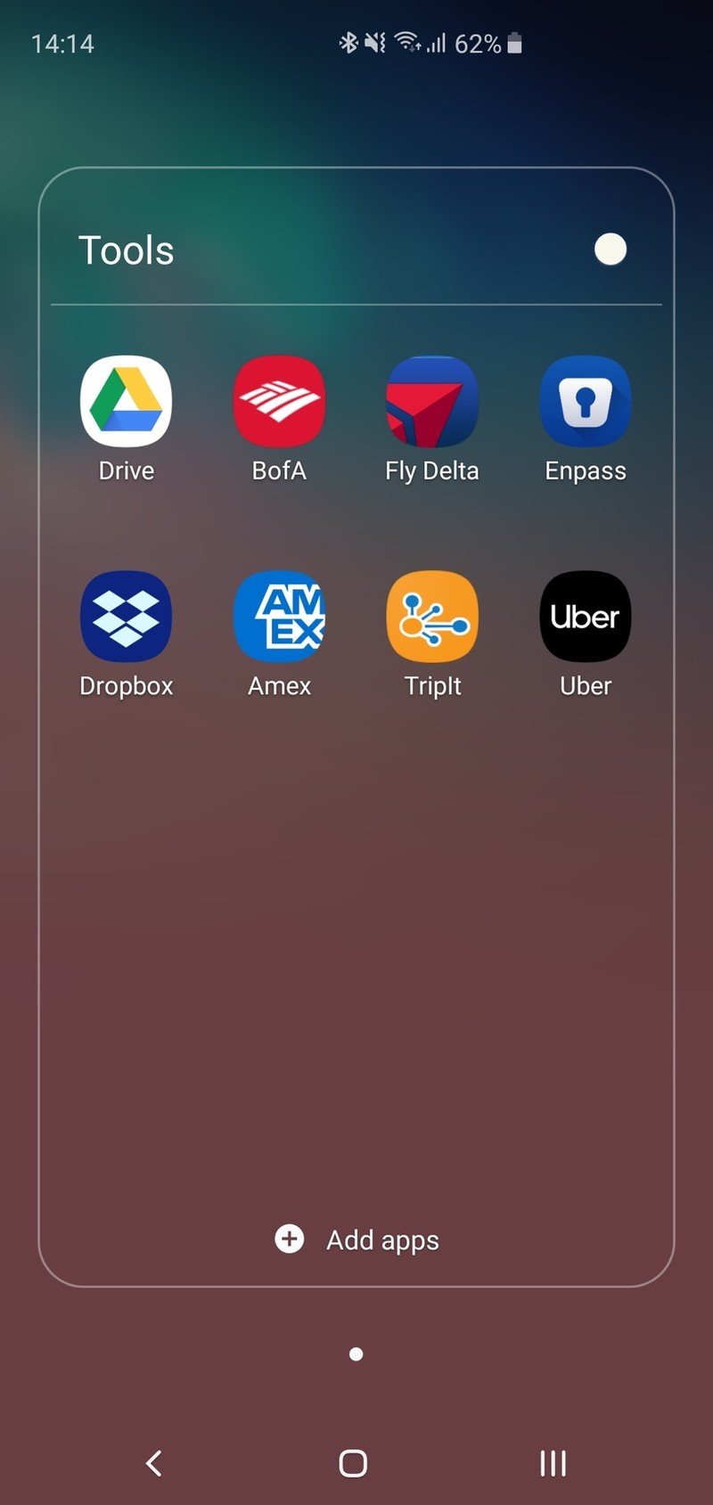
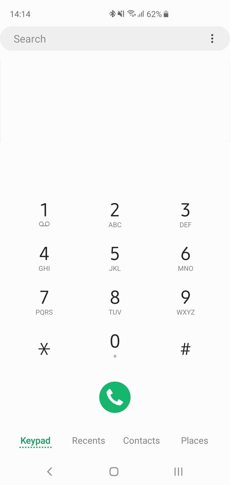
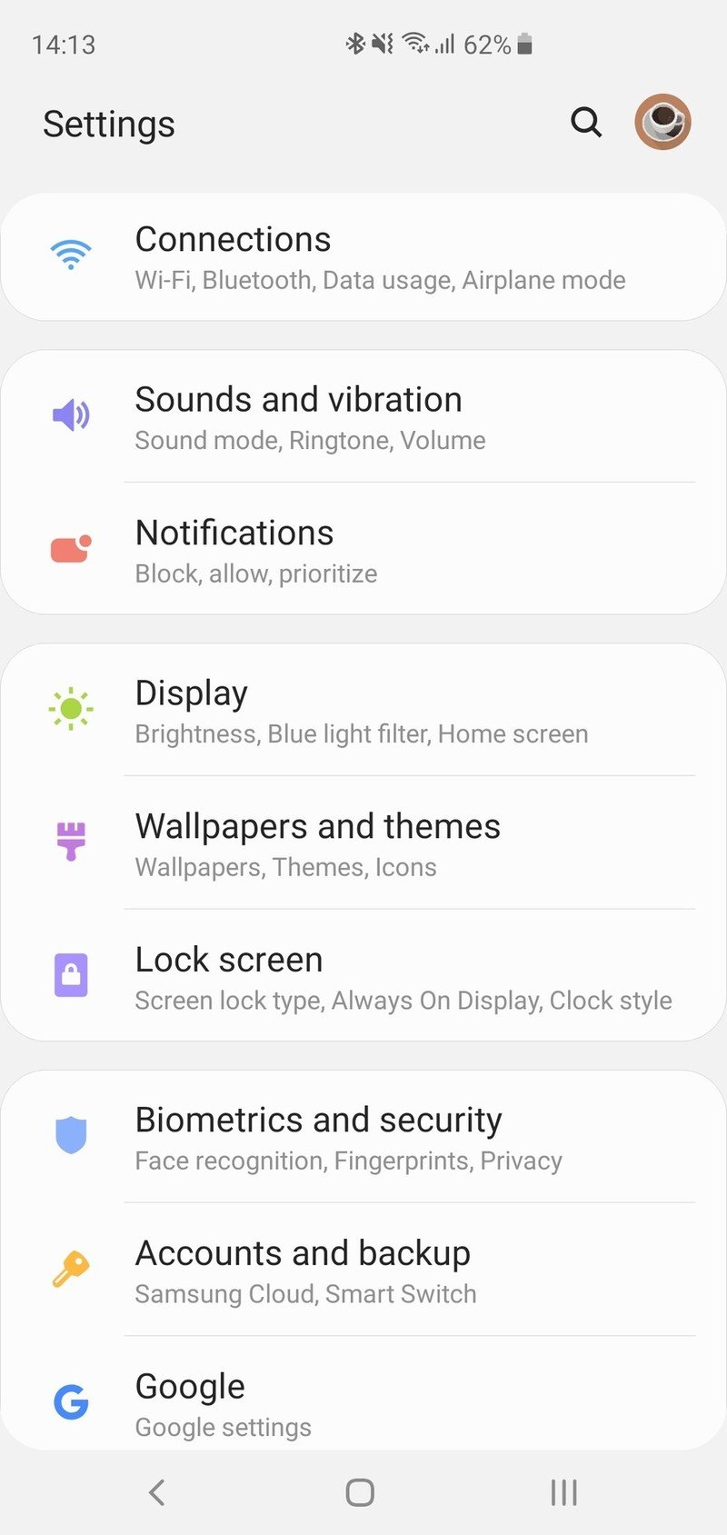
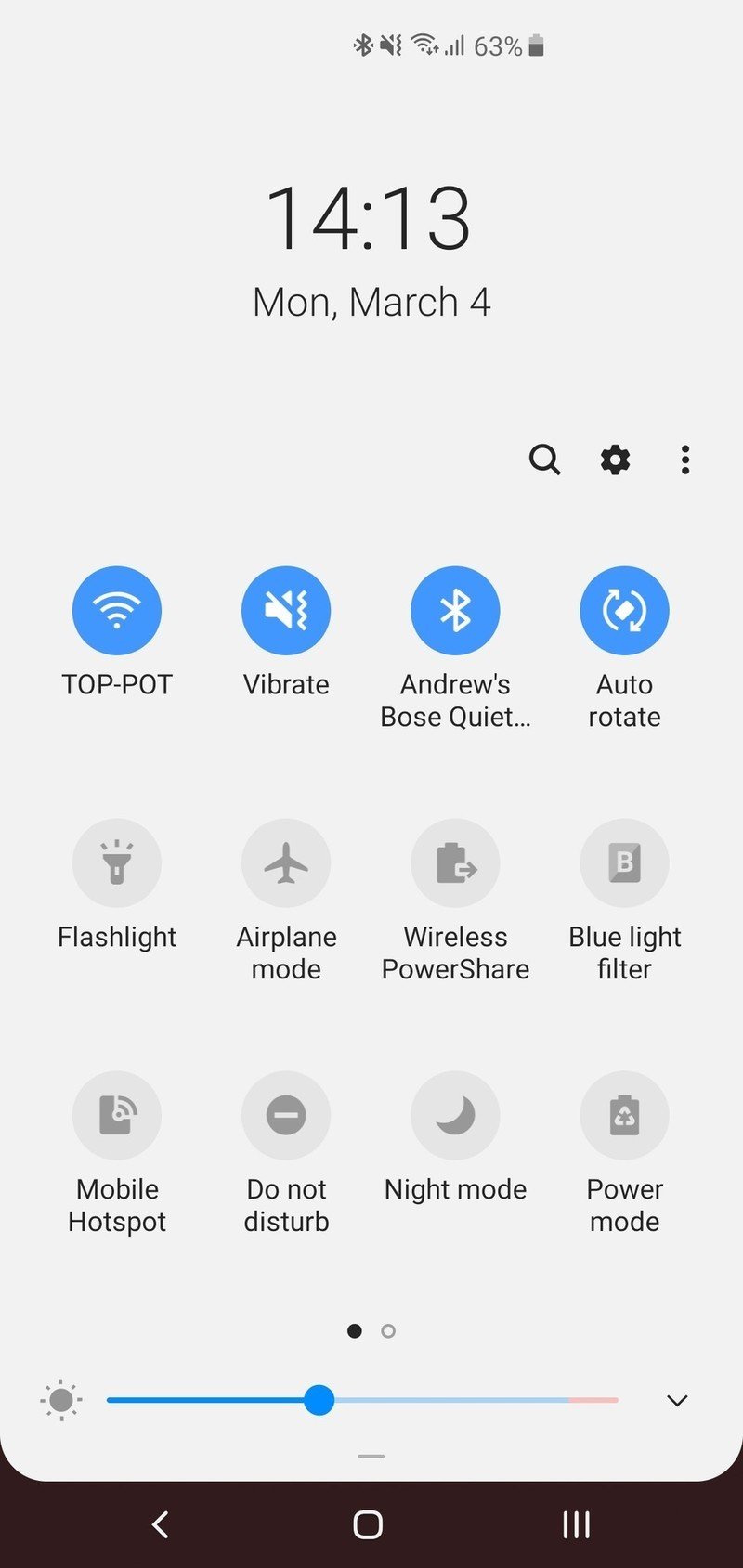
One UI is Samsung's best software yet. But it still requires work to get it set up just right.
In my One UI review I said it was "Samsung's best software yet," and the extra time using the Galaxy S10+ hasn't changed that opinion. Most of Samsung's updates from the last generation are clear improvements in usability and clarity, with larger buttons and simpler lines. The entire software experience is sleek, consistent, modern and filled with features. Some changes lead to a difference of opinion based on personal taste, like the colors, icons and overtly rounded interface elements, but nothing is objectively bad here.
The only complaint I can raise at this point is the home screen launcher, which seems to have been in a blind spot when the whole One UI redesign came through. It seems particularly stuck in the past when compared to the rest of the interface that otherwise incorporates modern ideas. The folder styling and functionality are a particularly rough example. The launcher is an easy enough switch if you want, though.
The rest of my issues with Samsung's software, at this point, come down to how much you want to tweak, fiddle, adjust and tinker with your phone. After a week with my Galaxy S10+ I was still finding little settings and changes I wanted to mess with to get things set up just right — and remember, this was after about a month of using the Note 9 daily. Samsung still offers so many options and features that it can be overwhelming to manage it all. But on the flip side if you want to spend months perfecting (and re-perfecting) your software to be exactly the way you want it, this could be paradise for you.
Software performance is superb on the Galaxy S10 no matter what you throw at it.
Regardless of your thoughts on the software design, Samsung has the performance aspect down pat. On top of a brand new Snapdragon 855 processor, Samsung made the smart choice to standardize on 8GB of RAM for both the S10 and S10+, and while I'm sure performance is just fine on the S10e with 6GB I appreciate the extra gigs. (You don't, however, need to bother buying the 12GB RAM model.) With the high-end components, performance has been fast and flawless. Apps are quick, games perform well, I can multitask without any problems and I never have issues with apps being closed while in use for whatever reason (looking at you, Google.)
There are slightly slower animations here than, say, the OnePlus 6T — but I get the feeling that's by design. The biggest thing that maintains the sense of speed throughout the interface is its consistency. Every time you touch a button or open an app or change something, it happens at the same rate. Every time I open the camera, it opens in the same amount of time and is responsive right away. It's crazy that this isn't something to be completely expected from every phone at this point, but sadly it isn't — the Galaxy S10 provides that consistency.
Recharge
Samsung Galaxy S10 Battery life and charging
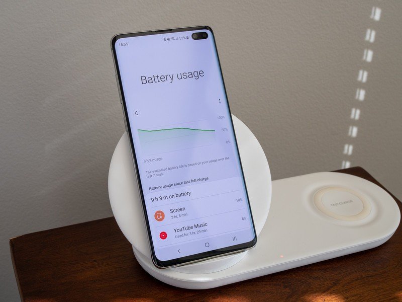
Samsung upped the battery size on both the Galaxy S10 and S10+, which is particularly important in the smaller model. For my time using the Galaxy S10+ exclusively, its larger 4100mAh battery translated to absolutely amazing battery life. It even takes a step up from the already-great Note 9. This phone just doesn't want to die, no matter what you throw at it. Lots of tethering, camera use, Google Maps navigation, screen on time and more — it doesn't matter, it just lasts all day. I wouldn't say there's particularly exceptional "standby" battery life when the phone is idle, but one of the hallmark features of Samsung's phones is that the battery drains at effectively the same rate no matter how you use it.
Battery life on the Galaxy S10+ is immense; and the Galaxy S10 should suit any average person without issue.
On an extremely long travel day, which is typically murder on a smartphone battery, I was particularly impressed by the S10+. Going from early in the morning, to and through the airport, on a long flight (sadly with little sleep) and the next airport and connecting flight, I went 18 hours before dipping under 10% and finally enabling power-saving mode. That's with nearly 5 hours of screen-on time, hours of podcast listening, and always on display active the whole time. That is use that would have me charge up my Pixel 3 XL at least once and still be hitting the danger zone at the end.
On a typical day, when I'm not running around airports, the GS10+ is just as impressive. With normal usage, spending plenty of time on Wi-Fi but also having the screen on for at least 3 hours, I could easily end a day with 20%, sometimes as high as 40%, battery remaining. The battery monitor estimates my battery life on any given day to be about 20 to 22 hours, slightly depending on usage, which I've found to be accurate as I haven't had to top up the phone midday a single time.
Wired charging speed is the only part of the equation that could use improvement.
This also gives me hope for the smaller Galaxy S10. Despite having a ~17% smaller battery (3400mAh), it should be a full-day phone without issue — it just may not hold up to the most intense days you can throw at it. Not everyone is going to use their phone as hard as I have throughout this review, and they're going to be able to go through a day with a considerable amount of power left in the tank.
Samsung ekes out a little more from the same 15W (Quick Charge 2.0) wall plug it's been using since the Galaxy S6, but it's no match for what companies are now doing with Quick Charge 4+ or proprietary chargers at up to 40W. But at least in the case of the Galaxy S10+, the battery life lasts so long I haven't been bothered by its slightly slower recharge speeds; not having to charge midday in the first place is the best solution.
Easy pick
Samsung Galaxy S10 Final thoughts
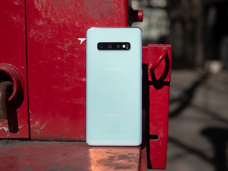
Samsung has, once again, set the bar for smartphones. The Galaxy S9 and S9+ were solid phones as it was, but Samsung upgraded and made important improvements nonetheless with the S10 and S10+. The cameras are standardized across the two models, and the new wide-angle lens is a treat to shoot with. The displays are still leading the industry. Battery life took a jump, and is a huge selling feature on the S10+ in particular. This is Samsung's best-ever software, running on high-end specs that offer consistent performance. All of this, and more, was added to the core Galaxy experience with great hardware design and crowd-pleasing features to fill anyone's needs.
The only clear regression from last year is the in-display fingerprint sensor, which in the grand scheme doesn't detract from all of the other improvements and generally great qualities. And no phone is perfect, so you can of course find little quibbles with some of the minor specs and execution on certain features of the Galaxy S10. It can't be exactly what every person wants and needs.
4.5 out of 5
But as a single phone (in two sizes), the Galaxy S10 gets as close as possible to fulfilling the promise of being the best phone for the widest range of people out there — provided, of course, they're able to pay $900 or more for a phone to start with. Without caveats or questions, I can recommend a Galaxy S10 or S10+ to anyone and not worry that it'll be missing something they want or rely on in a modern high-end smartphone. Once you've found the Galaxy S10 for yourself, there's little reason to look any further.
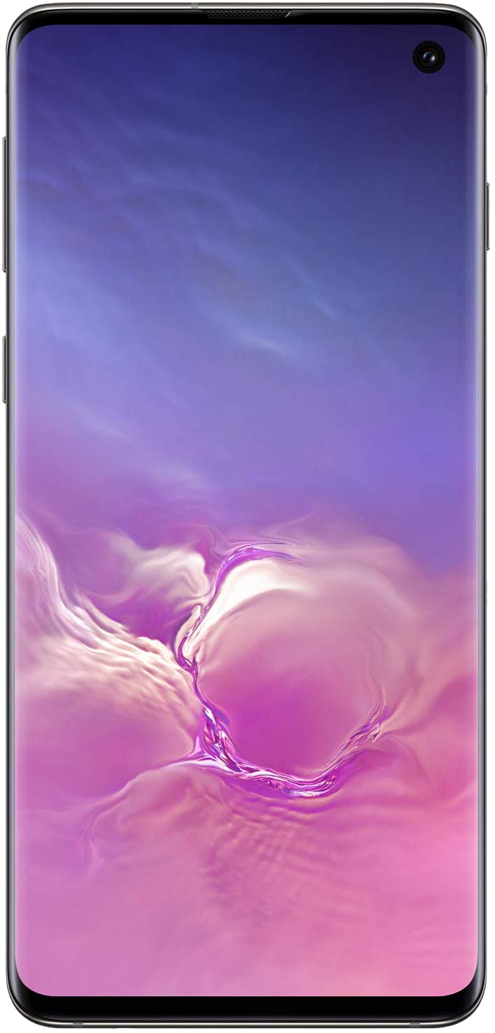
Samsung Galaxy S10
It's tough to argue against the Galaxy S10. Fantastic hardware and a best-in-class display wrap around top-notch specs and a pile of features to make anyone envious. The wide-angle camera is a treat, and the photography experience is fast and consistent. Just allot some time to tweak the software, and you'll be happy as can be.
Andrew was an Executive Editor, U.S. at Android Central between 2012 and 2020.
