Samsung Galaxy Fold hands-on: The tablet that (almost) fits in your pocket
If you stretch your mind far back enough, you can probably find fault with every first-generation product. The original telephones only communicated over short distances and produced a hollow, ghost-like sound. Early televisions had tiny, shadowy screens inside massive, boulder-like cases. Within both of those categories, innovation happened in fits and starts, but it was relatively constant. By the time we got to smartphones and flat-screen TVs, the sound had improved, the picture sharpened, but it would take many more years — 'til the mid-2010s, in fact — for them to both thoroughly commoditize without sacrificing major core features.

Which brings us to today, where I got to try — and take home — the first truly foldable phone on earth. Yes, there have been other attempts, but they have mainly been two displays crudely and deleteriously conjoined, with little to no thought as to the software experience. The Samsung Galaxy Fold is just the first of an inevitable avalanche of foldable smartphones to be released in 2019 and beyond, but the company's bragging rights don't just extend to timing, but to completeness. While nowhere close to perfect, the Galaxy Fold gracefully handles the transition from small to big screen, and where it can't, it provides a pretty robust set of fallback experiences that shouldn't upset the early adopter crowd too much.
A brief Galaxy Fold recap
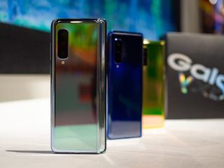
We've known Samsung was working on foldable display technology well before the company unveiled the Infinity Flex display — the Fold's foundational elements — at its developer conference in November. When the Fold was officially announced in February alongside the Galaxy S10 series, it did a good job overshadowing Samsung's flagships, as it received a price ($1980 USD) and a release date (April 26), numbers both cheaper and earlier in the year than Huawei's Mate X, which was announced a few days later at MWC.
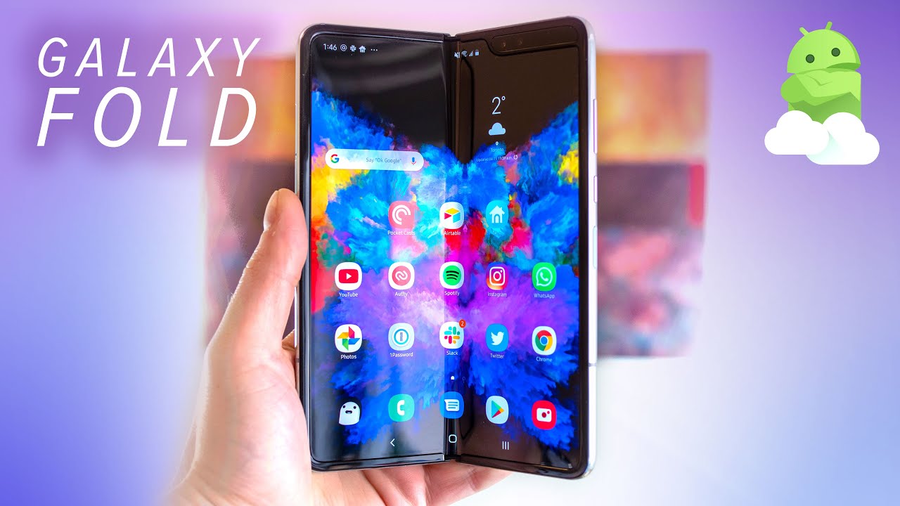
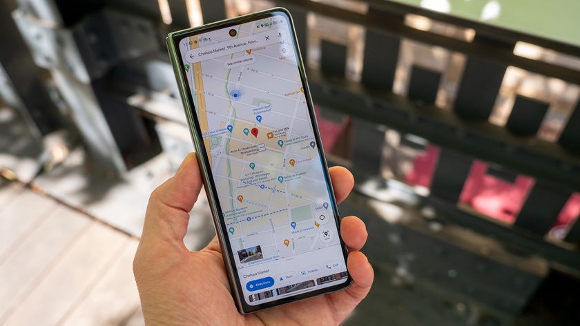
You'll probably want to use the huge 7.3-inch tablet display more than the smaller outer display, but both are surprisingly usable.
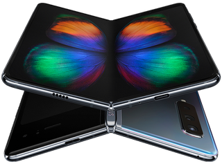
Samsung decided to go for an "innie" design, opting to include a 7.3-inch display on the inside, with an old-school tablet-like 4:3 aspect ratio. While many phones, including Samsung's own Galaxy S10 series, have screen sizes approaching 7 inches, they're measured diagonally using the ultra-tall 19:9 aspect ratio. The same size screen with a more traditional 4:3 measurement provides a lot more real estate — and many fewer apps optimized for that design.
But to ensure that everyday tasks can be completed without needing to open the phone, there's another 4.6-inch panel on the front, this time using a super-tall 21:9 aspect ratio. It's quite a contrast, and one of many on this device, though many of the trade-offs are worth it, as I'll get to shortly.
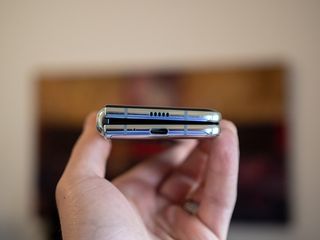
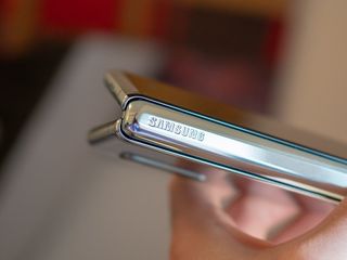

The hardware that ties it all together is an extremely seamless hinge paired with a magnet that allows the two sides of the phone to open and close with only a bit of effort — and a satisfying click that will become a bit of a habit for some, I'm sure. Of course, glass doesn't bend, so while the front and back of the phone is covered with glass, the inside screen uses a proprietary plastic substrate.
While I'm unwilling to scratch it to see how it withstands the realities of daily abuse (though technically it should do well considering it's only exposed while being used), it's also clearly not glass, which comes with a bevy of obvious trade-offs. First, the crease. Samsung's calling it the "fold" — yes, like a book — which will attempt through marketing to preempt any criticism of its presence. But it's there, and you either have to learn to live with it or not. Second, the touch response is definitely not as good as it is on a regular smartphone.
Be an expert in 5 minutes
Get the latest news from Android Central, your trusted companion in the world of Android
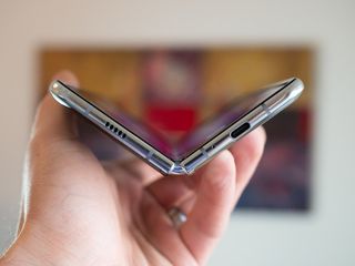
The phone doesn't sit flat, either, thanks to the hinge forcing one side of the phone to protrude and separate slightly from the other. This is in contrast to Huawei's Mate X, which uses an "outtie" design that negates the need for a similar hinge.
Samsung did a lot to make the inside display feel the same as close to its S10 counterparts as possible, but the technology is still too new for that to be the case. The two sides of the screen appear to refresh at different speeds, leading to a jankiness that, while difficult to spot at first, is unmistakable once you actually notice it.
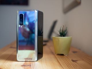
Hardware-wise, the Fold is pretty close to a Galaxy S10 — at least the super expensive ceramic version of the S10+. There's a Snapdragon 855 inside it, along with 12GB of RAM and 512GB of storage — and you better be OK with that amount, since there's no way to expand it with a microSD card. The phone has six cameras, including a 10MP selfie shooter on the cover, another 10MP selfie on the inside, along with an 8MP RGB depth camera, while the rear has the same loadout as the S10 — a 12MP wide-angle and 12MP telephoto, both optically stabilized, along with a 16MP ultra-wide.
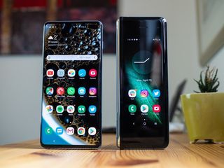
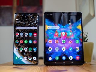
While the phone actually has two batteries — one on each side of the hinge — they total to a massive 4380mAh, which is bigger than the S10+ but smaller than the upcoming Galaxy S10 5G. It's unclear how the Fold's battery life will be affected by the, well, folding, but it should last at least a day on a charge.
The capacitive sensor doubles as a Bixby button which, coming from a S10e, isn't confusing at all 🙄
To top it up, there's wireless charging and fast wired charging, just like the S10, though for some reason it only supports the 15W wired charging standard that we've seen going all the way back to the S6, rather than the 25W option debuting on the S10 5G later this year. The Fold is also limited to LTE speeds of 1.2Gbps, as the company couldn't manage to get the 4x4 MIMO antennas needed for the Snapdragon 855's 2Gbps speeds on this new form factor. Still, 1.2Gbps is nothing to turn your nose up at.
On the right side of the phone is a capactive fingerprint sensor that's in a far more comfortable place than it is on the Galaxy S10e, but confusingly its secondary function operates as a Bixby button, not the power button as it does on Samsung's smallest S10. Stereo speakers round out the list of features pumping out of each end of the "cover" screen.
Using the Galaxy Fold
So how is the Galaxy Fold as a phone? I've spent a few hours with it as my main phone and the dichotomy of small, tall screen that expands to be a near-square tablet display is a bit jarring at first, but it works a lot better than I expected. Samsung's worked with Google to develop App Continuity — which works as simply as promised. When you have a supported app on the cover, it opens to fill the entire inside screen; non-supported apps just fill the center and can be forced to re-open in a tablet view. It's not a great experience, as shown below, but it's a relatively creative solution to something that Samsung, as a hardware vendor, ultimately has very little control over.
Here's my crudely shot video of how App Continuity works on devices that don't support it, like Twitter.
Tl;dr it's a window pic.twitter.com/u0x51mA9aPHere's my crudely shot video of how App Continuity works on devices that don't support it, like Twitter.
Tl;dr it's a window pic.twitter.com/u0x51mA9aP— Daniel Bader (@journeydan) April 15, 2019April 15, 2019
But Samsung's value proposition for the Fold isn't to mimic a dumb Android tablet, most of which have deservedly received a heavy dose of criticism over the years for lacking an ecosystem of apps that do anything to support their larger form factors. Google is partly to blame here — aside from a brief campaign five or so years ago, Android's creator has largely given up on encouraging the developer community to optimize their apps for more spacious screens. That leaves often-used apps like Twitter, Instagram, YouTube and others wasting a lot of space as they merely expand outwards to fill additional horizontal space on the Fold.
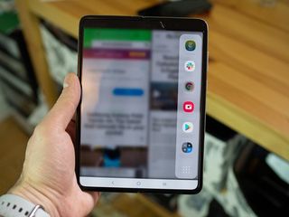
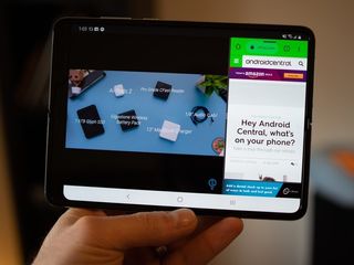

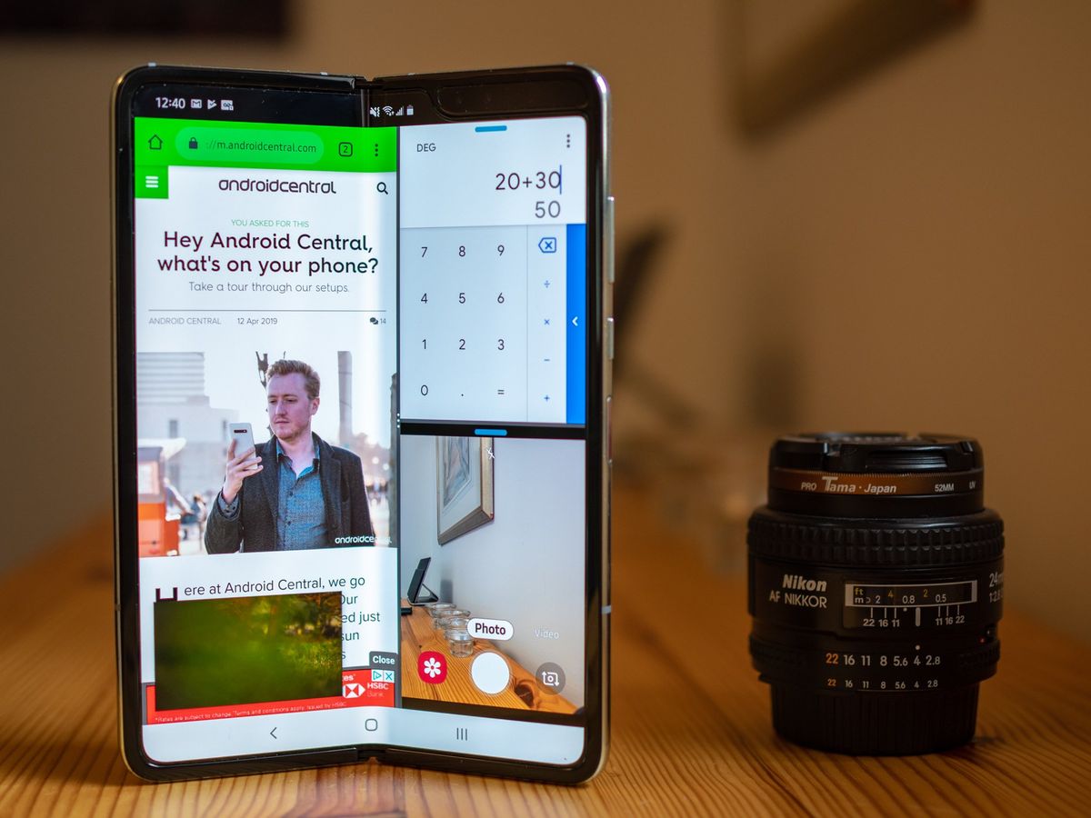
Instead, Samsung wants people to use its improved multitasking mechanism, which borrows the UX from its Edge Display feature on Galaxy phones. Swiping in from the right side of the screen in tablet mode lets you open a second app in a two-third/one-third split with the primary app, and then a third that cuts into half of that space; plus, you can add up to five more apps running concurrently in floating windows.
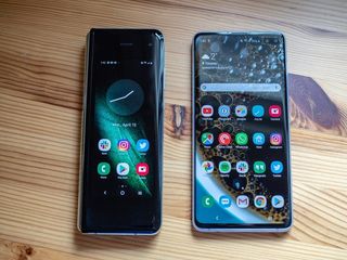
This works well because, as I said above, the tablet mode's 4:3 aspect ratio (it's actually 4.2:3) provides an almost equal number of pixels horizontally and vertically, so having two apps side by side merely lets them revert to their natural phone interfaces. Three apps is a bit trickier, because you have a phone layout on the left while two are squared-off on the right, but it still feels productive.
And that's... it. There are very few gimmicks here. The rest of the software is strictly Samsung's One UI, so you get the same love-it-or-hate-it design changes that arrived on most recent Galaxy phones a few weeks ago. Because of the notch on the inside's top right corner, some apps, like YouTube, currently cut off content in that area with no option to resize it, while others, like Netflix, letterbox video so that the notch doesn't come into play.

As a phone, this is otherwise a Galaxy S10 — the camera viewfinder looks a bit silly when taking up the entire tablet screen, but it's still quite usable. I made a bunch of phone calls with the earpiece and they sounded great, as do the two speakers (though they're easy to cover when you're holding the phone in its default landscape orientation.
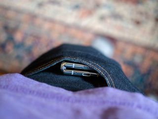
The biggest criticism I can throw at the Fold is that it's very tall and quite heavy — 161mm and 263 grams, respectively — which may disqualify it from the average jean pocket. When you use the Galaxy Fold, or when you're transporting it, it's difficult to forget it's there. That said, it's quite enjoyable to use with one hand because it's narrow enough that the height doesn't undermine its "phone-ness." I find myself defaulting to the small screen most of the time, even for typing — Gboard works really well on the cover, and less so on the tablet screen — because it's easier to use a phone with a single hand than two.
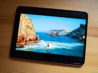
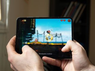
The larger screen, conversely, is great for gaming or Netflix, or anything that requires more surface area. Reading. Browsing. Tablet stuff.
But I keep coming back to why this thing exists in the first place, why someone — even someone overflowing in money — should buy it over a really good phone and a pretty good tablet. There's no question that there are plenty of advantages to having both form factors in your pocket, even one so heavily weighed down. And the $1980 you're spending is only — only — $400 or so more than the top-of-the-line Galaxy S10+, with which the Fold shares most of its high-end guts. Are the compromises worth the extra dough just to say you had it first?
Should you buy the Galaxy Fold?
Like all first-generation products, the Galaxy Fold isn't without its flaws. The cover display looks a bit odd taking up only 60% of the phone's front. The tablet screen, while excellent on its own merits, doesn't feel quite as smooth and responsive as most of Samsung's products. And the transition between cover and tablet modes is often finnicky, especially before apps have been explicitly updated to support Samsung's App Continuity.
That's all fine because when you're buying something like this, especially at its $1980 price, you're investing in the growing pains. While not quite a beta test, like the Galaxy Edge before it Samsung is definitely using the Fold as a test balloon for foldable phone demand, and I'm encouraged by how complete and usable it is, even in this early state.
There's a part of me that wants to go all-in on the foldable hype, embracing this as the next big thing. And perhaps it will be, once the software experiences catch up. Right now, though, you're getting a very good phone and a very good Android tablet built into a single product, and if that's worth $1980 to you, I say go for it.
One thing's for sure, though: this is one of the most remarkable pieces of technology I've ever used. And that's saying something.
A remarkable engineering achievement
Samsung's newest phone is actually a tablet in disguise, but it pulls off both. That's the beauty of being the first in a new category, since some of the Fold's flaws, along with its high price, can be forgiven. Still, only early adopters should consider the Galaxy Fold right now.
Daniel Bader was a former Android Central Editor-in-Chief and Executive Editor for iMore and Windows Central.
