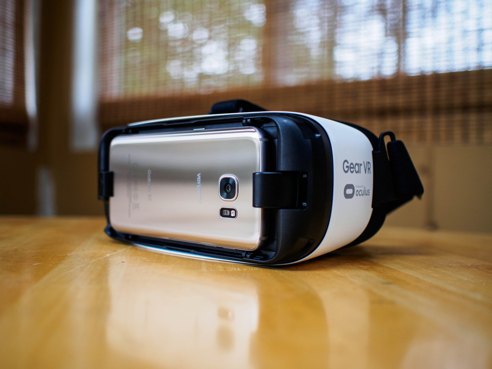
The jump from niche techy gadget to consumer-ready product isn't an easy one to make, but that's exactly what Samsung is trying to do with the Samsung Gear VR.
Asking someone who has never used a VR headset before — which is most people — to shell out $99 for a plastic accessory that makes them look funny isn't going to happen. Giving hundreds of thousands of them away to people who are pre-ordering the best phone to use with that headset is a little different. It's an attempt to get as many people as possible past the look of the strange plastic thing on the shelf and into the experiences contained within. It's also working, though to what degree is anyone's guess for now.
If Samsung and Oculus are going to succeed in pushing the Gear VR out of techy nerd hell and onto the faces of people who would otherwise never consider something like this, a combination of capable hardware and feature complete software needs to exist. Previous combinations of Samsung phones and the Gear VR headset have shown that smartphone-based VR can be fun and engaging, but not exactly easy for everyone. With the Galaxy S7 and a fully stocked Oculus Store, the Gear VR gets a new chance to pull people in.
Article continues belowThis is our Samsung Gear VR review, Galaxy S7 edition.
About this review
We've been using the Samsung Gear VR for quite a while now, back as far as the Galaxy Note 4, but have only been using it with the Galaxy S7 for ten days. This phone is running Oculus Store version 1.91 (Build 25307937), which is also available on the Galaxy S7 edge, Galaxy Note 5, and the Samsung Galaxy S6 variants.
Read: How the Galaxy S7 edge compares to the GS7 in the Gear VR
Please insert your phone to continue
Get the latest news from Android Central, your trusted companion in the world of Android
Samsung Gear VR initial setup
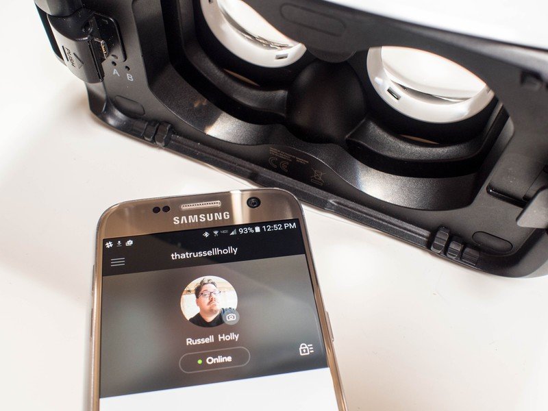
Samsung and Oculus have built the Gear VR experience to be something isolated from the rest of the experience on the Galaxy S7. The user isn't aware that any of the Oculus services even exist on the phone until the first time they connect the phone to a Gear VR. This can be a little confusing if you're already familiar with the interface and want to download games ahead of putting the headset on your face, but as far as set up systems go Oculus has done a lot of good here. You connect the phone to the headset, and the phone immediately knows what to do.
For a system that isn't dedicated to this experience, the initial set up process for the Gear VR is as good as it can be.
What happens next is not so smooth. The thing the phone does next is tell you to disconnect the phone from the Gear VR in order to install the Oculus app and set up your account. There's no way to do this setup in VR, and there's no way to set up the Oculus experience before the phone is connected, so users are stuck with this back and forth in order to get set up the first time. The good news is you only ever have to do this once, but it's still an unusual hurdle to jump for someone who has never used VR before.
After you've created your Oculus account, it's time to actually use the Gear VR. Putting the phone back into the headset launches a tutorial on how to navigate the interface. Oculus has created a series of short tasks for users to solve by moving across the touch pad on the side of the headset, and when those tasks are complete users are taken to the main system environment. From this point, connecting the phone to the Gear VR launches the Oculus VR environment.
As initial setup experiences go, the Gear VR is a mixed bag right now. The Oculus Store can't exist in the Google Play Store due to Google's policies on running a competing app store, and having the app live on every Samsung phone would take up a lot of unnecessary space, so this compromise is understandable. Once you actually get into the Oculus environment, the tutorials to familiarize the user with what's happening are perfect. The execution is visually appealing and there's no doubt the user understands how the interface works when the tutorial is over. For a system that isn't dedicated to this experience, the initial set up process for the Gear VR is as good as it can be.
Your house will never be this nice
Samsung Gear VR interface
Using a VR headset breaks down into two key components: being comfortable enough on your face to use for the duration of the app you're using, and being easy to navigate the interface. The Gear VR is more comfortable than most VR headsets you'll find out there today, but its real strength is the interface. Putting on a Gear VR transports you to an incredible outdoor pavilion with floating menu options fixed to the position you started in. You can look around and take in the sights, but the position you started in is where you'll be when navigating menus.
Before you get into any of the apps and explore those experiences, the Oculus menus and environments are genuinely enjoyable to use.
Oculus has paid special attention to the design of their menu system. In a VR environment frequently described as having a "screen door" effect in white spaces due to the ability to see pixels on the screen, text is sharp and images are clear everywhere. When you go to buy an app, there's plenty of information about the game that is easy to read and easier to scroll through. Purchasing an app offers a similar experience, with a convenient pin system for authorizing a payment. It's an interface that has slowly evolved over time, and has reached a point where you can easily navigate through existing apps to select something to do or install a new experience with a couple of taps. There are no menu options asking you to aim a pointer at a specific place for a few seconds to register a click, it's all straightforward and clear.
Secondary to the main Oculus menu is the system menu that can be accessed from anywhere by holding down the back button on the Gear VR. In the past, this menu system was a series of small floating buttons that required you to either memorize the icons or hover a pointer over the icon to know what your options were. Now that menu is a set of large blocks with clear text that explains what you need to do. This includes brightness controls camera passthrough, and of course returning to the main menu if you're done with whatever it is you are doing right now. This menu has been greatly improved recently, and the end result is significantly more user friendly.
The most interesting pair of features in this system menu are the camera passthrough and notification settings, mostly because you'll either use them all the time or not at all. Camera passthrough is exactly what is sounds like, a way to access the camera on the back of your phone so you can see the real world without taking the headset off.
There's less lag in this mode than previous Samsung phones using this mode, but walking around with this mode on is still a bad idea. Notification controls in the Oculus UI allow you to bring notifications from your phone into the virtual environment. This Do Not Disturb mode is off by default, but it's not entirely clear why since users aren't able to interact with notifications when they appear in the Gear VR. All you really get is a rectangle that interrupts whatever it is you are doing with a truncated version of the notification you'd normally get on your phone.
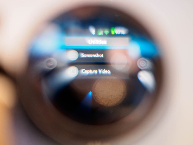
Finally, Oculus has made it easy to share your virtual experiences with others. The system menu now includes the ability to take screenshots and record video, both of which are available to share once you're out of the Gear VR and back on your phone like usual. These screenshots and video shots are a 1024x1024 sample from one eye, so they're square and ready for sharing without any additional cropping. This looks a whole lot nicer than recording on your own with a third-party app, and on the Galaxy S7 the video is more than smooth enough to share with friends.
Oculus has done a lot to grow this interface over time, and now it feels more like a complete thought. Before you get into any of the apps and explore those experiences, the Oculus menus and environments are genuinely enjoyable to use.
At long last, a search button
Samsung Gear VR app
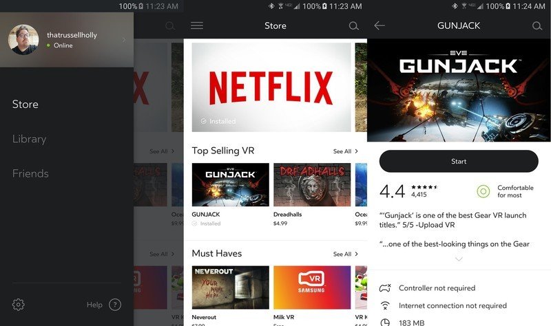
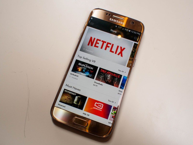
Once you've set up your Gear VR, you'll find an Oculus icon on your home screen. The Oculus app on your phone is designed to make it easy to manage your VR apps before you get to the virtual environment. When you consider the size of your average VR game and the time required to install it, the app is a much better way to browse for things you haven't tried yet. This interface is set up more like a traditional app store, which means you can search for apps, browse categories, and take a look at detailed explanations of what the apps are about before installing.
Oculus apps are all vetted before they reach the store, so they include things like content ratings and hardware requirements at the top of the description. If a game requires a gamepad to use instead of just the touchpad, this is where you'll see it. Similar descriptions exist when browsing these apps in the virtual environment, but in the app they're all available at a glance. Once you've installed an app you're interested in, you can launch that app from the Oculus app, making it so when you put the phone in the VR headset you're taken right to that app.
The Oculus app is the gateway to a virtual environment that happens to live on your phone, but it doesn't play nice with the rest of your phone or its features.
The Oculus Store uses a separate payment mechanism than the Google Play Store, so you enter your credit card information here and the transactions are separate from your Google Account. In doing so, Oculus allows you to create a pin for quick authentication in and out of the virtual environment, as well as emails for transactions when you've completed a purchase. It's a simple enough system once you get it set up, and is simple enough to adjust as needed.
Social experiences are going to be a big part of the Gear VR in the future, but it'll be a while before this is a truly social platform. As part of your account creation in the Oculus app, you now have the ability to find friends and add them to your account. This makes it easier to jump into apps together to do things like watch videos together, but it's not yet widely adopted across all of the games you can play on the Gear VR. Long term, it's clear Oculus wants this to be almost like Xbox Live, where users can jump in a game together and play together. All of the pieces are there now, and over time we'll see this social tab become more important to Oculus.
More than anything, the Oculus app is a reminder that this experience is not a part of your usual phone experience. The Oculus app is the gateway to a virtual environment that happens to live on your phone, but it doesn't play nice with the rest of your phone or its features. Some of that is on Oculus, but most of the limitations are in place because Google says so, and at the end of the day this is still an Android phone being used to do the heavy lifting for this platform.
Bring on the competition
Samsung Gear VR: the bottom line
As VR headsets go, the Gear VR is in a fascinating position. It exists as an infinitely more capable system compared to the only other smartphone-based system — Google Cardboard — yet it makes no real sense to compare it to the desktop-class VR experiences. The closest thing you could compare the Samsung Gear VR to and have it make any sense is Sony's PlayStation VR, but even then it's nowhere near an apples to apples compare.
In a way, standing out in the crowd is what has created the opportunity for Samsung to push their hardware to as many new users as possible. Oculus and Samsung have refined this experience over the last two years, and what they've come up with by combining the raw performance of the Galaxy S7 with the Gear VR headset is unique and fantastic. It's polished, capable, and full of interesting things to explore and play with. Gone are the days of overheating warnings or batteries that only last 45 minutes, due in no small part to the work Samsung has put into their latest smartphone. This combination is without equal, and it's unlikely we'll see real competition for this experience this year.
All of that having been said, there's still a lot about this experience that still feels geared to the early adopter. Samsung is introducing users to this platform in droves right now, and the initial setup is still confusing. It's still not immediately clear that you need to have the phone awake and unlocked before you put it in the Gear VR, and the spoken warning to do so doesn't appear until you've already got the headset on your face. Once you get into the virtual environment, the experience is exceptional. The journey there needs to match that, and right now it doesn't. Oculus and Samsung need to work together to create simple solutions to these pain points, both of which can be addressed with relative ease.
Should you buy it? Absolutely.
If you're interested in VR, but aren't planning to build a powerful gaming desktop or a PlayStation 4, the Gear VR is the way to go. If you're interested in the best possible experience for the Gear VR, the Samsung Galaxy S7 is the way to go. Combining these two ensures you have a great phone and a great VR experience, one that is picking up new video and gaming experiences every day.

