Large Android tablets are hard. Most apps aren't formatted to take advantage of the extra screen size, and the frequent implementation of 16:9 aspect ratio means using anything with a screen larger than eight inches is cumbersome at best. The best we've seen from these devices is a focus on gaming or media consumption, but when these devices enter the $400+ price range it becomes more than a little difficult to justify the price against the feature set.
It turns out all we really needed was a fresh perspective.
After nailing the 8-inch tablet design, Dell set their sights on something that functionally bridges the gap between tablet and laptop. In the Windows world these machines are often called convertible laptops, and if the Venue 10 7000 Series were running Windows that's exactly what it would be called. In the Android world, however, it represents something new. An Android tablet focused on productivity without giving up any of the things that make using an Android tablet fun, and in some ways even managing to improve on basic tablet ergonomics through yet another seemingly awkward tablet design. It's a series of ideas that, while separately have all been done before, come together in this device to simultaneously set an impressive new bar for Android hardware and point out some positively hideous flaws in Android as a software platform.
Article continues belowHere is our review of the Dell Venue 10 7000 Series.
About this review
We are bringing this review to you after a week of use on a build EPP101A166700DEL, which is Android 5.0.2 for those of us who don't speak Dell.
The Dell Venue 10 7000 Series being reviewed here is a $680 32GB variant with the keyboard included, and was tested on several Wifi networks and was used to write the lion's share of this review.
Dell Venue 10 7000 Series Video Review
Large Android tablets have never really been focused on productivity.
There's a few reasons we've never really had a good Android convertible before. The first, unfortunately, is that large Android tablets aren't particularly popular. Android tablets tend to do better when they hover around 7 inches in screen size and cost less than $400. Second, Android apps that play nice with 10-inch devices - even in our Material Design wonderland - are somewhat rare. Those first two reasons come together to form the third, and arguably most important reason: large Android tablets have never really been focused on productivity. You can't throw a rock in an Airport without hitting a suit gripping the sides of either an iPad or a Windows convertible, and that's because marketing dollars went into selling those devices as productivity machines. Those devices, and their respective operating systems, are no more or less functional than Android when it comes to productivity software. There's just not been a company out there to say "look at how much work you can get done on this thing" while pointing at an Android tablet. You can be sure that's exactly what Dell has in mind with this design.
Get the latest news from Android Central, your trusted companion in the world of Android
| Category | Features |
|---|---|
| Display | 10.5-inch 2560x1600 OLED @ 288ppi |
| Processor | Quad Core Intel Atom Z3580 @ 2.3Ghz |
| RAM | 2GB |
| Storage | 16GB or 32GB |
| MicroSD | up to 512GB |
| Camera (rear) | 8MP primary w/720p Intel RealSense secondary |
| Camera (front) | 2MP |
| Wireless | Wifi only, dual band 802.11 a/b/g/n/ac |
| Bluetooth | v4.0 |
Mostly familiar hardware design
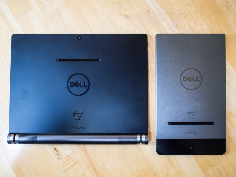
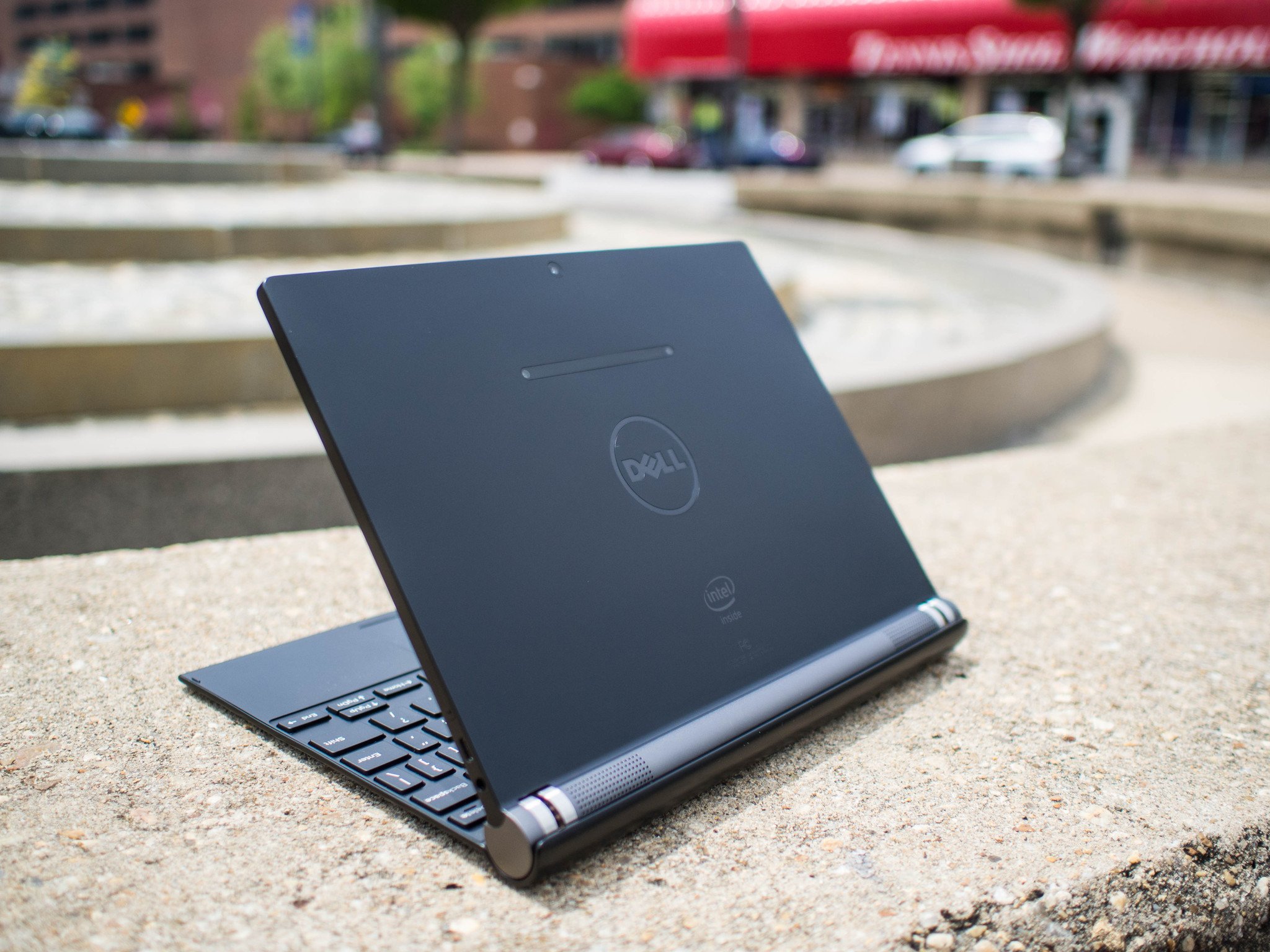
In keeping with the design language we saw from the Dell Venue 8 7000 Series, the Venue 10 is essentially a flat, thin rectangle with speakers on one side. The functional difference here is that, unlike the almost too thin and oddly asymmetrical design of the 8, the speakers bulge out from the side of the device like a handle. This not only gives ample room for the battery, but creates the space needed to offer a proper hinge for the keyboard. The end result is a design that matches Dell 8-inch predecessor in peculiar looks, but is significantly more comfortable to hold.
It couldn't be more clear this design comes from a company that has been building laptops of every kind for quite a while.
Thinking about the cylindrical speaker hinge as a handle, this device becomes quite comfortable to hold in both portrait and landscape. In portrait, most of the weight is in your hand, so most of the awkwardness associated with holding larger tablets is essentially eliminated. In landscape the only difference in use is adjusting to holding the tablet by the bottom instead of by both sides. This adjustment takes a day or so, but feels perfectly natural once you adjust. Also, like in portrait, having most of the weight in your hand makes holding the tablet a great deal easier than you'd normally expect.
Perhaps most important of all when talking about the design of this tablet is how solid it feels. Dell has taken the same build quality we saw last year and extended it to a modular design to support one of the best keyboards you can buy for an Android device today. The front-facing speakers work great no matter how you hold the device, and complement the laptop styling when connected to the keyboard. The placement of the headphone jack and microUSB port is perfect for laptop or tablet use, and the three microphones around the bezel are in places you aren't likely to cover with your hand. Even the microSD card slot is placed well, and secured with the mechanism you usually see for SIM cards. It couldn't be more clear this design comes from a company that has been building laptops of every kind for quite a while.
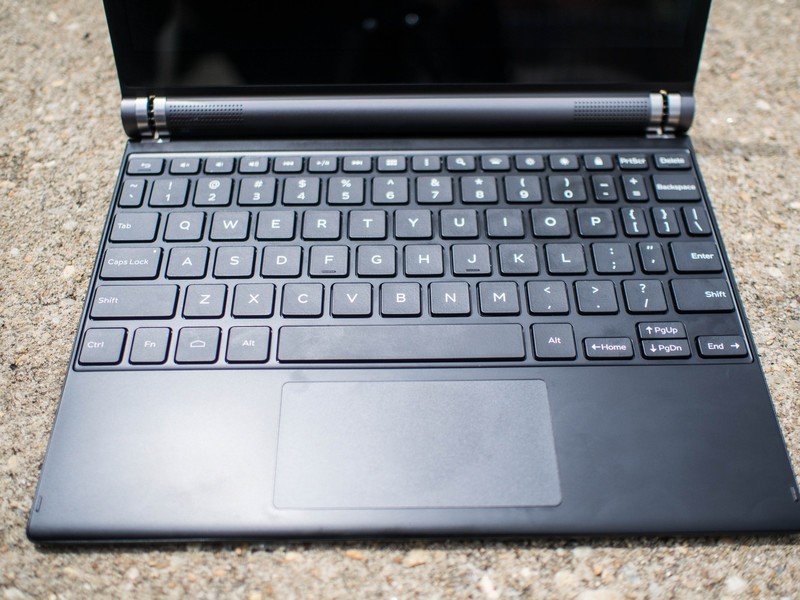
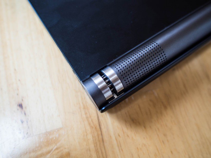
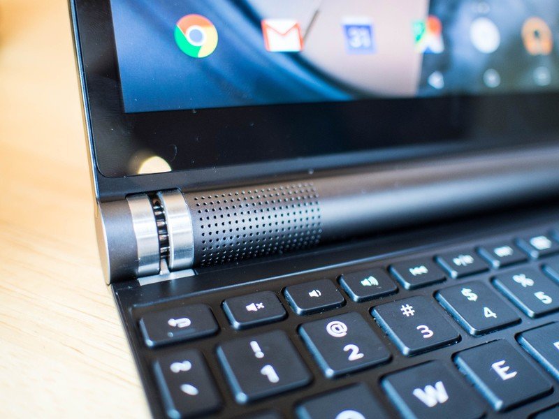

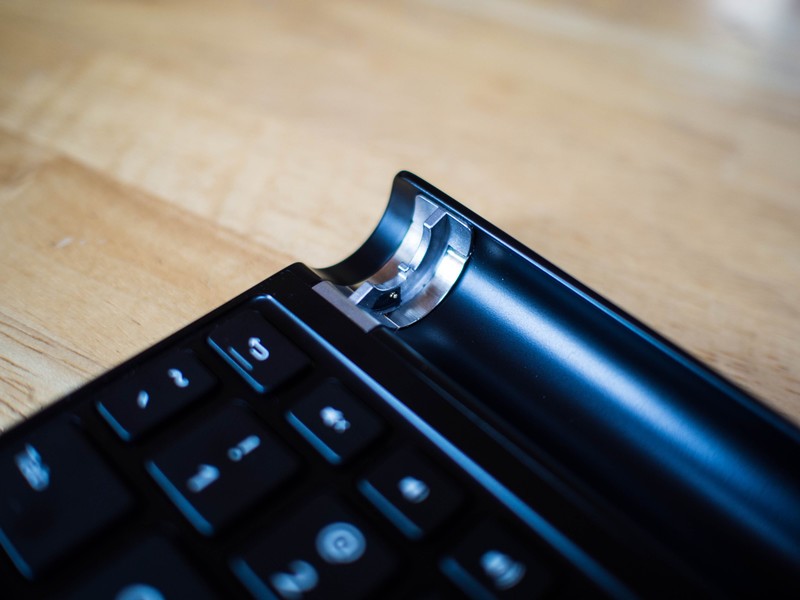
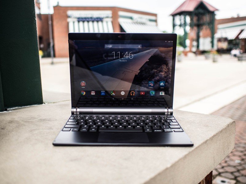
I have not been shy about my appreciation for the keyboard Dell has packaged with the Venue 10 7000 Series. In a world of flimsy, poorly made folio keyboards with keys that are too close together and no effort to make the accessory feel like a part of the device you're connecting it to, Dell's keyboard stands out in a big way. While the keyboard is limited to the 10-inch space created by the display, the key spacing and tactile response are both great. You could easily compare this keyboard to your average convertible laptop keyboard and walk away feeling like Dell had the better offering. Between the media controls, Android system controls, and an actual trackpad with scrolling and long press support, this really does feel like an Android laptop when assembled.
All of that said, there's something of a learning curve to this keyboard. You're in a largely one-click environment, which means accidentally brushing against the trackpad often means you are tapping somewhere on the screen. It also means trying to use the trackpad to interact with the notification shade is a little clumsy. You essentially double-tap the top bar to bring down the notifications, but you have to click and drag to dismiss a notification. It takes some getting used to, and is the only thing the trackpad doesn't do well in the OS, which is impressive. While the trackpad can be disabled in settings, it's a nice thing to have when you'd rather scroll with two fingers than reach out and touch the screen.
The keyboard is an incredibly well-thought-out accessory that transforms this device.
It's also unfortunately obvious that the keyboard, and the software that drives it, was not made with Lollipop in mind. The symbols on the keys for Home and Back are from Kit Kat, and there's a Menu button instead of a multitask key which means the only way to access multitasking is to poke the screen or drag your mouse over the key. It's the only part of the keyboard experience that doesn't feel particularly well thought out, and that has just about everything to do with this device being prototyped on an earlier version of the OS and not 100% updated with the rest of the experience. It's a small thing overall, but the kind of thing that irritates when you're frequently switching between apps.
The bottom line is you can comfortably use this keyboard in the same way you use laptop keyboard, which is an impressive accomplishment on its own. There's no worry about the tablet tipping over, because the weight is all on the hinge. There's no need to worry about charging the keyboard, because it is powered by the pins in the hinge and has no battery — and those pins are placed smart enough to not power the keyboard if you dock the tablet backwards to use the hinge as a stand or leaning post for the tablet. It's an incredibly well-thought-out accessory that transforms this device in a way we've been hoping to see on other Android devices but never really managed to fully accomplish.
Lollipop on a large tablet
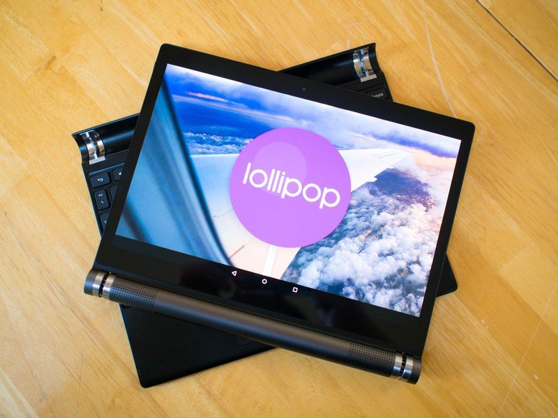
Day to day performance on the Venue 10 7000 Series is nearly identical to the Venue 8, which is to be expected given the remarkably similar hardware profile. It also means the tablet performed quite well, with no UI lag and plenty snappy when loading apps. Everything looks great on this display, but gaming and reading experiences really stand out thanks to the ambient display mode in Lollipop and dual stereo speakers. The 2.3GHz quad core Intel Atom Z3580 and 2GB of RAM is more than enough power for this device, especially when sat side by side with Google's Nexus 9 and asked to perform identical tasks in identical situations. Both tablets are nice and fast, but it's interesting to see Dell is reaching the same level of performance with less hardware. More than anything, it's fascinating to see Intel take its place as one of the high-performance chipsets in Android today.
When Lollipop came to the Dell Venue 8, it felt like the OS was made for that device. The thin bezels and brilliant display handled Material design elegantly, and being able to hold the whole tablet with one hand completed that experience. Dell's biggest hurdle with this new device is its operating system, or more specifically the apps written for it. The number of tablet-friendly apps is still a pain point on Android, and it doesn't get more obvious how big a problem this is than using a 10.1-inch 2560x1600 resolution display. While Google has made things easier with Material Design, there are still hundreds of thousands of apps out there that don't follow these new guidelines and just plain look bad on this tablet. Since Google has yet to officially implement multi-window support into Android, and the Dell Venue 10 7000 Series is just about as close to Google's vision for Android as a company can get without making a Nexus, there's some usability issues with a lot of apps that diminish the experience quite a bit.
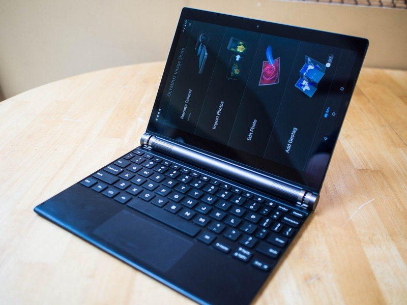
Unfortunately, it gets worse. The design Dell chose for this device makes it easy to lean towards landscape use for most of your time with the device, but Android occasionally has other plans for you. App developers are still allowed to force landscape or portrait when they deem it appropriate, so you run into the occasional app that doesn't rotate when launched and only really works in portrait. Dell's own Gallery app forces portrait when offering tutorials on how to use the app. Slack is another great example, even after having overhauled the app to support Material Design the UI still forces portrait for the login page. This artifact of Android app development is downright obnoxious when using the Venue 10 7000 Series in landscape or keyboard mode.
The user experience doesn't quite feel complete.
In several cases, most notably when using Facebook, I found myself preferring the web interface. Chrome for Android is, after all, a perfectly functional modern web browser. At this resolution most websites load just as they would on my Desktop, so the only thing I was missing from the mobile Facebook experience were notification tones when something happened. This behavior continued on quite a bit in my day to day usage, usually because I already had Chrome open and just sort of fell into the same behavior patterns I would on my MacBook or Desktop. The experience isn't even all that different with two-finger scrolling on the trackpad and CTRL-C/V working for copy and paste. There are certainly times where the app experience is better, like when I'm writing in Google Drive or in a video chat with co-workers, but it was interesting to see how the browser returned to center stage in using this tablet instead of being the thing all of my other apps use to open links.
The user experience doesn't quite feel complete on the Dell Venue 10 7000 Series, but in exchange for some awkwardness in a handful of poorly written apps you gain a legitimate productivity experience. Our workflow here at Android Central isn't exactly average, but I was able to comfortably (well, almost comfortably, I love my CODE keyboard) write this review on this tablet. That process included photo editing in Lightroom after importing through the Olympus OI.Share app, research, writing, and finally assembling the post in the Android Central backend. With exception to video editing, which I could have done through remote desktop if I really wanted, my entire workflow was not only possible on this machine, but enjoyable.
Four cameras on one tablet
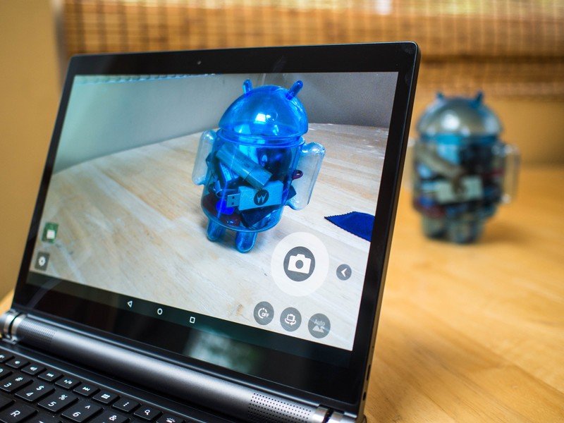
Like the Venue 8 7000 Series, Dell's 10-inch tablet is sorting a tri-camera system on the back and a single camera in the front. The tri-camera rig is part of Intel's Real Sense depth measurement tech, which still feels more like a cool science project than an actual consumer feature. It's an 8MP primary sensor with two 720p sensors underneath to help determine depth, with a Gallery app that lets you measure distance and height for objects you've taken photos of. Taking these photos requires you be in a large open space with lots of light, which usually means outdoors, and there's still roughly a 75% chance you'll get an accurate measurement after a photo is taken.
The size and shape of the Venue 10 make this camera even less practical, because holding this rig steady is a critical part of depth measurement and not particularly easy to do. The camera quality also hasn't improved from one device to the next, which means you aren't likely to use the camera for much more than showing your friends this weird thing your tablet can do.





The front camera is a 2MP sensor that feels a little dated when compared to the powerhouses we've seen in the LG G4, Samsung Galaxy S6, and HTC One M9 this year. Video chat can be a big deal for folks relying on devices like this for portability and communication, and the experience is more or less what we'd expect from the last generation of smartphones. It's easy for a bight light to blow out the image, and in darker environments the camera is mostly useless. The microphones, however, are fantastic. In all of our tests the recipients could hear the user loud and clear, which is often more important than a solid video feed.
The bottom line
If you're looking for Android in a more laptop-like form factor, this is it. The experience is easily comparable to Windows-based ultraportables and convertible laptops in the same price range, which is important. The most expensive version of this device is $680, and does a great deal to add purpose to a category of Android devices that have never really escaped the media consumption category. There's no doubt that the whole package is what we'd recommend, either. The tablet alone is decent, but with the keyboard it becomes something much more. It's fun to game on, enjoyable to work on, and despite the occasionally obnoxious software quirks the overall experience is great.
Dell has put their best foot forward here, and if history is any indicator you can count on an update to the next version of Android shortly after Google makes their offerings available to the world, so this is a device you're likely to enjoy for a while.
Update: As of June 2016, Dell has discontinued its Venue tablet line, and will issue no further software updates to the tablets. Active warranties will be honored, but you will not receive future updates on a Dell Venue tablet.

